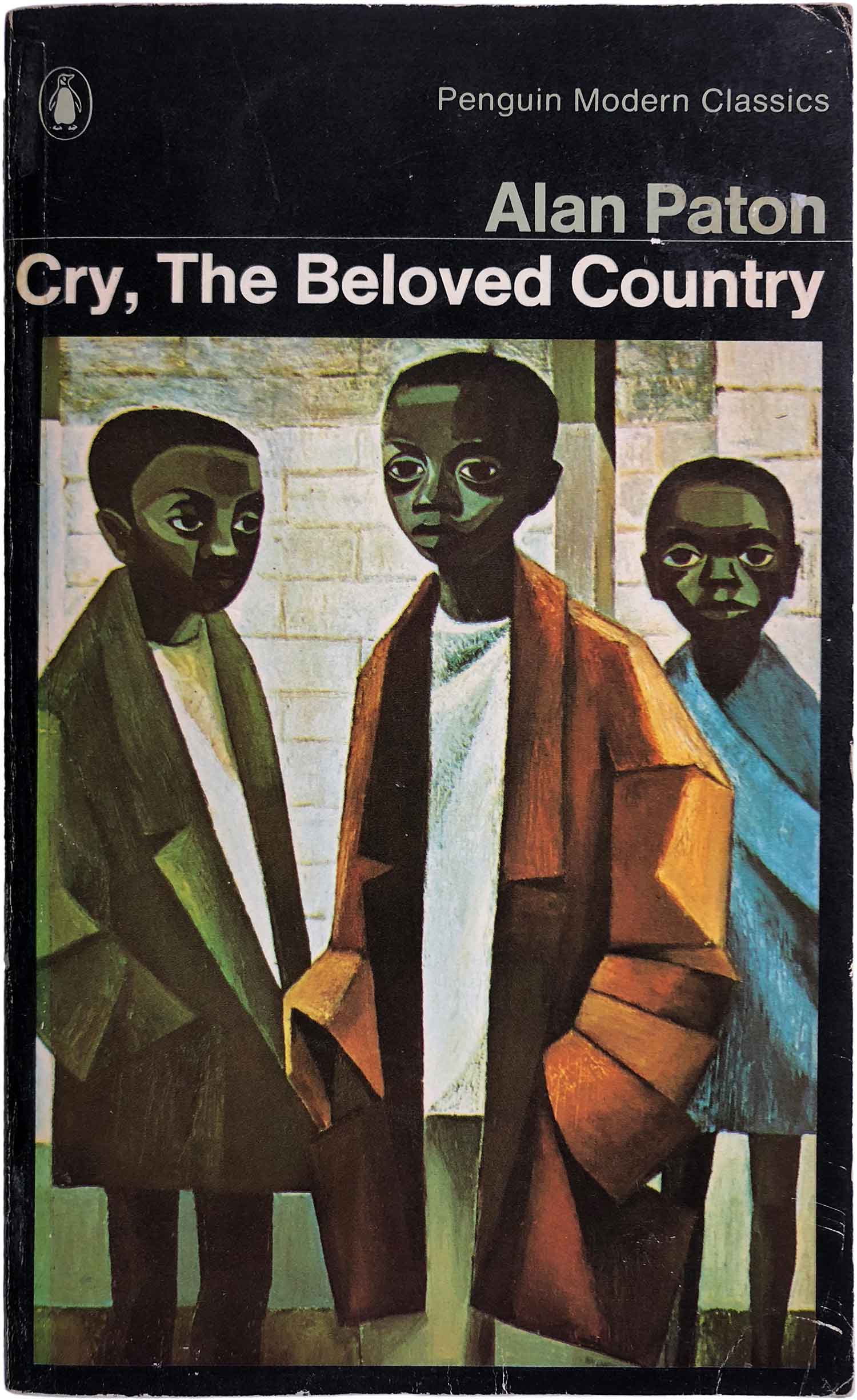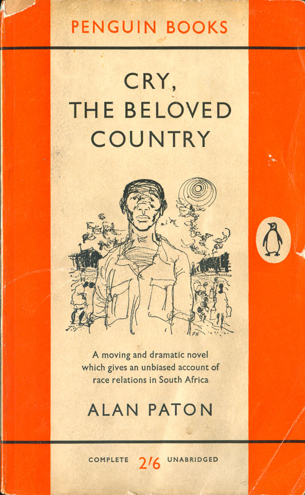
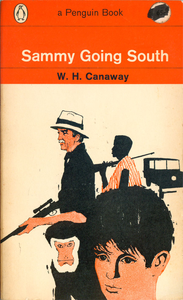
When I was tracking down all the books in the Penguin African Library (see HERE), I came across an old novel based in South Africa that Penguin published, W.H. Canaway’s Sammy Going South. The edition was published in 1963, and is a classic looking “late orange” Penguin book, with the only colors on the cover being shades and overprinting of orange and black. Then later, while working at Human Relations (definitely check it out if you are in Brooklyn, it’s a great used bookshop!) I found Penguin’s first paperback edition of Alan Paton’s classic South African novel Cry, the Beloved Country. The cover illustration of this 1960 edition is by Paul Hogarth, and its simplicity of line captures a depth of ambiguous emotionality. Confusion, tension, frustration, anguish, and even acceptance appear to flash across the face of the central figure.
Finding these two titles launched me into a hunt for early “orange” Penguin novels based in Africa or written by Africans (although most by white Africans, given they are from the early 60s and before). Most have strong and intriguing cover artwork, worked into the Penguin grid of the era. Over the past year I’ve found six novels, and they’re all here for you to check out.
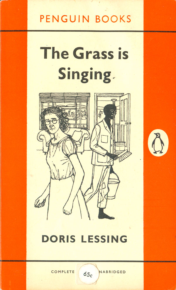
Doris Lessing’s The Grass is Singing (this edition published in 1961) is her first novel. The cover follows the early vertical Penguin grid (the design initiated by Jan Tschichold and finished by Hans Schmoller in 1951), with a central illustration by Heather Standring. The novel is set in Southern Rhodesia (originally a British Colony which would eventually become Zimbabwe), and the cover image captures the alienation and distrust between the white and black characters. Lessing’s novel articulates the way increasingly institutionalized racism against black Africans in Southern Africa was warping and dehumanizing social relationships.
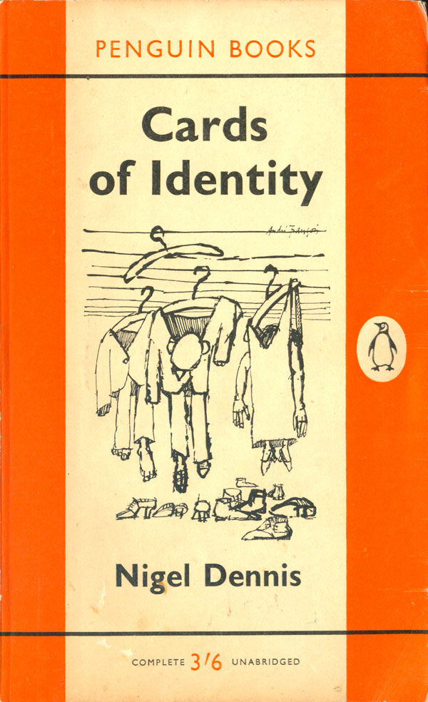
The cover of Cards of Identity (this edition, 1960) by Nigel Dennis also follows the standard Penguin vertical grid. Although the novel isn’t about Africa, Dennis grew up and went to school in Southern Rhodesia so I’m including him here. I love the cover illustration by André François—the bodies awkwardly hanging in clothes on a clothesline introduces the satire and humor of the novel.
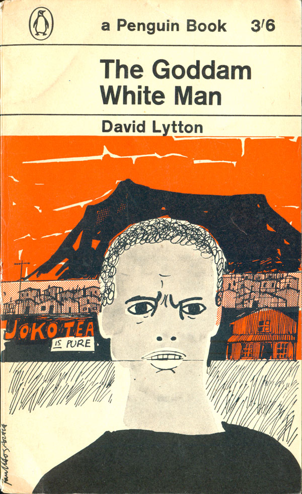
Next are three covers published later in the 60s, all following the Penguin horizontal grid, originally designed by Romek Marber in 1961. David Lytton’s The Goddam White Man (1962) features another fabulous cover illustration by Paul Hogarth, the strength of the title and figure slightly undermined and modified by the horizontal line that cuts across his face. Intentional or not, the scratchy, sketch-like quality of the drawing transfers to the figure, making his world seem unstable and out of his control.
The edition I have of the aforementioned Sammy Goes South is from the following year, published in 1963. It’s an adventure/travel novel about a ten-year-old white boy making his way from Egypt to South Africa. The cover has a much more compact illustration, by Adrian Bailey. The images in the illustration are based on the characters from the film based on the novel. Like many early image-based Penguin covers, it has a classic and clean style, one that seems both specific to its early 60s moment, yet also timeless.
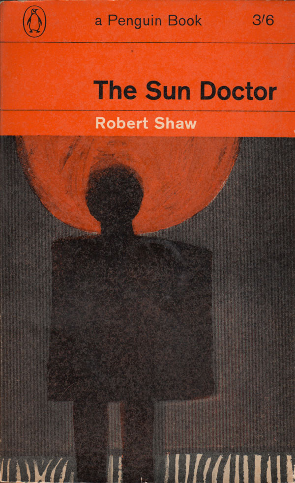
Next is Robert Shaw’s The Sun Doctor (this edition, 1964) is a British novel, but based in Angola. It has the darkest cover of all six books by far, the painterly illustration (by Malcolm Carder) of a harshly backlit figure is menacing, and ambiguous. It could be illustrating the book’s protagonist, a doctor who’s good intentions play out to questionable effect, or one of the African villagers he treats.
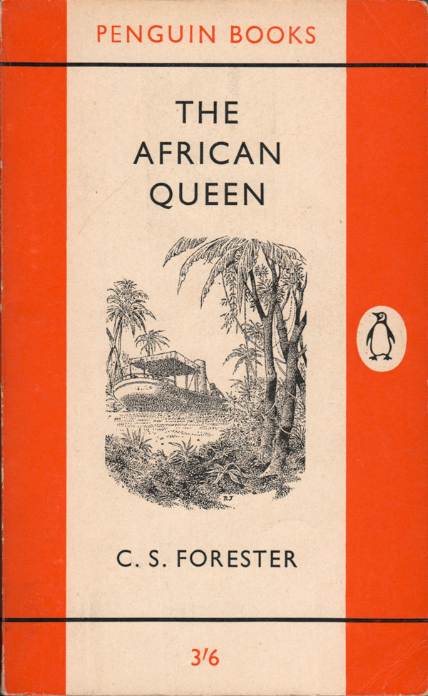
And finally two outliers. First is C.S. Forester’s The African Queen (this edition, 1956). Although it takes place in Central Africa and the Congo, I only really wanted to include this to look at how Africa becomes the backdrop for a struggle between German’s and the British, and simultaneously is transmogrified into a passenger ship, an inanimate object, something that moves European’s throughout the world. The cover illustration of the ship and landscape is by Robin Jacques. Next to that is a 1972 edition of Cry, the Beloved Country (the 16th Penguin printing!) to see how the representation developed and evolved. The cover design is by Germano Facetii, the illustration a detail from Marianne Podlashuc’s “Three Boys.”