I was in San Francisco in the Spring of 2012 for the Bay Area Anarchist Bookfair, and since I had a little extra time I made the rounds of the local used bookstores. One of my favorites is Dog Eared Books. Sometimes it can be a bit pricey, but at the same time there are often some great deals, and the book buyers tend to pick up quirky Left books. This visit I found a copy of Cuba: Castroism and Communism, 1959-1966 by Andrés Suárez on MIT Press. I was drawn to the book because its austere front cover—large, bold, white letters spelling out C-U-B and a big red star in place of the A. The tiny, tiny full title and author underneath is a really nice touch. The clinch for deciding to buy the book was when I flipped it over and found the same exact design on the back, but with each letter super-imposed on top of key figure in international politics in the 1960s (if not the Cuban Missile Crisis): Mao, Kruschev, Kennedy, and finally Castro, sitting comfortably behind the red star.
I was surprised to find a book on communism in Latin America published by MIT, as these days their trade list seems to focus on high end art, architecture, and theory/philosophy publications. It turns out that throughout the 1960s MIT partnered with the Center for International Studies to publish a series of books under the title “Studies in International Communism.” I’ve found record of thirteen different books in the set (six of which I’ve tracked down actual copies of), although there are possibly more that have eluded me.
The best part about the series is that across the board they are smartly designed, with forward-looking and graphically efficient covers. Although the design across almost a decade of covers is extremely consistent, if evolving, not a single one of the books I’ve found have an acknowledgement of the designer, so I have no idea if a single in-house designer did them all, or if they were just done as the came out, with each new designer building on the design of the previous book.
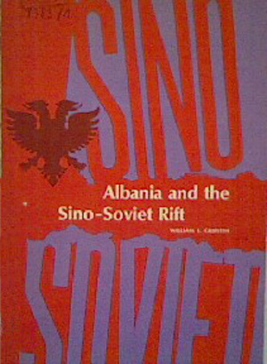
The series appears to be edited by William E. Griffith, who also authored and edited a number of the books, including the first in the series: William E Griffith, Albania and the Sino-Soviet Rift (Cambridge, Mass.: MIT Press, 1963). Yup, scintillating reading kids! But the cover is bold, using deep red, magenta, and purple, literally splitting up SINO and SOVIET, and imposing an Albanian coat of arms on top.
The second book in the series is: P.J. Honey, Communism in North Vietnam (Cambridge, Mass.: MIT Press, 1964). The cover of this book is the most out of synch with the rest of the series. The title font is the same as with Griffith’s book, but the entire covered is filled with a photo of Ho Chi Minh, the only illustrative element being a small red star. Over all the entire effect is much less graphic and punchy than the rest. It’s not a bad cover, just out of step with the rest.

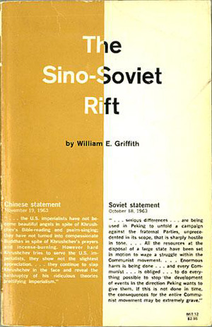
Griffith is back for the third book in the series: William E. Griffith, The Sino-Soviet Rift (Cambridge, Mass.: MIT Press, 1964), further exploring the same topic. This cover is once again very graphic, and contains a combination of bold and subdued elements, but reads as boring in comparison to some of the refinement of the later books. The chisel calligraphy font (I’ve been trying for hours to come up with the actual font name, but it’s eluding me!) has been jettisoned in trade for the much cleaner Helvetica-type font, but the gold/yellow and white split cover is way too literal, never mind the uncomfortable use of yellow for the Chinese side of the page.
The forth and sixth books in the series are omnibus edited volumes: William E Griffith, ed., Communism in Europe, vol. 1 (Cambridge, Mass.: MIT Press, 1964) and William E. Griffith, ed., Communism in Europe, vol.2 (Cambridge, Mass.: MIT Press, 1966). Both covers are variations on the same theme, and I was only able to find a decent image of the first volume. The title is in a tall, bold sans serif font across the top, with the subtitle tucked underneath it. The rest of the cover is filled with words as graphic elements, a long and running list of countries with active communist movements turned 90 degrees clock-wise, as if they are streaming out from the below the title. The names of the countries addressed in each volume are highlighted in a different color than the other names.


Volume five is Ernst Halperin’s Nationalism and Communism in Chile (Cambridge, Mass.: MIT Press, 1965). Here the covers are really hitting their graphic stride, both in smart use of duo-tone printing and maximizing impact with only creative use of type and very simple graphic elements. This cover really pops in red and blue overprinted on a simple white. The words in the title are rendered in very tall sans serif and stacked tightly from top to bottom, mirroring the long, thin form of Chile they are superimposed on top of. The simple decision to overprint of the blue, so it reads darker when on top of the red than the white, gives the entire cover another layer of visual depth and complexity without adding any additional and unnecessary elements.
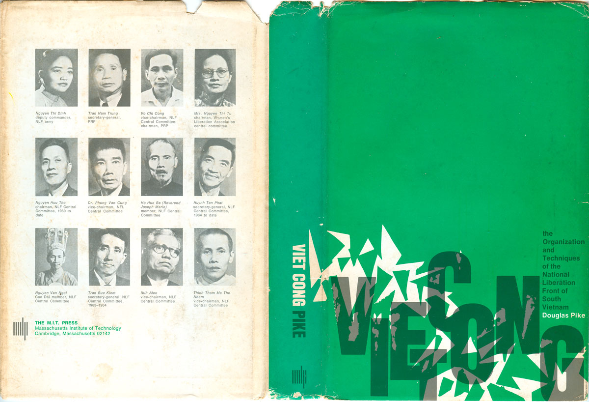
The sixth book is the set is Douglas Pike’s Vietcong: the Organization and Techniques of the National Liberation Front of South Vietnam (Cambridge, Mass.: MIT Press, 1966). The general design sense is consistent, the color scheme is completely switched up from earlier titles. Kelly green and grey are the two colors printed over white. White cut-outs make for a jagged and explosive pattern across the bottom, which is echoed in the tightly compressed and vertically divergent letters of the word VIETCONG. The subtitle and author’s name are tightly squeezed into a convenient space open on the far right of the visual field, with the subtitle printed in grey over the green, and reading as black at first look. Like the title in Halperin’s book above, each letter is partly overprinted on green, and partly on white, adding to the depth of field. This is also the first book in the series to really utilize the spine and back cover. The front cover wraps around the edge, adding a graphic element to the spine, while the back shows a grid of political figures from South Vietnam.
Next up is another Griffith title, Sino-Soviet Relations, 1964-1965 (Cambridge, Mass.: MIT Press, 1967). This cover sets the tone for most of the rest of the series. A single, small line of tight, white Helvetica text runs along the top of an entirely black cover, with the shapes of China and the Soviet Union floating in the black field, white with a bold red outline. The two colors on a white stock have been whittled down to stark efficiency, and the graphic is also a stark and direct representation of the title.
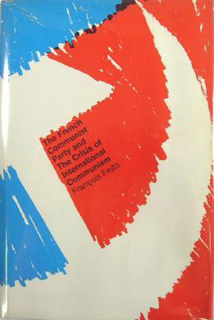
In comparison, the cover of eighth book in the series: Francois Fejtö, The French Communist Party and the Crisis of Communism (Cambridge, Mass.: MIT Press, 1967), is practically expressionist, with the red and blue scratched onto page. The red and blue fields draw out the white hammer and cycle from the negative space, and the clean Helvetica titling is once again small, and cozily fits at an angle right under the head of the hammer. I wonder if this cover was designed by someone else, or if the scribliness is supposed to connote the “crisis” in the title?

The next two books are a Romanian double feature: Stephen Fischer-Galati, The New Rumania: From People’s Democracy to Socialist Republic (Cambridge, Mass.: MIT Press, 1967) and John Michael Montias, The Economic Development of Rumania (Cambridge, Mass.: MIT Press, 1967). The production coordinator, or someone along the line, made the smart choice of visually linking the books—well, actually making the covers almost near mirror images of each other. In the first the entire cover is cleanly white, with the title in small sans-serif at the top and a bold, red and black star graphic at the bottom. The second book is inverted, a black field with small white title at the top and the same star graphic at the bottom, but in red and white.


I already discussed the twelfth book in the set above: Andrés Suárez, Cuba: Castroism and Communism, 1959-1966 (Cambridge, Mass: MIT Press, 1967).


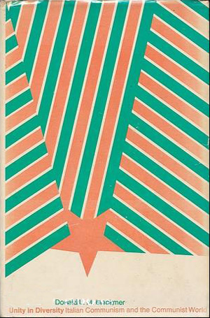
And the final book I’ve found in the series is: Donald Blackmer, Unity in Diversity: Italian Communism and the Communist World (Cambridge, Mass: MIT Press, 1968). Another really powerful cover, red, white, and green stripes clashing across the majority of the page, resolving into a large red star which points right down onto the title. The text is once again small and unobtrusive, allowing the graphic elements to grab your attention and lead your eye to the fine print. It’s been a long time since I’ve seen a cover this abstract and graphic on a left non-fiction book—it so strongly bucks the dual contemporary demands to directly illustrate the content and cram as much text as possible onto the cover. It would be so refreshing to walk into a bookstore and see covers like this on books about communism, not just fashion and design titles.

I’ve tracked down three additional MIT Press books related to international communism, but as far as I can tell, they are not part of the same series. The cover to Robin Alison Remington’s The Warsaw Pact seems most likely to have been designed by the same person doing the later half of the Studies in International Communism set. The cover has all the I love in a design, with only two colors in use, powerful and illustrative graphic elements, and the titling being readable, but smartly kept out of the way. The dove and gun barrel are obvious—and almost cliché—peace and war symbols, but their strong stylization and color inversion keeps them feeling fresh.
Marcus Franda’s book, Radical Politics in West Bengal (MIT, 1971) has the same type treatment as the communism books, but the illustration on the cover is so much more organic and expressive it really stands apart. And the selected works of Castro, Revolutionary Struggle (MIT, 1972), takes a completely different tact, mixing repetition, hand written script, and the play between positive and negative space. It’s a nice cover, but coming from a completely different place.


I find it interesting that a series of very dry and policy-oriented books on international
communism published by an academic press have such well-designed and coherent covers, especially for a run of almost a decade. The wrapping on these books has far outlasted much of the content, but unfortunately I don’t know who to thank because no designer was ever attributed.