
Continuing with my cleaning up and filling in the gaps in old posts, here’s nine more covers from the East German, English-language publisher Seven Seas. You can check out the first five posts, thirty or so covers, and another couple dozen images HERE. Half of these new books I’ve found in my travels and hunting, the other half come from my friend Aaron, a fellow-traveler in collecting things strange, political, and book.
To the right is Naked Among Wolves by Bruno Aptiz. At first glance it’s a simple black cover with white and yellow type, but on a second look, a face emerges from the darkness. My eyes can’t figure out whether to read the face as threatening or threatened, which makes it that much more creepy.
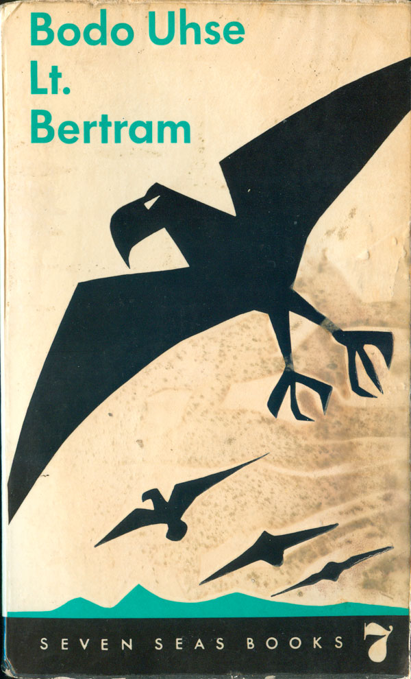
I love how simple black shapes form into images on both the covers below. Really simple gestures, as you would expect on a kids book, but they carry a lot of dark emotion. The tree is haunting, and the eagles are terrifying, an avian embodiment of fascism.

Both of these covers a quite simple. The La Guma is just a box within a box, and a good argument for why simple isn’t always best. This cover treatment doesn’t even compare to the other La Guma covers in the series (which you can see in the older posts), even though they are all done by the same designer, Lothar Reher. You might notice that there isn’t a bar at the bottom with the Seven Seas logo. This is because this is the US version of the same book, published by International Publishers.
Labyrinth Without Fear has a similar simplicity, but setting the word “Labyrinth” in a Bodoni showcard type and jumbling the letters adds a bit of playfulness. This works in some ways, but also calls attention to how little else is happening on the field of the cover.


It seems that 1976 was a year where other designers got a turn on the steering wheel. Both on Time for Dreams below, and The Seventh Well a couple images down. Both of these are designed by Klaus Krüger (as was the Hans Eisler cover in the earlier posts—which was originally published in 1976, but not by Seven Seas until 1978). The cover of Time for Dreams is certainly simple and efficient, but reads much more pop and 1980s than Reher’s usual nod’s to Modernism. The front seems a bit silly, but I really like how the back simply contains a poem from the book.


Dorethy Hewett’s Bobbin Up is an Irish novel, which maybe explains the green. Nothing too special here, but nothing offensive either. I like the green shapes, but their potential power is undermined by the images of young women, which at this point don’t really communicate much. Although maybe that’s the point—I suppose it is a novel about young women.


Stefan Heym’s The Lenz Papers is a novel about revolution, but you might not get that from the cover. It’s about the 1849 revolution in Baden, told through the eyes of the title’s Andreas Lenz. Two women love him, thus the locket photos on the cover, but something more rousing than the old pistol could have been used to illustrate uprising. The solid yellow color choice is also odd—not bad, but not expected.
Fred Wander’s The Seventh Well has a terrible cover. The original painting might be interesting, but it has no room to breath here, and is hard to read and register. The type is also difficult to read, the stencil font crammed in the top left is inexplicable.
I hate to go out with such a whimper, but that’s all I got this week. Come back next week when we head over to Africa again!
Bruno Aptiz, Naked Among Wolves (Berlin, GDR: Seven Seas Books, 1978, 3rd ed). Cover design by Lothar Reher.
Günther Deicke, ed., Time for Dreams: Poetry from the German Democratic Republic (Berlin, GDR: Seven Seas Books, 1976). Cover design by Klaus Krüger.
Dorothy Hewett, Bobbin Up (Berlin, GDR: Seven Seas Books, 1961). Cover design by Lothar Reher.
Stefan Heym, The Lenz Papers (Berlin, GDR: Seven Seas Books, 1968). Cover design by Lothar Reher.
Walter Kaufmann, The Curse of Maralinga and Other Stories (Berlin, GDR: Seven Seas Books, 1962). Cover design by Lothar Reher.
Alex La Guma, ed., Apartheid: A Collection of Writings on South African Racism by South Africans (New York: International Publishers, 1978). Cover design by Lothar Reher.
Joachim Nowotny, Labyrinth Without Fear (Berlin, GDR: Seven Seas Books, 1970). Cover design by Lothar Reher.
Bodo Uhse, Lt. Bertram (Berlin, GDR: Seven Seas Books, 1961). Cover design by Lothar Reher.
Fred Wander, The Seventh Well (Berlin, GDR: Seven Seas Books, 1976). Cover design by Klaus Krüger, cover image by Anatoli Lvovich Kaplan.


Hi Josh, I know this post is pretty old, but it’s worth pointing out that Dorothy Hewett’s Bobbin Up is set in Sydney, Australia, and is by one of Australia’s best-known writers of the second half of the twentieth century. It’s a lovely evocation of working-class Sydney, framed by a classic socialist realist plot set in a factory, ending in a strike.
Great to see attention to the amazing Seven Seas Press.
Best wishes
Nicole Moore
Thanks Nicole! Not sure how or why I missed that, maybe fell prey to assumptions based on the green. The book sounds great, although none of that class tension/struggle seems captured by the cover. I’ll have to dig it out and give it a read!