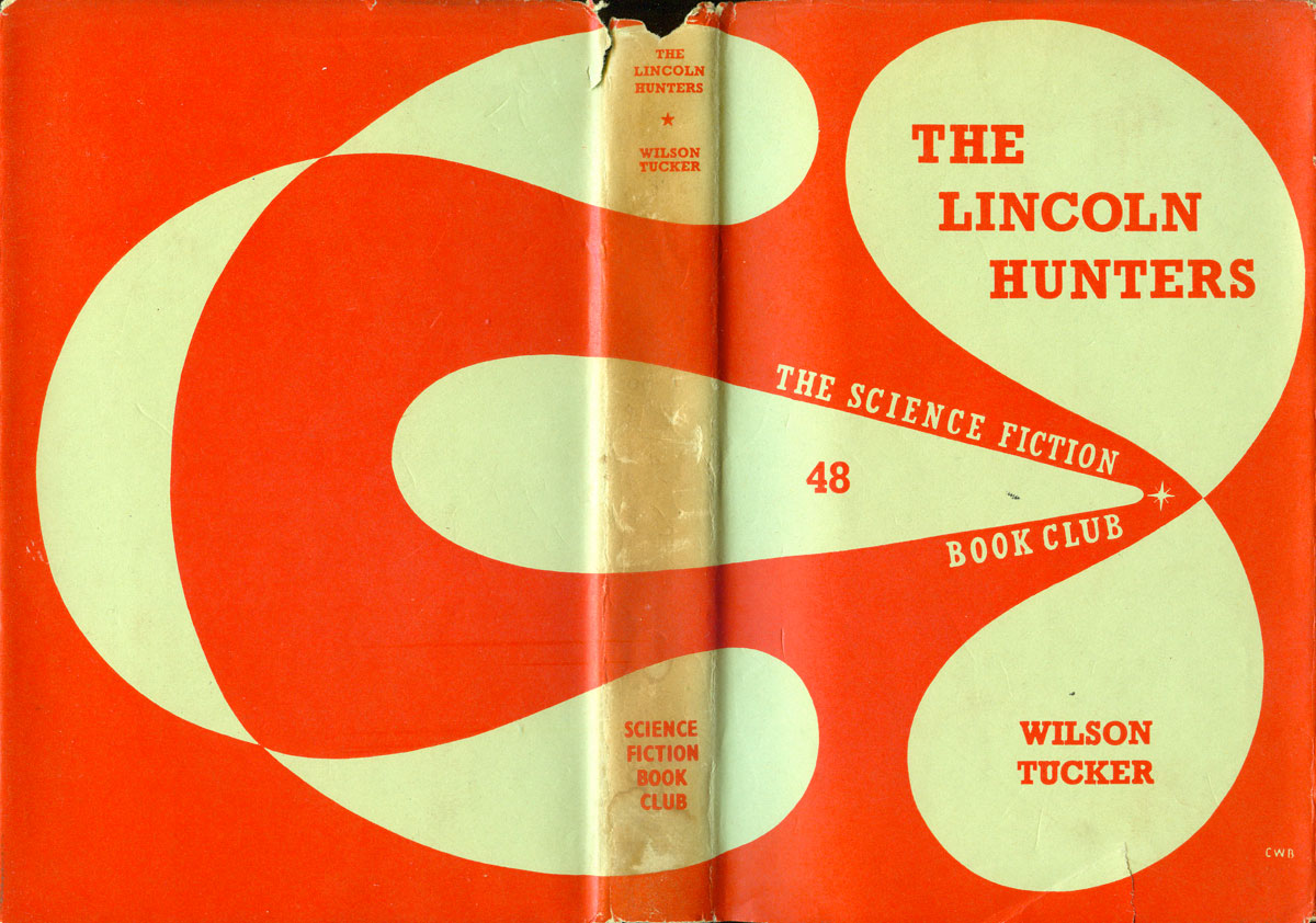
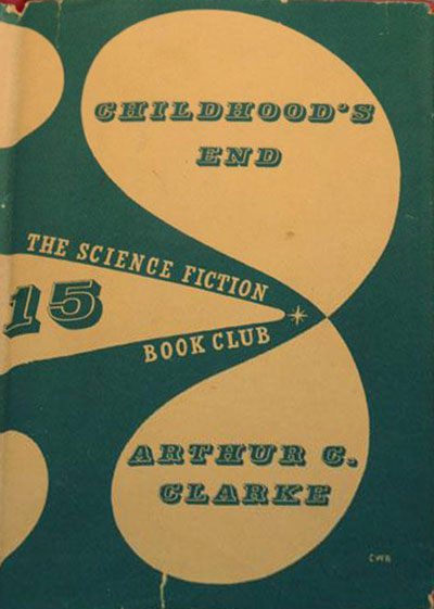
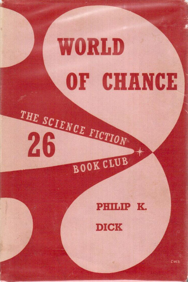
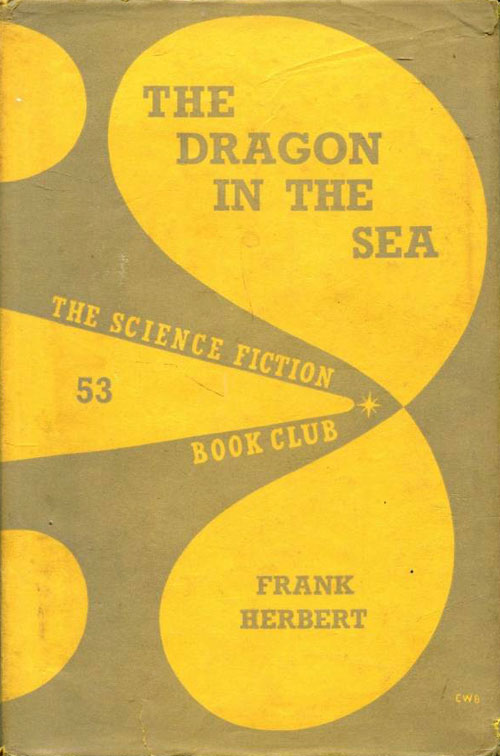
I recently stumbled upon a small handsome science fiction hardback at a used book sale. The cover of Wilson Tucker’s The Lincoln Hunters is entirely abstract, but still manages to provoke a sense of motion, as if the cover itself is in flux. The bulbous shapes that make up the cover gesture towards arrows, plasma, and a general outer-space-ness. It turns out that this is just one of at least five dozen titles in this particular Science Fiction Book Club series, running from the mid-1950s into the early 60s. All share the same shapes on the cover, but the colors change and evolve, and the type treatment also transformed over time.
I read in one place that this incarnation of the Science Fiction Book Club was published by Victor Gollancz, the big British leftist publisher, but I have seen Gollancz SF books which are graced with a modified version of that publishers usual yellow covers, so I’m not sure there is anything to that. It appears that “Science Fiction Book Club” is a publisher in its own right in the UK, putting out affordable versions of popular SF titles. One website states that UK and US clubs were started in 1973, and that the UK SFBC was originally owned by Sidgwick and Jackson, then by Dent, and the by David and Charles in the 1970s. The best info I could find is HERE.

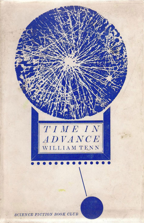
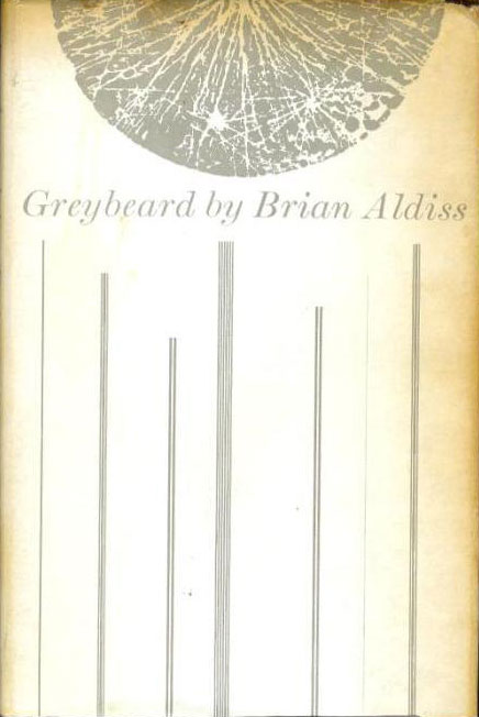
By 1962 the covers had shifted from the color field of shapes to clever design variations centered on a circular, stylized image of a planet, or even solar system. All of these covers are credited to John Griffiths. Some of them play off the titles—William Tenn’s Time in Advance sports the planet as clock, while Brian Aldiss’ Greybeard features thin grey lines descending from the planet shape, converting it to the bottom half of a bearded face.
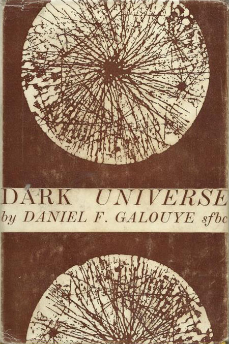
Others are simply elegant deviations on the planet shape. The designer of Agnew H. Bahnson’s The Stars are too High does a lot by simply running the Book Club name vertical out of the planet shape. Daniel F. Galouye’s Dark Universe appears quite dark through the simple inversion of the planet on a dark brown background.

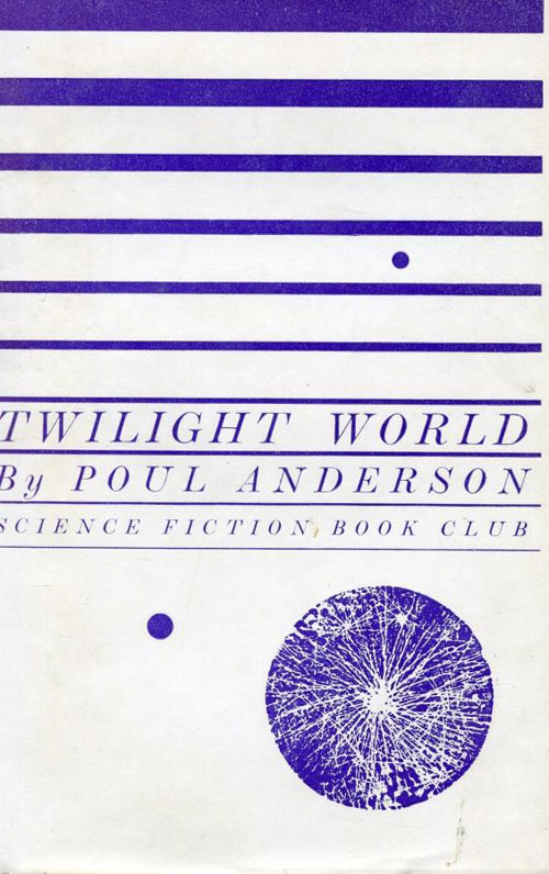
Poul Anderson’s Twilight World cover introduces strong horizontal stripes to the design palate, with the planet-shape shrinking to a supporting role. By 1965, with Arthur Sellings’ The Uncensored Man, the stripes take over, and the planet is replaced with a abstract human figure, likely the man of the title. This appears to be a transitionary design, linking the cohesive set of covers featuring the planet-shape to the next phase.

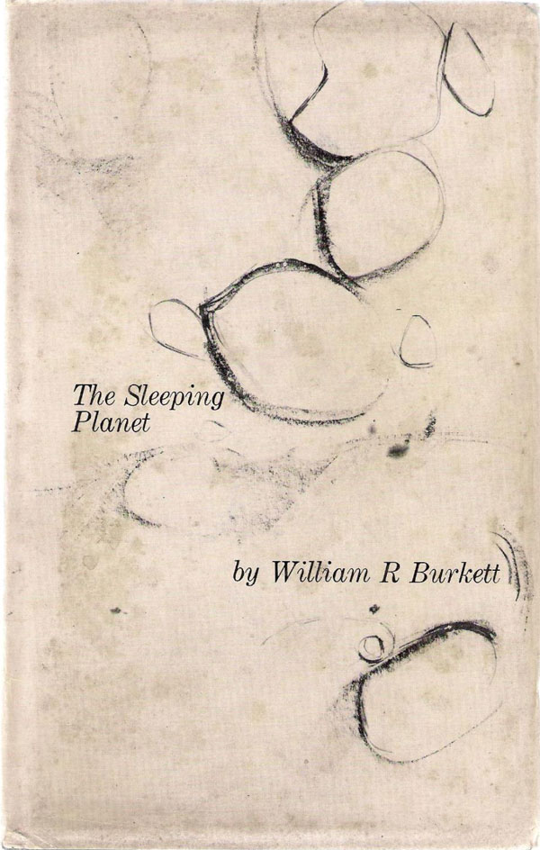
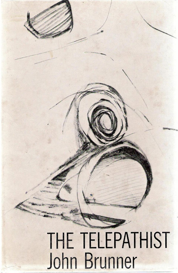
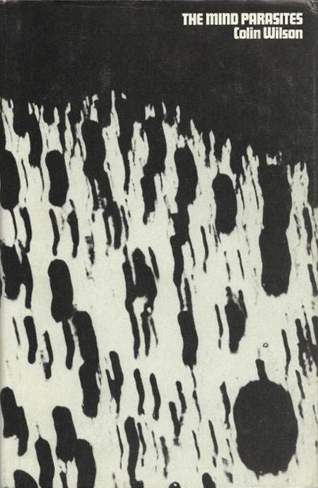
In 1966, all of the covers take on a new, even more abstract design. The Burkett, Brunner, and Galouye titles to the right and below are all of this period. The roughly drawn abstractions in many ways have more in common with the Alvin Lustig-designed modernist covers of 1950s New Directions Publishing books than anything associated with Sci-Fi. The lack of any representational clues in the drawings demand the viewer supply all meaning, and my eyes—at least—start to create sketches of a alien planet’s surface out of the cover of The Sleeping Planet, and rough designs for some sort of time travel device out of the scratches on The Telepathist.

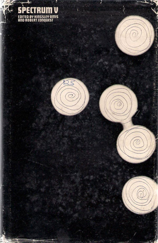
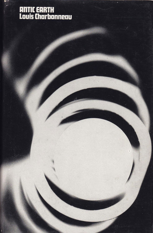
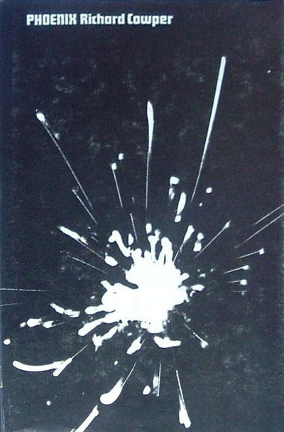
In just one year the scribbled abstractions of 1966 give way to the photogram experiments of 1967 through the end of the decade. The cover of Spectrum V (below left) appears to be the transition piece, mixing abstract light with hand-drawn circles. The combination creates a push-and-pull, the bright circles otherworldly, the human-made lines much more familiar, even if there meaning is slippery. The majority of the covers I’ve found from this period have none of the hand in them, and are composed of completely abstract light movements on dark fields.
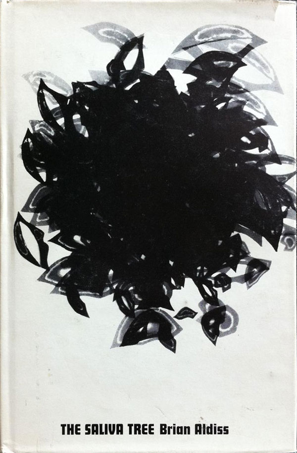
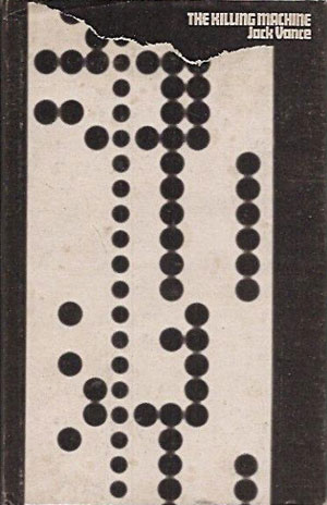
Brian Aldiss’ The Saliva Tree is an exception—the positive and negative inverted, and the central shape apparently constructed of dozens of overlapping sets of lips—I assume a reference to saliva. The cover for Jack Vance’s Killing Machine evokes a computer punch card, torn. Given how deeply it has come to effect our lives, thinking of the computer as a killing machine in 1968 seems quite prescient.
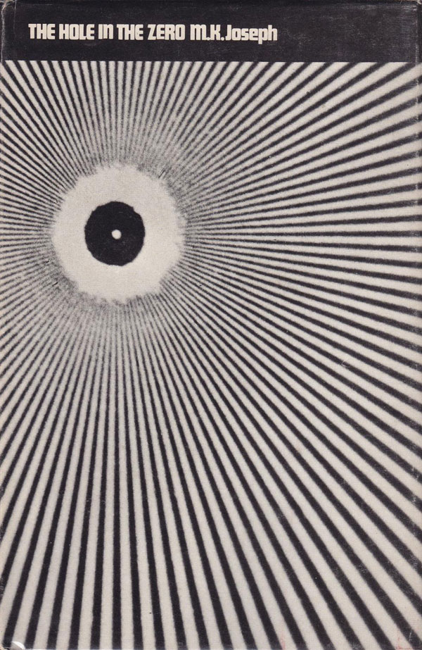
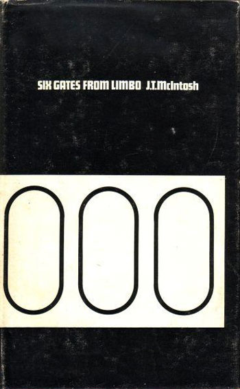
These covers of the later 60s maintain aspects of abstraction, but seem uncomfortable leaving meaning completely open. Like The Killing Machine above, the cover for The Hole in the Zero seems quite literal. Meanwhile the image on the cover of Six Gates From Limbo forgoes the photogram for straight shapes, which although opaque in meaning, still fall much more flat than the other covers.
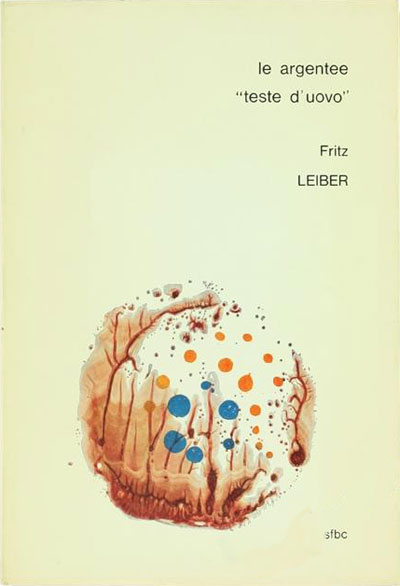
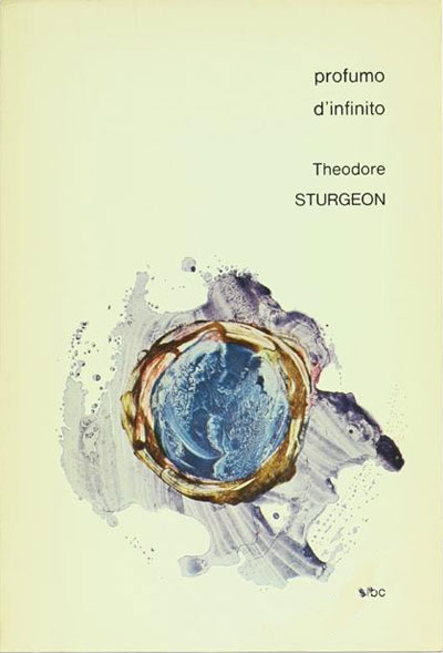
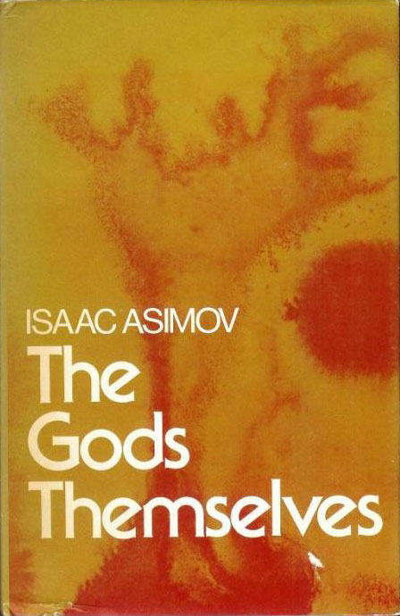
Maybe because of industry wide changing cover design standards, by 1973 the SF Book Club converts to much more colorful fare. They are still abstract, and only duotones, so still set apart from the 4-color process covers on most books at the time. I assume the adherence to more rudimentary color scheme was either an actual cost saver for the cheap book club editions, or an aesthetic nod in that direction. In ink splotches on the covers of Simak and Asimov below are almost organic and biological, and recall for me things much more “inside” than the sense of “outside” inherent in the earlier photo/light-based covers. This might also mark a turn within the content of Sci-fi as well, where our bodies and social relationships become as much the subject of the narrative as spaceships and far away planets.

And finally, I found a couple images of Italian SF Book Club editions from a publisher called La Tribuna. Although more than likely unrelated to the UK book series, many of the authors are the same, and their abstract covers capture a similar sense of openness and wonder, allowing the reader to interpret the contents without the overdetermined, representational covers that were always standard on US science fiction paperbacks. Some of that freedom might also be afforded to the designers of these series because they are book club editions, so people had already subscribed to the series, so there was no need to sell each individual book. While the age of the book club has largely past (although it has made a bit of a come back with book subscription schemes like Friends of AK Press and Friends of PM Press), we could definitely use a little bit more of that freedom in cover design…