
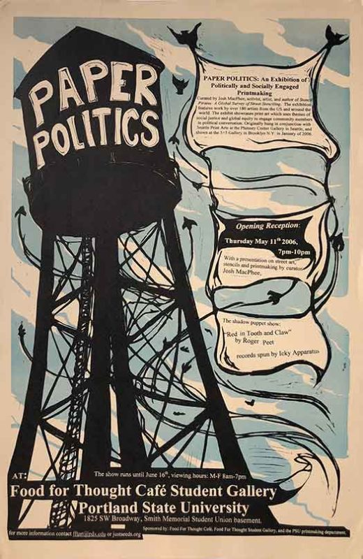
After looking at one of the anarchist presses with the best cover design of the 1970s and 80s, I wanted to look ahead and see who is doing something comparable today. The two largest contemporary English language anarchist publishers are AK Press and PM Press, and both have some great covers, but both also work with many different designers and put out over 20 titles a year. There is little design consistency in their output. Maybe in a future post I’ll pull out some of my favorites from those two, but for now I want to hone in on a smaller project, a publisher with a more consistent and evolving design sense.
Eberhardt Press was begun in 2004 by Charles and Esther. Eberhardt is not only a publisher, but also a printer. They started on a Chief one-color offset press, and have graduated to a 2-color Ryobi. Charles runs the shop solo now, and does a lot of job work (other people’s jobs that he prints) to keep it running, but over the past 7 years has designed, printed, and published a small catalog of specifically Eberhardt Press titles. Although diverse, these publications retain certain design elements that are distinctly Eberhardt, a rare treat in the 21st Century!
The first time I was introduced to Eberhardt was on a visit to the Lucy Parsons Center in Boston, where I stumbled upon Fire to the Powder Keg (2005), which I believe was the first book Eberhardt published. It’s small (similar to a quarter-size of an 8.5″x11″ paper sheet) but has great attention to detail. The cover (above left) is tightly designed, conveys the content, and is printed in 3 spot colors, which is pretty unusual in a world awash in cheap 4-color process. In addition, it has dust jacket flaps, another rarity on a paperback book. You can see the full spread of the cover below.
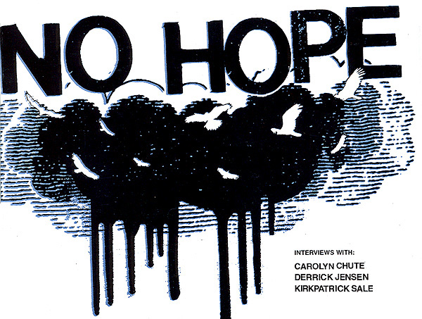
Another early publication was No Hope (2006), edited by Sam Bain. If Powderkeg was about broad social struggle and insurrection, this little book sets the tone for the other political pole of the press: environmental issues with a green anarchist lean. No Hope features interviews with Derrick Jensen, Kirkpatrick Sale and Carolyn Chute. The cover is somewhat deceptive; the distressed type and graffiti-like clouds are not typical Eberhardt (and were not designed by Charles), but the birds do become a recurring motif on future titles.
Next to that is Free to Choose, which introduces an additional series of elements we’ll see repeated in Eberhardt titles. The cover design is an intricate and lush red pattern on a pink background which shimmers before the eye. The illuminated letters and type make it appear almost Victorian, and deeply pleasurable. The design hearkens (I assume intentionally) to a time when this style would evoke femininity, and the subject matter fulfills that expectation in one way but turns it on its head in another. Reproductive rights are certainly seen as a woman’s concern, and women taking control of themselves turns the meaning of the pretty wallpaper inside out.

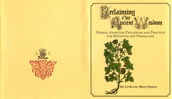
The concern for women’s reproductive autonomy shows up in another pamphlet, Catherine Marie Jeunet’s Reclaiming our Ancient Wisdom. This pamphlet has been published by Eberhardt three times, beginning in 2007, and each printing has been more ornate and beautiful. The most recent printing (2011) is below. On the top is the spread of the dust jacket printed for the pamphlet, with green, maroon, and black spot coloring. Notice on the back cover the extremely ornate colophon made up of the Eberhardt Press initials in green, logo in black, and exquisitely decorative wood-type ornament in maroon.
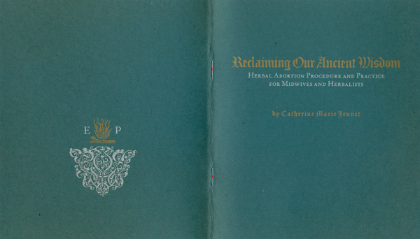
Below the dustjacket is the actual cover spread, a slate green cover with gold and silver printing. The cover image is dropped and set in straight type, but the colophon is reproduced in full in gold and silver. Next week you’ll see how far Charles has been taking this idea of printing metallic inks on dark paper.
This level of attention to detail is so rare in political publishing today, it is hard to know what to even say about it. I have some ideas about these intersections of anarchism, propaganda, and craft, but they are going to take a little while to brew in my head before I can articulate them.
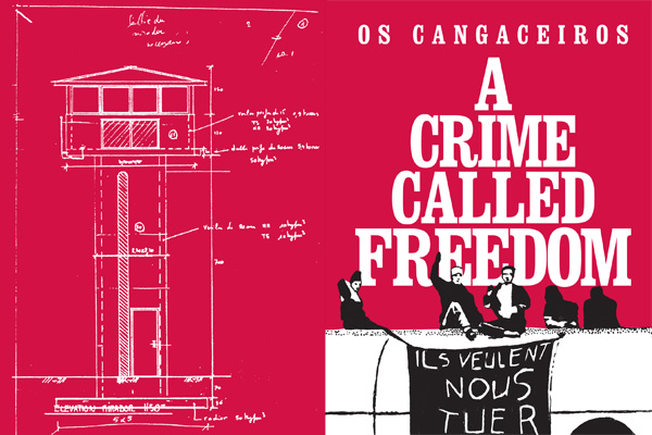
Although Fire to the Powder Keg was the first Eberhardt title I noticed, Os Cangaceiros’ A Crime Called Freedom was the first book I bought. The real genius of this book’s design is how it takes black and red spot colors on white paper- the old standby for millions of anarchist flyers, posters, pamphlets, record covers, etc.- and seems to give it new life. The red is dominant, so the cover feels light and the black and red aren’t competing for attention (a la the black and red diagonal flag). The title font is bold serif, and has its own weight as a graphic element so it feels like a conscious decision rather than a default. In addition, as you can see in the spread below the cover, red is used a spot color inside the book and the inside covers and many opposing pages are printed with red and white graphics. Many of them are blueprints from prisons (Os Cangaceiros were a European political group that opposed prison construction through direct action).
A second Os Cangaceiros title was planned but never printed. The intended frontispiece is below to the right.


The last book for this week is Ron Sakolsky’s Swift Winds, published in 2009 in an edition of 1000. The illustrations are by Anais LaRue, but the design is all Charles. The wrap-around cover image is of a magical ship being drawn by birds instead of sails. Given that the birds appear to be flying in slightly different directions, the Swift Winds of the title are not simply created by the weather, but by the flight patterns of our fancy. The cover is to the right, and to the left is the frontispiece, where you can get a full look at the ship. The large field of blue creates a nice backdrop for the birds to soar across, and these fields of solid primary colors show up on multiple Eberhardt publications.


You can read more about Eberhardt and order/download some of these titles (and next week’s!) HERE.


Really thoughtful and descriptive review Josh,
Eberhardt sure does have unique and exemplary
Cover design. This also made them stand out at the anarchist bookfair in SF. Their tight cover design translated to their setup, very elegant and organized!
They deserve the praise you’ve given them.
Judging from the book fair in Montreal, it looks like letterpress is gaining influence in anarchist publishing these days. Small zine and pamphlet publishers using type for cover design. Some nice looking stuff.