In January 1994 I made my first visit to the UK and to London. At the time there were two functional anarchist spaces in town that were open to the public: the 121 Railton and 56A Infoshops. At the time I felt like 121 was where all the action was: it was based in Brixton, had an old printing press, a large meeting and event space, a cafe, etc., etc. My memories of 56A are foggier. My main memory was that there was a food coop there, which was decidedly less interesting to me than the 1 quid veggie burgers and Anarchist Black Cross meetings at 121. Turns out 121 was soon to collapse, and 56A has held on and maintained itself as a thriving social centre in South London.
I went back in the Fall of 2007 and ran into Chris, who I had met there almost 15 years earlier. We got to hang out, and he gave Icky and I free run of the 56A archive, which we helped organize. We tried to document material from it that would be useful in a future issue of our journal Signal. Two years later I was back in London, and this time met up with Chris and his mate Mark, who together make up the main major force behind Short Fuse Printing and Bandit Press.
Like Charles over here in the U.S., Mark and Chris are running their operation out of a modified garage/storage space, but unlike Charles, they are not offset printers, they almost exclusively use machines called risographs. The risograph is similar to a Gestetner machine, or an advanced mimeograph. Every time you print a page, a master—or stencil—is created and wrapped around a drum. When you print, ink is pushed through the holes in the master. In this way it is a bit of hybrid of an offset machine and small, automated screen printer.
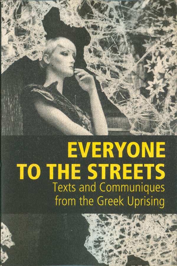
Chris and Mark have been learning the limits and possibilities of publishing with these machines, and have a nice catalog of titles produced over the past couple of years. The focus has been on individualist and insurrectionary history and tracts. One of the first publications I saw that they had produced was a collection of communiques from the 2008/09 Greek Uprising titled Everyone to the Streets (see top right). A strong photo of a smashed department store window has the title stretched across the middle in yellow. Simple but effective. Almost all of their titles use basic sans serif type, simple images or graphics, and one or two spot colors.
Four of the dozen or so titles all carry almost the same design: the bottom third of the page printed in a single spot color, a found black and white graphic laid on top, which breaks into the top, white two thirds of the cover, and a simple sans serif title in the top third of the page. Each one has a slightly different type treatment, with variations in size, weight of the font, and with Tiqqun’s How is it to be done?, an underline that runs off the cover on the right hand side. It is unclear if these differences are purposeful or if they simply haven’t settled on a final style yet. The Tiqqun type treatment seems the most successful.
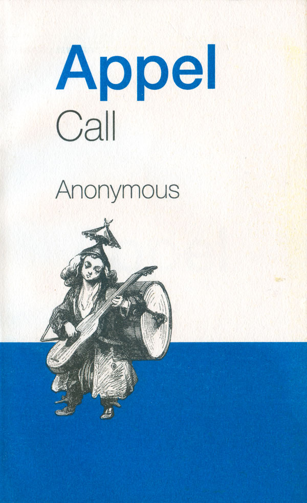
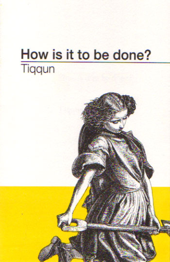
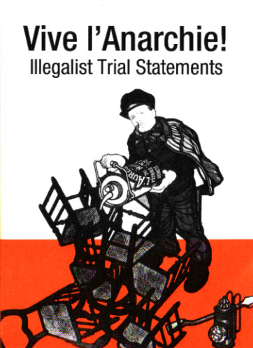
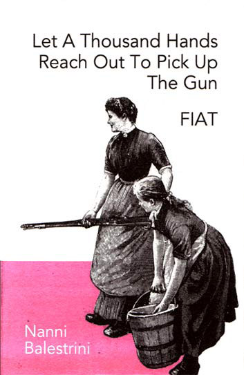
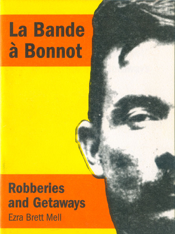
Yellow, orange, and red are colors that the risograph can pump out to great effect. Both of the covers below use a combination of these and work well. The cover for Ezra Mell’s La Bande a Bonnot takes the color bands used above to the next level, filling the page with alternating stripes of yellow and orange, with Bonnot’s head filling a third of the cover and creating a black vertical stripe. The title and the author’s name fit comfortably in the orange stripes on the cover. The giant face and saturated colors make for a very full and realized cover, something rare in contemporary political pamphlets.
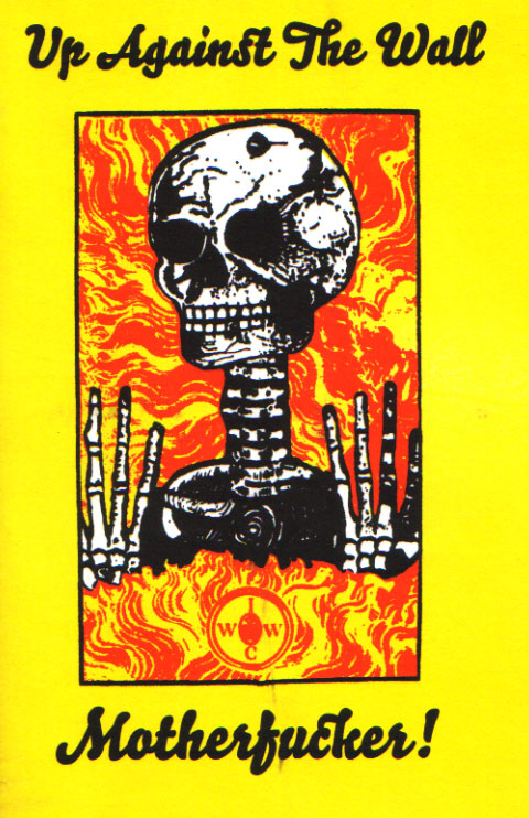
Next to Mell is Ian McIntyre’s edited collection of materials on the 60’s anarchist art crew Up Against the Wall Motherfucker. McIntyre, an Australian, has been friends with the Shortfuse printers for years, and has had them print a number of pamphlets and projects. Once again the bright and fully saturated yellow and red create a striking base for the cover graphic to sit on. The overall design is a little less nuanced and interesting than many of the other covers, with a simple rectangle within the rectangle of the page proportions, and the title running along the top and bottom.
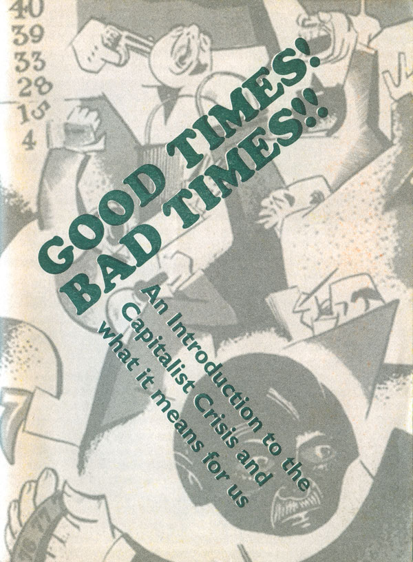
To the left below is a one off pamphlet from 2009 called Good Times! Bad Times!!, an introduction to the recent economic crisis. The cover is a bit muddy, a dark green title in Cooper Black laid on top of a grey illustration that has a New Masses 1920s/30s feel. The angled titles work well with the angular illustration, but the colors are too dark and similar in tone to let the cover breathe or pop.
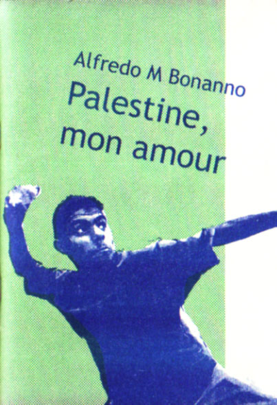
To the right is the first in a series of pamphlets and books Shortfuse has printed for the UK/Italian publisher Elephant Editions. I’ll get more into what Elephant Editions is next week, for now, lets just look at the covers. This one is for an Alfredo Bonanno pamphlet on Palestine. The cover is similar to other Shortfuse designs, with a solid color stripe, this time green and vertical, instead of the usual horizontal. The title and image are laid on top in blue, and the contrast is nice, even if the text treatment is a little too pedestrian to really say much. The graphic is powerful, if a bit cliche by itself, but the composition makes up for it. A young kid throwing a rock, his pulled-back throwing arm tightly framed by the left edge of the cover. The other arm is thrust off the right side of the cover, giving a strong sense of motion and showing the inability of the page to hold the figure and the oncoming violence.
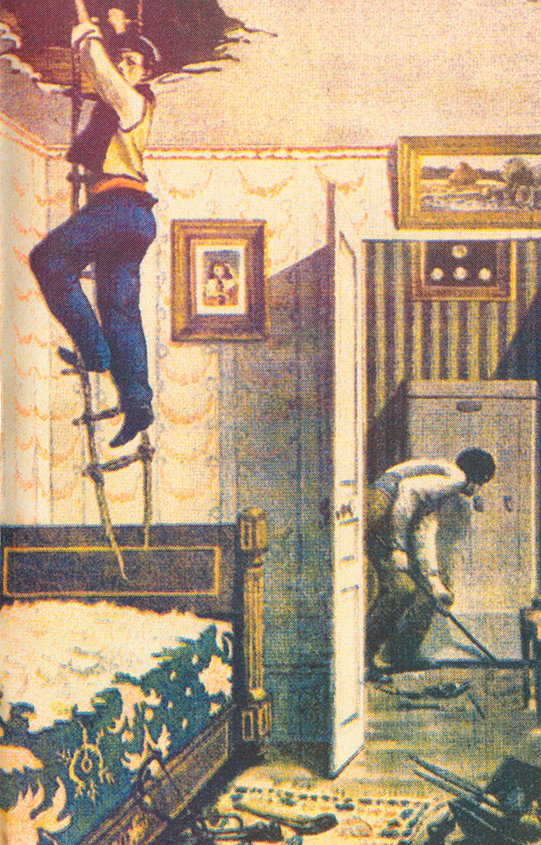
The last book I’m going to talk about this week is the Shortfuse edition of Jacob, by Bernard Thomas—once again, a French Illegalist text. The cover on the surface isn’t that interesting, a basic portrait with simple sans serif type. But on second look the color is strange and shimmering, and you notice the image isn’t a simple brown print, but a series of colors laid almost, but not quite, directly on top of each other to create the golden brown effect. Inside the book is a great and very funny color illustration of a thief escaping through the ceiling of a room by way of a rope-ladder. Cyan, magenta, and yellow colors were all printed to create this full-color facsimile. The slightly off registration is very reminiscent of the color pages you can find within early Black & Red publications from the U.S., likely exposing a common interest amongst the printers to experiment with the limits of their tools.

You can read more about Shortfuse HERE.
