Welcome to the second installment in my sub-series of book covers from early utopian/distopian novels. Back in March of 2014 I took a look at the covers of Yevgeny Zamyatin’s We, an amazing early Soviet dystopia written in 1921 and immediately banned. Those posts can be found HERE and HERE. This week I’m going to look a novel closer to home, Jack London’s Iron Heel. It was first published in 1908, and was quite popularly received, but fell out of circulation in the 30s or 40s. It appears to have been revived by left-leaning publishers in 1980, and at this point has entered the public domain, so there are now dozens of cheap Print On Demand and eBook versions floating around online.
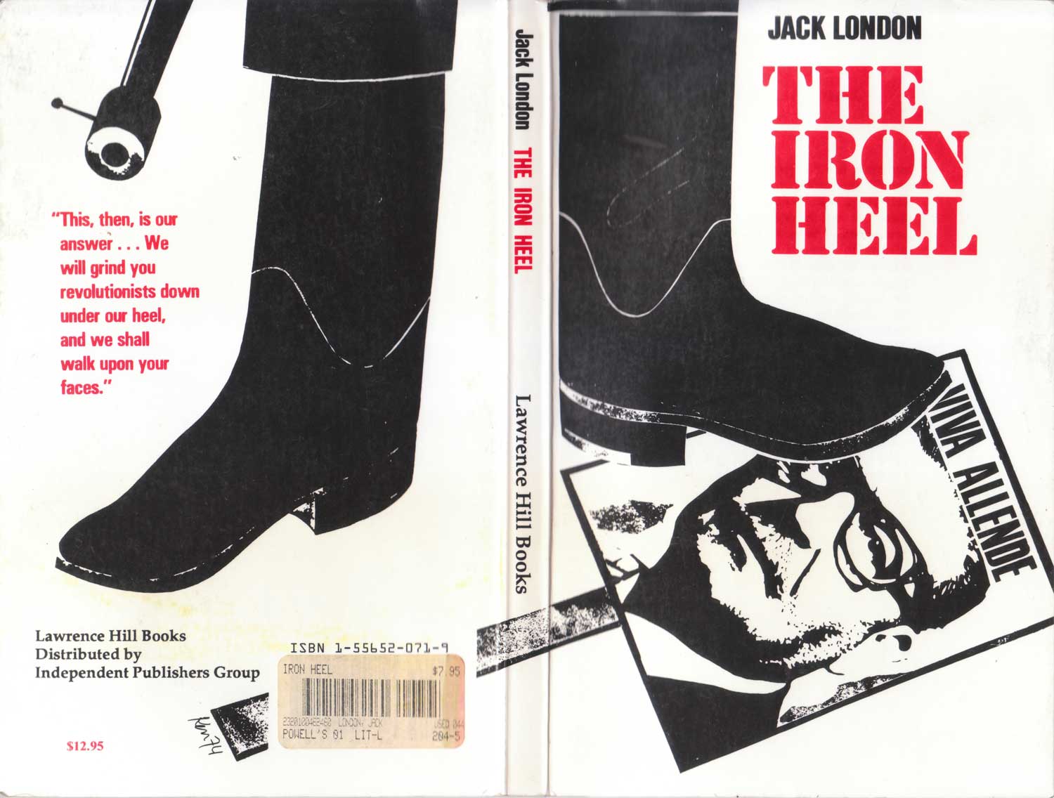
The basic story is one of a fascist dictatorship (“The Oligarchy”) coming to power in the U.S. A false-flag terrorist attack leads to The Oligarchy refusing to allow the left to sit in government, which rapidly snowballs into an all out assault on the working class and guerrilla resistance to this repression. Today the plot seems almost banal, but remember that in 1908 “Fascism” as we understand it now didn’t exist, the Nazi’s hadn’t provoked the burning of the Reichstag, and state power was a much more blunt instrument. London’s predictive power is pretty disturbing, and its continued relevance can be seen on the cover of the 1977 edition above, published by Lawrence Hill. The boot is on a picture of Chile’s Allende, and thus the cover transforms the book’s Oligarchy into Pinochet and Chile’s then neo-fascist military dictatorship (which took power in a 1973 coup). The cover image is not attributed, but is clearly signed “Ken 74.” It’s possible this is UK political artist Ken Sprague. This is the first copy I found that sparked my interest, and clicked on my desire to track down more.
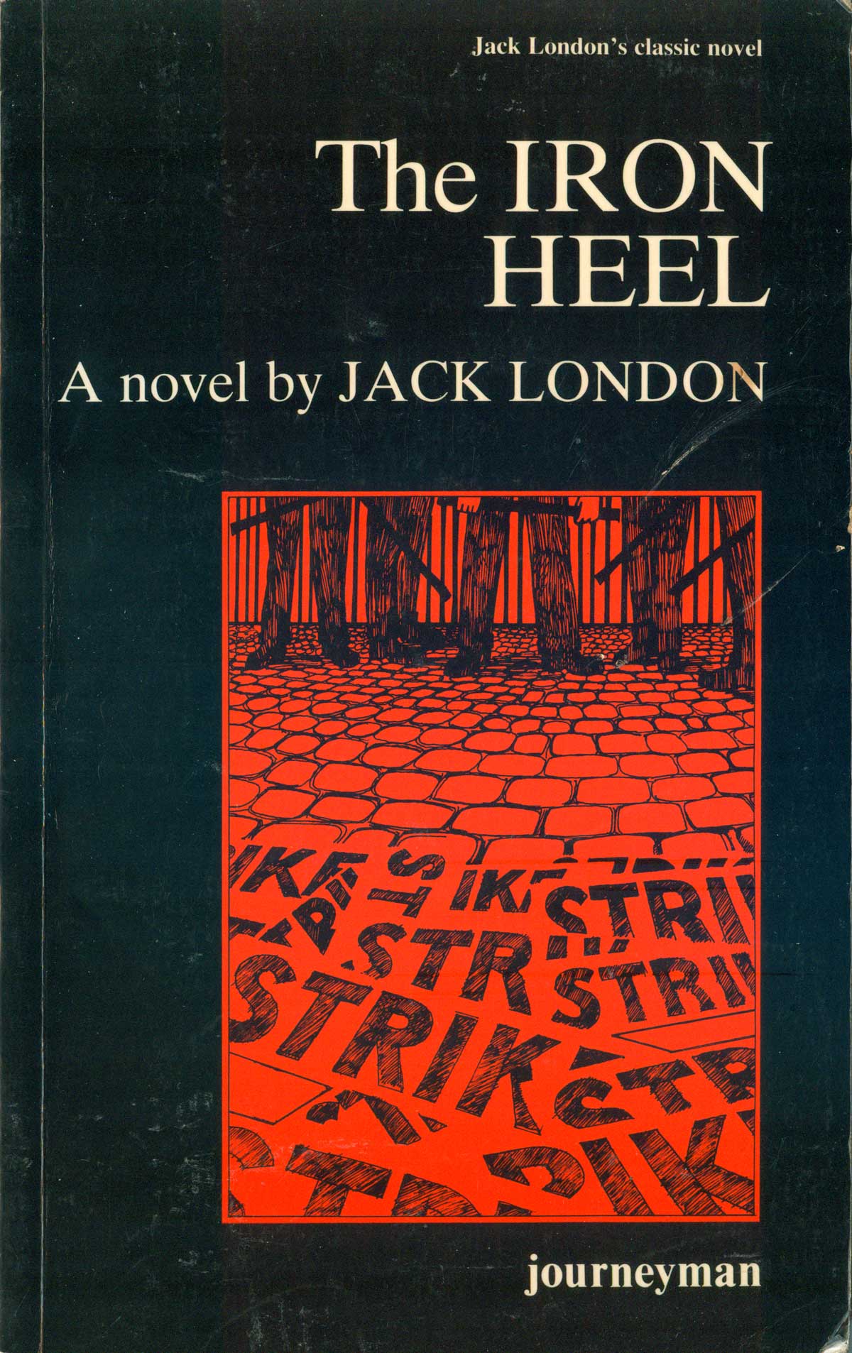
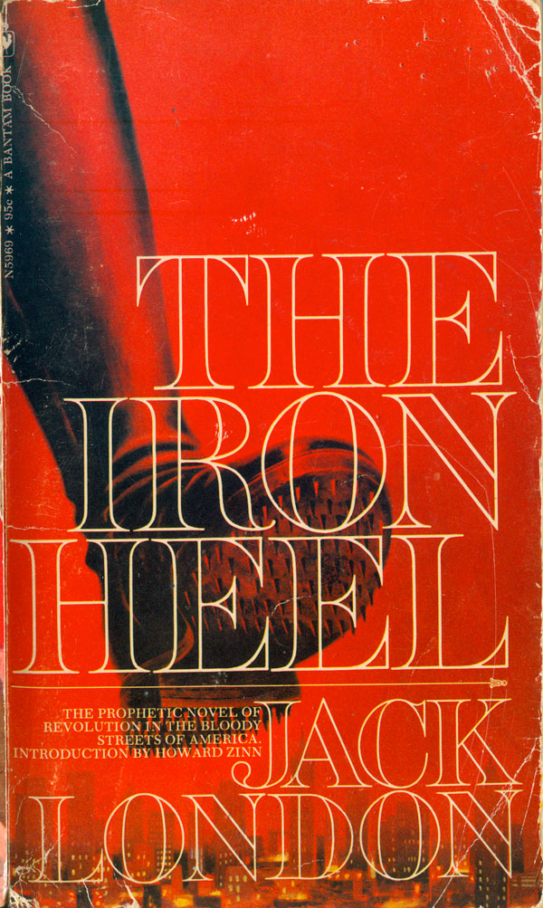
England’s left wing and working-class focused Journeyman press republished The Iron Heel in 1977 as well. Their cover is nice as well, although very different than the above. Not much to say about the type, but the red and black illustration—definitely by Ken Sprague, this time—is great. A simple yet provocative line drawing of the end of demonstration, where all we can see are the legs and batons of the cops and the abandoned placards of the protesters. Resistance is abandoned, hope on the run. Resistance is absent from the 1971 Bantam mass market edition as well, with a giant spiked boot coming down on the city. This one is quite creepy, the red sky deeply provocative of blood.
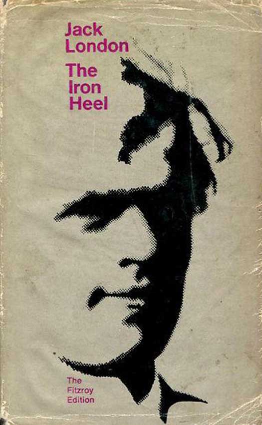
instead a simple illustration of London himself.
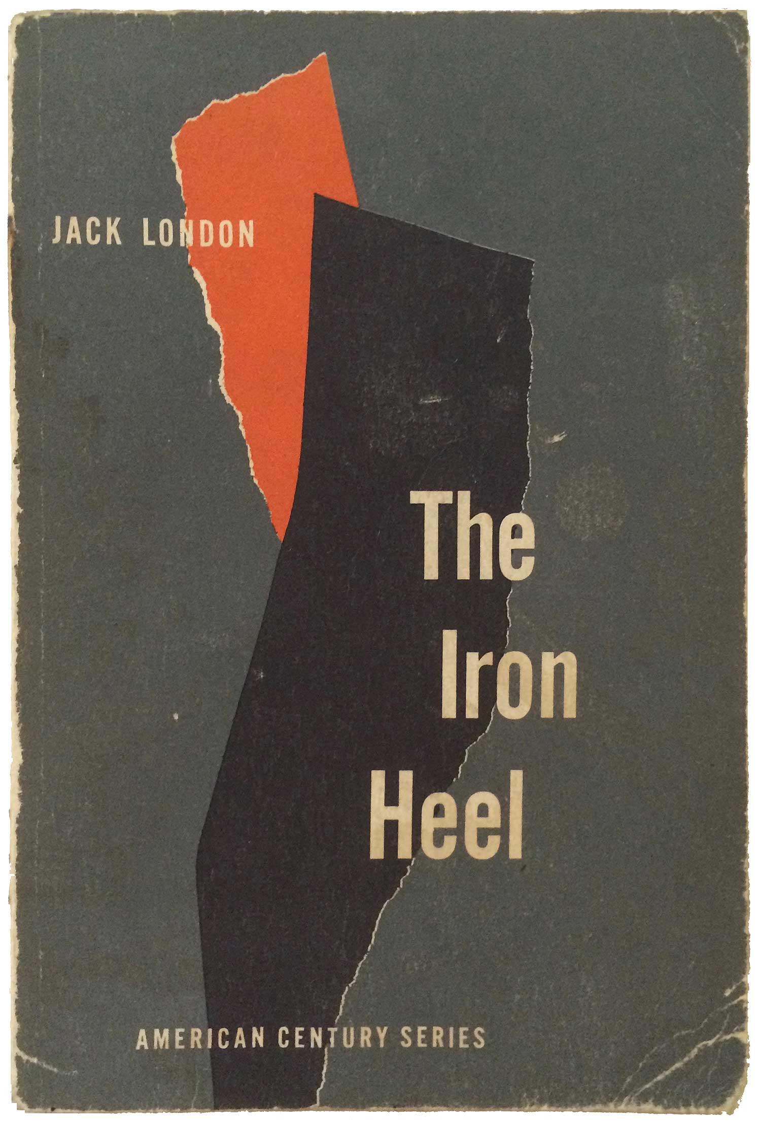
The only other editions from the second half of the 20th century that I could find were an Sagamore Press American Century Series trade paperback and a hardback by Arco. The Sagamore cover is quite strong, black and red torn paper shapes struggle in the background, pushing the author and title to the front. Although I could see this design being specific to the Iron Heel, it is actually the same basic layout as all the American Century Series, which each feature torn paper of various shapes and colors. As for the Arco, the image not specific to the title, but instead a simple illustration of London himself, likely also part of a series.
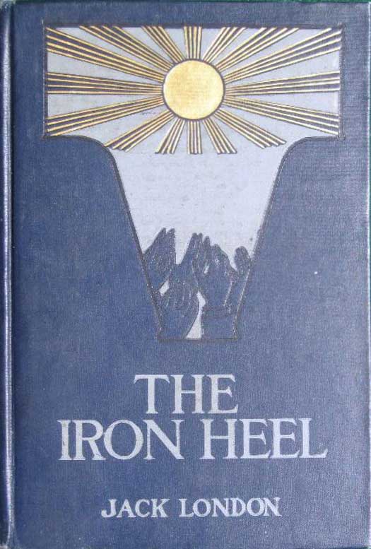
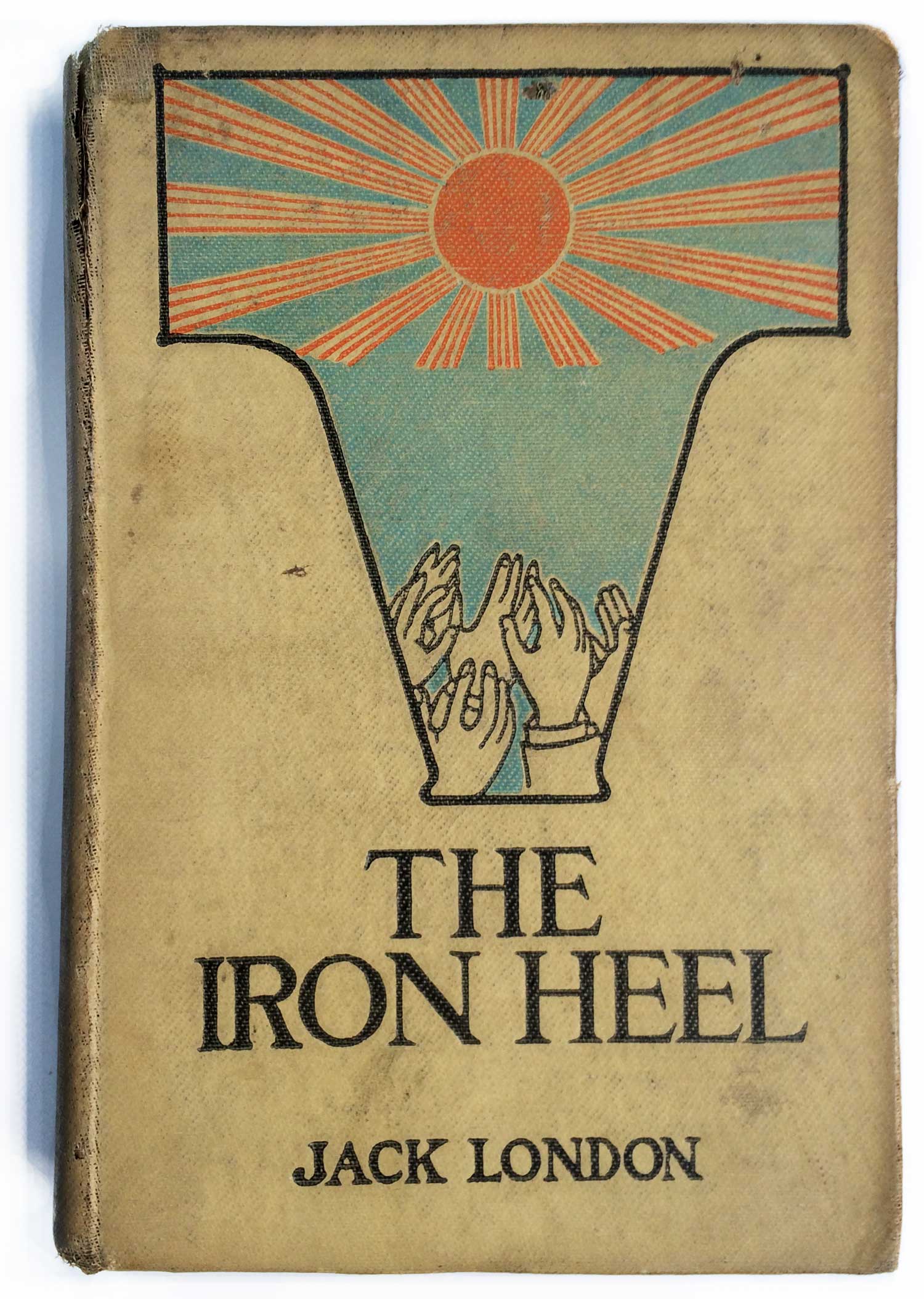
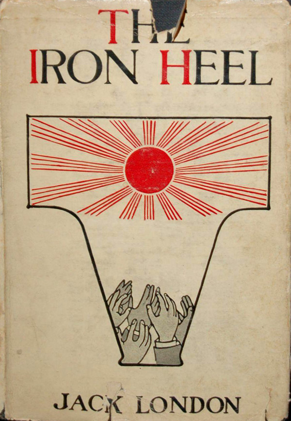
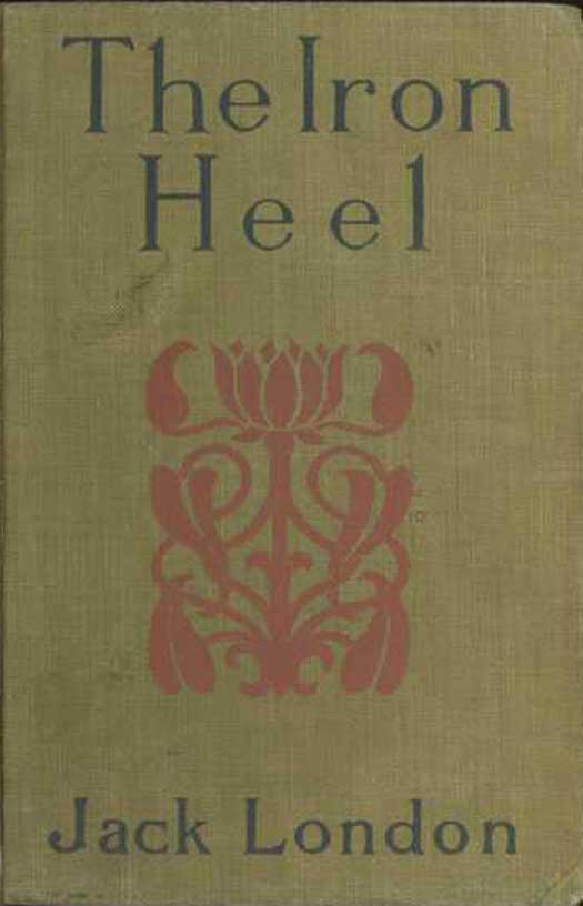
I found a really nice 1917 Grosset & Dunlap hardback at Book Thug Nation about a month ago, cover below in the center. The design is based on the 1908 design of the first edition published by MacMillan, cover below to the left. I actually like this later version much better, the cream cloth provides a much better background for the illustration than the dark blue. A 1937 Grosset & Dunlap reprint reproduces the graphic again, this time on a dust jacket (I don’t believe either the 1908 or 1917 editions originally had jackets). The design on all these editions is cool, but curious. I’m not entirely sure what I’m looking at: Is the shape that contains the illustration supposed to be some sort of representation of a heel? Of iron? It’s a bit lost on my pair of 21st century eyes. And I’m assuming the glowing sun is supposed to represent hope, somewhat out of reach, but it’s hard to not see it at this point as a reference to Japan, giving the cover a real World War II feel, which was obviously not something that could have been pre-imagined. It’s striking, but doesn’t at all feel like American design or representation, it almost seems more British.
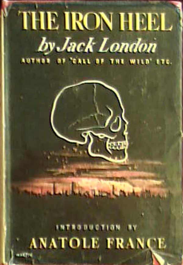
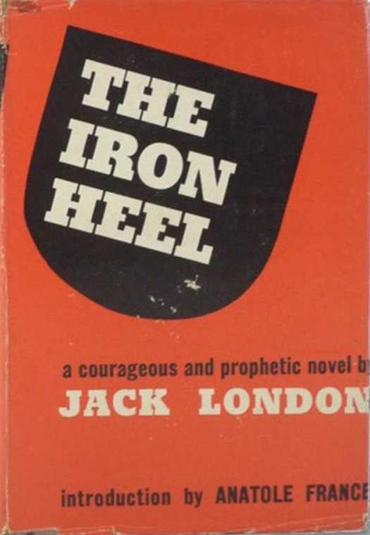
Below is another set of early editions. In 1913, Regents publishes the edition to the below left, with its nice William Morris-esque floral pattern in sharp contrast to the brutality of the title. The British edition in the middle rectifies that, going for the much more direct representation of a skull super-imposed on a city on fire! And then in 1948, the dust jacket of the Grayson Publishing edition starts the visual trend that dominates the representation of the book from here on out. At first it looks like the title is simply floating in an odd-shaped black field, but then the eye adjusts, and sees the heel of a shoe. This visual trick is fun, and the terror of being stomped on is a slow burn, rather than being hit over the head with it. The same can’t be said with much of the follow-up cover imagery, as we’ve seen above with the Lawrence Hill and Bantam editions, and well see again below.
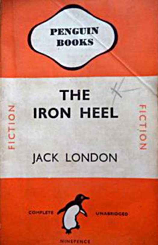
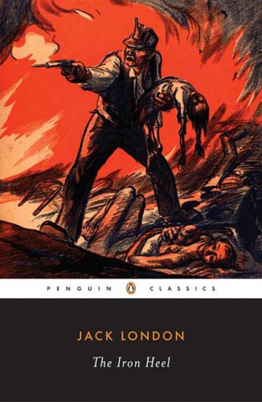
Likely the first paperback edition was by Penguin (of course), released in 1944 in a then-standard orange cover for fiction, and quickly reprinted in 1945. And then I can’t find any evidence of another Penguin edition until the title is re-released as part of the Penguin Classics series in 2006. In 2001, UK publishing upstarts Rebel, Inc. put out their own edition, with a cover once again leaning heavily on a literal representation of the title. It works OK here, the boot is a little blurry and the black circle design on top is strong enough to set the design within the broader series of the Rebel, Inc. catalog, allowing the laziness of the image selection to be a forgiven.
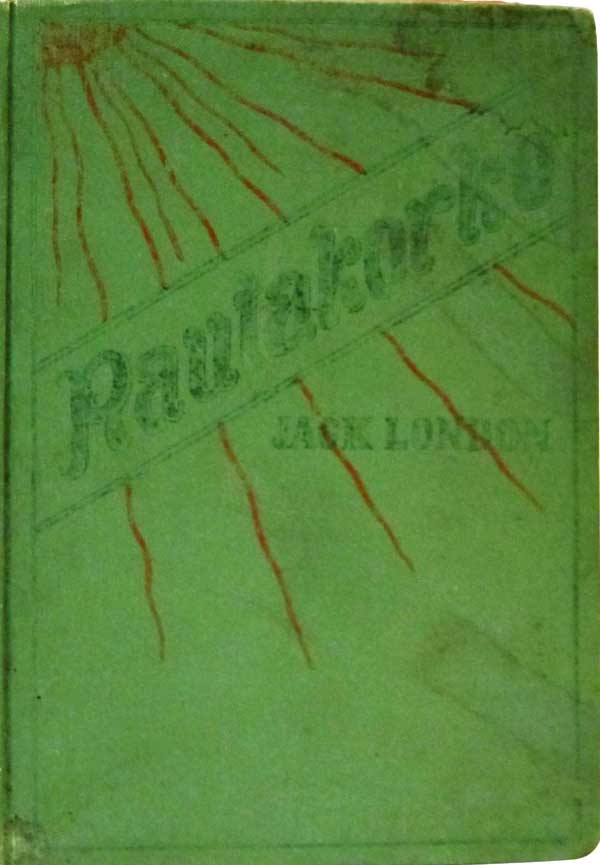
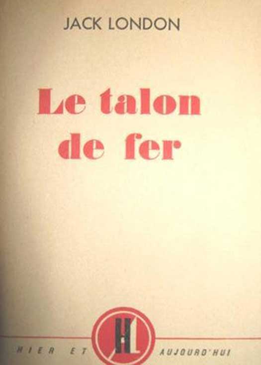
Dozens of foreign language editions have also been released, I found covers for a small handful below. They all have pretty traditional and conservative “continental” design save the 1910 Finnish edition published in the U.S., with its red sun rays withering down from the top left corner.
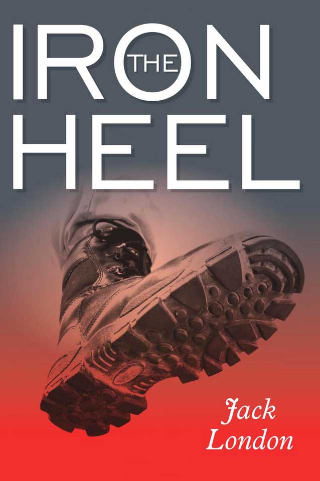
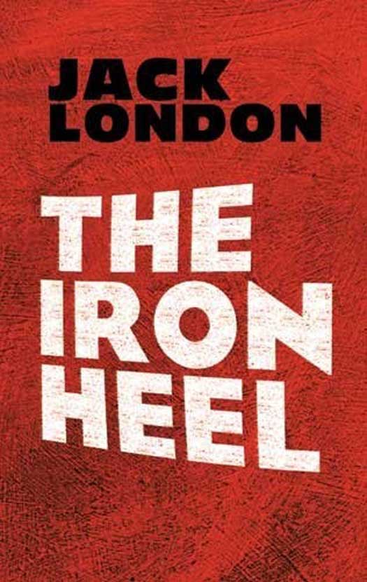
And finely, the somewhat sad but increasing reality of how many of us interact with old and public domain books, through the flood of print-on-demand editions. These are often strange amalgamations of half-hearted design attempts mixed with clip art and stock imagery, but the sometimes startlingly weird results that combination produces are entirely absent here. The cover on the left is exactly what you would expect if you asked someone who knew little of the book to design a cover, an very literal heel of a boot coming down on the viewer. The edition next to it is standard POD nonsense, stock patterns with text imposed on top, and then on the far right is the current Dover Books edition. While technically not POD, Dover has fallen far from their peek of really interesting and creative cover work in the early 1960s (see HERE, HERE, and HERE), to what I can only imagine is contract work for one or to designers to re-do the covers of their catalog of thousands of books as quickly and efficiently as possible. So there’s rarely anything interesting or surprising, just photoshop-ed titles and stock imagery.
Geez, I have to start planning out these posts better so that I can end on a bang rather than a whimper. The Iron Heel is a powerful book, and I suppose it’s sad that even as it increases in resonance, it seems doomed to a future of crappy POD and eBook editions. This is why I really respect what Rebel, Inc. was trying to do fifteen years ago, to curate a collection of important and relevant titles that have fallen out of favor and to bring them back in solid, well-edited, and nicely designed editions that can hopefully bring them a new life. But this seems easier said than done, as so many attempts at this have briefly flurished, only to have their output quickly disappear into the sea of popular publishing. This is what PM Press has been trying to do with much of the output of the venerable U.S. left publisher Charles H. Kerr. It has been a blast designing the covers for this new series of old titles (you can see most of them, and the covers I designed, HERE), but I fear sales will slow-down and finally curtail the ability to keep it going. But we shall see, there is always room for pleasant surprises!
Next week will be something completely different, but I do have posts in the works about other important early utopian/distopian novels by Bellamy, Huxley, and Capek, so keep a look-out for that in the near future.
Partial bibliography:









I’ve recently acquired a version of the 1913 regent press cover you have listed here, the art deco embossing slightly different, but colors the same black lettering with red floralish design. have you seen it? don’t have a camera on me or id send it to you.
strangely just saw a Hollywood feature film that showcases a jack London find by a young ill-fated bookseller, “unfaithful” with Diane Lane and Richard Gere.
I haven’t seen it, but would love to! If you can send a photo, please do! you can email josh [at] justseeds.org. Thanks!
Hi Josh
Thanks for this fascinating piece. I have a 1976 printing of the Journeyman edition which, interestingly, has the same cover design as your Lawrence Hill edition. It is indeed by Ken Sprague. Journeyman published a couple of collections of Jack London’s shorter writings titled Revolution and People of the Abyss which I also have – they were based in the area of North London where I grew up and would probably been stocked at the local bookshop. I have Revolution in front of me and the cover art is bold and striking, though there’s no attribution. The Iron Heel feels more relevant than ever after last year’s coup attempt…
Best wishes
Rodger
Brighton, UK
Thanks for the confirmation, Rodger! I have a book on Sprague, but sadly it doesn’t include almost any of his work on book and record covers, which I’ve definitely seen around. Would be nice to have that collected…
Thank you for this fascinating piece. I live in Sonoma where Jack London lived and where the Iron Heel is partially set. I stumbled across the book a year ago while visiting Jack London State Park, Jack’s final home and resting place. A friend and I were shocked to see a copy of the book with Allende on the cover, knowing the book was written in 1908. The friend and I lived and worked together in Chile during the Pinochet years. We purchased copies (not with the Allende cover), and I’ve shared the book with at least 10 friends in the past year.
I keep referring to the book and its hauntingly predictive vision of the rise and (hopeful) fall of what some now refer to as neoliberalism. While the book doesn’t predict the two most unimaginable existential threats to life on this planet (nuclear and climate annihilation), it very clearly predicts the cause of and apathy around those two threats.
An added thanks for the comment referencing the film that mentions the book. I’d love to see the book on stage or on the big screen.
Thanks again.
JLJ