Ben Shahn is one of the artists most influential to many members of Justseeds. He was a Lithuanian immigrant who apprenticed as a lithographer before becoming a master of multiple disciplines, from painting to illustration, printmaking to muralism (Alec posted about some of his WPA murals HERE). Quite left wing, Shahn rooted his practice in a deep commitment to social justice. He is best known for his painting—rooted in a stylized social realism—which captures early 20th century working class life on the East Coast of the U.S. He also was a popular poster maker during and after World War II, creating some of the most enduring political posters produced here. Leftists and activists might be familiar with the suite of images he created about martyred anarchists Sacco and Vanzetti, or union organizer Tom Mooney. If you haven’t heard of Shahn, or spent much time looked at his work, I highly recommend it!
Shahn is also the focus on my next series of blog posts, and the second artist I’m focusing on in a trio of socially-engaged printmakers who worked as book designers in the 1950s—70s. The first was Leonard Baskin (see posts 202 and 203), and the third will be Antonio Frasconi (hopefully sometime in the next couple months).
I was first introduced to Shahn via monograph my Dad gave me when I was 19 or 20. I was a young anarchist, and was shocked and inspired to see his paintings of Sacco & Vanzetti, but was really intrigued by the handful of line drawings and illustrations included. While I love getting to see Shahn’s paintings in museums when I get to catch one on display, or even see his murals in my travels (if you ever end up in Syracuse and check out giant the Sacco & Vanzetti mosaic mural!) I think I get the biggest charge out of catching his imagery and typography on the covers of old mass market paperbacks. There’s something about stumbling upon a Shahn at old bookstores, in small piles of free books out on stoops, or on friend’s coffee tables that makes me smile—it seems like such a true and honest way to get work out in the world far and wide. [As a side note, I don’t offer dates on any of these covers. Although most—or all—were created between 1957–1965, the publishing info is spotty in the books themselves, sometimes only offering the copyright of the hardback, sometimes of the actual printing rather than of the edition. This makes it hard to date when the covers themselves were first published.]
One of the greatest things about much of Shahn’s cover work is that he composes original art and typography for the books. Each one is like a huge edition of a print—on many of the early commissioned he’s not recycling old images, but building the designs from scratch. The majority—and best—of this work was done for two large paperback houses, Vintage and Anchor Doubleday. I’ve found sixteen covers between the two. There is likely a handful more, and if you know them, please pass the info on, or better yet, send in images!
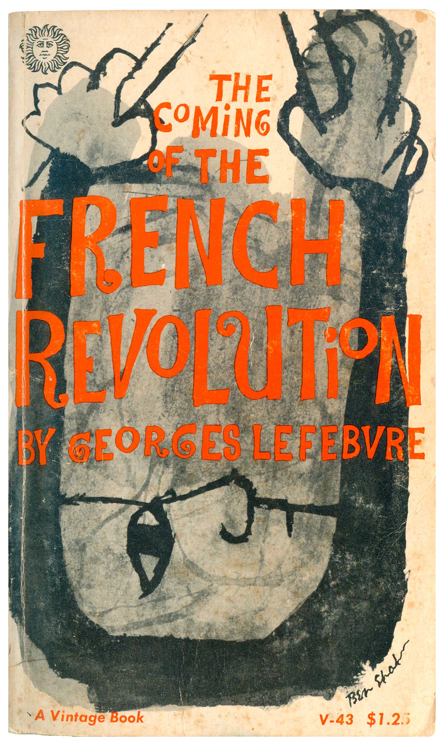
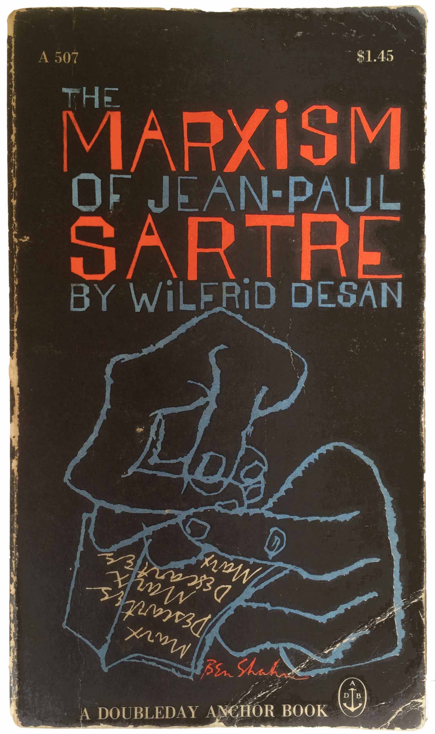
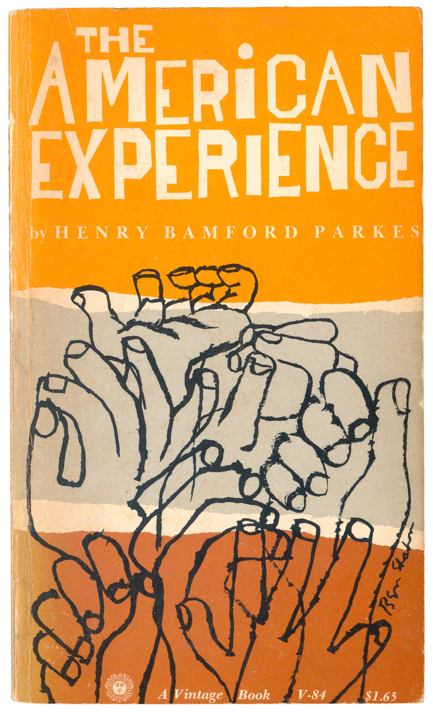
Although the covers are original work, they almost always follow the visual themes of Shahn’s other work. In his prints and illustrations he shows a fascination with hands, drawing and redrawing them, and that’s present in many of these covers, not least of which on The American Experience above.
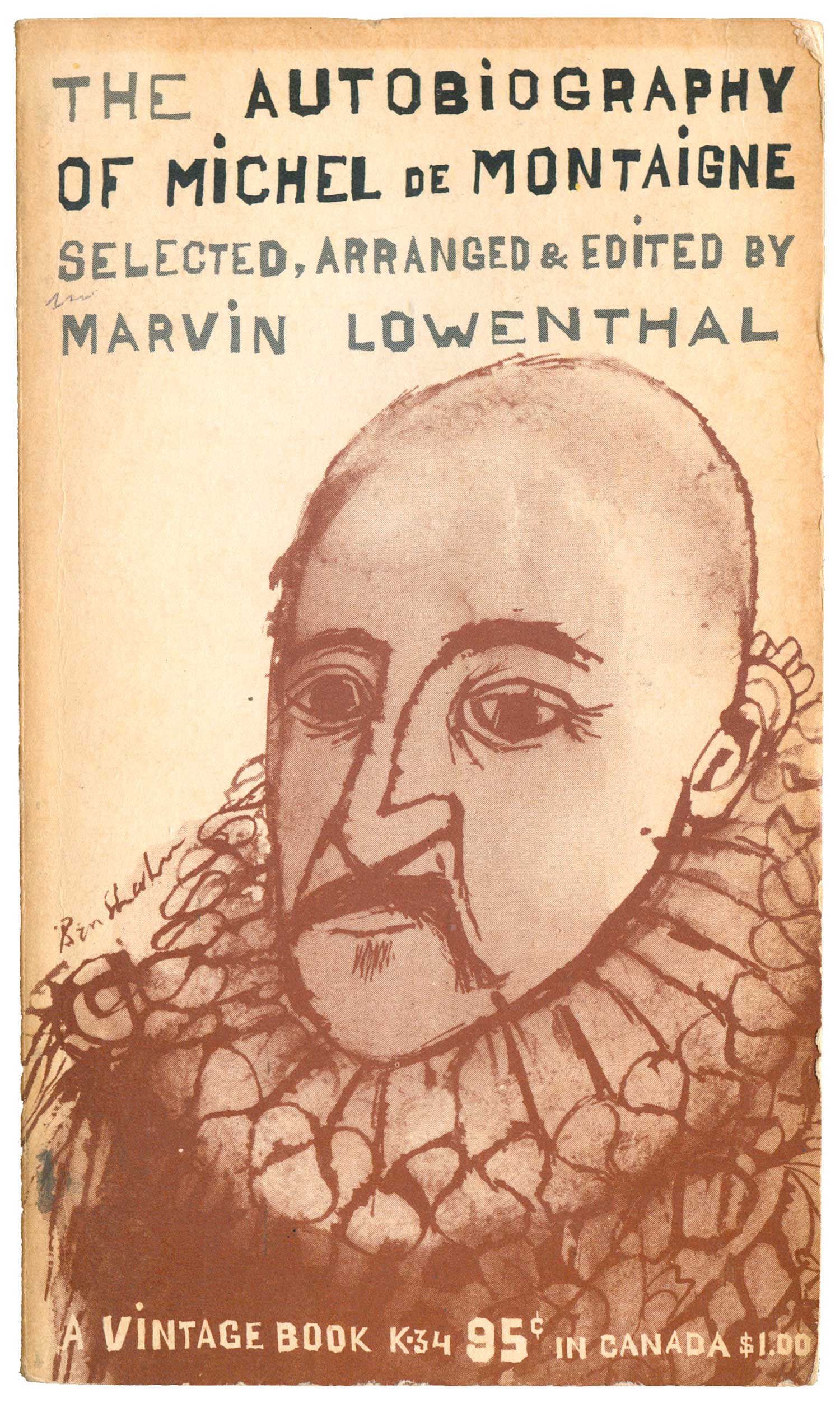
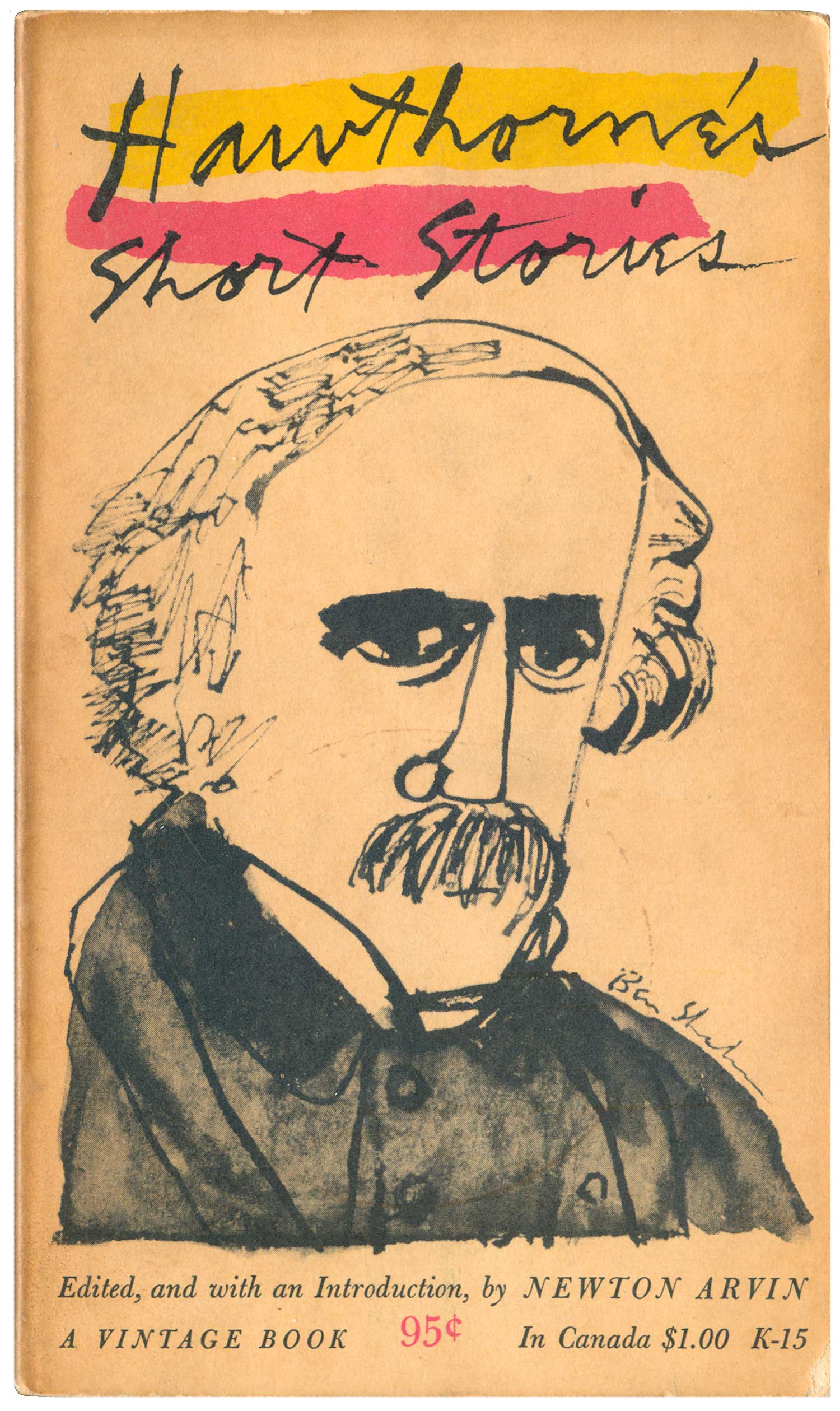
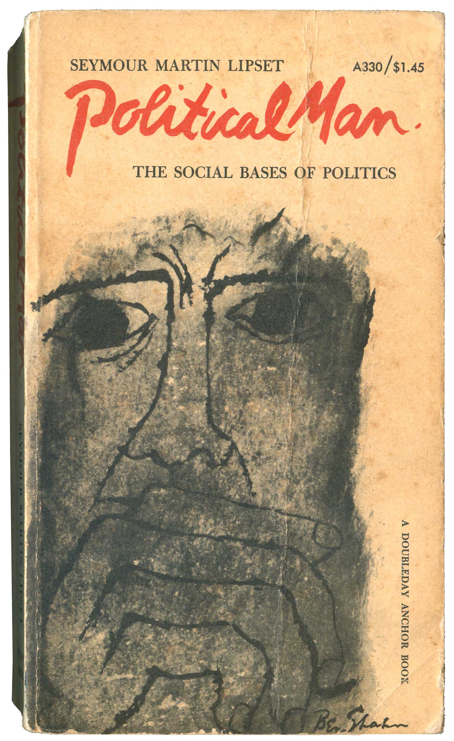
Another popular topic is portraiture (i.e. Sacco & Vanzetti and Tom Mooney). This is one of Shahn’s strengths, the ability to efficiently capture a likeness with no compromise to his unique and quirky style. The de Montaigne and Hawthorne portraits are effective illustrations, and the de Montaigne really commands the visual field of the cover. The more generic portrait on Political Man brings the hands back in, and is intensely expressive. All three covers benefit from different type’s of Shahn’s unique hand lettering, from his angular block letters to quick scrawl to a more mature cursive.
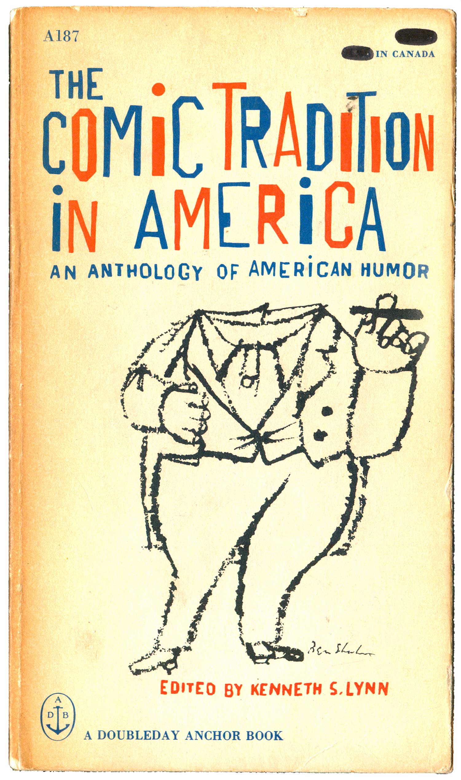
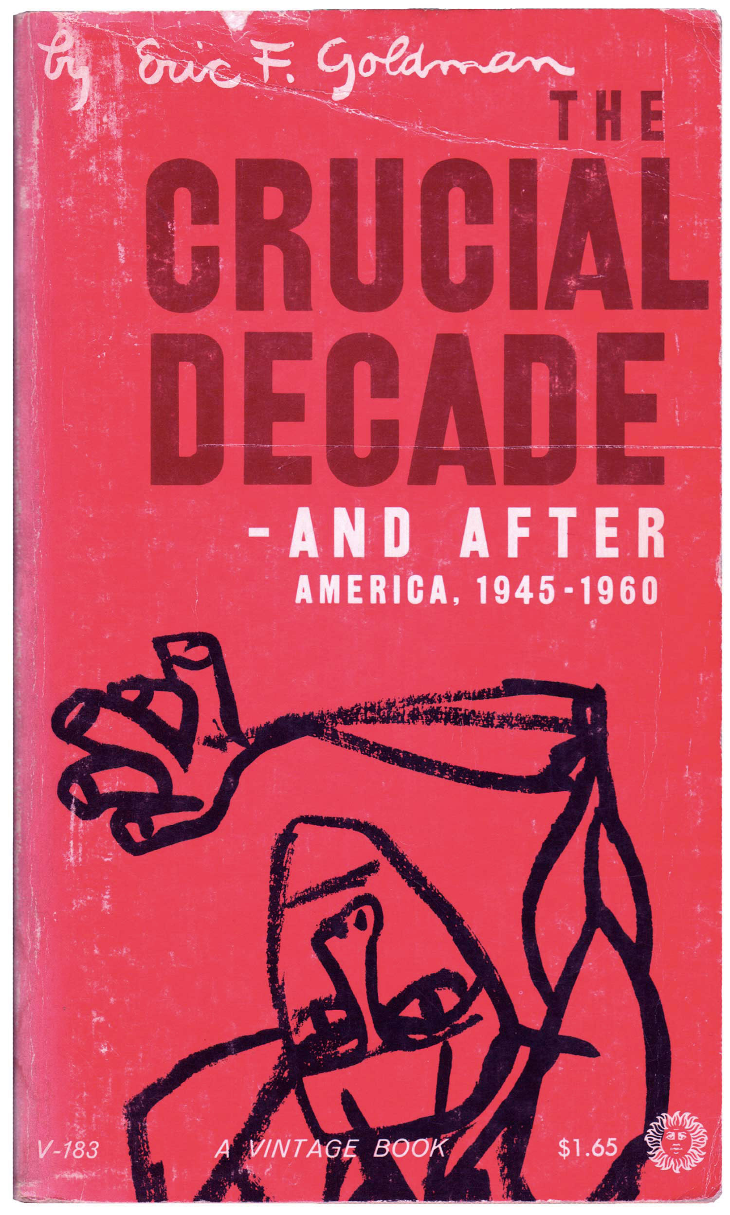
This next set below are a variation on portraiture, but more general. Each features a single figure, with variations that speak to the specificities of the titles. I find the two to the right the strongest. The performer featured on The Comic Tradition is comic but a bit creepy, all dressed up but missing his head. The titling is super strong here, interweaving red and blue to highlight the “American” aspect, and a much taller variation of Shahn’s distinct block letters, which give the words a flag-like quality. And the figure on The Crucial Decade is stunning. The black on pink really pops, but also the ambivalence—is this character anguished? transcendent? aspirational? worried about being crushed? On some level it feels like it doesn’t matter, he commands the space regardless.
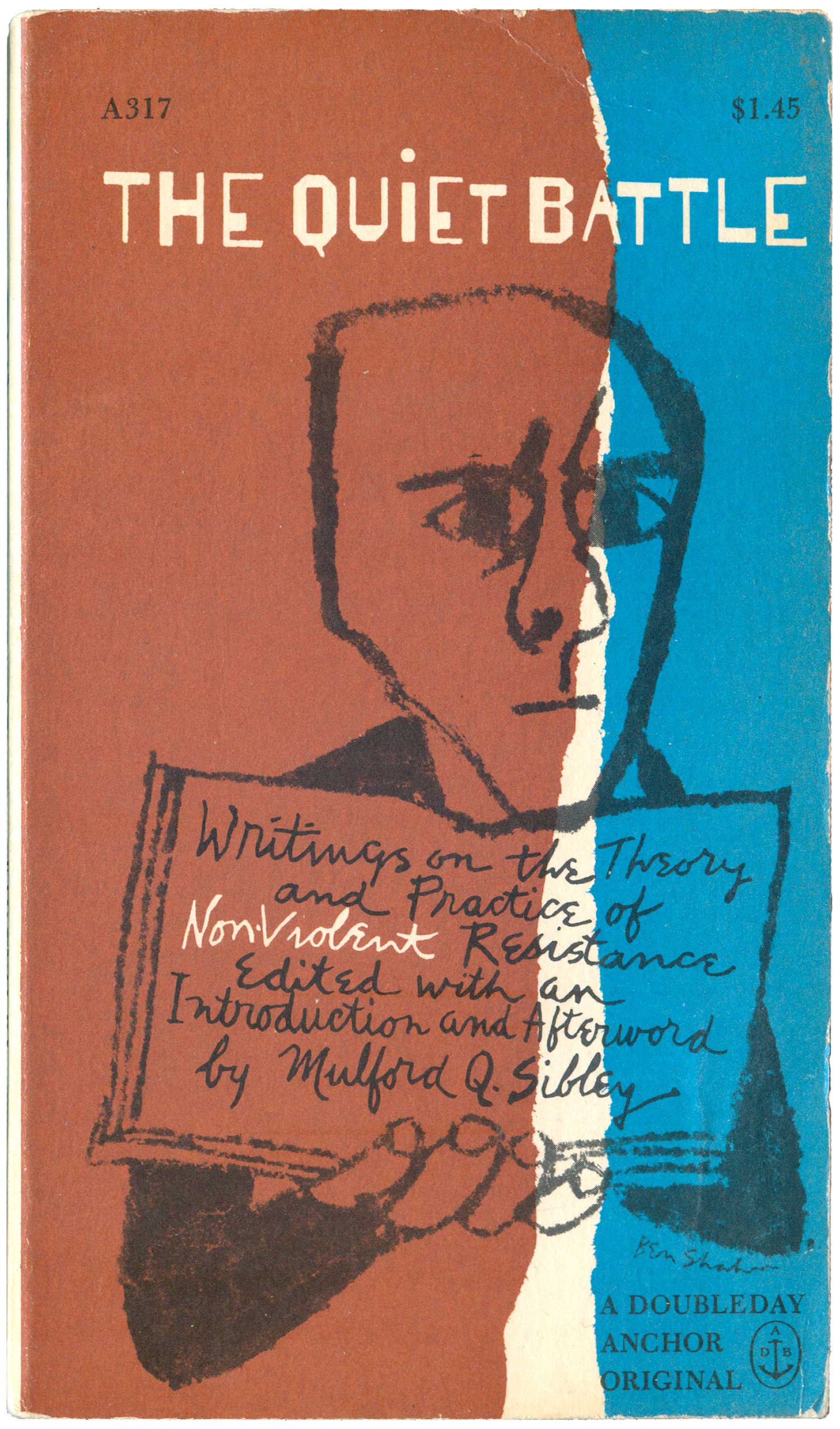
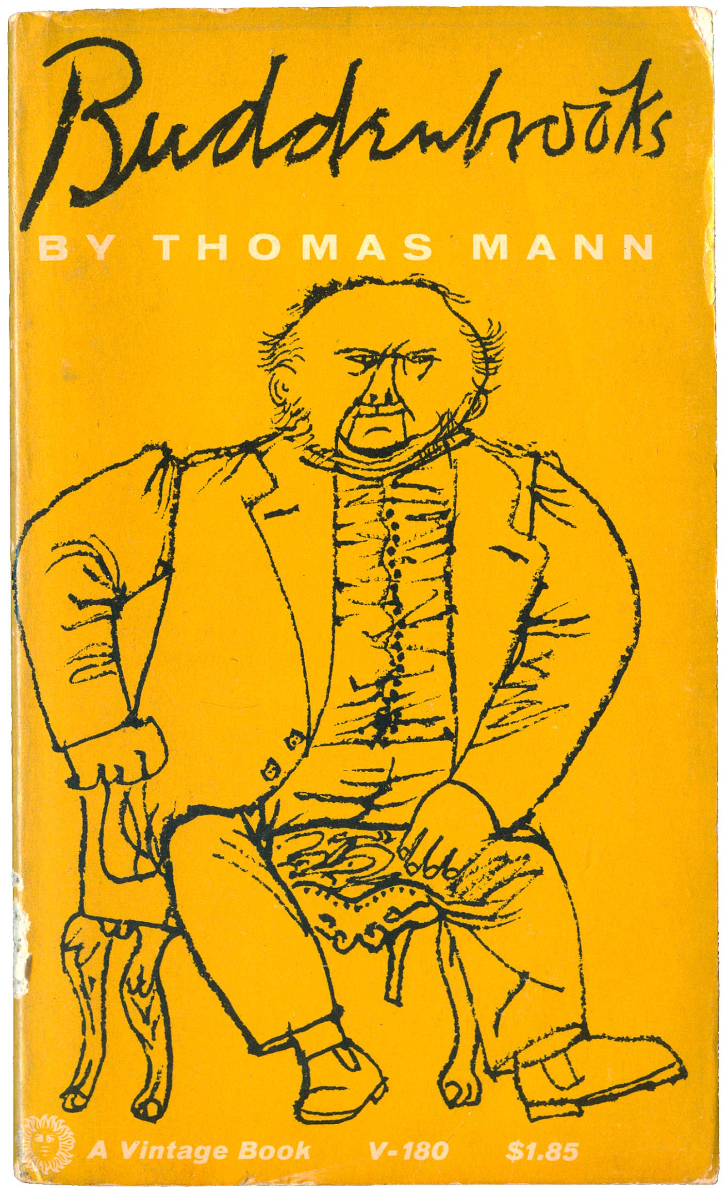
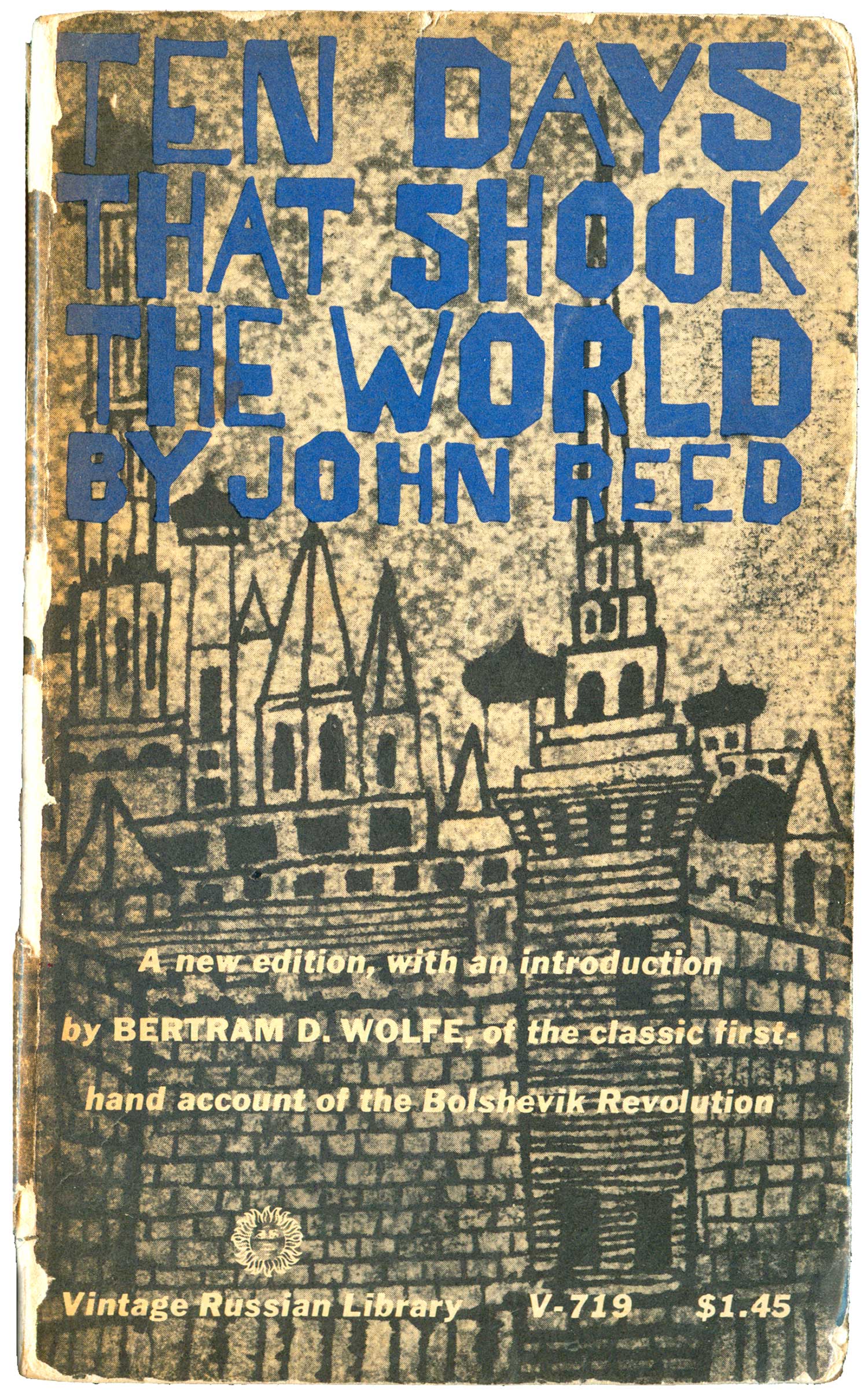
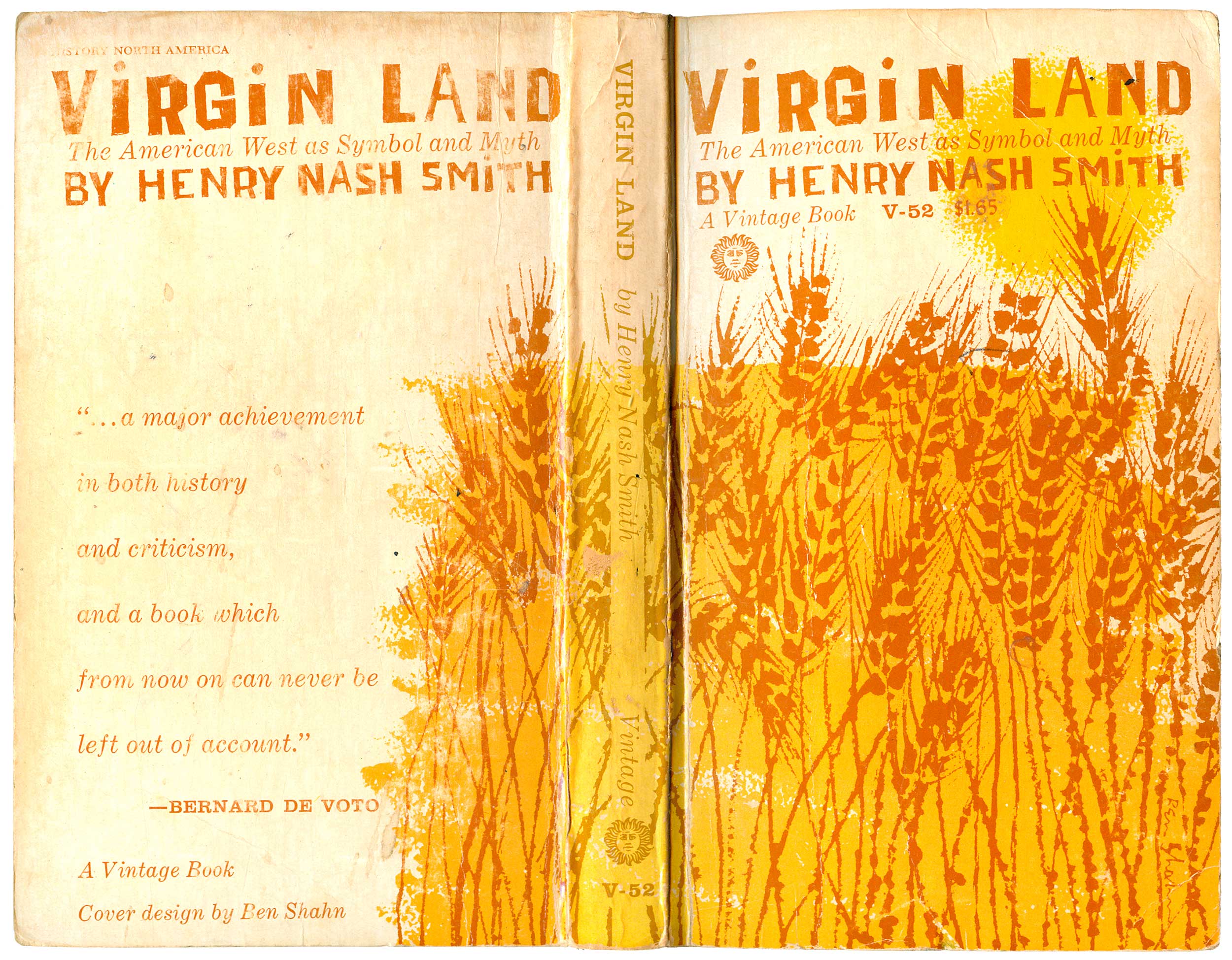
The two covers below both feature environment, or landscape—one architectural and one rural. Ten Days That Shook the World is a pretty well-known cover, likely one of Shahn’s most distributed. I love the density of the building, background, and titling, but also wonder if the overall design would benefit from a little more contrast. Maybe lightening the background sky area, and setting the text in a color that’s in a different tonal range. And Virgin Land is one of my all time favorites. There is something magical about Shahn’s wheat drawings. So simple and compelling, flat yet completely alive. And the decision to forego black or any dark framing color, and stick with the brownish orange and yellow is spot on, transporting me into a sun burnt field.
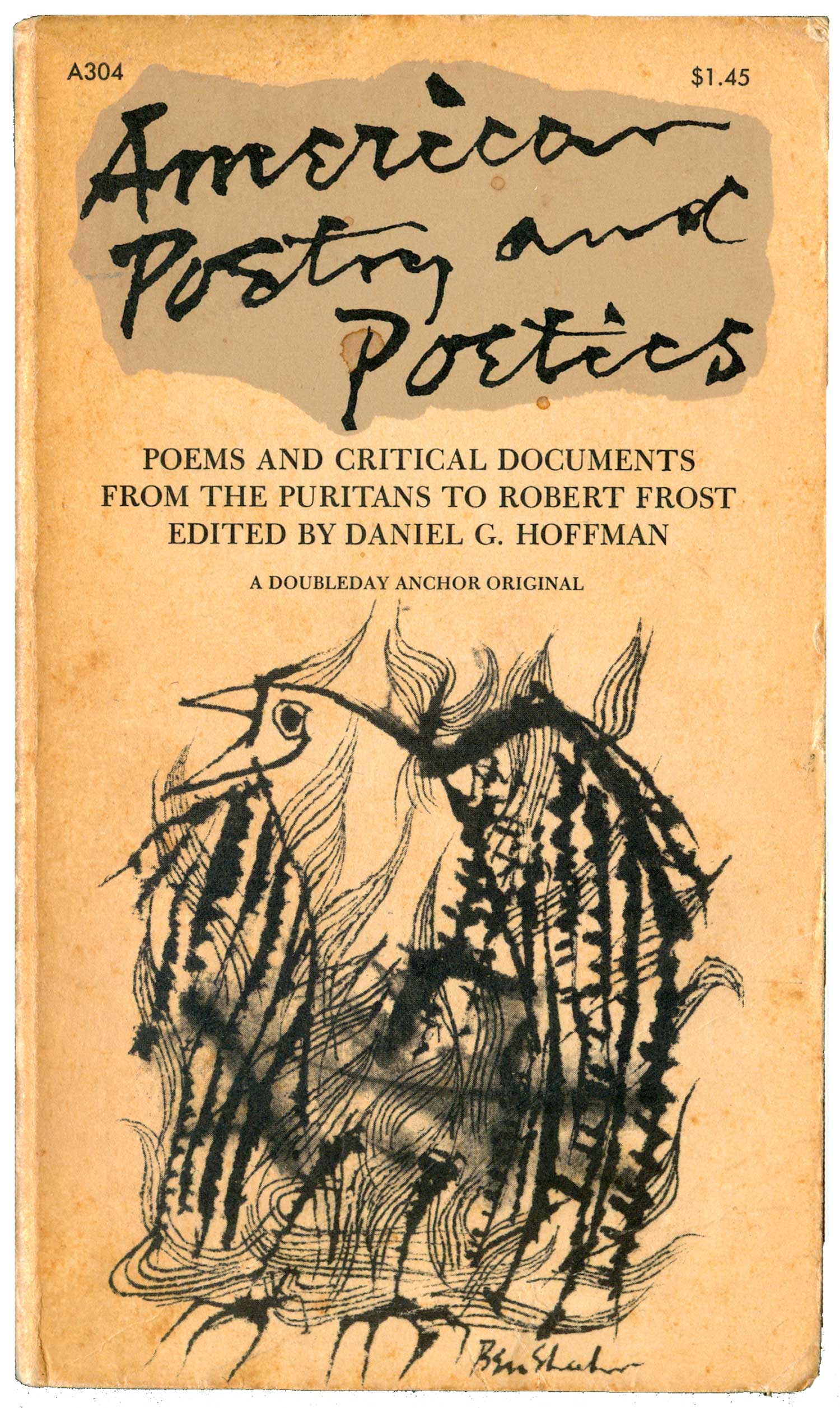
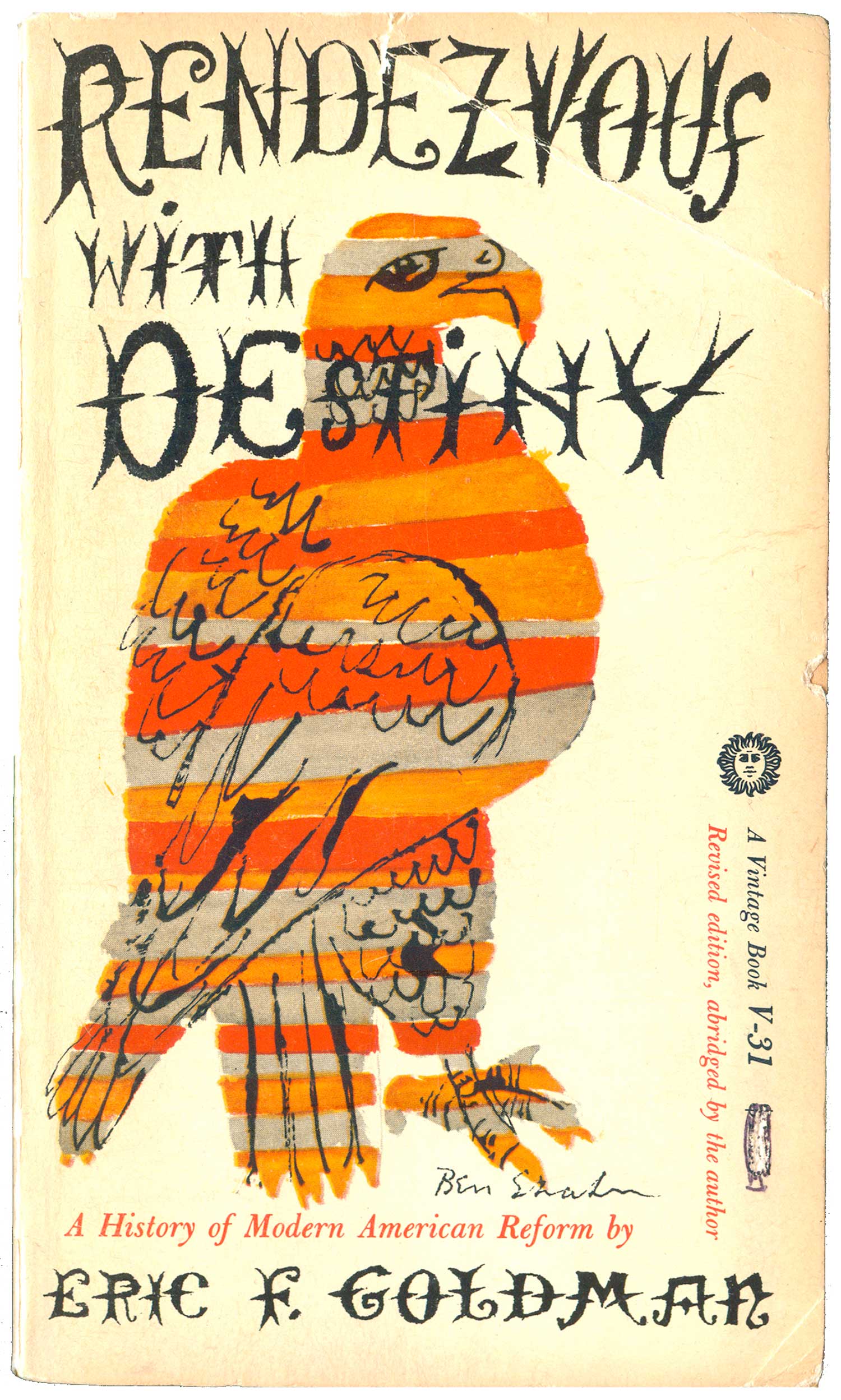
I really only stuck the below covers together because they both feature birds, they don’t really go much together. The Goldman cover is clearly the superior of the two. A complete reinterpretation of the American bald eagle, remade up in flag-like stripes, but in red, orange, and grey instead of red, white, and blue. Not sure if the colors were intentional or meaningful, or simply what was available for the duotone cover. The scratchy barbed type is gorgeous, recalling both the Wild West and illuminated manuscripts from the Middle Ages. The combination of image and text is regal yet thorny and aloof.
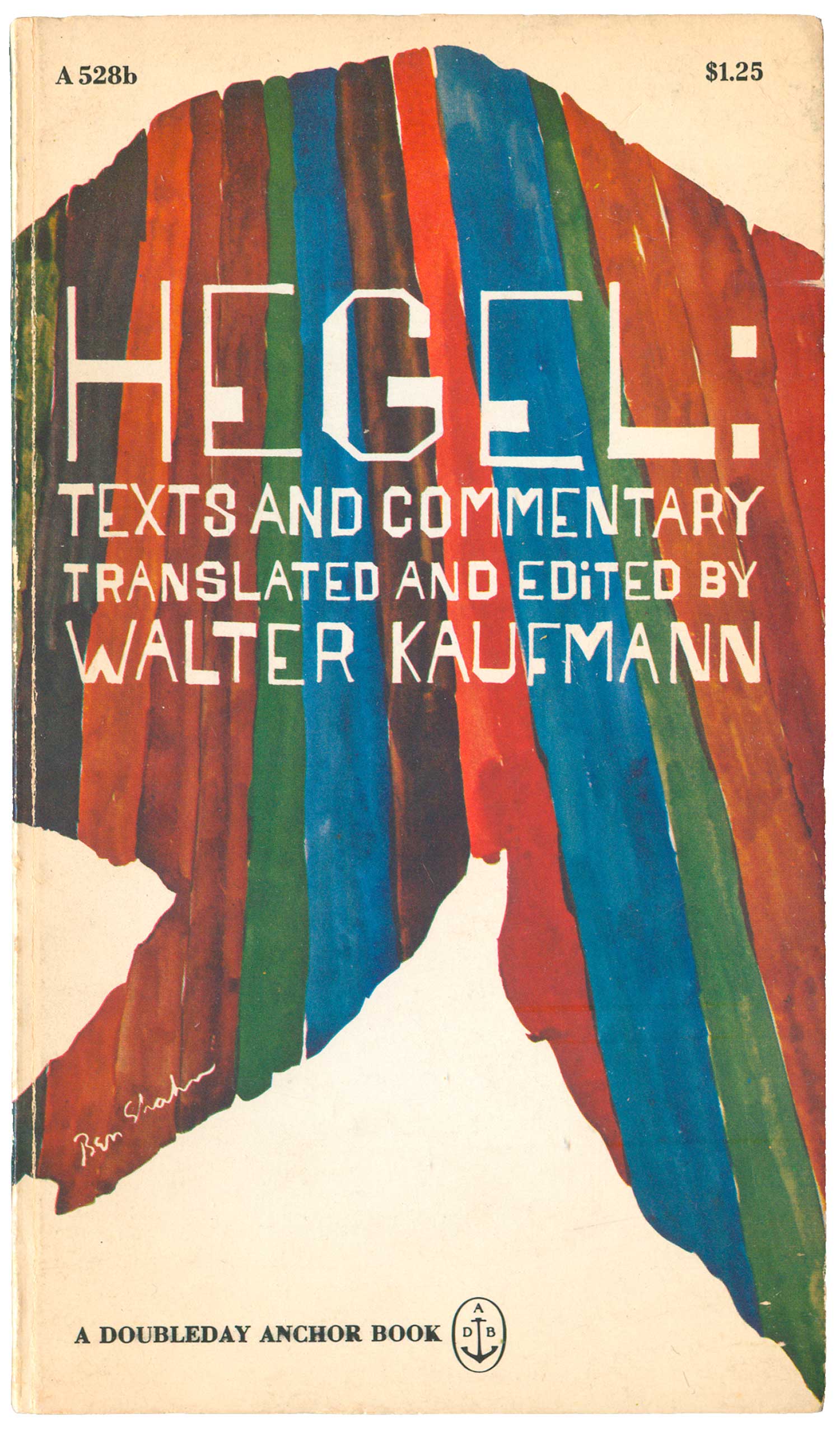
The last couple covers are one for a book on Hegal, and Shahn’s own book on art, The Shape of Content. Hegal is unique in this set, as it’s a water-color with type added, as well as almost entirely abstract. Or at least I think it is, I can’t make anything out of the background shape, but maybe I’m just not looking at it right. The Shape of Content cover was constructed out of Shahn image and type, but he didn’t actually design it, which you can tell because it feels more “designed” and less built from the ground up. But it is still a handsome cover, the lion graphic being a signature illustrations, and the thick/thin block type so definitively Shahn.

I suspect I’ll be looking at Shahn covers for 3 more weeks—one week to see what Penguin has done with his work on their covers, another for all the other publisher’s titles, and a final week on books by and about Shahn. A full bibliography of all the titles in the series will be included at the end of the final post. Once again, if you have cool Ben Shahn covers, stories about Shahn and his work, or anything else book cover related feel free to comment below or send them along.
