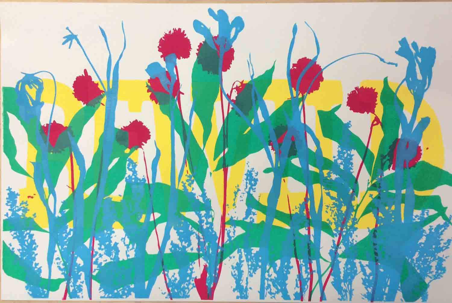
This spring I hammered out a fun and fairly experimental print, one where I wouldn’t actually draw much of anything and mostly relied on dried flowers and leaves to create the design. A lot of folks were responding to the process, and it was quite simple to do, so here I’m tossing out the basics of how I built this print.
To begin, here’s what the print looked like right before I put the final layer of text on it. I was going for a cacophony of wild shapes, but I didn’t quite know how my plan would work out. The basic idea: can you burn images on an emulsioned screen by exposing physical objects on top of it? In this case, dried flowers? The answer is probably clear to anyone who understands how the photographic process works, but I’m not writing a how-to for experts – this is to inspire folks who might be new to screenprinting!
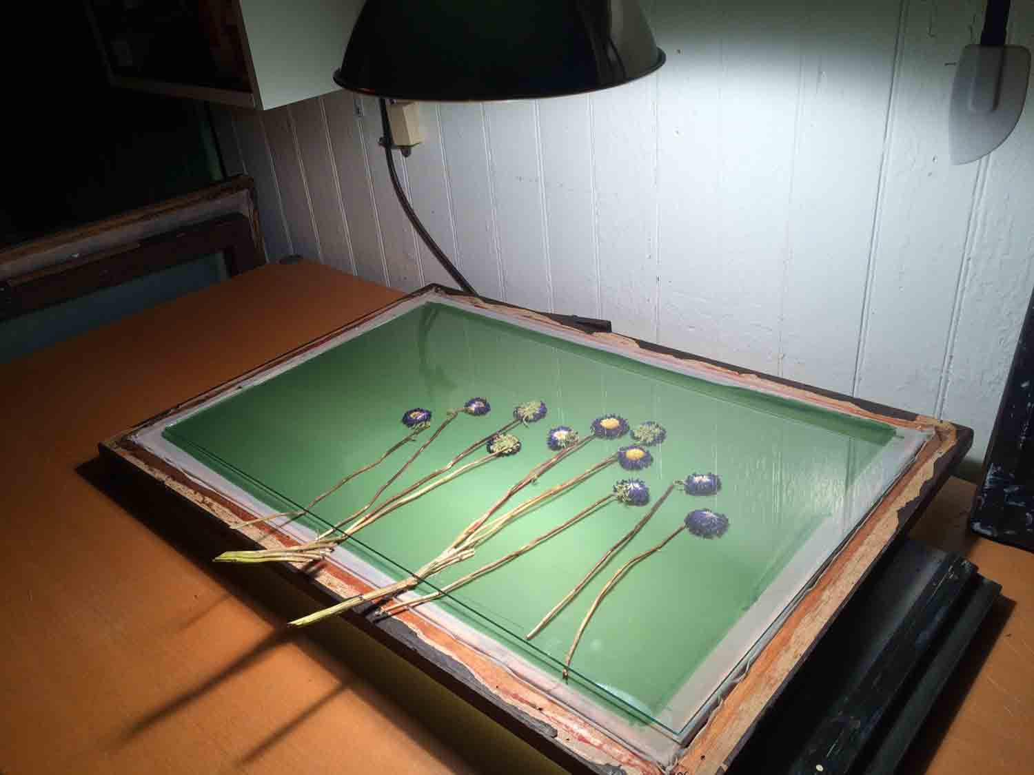
To start, I grabbed a bunch of dried flowers from a bouquet that had wilted up well past it’s prime, but was still languishing in my kitchen. I scoop-coated some screens we had stretched a few weeks before, so they were ready to burn an image onto (there’s some simple scoop-coating tutorials on YouTube, etc already, so I’m skipping that step here).
I work from a really scrappy basement set-up, using off-the-shelf Speedball Diazo products, so here the emulsion is Speedball, and so is the exposure bulb. I timed the exposure based on their recommendations for image size vs. bulb distance, and had no tweaks or surprises. This is an achingly simple set-up, we just have an exposure bulb hanging from the ceiling in a reflector shade.
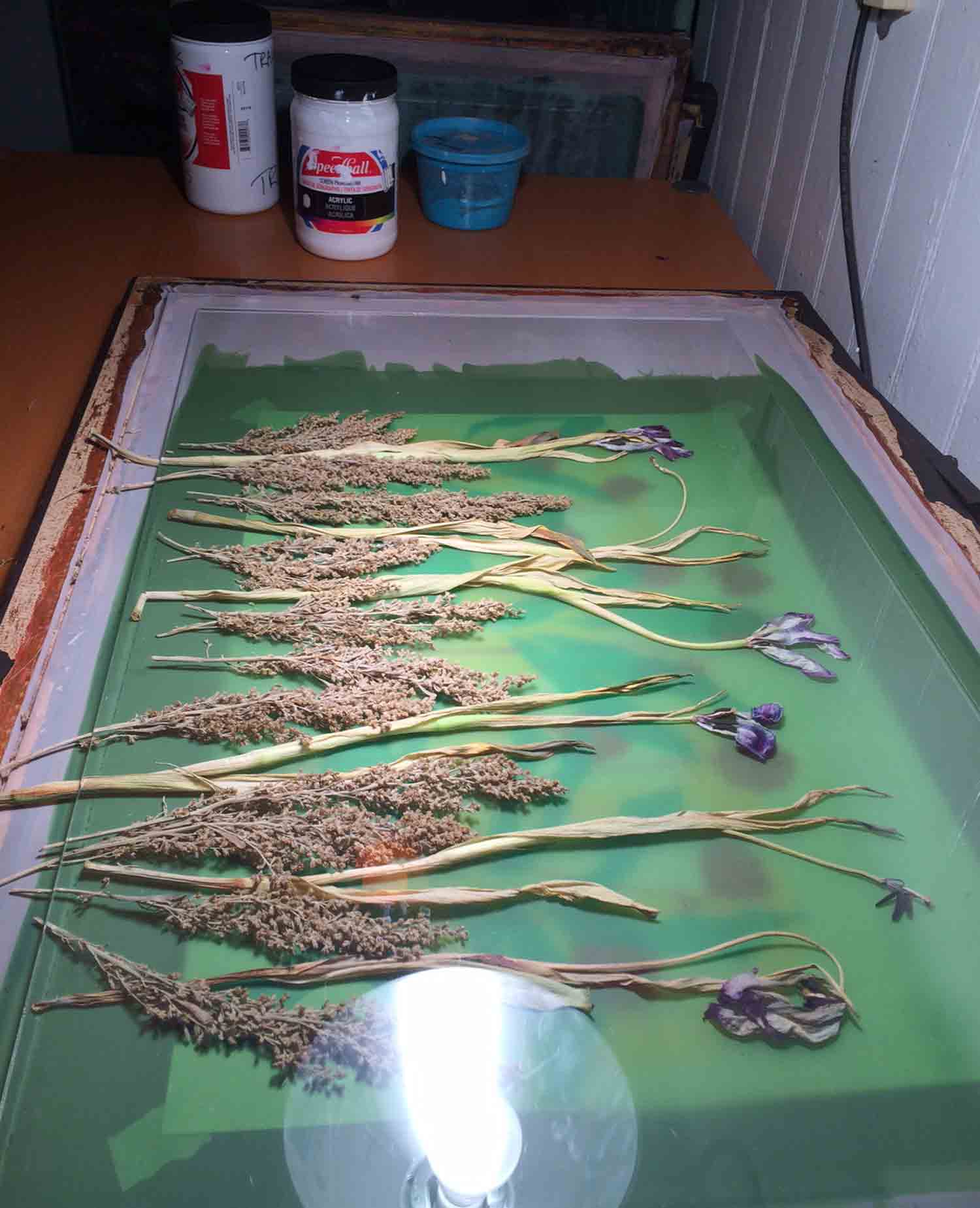
Here’s layer one: a handful of flowers laid out rather arbitrarily on a ready-to-burn screen. You’re going to want that glass sheet smashing them down on the screen surface. That glass will keep you from having gaps around the stiff parts of the stems, etc. where light gets around them, and it also helps to be able to lock in the positions of the flowers if you’re going for a more composed layout. You’re going to be doing the laying-out with a darkroom light (I just use a yellow “bug light” from a hardware store), but the following images were taken when the exposure light was on:
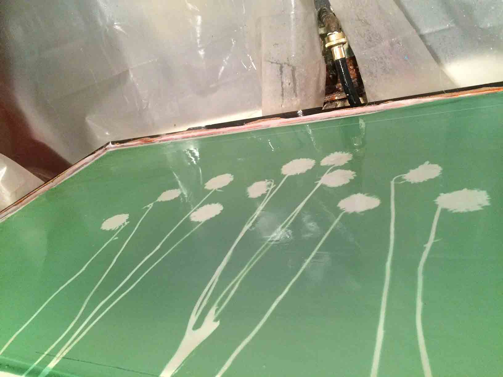
Here’s that first image after washing it out! Pretty similar process to cyanotype, so I’m told, and a similar look before you start printing:
And here goes that first ink pass! Magenta. I was mixing in loads of transparent base for each layer, hoping to get a lot of color overlap and blending in the finished print.
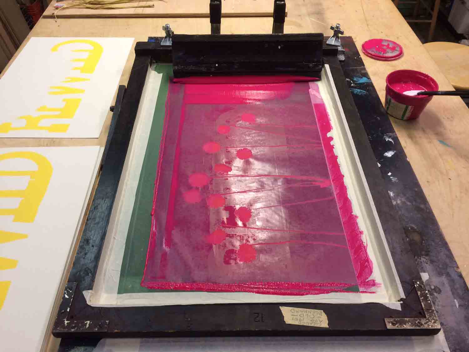
You can see now that I had actually already run a pass in yellow ink, before these first flowers were printed. This was because I had hoped to somehow merge my first text layer with my final text layer. If I did this again I might have solved the text layers a bit more concretely before I started printing, but honestly I was just trying to have fun with the process and give up on over-planning (which I tend to do with all other prints). I made that first layer by painting screen filler on a non-emulsioned screen, but it was kind of a mess! No documentation of that here, I need to fine-tune that process a bit (but the process is well worth looking up if you’re interested in screenprinting without dealing with emulsion).

Second layer: I grabbed some leaves from the same bouquet, mainly because of the difference in the shapes…
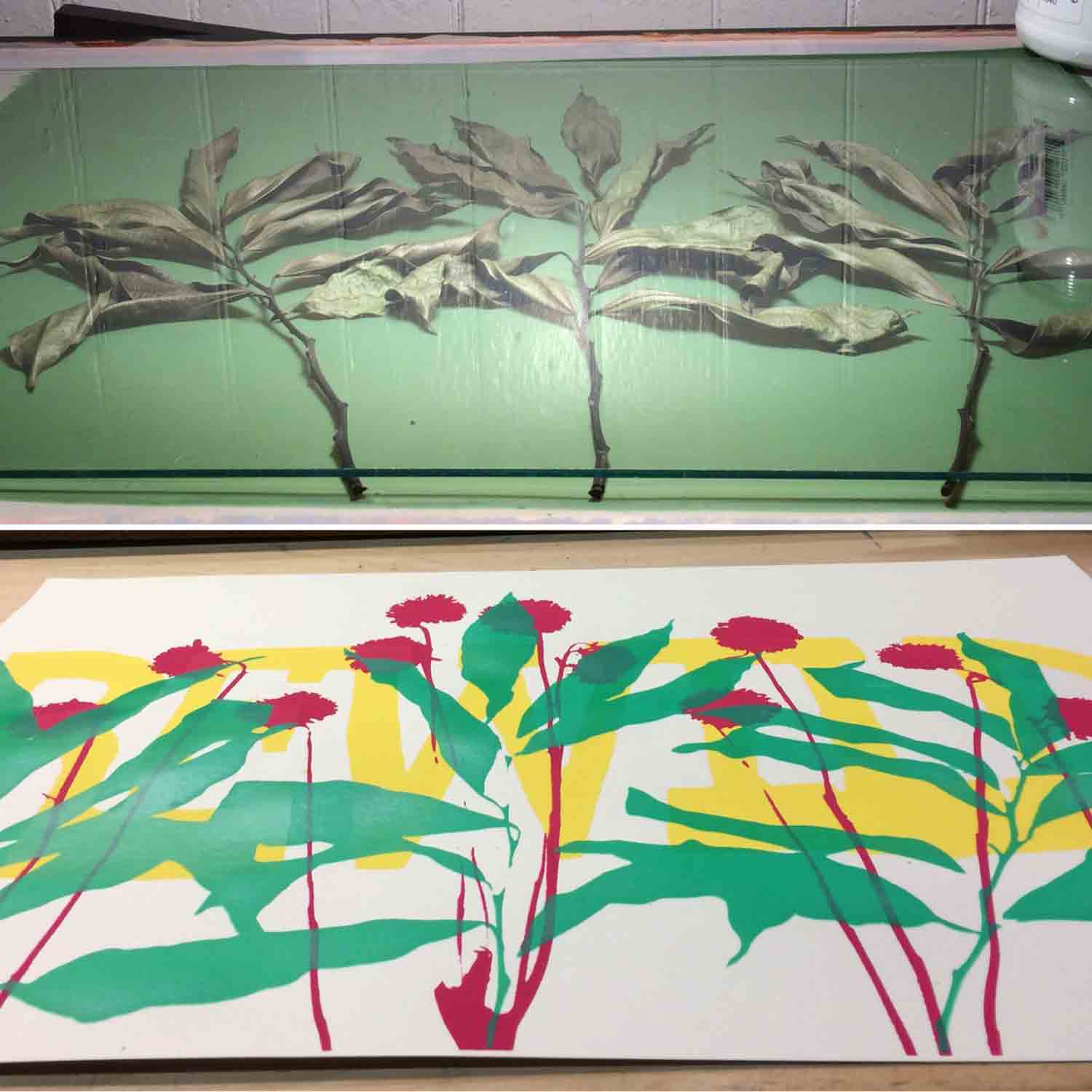
…and printed them in a green with even more of that transparent base mixed in. I mean gobs of the stuff, it never seemed to be enough!
Here’s the third layer. When laying these plants out, I was actually positioning a print under the screen to judge the layout of the new plants, because even though I was attempting to be footloose, I started seeing spots in the composition that might look nice filled in with a new flower or something else. You can see the colors of the print peaking out under this screen:
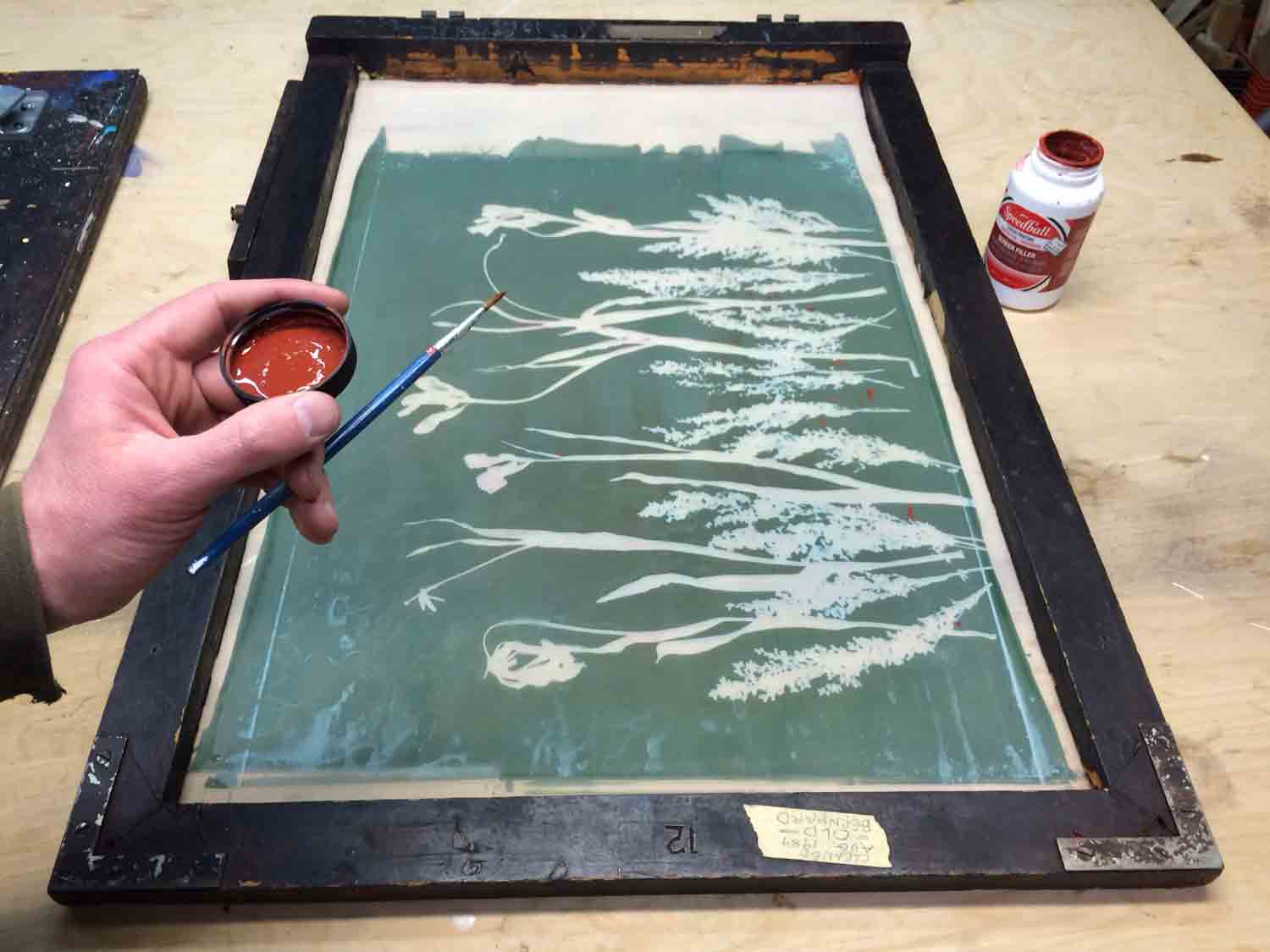
I found that after I had exposed each screen and washed it out, each image revealed some little “holes” in the emulsion here and there, from seeds or detritus that fell off the plants while shuffling them around pre-burn. I did a lot of touching up with screen-filler so that ink wouldn’t makes those dots pop when I printed…
And here’s the last plant layer printed!
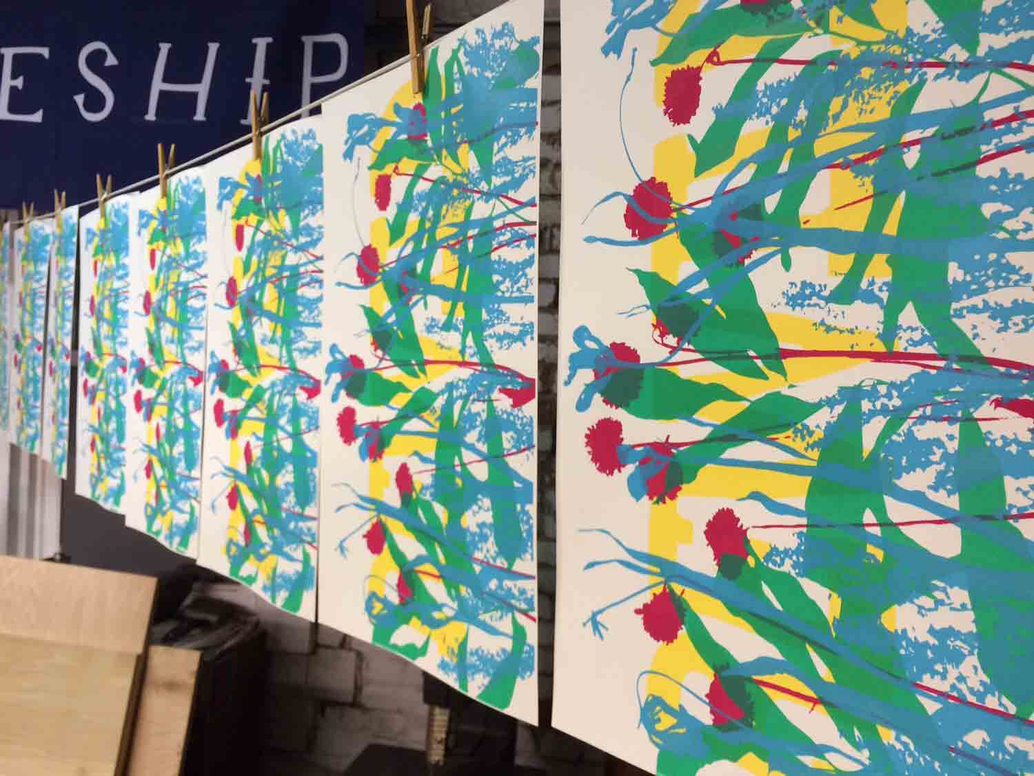
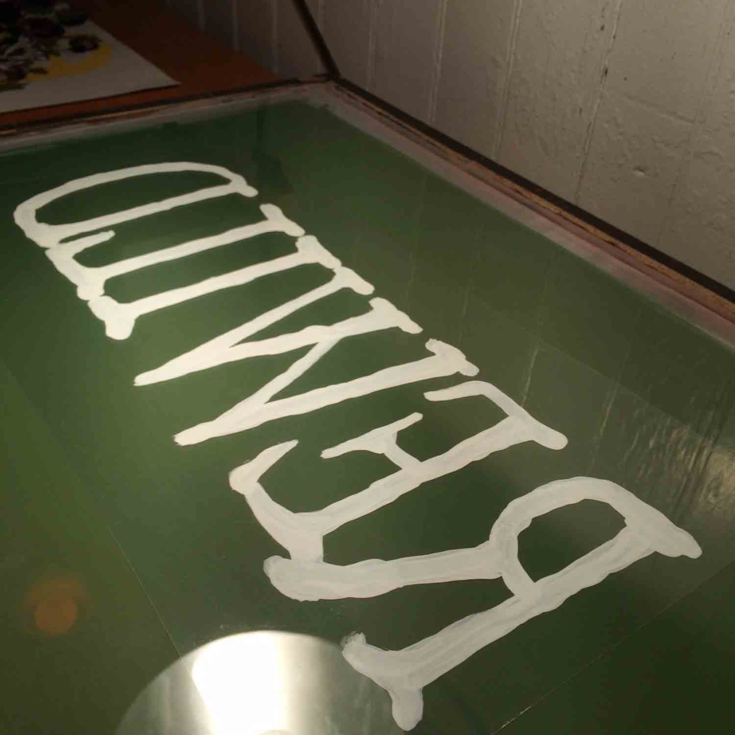
Part of me really wanted to leave the print in this state. But, because I wasn’t fully happy with that first yellow base layer, and still wanted to get a new text layer on top to tie everything together, I went for one more piece to the design. I made this final layer by painting with some leftover latex house paint on transparency film – this made it easy to make a few different versions by painting directly over the existing print, and seeing what I liked best:
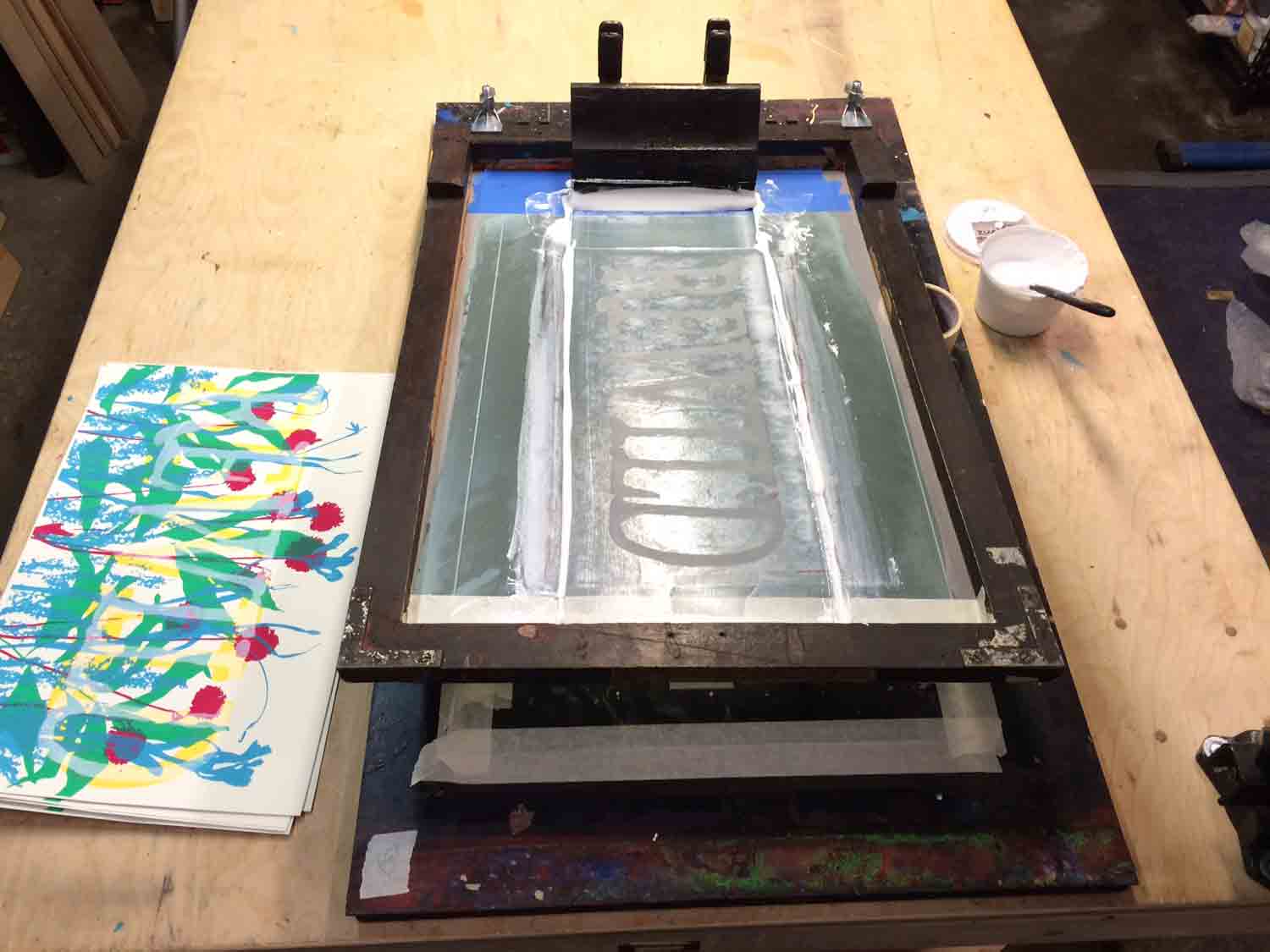
Then printing that layer, with as much transparent base as I could manage to use, keeping those brightly-colored plants as visible as possible:
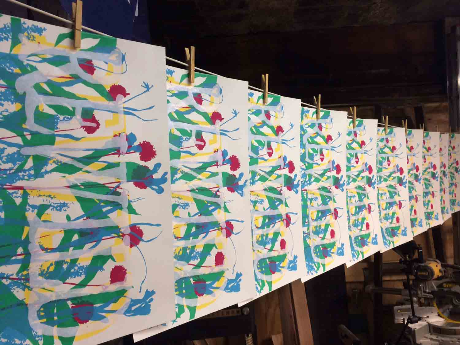
And here they are drying on the line!
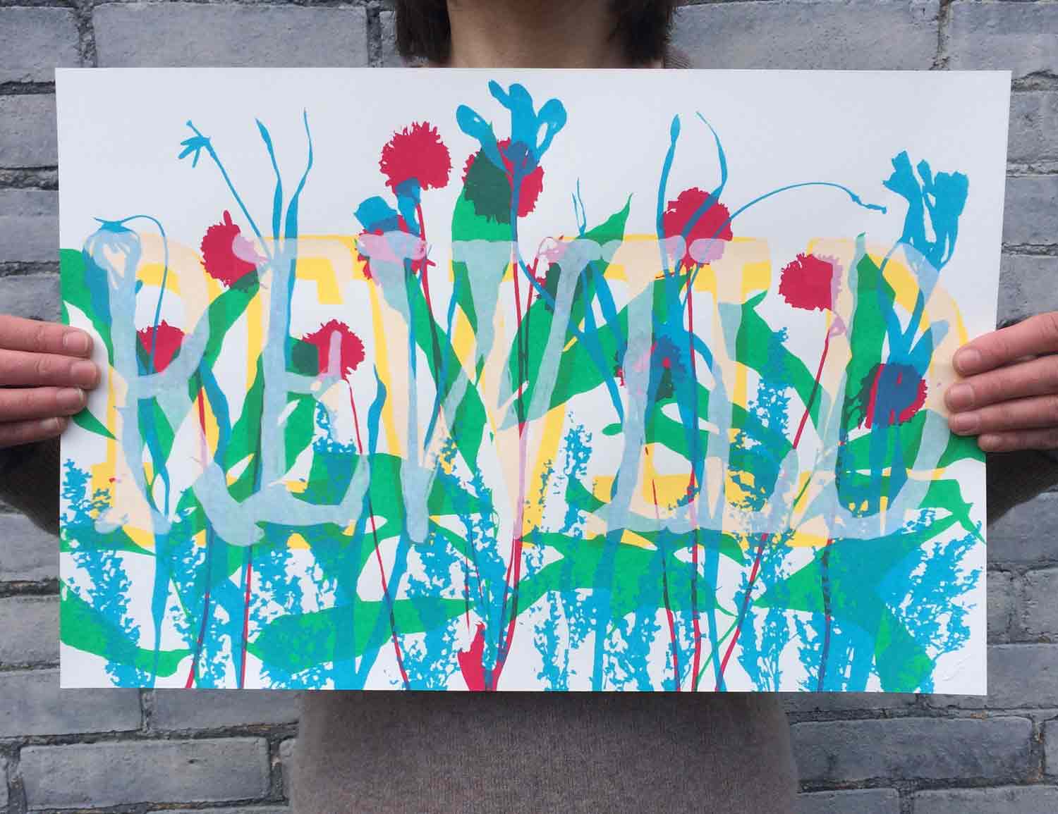
The finished print:
Hopefully this short article is helpful, or inspires you to take this simple process and run off with your own ideas! Feel free to ask any clarifying questions about the process, and happy printing!
You can get a copy or this print, or just read more about it right here.


I friggin love it Shaun!
Thanks for taking the time to walk us thru the process. The colors chosen the plants forms and your lettering are all super vibrant and inspiring!!
This most beautiful! Thanks, Shaun.
I really like this approach. Thanks!
Thanks for this – so inspiring.
I’ve also preserved my leaves etc. with a 1:0.5 solution of glycerine and water which means I can also use them as simple cut outs/templates if I run out of photo emulsion or can’t be bothered – for textile printing.
Also preserves the autumnal colours brilliantly
Hello:
Intriguing silkscreen print work of the flowers – very impressive!
I found my passion as a digital artist, using Adobe Illustrator, since I got my bachelor’s degree in graphic design. Now, I’m authoring an article for my local camera club in how I use photography for creating my renditions of real locations. Back in college, I recognized Illustrator’s vector file-extension to silkscreen printing. Your top image of the flowers would be an excellent graphic to include in my article, comparing my digital medium with yours. I would make sure that your work is credited. If you’re not interested, no worries!
You’re welcome to view my work on my portfolio website, matthewjablonski.com.
Thanks,
Matthew Jablonski