You wouldn’t necessarily know it from the books I’m usually discussing here, but a solid half or more of my reading intake is genre fiction, sci-fi and especially crime novels. Back in high school I figured out that there were strong connections between science fiction and left and radical politics, especially in authors like Ursula LeGuin and Samuel Delaney. It wasn’t until much, much later that I realized similar sympathies run rampant in the crime genre, from Dashiell Hammett’s Red Harvest; to Henning Mankell participating in the 2010 Free Gaza flotilla. Even though so many crime novels lean heavily to the left, it’s pretty rare at this point for explicitly lefty or radical publishers to put out much in the way of fiction, never mind crime. The only current exception seems to be PM Press, which has an increasingly large catalog of science fiction, crime, and novels in translation.
There was another big exception in the 1980s that I was happy to find out about a couple years back. Trolling a used bookstore shelf I came across an anomaly, a book put out by British socialist publishers Pluto Press on the crime shelf. Turns out they released a series of over twenty crime novels between 1984–87. Many readers here might be familiar with Pluto, which is still quite active. They were pretty experimental in their early days, working with influential designer Richard Hollis, and producing a set of great Worker’s Handbooks which I featured here on the blog back in 2013. And I also have to acknowledge a great collection of information on the Pluto Crime series pulled together by Mick Ridley. While sometimes I can find images of additional books along themes I’m researching and writing on for this blog, it’s rare to find any actual information about the publishers, designers, etc. But in this case Mick’s compiled a near complete set of covers and some contextual material. I’ve only tracked down seven of the actual books, so most of the rest of the images here are taken from Mick’s site.
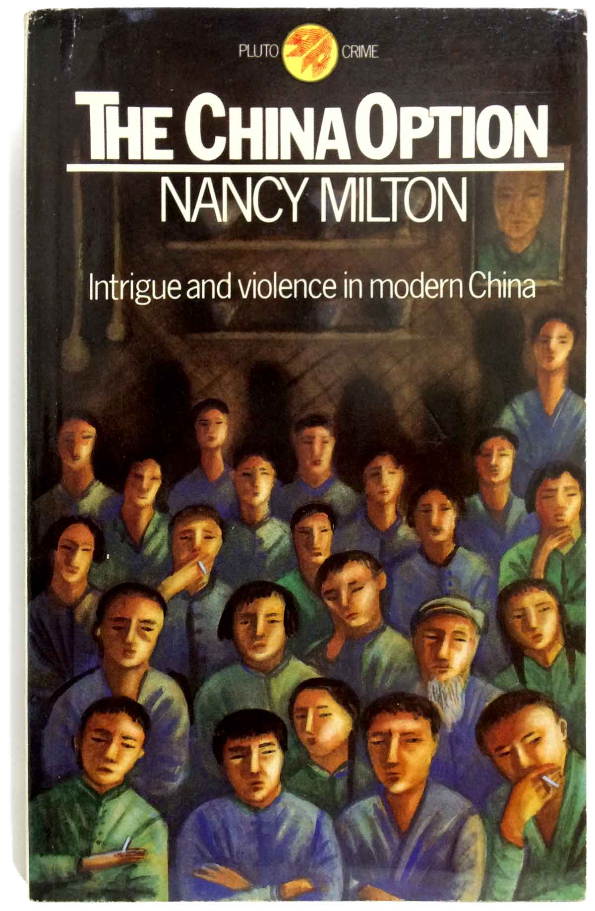
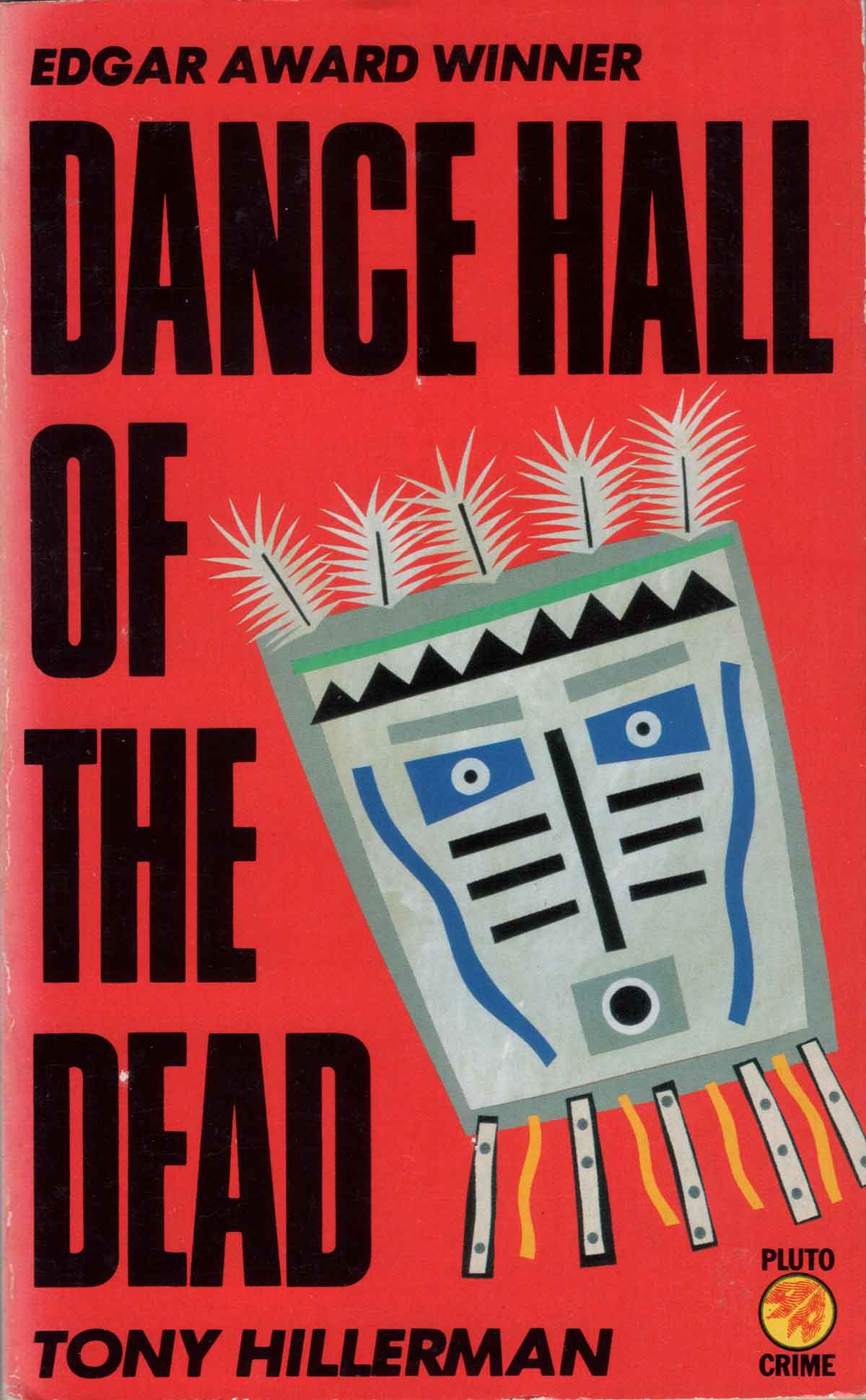
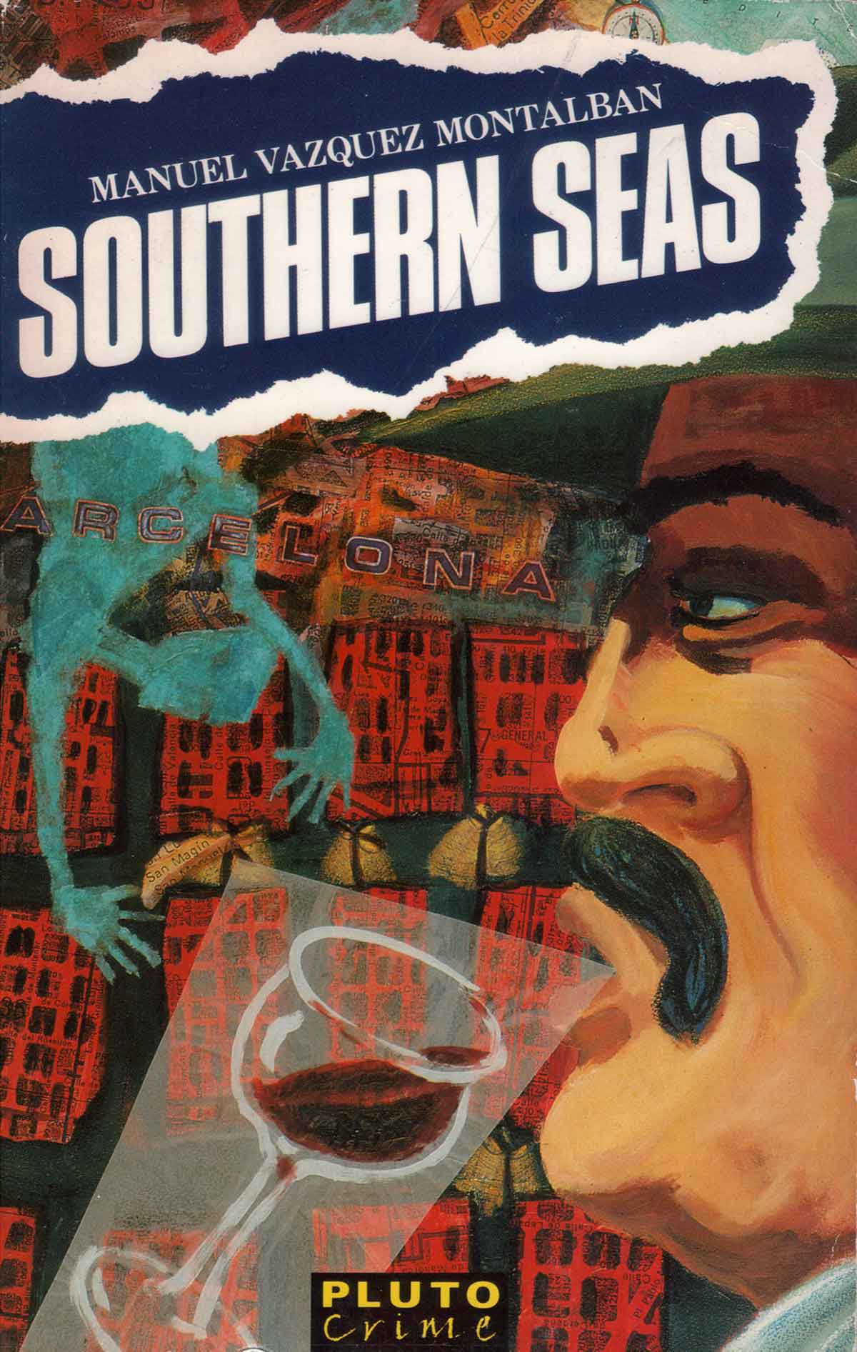
In an additional link-back to earlier posts here, the crime series appears to have been edited by Ronald Segal, the South African exile who worked closely with Penguin books for years, as both an author and as the editor of their impressive Penguin African Library. I featured these books over a ten-week span (posts 111–120), with the eighth week focusing in on Segal himself. Segal did a pretty great job on the Pluto series, pulling together a nice collection of new and original titles, foreign titles previously unpublished in the UK, and paperback editions of books that had only been previously available in hardback. Many of the titles have since gone out of print, but Tony Hillerman is a big name in crime, and the Manuel Vazquez Montalban novels have since been republished multiple times by both Serpent’s Tail and more recently Melville House.
Anyway, on to the covers! While I love both genre fiction and books released in series, I have to say that crime novel sets often have the most horrendous covers. All noir-ish black and white photos or hyper-realist crime scene paintings, tight details on weapons that read as abstraction or awkward attempts at recreating 40s and 50s pulp cover illustrations. For the most part, the Pluto series has none of these particular problems, but unfortunately has plenty of its own.
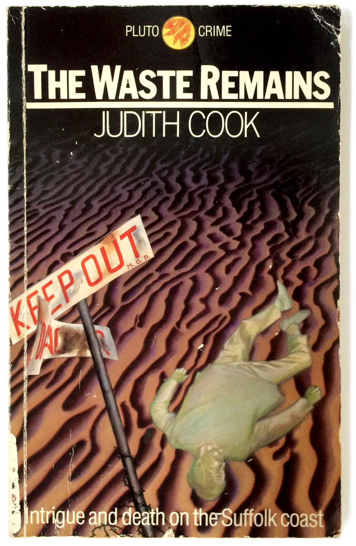
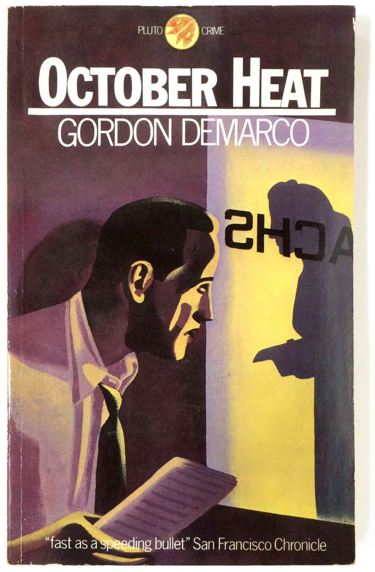
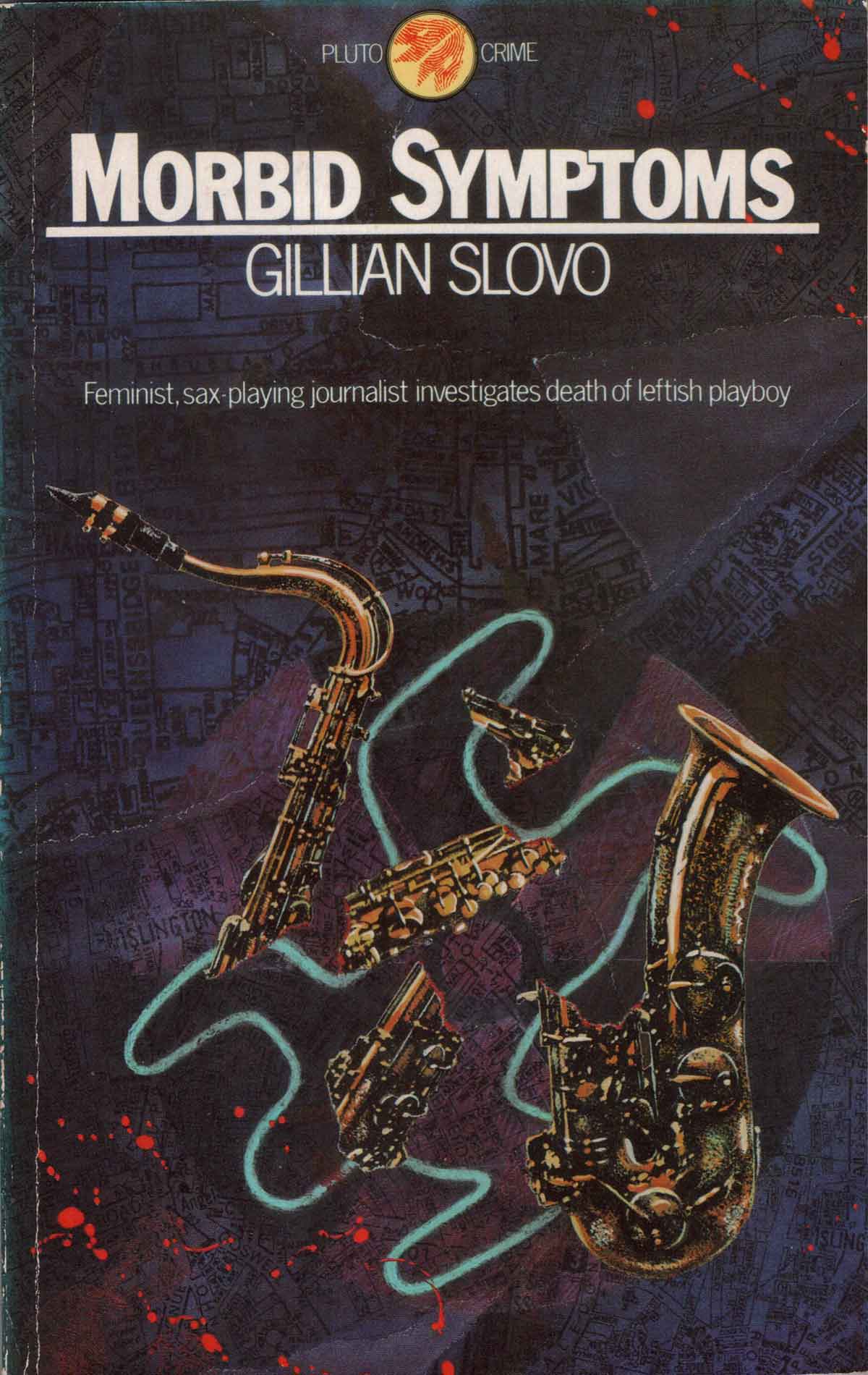
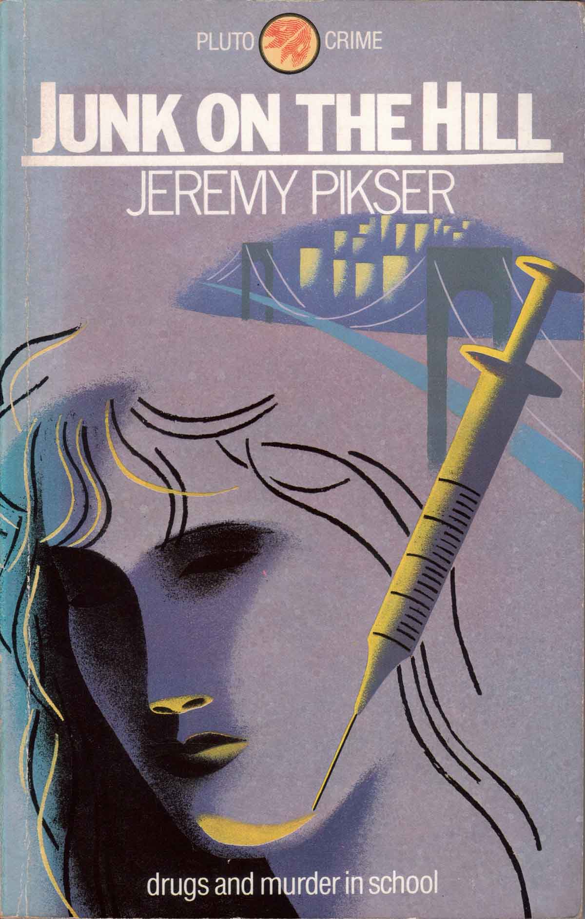
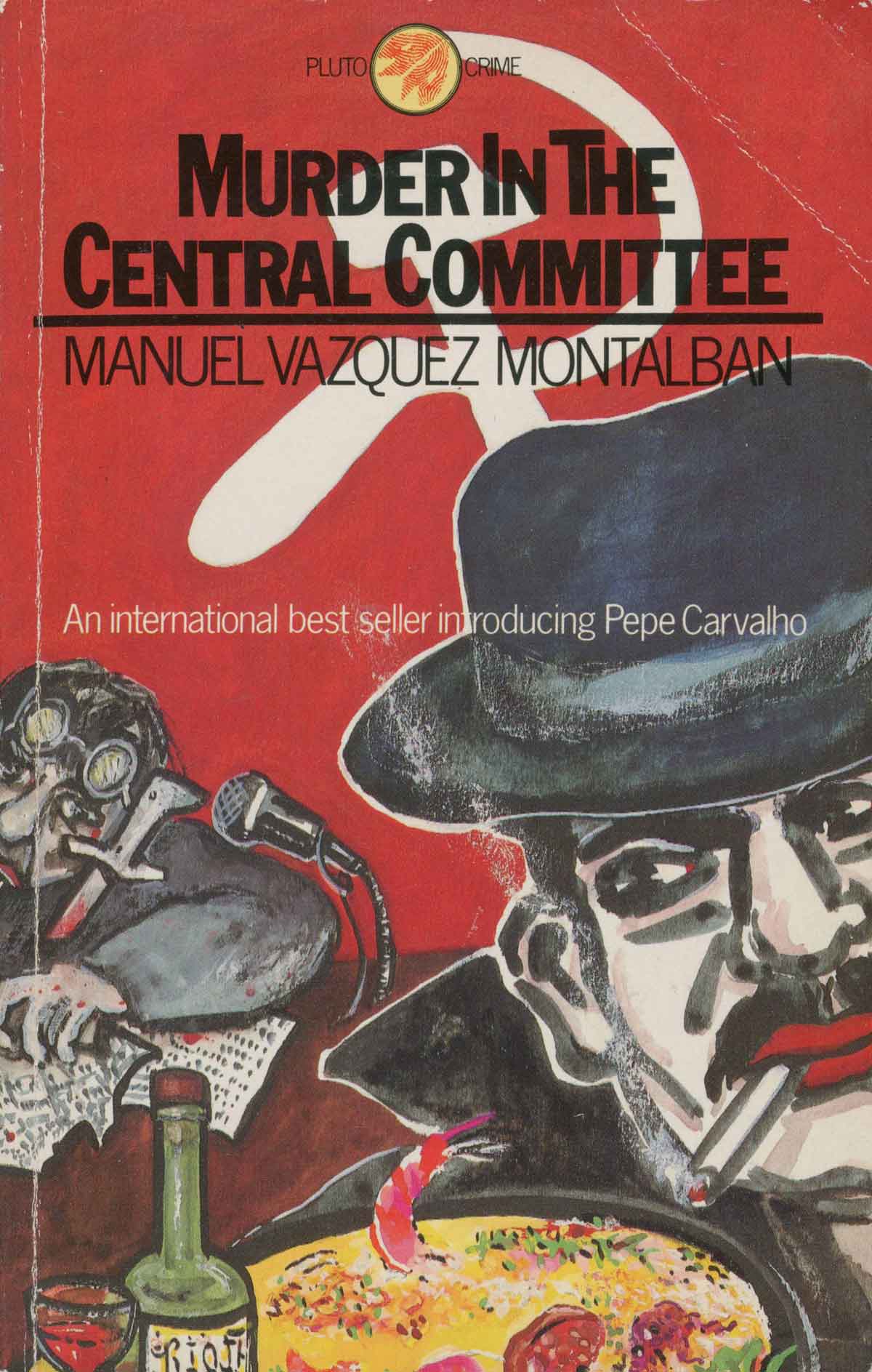
The series starts out in 1984 with a very clear design style, created by Clive Challis. These six titles all share the same Pluto fingerprint crime logo centered at the top, the title laid out in a bold, tightly kerned sans-serif, followed by a thick underline and then the authors name in a thin sans below. This makes up the top quarter of each cover, leaving the rest of the space for a unique and original illustration. While I like the illos on The Waste Remains and October Heat (a nice stencil-like update on the classic P.I. office), Morbid Symptoms and Junk on the Hill (like a third-tier WPA health education poster) leave me flat. Five of the six covers are dark, allowing for the type to comfortably float on top in white. The only exception is the Montalban book—the red and white cover background demands black titling, which adds to the overall too-busy feel of the cover.
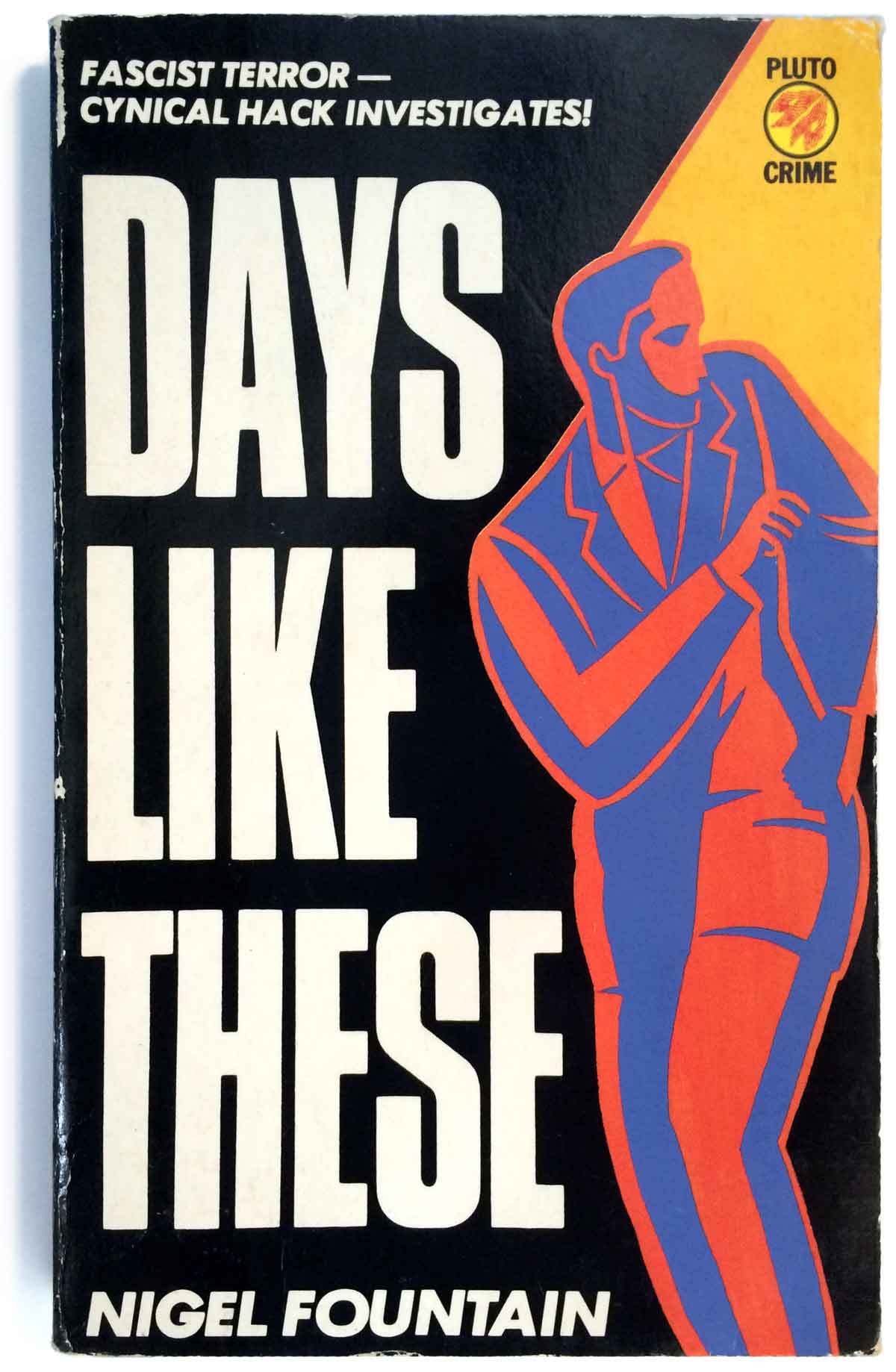
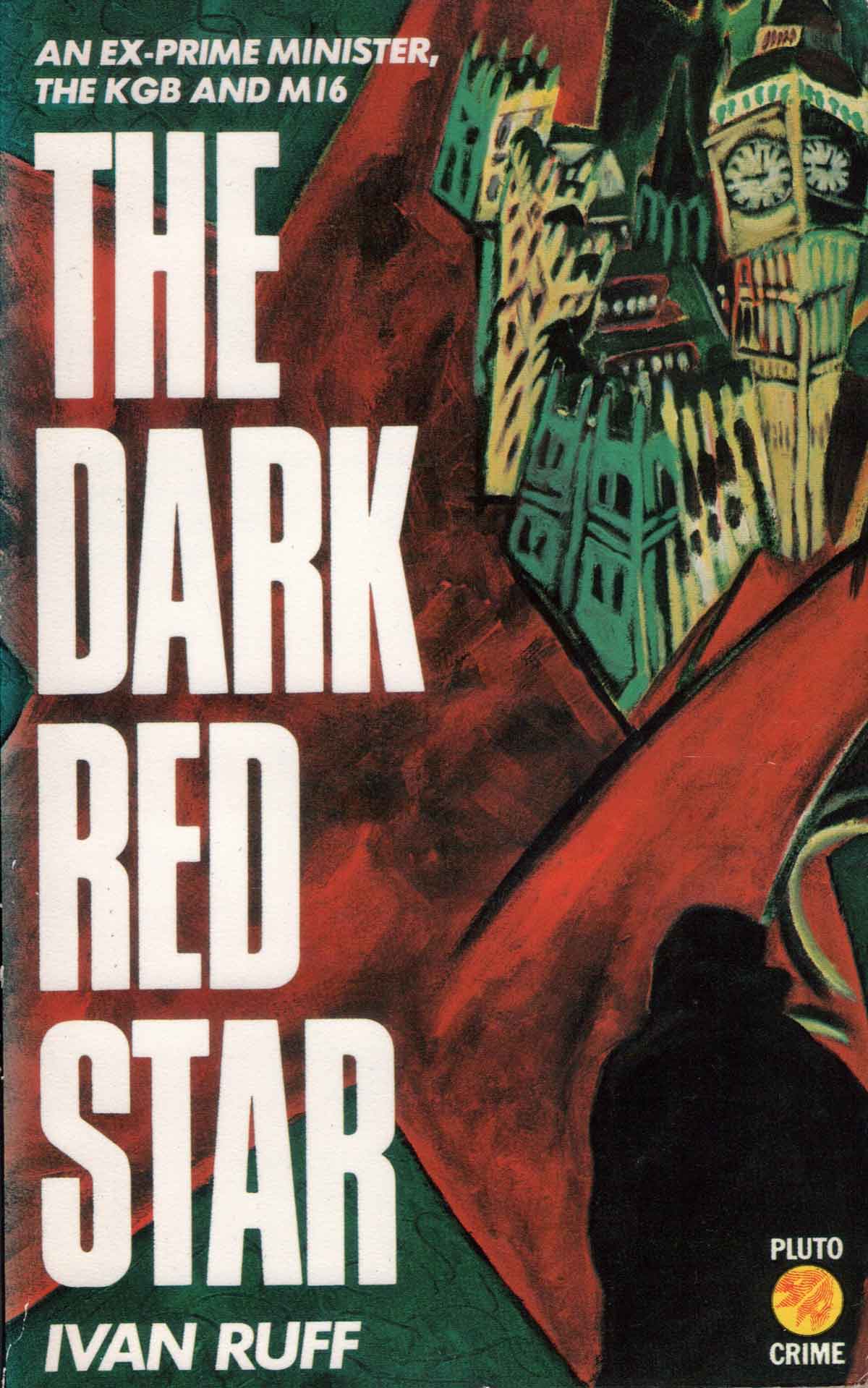
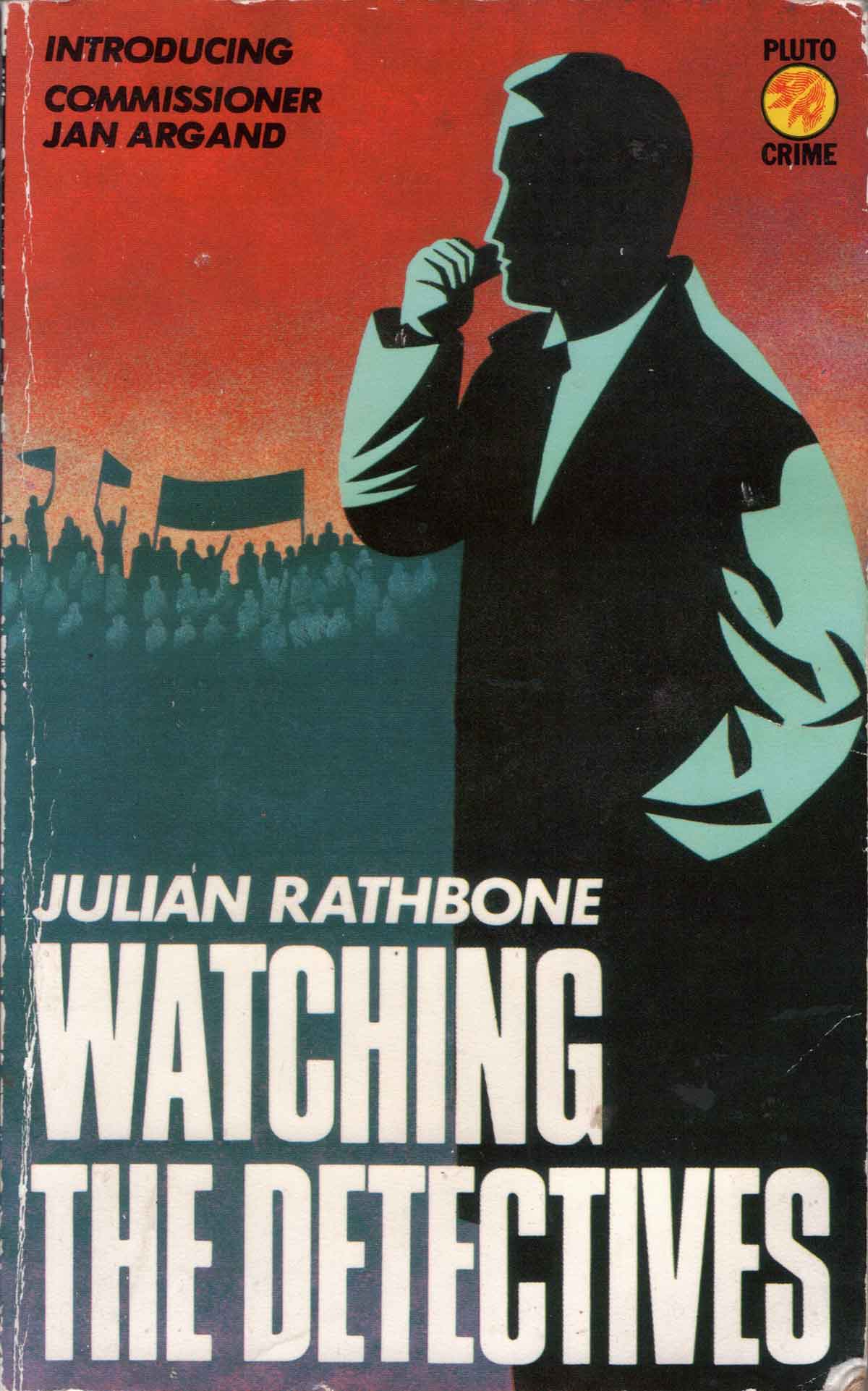
The designers of the 1985 and 86 series are not attributed. For the first season of books in 1985, the format changes from trade paperbacks to mass markets, and a new style is used for these four titles. The title is no longer caged above a line at the top, and instead becomes a dominant visual element, each word stacked on top of the following one, all in very tall, bold sans. The backgrounds are also largely simplified and more graphic, with the exception of the painterly cityscape by Ashley Potter on the Ruff book. These might be the strongest set of covers in the series overall.
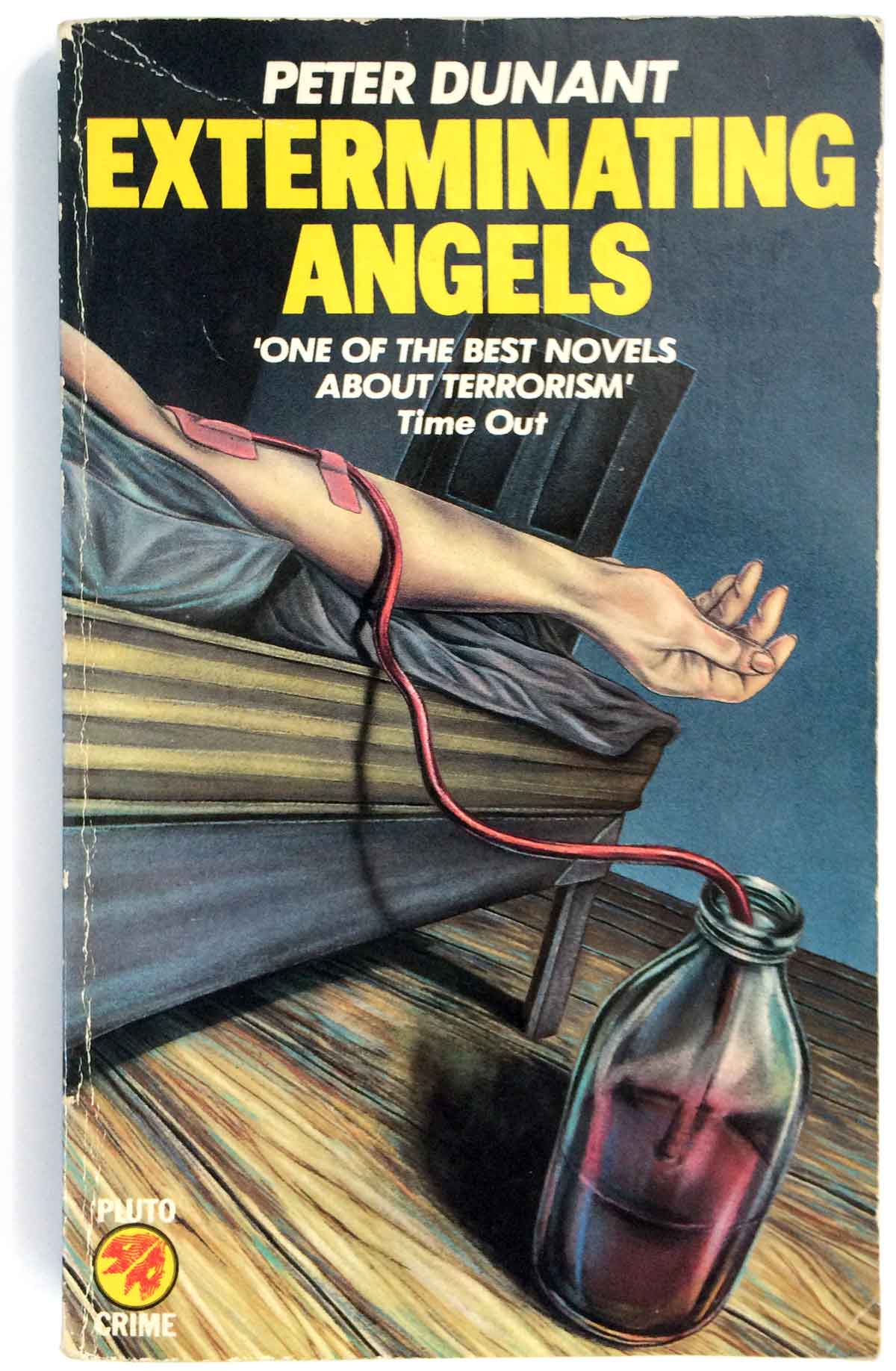
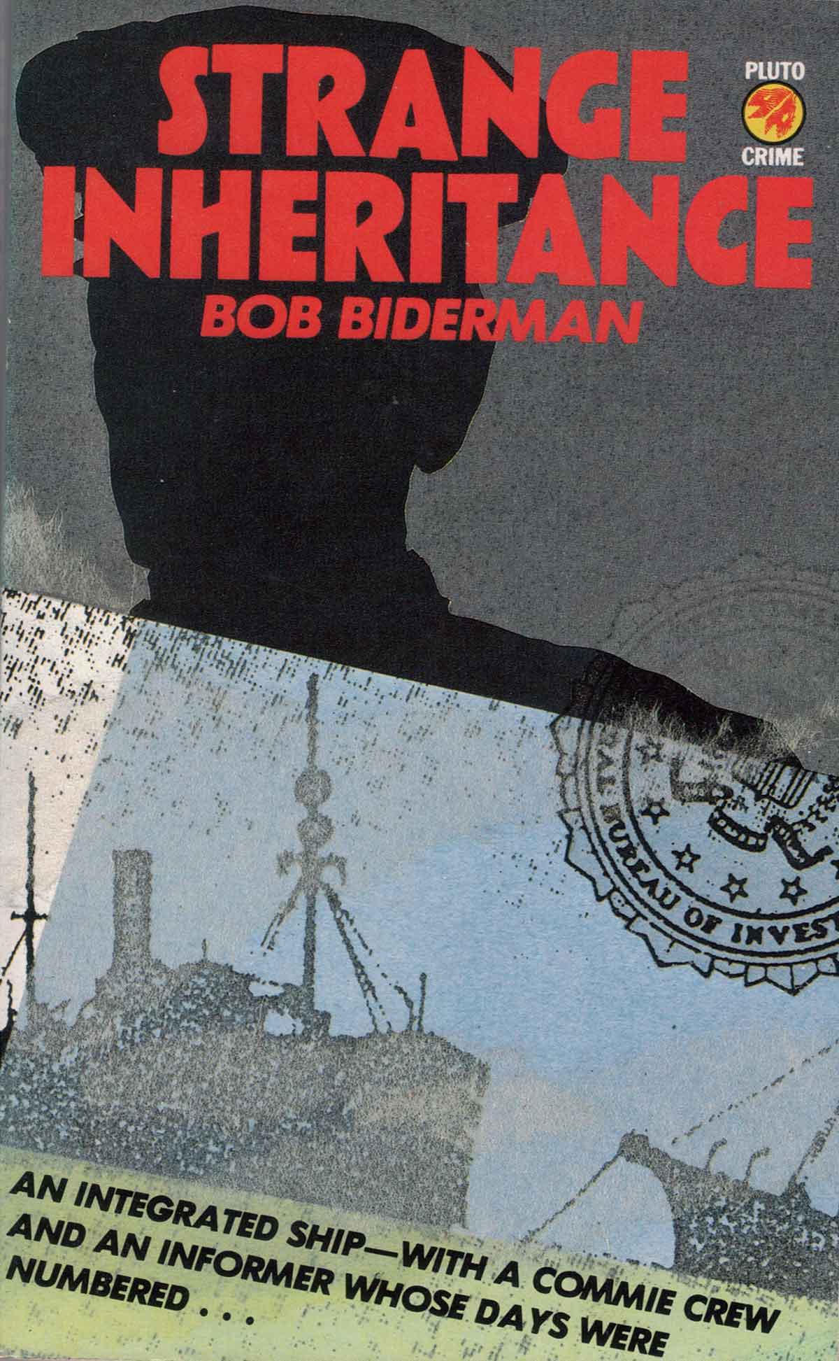
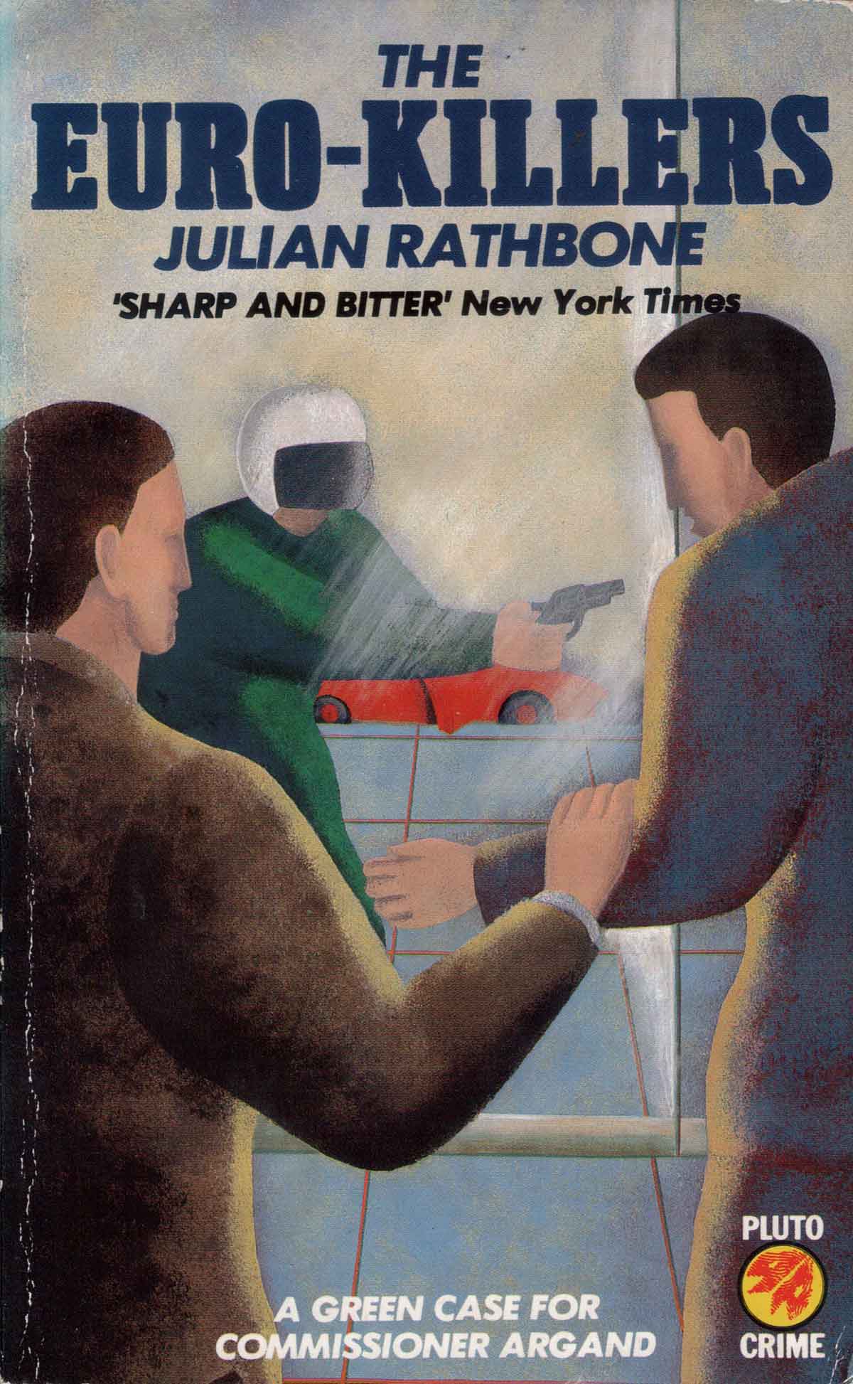
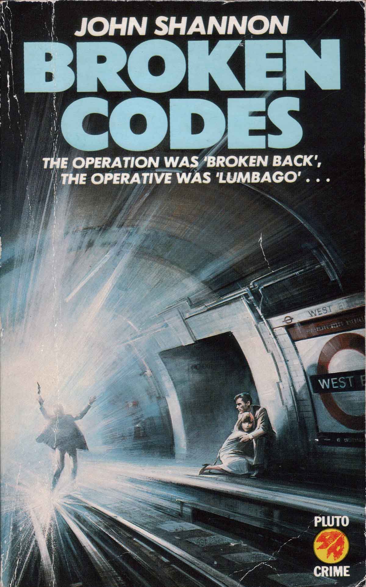
The bulk of the titles came out in 1985 and 86, and while there is a house style, it is much less strict than the earlier formats. The book size has now been returned to trade paperback. The standard typeface as been abandoned all together, but there is a return to the title and author being centered at the top (for almost all the covers). The order flip-flops, and the font choices are quite diverse, from the slab-deco on Frisco Blues to the Block Bethold on Operation Emerald. Some work well (Strange Inheritance) while others are uneventful but unobtrusive (Exterminating Angels) and a few are a little too much (Not a Through Street).


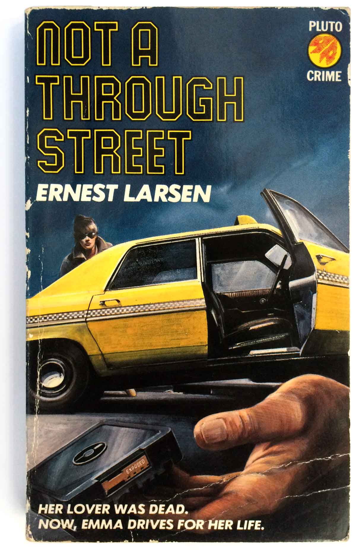
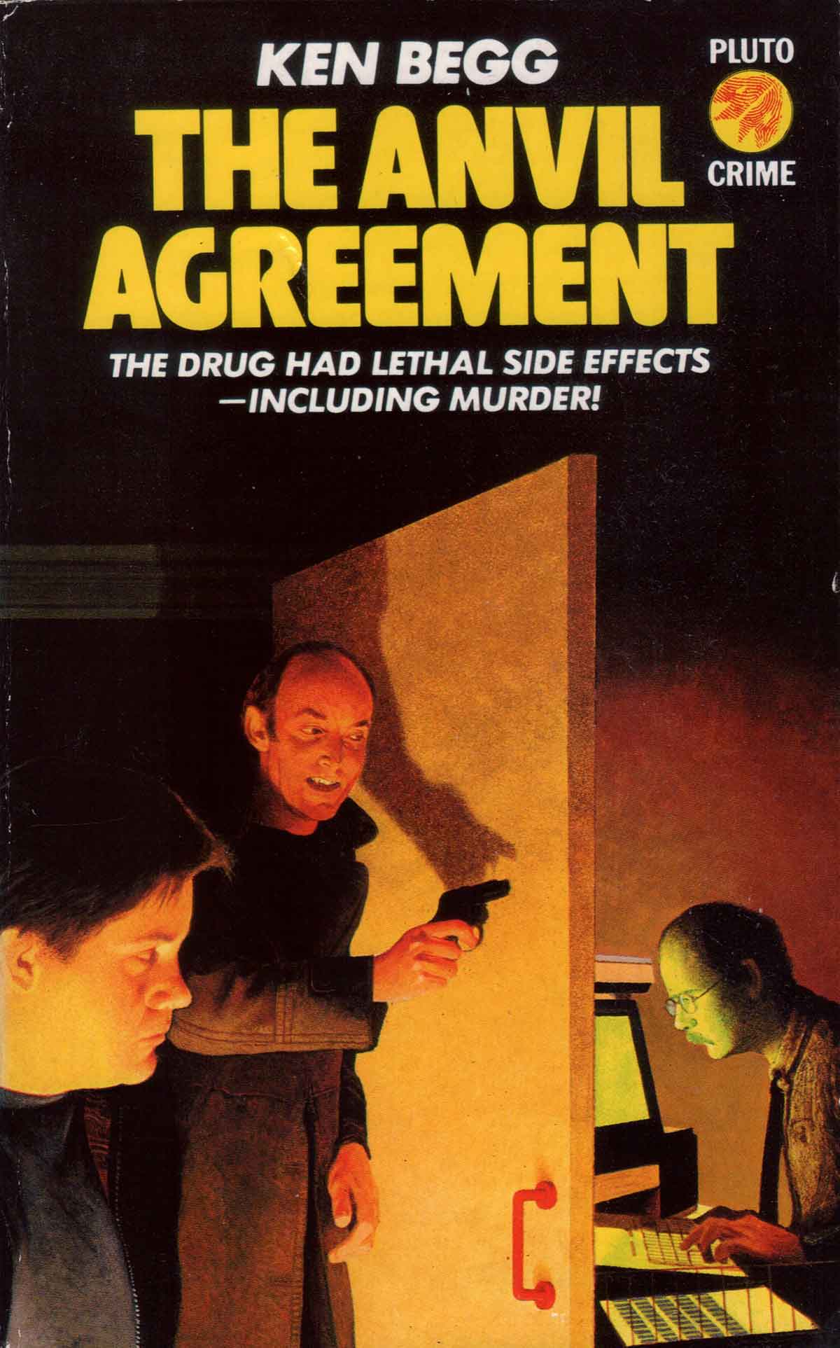
The same diversity holds for the illustrations, where some are really sharp—Strange Inheritance and Broken Codes are stand outs—while not so much for others. Frisco Blues and The Euro-Killers are just too awkward to be compelling, while Exterminating Angels and Not a Through Street have the opposite problem, with overly intense and foreshortened imagery that leaves little to the imagination. The cover of Operation Emerald is just straight-up ugly, and the Anvil Agreement is creepy and strange, which works for a crime novel. None of this says much about the books’ content, as Exterminating Angels is a great read, even if I could do without the cover. I much prefer the cover to The Waste Remains (way up top here), but didn’t love the book.
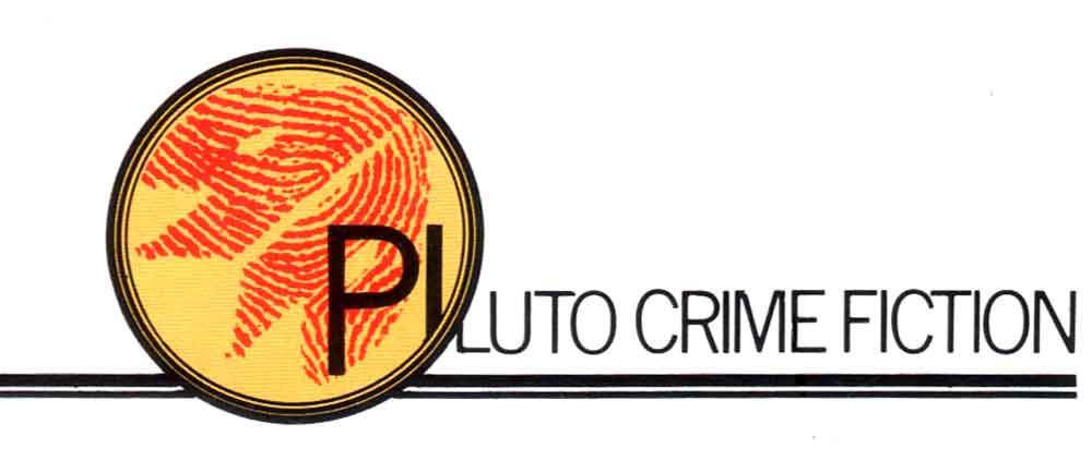
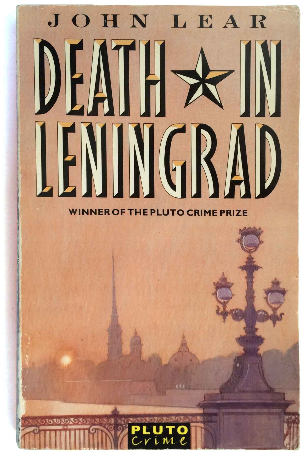
Regardless of typography and illustration style, most of the covers from this period have a dense, even claustrophobic feel, like too much is being crammed into the visual field. John Lear’s Death in Leningrad is the anomaly, with an airy watercolor illustrated cover, bold typography, and a move to a new, more “sophisticated” series logo for “Pluto Crime” (which carried on for the rest of the series through 1987).
In 1987 Pluto released the final three books. I haven’t been able to find any record of why the crime novels were dropped—maybe sales, loss of editorship, etc. Publishing history isn’t exactly the most popular topic online (or off), so there’s far from an easy source to turn to to track down these histories. As always, if anyone out there knows more about any of the books, designers, and publishers I discuss here on Judging Books by Their Covers, leave a comment and let me know!
Bibliography of the Pluto Crime Series (1984—87):