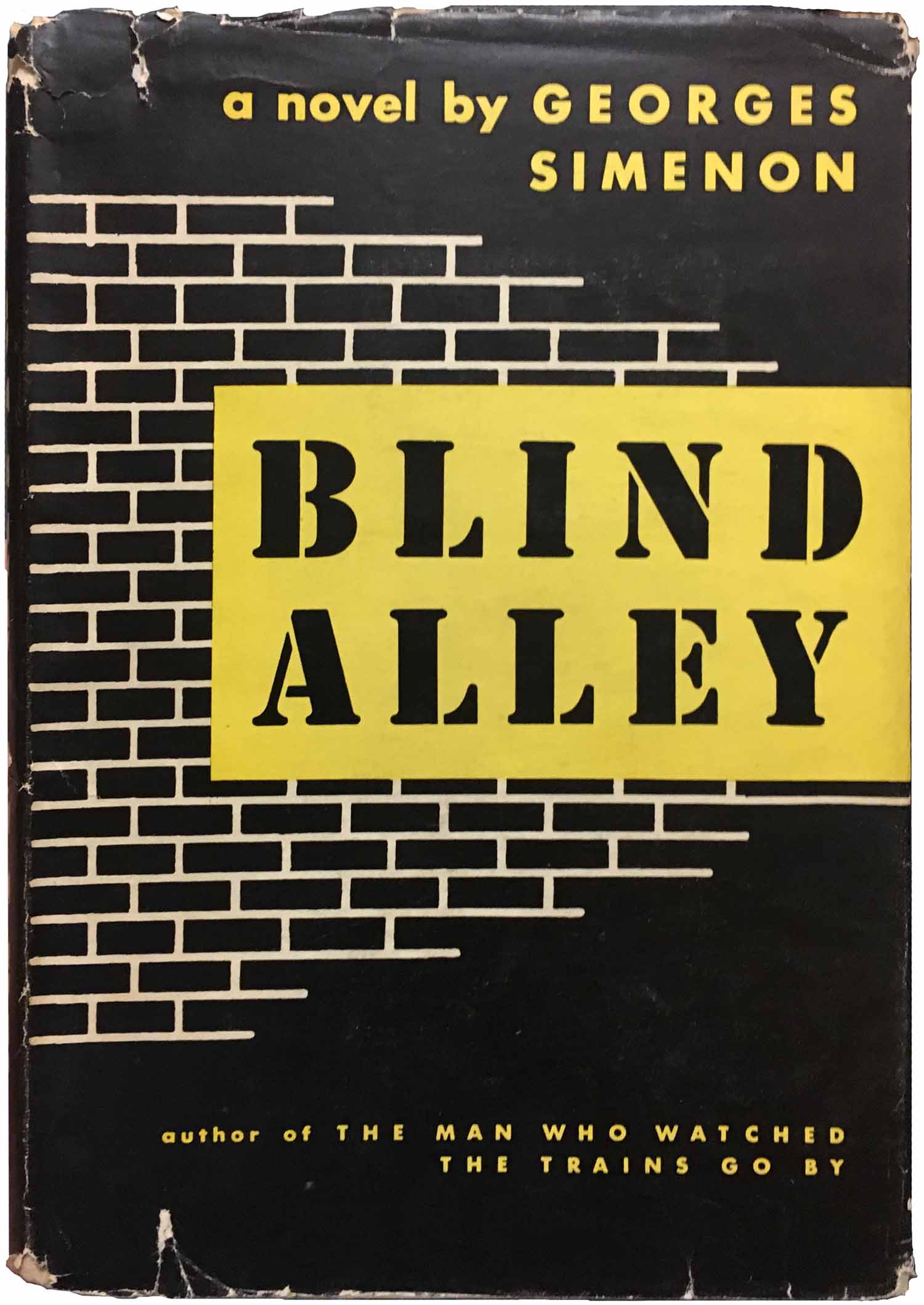
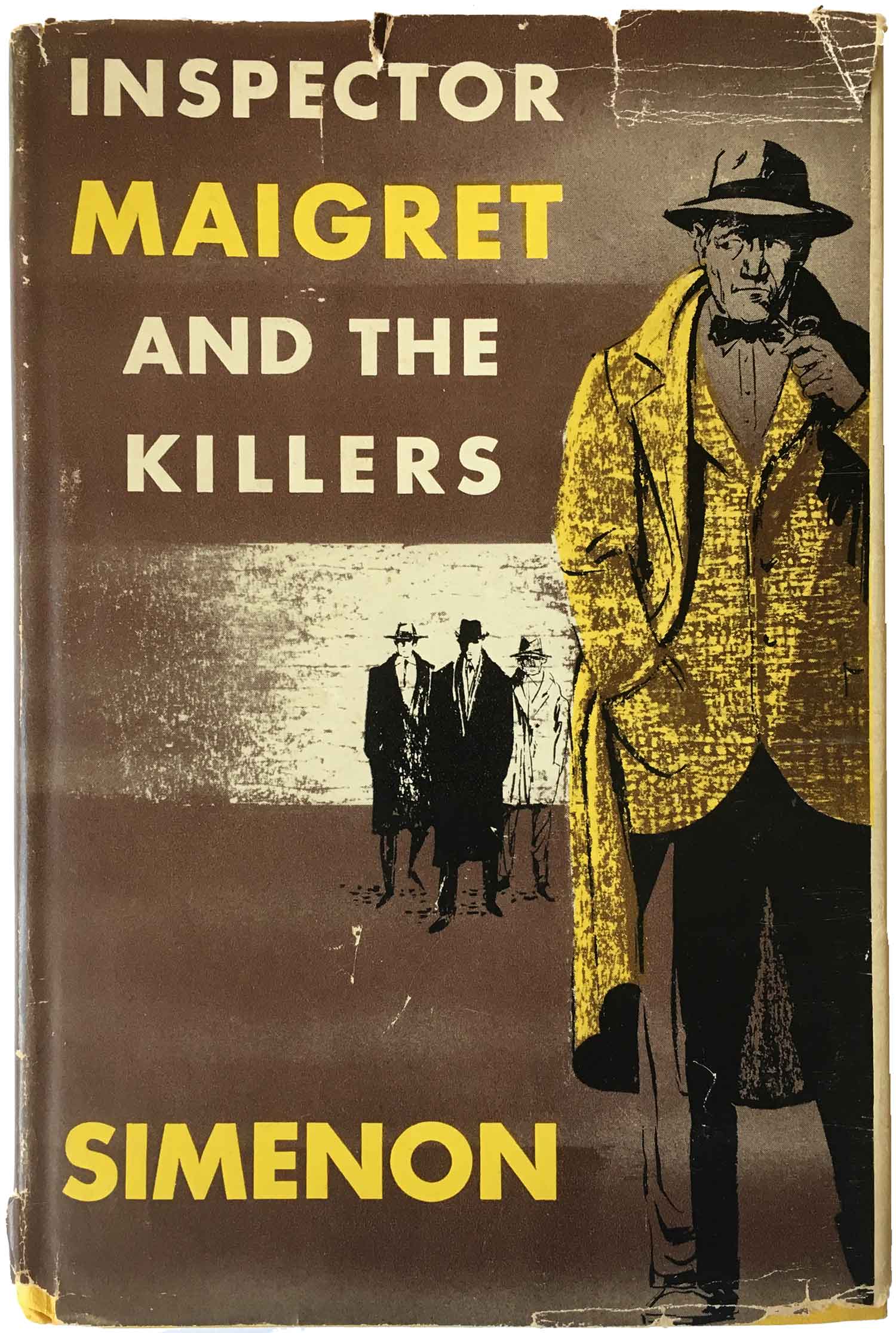
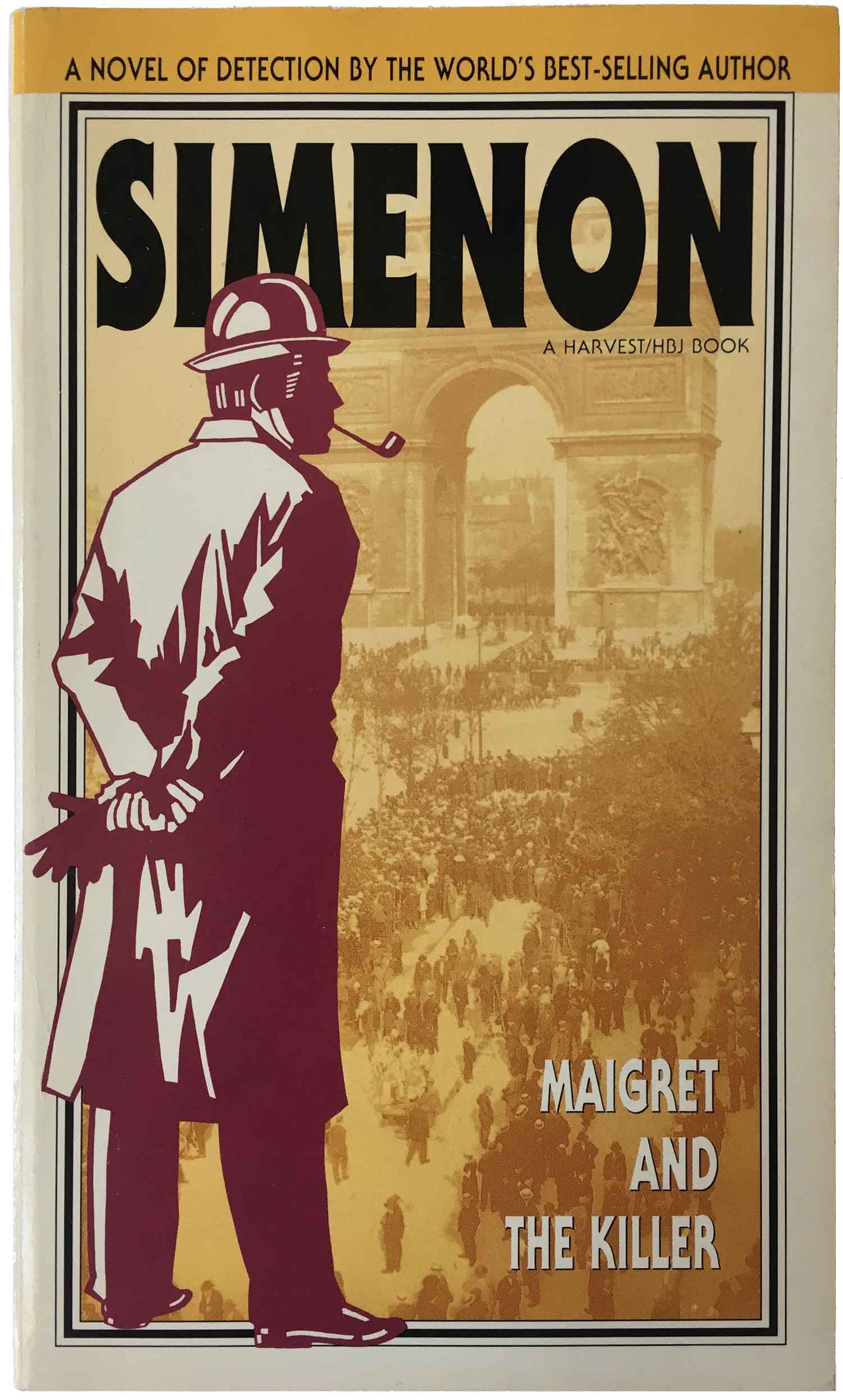
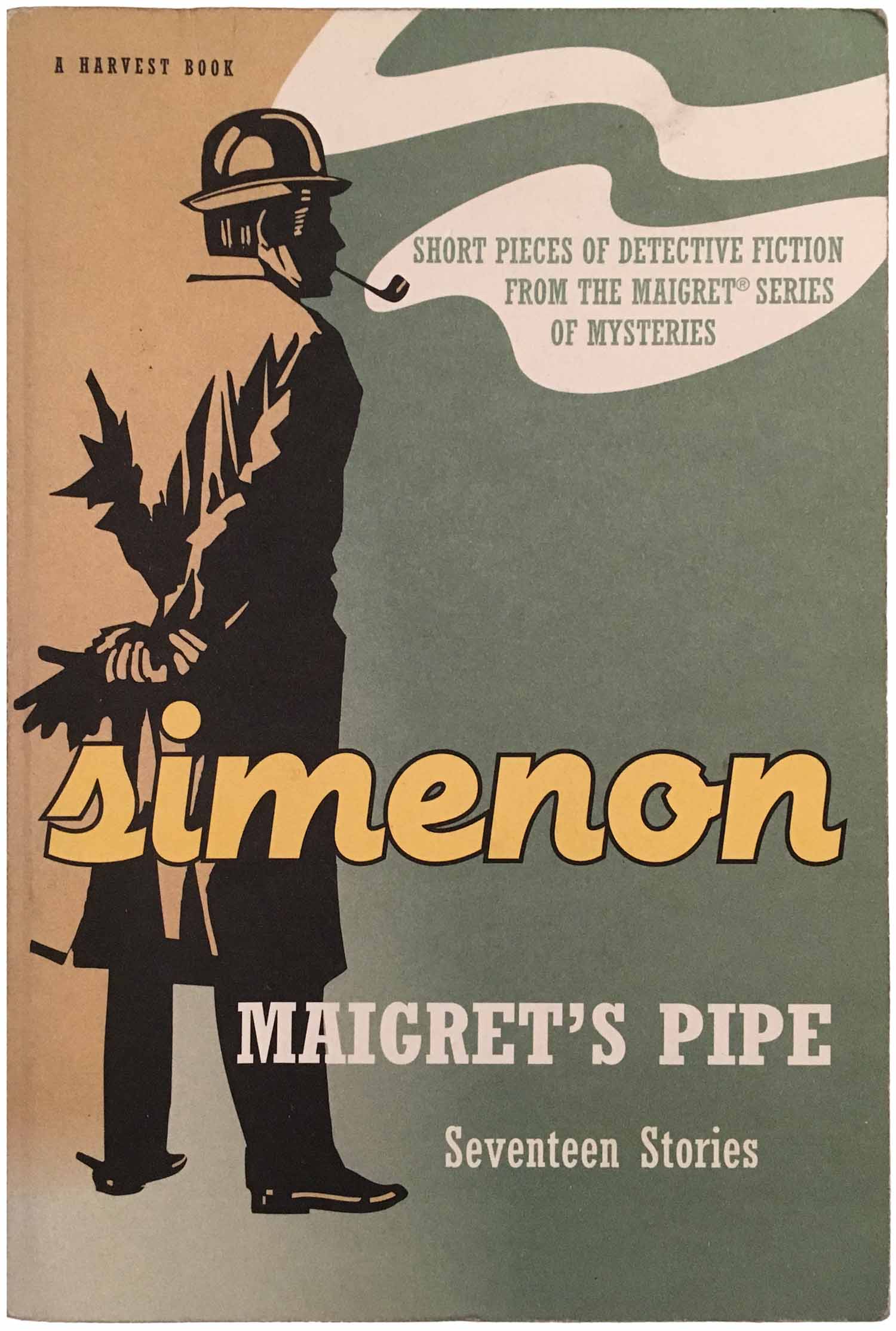
This week is the final installment of covers of novels by the extremely prolific Belgian author Georges Simenon. When it comes to Simenon hardbacks, I’m partial to the 60s/70s HBJ editions I featured a couple posts back (245: Simenon, part 1). But there are a ton of others out there. Blind Alley is one of the earliest English editions I’ve seen, from 1946. It’s got a nice classic simplicity too—black cover, brick wall, stencil signage titling—which is definitely of a period, but also has a certain timeless quality. It almost reads as a 1940s example of how one would design a successful book cover. The above edition of Inspector Maigret and the Killers was only published eight years later, but it is so much less compelling. The illustration feels trapped in the ’50s, the color scheme is completely unattractive. While some design sensibilities transcend historical context (or at least come close), others are completely trapped in their moment. Maybe this is what was expected for the cover of a crime novel in the ’50s? Dapper detective, shady criminals lurking in the background, musty color combinations. Also notice the pipe, one of the main consistent elements Simenon attributes to his main character, Maigret. While the pipe played a small role on the HBJ covers from week 245 (featured on 2 of 13 covers) and barely one on the Penguins from last week [246] (3 of 28 covers), it’s in almost half of the covers this week (10 of 22). In general it seems like a shortcut, an easy way for a designer to reference Maigret without having to do any heavy lifting.
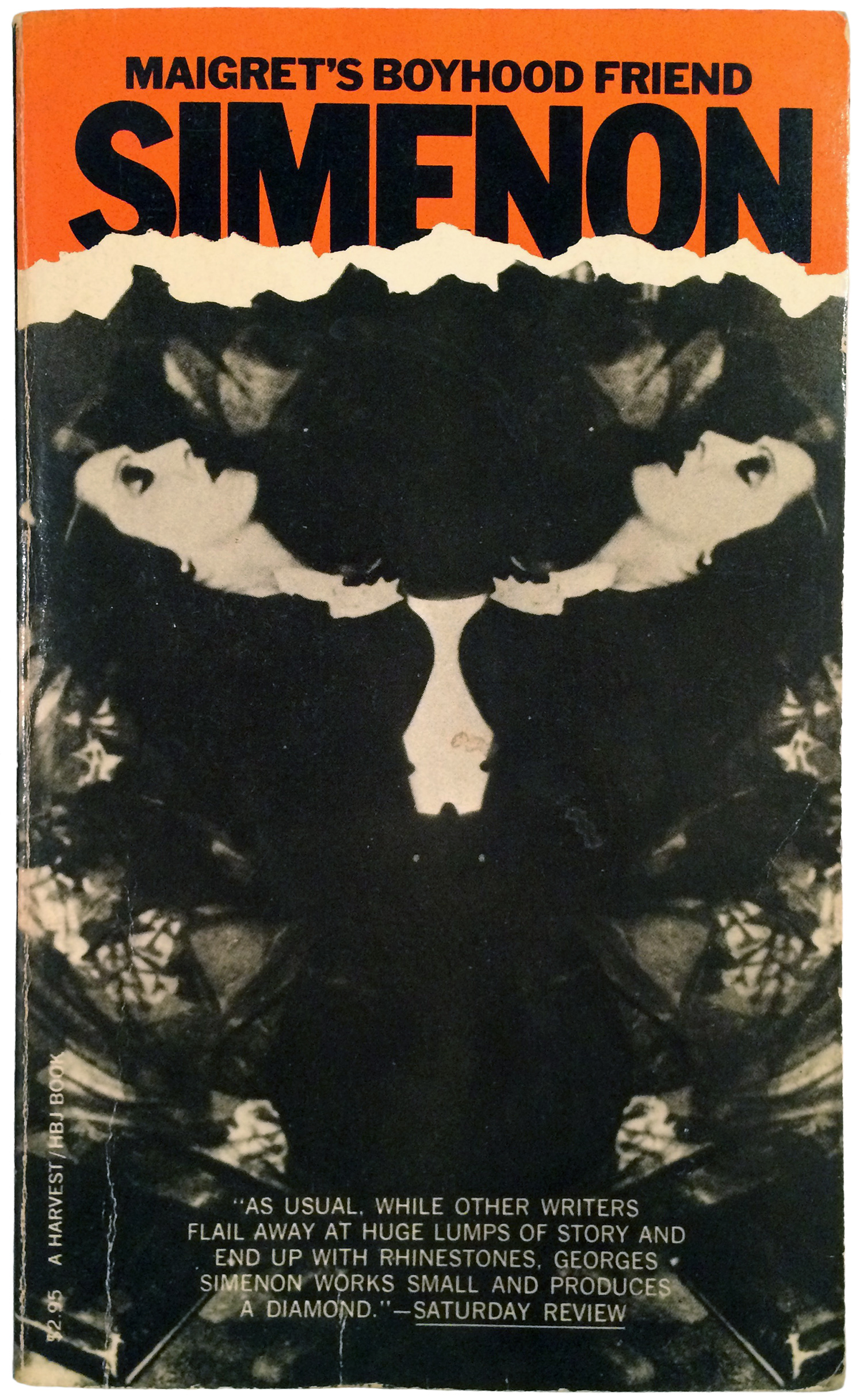
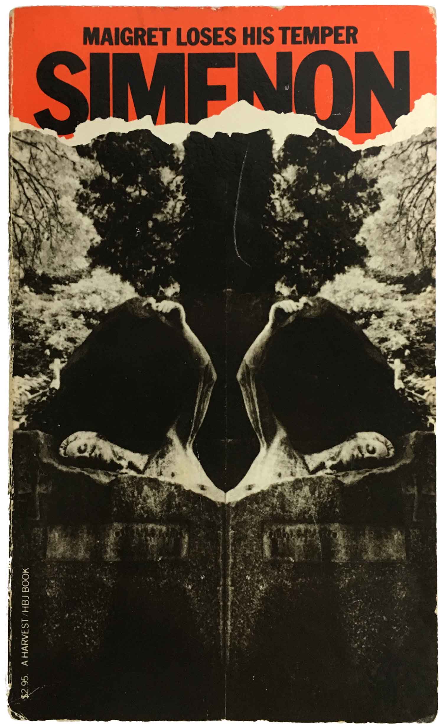
While I already looked at the HBJ hardbacks, Harcourt were also the primary purveyor of English-language Simenon in paperback from the 80s through the early 2000s. In about twenty years they ran through at least five different series designs. In the early 80s they launched (both books below) what I feel are the most successful in terms of capturing the atmosphere of the books, but I can guess they might have been less of a hit when it came to actually selling books. The montages and mirror refraction make for super spooky designs, the cover imagery would be dark enough, but the split design gives the sense that the books have been cracked down the middle of their rib cage. Each cover is extremely unique, but the darkness is so overwhelming that it’s easy to see how the might have blurred together for a lot of readers. I find the slab sans serif titles at the top also extremely effective, with Simenon’s name sinking into the mire of the design. These are also the covers that best capture the same feel as the early Penguin greens, so moody and intense.
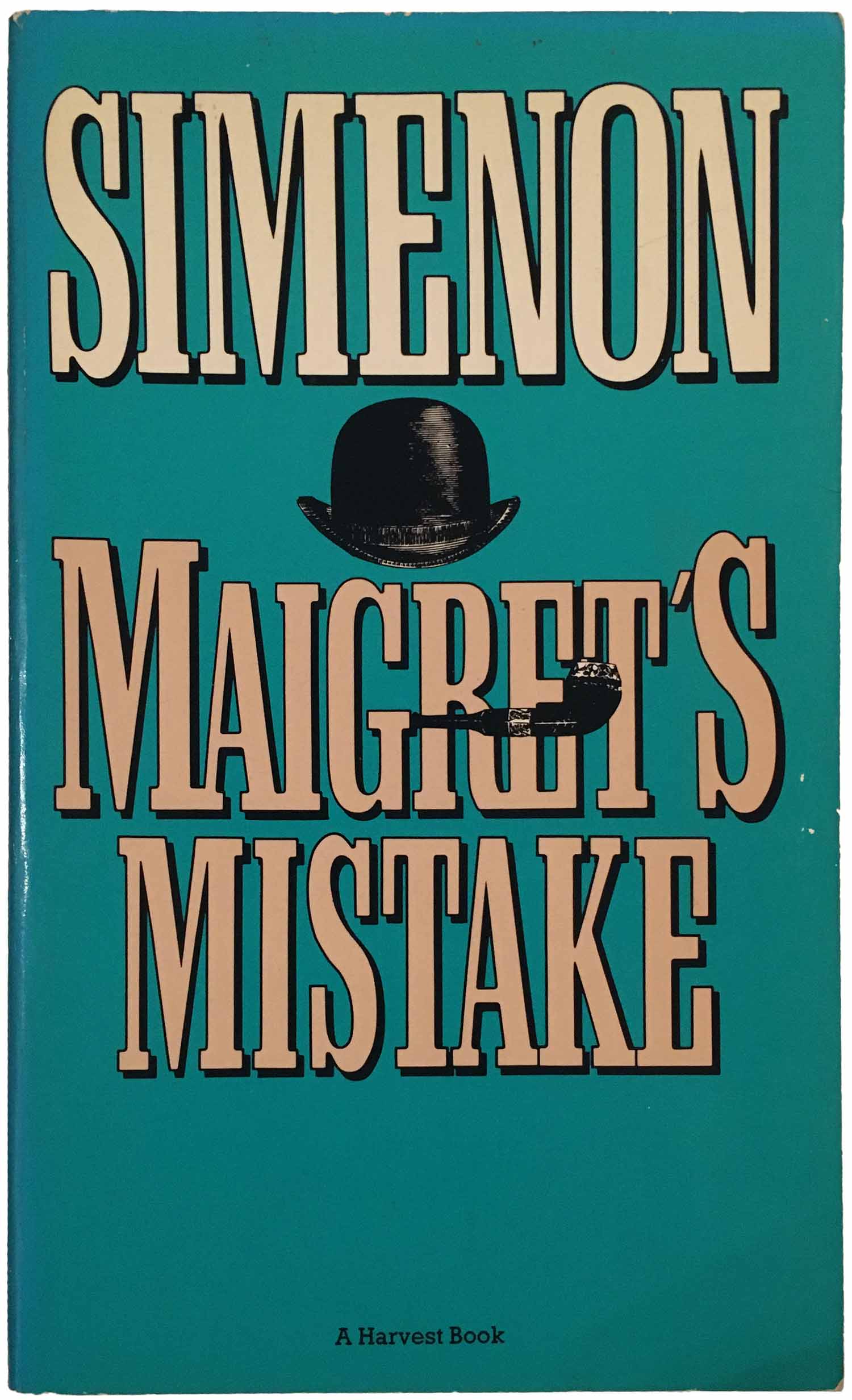
In the 1990s, the mass market editions went through a couple facelifts. Both seem intended to angle for more popularity. The first one consisted of an ever evolving set of color backdrops for the same basic design, as seen below on Maigret’s Mistake. While I don’t love the design, the disembodied cap and pipe do a decent job of capturing the playful visual puns so prominent in the earlier HBJ hardbacks. It’s also very difficult to not read it as a nod to surrealism, and a play on the names Maigret and René Magritte (“Ceci n’est pas une pipe”).
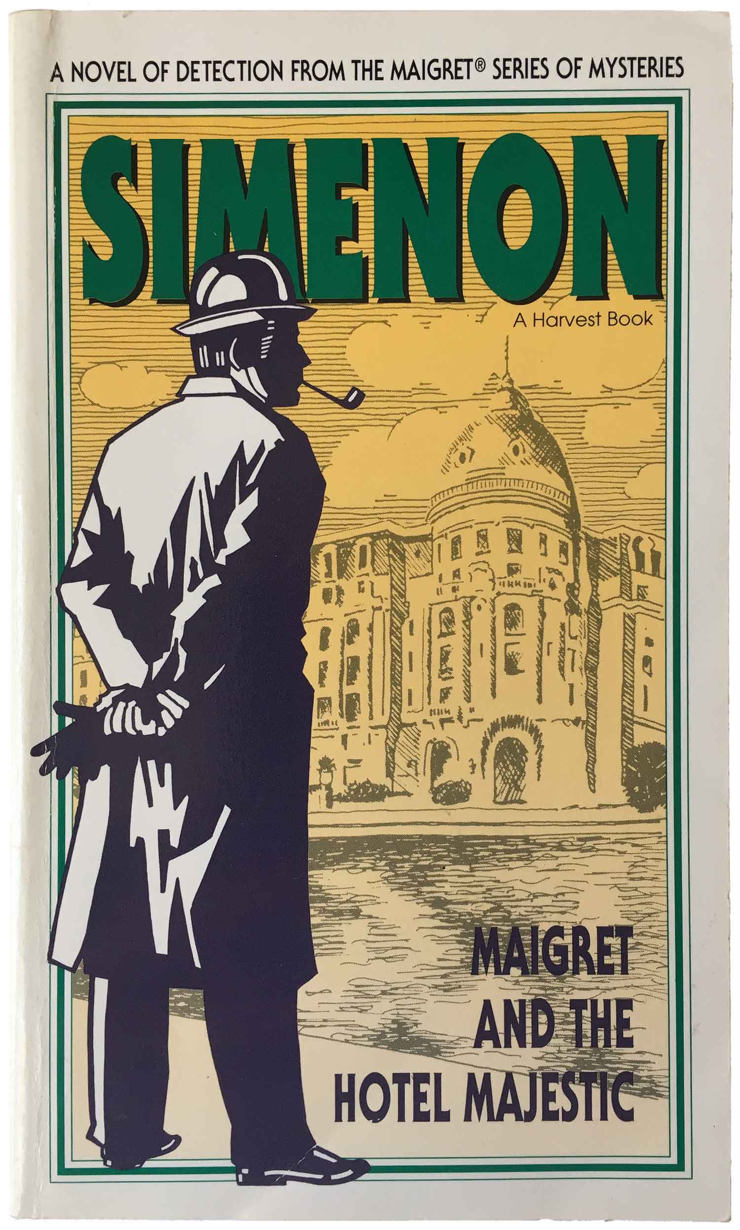
While that design was passable, the next iteration is downright dull. First, the background has been converted to white, lightening the mood considerably. Then a static frame, author name, and even more static rendition of Maigret take up over half the cover real estate. The design differences in each title are made up by variations in the color of Simenon’s name and the Maigret figure, and then unique background graphics, most of which consists of location imagery. I believe the series design started with this graphic being rendered as a drawing, and then eventually moved to using mono-toned photographs. While the design overwhelmingly conveys that this is a series, it does little else.
Those are mass markets, come the late 1990s and early 2000s HBJ jumped to the more popular trade paperback editions. Unfortunately these designs contain no leaps of improvement on the last design. The initial series used the same Maigret figure and completely did away with other imagery, and replaced it which airbrush-style color fields and a snazzy new bold cursive title. This actually works much better, but is still fairly dull. The next iteration takes on a much more direct film noir vibe. Maigret is moved to an inset, and the cover imagery is rendered in smoke and shadows. The typography has a strong Deco feel. Overall this is arguably much better, but it still leaves me feeling pretty flat.

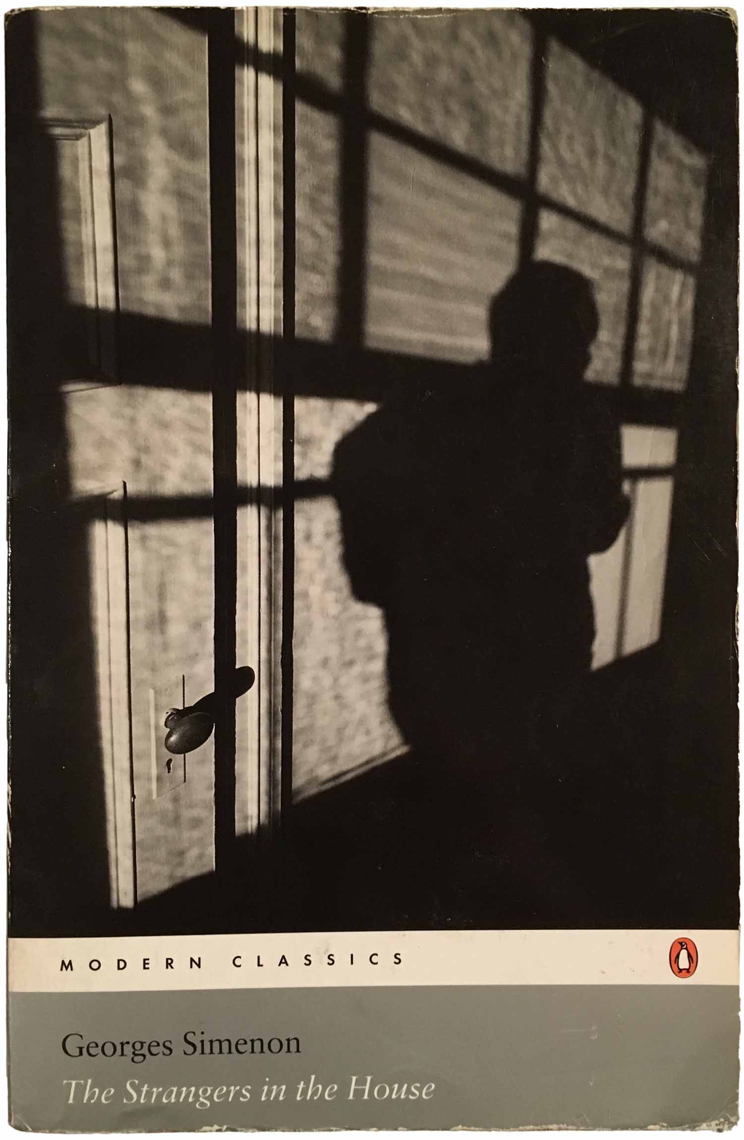
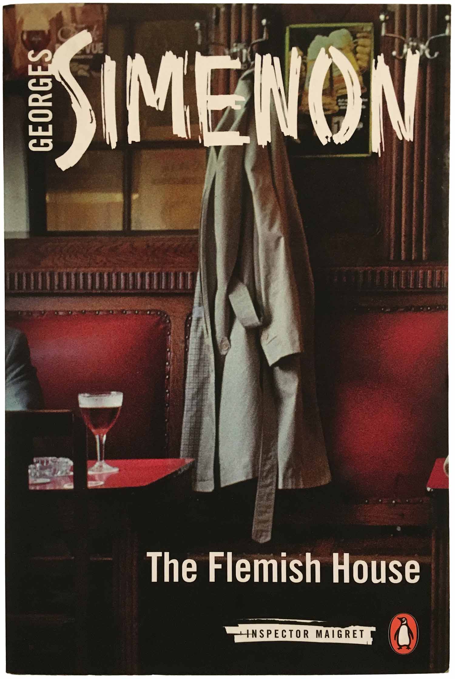
As I mentioned when I first started this Simenon series, he’s had a huge comeback in the publishing world, with major new series editions of his work put out by both Penguin and New York Review of Books. Penguin had kept a number of non-Maigret titles in print since the 60s, moving some of them into it’s “Modern Classics” series. The Strangers in the House (2004) is a good example of this, with the silver grid used at the time and the photo an appropriately shadowed and oblique image. For their 2014–15 run of the entire Maigret collection, they created an entirely new design. I’m clearly partial to the Marber grid and green covers of the 60s, but even so, I find the new design almost entirely flat. Static still-lives are what passes for compelling cover photography, with white over-printed trade gothic titling and an Illustrator-rendered version of hand type for Simenon’s name. You would think when a publisher is going to re-issue dozens of novels in a series they would attempt an eye-catching, edgy design, but this feels like whatever life was once in it was squeezed out by all the different hands that had to touch it on its way from idea to printer.
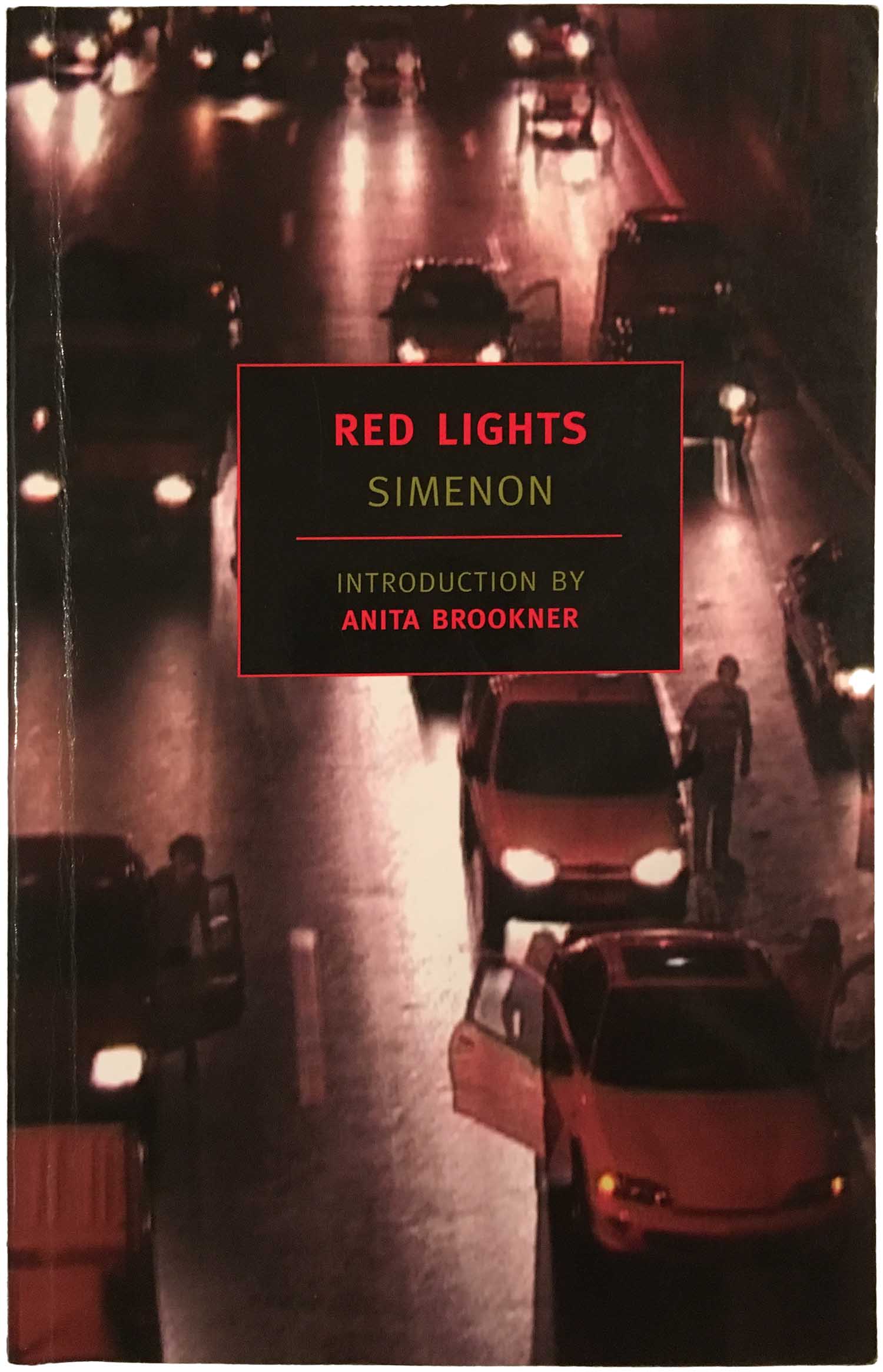
New York Review is known for their consistent, yet playful cover design, with evolving imagery (from famous photos to new illustrations to historic paintings) as backdrops to a central square that contains all the book’s title info. Yet their use of this design conceit for the Simenon titles really doesn’t do much. First off, they are all printed on gloss stock, rather than NYRB’s standard matte finish, which makes them feel cheap and throw-away. And then the photo choice doesn’t do much. As you can see below, the images are dark and ope to interpretation, but don’t really command the space they fill—and Red Lights is one of the best of the lot.
Thankfully I don’t have to end this on such a sour note! I’ve also been picking up international Simenon editions over the past couple years. Many I’ve actually found either on the street or in dollar bins, I don’t think I’ve spent more than $3 on any of them. So these are what we can get into next.
I know in the back of my mind that tens of thousands of book cover images are at my fingertips if I simply type the book’s title and author into a search engine. This is likely the very reason I almost never do that—it’s both too easy and destroys the joy of actually finding the books out in the wild, so to speak. For some reason this time around I decided to do it anyway, and quickly became a bit embarrassed by my limited collection. So many cool covers, so few of them on my shelves! But then again, like I said above, I think all ten of the covers below probably cost $10.
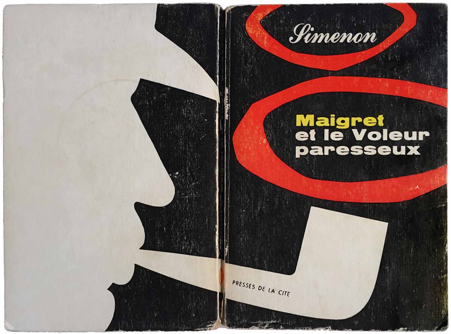
Simenon wrote in French, and there are thousands of different cover designs on his French editions. It seems like most of his books were published in paperback by Presses de la Cité, and then later by Livres de Poche and others. The early ’60s saw a series design based on Maigret’s pipe that actually doesn’t suck. Maigret’s silhouette fills the entire back cover, and then his pipe wraps around to the front. The author name and book title sit comfortably within a series of smoke rings rising from the pipe. It’s all so flat and simple, the positive and negative space pushing and pulling against each other, that it makes for a great design. Different books in this series edition are identical other than an evolving set of color combinations for each of the objects.
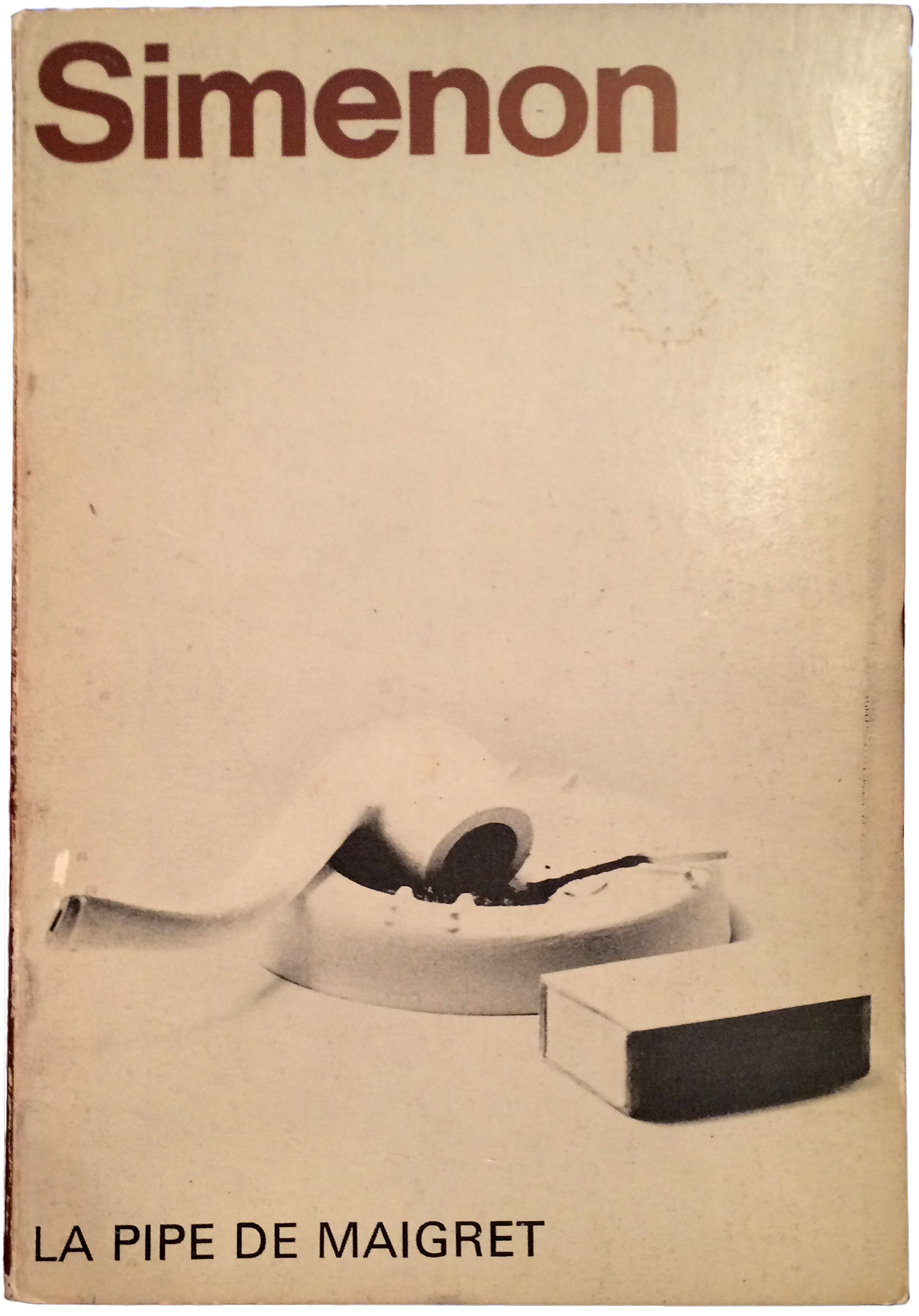
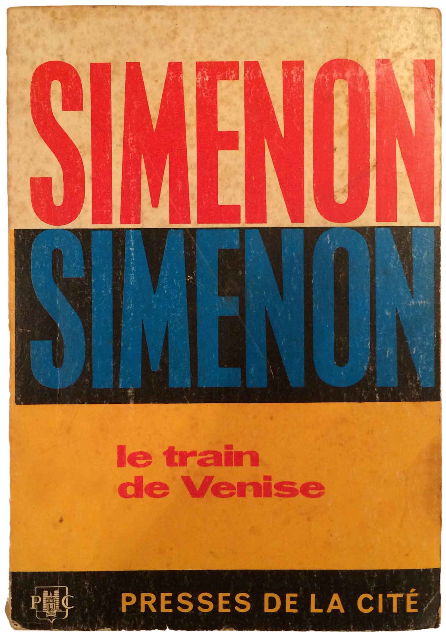
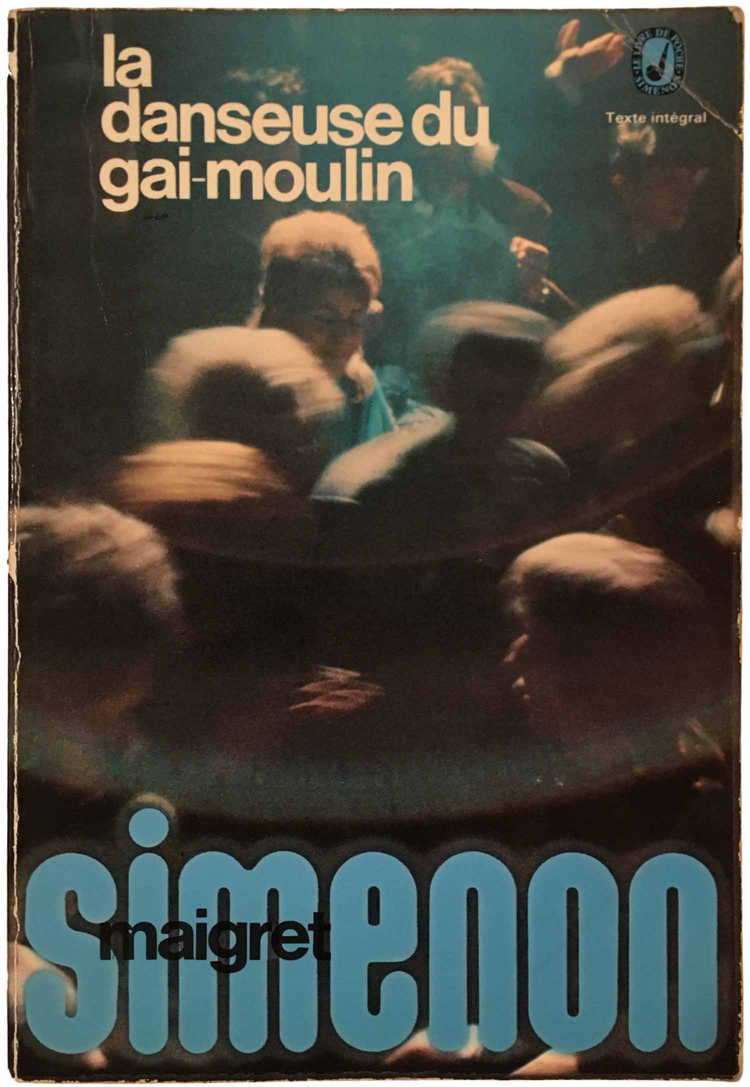
Two of the other 1960s designs I’ve found are also quite strong, although not the first one below. This is an interesting bird, a U.S. published French edition. The cover—a photograph of a white pipe and lighter on a white background—does absolutely nothing for me. Which I guess makes it a little intriguing. The covers in the center and right below are much more interesting. The double stacking of Simenon as both author and graphic works well, he’s so well known in France you really don’t need much more than his name to sell the books. And next to that is likely the most absorbing of the covers this week. While the “Simenon” typography is directly lifted from the cover next to it, the imagery is completely unique. It feels almost like a monoprint, simultaneously holding a strong sense of flatness, yet also a wide array of texture. The main body image is composed of cobblestones, clearly smashed on the road, and the background echoes the same pattern, but is rendered as washed out bricks. The texture feel completely authentic, as if the image was photographed directly off a wall—nothing like the faux texture so popular on contemporary book covers.

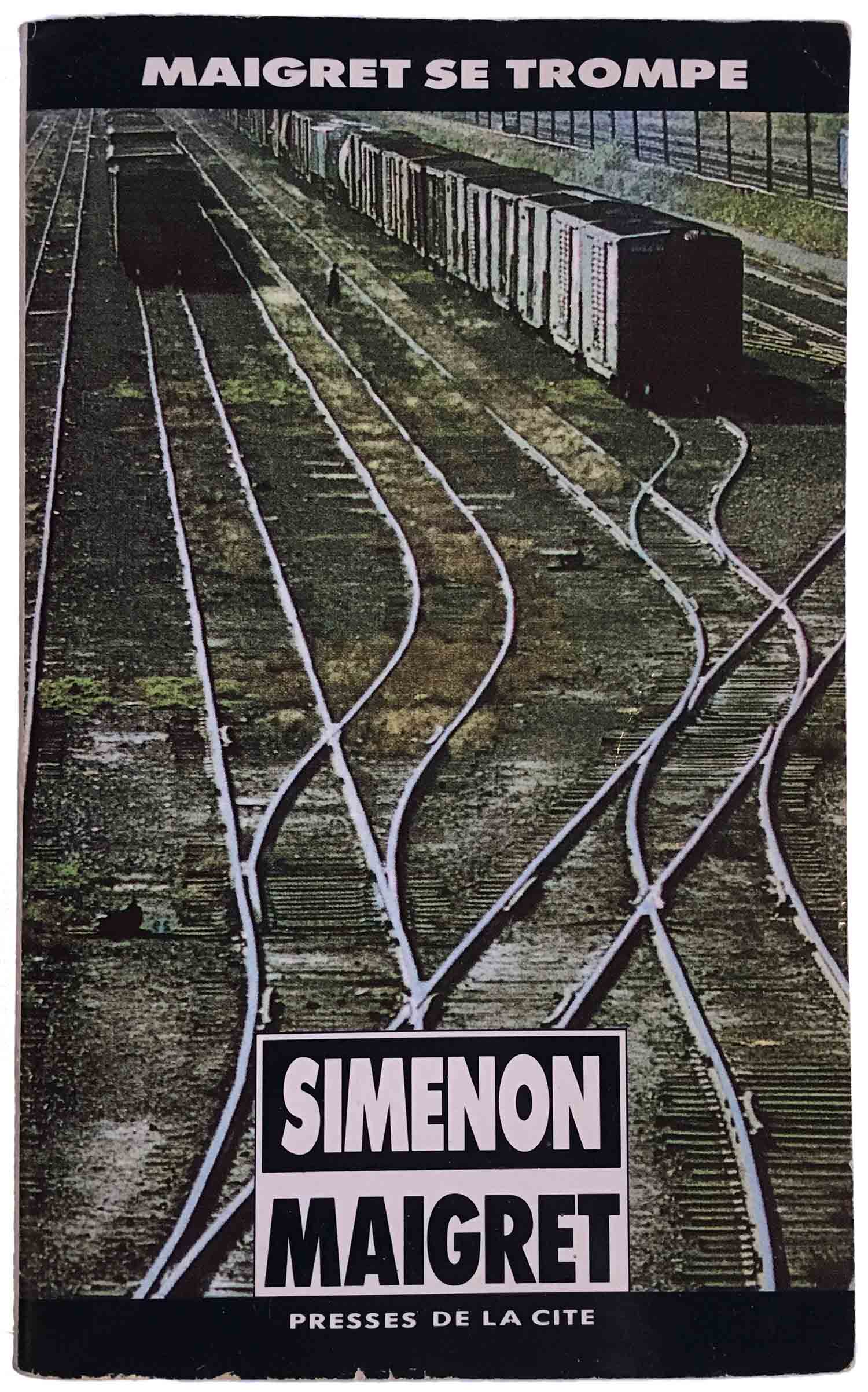
As with the English editions, the designs seem to get increasingly tired as time goes on. The 70s series from Livres de Poche has an almost disco feel, with glowing “Simenon” and debauched party scene—fundamentally not the context Maigret was written in. The Folio editions from the 80s are adorned with functional yet ugly watercolors. And then the 90s Presses de la Cité series defaults back to simple photographs within a strict design system—black bars at the top and bottom, black and white box for series title. Of all of these, this last one works best, but overall it just feels like the designers were calling it in from bed.

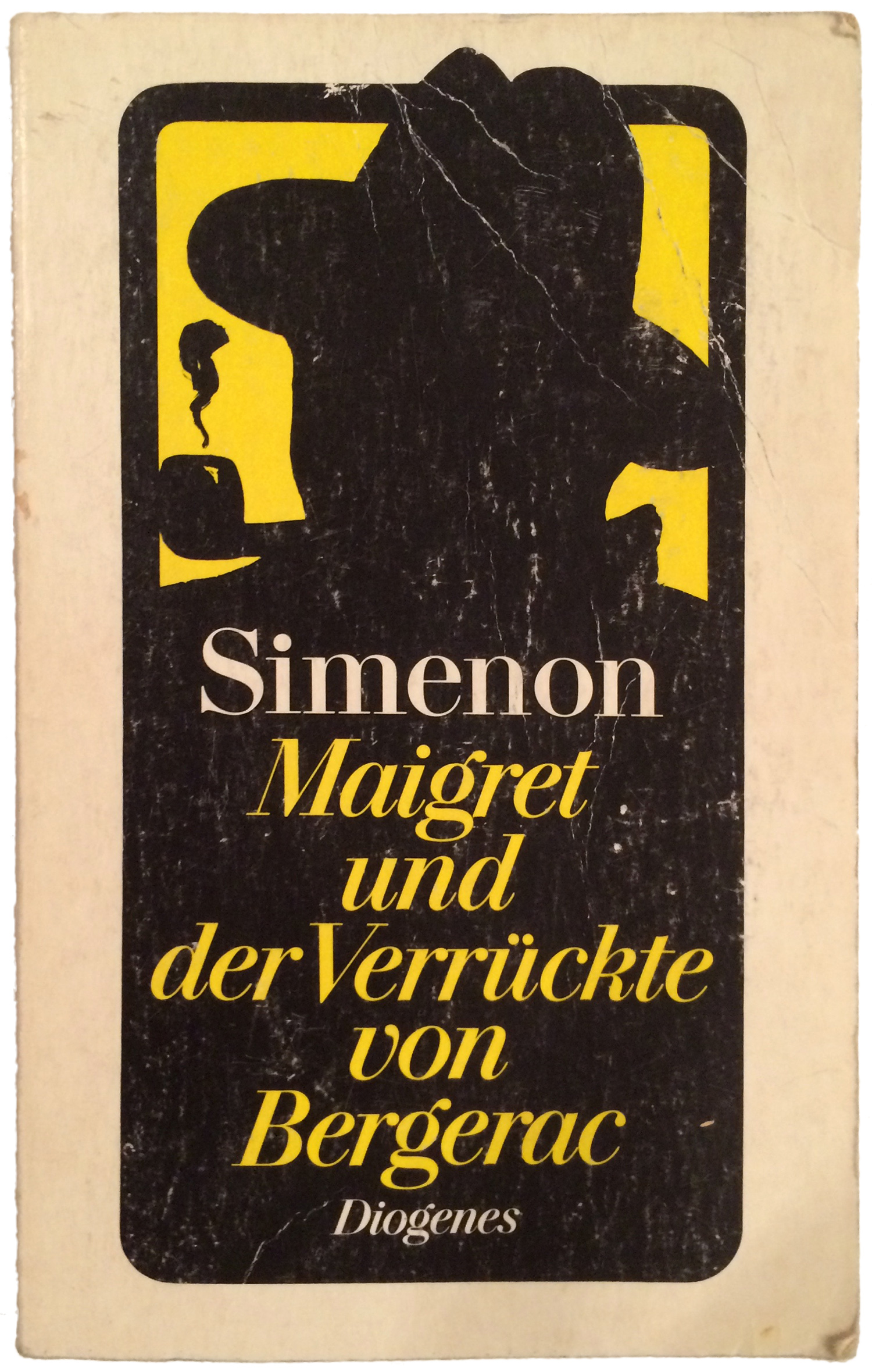
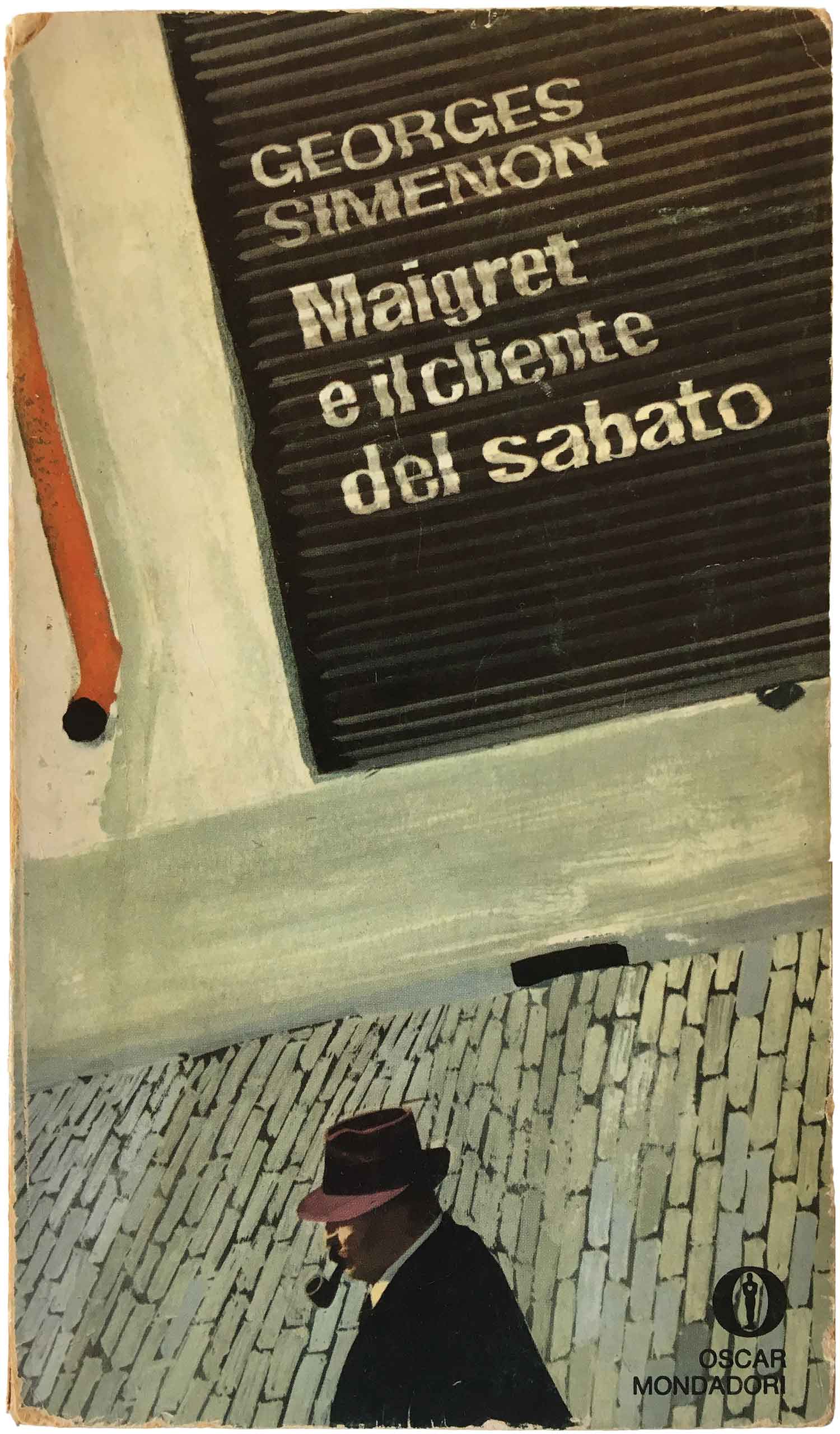
Things start to get interesting again when we leave France. While the Diogenes German editions lean heavily on the “Maigret with pipe” trope, there’s still something a little charming about it, maybe the allowance of 80% of the cover to be rendered black. And the Italian edition next to it is one of my favorites of all of these covers. At first glance it just looks like another landscape photo (although oddly in mid-range, rather than a close-up or distance shot), but a closer look reveal it to be a relatively crudely painted scene. The illusion really works for me, and I love the hand-painted titling on the roll-down gate—between that and the cobblestones the cover absolutely captures a sense of a cramped street in an old European city. Maigret bumbling along at the bottom is a nice touch, like he was added as an after thought rather than the central element. This is just a really great cover, and a fabulous mix of fine art, illustration, and design techniques.
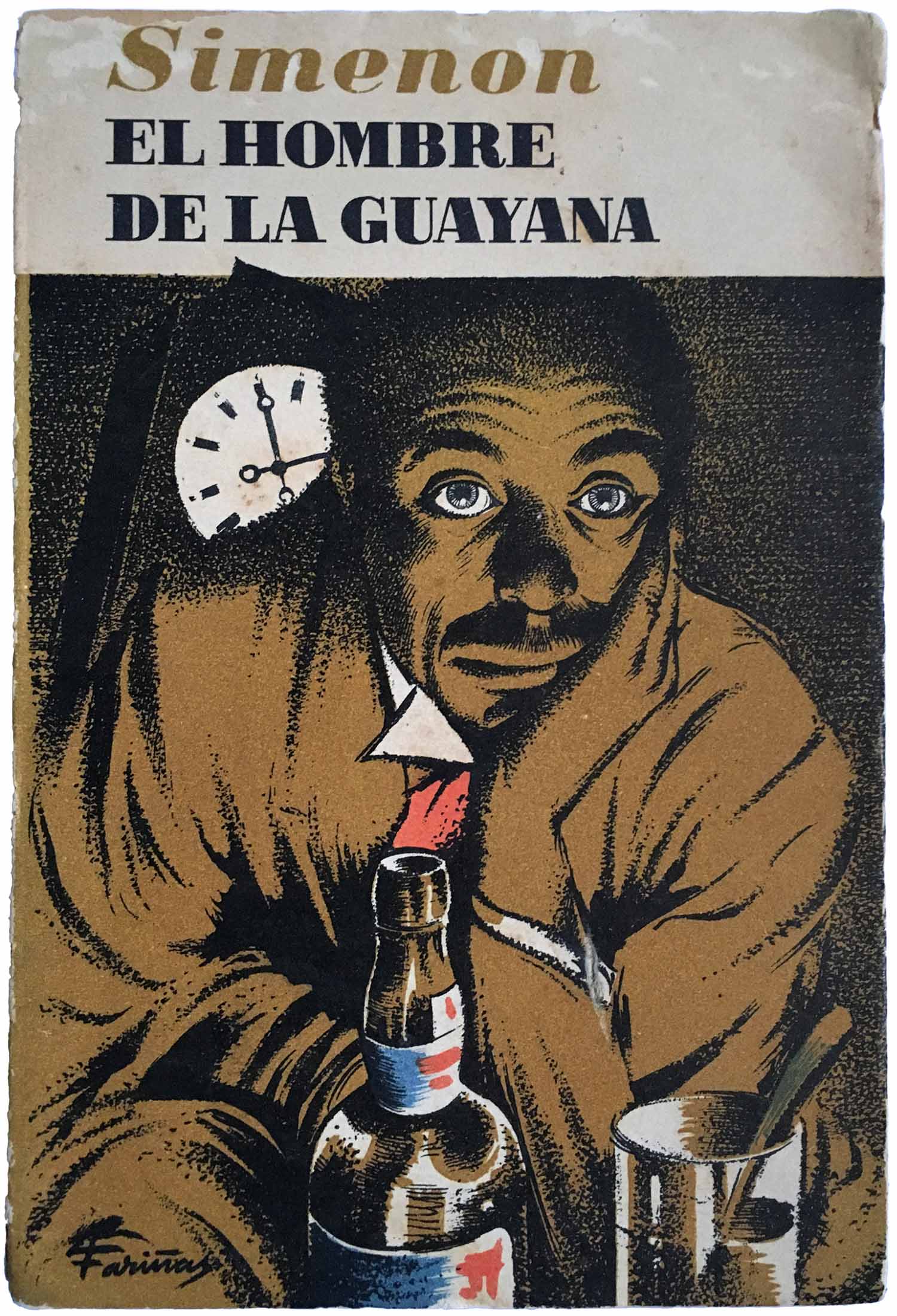
Finally I’ve got a great 1950s edition from Barcelona’s Editorial Albor. A darkened figure lazily looks out over a bottle of alcohol, his white eyes—and a clock face in the background—gleaming in the relative gloom. It’s rendered in the style of an old school lithograph—it actually might just be an old style lithograph!—with fabulous texture in the strokes of the image. And as a special bonus, the back cover is equally beautiful, an open book and rising sun—the publishers logo—set alone on a field of color.
I’m not sure what’s on deck next, but I hope to get another couple posts out in January, so keep an eye open for those.

Bibliography: