A couple months ago I stumbled onto twenty Dutch mass market paperbacks scattered across the $.50 and $1 racks at the Strand here in New York. Although I can’t read Dutch, the covers on some of them are phenomenal, and what’s the $10 total they cost me compared to the joy of getting to share them all with you?
I’m not going to pretend to know a lot about the Dutch publishing industry, but these covers appear to be an interesting bridge between the more abstract and austere covers of France or Italy mixed with the 60s image experimentation of Penguin in the UK. They run from 1955 to 1972, and are largely from three presses: Prisma Boeken, Elsevier Pockets, and Ooievaar. I’ll start with the Prisma books, as those are ones that first caught my eye on the rack, and then move to other presses.
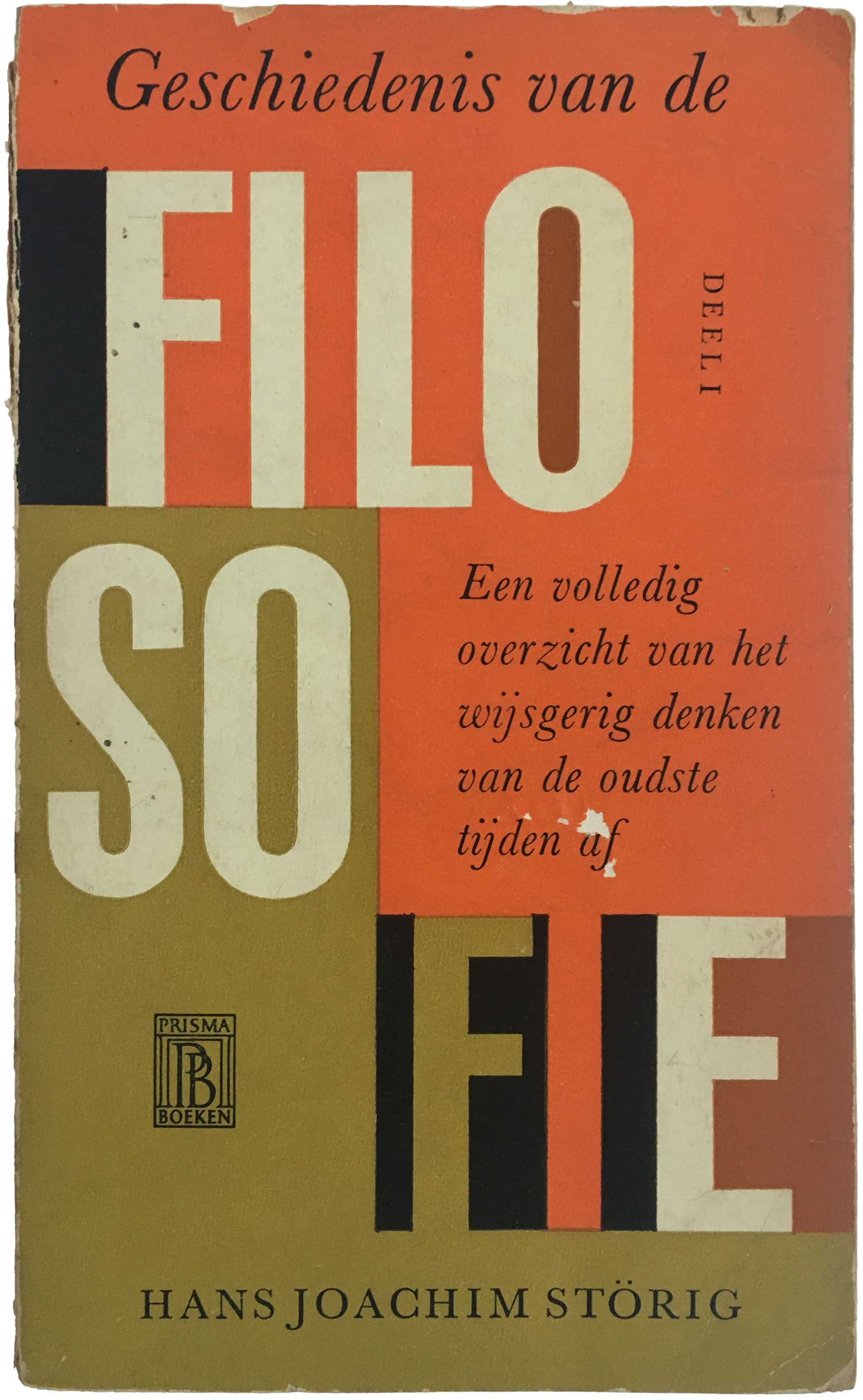
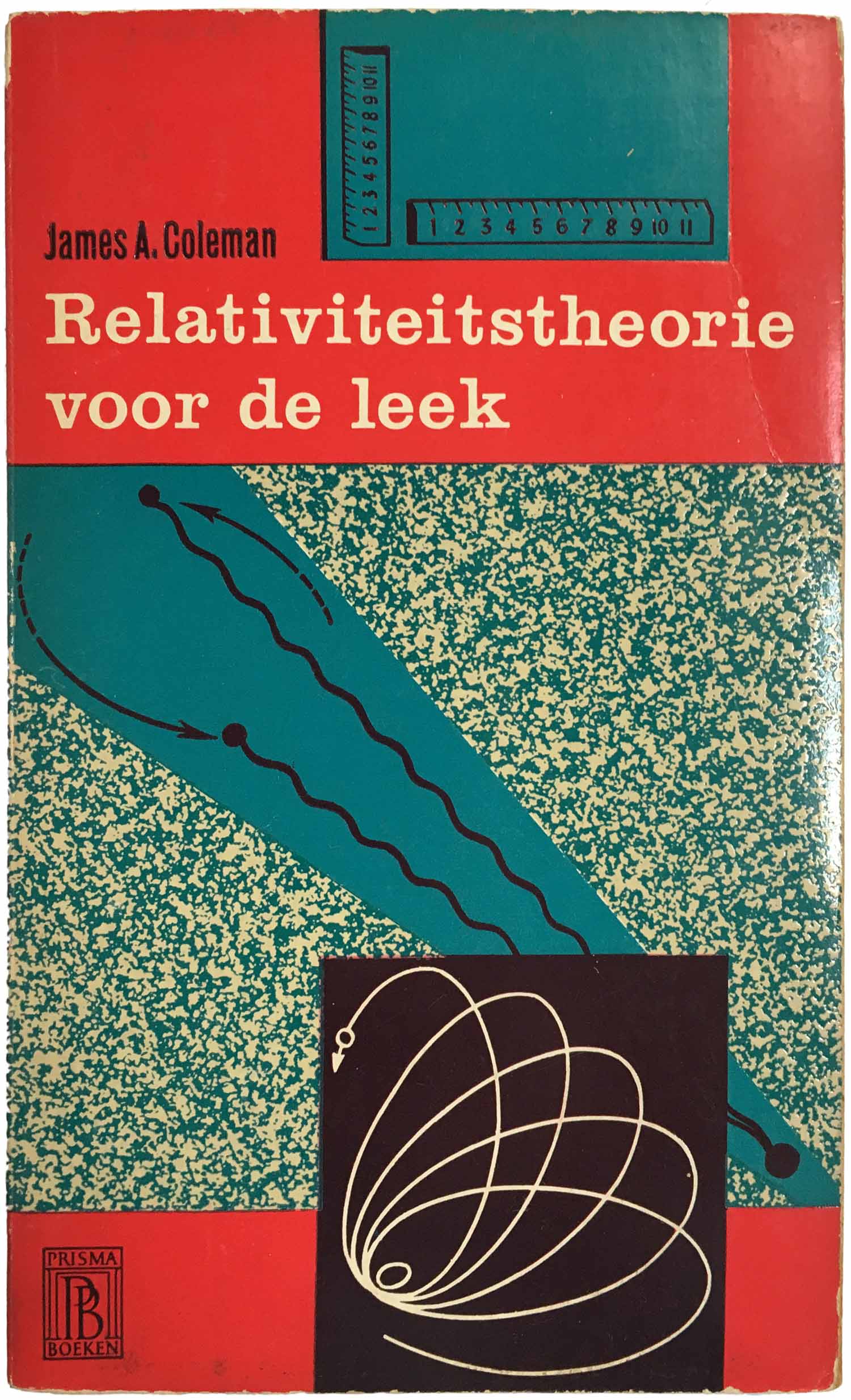
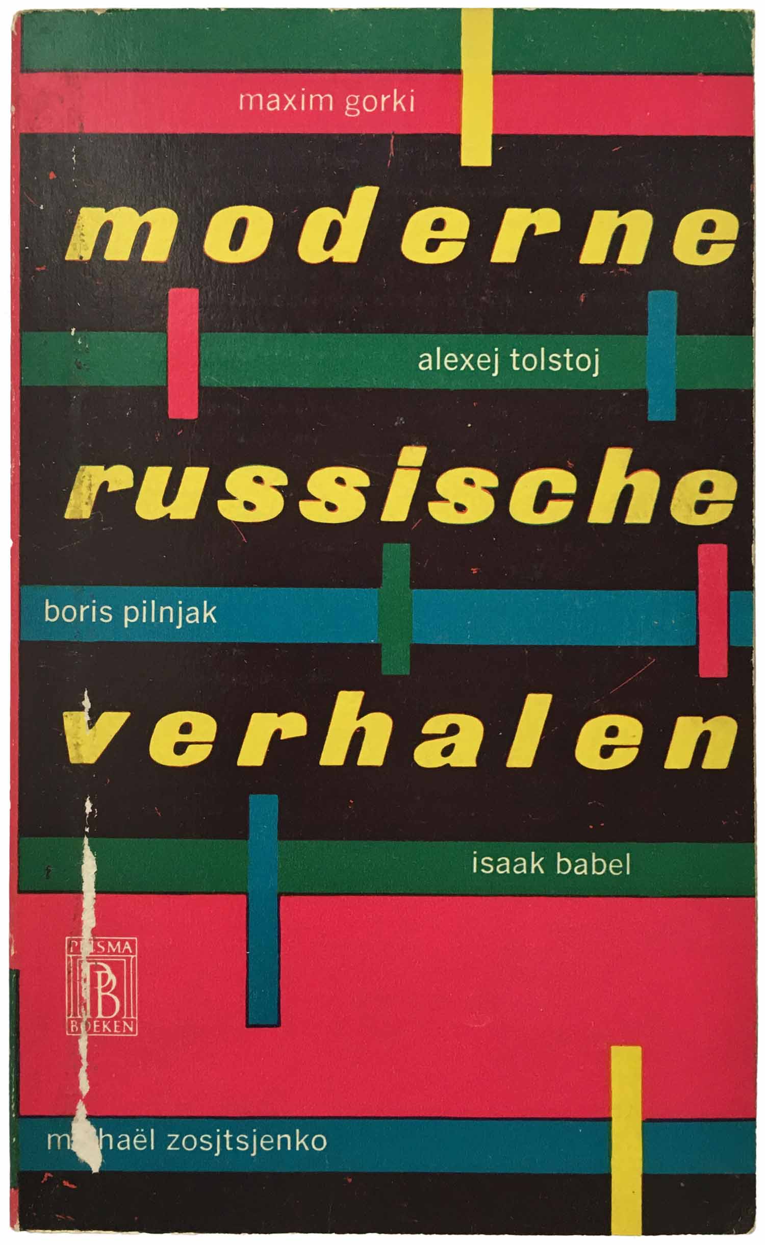
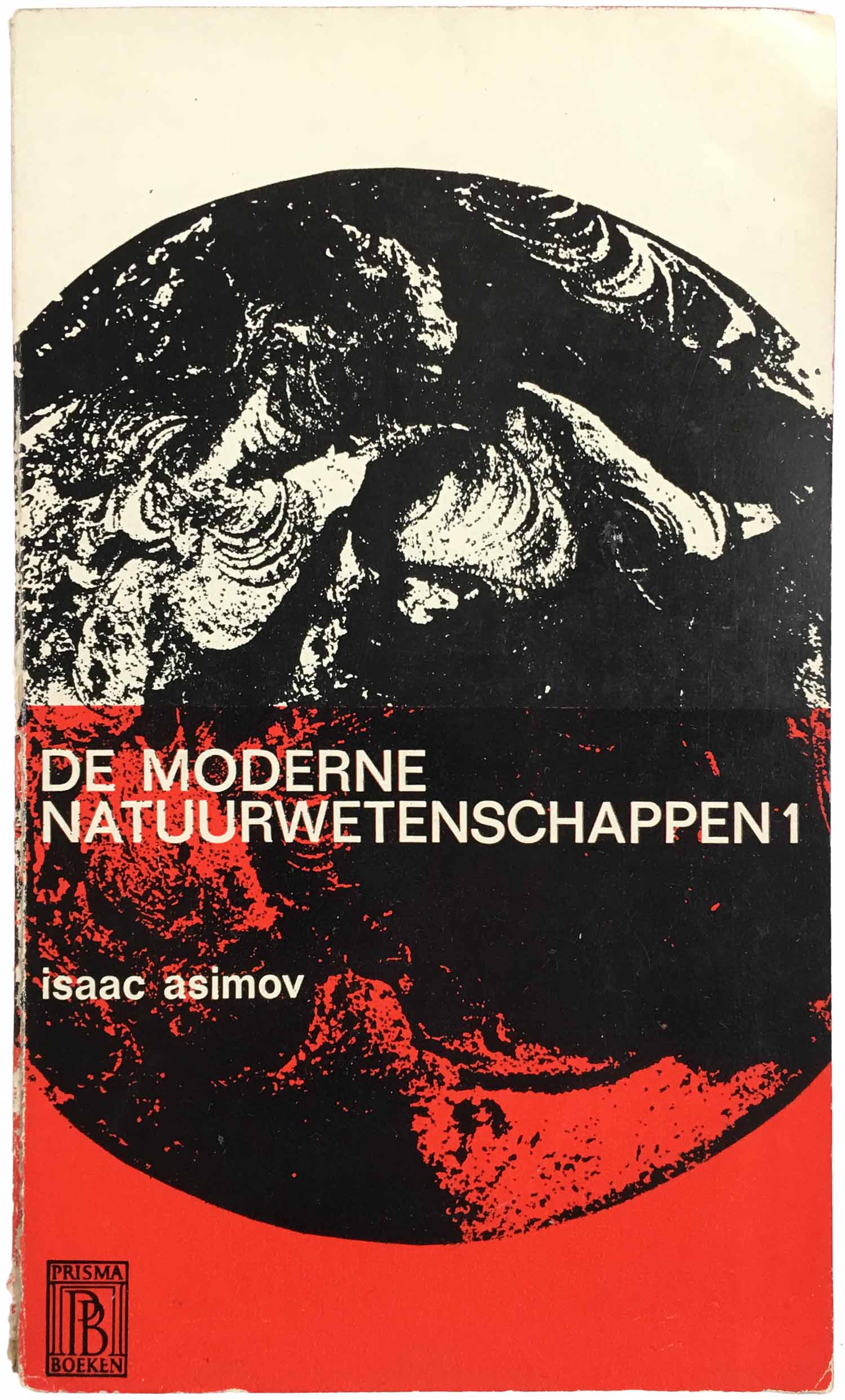
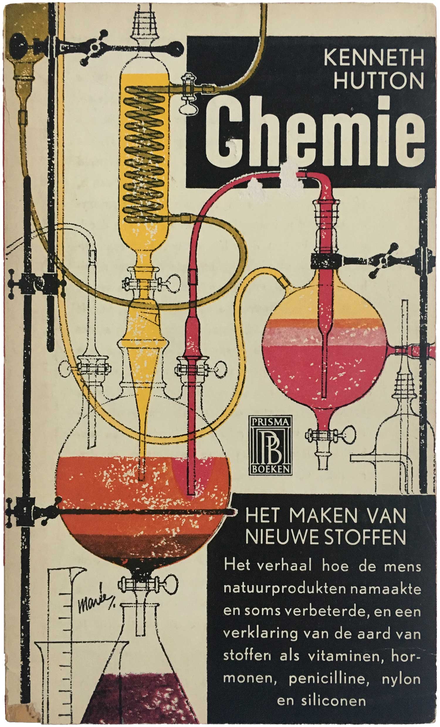
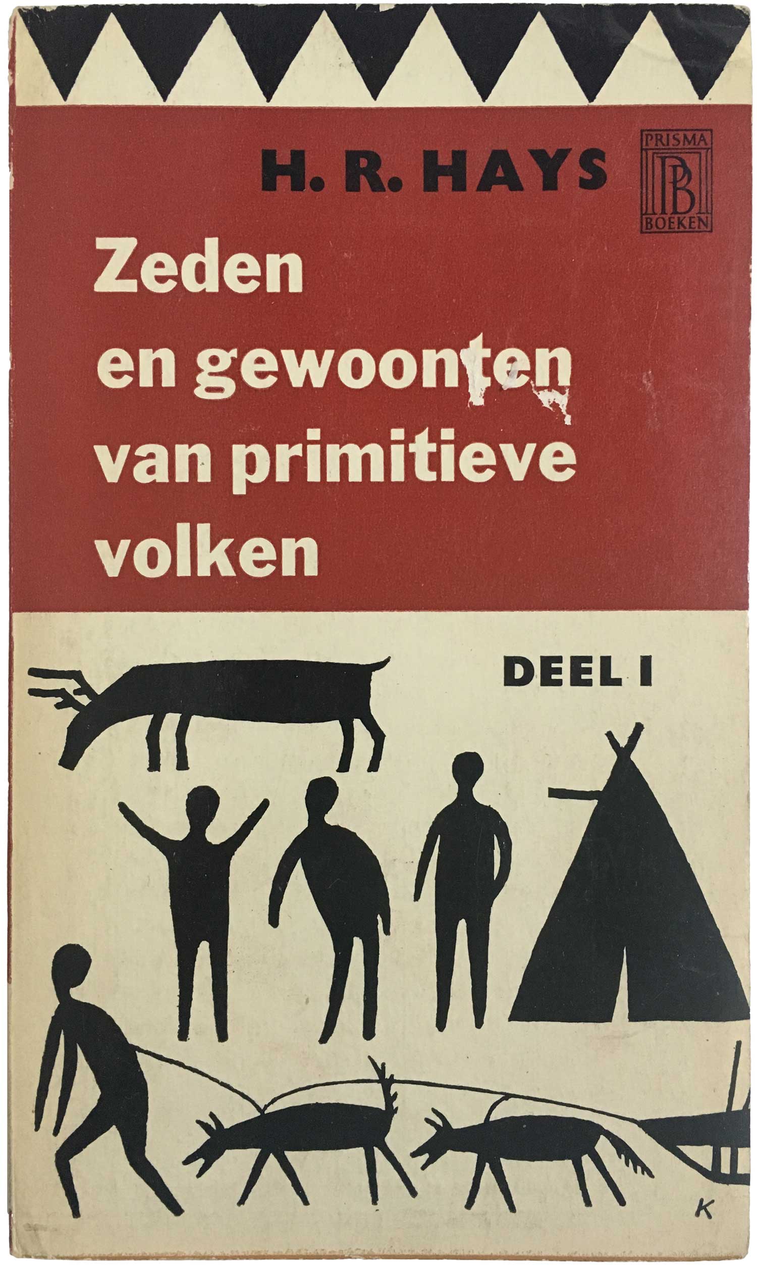
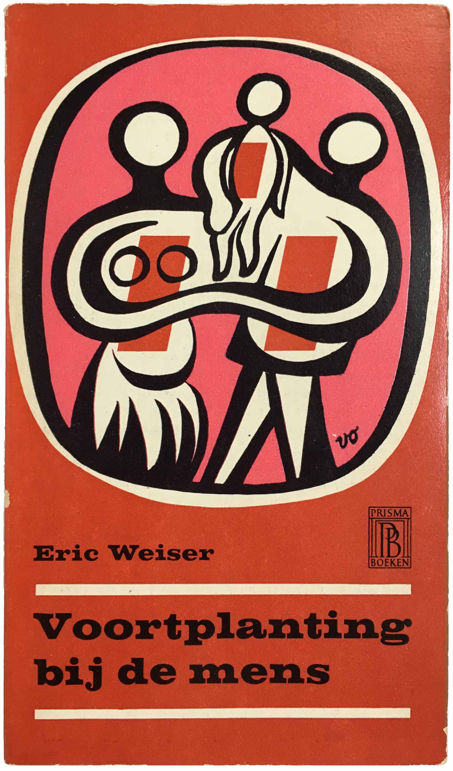
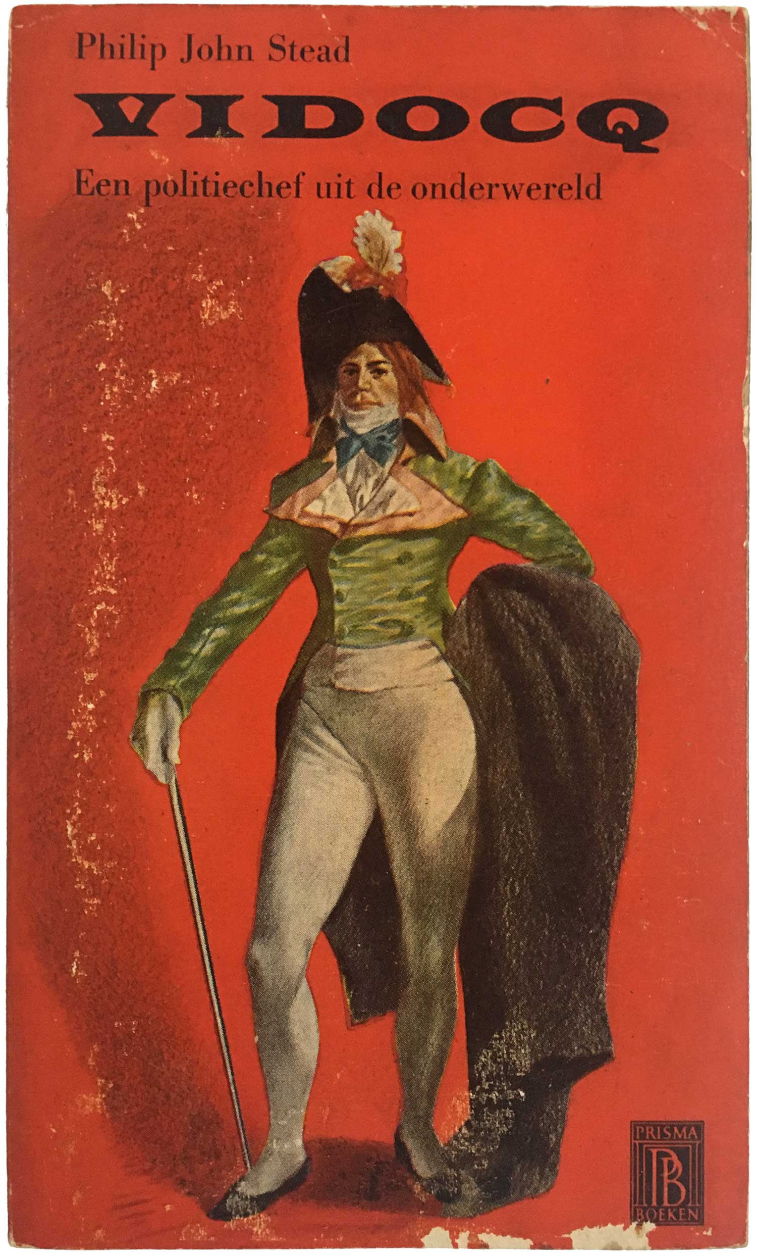
First, one thing that striking about all these books, regardless of the specifics of the design, is that the majority have letter-pressed covers. Each color is printed with a unique plate, with the type likely set by monotype machine. The cover above and the next eight below were all published by Prisma within a four year period, and display an amazing diversity given the simplicity of the tools. There is also not a clear stylistic shift between content, with the two covers below sharing a similar feel and aesthetic, yet one is about physics, the other Russian literature. Similarly a couple covers below, the echoes between the cover of Hay’s (arguably racist) anthropology text and Weisner’s general study on human reproduction. Two of the most compelling covers to my eyes are the Asimov, which would make for a great contemporary cover on a collection about climate change, and the Vidocq cover, mostly because it is so out of place with the rest. Painterly and quite ugly, it has the feel of a rejected design for an Alexandre Dumas novel.
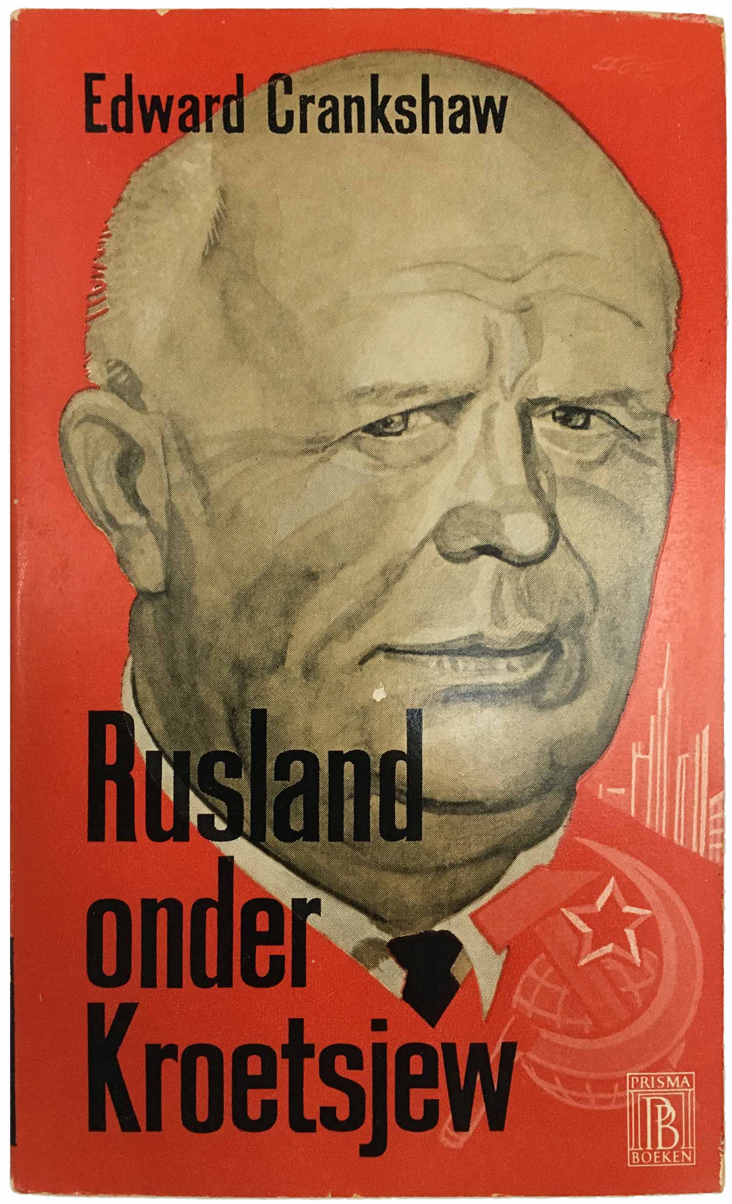
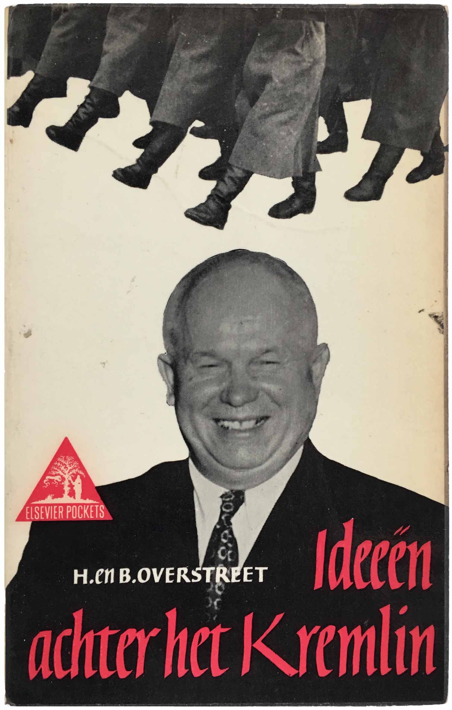
The last Prisma cover is the Dutch edition of the then bestselling Edward Crankshaw book on the Soviet Union in the 1950s. A lumpy Khrushchev floating in a sea of red looks out at the viewer, with a look that uncomfortably mixes a small smile and a sense of disdain. Not something I would normally be attracted to, I actually quite like it. The book on the right, Overstreet’s Soviet volume published by Elsevier Pockets, also has a great montage cover. This one is much funnier, Khrushchev’s whole face lit up by a toothy grin while his head is being marched on by the Soviet infantry.
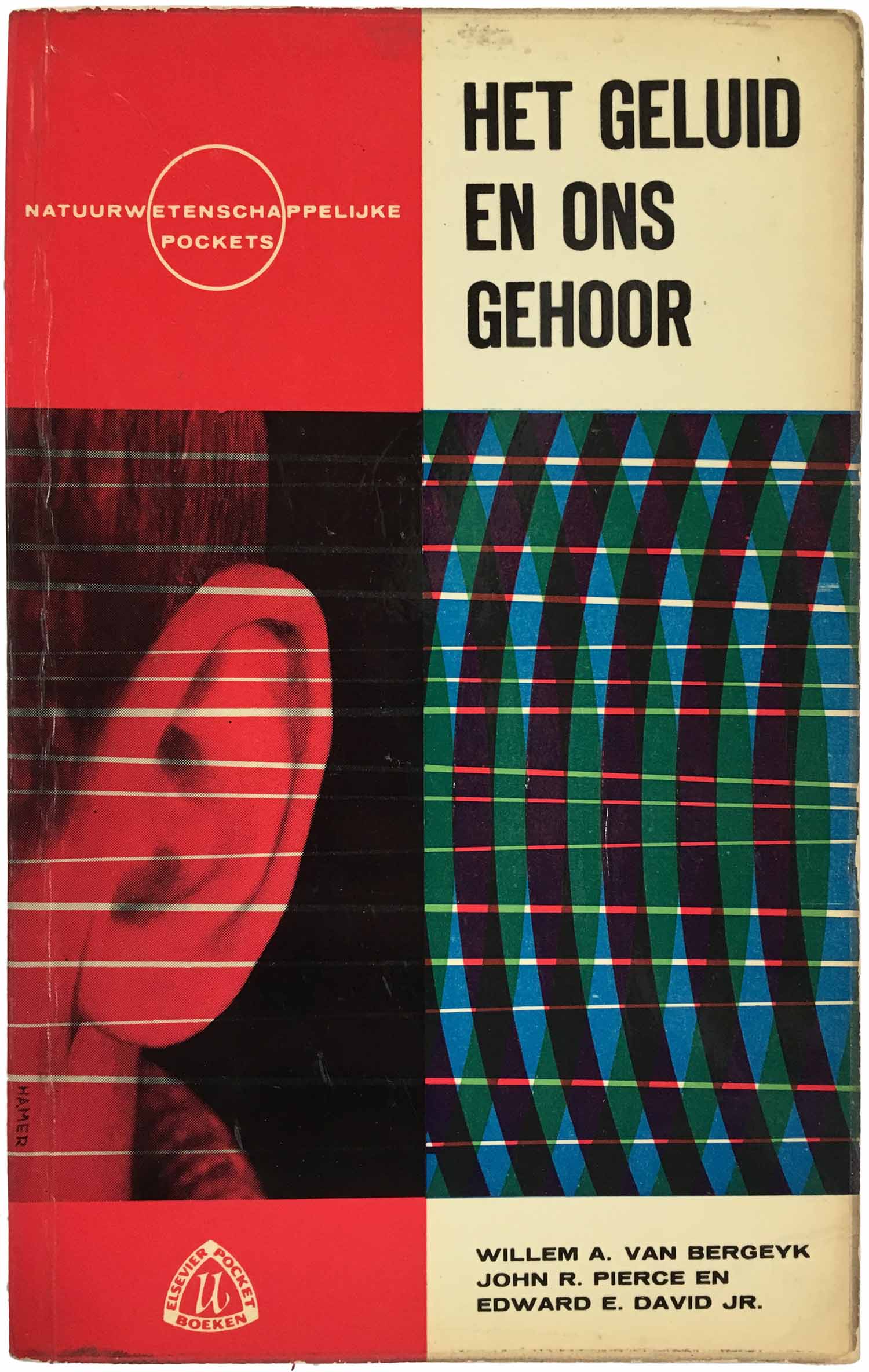
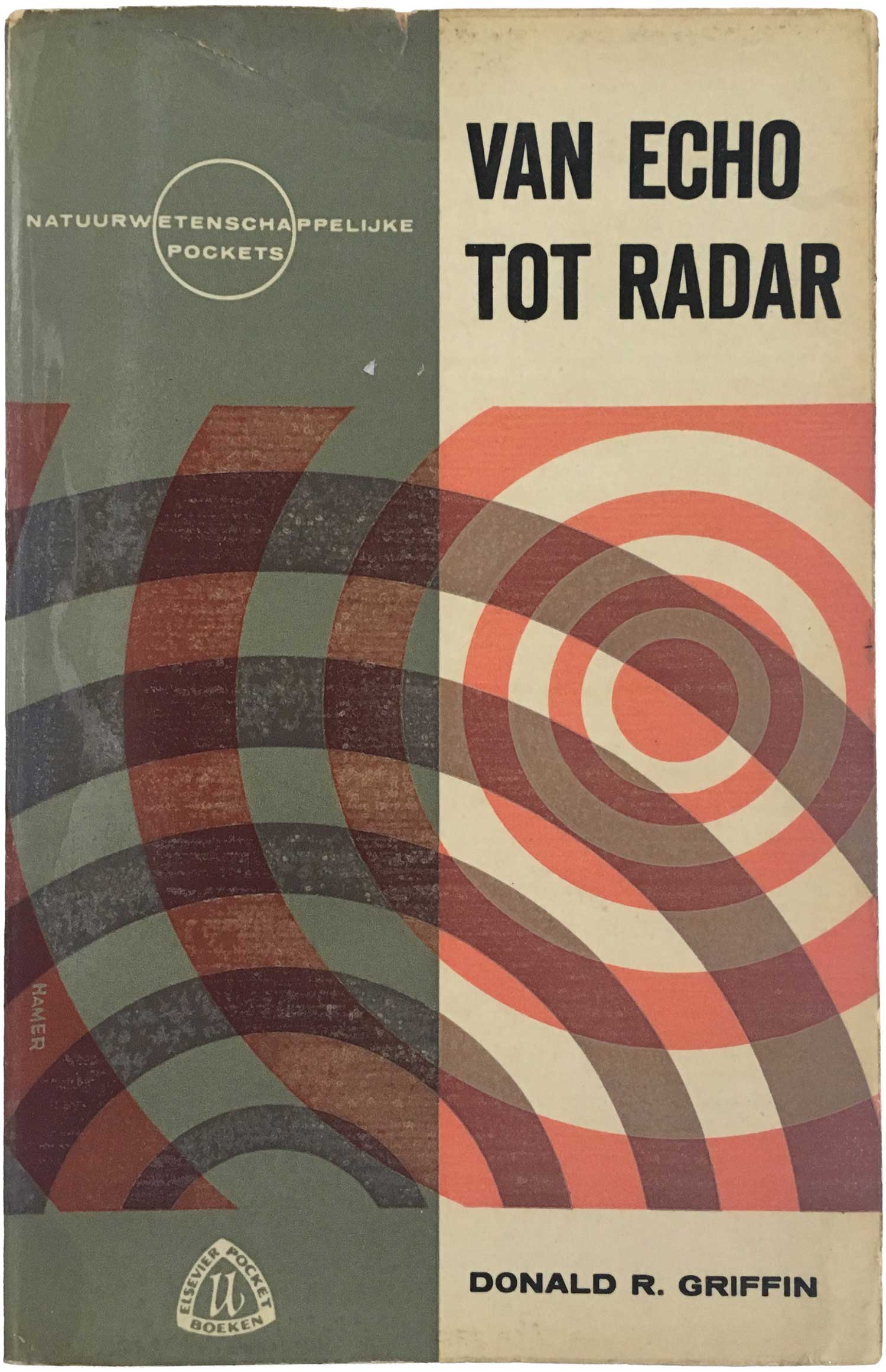
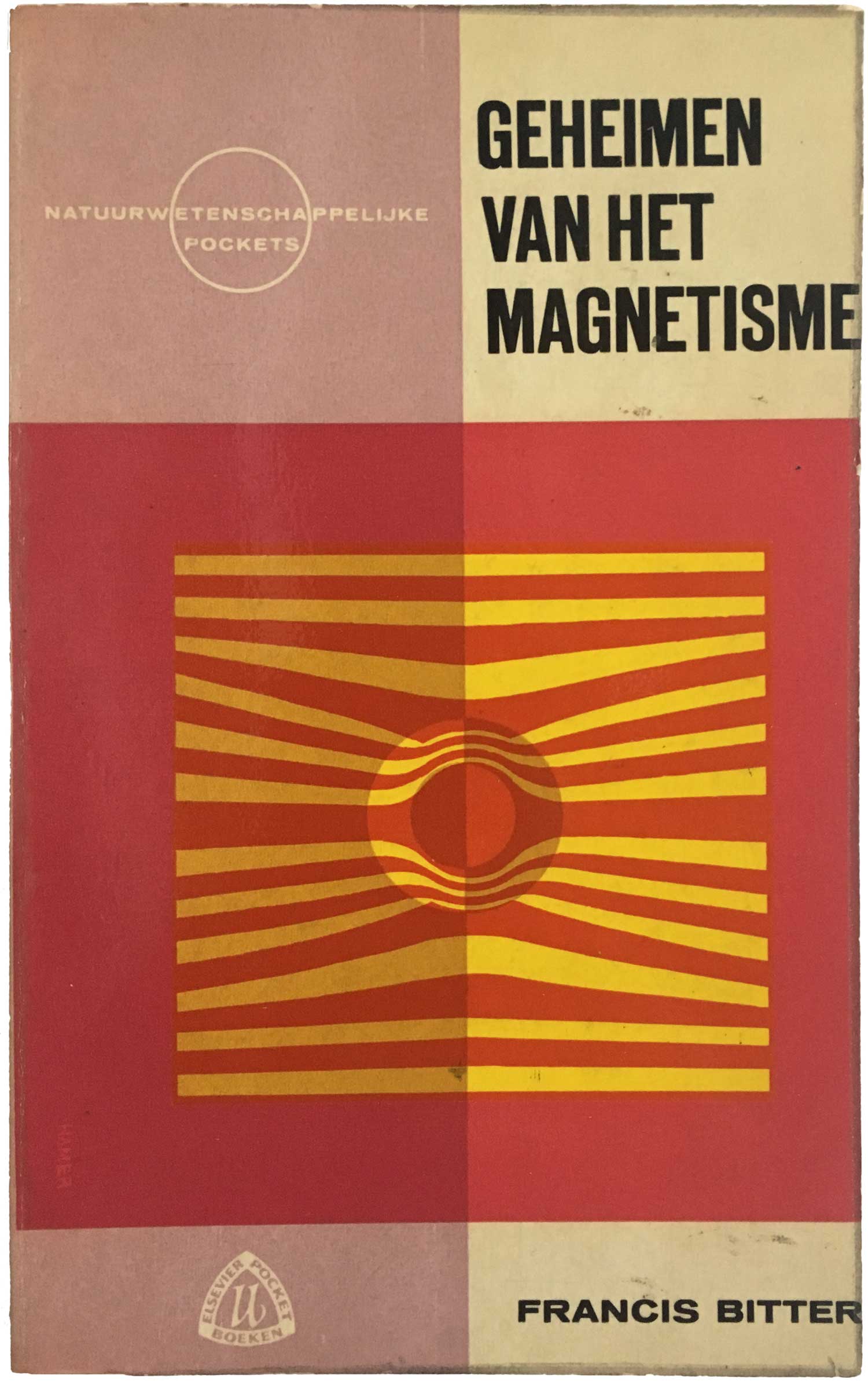
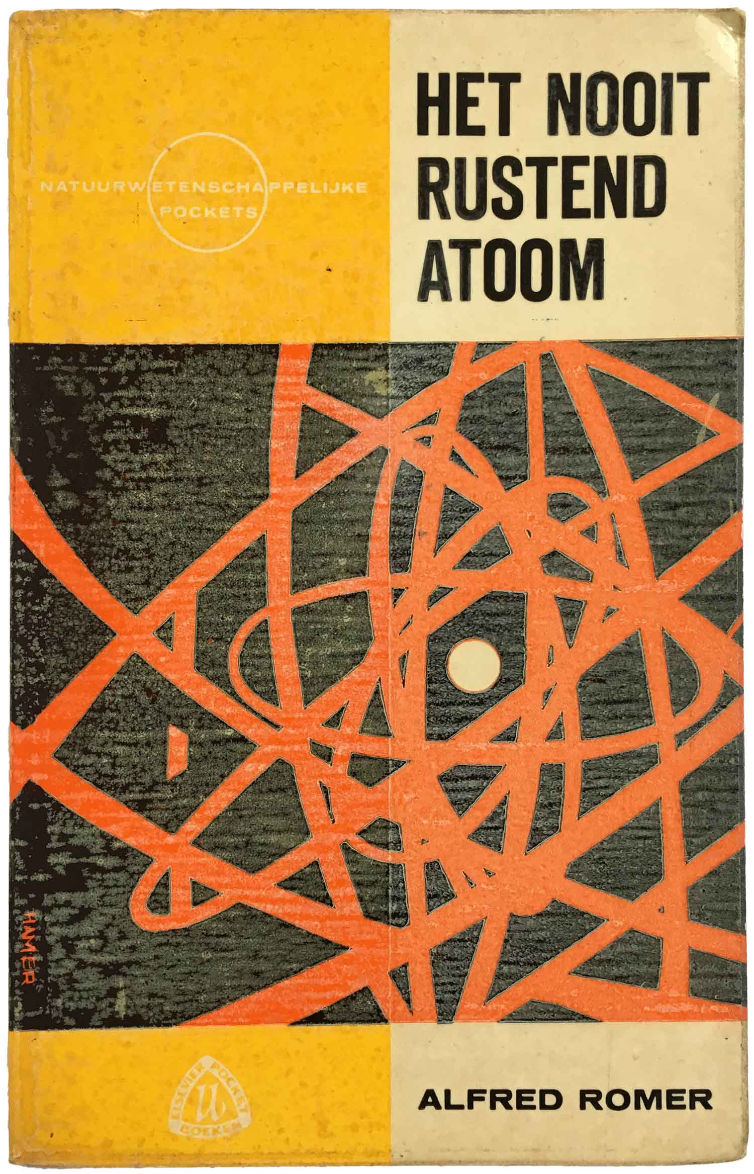
The other four Elsevier books I found are all part of their “Natuurwetenschappelijke Pockets” [Scientific Pocketbooks] series. These are all designed by J. D. de Hamer, who uses a great sense of overlapping color and shape to give graphic form to basic scientific ideas. Each also follows a strict series design (cover vertically bifurcated into two colors, horizontally split with text at top and bottom, image in the lower center, etc.—it’s actually a quite complicated schema when you really look at it) yet they all carry a fresh and individual feeling. These go nicely with the Dover covers of the 1950s and 60s (see 147, 179, and 180)
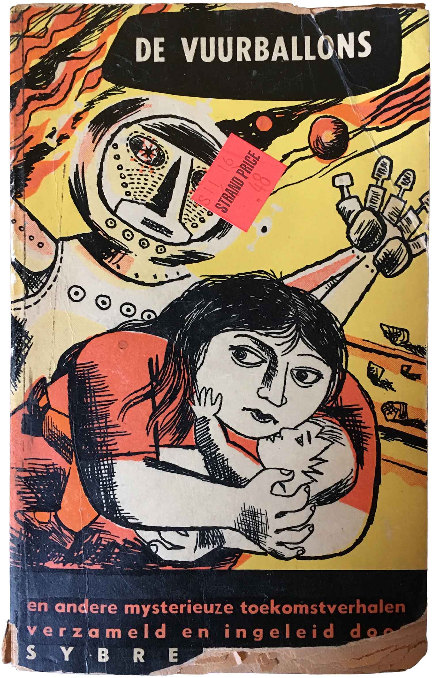
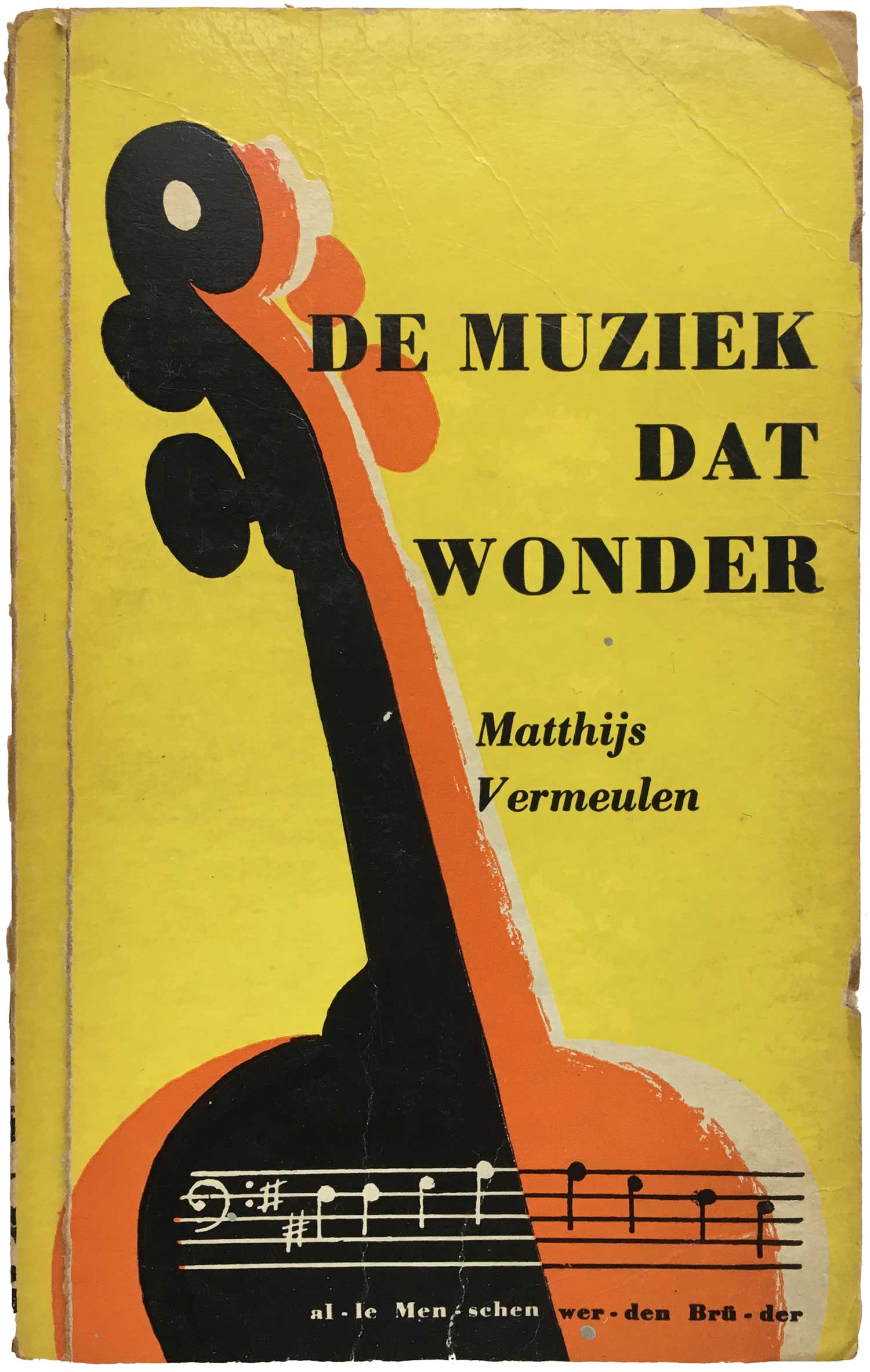
The below four books are all published by Ooievaars, and have much more expressionistic covers. I suspect all were designed by Berserik, although only the first three are attributed. The not quite menacing robot on De Vuurballons en andere mysterieuze toekomstverhalen is fabulous, and the horn on the back cover of De Muziek dat Wonder is so simple and great.
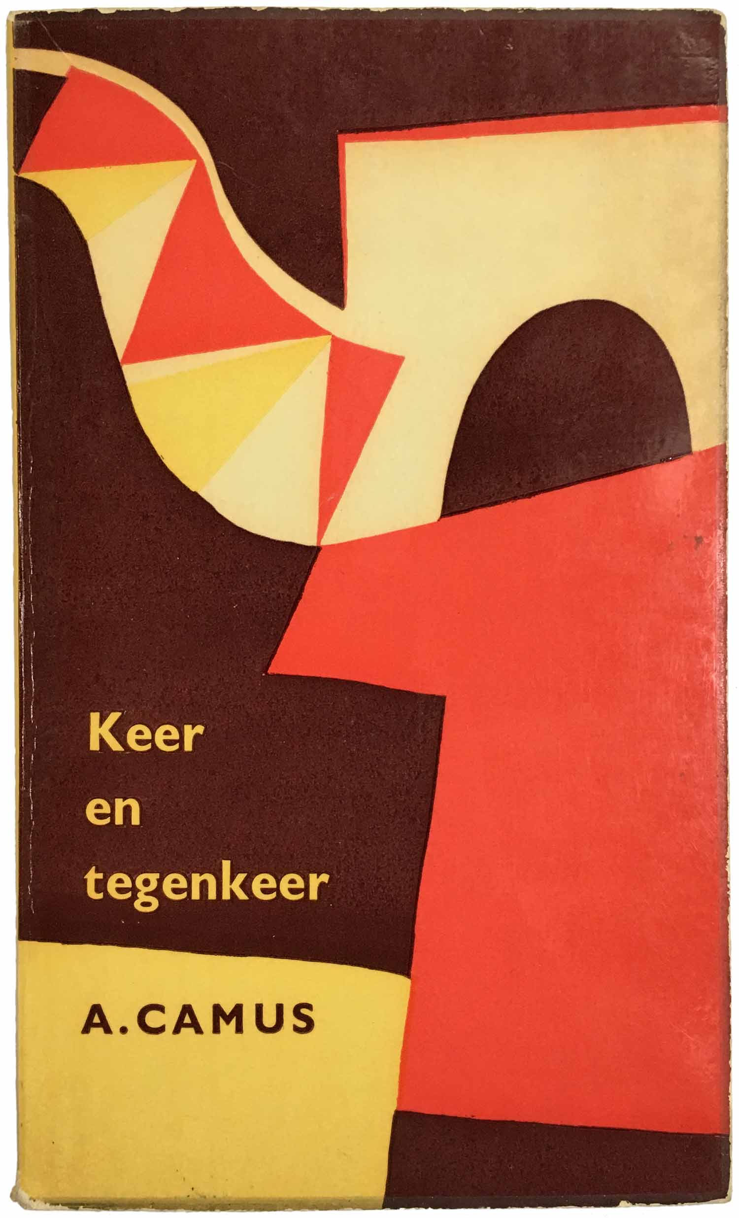
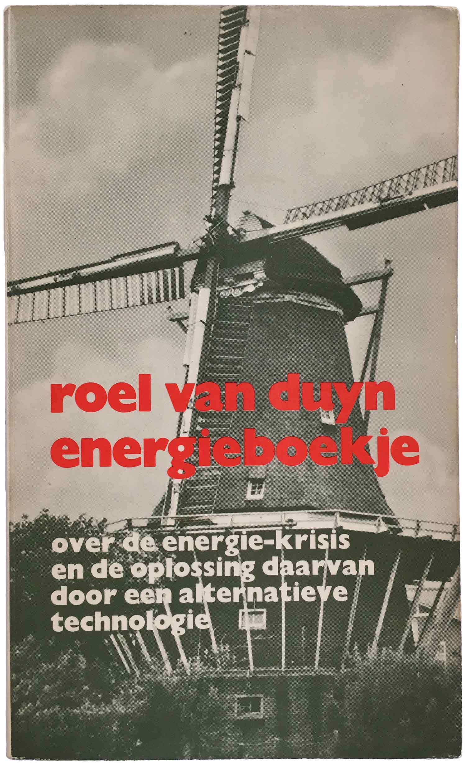
Finally are two outliers. First a Camus essay (I believe this is the Dutch translation of The Myth of Sisyphus, the title here rendered as “Again and Again”), which a cover in color and form evokes North Africa but I’m not entirely sure how it represents Sisyphus. Even though I alternately see a tea kettle, architectural forms, and a face in the design, it’s possible that it is intended to simply be abstract. Next to it is a book I likely wouldn’t have picked up given that it visually shares nothing with the other covers here, but it is Dutch, and on second look I relieved that it is a copy of one of Roel van Duyn’s books from when he was involved in the eco-troublemaking group the Kabouters. Van Duyn had been one of the founders of Provo in Amsterdam in the mid-1960s, explosively merging anarchist theory with rebellious youth culture. This is his “Energy Book,” laying out a plan for society to function without the use of fossil fuels, and it was published in 1972!
Bibliography:


Great stuff! “Keer en tegenkeer” is actually Dutch for the essay “Betwixt and Between”