While hunting for books in the Heinemann African Writers Series (by far the most expansive collection of writing from Africa in English, with interestingly designed covers to boot!) I began stumbling on titles in a parallel series by British mass market paperback publisher Fontana. While the African Writers Series is largely aimed at academic and literary audiences, the Fontana “African Fiction Collection” clearly aims at a more populist audience. This will quickly become clear when you look at the majority of the covers!
I’ve found most of these books in used book shops, but I also broke down and bought a couple of the great ones online, and there are still a handful I haven’t been able to find. I’ve tracked down images of some of these, and when possible cleaned them up and included them here. That said, it’s pretty clear for many which those are (as they are shitty photos or way too low-res), so I’m still on the hunt for the actual books. If you have any and want to send me scans (or books!), that would be great. I’ve included a bibliography at the end of this post, which includes all the book in the series (to my knowledge), with those I don’t have clearly marked.
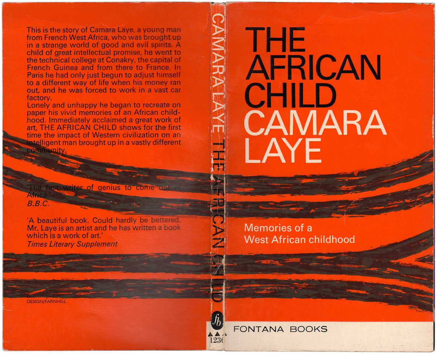
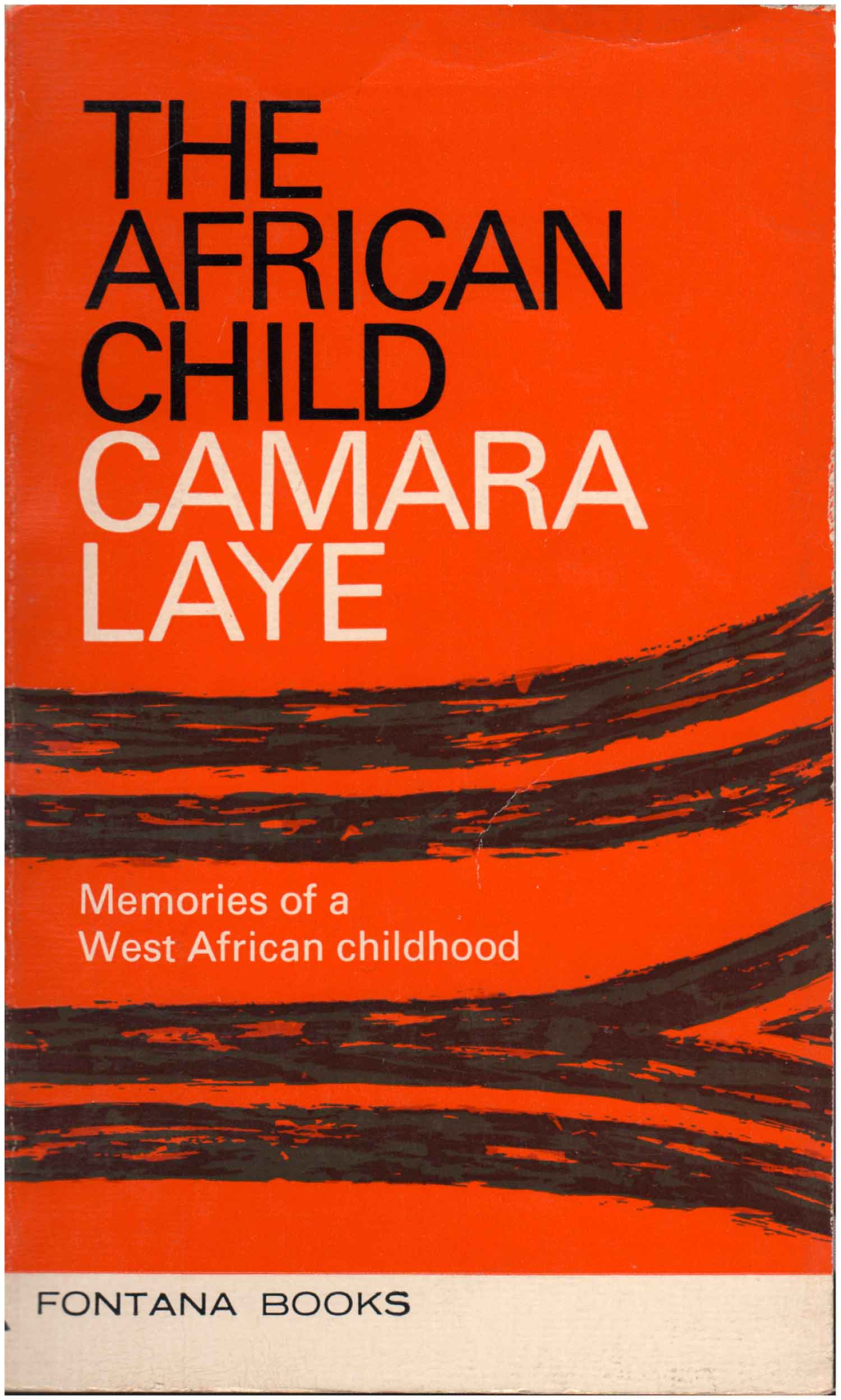
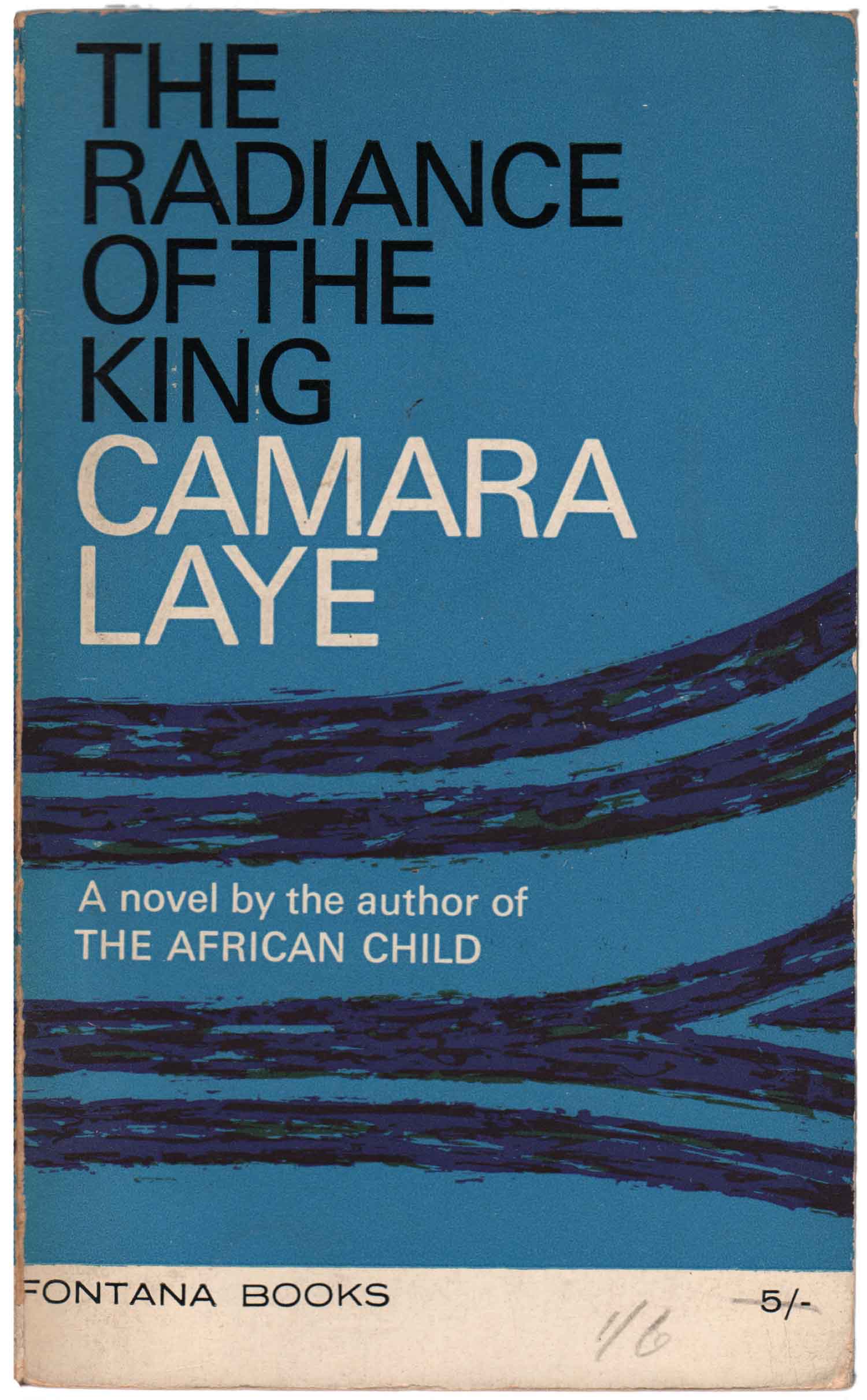
The first title I found is a bit of a design anomaly for the series. It is a 1960s edition of Camara Laye’s autobiographical The African Child. Laye was a Francophone Guinean author who was extremely popular in the 1950s and 60s—but has since been eclipsed, at least in English, by Achebe and Ngugi as a heavyweight African author. (This might, in part, be due to Laye never being part of the aforementioned African Writers Series, which was the dominant African fiction collection in English for 30 years.) He is the anchor for the Fontana series, and they published four of his books in multiple, inexpensive, paperback editions. Some of them, including the one above and below left, actually predate the specific African Fiction series. I’ve found these early versions of both The African Child and The Radiance of the King which follow the cover design conventions of Fontana’s non-African books. The colorful striped covers were designed by Kenneth Farnhill, and are used on other Fontana books as well.
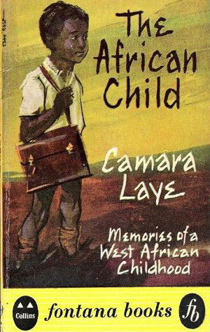
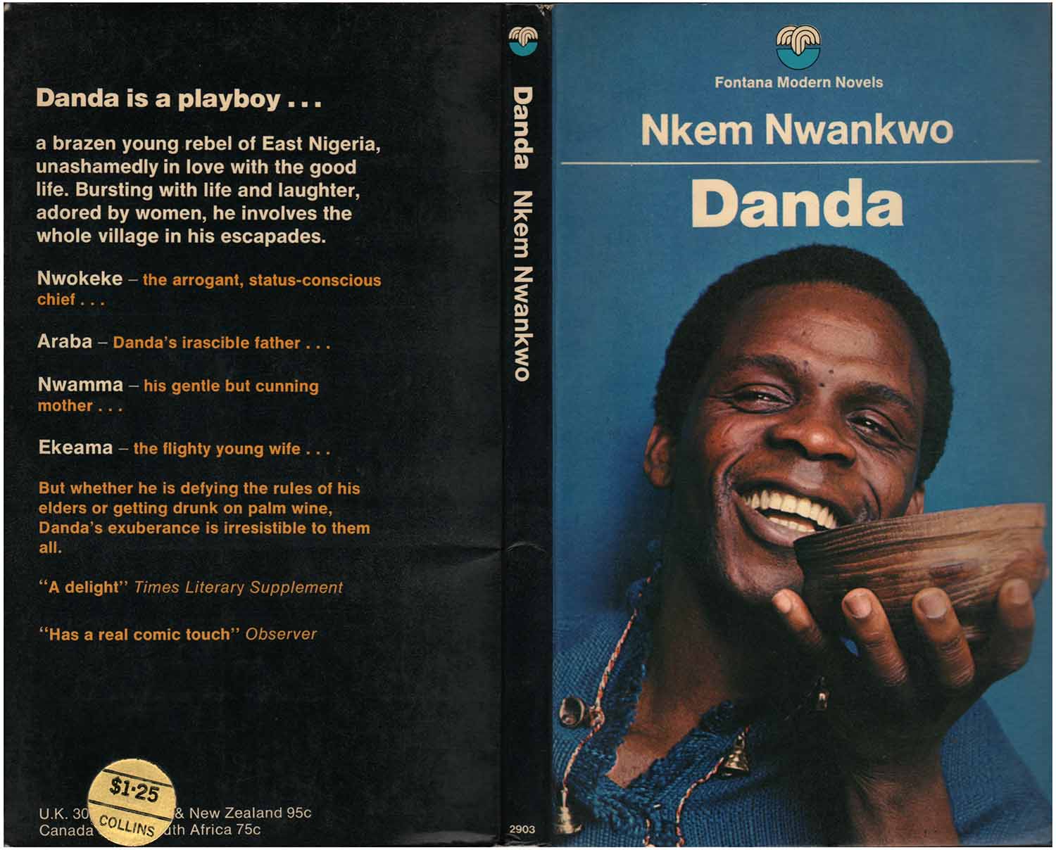
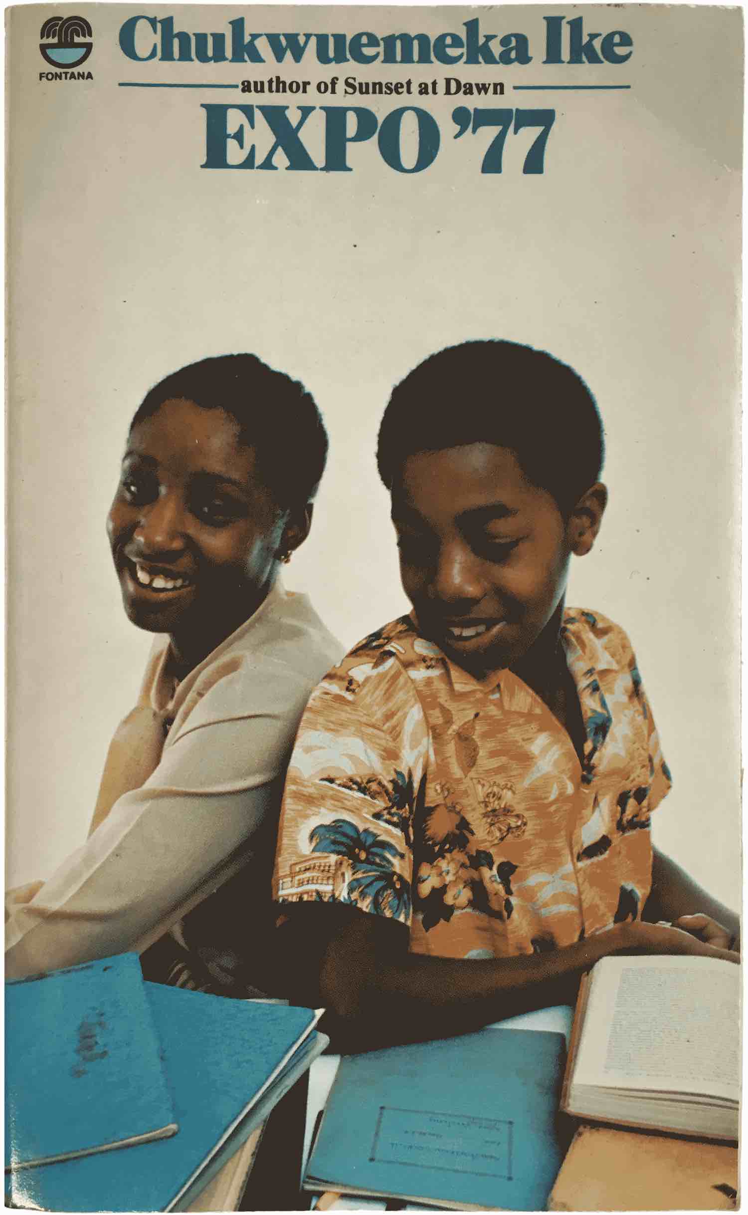
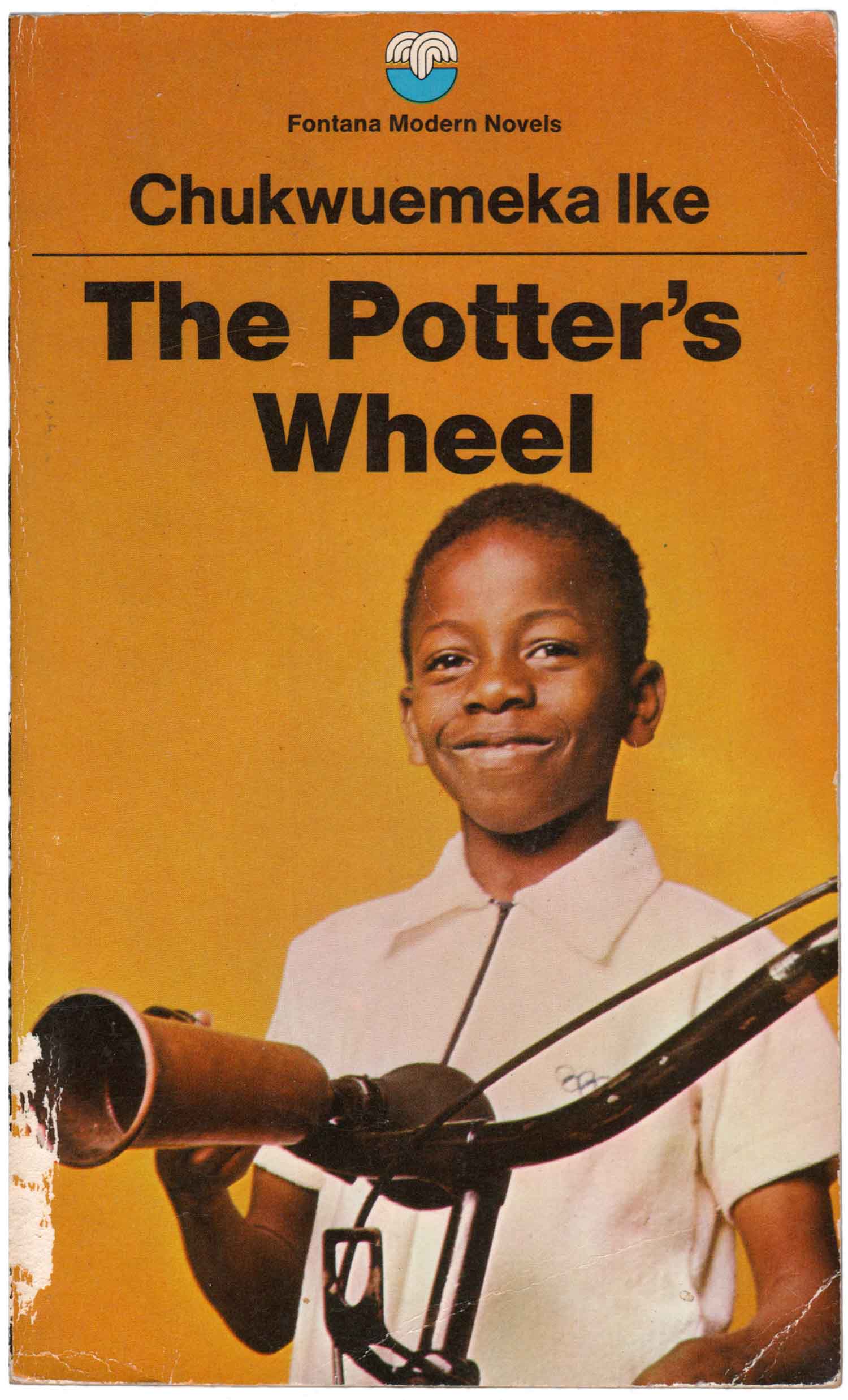
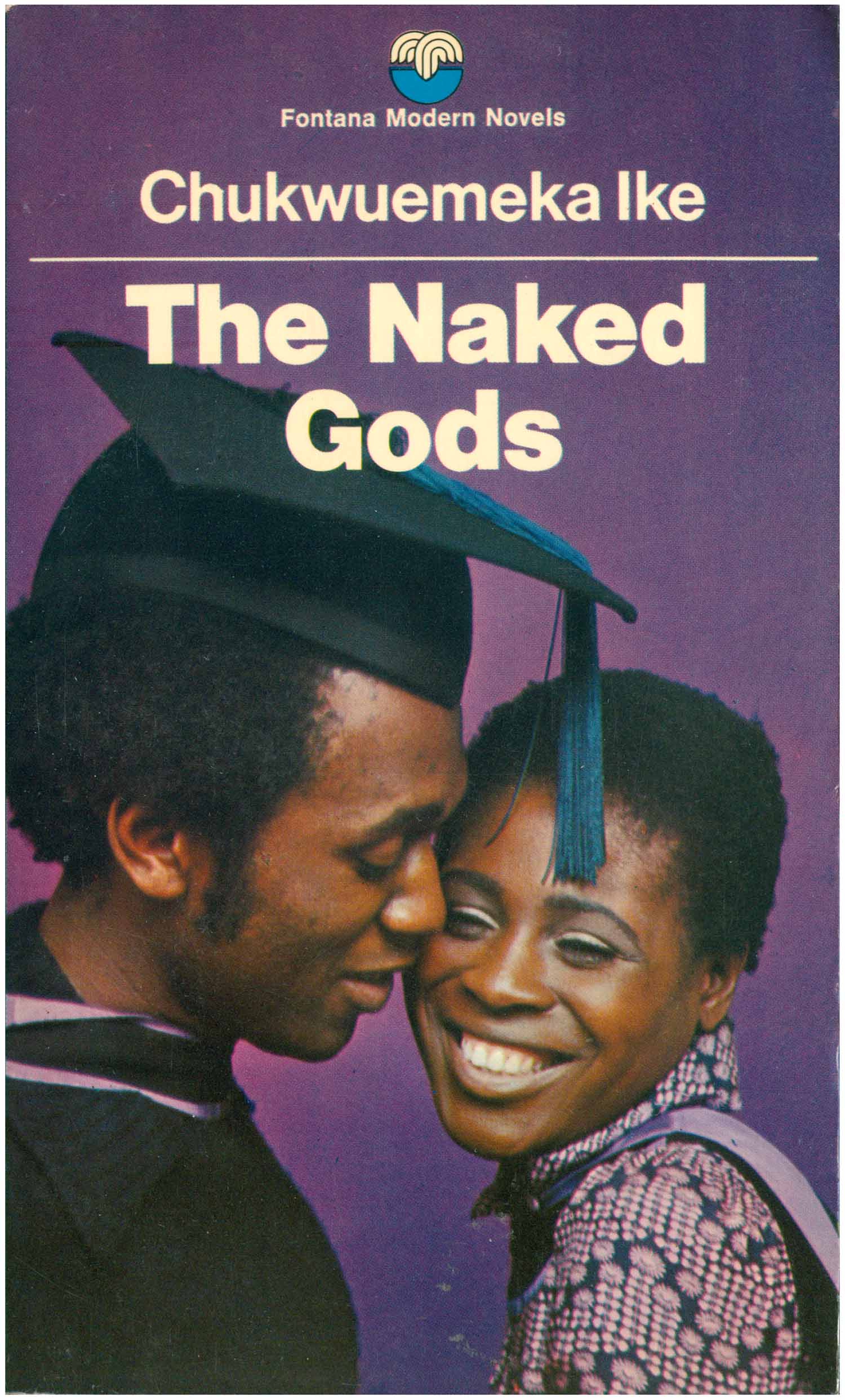
Below is the first Fontana paperback edition of The African Child, from 1959; the second edition from 68; and to the right is the 70s/80s version. This is a good snapshot of the evolution of the cover designs, from 50s illustrative to 60s abstract to 70s/80s photographic. It is the design of the 70s/80s books that catches my attention most, or to be more specific, the photography featured on the covers. All feature bright, saturated photographs of Africans. Most are clearly staged—or even montaged—but attempt to appear candid, as if they were a window into other’s lives. Some, like the cover for The African Child, are sweet and generous, while others are aggressive, vaguely erotic, or simply strange. While most publishers of African fiction take the subject very seriously (see 208: Zimbabwe Publishing House or 204: Three Crowns Africa) Fontana appears to be promoting these books with the same pop sensibilities they would use to sell other genre books, such as romance novels or crime fiction.
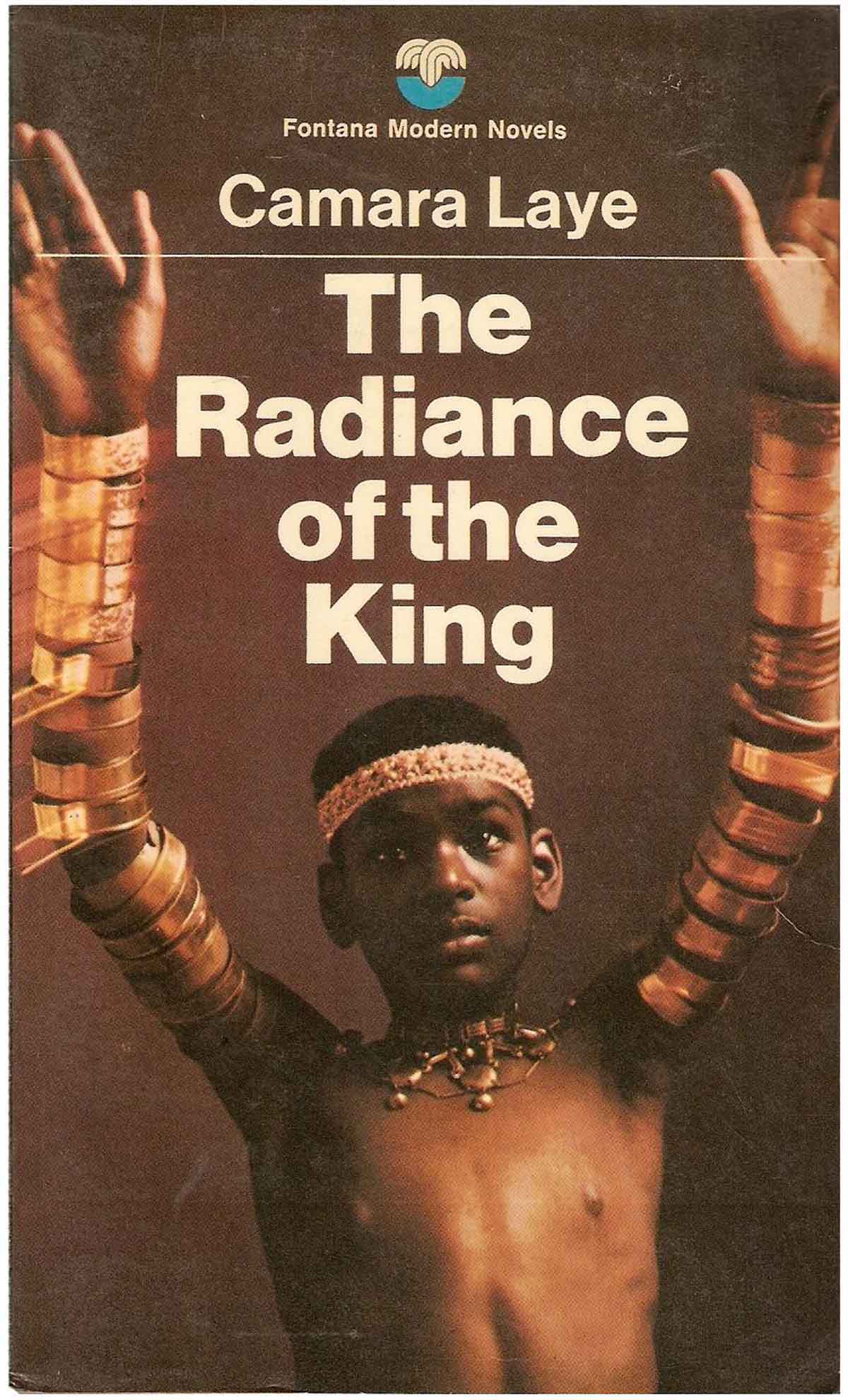
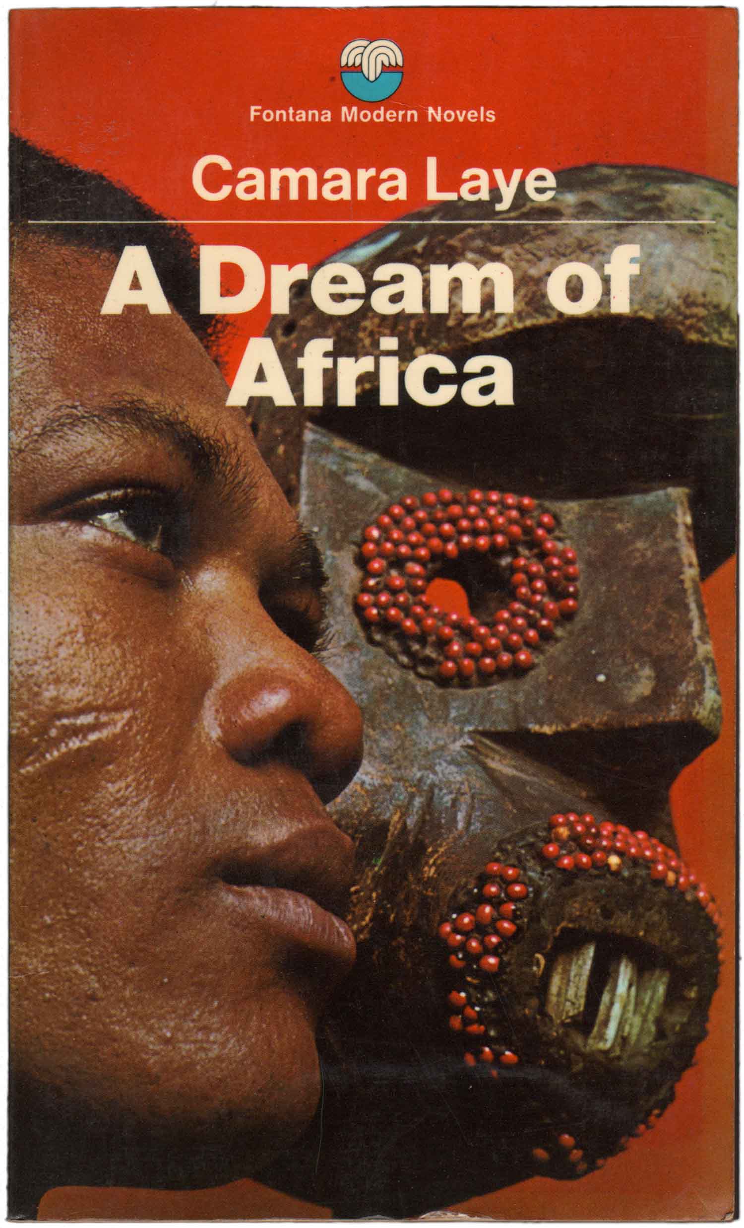
The photographic cover for The Radiance of the King is less schmaltzy than the picture of the kid with the butterfly, but it is still heavily genre, with the gold armlets evoking a time past, a “tribal Africa.” The same is true, and more so, for the cover of A Dream of Africa, with the portrait of a young man with facial scarification in silhouette with the tribal mask. The placement of these photos on a clean red background decontextualizes them, they could be anywhere, at any time.
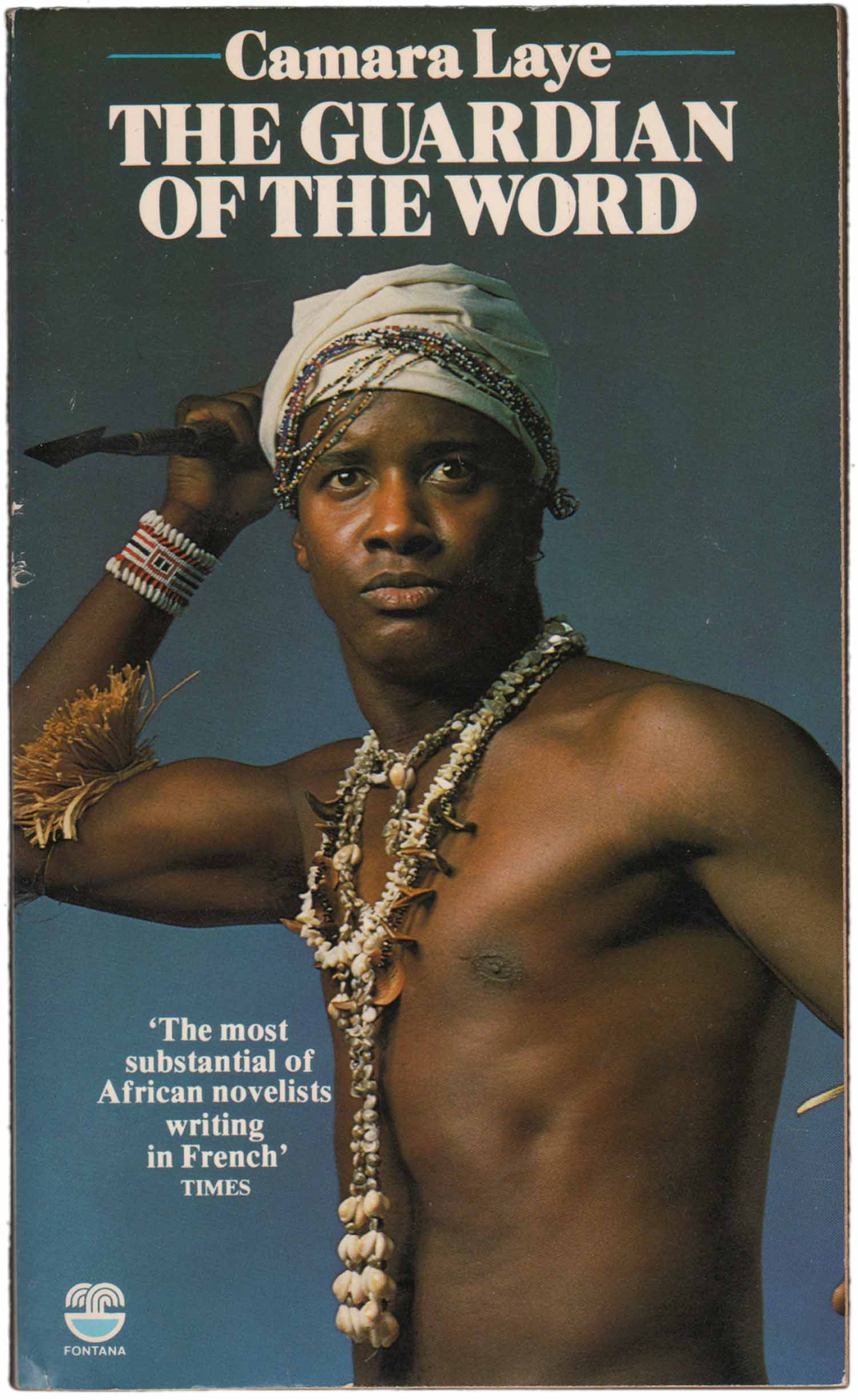
The photograph from the cover of The Guardian of the Word is much goofier than the previous ones, and definitely approaches what you could imagine the design of an African romance novel might look like. The recreation of “traditional” dress and clearly staged posing of the model rings funny. It makes me wonder how covers like this were received by general audiences—both African, and non-African—in the UK? Did anyone pick this up and think, “Wow, that looks cool!”? Were Black and African people in the 70s simply excited to see images like this on newsstands and in bookshops, or were these covers seen as hokey, condescending, or even slightly racist? It is so hard to tell from this historical distance.
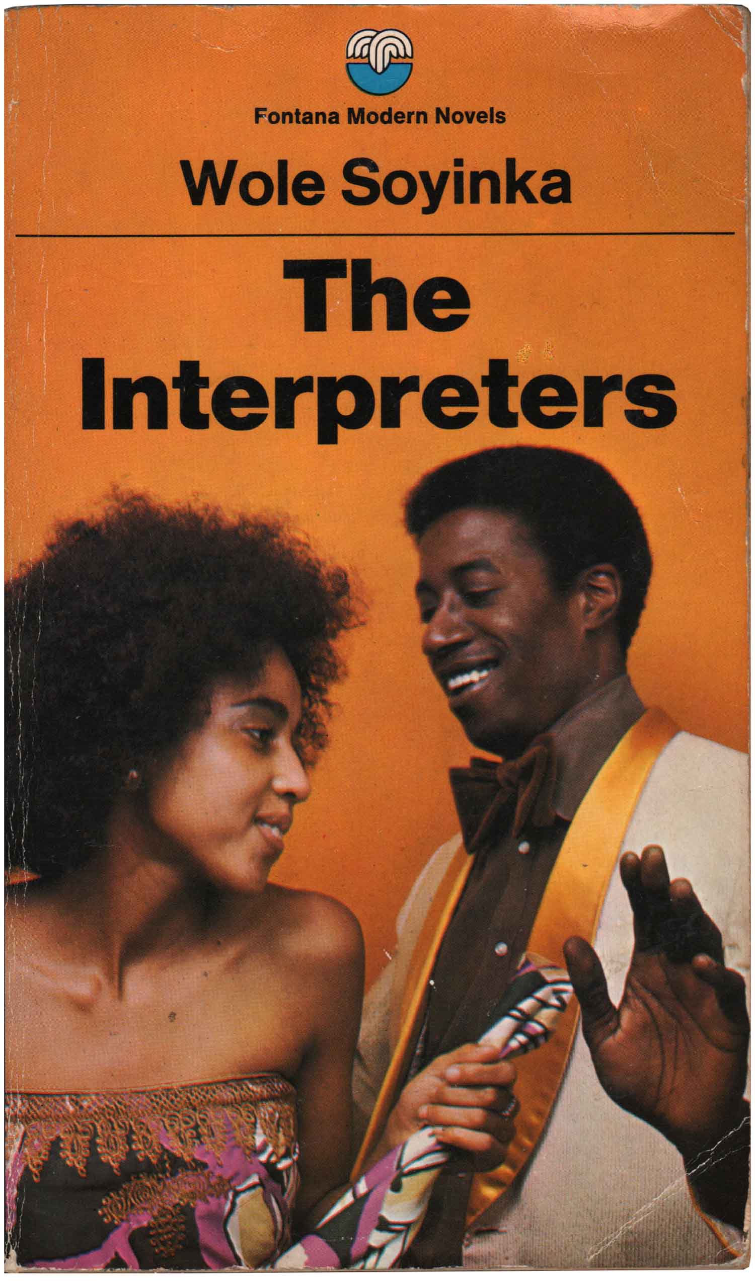
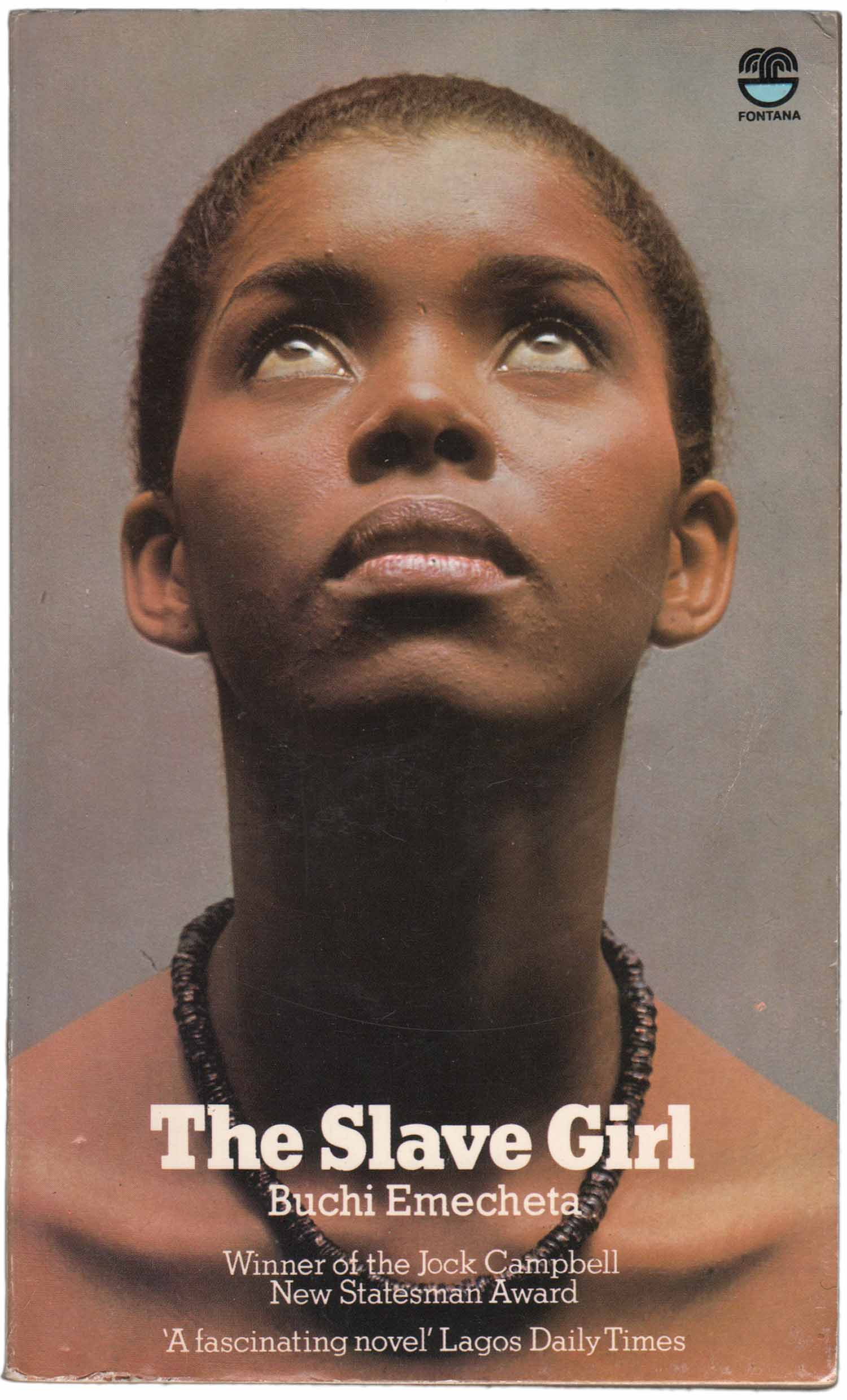
Although the series sticks with photographs, we see a transition in the type treatment from the 1970s to the 80s. All the early to mid-70s books have centered titling in a heavy version of Helvetica with a thin line between author and title, always in the top 1/4 of the cover. Starting in the late 1970s and into the 80s, we see a small selection of slab serifed titles and a more flexible general design, the title moving from center to the left or right corner, and even sometimes at the bottom of the layout. It is the photographs that are used to drive the design, with the type doing its best to communicate yet stay out of the way.

What interests me about these covers is the desire to create a mass market interest in African fiction, rather than relegate it to more traditional sales avenues of academic contexts or specialty markets. This has definitely led to some quirky decisions for cover imagery—yet it also makes the novels seem more quotidian, less “other,” than some of the more popular series like Heinemann or Longman. For the most part I’m going to just let these covers speak for themselves, as it’s really hard to know what to say about most them individually. They are most interesting as a whole, and give a window into a world of hip African socialites that might have looked like this, or might have largely been a creation of Fontana’s promotional staff.

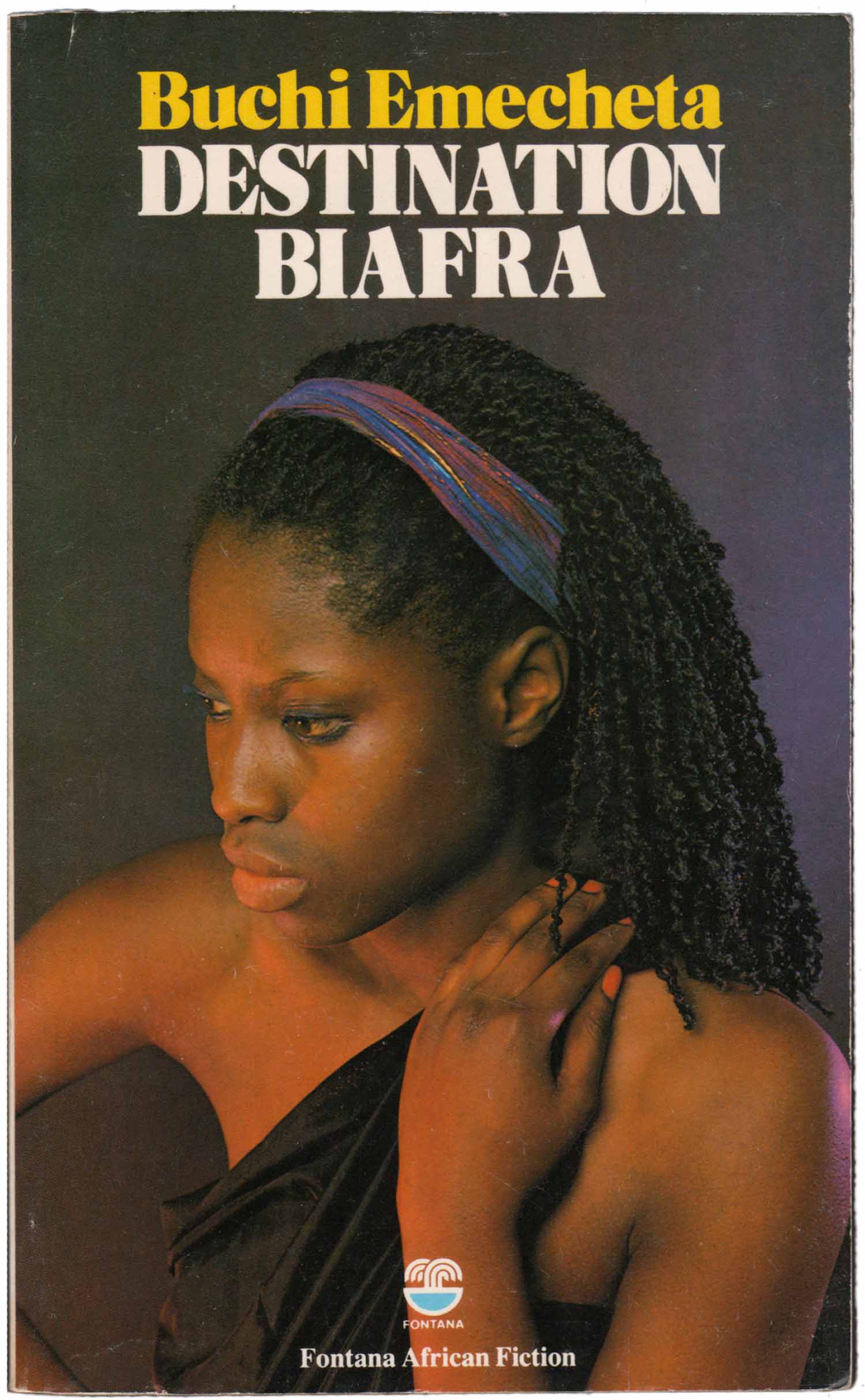
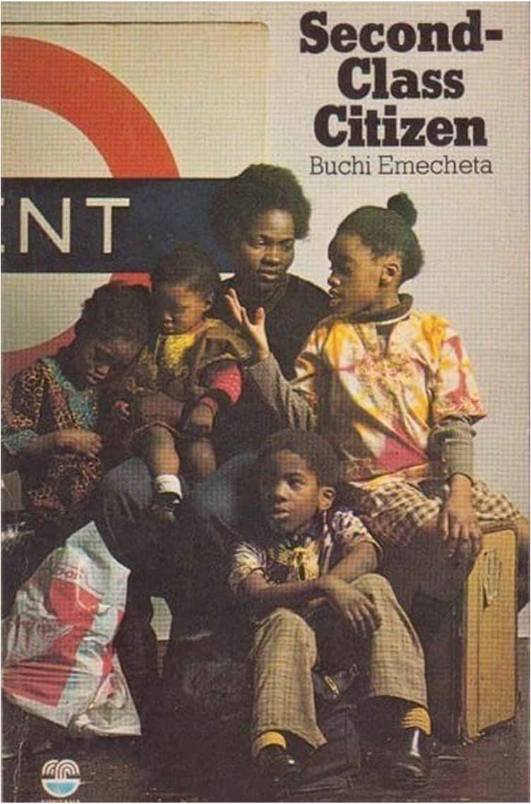
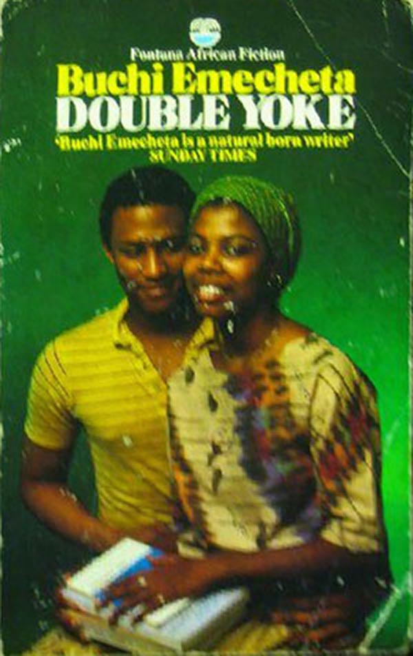
While the narratives in the books take place in a range of time periods—some novels are set in a precolonial African past, while others focus on decolonization, and others on contemporary issues (of the time, the 1970s)—most have covers that seem solidly set in the 1970s and 80s. The placing of the figures seems so staged as to feel awkward, and the lighting so intense that some of the Buchi Emecheta novels below look like romance novels. This is in striking distinction to how the very same books were designed and sold by other publishers (see 220: Buchi Emecheta).

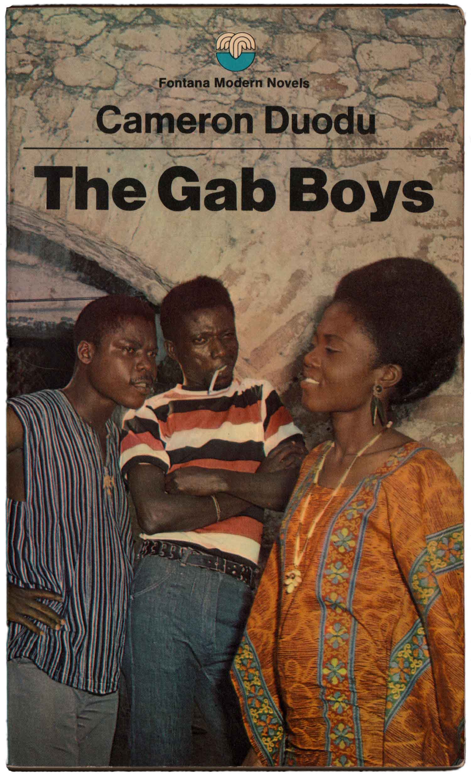
Cameron Doudu’s The Gab Boys, below, is one of my favorites here. The people are so clearly shot in different places and pieced together—and the background is so flat and fake looking—that the entire composition feels as much an art montage as a piece of commercial design. There is something really punk about it.
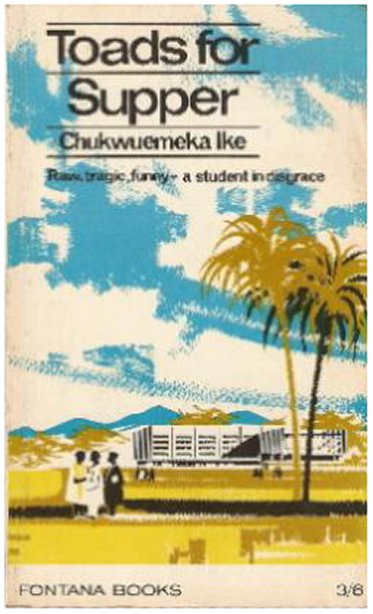
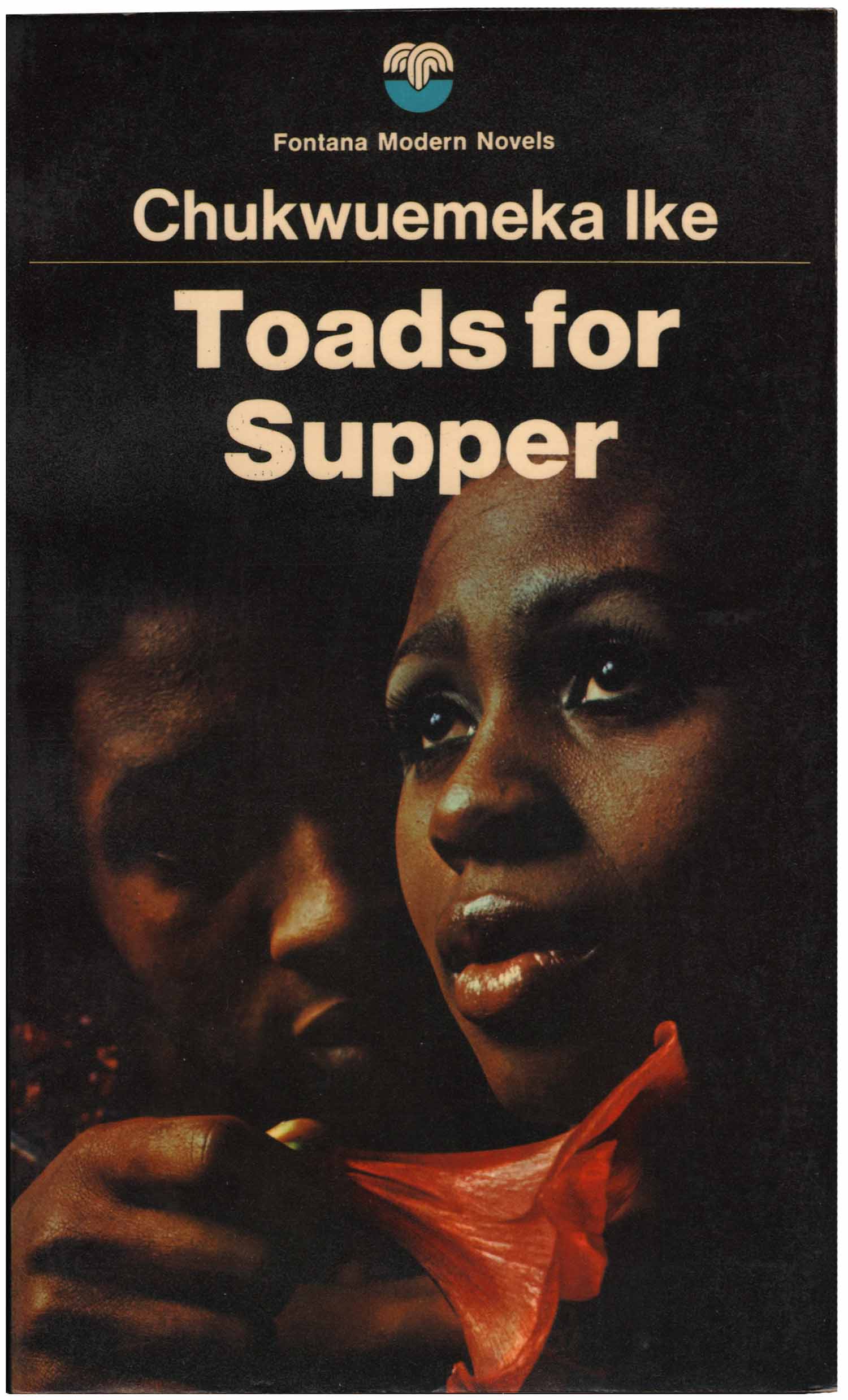
Below is another great comparison between the 1950s Fontana editions and the 1970s ones. These Toads for Supper covers also highlights the differences between the African-esque abstract illustration and the hyper-real photography, and how one would never expect these are different covers for the same book.

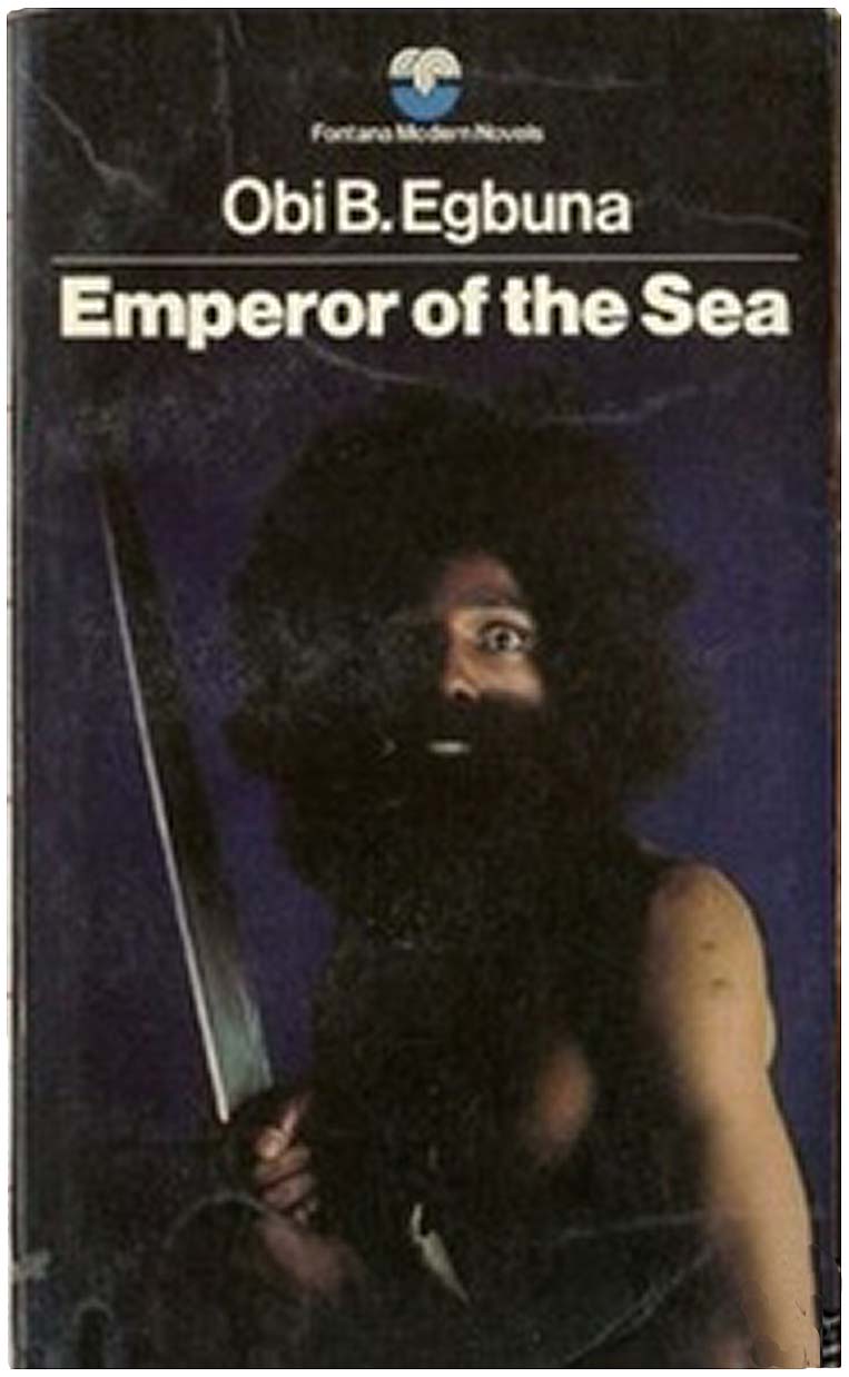
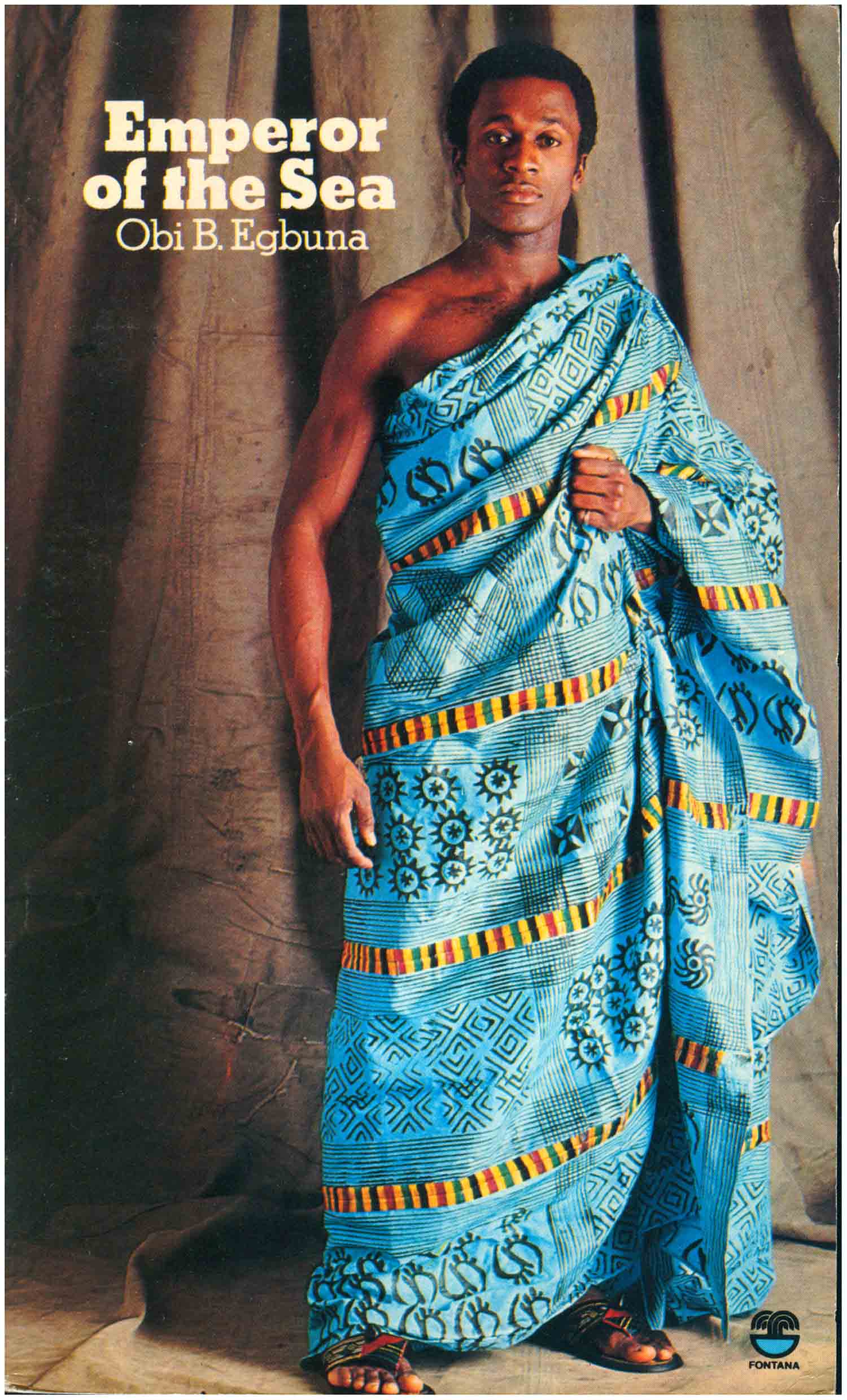
Like the evolution in typography, we also see a change in the photographs, none more clearly visible than in the two editions of Egbuna’s Emperor of the Sea below. The 1974 edition features a wild-eyed, knife-wielding man with a giant afro, which is clearly intended to ring out, “crazy man,” while the 1978 edition is covered with a regal man wrapped in Kente cloth. Did the ethos of Black Power finally catch up to Fontana? Did people complain about the earlier covers seeming exploitative? Or was there a marketing decision that images of attractive, more prideful African people would be more salable?
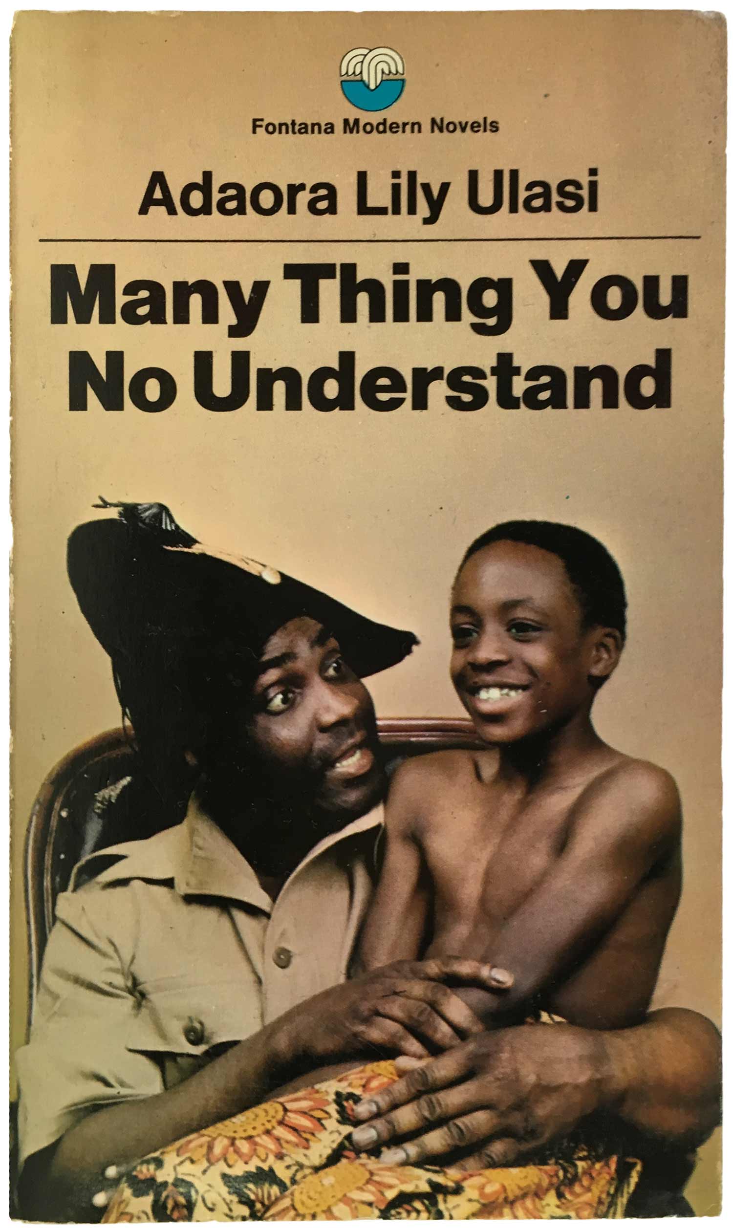
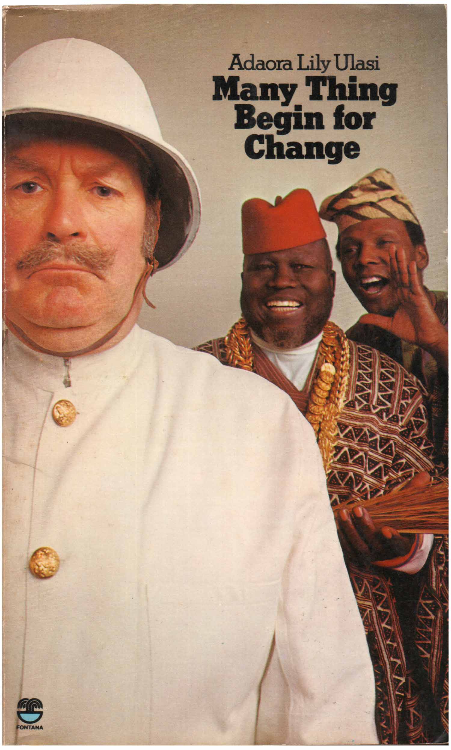
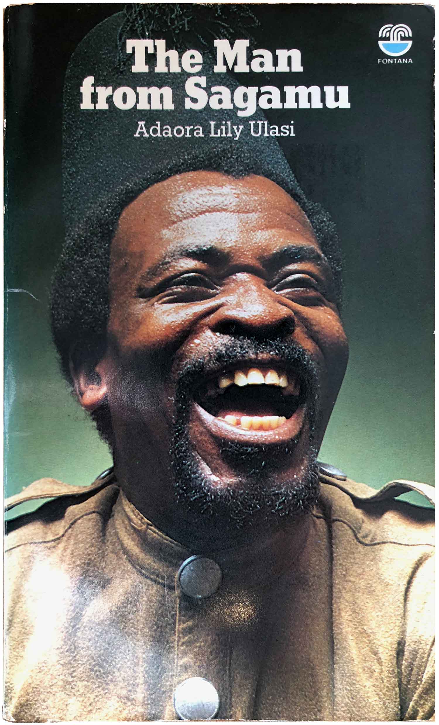
We see a similar transformation in the representation on the Ulasi novels below. Many Thing You No Understand and Many Thing Begin for Change are from earlier in the 1970s, while The Man From Sagamu is from 1978. While the figures on all the covers seem exaggerated, the middle book features a white man who appears to be the butt of a joke between the two African characters, at least on the surface neutralizing the stereotypes present in the two African men, and the final cover is simply a close-up of a laughing African man, cropped tight enough to avoid the more caricaturish aspects.
This post is a reworking of three blog entries I originally posted back in June of 2013. Since then, I’ve tracked down a number of books in the series I was missing, as well as some better images of books I haven’t found yet. I’ve cleaned up the text, added a half dozen images, and updated and improved the series bibliography. The entries in the bibliography below with an *asterisk are books I have found neither hard copies nor even images of. The ones with double **asterisks are ones I have images of, but not the actual books, so I’m missing some of the bibliographic info. [Post updated 3/23/18 with one additional cover.]
Fontana African Fiction, bibliography:


I’m glad I found this! I was doing some cleaning this morning and I found the cover of Fontana’s edition of Nkem Nwankwo’s Danda and nostalgia hit me like a moving train. The book has been a huge part of my childhood but somehow, I’d never got to read it. I’m glad I found a digital copy of it and I’m now in chapter 3. I also found Buchi Emecheta’s second Class Citizen and unlike Danda, it’s still whole.
I absolutely adore these covers and how, for me, they easily spark curiosity and interest in the heart of anyone, including those who aren’t inclined to reading; something the very academic covers of African writers series does not do. I think it’s beautiful. I think it’s important. The images feel like magazine covers of the 80s you would find splayed on tables in offices and counters on salons. I absolutely love all of them and I’ll try to find and read as many of these books as I can. Thank you for posting these covers and the bibliography. As a millennial who feels yearning and deep love for a time I did not see, these covers and this post warms my heart. Hearty cheers!
Wow, thanks! This makes me feel great. I love these covers (and many of the books as well) but it often feels like I’m sharing them into a void, as everything has moved to social media, which is great for images but terrible for the context I think is important to discuss and understand the imagery in.
Bonjour, est-ce que je peux avoir une version numérique de Elina de Obi B Egbuna s’il vous plaît ?