
While there is a fair amount of literature out there on the “paperback revolution” and the sea change in publications created by the Pocket Books imprint in the US (founded 1938) and Allen Lane and his Penguin imprint in the UK (founded 1935) [the best book on the subject, IMHO, is Two-Bit Culture by Kenneth C. Davis], almost none of it even mentions Dover Publications. Founded in New York City in the early 1940s by Hayward and Blanche Cirker, Dover took a fundamentally different approach to paperbacks than most of the mass market houses that sprung up in the 1930s, 40s, and 50s. Rather than publish fiction with pulp-y covers, the Cirkers decided to put out a wide list of non-fiction titles, with a focus on interesting and scholarly math and science books that were available in the public domain. The money saved in not having to pay authors was both invested into producing high quality books and passed on to the consumer via quite inexpensive cover prices. Until relatively recently, almost all Dover books had sewn bindings, thick cover stock, and large trim sizes, which made for enduring books that people kept and could use heavily as reference texts without them falling apart. You can read more about the Cirkers and Dover in a really nice and lengthy obituary published by the New York Times in 2000 (also see a recent article by Karin Falcone HERE).
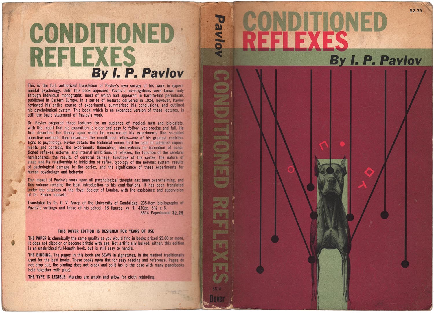
As I’ve mentioned before, I sometimes work at my friends’ bookshop here in Brooklyn called Book Thug Nation. It’s a great place, and there are many, many nuggets of book design genius hiding on the shelves. While at work back in 2013, my eyes landed on a 1960 Dover edition of Pavlov’s Conditioned Reflexes. The cover is astoundingly good. A quick scan through the science shelf and I found a handful of additional old Dover science books from the 1950s and 60s with awesome covers. It turns out that the late 1950s through the late 1960s was a design heyday of sorts for Dover, with the creation of a whole trove of very modern covers. Although the books themselves aren’t particularly rare, finding copies with this particular generation of covers isn’t always easy, as they were abandoned in the late 70s and into the 80s for designs that at the time probably seemed more “contemporary”—yet in hind site not as effective.
The Pavlov cover is a gem of the set. The mint green and dark pink are odd color choices, yet they totally work. The subtle use of darkening the pink by overprinting on the green for the majority of the cover is also smart, leaving the scientific symbols to jump out of the illustration in a pink that has the illusion of being much brighter than it actually is. Content-wise the image is strong as well, with the tough and mean looking dog stripped down to muscle, and the black lines implying a logical system with which those muscles can be controlled. It’s a strong example of a design which is both directly representational, as well as symbolic and abstract.
I’m also partial to the cover I lead with above. There is something almost comic about the design, with the small black and white image of Pasteur floating on a giant expanse of dark mustard—the color composed from orange and a nice light aqua-blue. While the orange color in its pure form is represented in the book’s title and author, and a small explosion at the top of the page, the blue exists only in a mirrored parallel explosion. These two bursts of color are the only bright spots, and they function like a pair of hovering eyes, or alternatively a big bang moment, something exploding into being.
William Gilbert’s early explanation of how magnets work, De Magnete (this edition 1958, originally published in 1600) has a cool cover as well, although slightly less dynamic. The large illustration of the magnet is actually much more visually interesting and important to the content than the image of Gilbert, so it’s unfortunate it’s shoved into the background by being printed in black on a rich blue background which just absorbs the black ink. The cover to Konrad Knopp’s Infinite Sequences and Series (1956), on the other hand, makes the absolute most out of very little. The only visual elements are the groupings of white lines on black background, but they are more than enough to draw the eye in and across the page. The design quality and efficiency feels similar to other high-modern book design, such as Alvin Lustig or the original cover of Animal Farm by George Orwell.


Ernest Mach’s The Analysis of Sensations (1959) has a cover with similar efficiency, but a different tack, using repetition as a visual tool to evoke the intersection of sensations and analysis. I have no idea what the black shapes are supposed to be, but I appreciate the bold decision to place them on a bright pink background. Some of these covers remind me of the design used on the early editions of the New World Paperback series (featured in these posts HERE). And similarly they are unattributed. But both publishers were based in New York City, and it seems not entirely impossible that they might have shared freelance designers!


One the most prolific designers in Dover’s late 50s/early 60s period was J. Lloyd Dixon. There’s almost nothing on him online, which is interesting, and makes me think he likely didn’t design for other publishers or his name would pop up in association with other books and projects. But over the past couple years I’ve found nearly a dozen of his covers, and they are all quite solid, and fairly diverse in aesthetic. While some are simply striking patterns (Bonola), others mix pattern and representation (Andrews), some veer toward abstraction (Abbott and Dickson), and some mix all these different elements together (Weyl). While I like some over others, they all “work.” They all read as modernist in intent, and like the covers of Paul Rand or Lustig, they are far more expressionistic than directly representational.


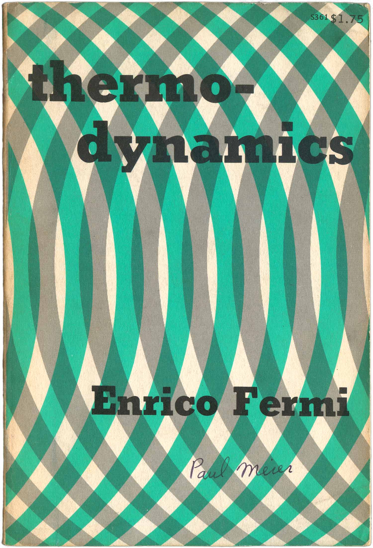
I’ve found a number of additional titles from this earlier period. While many have no actual publishing date, they can usually be distinguished by their Smyth sewn binding and thick, raw, uncoated cover stock. Fermi’s Thermodynamics and Ayer’s Language, Truth, and Logic both fall into this camp, but are also both notable for being very clean and singular in design. Fermi’s cover leans heavily on a repeated wave pattern, while Ayer’s on a pre-Columbian glyph. Neither design seems like a direct representation of the content, but in a way that makes them interesting provocations to potential readers to find out more.

Both of the below covers evoke the workings of the brain. William James’ The Principles of Psychology is extremely literal, the shape of a brain dominates the cover, while Babbage and his Calculating Engines is more creative, superimposing wild-looking machines on top of an image of Babbage’s head.


While the face of scientists are often represented on these covers alongside images of their fantastical machines, authors that dealt more with logic and/or the humanities have to hold their own without these visual props. George Boole’s face fills the entire cover, framed and balanced by a lot of text, while Ralph Waldo Emerson is bisected by color right under his sight line, and has hs face obscured by his name. The Emerson cover ends up feeling more dynamic, if also more strange.


Another set of more humanities-driven covers, the below are designs for books by cultural anthropologist Paul Radin. Both are striking. The mask feels a little too obvious, and these anthro-based designs are always tricky in today’s political environment, as they definitely feel exoticized and exploitative. The cover on the left ages better, and was designed by Dover go-to guy J. Lloyd Dixon.


I guess Lewis Carroll, author of Through the Looking Glass/Adventures of Alice in Wonderland wrote a number of math-related books, which were republished in the 50s and 60s by Dover. The covers are nice visual constellations constructed from numbers. Below these are a couple other covers built largely from numbers and letters as well.


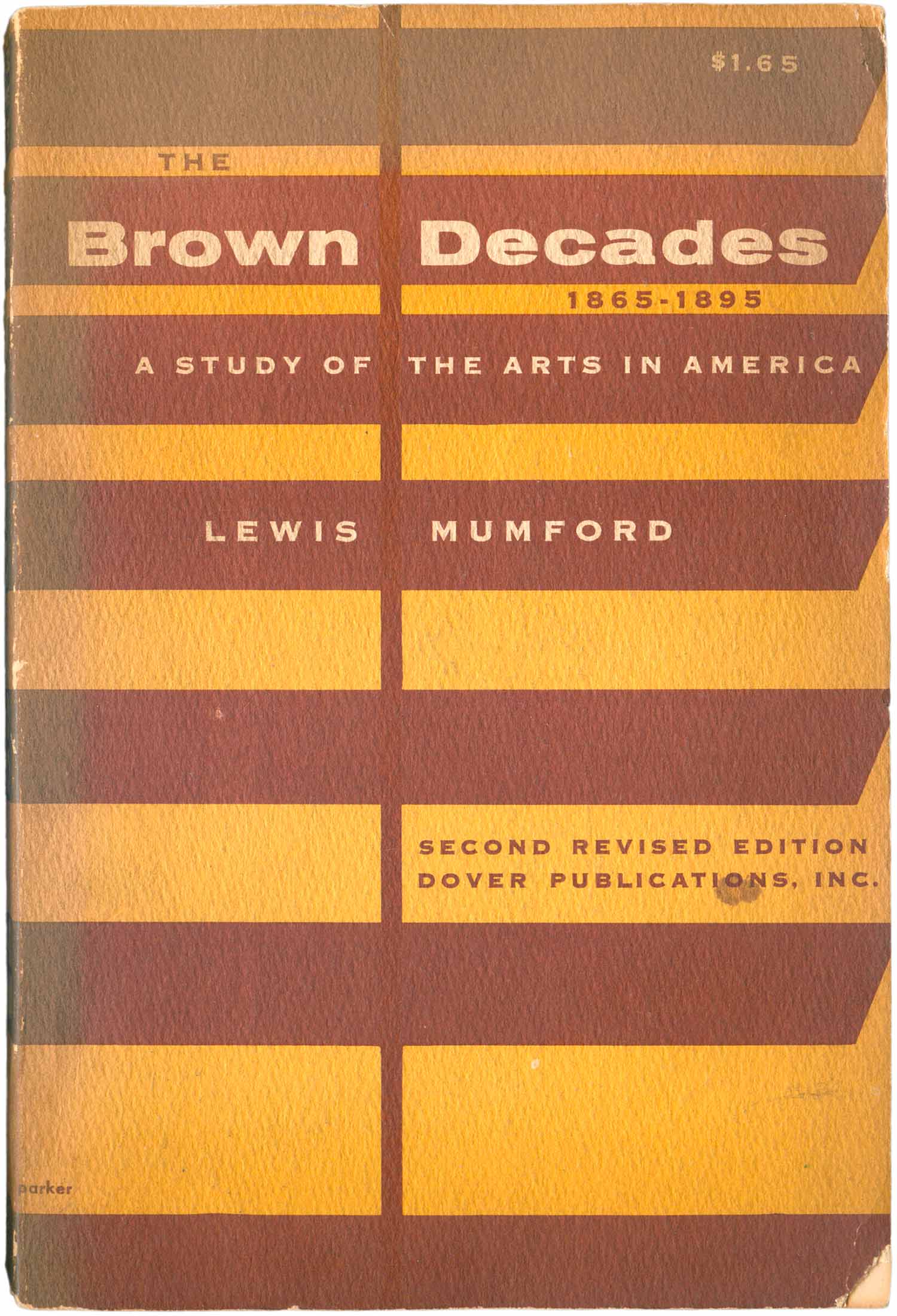
On to art-related books. The Brown Decades is decorated like a poor-mans modernism. Very clean sans serif type sits in a series of brown rectangles, the angles on the right side convert them alternately into a series of steps or a pile of hanging minimalist boxes a la Donald Judd. The vertical line that cuts through the entire cover fights against the optical illusion, flattening the shapes and bringing everything onto the same plane. A later edition of Mumford’s classic heads in a strikingly different direction, with white being the dominant color, broken up by architectural fragments and a fractured rendition of the title. Although this cover is gloss and clearly from a later printing, it was designed by the same J. Lloyd Dixon discussed above.
The type and outstretched hand on the cover of The Craftsman’s Handbook are much more classical than modernist, but they function in a similar way to the visual elements of The Brown Decades. They are simple and clean, yet still leave a small sense of wonder in the viewer. Where is this hand coming from? While it is cracked like a classical sculpture, it has a sleeve, something that would never look familiar on the wrist of a Greco-Roman marble.


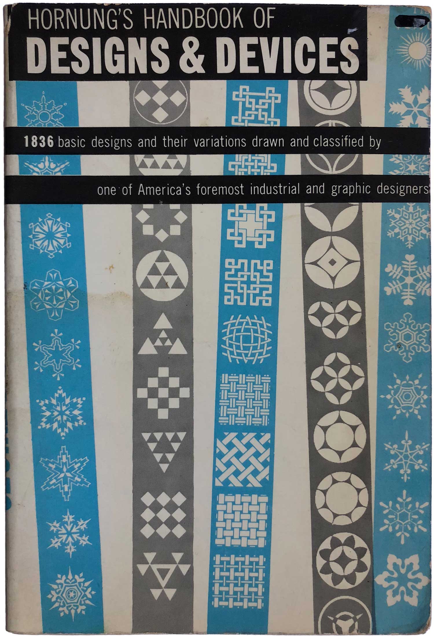
Dover is most well known know for their oversized collections of copyright-free clip art, letter forms, and imagery. This part of their catalog didn’t really dominate until the 70s and 80s, but there are interesting earlier examples of handbooks of design elements. Franz Sales Meyer’s Handbook of Ornament has a cover which in many ways diverges from most of the above. Rather than efficiency, here the point seems to be to overwhelm the viewer—to prove at the first glance that the book is actually as chock full of images (3,002!) as the cover copy promises. And as if the images themselves weren’t enough, small read arrows point to them, as well as everything else on the cover. It feels like a deluge of information, even though each part is distinct and quite self-contained, without overlaps or collaging.

Starting sometime in the early 1970s, Dover began laminating their covers in a thin plastic coating. I suspect the intention was to make the books even more durable (water resistant, mark resistant, etc.), but unlike contemporary gloss coatings, it had a strong tendency to peel off over time. Which means most books one can find from this period have covers in various states of delamination.
Some of the covers from this period are likely reprints of earlier designs on the new stock, such as the second Brown Decades above, or Norman Campbell’s What is Science? below. Let’s stop a moment on What is Science? What are those scattered floating v’s on the cover? They’re perfect for a general book on science because they are “science-y” but also impenetrable. They could be slices of images of a virus from a microscope, or pieces of meteor trajectory, or concrete blocks from some sort of building project. Science is must be filled with all kinds of mysteries!
One thing the lamination on these later books did accomplish was to make the colors much more eye-popping. There is no mystery as to what makes the Hoffman book below eye catching. Bright pink and concentric rings. Such a simple shape and pattern, yet completely mesmerizing. Edwin Hubble’s The Realm of the Nebulae is almost the inverse, drawing the viewer in rather than popping out to meet them. The photograph and the infographic are initially inscrutable, making you have to look closer to attempt to decipher. Although I doubt it’s intentional, the red, white, and blue fields make for a funny reference to the French flag, but also deepen the bifurcation on the cover made by the nebulae.


As the 70s move on, Dover starts to develop a new series of cover tropes. The first is the full bleed photograph, illustrated effectively below by these two astronomy books. Here fancy design is effaced in order to focus almost entirely on the imagery.


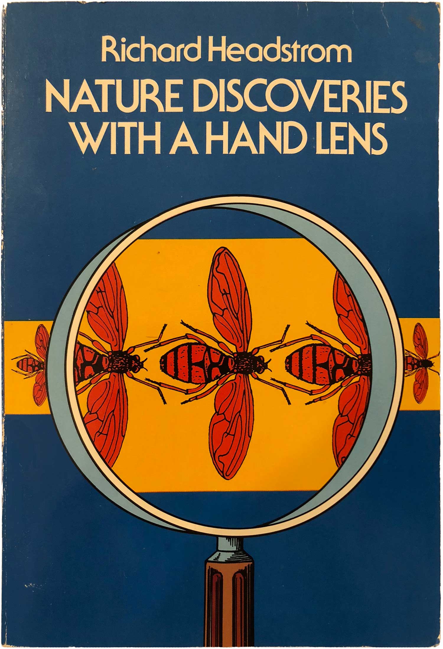
There is also the development of a new illustration type, turning away from the modernist-inspired designs of the earlier books for a more exaggerated, almost comic (with its thick outlines) style. The below three titles on insects and spiders clearly show this evolution.


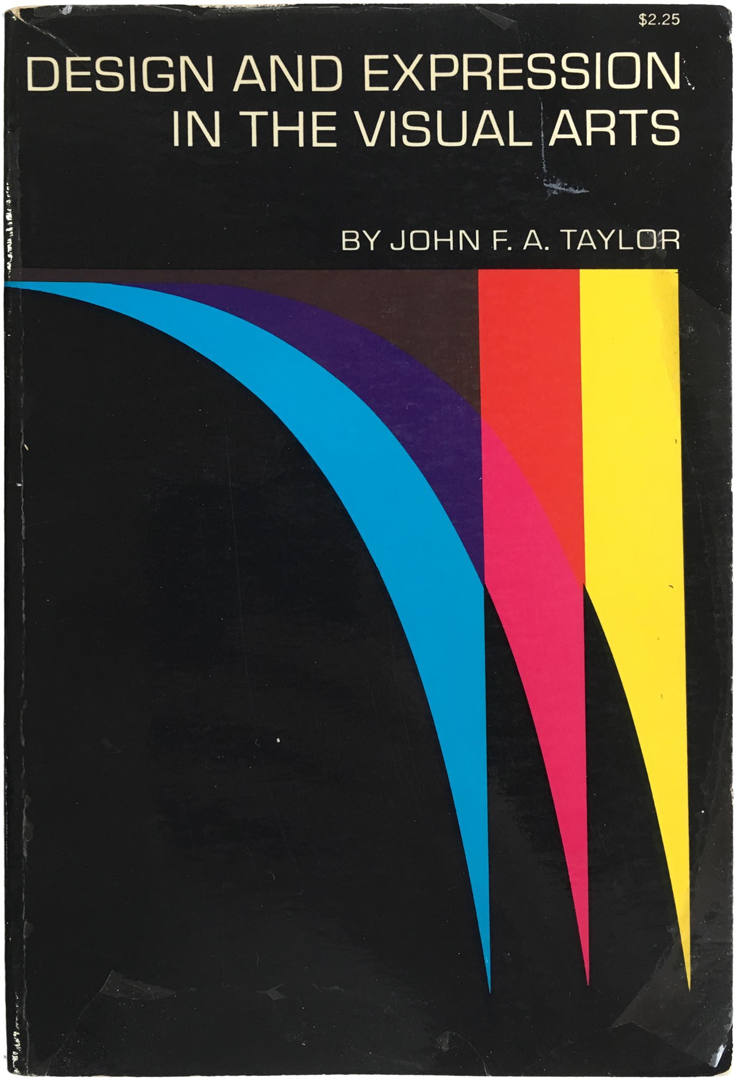
And finally, a move towards almost total abstraction, but without any of the classic flourishes used by Dixon and others in the 1960s. The Einstein book is a great example, the title crammed at the top in order to make way for almost three dozen red squares. Don’t get me wrong, I really enjoy this cover, but it is certainly less artful than the earlier designs. The same can be said for the ones next to it, which feel almost clinical and machined.


Overall I think this is a really stunning collection of unsung book design, and I’ll be keeping my eyes peeled for more of these as I dig through the shelves at used book shops. Just goes to show that the popular places to look for interesting cover design—literature and art books—might not always be the most rewarding, as science and math hide some gems.
Most of my book cover posts focus on publishers, authors, and designers with clear political and social content. This post is definitely a diversion at initial glance, but I actually think it falls squarely within my broader reasons for being so fascinated with book cover design. The book itself has always been a political object, and historically it has been a quite elitist one. What makes a publisher like Dover, and its founders Hayward and Blanche Cirker, so interesting is their nearly unique belief that bedrock math, science, logic, anthropology, and history texts should not only be available to a broad, general audience, but that if made affordable, this audience would buy them. And over the past seventy years they have been proven correct. In the long run, this is arguably as political a publishing project as the most anarchist of anarchist book outfits.
[This post is a consolidation of three earlier posts about Dover Books: 147, 179, and 180, plus a significant amount of additional material. Additional updating on 6/21/18]
Here’s a bibliography of the Dover books featured in this post:


“What Is Science” looks a little E.H. Carr’s book about Bakunin
I am an artist specializing in math and physics visualization sculptures and a HUGE Dover fan girl, with a collection of their math and science books in the hundreds. I may or may not have written them an overly emotional email or two in the past about how upsetting it is to me that their newer cover designs are all SO UGLY when their older ones like these are straight up GORGEOUS graphic design that absolutely stands as art in its own right. Like, while y’all abandoning THIS dope shit and replacing it with some unsophisticated, primitive early Paint Shop Pro-lookin’ garbage that was aging poorly BEFORE it even hit the printing press?? I swear, whenever I want to buy a Dover book that’s had a second print run, I will pay a premium to get the older version if I have to JUST for that added, giant spark of joy I get each time I look at the cover. This late 60s and earlier era of cover designs is hands down my favorite, though there are some that came after I also adore as well. I have “The Strange Story of the Quantum,” and it is my favorite Dover cover second only to “Basics of Electricity” (which imo is pretty unique and unlike anything else in their usual design styles; I also have this copy of “Brownian Motion” and “Textbook of Algebra” and I’m pretty sure “Thermodynamics”) Anyway, thank you for all these suggestions of Dover books to buy, not only for their titles but for their COVERS and I just want to put in a request for MORE MORE MORE!!!! More of this excellent content celebrating a totally underrated design powerhouse!!!! I have several Dover books published during this era with equally gorgeous covers I’d be more than happy to scan and send to you for inclusion. Idk bro stumbling across this article when looking for some rando math topic comPLETELY made my day. Thank you, thank you, thank you. Take care. <3