As I’ve mentioned before, I sometimes work at my friends’ bookshop here in Brooklyn called Book Thug Nation. It’s a great place, and there are many, many nuggets of book design genius hiding on the shelves. My eyes recently landed on the book to the right, a 1960 Dover Publishing edition of Pavlov’s Conditioned Reflexes. And the cover is astoundingly good. A quick scan through the science shelf and I found five additional old Dover science books from the 1950s and 60s with awesome covers. Although it appears that the books themselves aren’t particularly rare, and some of them Dover has kept in print, this particular generation of covers was used for a short period than abandoned for designs that at the time probably seemed more “contemporary”—yet in hind site many of these ones are so forward looking they could be very effective if used on books today.
The Pavlov cover is the gem of the set. The mint green and dark pink are odd color choices, yet they totally work. The subtle use of darkening the pink by overprinting on the green for the majority of the cover is also smart, leaving the scientific symbols to jump out of the illustration in a pink that has the illusion of being much brighter than it actually is. Content-wise the image is strong as well, with the tough and mean looking dog stripped down to muscle, and the black lines implying a logical system with which those muscles can be controlled. It’s a strong example of a design which is both directly representational, as well as symbolic and abstract.
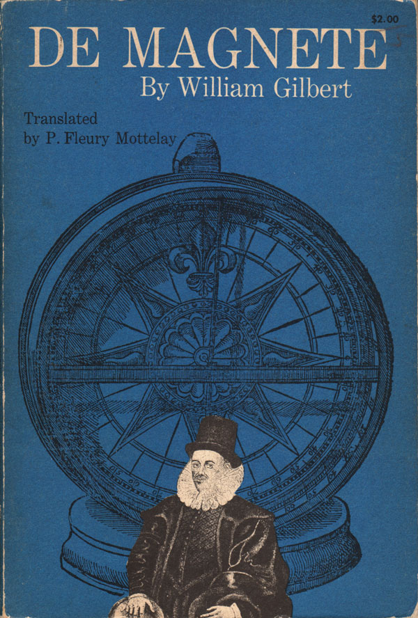
William Gilbert’s early explanation of how magnets work, De Magnete (this edition 1958, originally published in 1600) has a cool cover as well, although less dynamic. The large illustration of the magnet is actually much more visually interesting and important to the content than the image of Gilbert, so it’s unfortunate it’s shoved into the background by being printed in black on a rich blue background which just absorbs the black ink.
The cover to Konrad Knopp’s Infinite Sequences and Series (1956 ), on the other hand, makes the absolute most out of very little. The only visual elements are the groupings of white lines on black background, but they are more than enough to draw the eye in and across the page. The design quality and efficiency feels similar to other high-modern book design, such as Alvin Lustig or the original cover of Animal Farm by George Orwell (designer unknown).

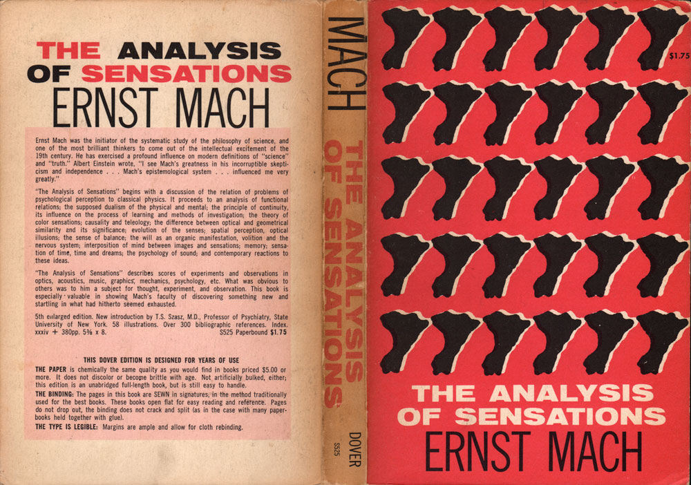
Ernest Mach’s The Analysis of Sensations (1959) has a cover with similar efficiency, but a different tack, using repetition as a visual tool to evoke the intersection of sensations and analysis. I have no idea what the black shapes are supposed to be, but I appreciate the bold decision to place them on a bright pink background. Some of these covers remind me of the design used on the early editions of the New World Paperback series (featured in these posts HERE). And similarly they are unattributed. But both publishers were based in New York City, and it seems not entirely impossible that they might have shared freelance designers!
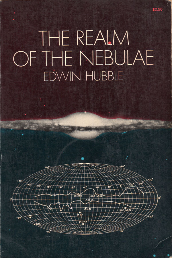
Edwin Hubble’s The Realm of the Nebulae is the only book here with a gloss cover, the others all feature a nice raw paper finish. Although I doubt it’s intentional, the red, white, and blue fields make for a funny reference to the French flag, but also deepen the bifurcation on the cover made by the nebulae. The type and the illustration also perfectly balance each other out on the top and the bottom.
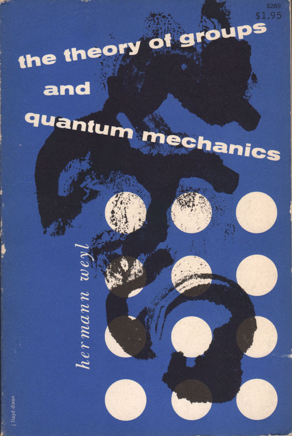
The cover of Hermann Weyl’s The Theory of Groups and Quantum Mechanics has an attributed designer, J. Lloyd Dixon, and reads as modernist in intent. Like the covers of Paul Rand or Lustig, it is expressionistic rather than directly representational, the abstract black shape and texture being brought to heel by the grid of white dots, the title and author angling off the pattern.
Overall I think this is a really stunning collection of unsung book design, and I’ll be keeping my eyes peeled for more of these as I dig through the shelves at used book shops. Just goes to show that the popular places to look for interesting cover design—literature and art—might not always be the most rewarding.
Bibliography:
William Gilbert, De Magnete (New York: Dover, 1958). Cover design unattributed.
Edward Hubble, The Realm of the Nebulae (New York: Dover, 1958). Cover design by Menten Inc.
Konrad Knopp, Infinite Sequences and Series (New York: Dover, 1956). Cover design by Poznanski.
Ernst Mach, The Analysis of Sensations (New York: Dover, 1959). Cover design unattributed.
I.P. Pavlov, Conditioned Reflexes (New York: Dover, 1960). Cover design unattributed.
Hermann Weyl, The Theory of Groups and Quantum Mechanics (New York: Dover, nd). Cover design by J. Lloyd Dixon.