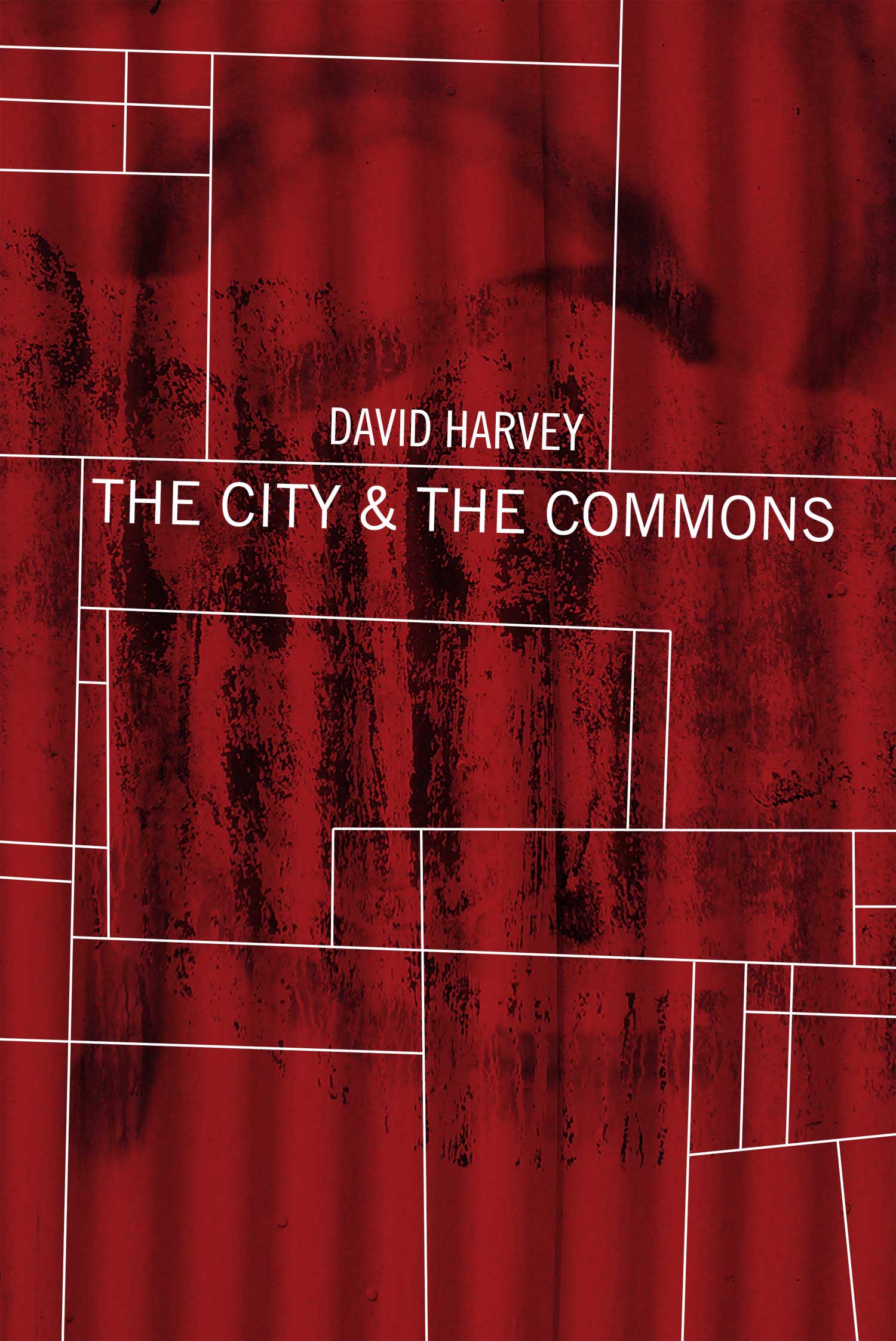
So for this second installment of Behind Design, I thought I’d talk a bit about what went into my recent screenprint poster, Producing the City. Back in April, my friend Malav from Common Notions, a small far left publisher, asked me if I would design a poster for David Harvey‘s 80th birthday. It seemed like a great gig, I have a lot of respect for Harvey’s writing and thinking, and even designed a cover a couple years back for his Rebel Cities book (published by Verso Press).
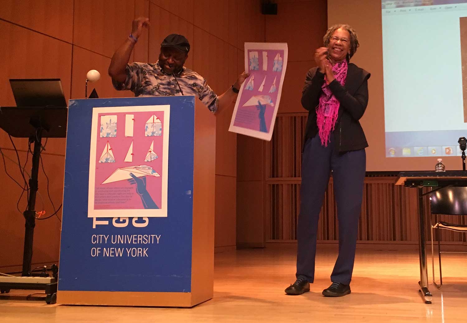
The main distribution outlet was a conference entitled Consciousness and Revolution at the City University of New York (CUNY) Graduate Center, put on by the Center for Place, Culture and Politics (CPCP). Malav was involved in organizing the conference, and CPCP wanted to use the event as an opportunity to celebrate Harvey’s birthday. Everyone that attended the conference got a poster as a gift, as did Harvey himself.
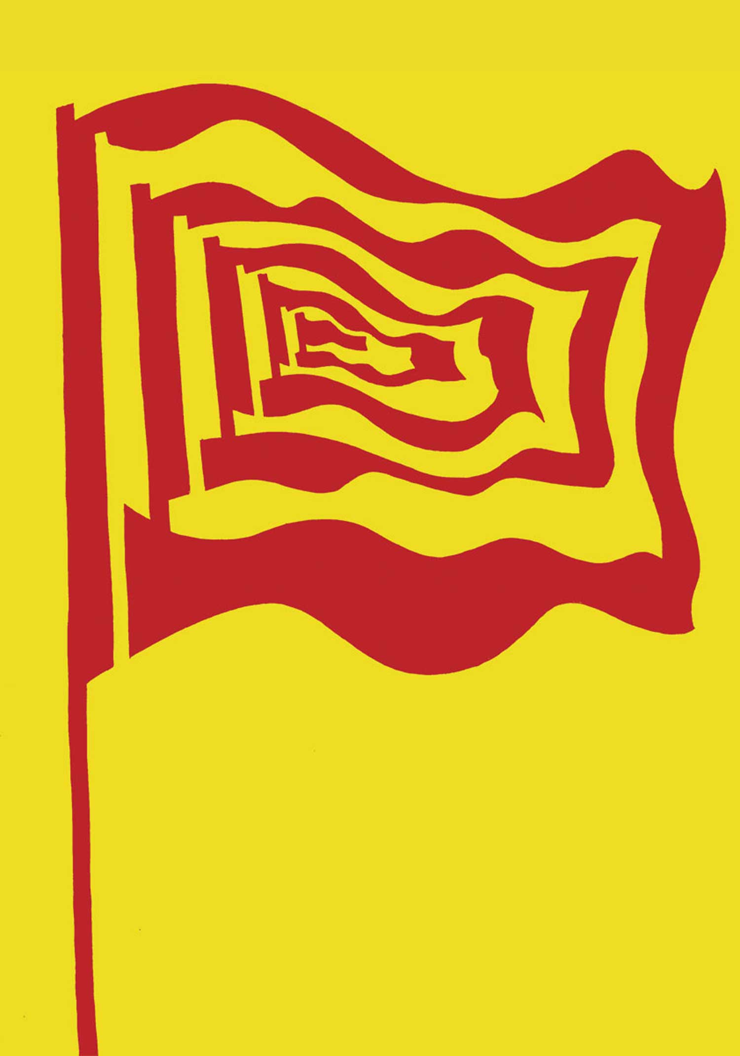
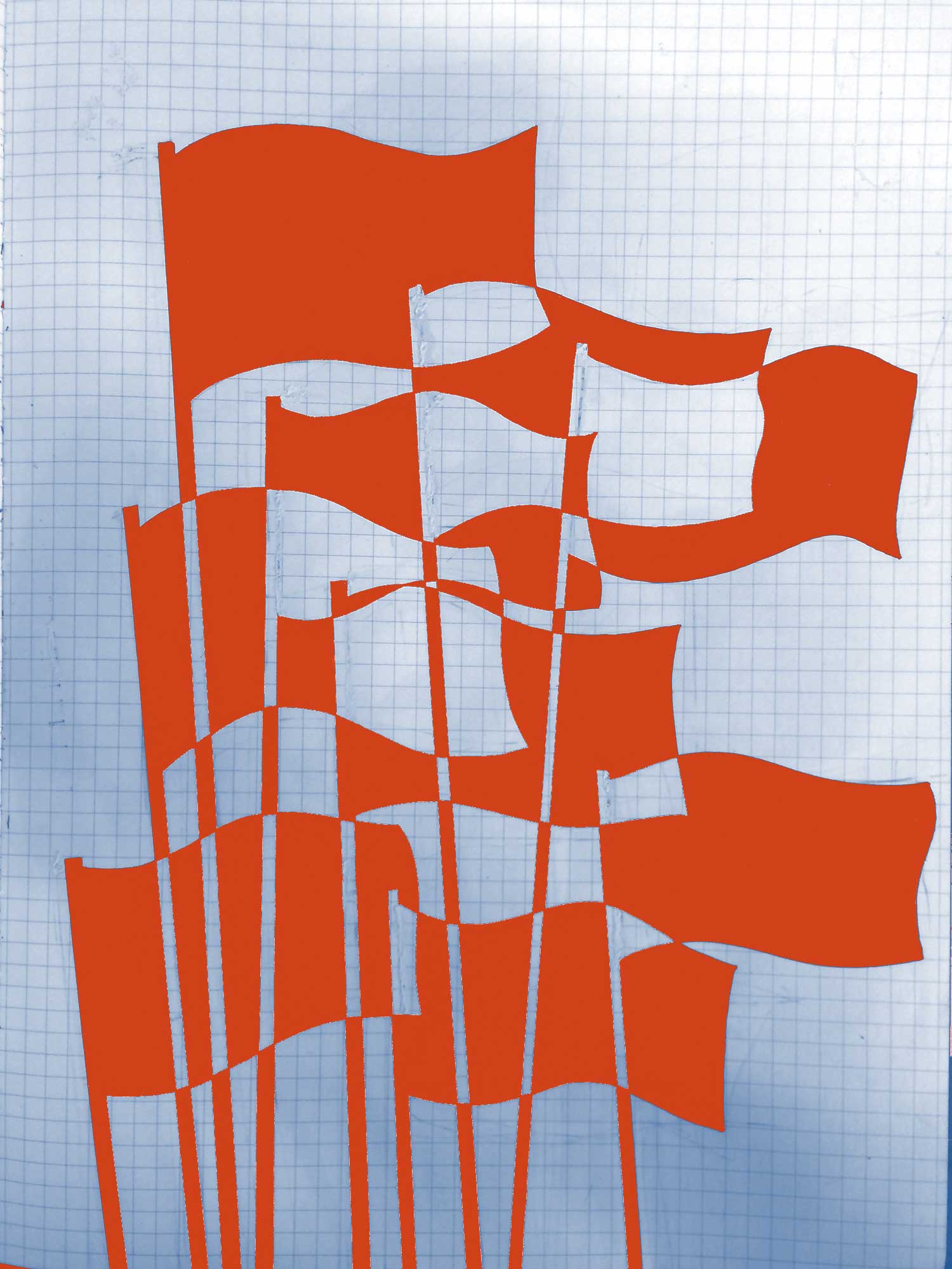
Malav, Mary from CPCP, and I sat down and talked about different possible design directions. I had a ton of rejected designs from the Rebel Cities cover, so we started there. The original title had been The City & The Commons, so I had mocked up a bunch of ideas mixing mapping/topography with urban street imagery. One of the nicest is below left, and Malav and I thought it might be a place to start for the poster. I had also been drawing a lot of flags earlier this year, and knowing that Harvey wasn’t one to shy away from a big red flag, I started thinking about building a design around one of these. The flag within a flag within a flag (below, center) seemed like a good start, as it sort of creates both a conceptual and physical terrain, one where communism is always simultaneously emerging and collapsing. I also began toying with the idea of flags emerging out of a grid, making some sort of map.
Malav collected a set of quotations to reference, and possibly use on the poster. I had initially gravitated towards this one:
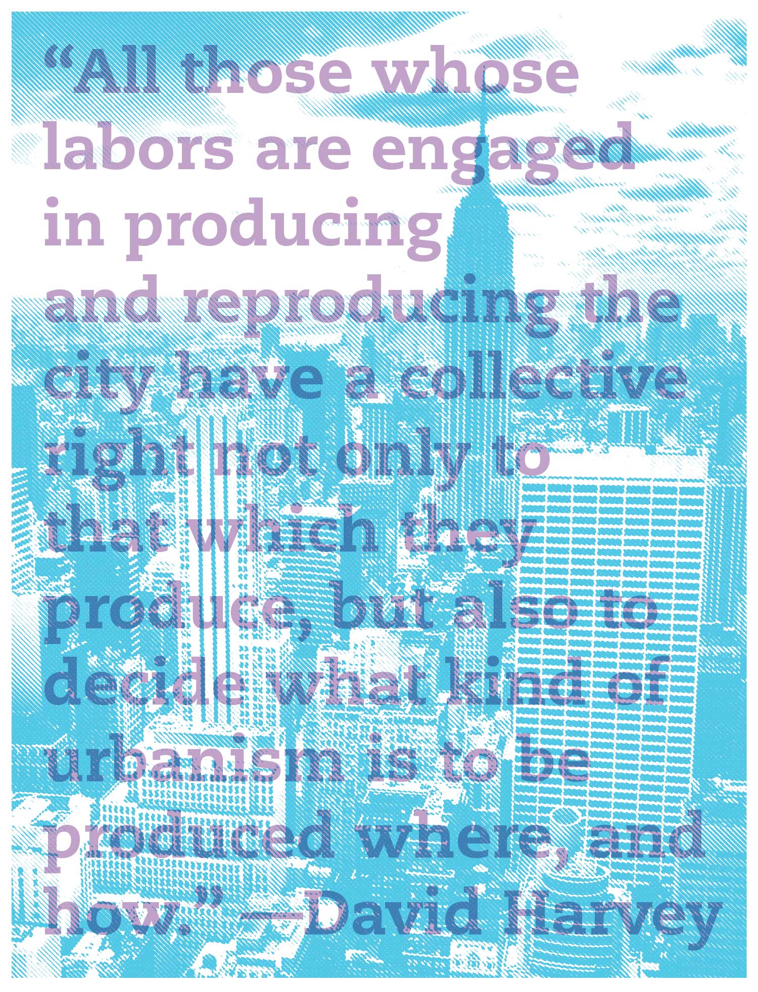
“There is a time and place in the ceaseless human endeavor to change the world, when alternative visions, no matter how fantastic, provide the grist for shaping powerful political forces for change. I believe we are precisely at such a moment.
Utopian dreams in any case never entirely fade away. They are omnipresent as the hidden signifiers of our desires.”
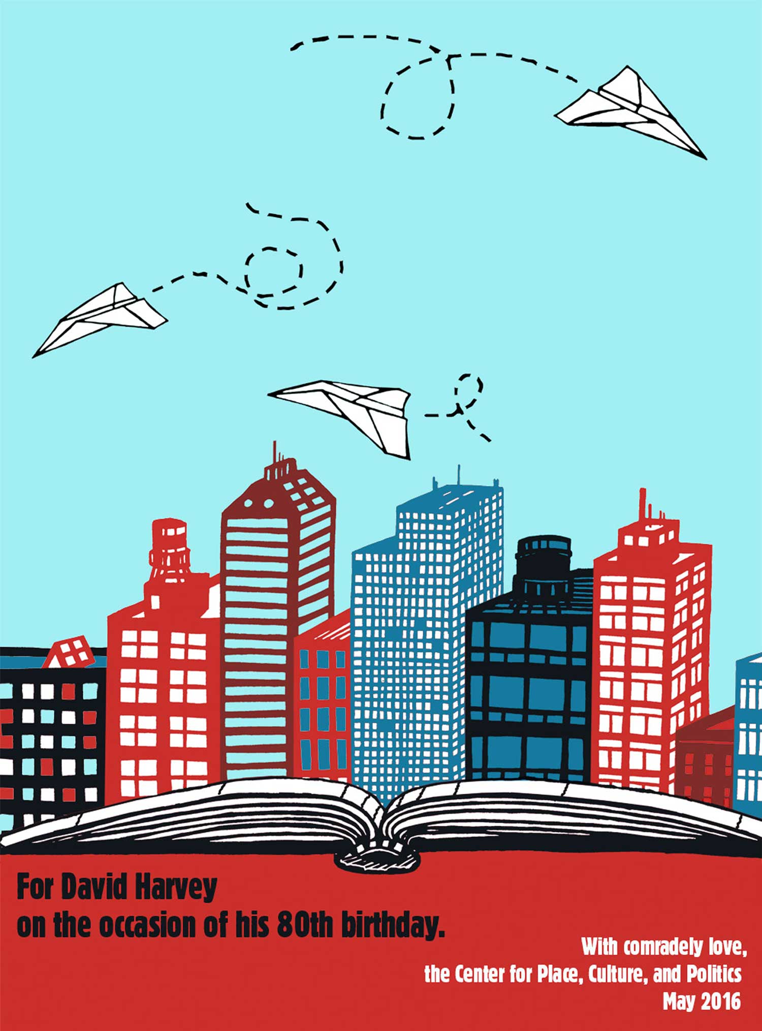
I remembered that I had designed a poster for the Institute for Anarchist Studies years back, maybe in 2010. It featured a city emerging from an unfolding book, with paper airplanes flying through the sky. The image is a little cartoonish, but it seemed like a good place to start, so I dug through old harddrives and found it. I also liked the idea of putting the quote on the trails of the paper airplanes (something I had done on a poster back in 2006 with birds). I was thinking about how the airplanes were a small, yet poetic, gesture of intervening into the city. Although the draft was well received, part of the feedback was this interesting point:
“A question I would have, though, is about the cityscape. Is this the capitalist city or is it meant to be a “postcapitalist city”? To me it seems to be the former. I just wondered because I was thinking about the role of the airplanes and the utopian words above.”
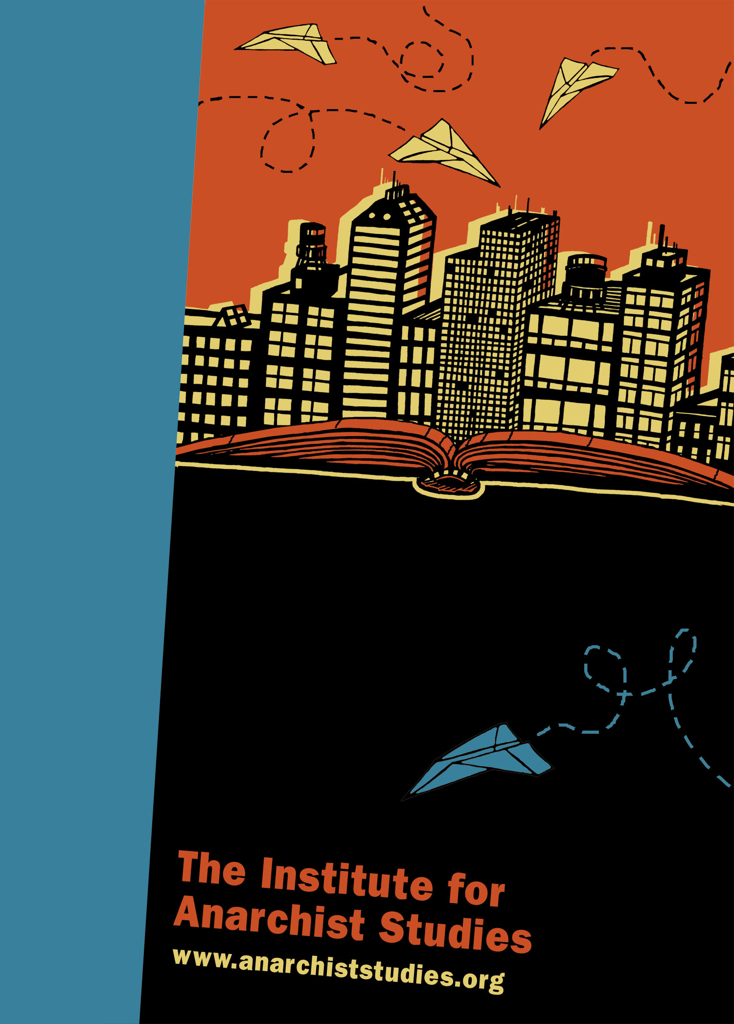
To which I replied, maybe a little too defensively:
“Aye, there’s the rub, right? What does a postcapitalist city “look” like? Are all the buildings the same height and shape, a la Soviet housing blocks? Are they all gumdrop shaped with space-ships flitting between them? Is there anything about gumdrop shapes or flying cars that conveys an equal distribution of wealth? Windmills and rooftop gardens? But don’t we already have those, along with entrepreneurial programs having youth of color work them for little or no pay?
For me the architecture of the city can’t be the foreground of whether it is postcapitalist. I see the airplanes as poetic gestures, ideas thrown by human hands that flit between the buildings, that carve out strange trajectories and interesting spaces.”
Which elicited this response:
“I do take the planes as poetic gestures. I guess I am just wondering, since we chose the less urban text, how the tension between the (capitalist) city and the planes/text can be clearer. Perhaps . . . a point of interaction of the two can yield to a new/different form. I see why the form taking on some “eco” architectural form is not interesting. Could it be something else—a socio-organizational form? An assembly in action? a manifestation of a confederative relation? or maybe you show a taste of the hands making the planes?”
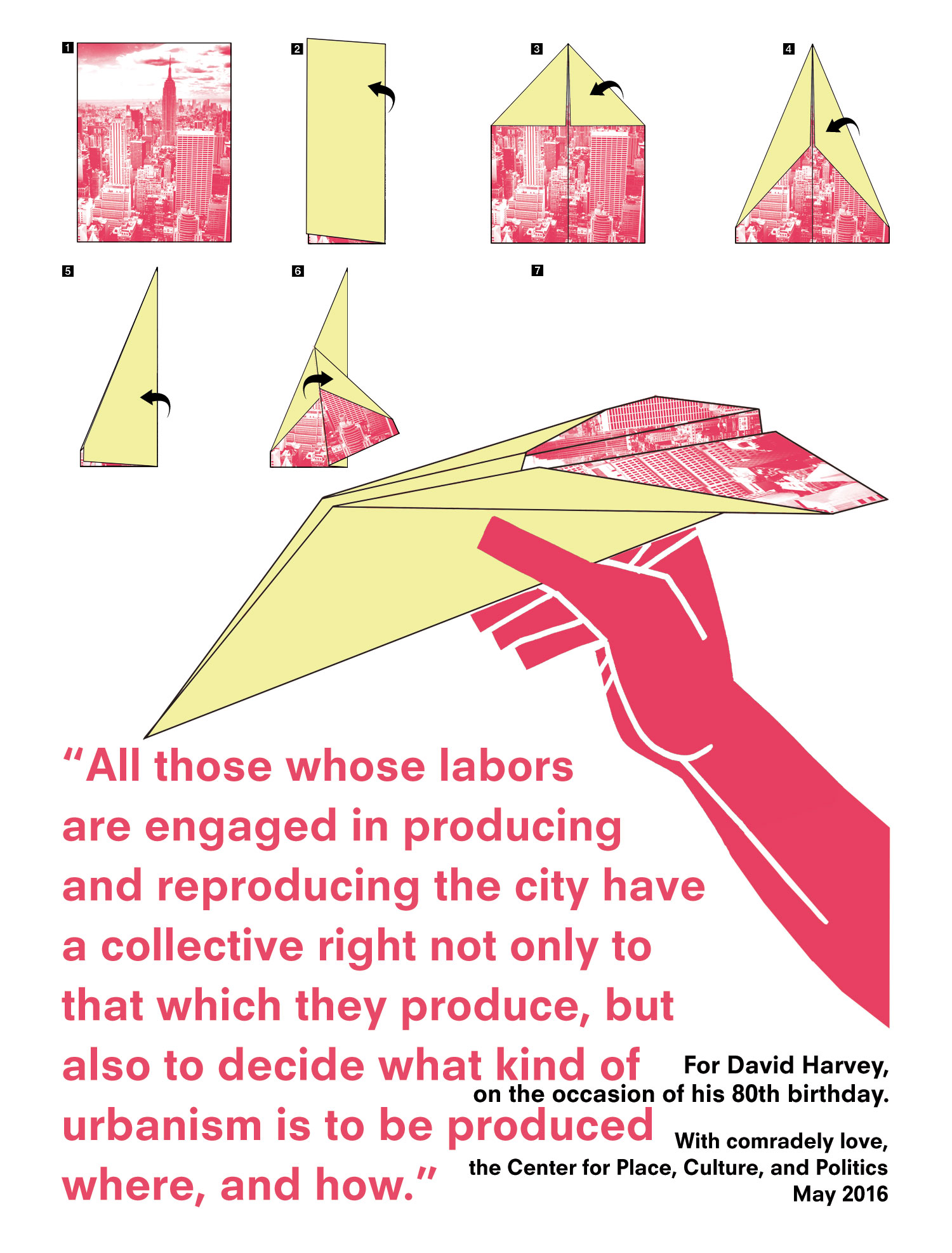
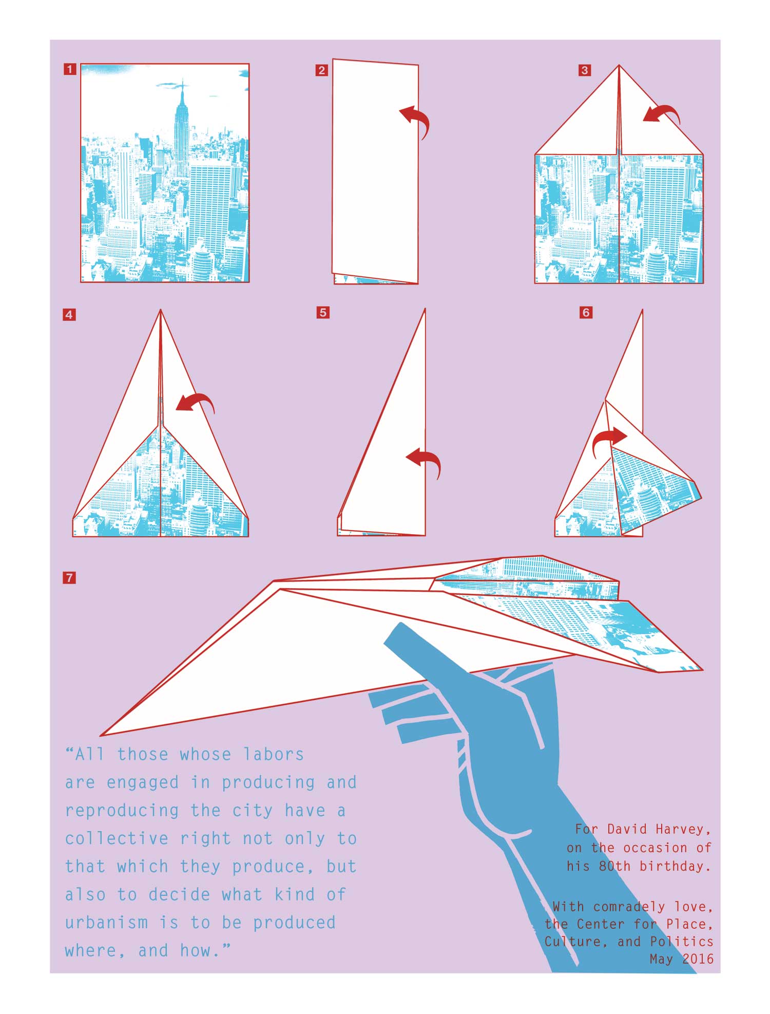
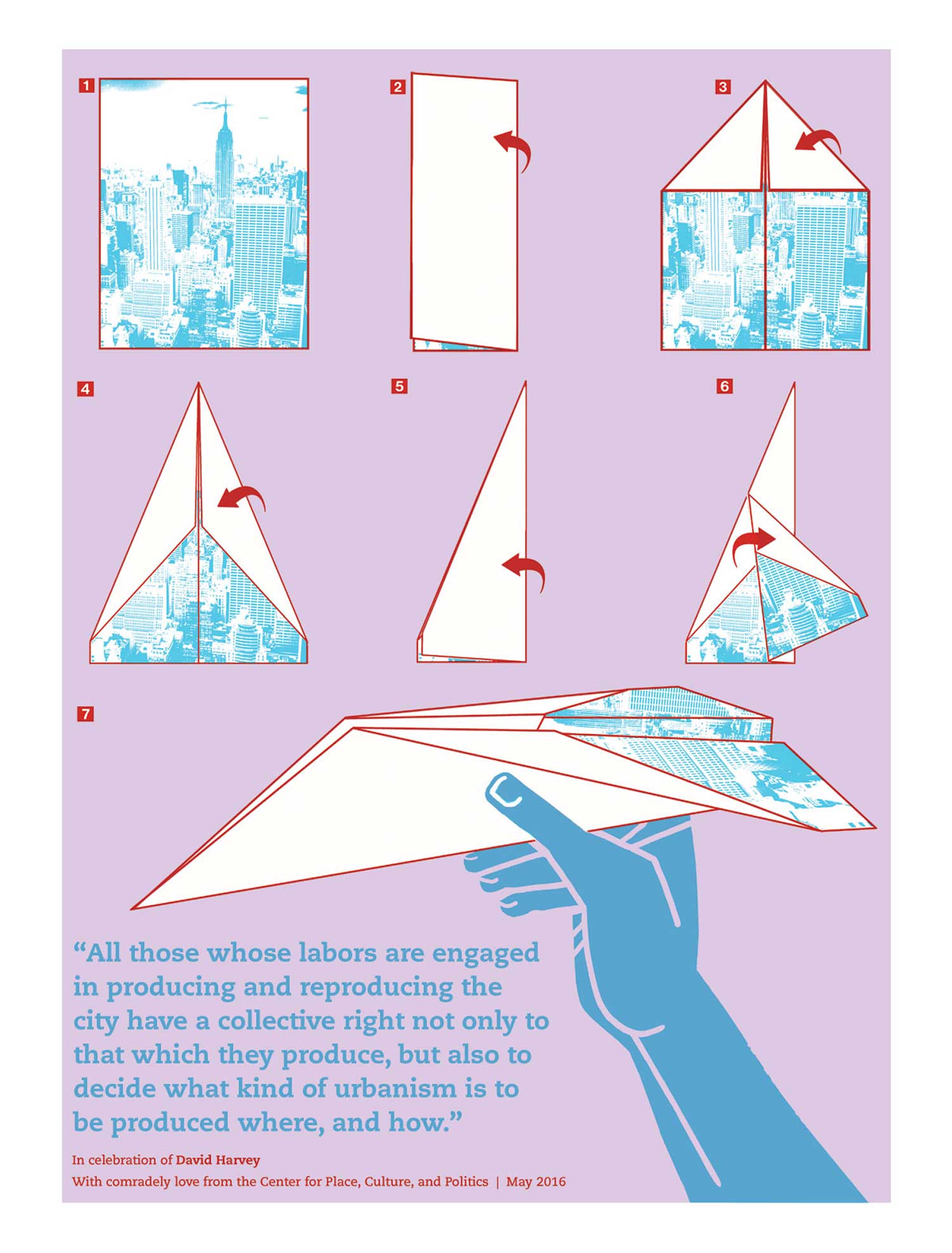
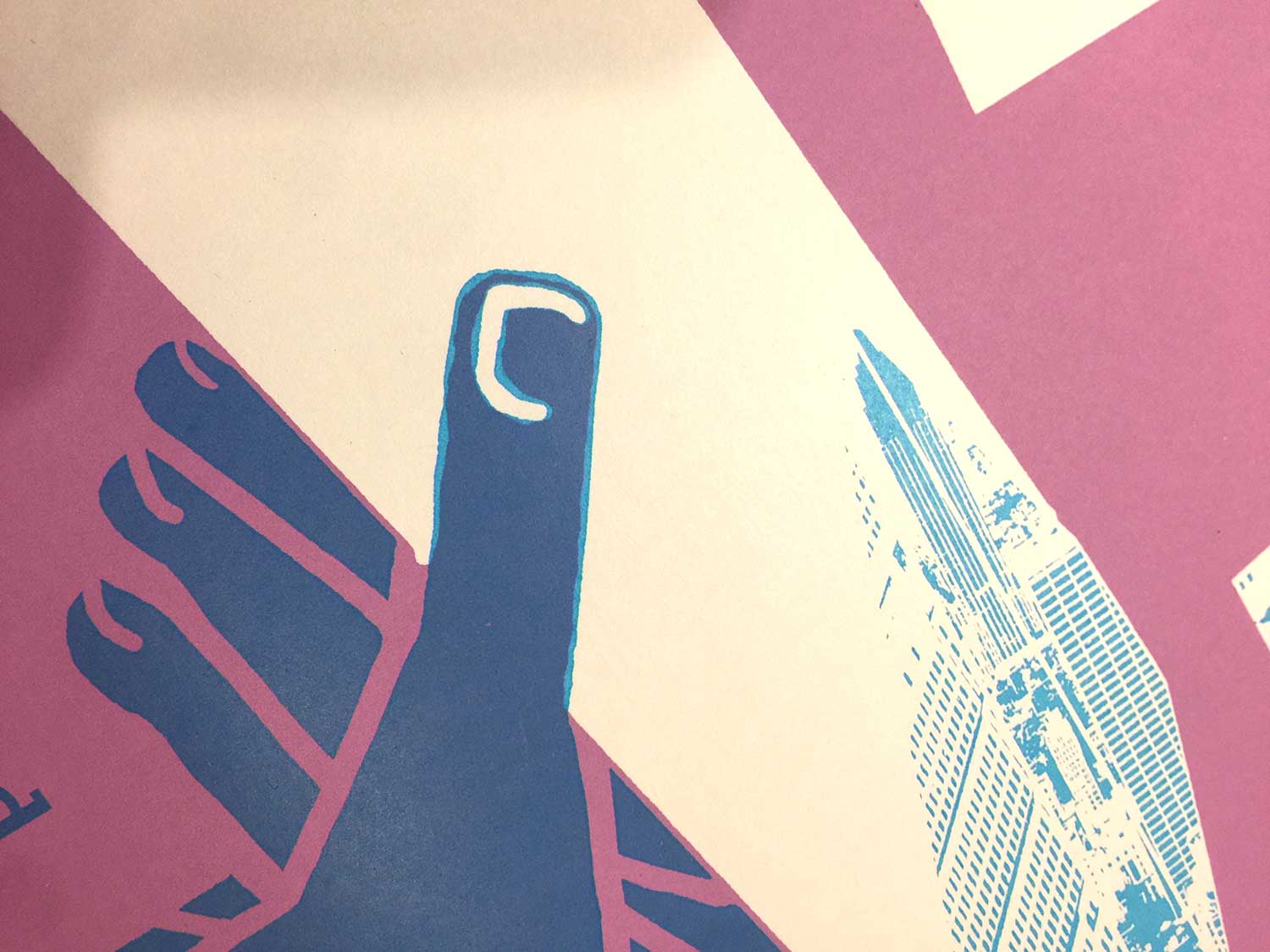
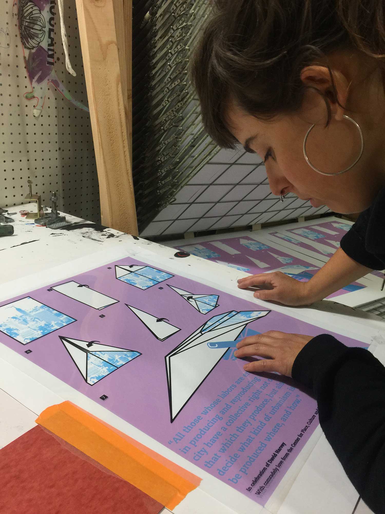
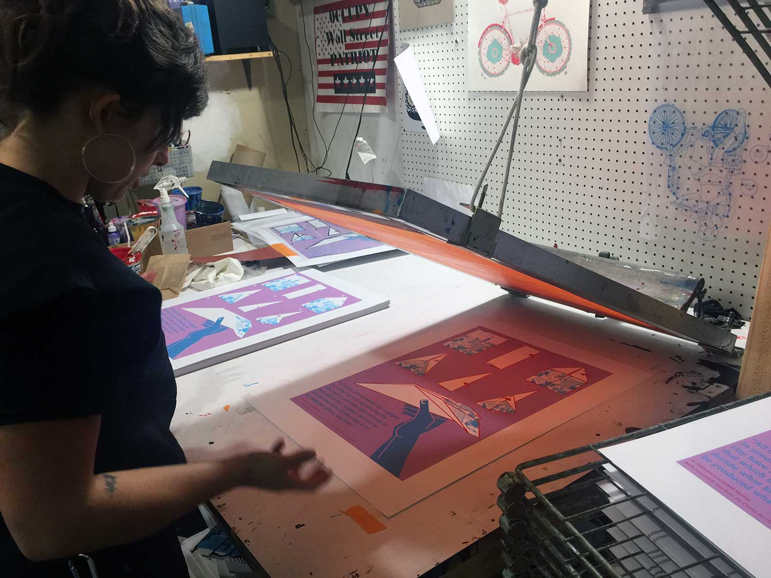
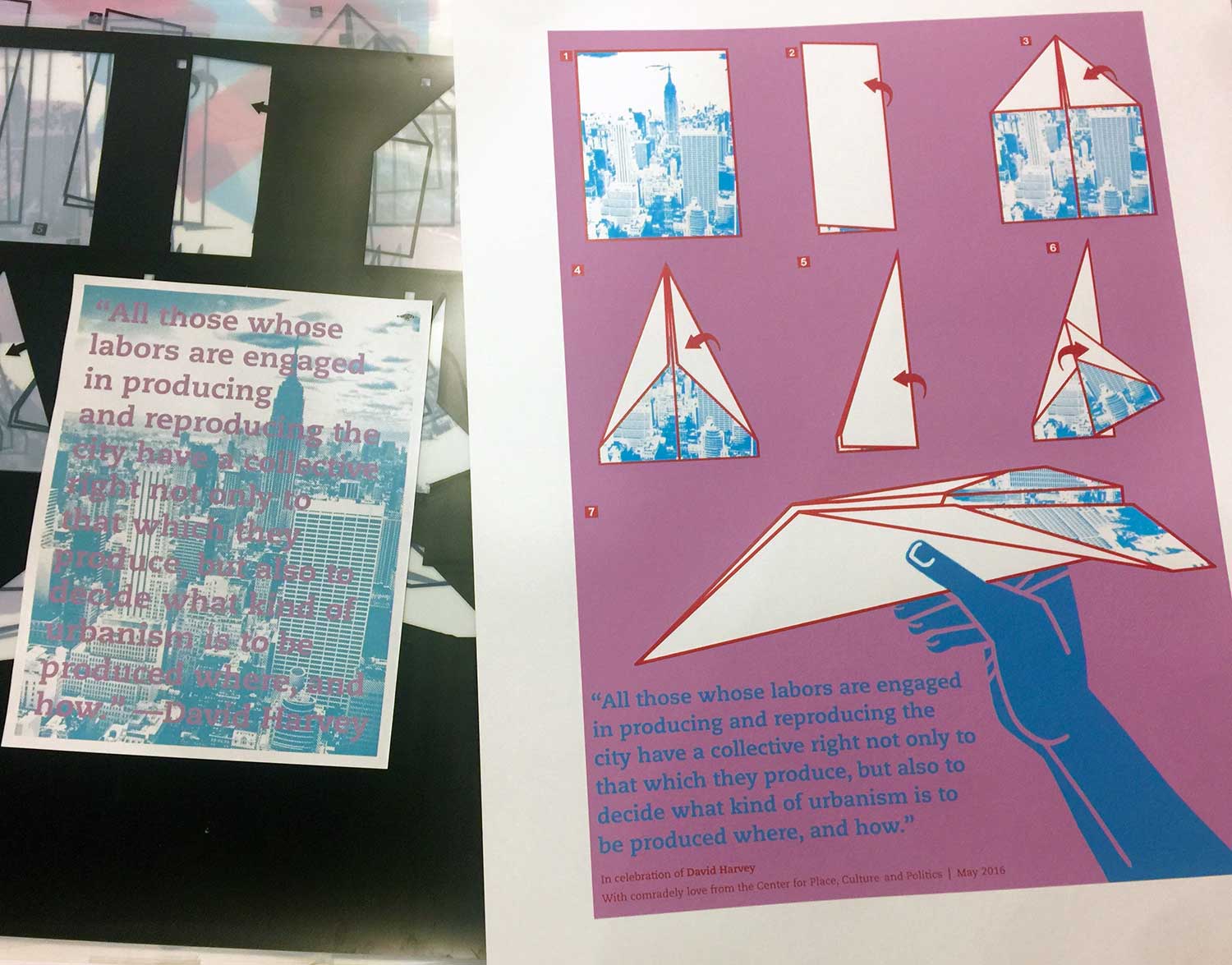
It’s the last bit of question/comment that really provoked me. This was the lightbulb moment: Why show paper airplanes flying in the city when I could just turn the city into a paper airplane? This is also why feedback and collaboration are so necessary! In addition, as a designer I sometimes forget that I’m the one in control, I can make the images and text on the page do just about anything I want, and it doesn’t have to follow dominant logic, reason, reality.
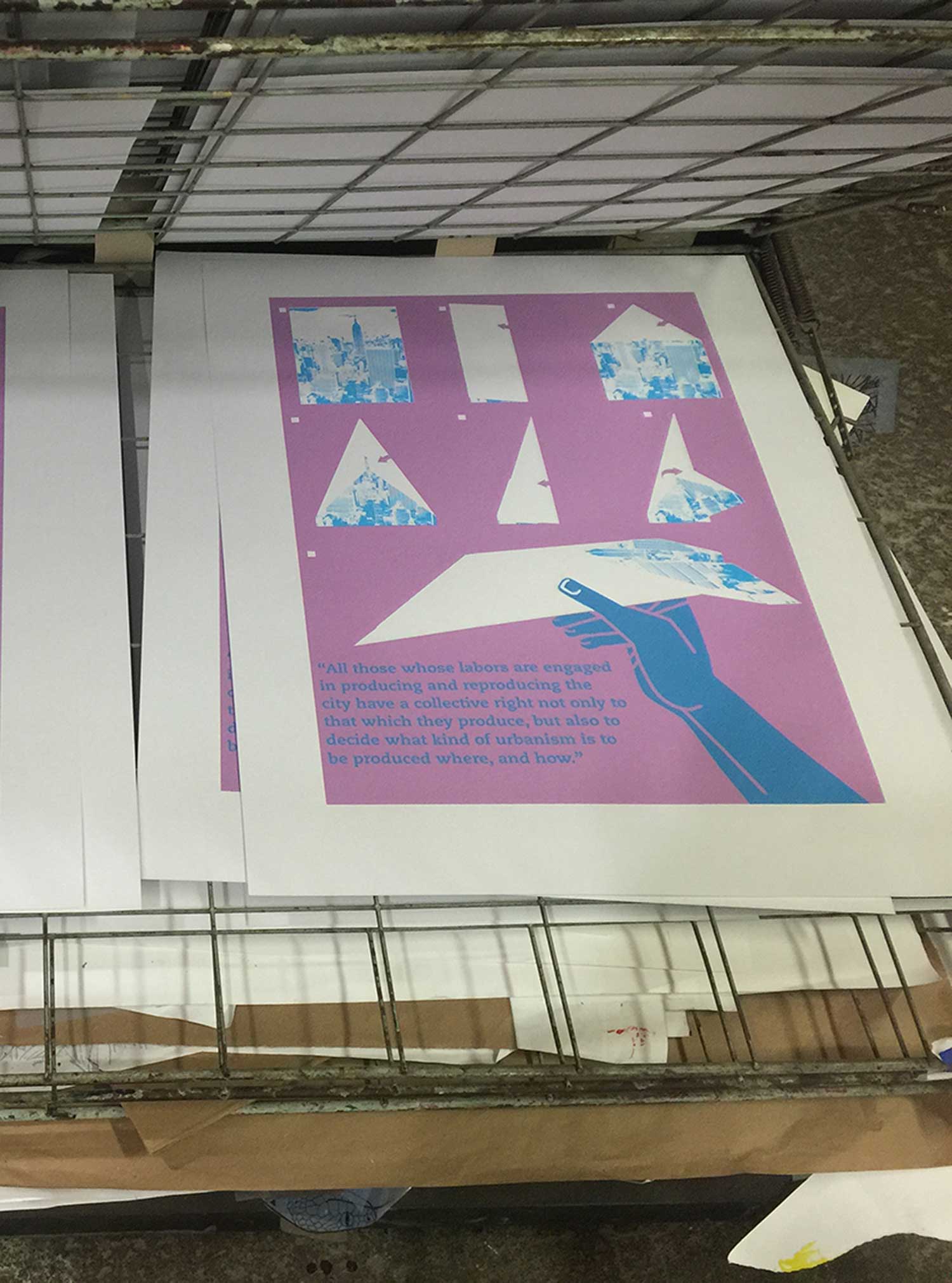
OK, so I’m going to turn the city into a paper airplane, thus converting the maker—or any maker—of a plane into a city planner, a provocateur, someone who can destroy and make the world in a series of folds. Folds! What if the city was a sheet of paper, and the poster was an instruction manual for turning the city/sheet into a plane?


Is there anywhere where I can get this print?