
In 1962, British paperback publisher Penguin launched a new book series, the Penguin African Library (PAL). Along with the Heinemann African Writers Series, it is one of the most ambitious English-language publishing ventures focused on Africa, and featuring the writings of Africans. The series was edited by Ronald Segal, a white, but Jewish, South African exiled in the UK for his anti-apartheid activities (I’ll go more into Segal in a future post). PAL ran from 1962 through 1975, and includes some 42 books, although many of the books were published in multiple editions, often with alternative covers. Each book was given a unique number with the prefix AP, so AP1 through AP46. Over the past couple years I’ve trawled used bookstores and hunted the web, and I’ve collected 51 unique covers, which I’ll focus on over the next handful of weeks. At the end of this series of blogs, I’ll be posting a full bibliography with citations to the designers of each book, so I won’t be doing much designer or image attribution in the body of the blog itself.
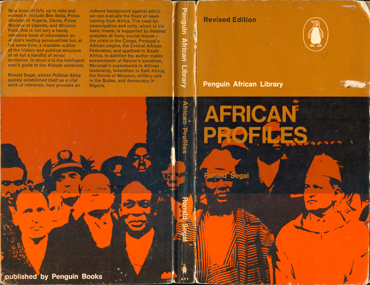
The first book published was by Segal himself, entitled African Profiles (AP1: 1962). The cover design, by Massimo Vignelli, sets the tone and general style for the next 25 books in the series. The page is horizontally trisected by two overlapping fields: the top two-thirds are a solid color that I’ll call “PAL brown”; the bottom 2/3rds hold an image, the middle section where they overlap creates a third space. We’ll see dozens of variations on this simple grid system throughout the series.
African Profiles is a good example of the PAL grid. As you can see in the “Revised Edition” (1963) below, the grid wraps around the entire volume, including the spine, creating three visibly distinct horizontal boxes. The entire operation has a strong symmetry. On the front the top section is left largely blank and open, with an unobtrusive Penguin logo and the series title in white. The duo-toned photo of African leaders, on the other hand, is obscured, first by the darkened middle band overlapping brown, and then by the title (in all caps) and author’s name—both punched out of the image and left in brown—and Penguin’s then-standard cover typeface, Gill Sans. The back cover takes the opposite tack, filling the top third with black type, and then largely leaving the photo on the bottom two-thirds alone. Finally, the grid really works well on the spine, creating three distinct rectangles, one for the series title, one for the book title, and one for the author.
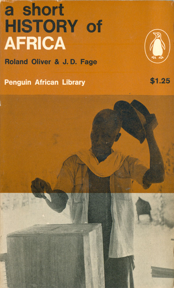
The second book in the series, A Short History of Africa (AP2: 1962), edited by Roland Oliver and J.D. Fage came quickly on the heels the first. The cover, also designed by Vignelli, is a basic modification of the design set on African Profiles. This time the title and author are moved up to the top third of the grid, and printed in a combination of black and white, and capitals and lowercase. The photo is of a man voting, and I can only assume it is intended to resonate with the title, showing how different contemporary, increasingly independent, Africa is compared to its colonial and pre-colonial history. The decision to make the word AFRICA white both helps it draw your focus, as well as balance the light tone of the photo at the bottom. It is important to point out that these early covers are not CMYK printed, they are spot colors, struck from metal plates, which often leave indentation, giving the books a strong feel as print objects.
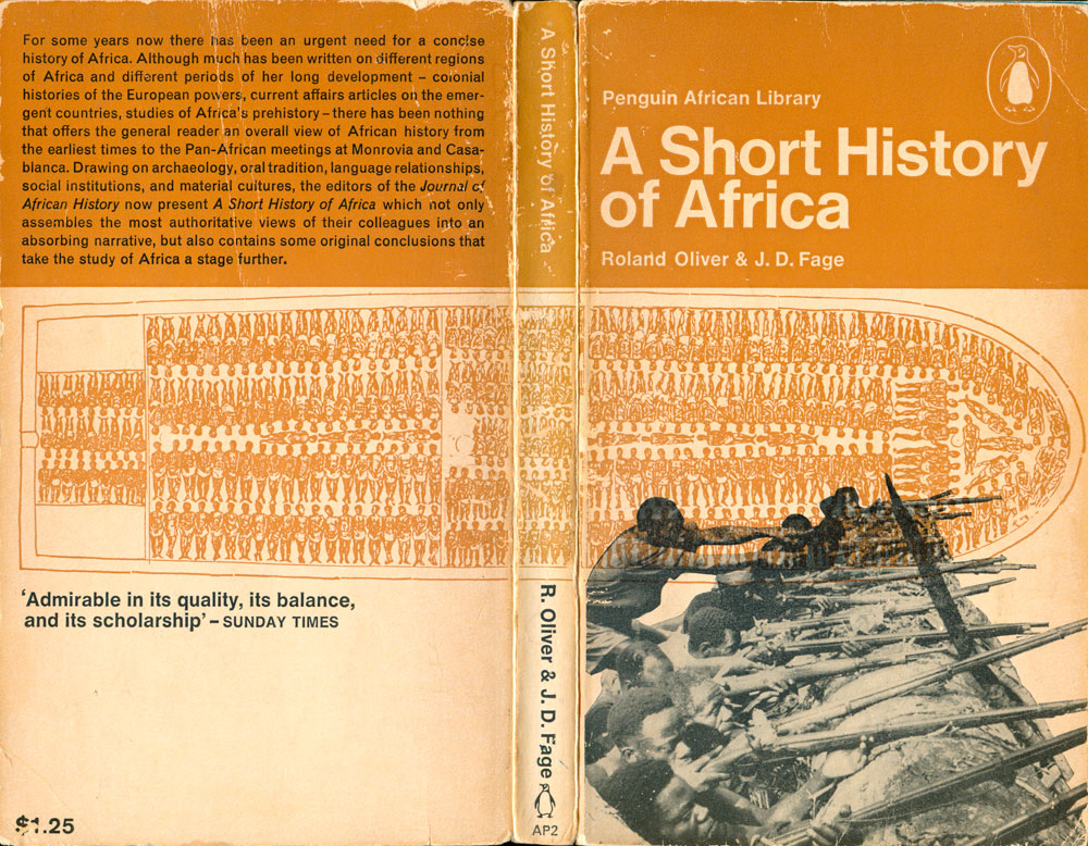
A second edition of A Short History was published in 1966, and we can see how the series design has evolved slightly, and designers are taking more liberties, pushing the boundaries of the grid. On this cover the middle section of brown is inverted, and instead of the negative space being a field of color, the color becomes a positive object, the slave ship (which also handsomely wraps around to the back). The overlapping bottom photo of armed Africans balances the slave ship perfectly, moving the subjects of the book from objects of oppression to actors in their own struggles. I suspect in the early and mid-60s, as Africa is actively decolonizing, this representation is itself a political gesture, planting this collection firmly on the side of decolonization. Back to aesthetics, this is a great example of design efficiency, with a strong cover created with only two printed colors, one of them being a largely unattractive brown. The mixture of colors and capitalization is lost in the new edition, with a standardization of white titles on the PAL brown, and capitalized first letters of words only.
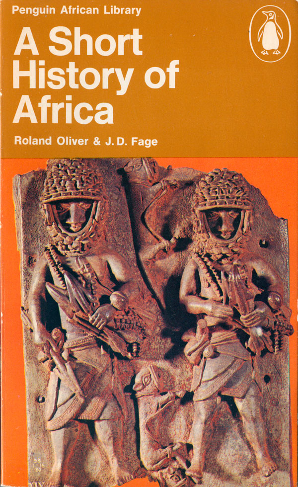
A Short History must have been one of the most popular of the PAL books as it was reprinted for a third time in 1970. The cover on this late edition follows the evolution of the series cover design, with the brown third left at the top, but the bottom 2/3rds turned over to a color photograph, in this case a Benin bronze sculpture. While the muted shades of brown seem justified in the early covers where the palette is so limited, when the decision is made use color photos, it seems strange to choose one that is largely brown, and to place it on an orange background.
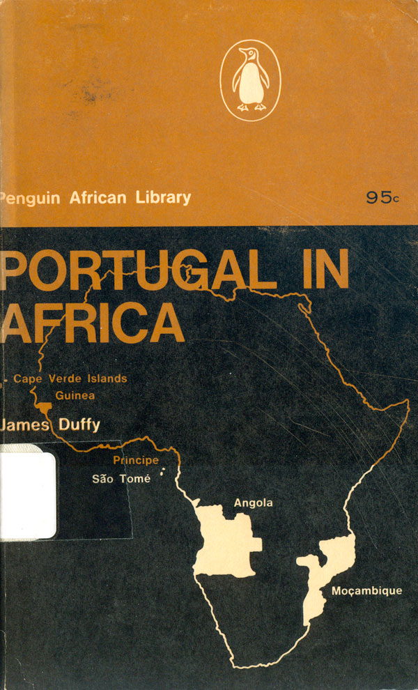
James Duffy’s Portugal in Africa (AP3: 1962) is the next PAL book. The cover more strictly follows the style of African Profiles, with the overlapping brown and image-based squares. The top rectangle is left brown, the title emerges from the brown in the middle section, in all caps on top of the map of Africa which fills the bottom 2/3rds and highlights the Portuguese colonies. Maps, flags, and other graphic elements (especially pre-colonial masks and statues) become a major component of the covers for the series, and this is the first example of an attempt to build a compelling cover with these often extremely flat elements.
By all accounts I’ve read, AP4 was never produced, and is a blank spot in the PAL bibliography. I have not been able to figure out what the intended title was, nor if any cover design was ever drafted. On all the Penguin bibliographies I’ve found, AP4 is a ghost, a blank spot on the page.
Patrick Keatley’s The Politics of Partnership (AP5: 1963) is the next title that was published, and takes the grid and the flat elements mentioned above and creates something new. The basic overlapping squares are the same, and the top is still dedicated to a wide swath of PAL brown. But centered in the bottom square is the coat of arms for Nyassaland (now Malawi) on top of a vertically split field of blue. The two blues overlapping with the brown create a set of four differently shaded squares, with the crest holding them together in the middle. The blues are a nice departure, and resonate with the brown in a new way, creating a more dynamic color field. The title, with its shifting blues midway through, is a nice detail as well, pushing the series style but ultimately submitting to it.
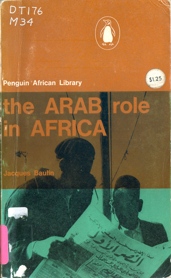
The next book is Jacques Baulin’s The Arab Role in Africa (AP6: 1962). This time the bold bottom color is green, and it gets to operate in concert with a photograph instead of a logo. The green, brown, and their overlap color are nice, but unlike AP5 (on the left, below), the title is left in brown, which makes the cover feel a bit less dynamic. The quirky titling resumes, with Arab and Africa in all caps, the rest in all lowercase. Both here and in AP5 the initial “the” is left lowercase, which is interesting, as that would never happen on a book cover today, unless their were specific stylistic reasons powerful enough to overrule standard grammar.

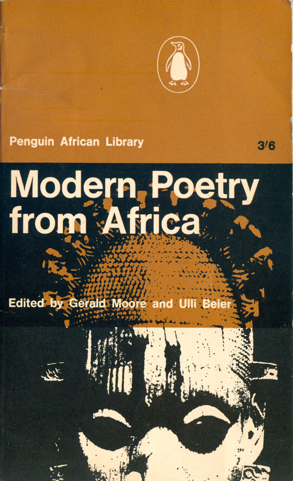
And I’ll close out this week with the next title, which might also be the one most familiar to readers here, as it has circulated more than many other of the PAL titles. Gerald Moore and Ulli Beier’s Modern Poetry from Africa (AP7: 1963) has been used as a course text and is the most common of the series I find in stores and at used book sales. The cover is very similar to AP3, except the map is replaced by an image of a sub-Saharan African mask, the contrast blown out to the point where it functions more as a graphic element than a photograph.
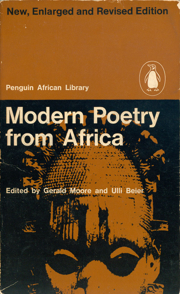
A revised edition was released a couple years later in 1965, but the cover largely stays the same, except the three part grid is abandoned, and the bottom third is filled with the same PAL brown, making the mask one seamless graphic element with all the type floating above it. This makes for a more traditional and logical cover than the initial version, but it loses some of the quirkiness.


Penguin contracted with David Williams in 1963 to produce a book on Ghana. Six years later and with no manuscript they wrote it off. That may have been the projected AP4.
Thanks for the info Rob! Helps fill in the gap!