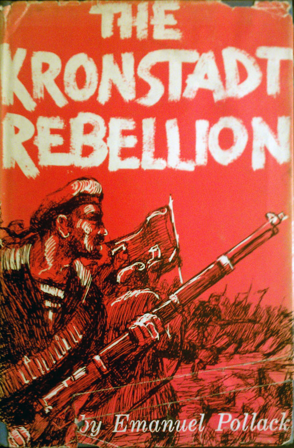
This week’s post is inspired by the book to the right, which I came across on Alec’s bookshelf during a recent visit to Pittsburgh. Emanuel Pollack’s The Kronstadt Rebellion (New York: Philosophical Library, 1959) caught my eye, with the roughly drawn hand lettering—almost as if the title was graffiti painted with a broad brush—and the sketchy black drawing with bright white highlights on a red field. What’s not to like? (Once again I apologize for the slightly blurry cell phone photo.) If it hasn’t become abundantly clear, unlike most of the reading public in the U.S. I’m not a fan of straight photographic book covers. With the spread of digital pre-press in the late 90s/early 2000s, it became easier and easier (and cheaper) for publishers to run large 4-color process photographs on their covers, and the book trade very quickly became dominated by them. I would guess that about 65-75% of all covers are now graced with full color photographs, with that number being even higher for nonfiction books, likely upwards of 80%. This is all just to say that heavily illustrated and uniquely lettered covers like Pollack’s are rarely produced these days.
But beyond my screed against photographic covers, this book spawned an interest in seeing how else Kronstadt has been represented on books. (For those in the dark, Kronstadt was an important moment during the Russian Revolution, when in 1921 a group of sailors mutinied against the Bolsheviks in solidarity with a general strike occurring in Petrograd. Many of the sailors had clear anarchist tendencies, so when Trotsky crushed the revolt and killed the sailors, Kronstadt became a touchstone for the animosity between big-C Communists and anarchists.) The most definitive book about Kronstadt was written by the historian Paul Avrich, who generally had strong anarchist sympathies. His book Krondstadt 1921, has been published in many languages and likely over two dozen different editions. I’ve found six, all shown below.
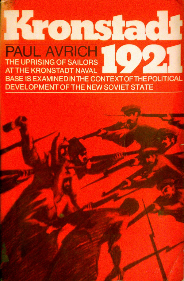
Alec had on his shelf what I’ve found to be the most common edition floating around, one published by Norton in 1974. Like the Pollack cover above, it features an illustration in black on a red field, with white type treatment. While a strong cover, in comparison it seems almost clinical, with none of the expressiveness of the Pollack. The figures fighting seem static, and the title sits in a heavy block on top. Next to it is the cover of the most current English edition, published by Princeton University Press in 1991. A poster about the Kronstadt sailors before the 1921 revolt has been reworked into a cover. While the original poster is bursting with movement and energy, the lazy titling and block of blue dumped at the bottom of the cover contain rather than release this energy, making for what feels like a lost opportunity.

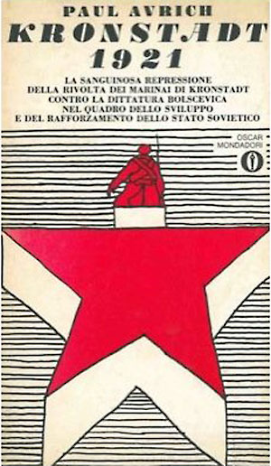
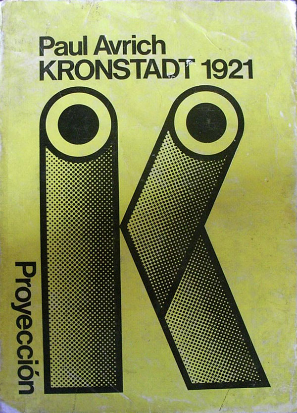
Some earlier foreign editions get right what the U.S. versions miss. The Italian cover (left) published by Oscar Mondadori is fabulous. The revolutionary sailor is represented as the top of the Soviet star, but split off from the larger body, standing above in moral authority and revolt. The handdrawn horizontal lines and huge drop shadow give the star and figure a great “pop,” so they are lifted right off the page. The Argentine cover (right) published by Proyección in 1973 takes a different tack, but one just as pop-inspired. Kronstadt is represented by the letter K, constructed with stylized cannons from a battle ship. Not only is the cover simple and efficient, it also references back to classic soviet poster designs for the film Battleship Potemkin, which rely heavily on the same cannon imagery.
Below those are another, more recent, Argentine edition (Anarres, 2007, to the left), and a Turkish cover (Versus, 2000s). Both of these are functional and clean, but dull. The Anarres cover has two different design elements competing against each other; on the one hand there is the super-enlarged title greyed out and running behind the readable title, almost never a good idea, and on the other, nice red blocks at the bottom at the same degree slant as the title, referencing constructivist conventions, which is often a very good idea. Unfortunately they cancel each other out and the cover is a wash.


Another popular account, partisan for the anarchists, is The Kronstadt Uprising by Ida Mett. I believe it was first published in English as a mimeographed pamphlet by London’s Solidarity group in 1967, and entitled The Kronstadt Commune. They republished it under the new title sometime in the early 70s, and around the same time (1973) Black Rose in Canada published a new edition as well, with a new introduction by Murray Bookchin. I don’t have a copy of the mimeograph, but my guess is that it’s cover is similar to all the early Solidarity pamphlets, simple text based covers easily created for and reproduced by mimeo and other early reproduction machines. The later Solidarity edition isn’t much either, they’ve simply moved up to a large, clean sans serif title in white on red.
The Black Rose cover has a little more going on, the ever popular red has been eschewed for a burnt orange, and the heroic, stylized fighting sailors have been replaced by a cheering mass, likely the same sailors, but much less differentiated. There are some interesting design decisions at work here. The main illustration is produced twice, obviously on top, but more subtly in the background as white on grey, within the large light slash that cuts the cover into thirds. The titles sit comfortably in black in the top and bottom orange corners, but then the main illustration sits straight on top of the slant, the tops of the sailors hands and their bodies cut off on the edges, floating in a strange stasis between the text above and below. It oddly works, giving the viewer of an otherwise bland cover something worth looking twice at.


OK, next week I’ll trot out more, and if anyone out there is sitting on some fabulous Kronstadt covers, please photo or scan and send them in!!


I have 2 Kronstadt book images for you
in case you are interested in these…
(I don’t see anyway to contact but this mechanism…hope this works out, let me know)
Avrich hardcover
http://recollectionbooks.com/bleed/Kronstadt1921.jpg
A bit better image of Pollack’s book
http://recollectionbooks.com/bleed/KronstadtRebellion.jpg
I should also have the Left Bank Books pamphlet The Kronstadt Uprising of 1921 by Lynne Thorndycraft which I printed many many years ago which I will try to dig up & scan for you.
Online, there is also
http://modkraft.dk/IMG/jpg/1921sandhedenomKronstadt-110.jpg
from the page at http://modkraft.dk/tidsskriftcentret/linkbox/article/kronstadt-1921
Found this quickly…I must be getting organized…..
http://recollectionbooks.com/bleed/KronstadtUprisingThorndycraft.jpg
Thanks Dave!
I can always be reached at josh at justseeds dot org.
If you have any other missing pieces from early book cover posts, please let me know!
Thank you for this good education and writing.