This week, more Simenon! Although rather than focusing in on the author himself, this is a perfect opportunity to dig into one of my favorite moments of paperback cover design, the early 1960s Penguin Crime series. I call them the “greens.” This has been one of the most frustrating of collections I’ve embarked on, because very few of this particular series were published in the U.S. Although upwards of 500 different covers were created for the greens between 61 and 65, you really only see 25 or so that circulate in bookstores stateside. A large number of the ones I’ve collected I picked up in the UK or South Africa. By looking at the evolution of one author’s covers over the decade of the 1960s, Simenon becomes a lens to look at and try to understand what the designers at Penguin were up to. I’ve long, long been a fan of classic Penguins (join the club, right?) and I’ve been including them in these posts for years. I’ve done a number of posters exclusively on Penguin series, including 94 (Political Leaders Series), 111, 112, 113, 114, 115 (Penguin African Library), 116 (West African Series), 120 (various Penguin books on Africa), 148 (early African fiction), and 233 (Ben Shahn).
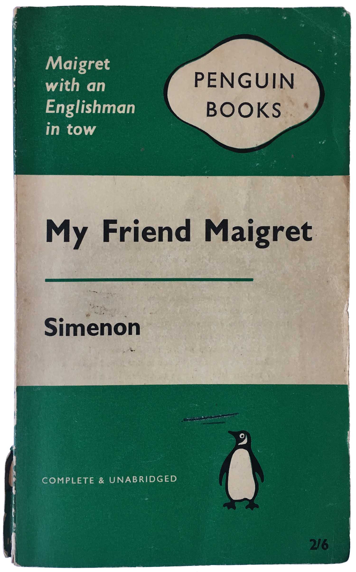
Design-wise, initially the only thing that distinguished crime novels published on Penguin from the rest of their titles was the color of the cover. All the covers used the same basic design (updated from the 1930s original by Jan Tschichold in 1948)—three horizontal stripes, the top and bottom in a solid color (with the words “Penguin Books” in the top and the Penguin logo in the bottom), the middle containing the author and title in Gil Sans Bold. Fiction was orange, travel was pink, non-fiction was blue (named Pelicans), handbooks was yellow, memoir was purple, and crime was green.
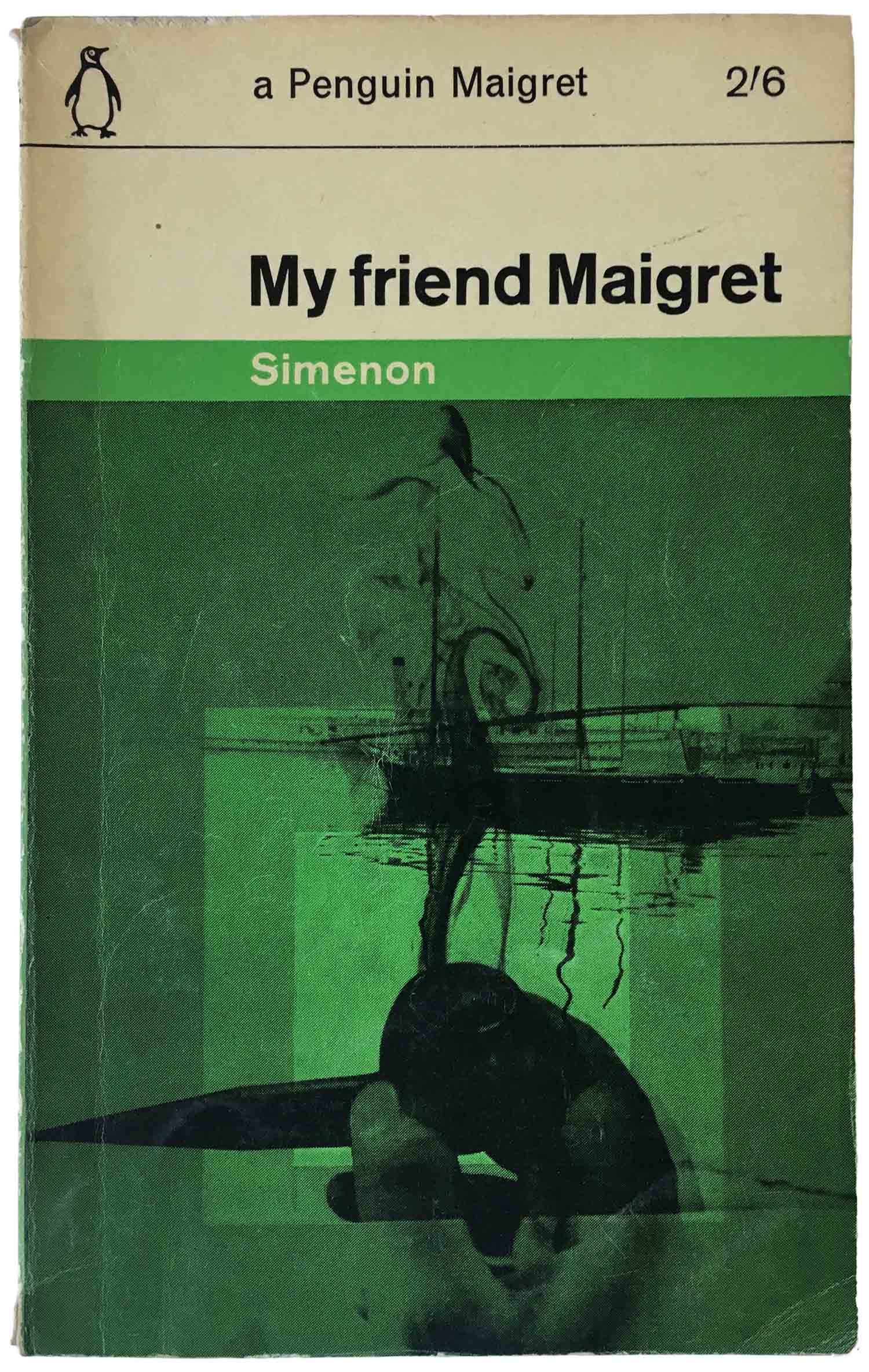
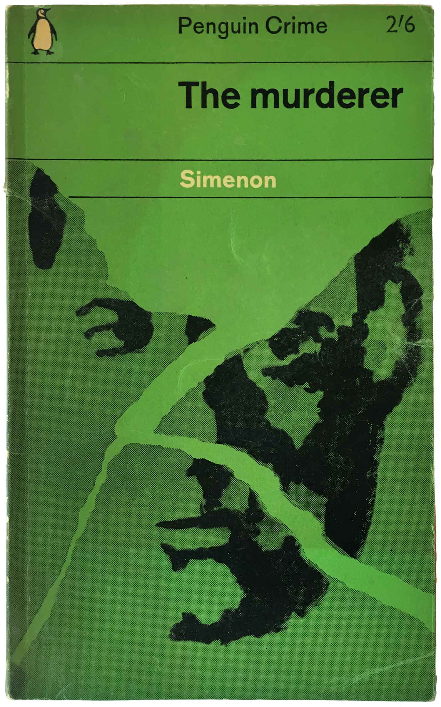
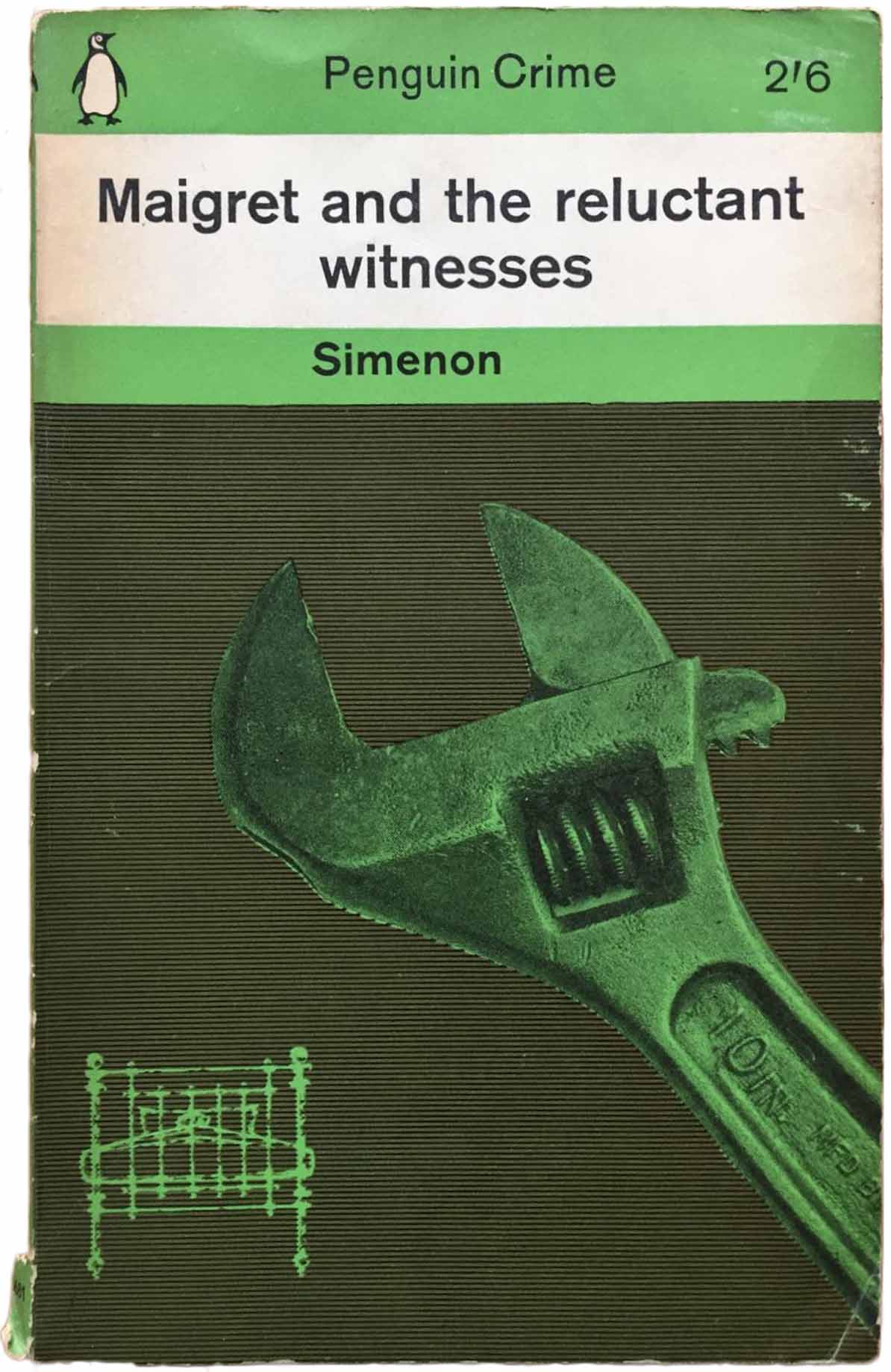
This conservative style was a signature of Penguin, and even as other publishers were moving towards full color and photographic covers, they stuck to their guns. In 1961, then art director Germano Facetti made a concession to the evolving market standards and commissioned a new cover system for the crime series. This new cover grid was designed by Romek Marber, and consisted of moving all of the existing cover information to the top 1/3rd of the page (author, title, price, and Penguin logo), leaving the bottom 2/3rds for illustration. The font was changed to Intertype Standard, and the green color was lightened in shade. All illustrations were expected to be duotone (black and green) and most were relatively abstract, or certainly not direct representations of the book’s content. You can see the before and after above.
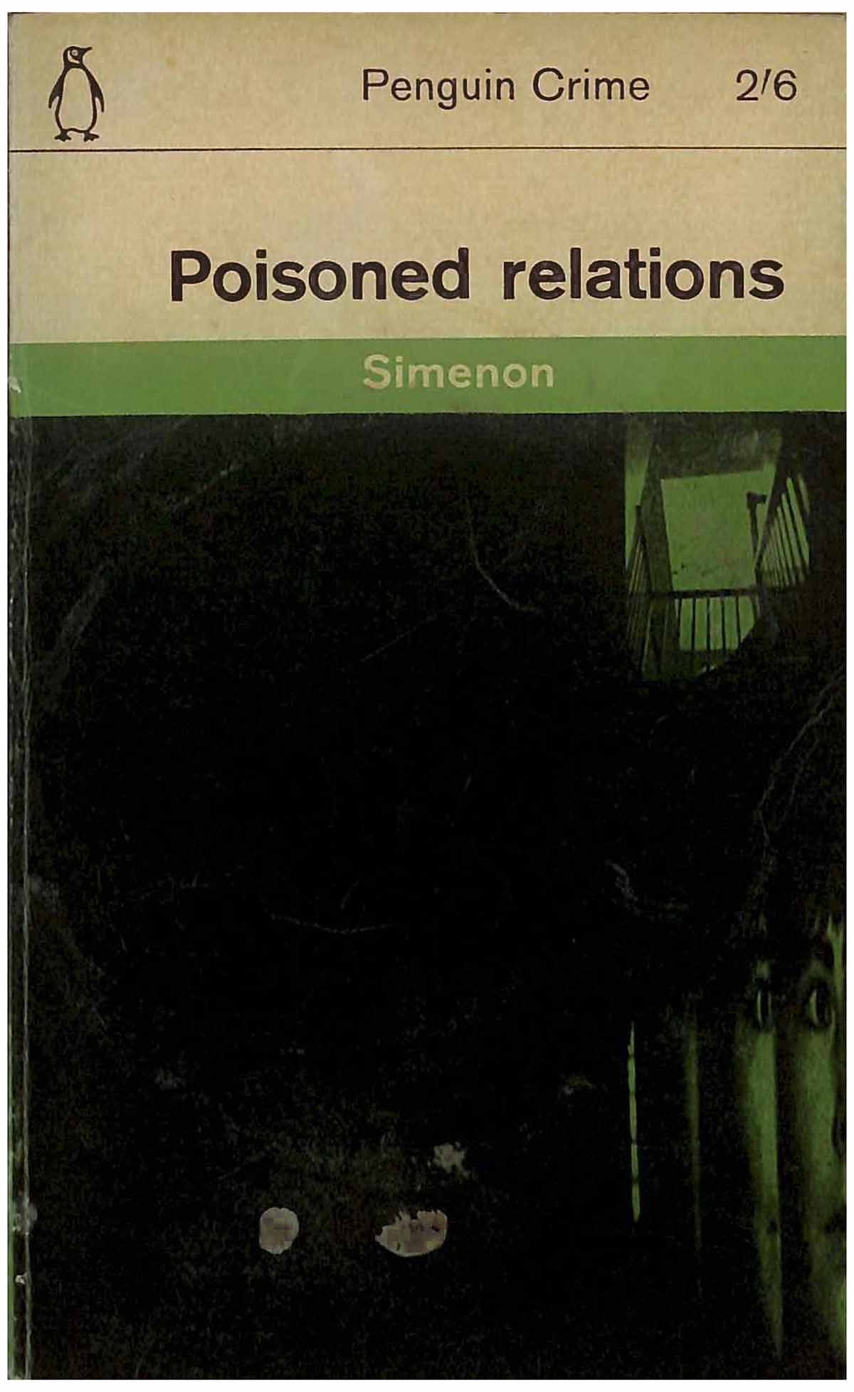
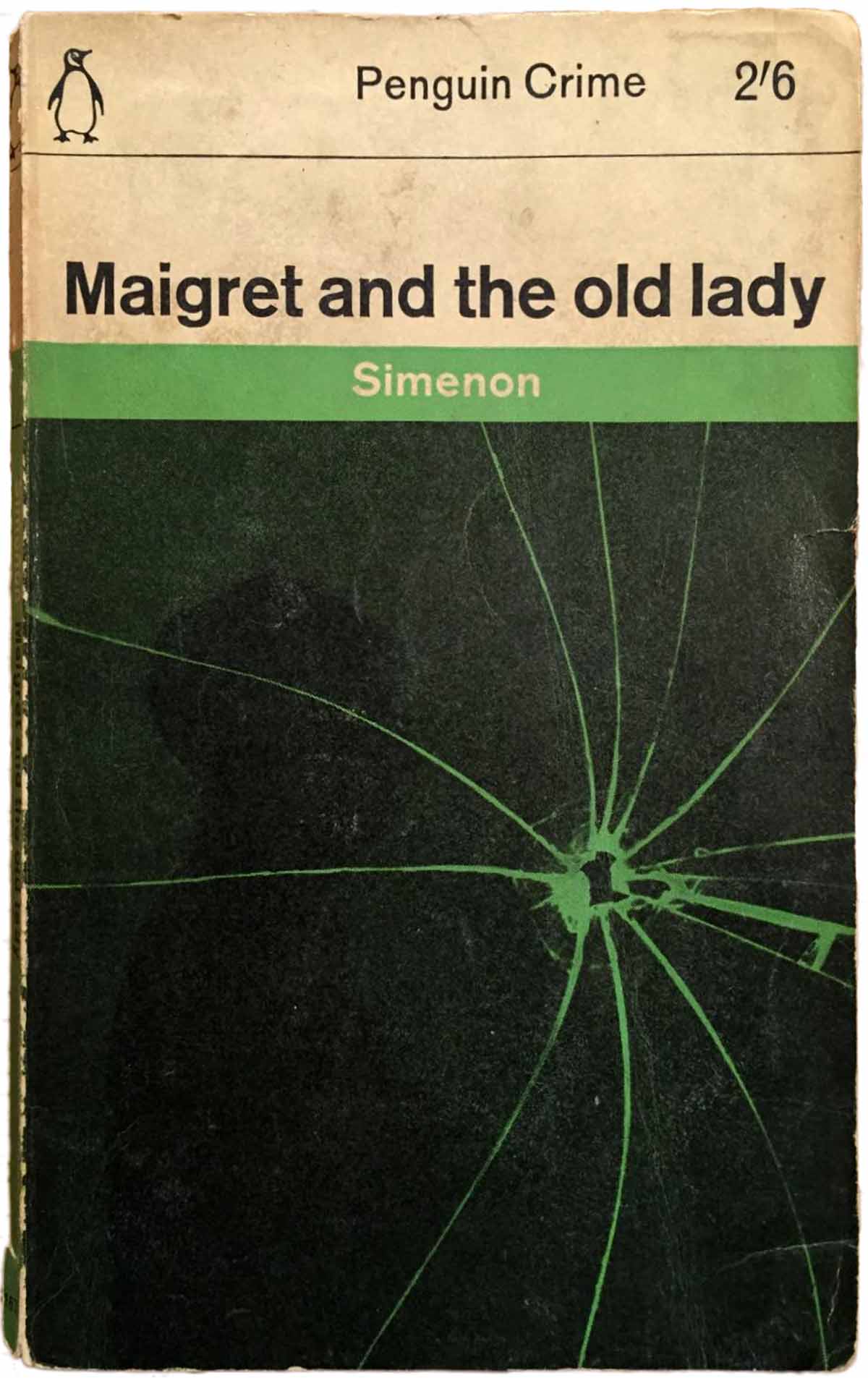
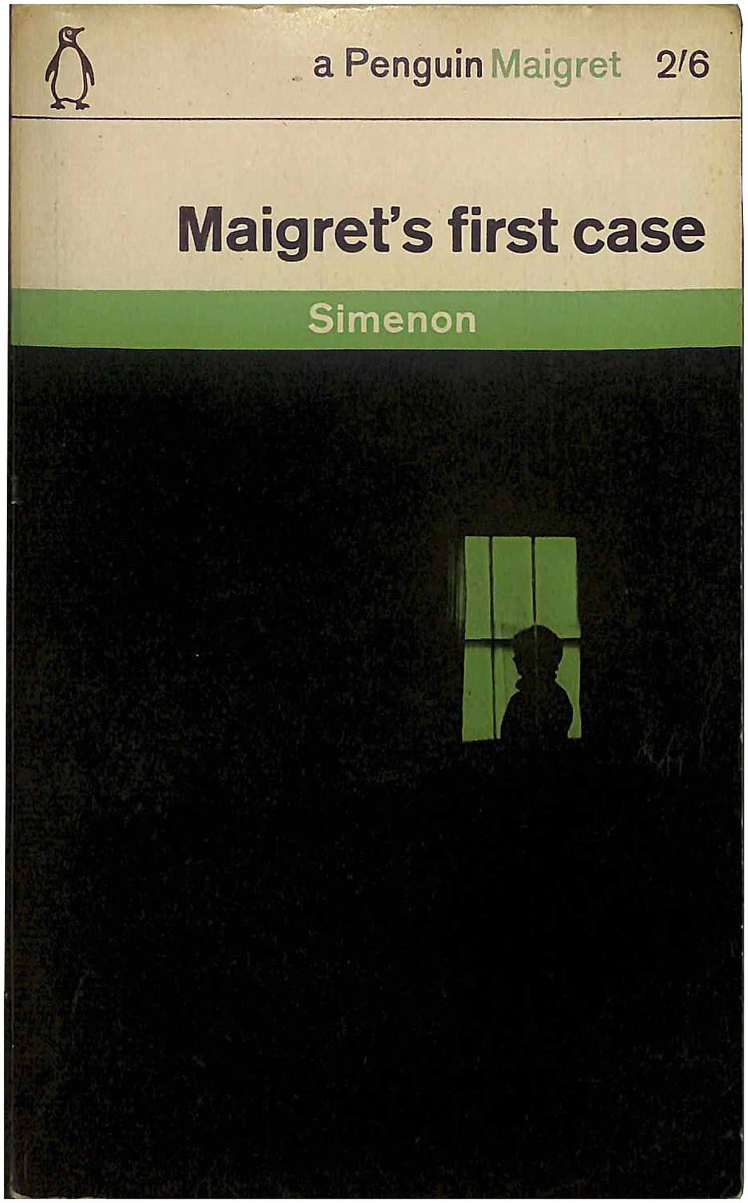
The initial salvo of covers (many by Marber himself) had the first two sections of the top in white, with the author’s name in green stripe, and then the illustration a dark and high contrast photograph. While legibility suffered for the darkness of these early designs (1961–62), they are certainly spooky and set a great mood for a crime novel.
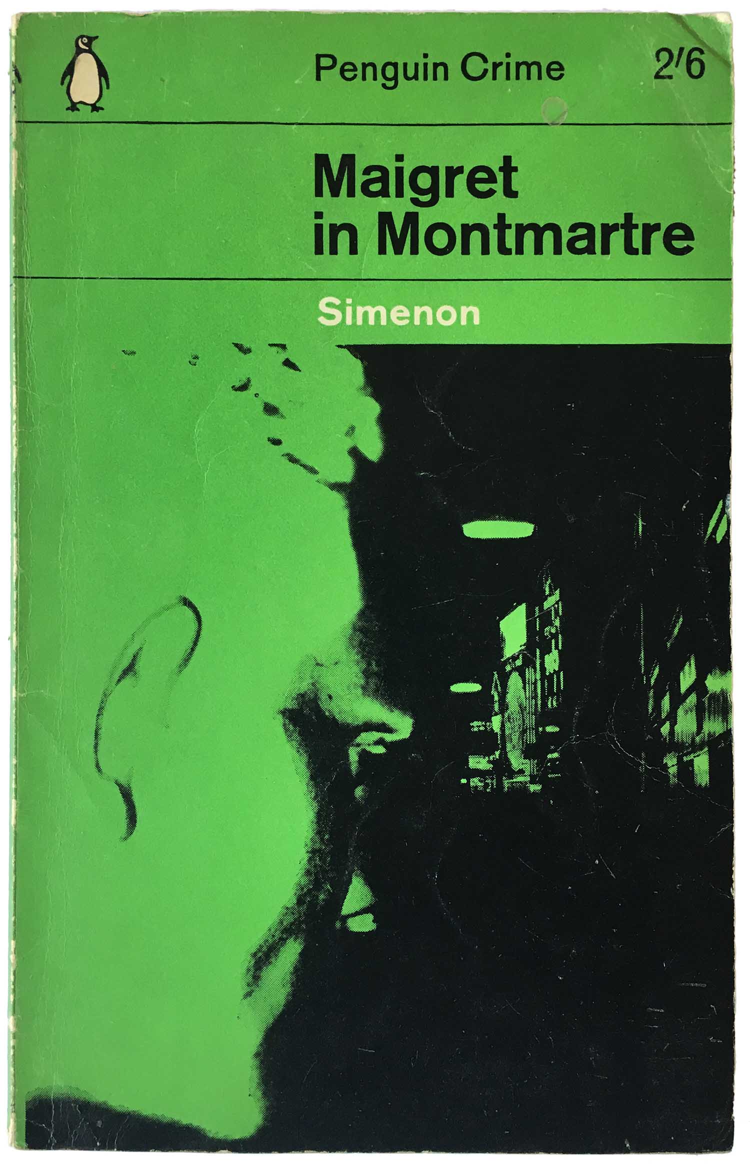
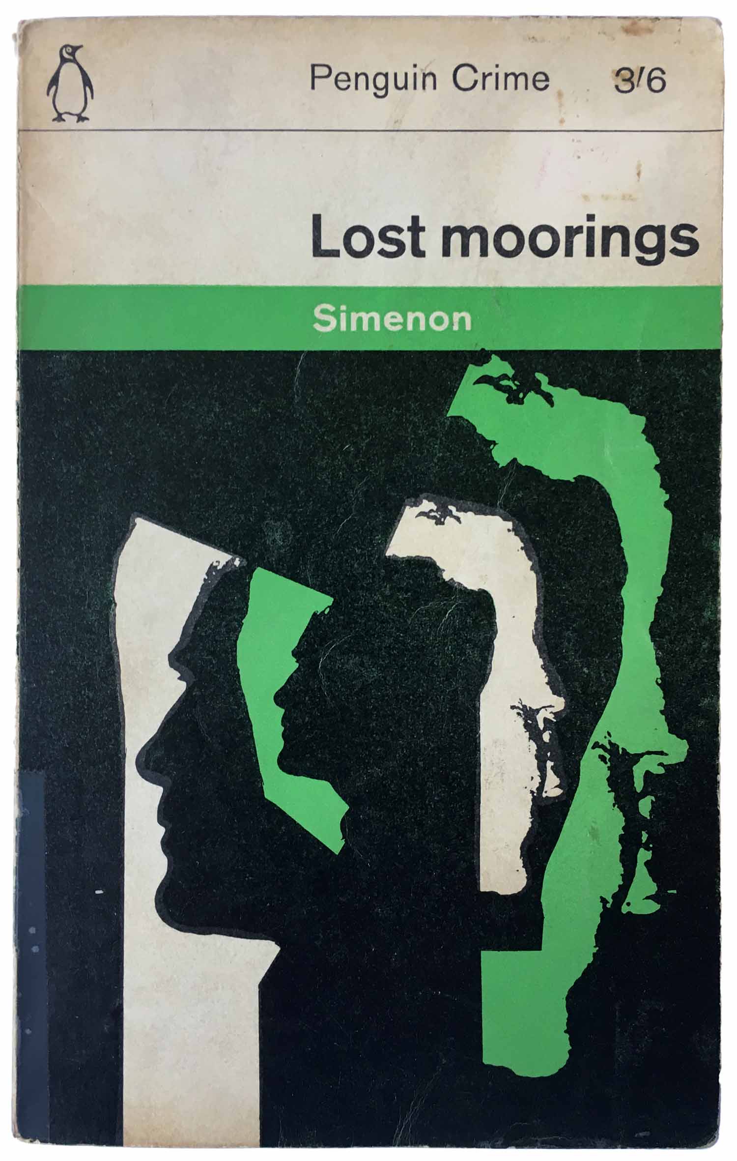
By the second round of covers—by the 1960s Penguin was selling tens of thousands of copies of most of their books, and many sold on the newsstand, so it was to their benefit to continually evolve the cover designs and make old titles look fresh again—the designers abandoned the exclusive use of dark images, and started playing much more with the duotone elements and making the covers much more graphic. This evolution is clear in the two covers by Marber above: Maigret in Montmarte (1961) is murky and unimpressive, but then Marber re-purposes the facial profile for Lost Moorings (1962), and uses it with a second profile to create a much more dynamic and paranoid feeling composition—which simultaneously feels Constructivist-influenced and its own style.
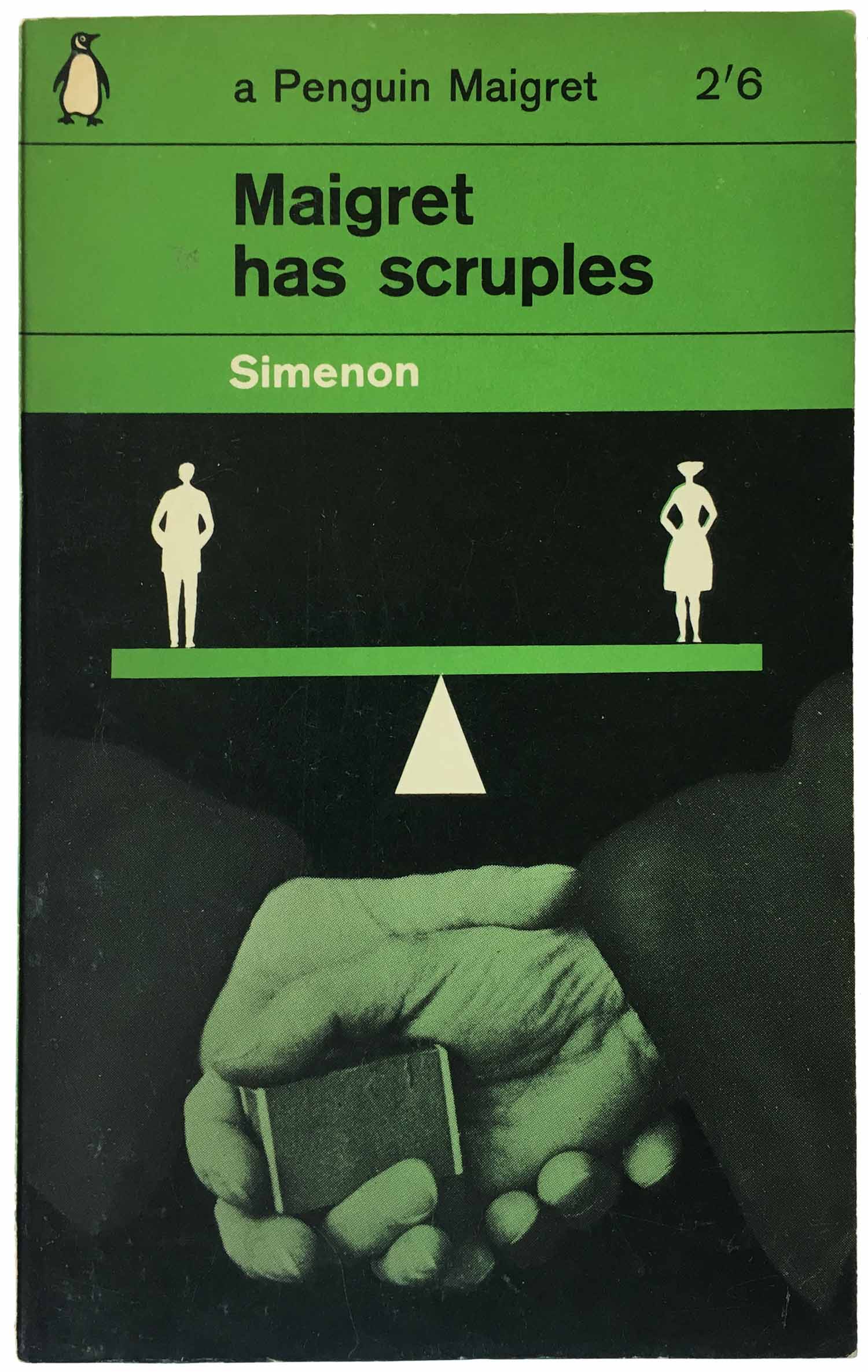
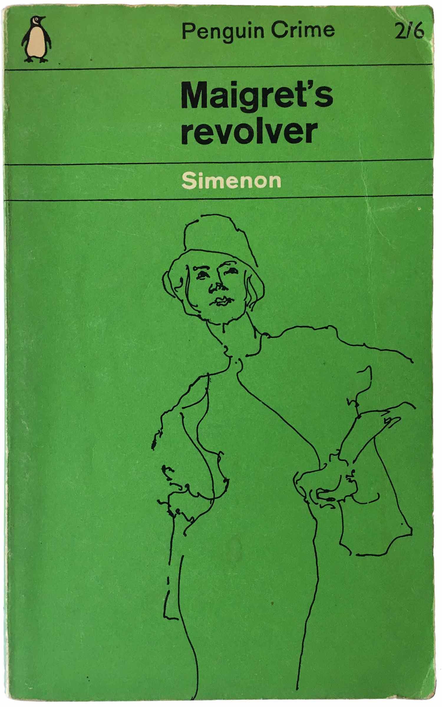
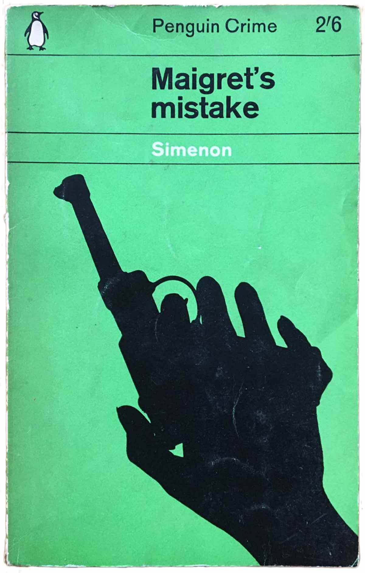
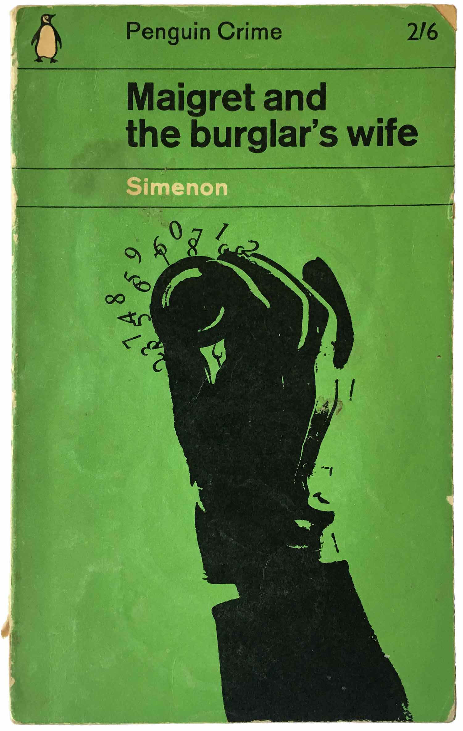
By re-purposing the black from shadow to graphic element, the series design gets an entirely new life. While the line drawing on Maigret’s revolver (1961) is a neat exercise in simplicity, it’s the hands holding a gun (Maigret’s mistake, 1962) and cracking a safe (Maigret and the burglar’s wife, 1963) that are totally stunning. I suppose at some point this trick would feel old, but these covers are 55-years-old and feel totally fresh.
In 1963 it looks like a big section of the Maigret list was republished and re-wrapped, all in variations on new sub-series design (by Geoffrey Martin) within the existing grid. This new design was based in the creation of a grid within the grid, so just as the top 3rd of the page was split into thirds, now the bottom 2/3rd would be as well, but only for variations on green and white stripes—overprinting black and white photos of staged scenes with one or two people, one of them often Maigret with his pipe. I don’t know enough about television history, but it really feels like these are stills from a Maigret show on BBC. Oddly I think these are the main Penguin Simenon editions from this period published in the U.S., and only ones I ever regularly come across.
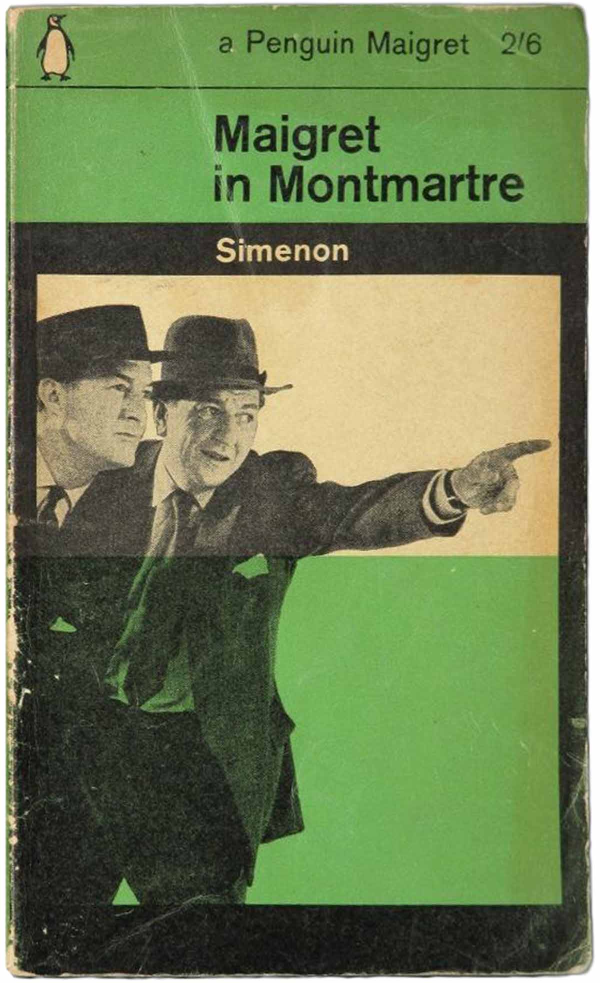
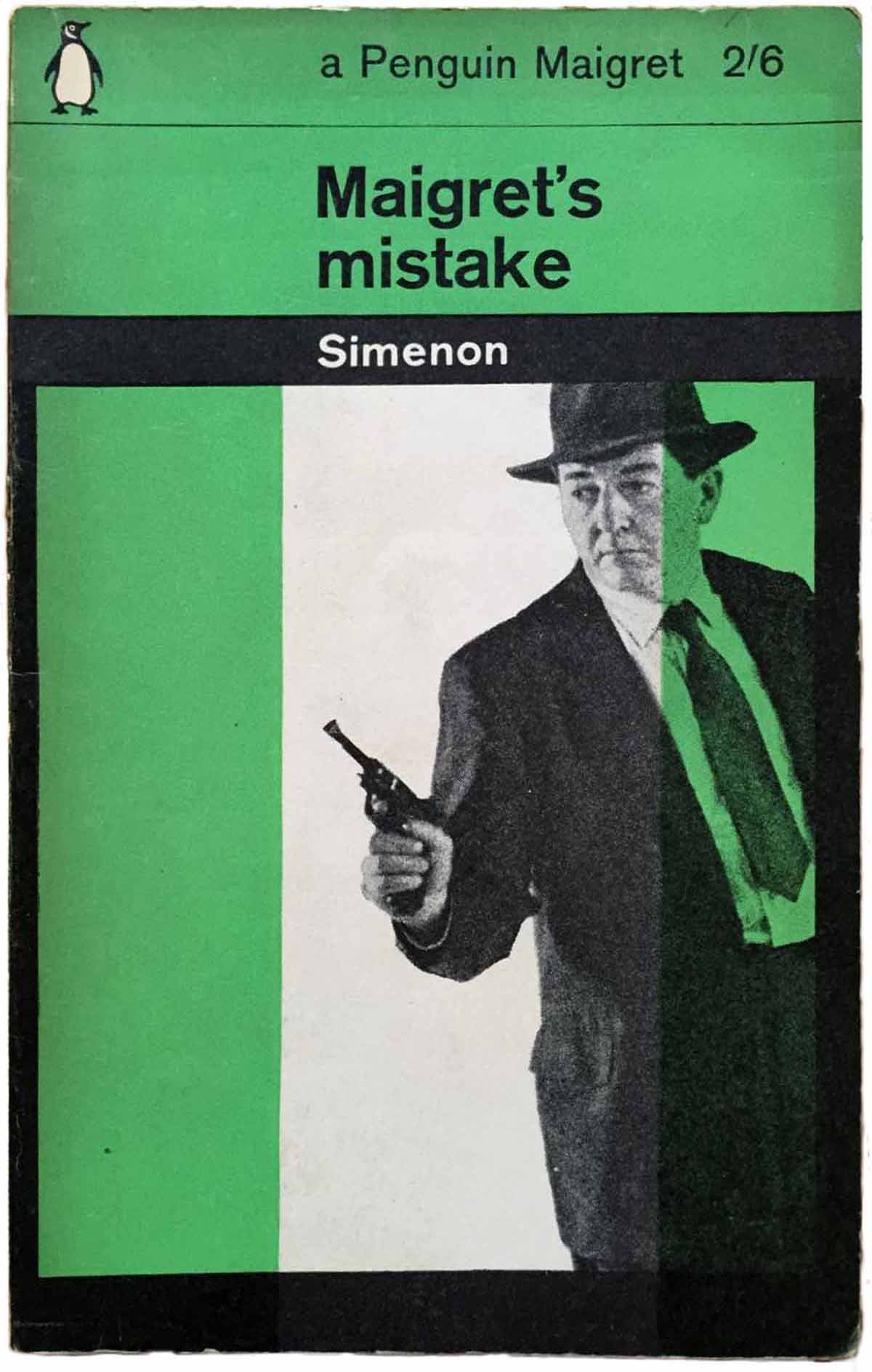
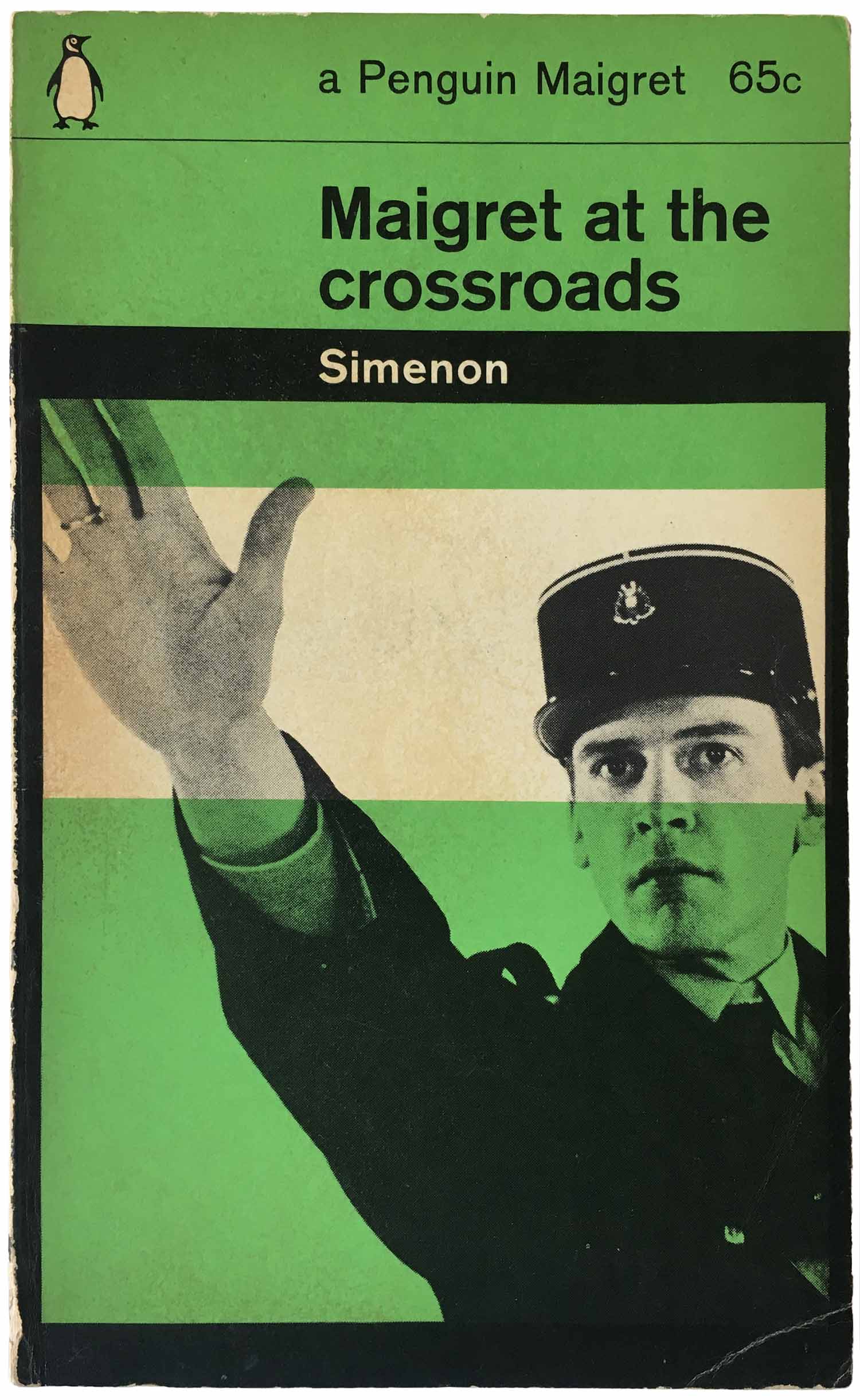
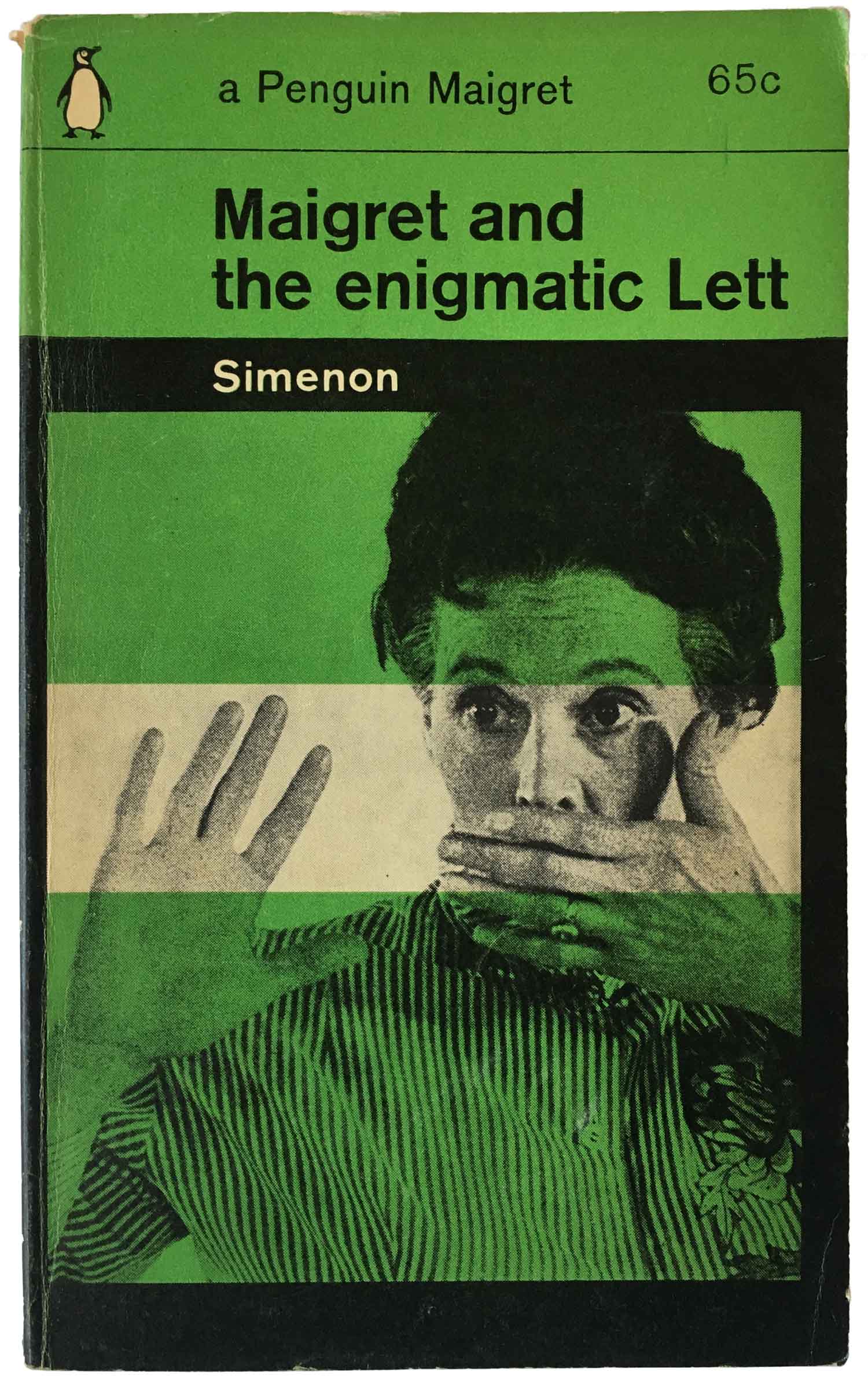
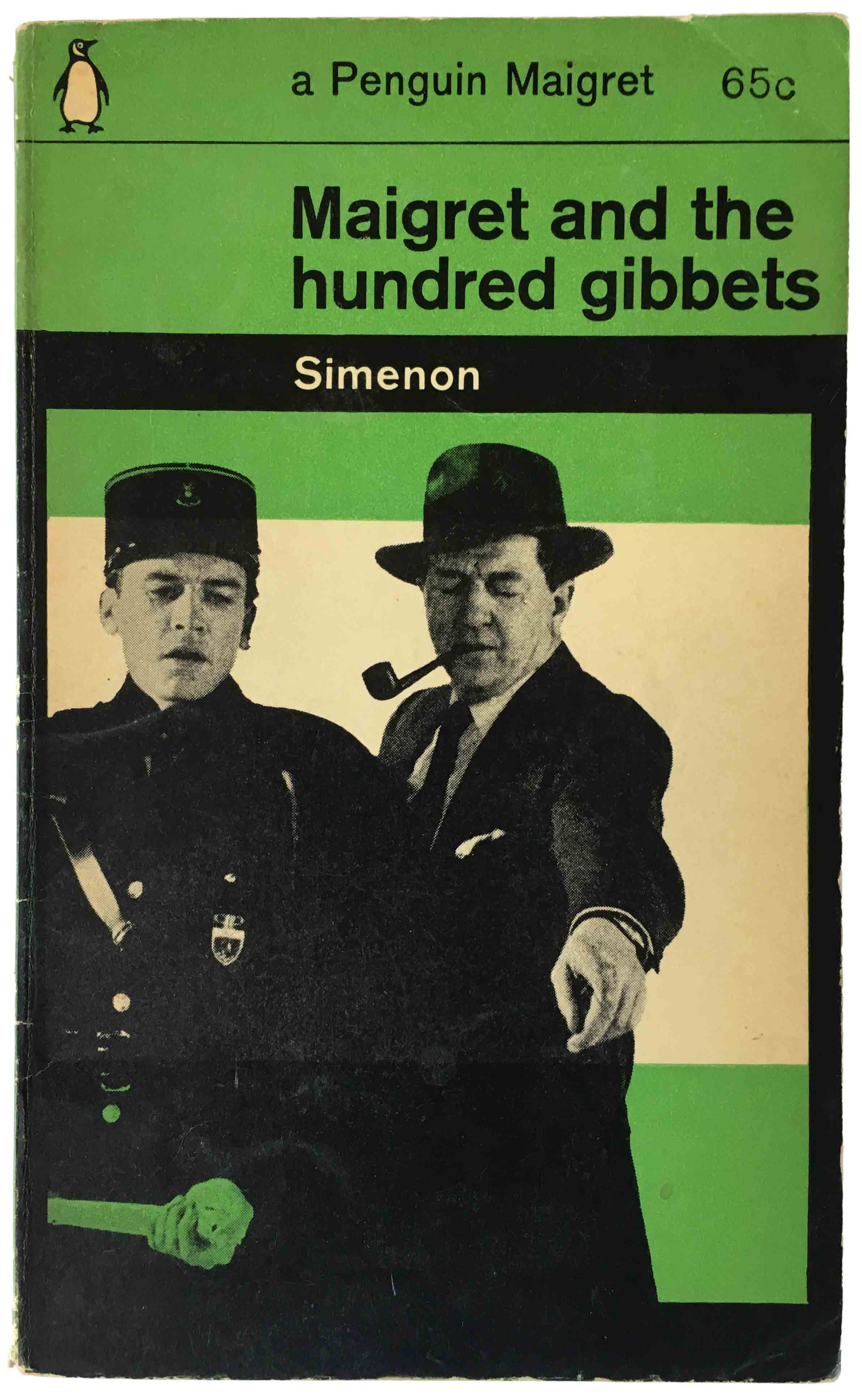
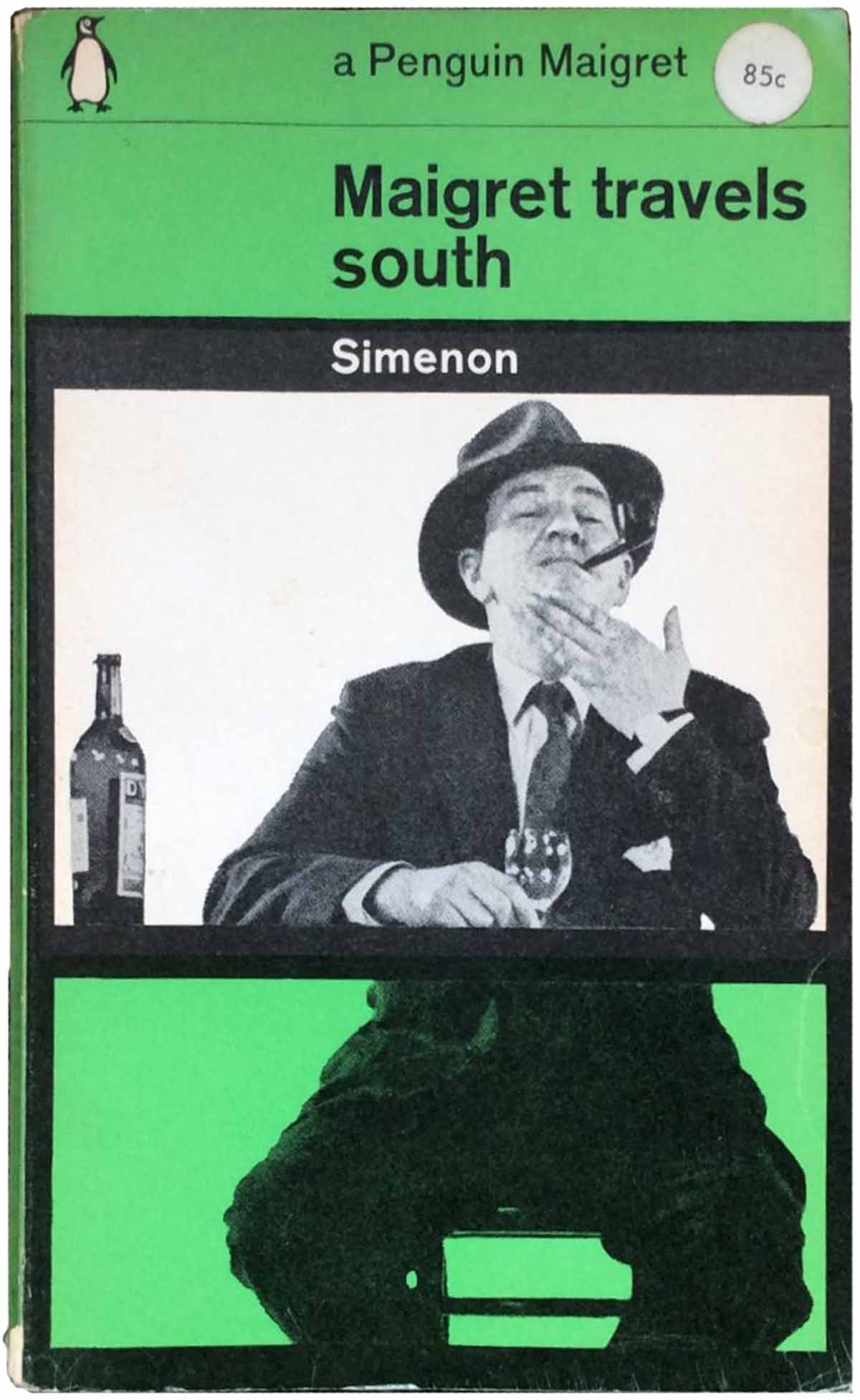
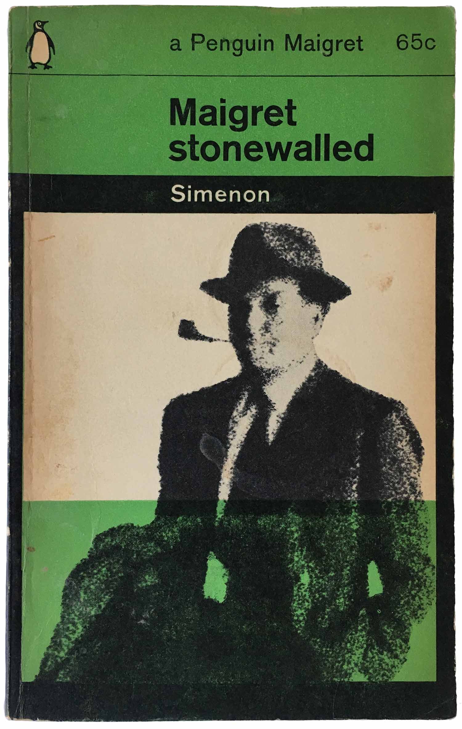
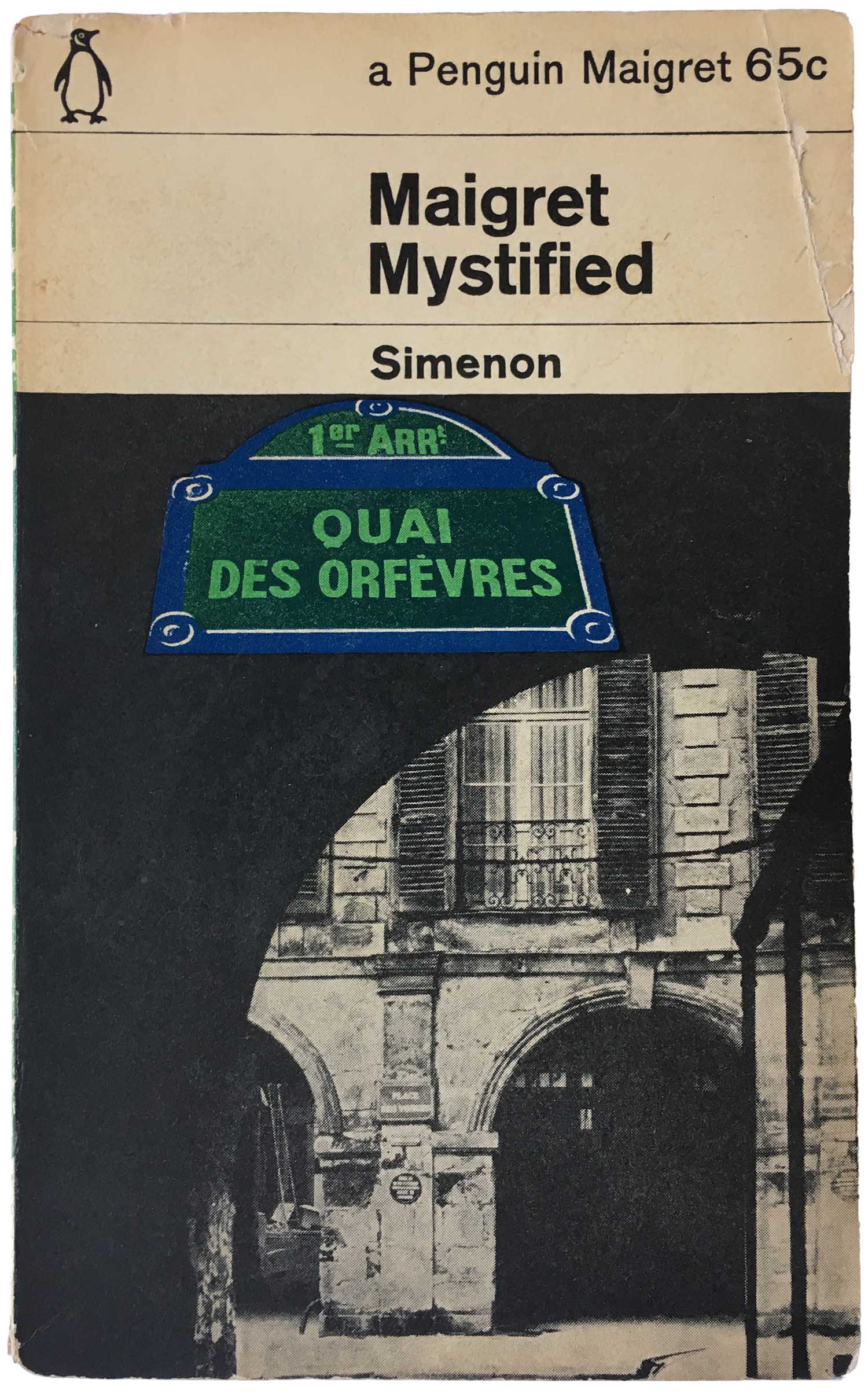
Although it starts out relatively rare, by 1964 and 65 it is not at all uncommon for a third color (beyond green and black) to be introduced to the covers, sometimes adding spice to the series design, sometimes simply getting in the way. Both examples below work fairly well, with brown (a rare color choice for this period of Penguin crime covers) used to strong effect to the left, and blue to the right. For this edition of Maigret Mystified, the blue is more dominant than the green, which isn’t used at all in the top 3rd of the cover. This in itself is striking, showing how far the two rules of the series design (the grid and use of green) can be pushed to the limits and still fall within the confines of the series aesthetic.
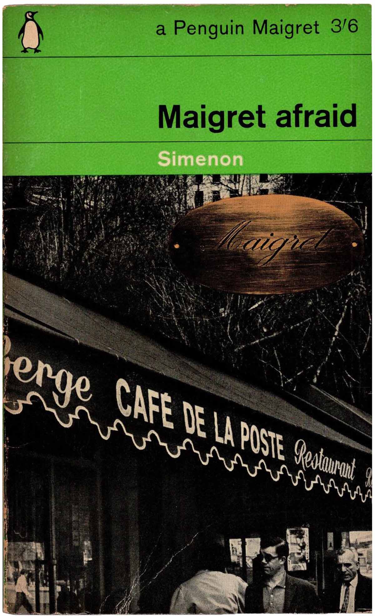
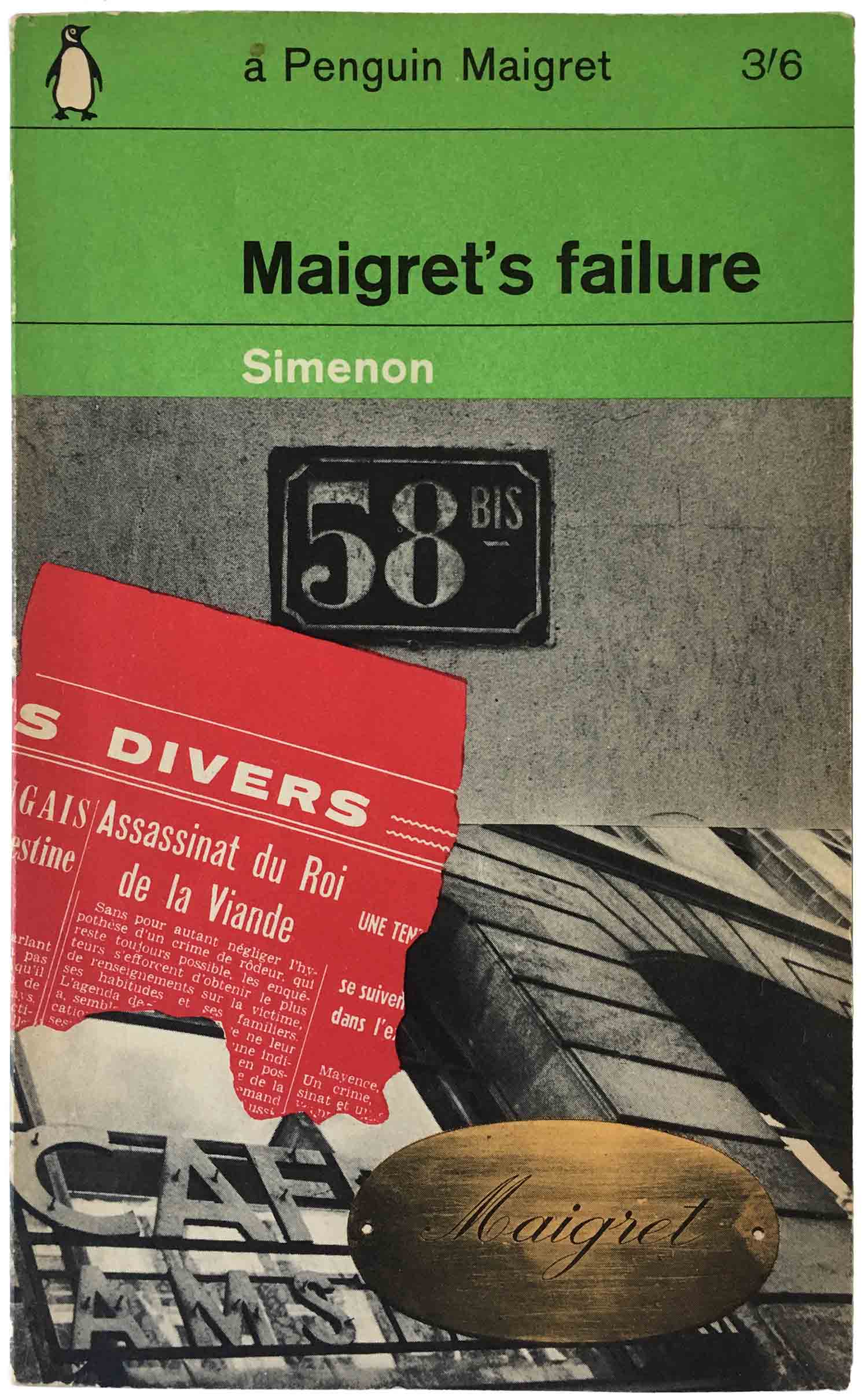
In 1965 there must have been a directive to attempt to both stick to the grid, but also make certain popular author’s books distinct in some way from the overall series design. In Simenon’s—and Maigret’s—case, this was the introduction of a bronze “Maigret” nameplate into a set of collaged covers. This works fairly well on Maigret’s failure, where red is also introduced and each element of the montage is distinct. But its not as successful on the cover of Maigret afraid, which comes off as muddy and hard to read.
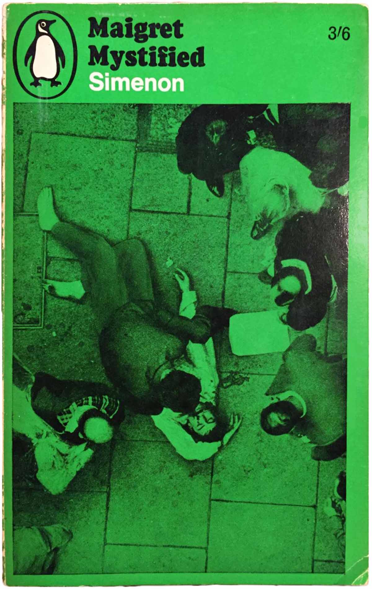
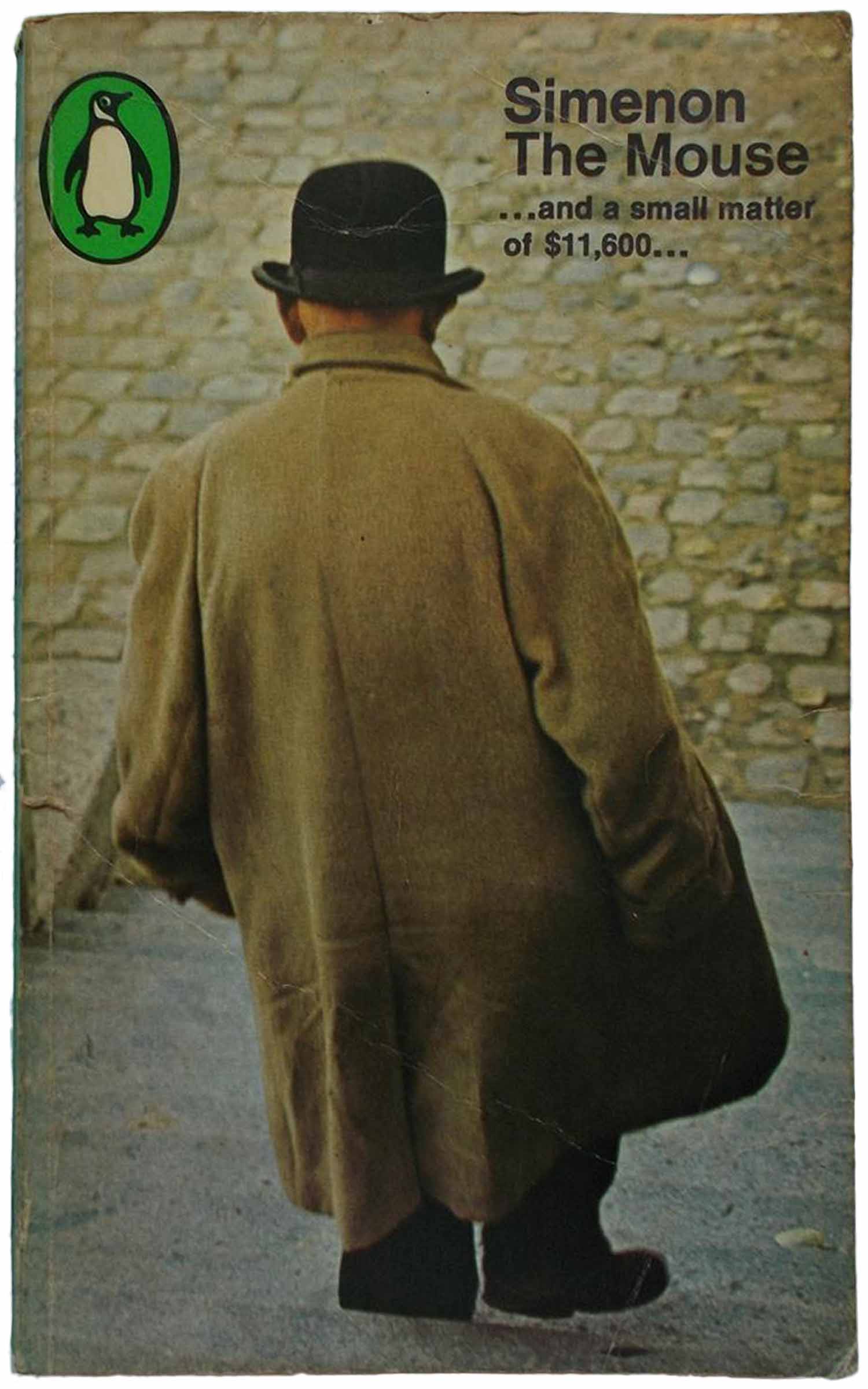
Once the grid is abandoned, it all pretty much goes to hell. First we see a new box form, with the enlargement of the Penguin logo and the conversion of the title from Gil Sans to Cooper Black. For the image, at first we have a similar aesthetic of a green-tinted, heavily-saturated photograph, but then quickly that is dropped (not for the worse, in this instance) to simply have a grayscale photo in the box. I believe similar style changes were used for other authors, but the titling font chosen was different. By 1966, the box is abandoned altogether and replaced with a full color photo, but the text is back to being all Intertype Standard. This third variation (The Mouse, below) became standard across the entire crime series in 66, and was briefly used for all authors (I’ve got a couple nice Raymond Chandlers and Dashiell Hammetts from this period). The only thing in this series design that connects it to the previous constructions is the green in the logo.
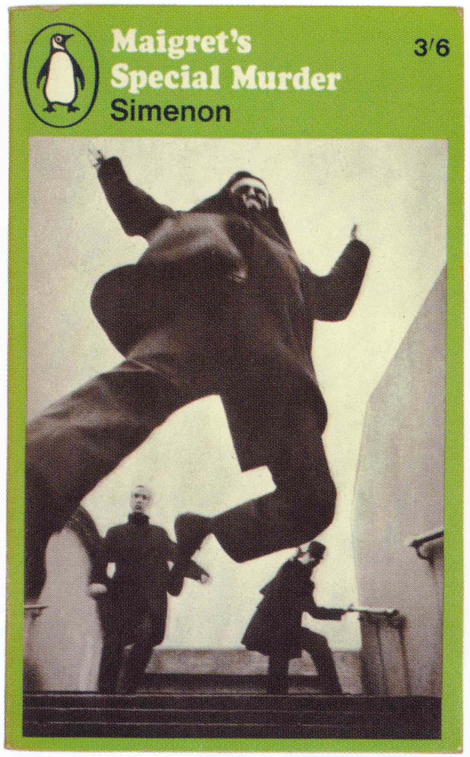
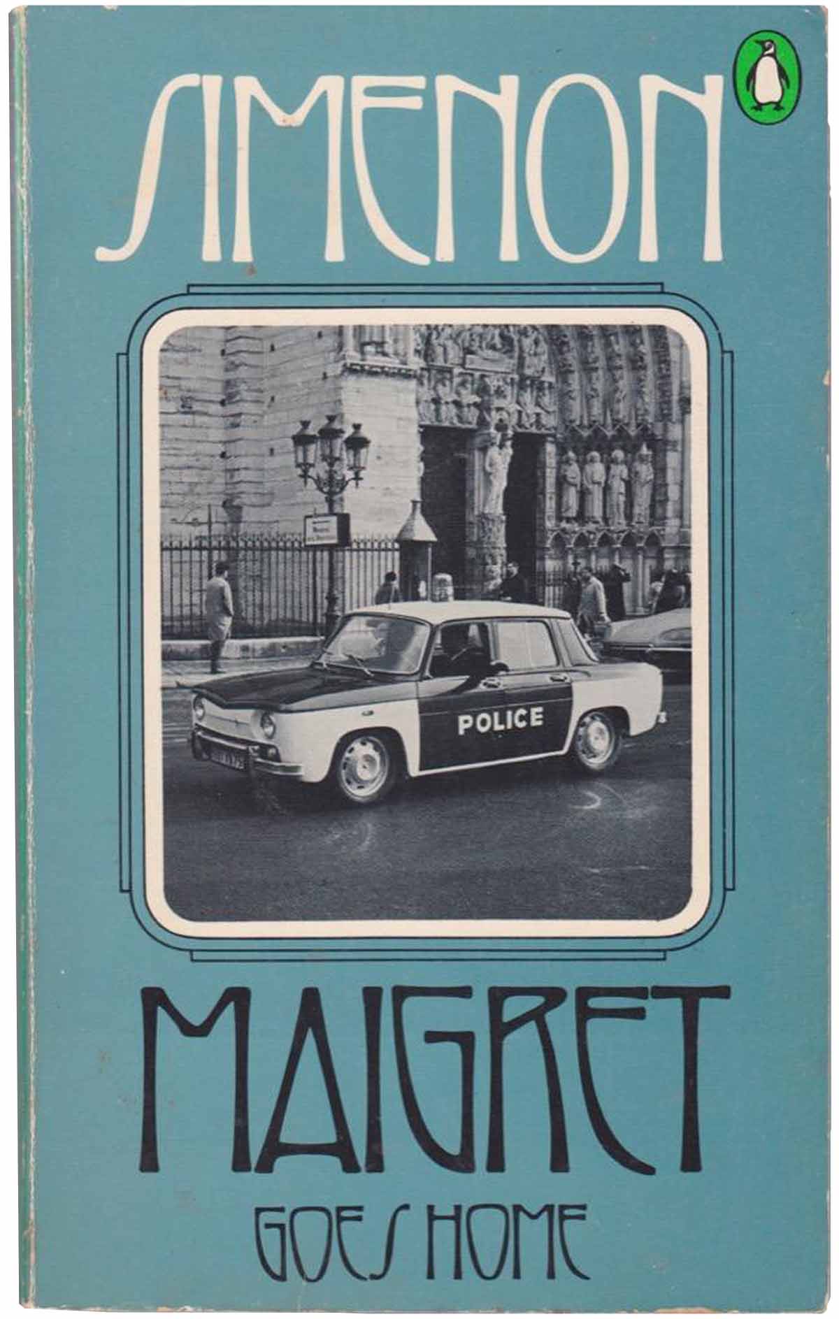
After 66 things really start to fall apart, and before it’s a total free for all two standardized styles get put in place. Below on the left is what seems to have been popular on UK editions, on the right what was used in the US by 1970 and throughout that decade. While the design on the left is somewhat interesting as an evolution on the Marber Grid, with the traditional title area is left blank and the image area is trisected into a set of rectangles, one for the title, one for an image, and one for the Simenon Maigret series title. The image is dark and intriguing, reprising the early grid editions with their dark and spooky saturated photos. I can’t exactly articulate why, but I really dislike the design on the right. Maybe it’s too straightforward. The deco titling and box around the black and white image—while not completely anachronistic—seem too affected and uninspired. I find it sad to fall from a dazzling set of covers like Maigret’s mistake and Maigret and the burgler’s wife to this one, all within a decade. While Penguin published some amazing covers in the 70s, the crime series would never again come close to its 1961–65 design peak.

Next post will be the final Simenon installment, and I’ll look at over twenty other covers, including a broad selection of international editions. And at some point in the future I’ll get back into Penguins, as I’ve been hoarding up collections of Sci-Fi books from the 70s, Education series designed by Omnific (1971-72), the entire history of Penguin Specials, and, of course, lots and lots of blue Pelicans.
Bibliography:





Hello
I am trying to find out who the artist who signed himself ‘mb’ on the covers of editions of Simenon’s books published by Routledge Kegan Paul in the forties and fifties was – do you have any idea who might know or who I might ask?
Thanks and sorry to bother you!
Gwilym
Sorry Gwilym, I don’t know. Outside of the Penguins and some varied international mass markets, almost all of my Simenon collection is US editions.
Thanks anyway Josh!
Best
Gwilym