From the early 20th century through the early 1960s, one of the largest Left organizations in the US (if not the largest) was the Communist Party USA. The propaganda wing of the Party created multiple publishing arms, including New Century Publishers (which I featured in post 66 back in 2011) and the still-publishing International Publishers. International was by far the largest operation, and although technically not a direct arm of the CPUSA until the 60s, it put out the bulk of communist books in the US, with much of its output sold internally within the party and its front groups. In the 1950s and 60s they spun off a paperback imprint called New World Paperbacks. I started looking at NWP covers here way back in 2010 (see 12 and 53). In 2015, in posts 210 and 211, I turned my eye toward an imprint of an imprint: Little New World Paperbacks. I had about fifteen of the almost forty books in the series, and was able to find passable images of another 10. Now I’ve tracked down another ten actual books, and some better images of some of the titles I’m missing, so it seems a good time to consolidate the two previous posts, and update the images and information.
In 1964, New World—which generally published its books in trade paperback editions—spun off a series of smaller-sized mass market paperbacks, a format that at the time was hugely popular in publishing. Most US mass markets were sold at news stands and on special racks in grocery and drug stores, so they were designed to appeal to a broad audience of people that might not frequent bookstores. Because of this, they tended to have lurid covers, with full-color paintings (which would eventually evolve to photographs) of crime, sex, romance, and early self-help. Giant titling fonts and eye catching graphics were also popular.
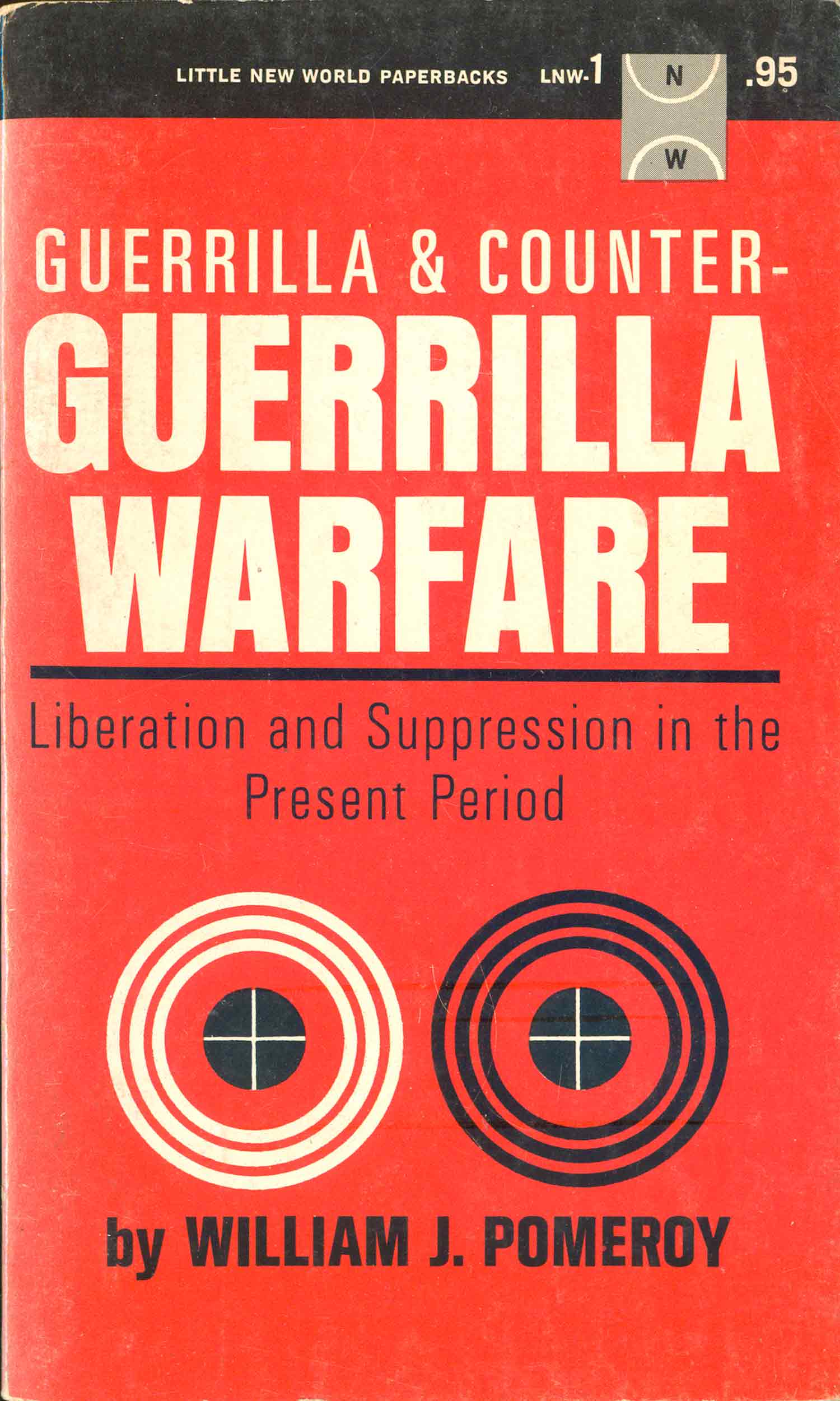
It’s possible that the aesthetic of Little New World (LNW) was going for that mass popularity, but if so, it missed the mark—widely. The first title in the series, William J. Pomeroy’s Guerrilla and Counter-Guerrilla Warfare (1965) has a very staid, almost clinical, cover. While the title is bold and yells out “GUERRILLA WARFARE!”, the rest of the cover is so clean and precise that it almost takes away any potential edgy appeal of the giant type. The mechanical bulls eyes and full sans serif treatment make this look more like a government report than a pop exposé. I have been able to find absolutely nothing specifically about LNW through basic research, so the motivations of the publisher remains opaque. Was this an attempt to popularize Communist ideas to a broader audience? Was guerrilla warfare chosen as the topic of the first book because of its potential gritty, fringe appeal? Where these books shorter and the idea was to make them more inexpensive and therefore accessible? Or did International Publishers just want to make books that fit in the reader’s pocket?
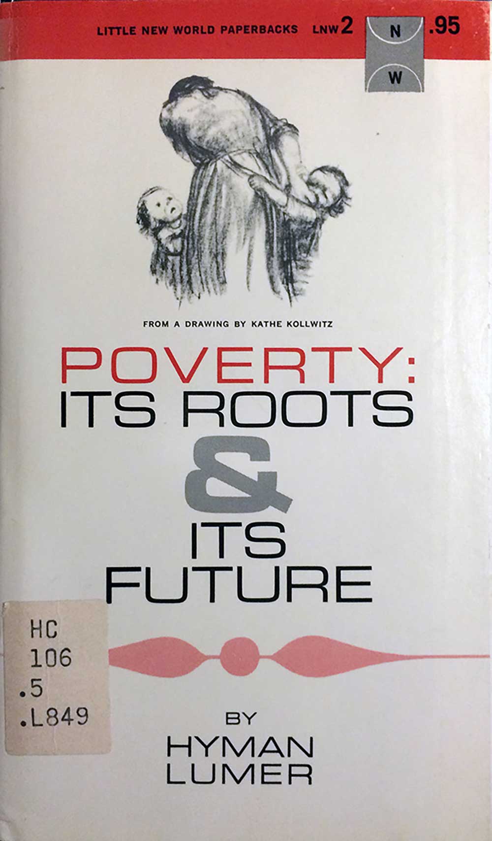
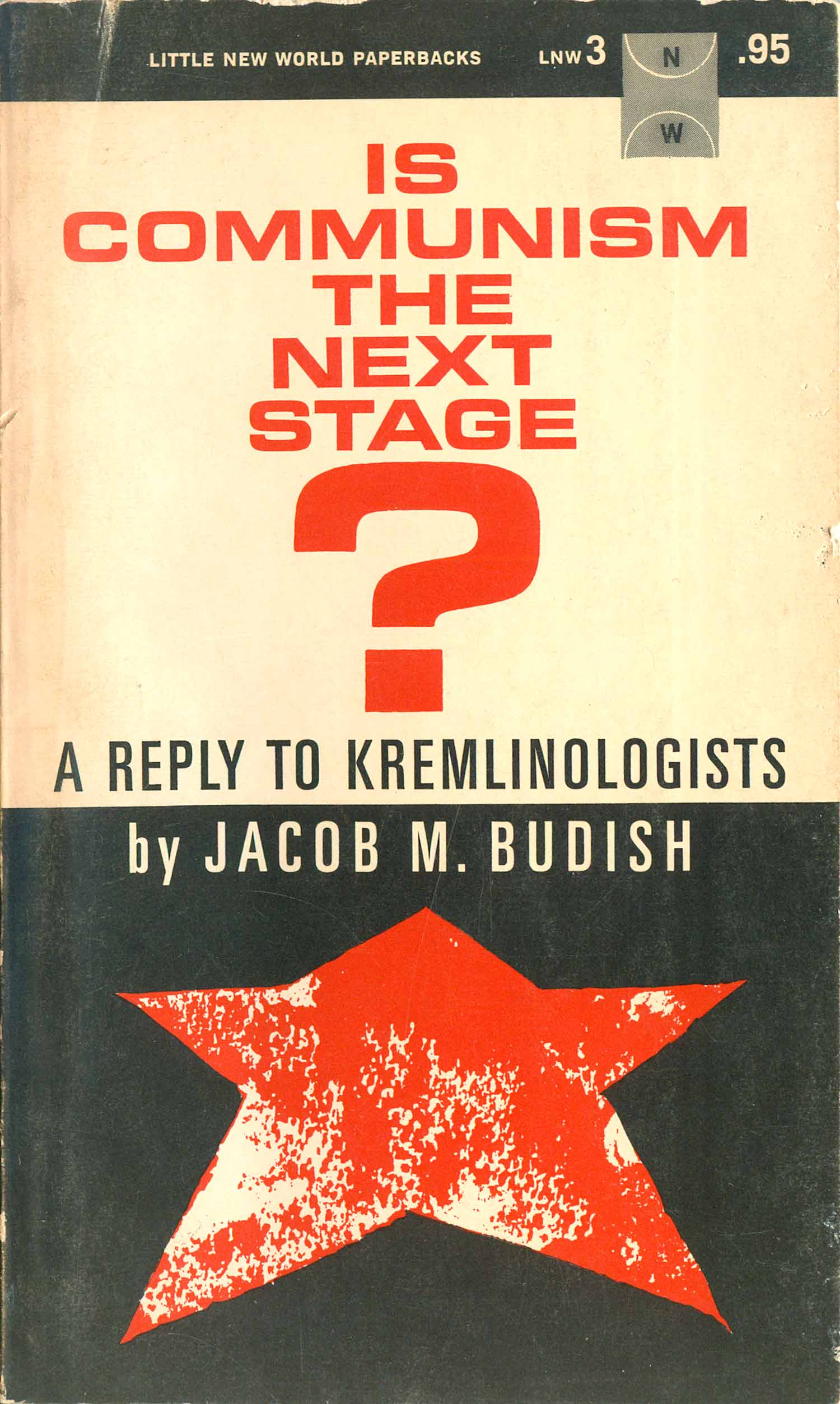
The next books, and most of the ones produced throughout the 1960s, have similar covers, with elements reaching for pop appeal, but for the most part coming off as an awkward combination of old-school political pamphlet and 50s modernist book cover. The Lumer book below uses an image by Käthe Kollwitz, but to no real effect (although she’s interestingly credited directly on the cover below the image, while the designer isn’t credited anywhere), and the Budish book is similar, with a distinctive confusion as to whether to play up the typographic elements or the rudimentary graphics.
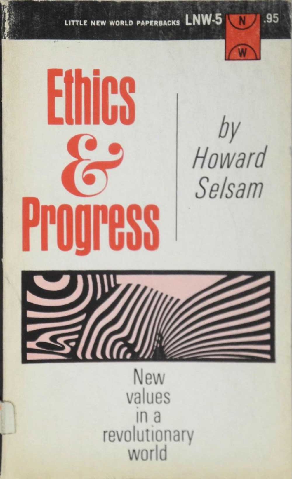
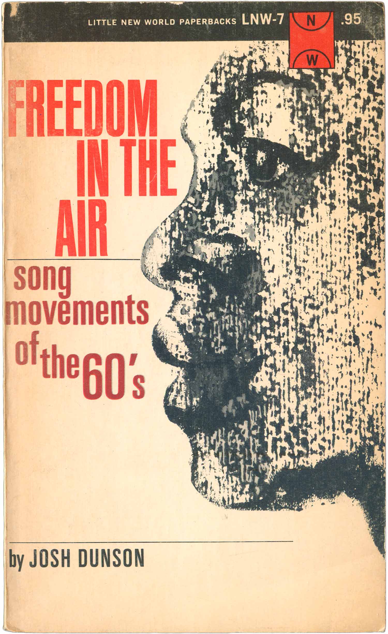
The Pittman book below is a great example of leaning towards more traditional Modernist cover design. The Selsam cover is notable for the op-art graphic, which unfortunately is small and boxed. I could imagine a version where the image leads the design (as opposed to the ampersand, which is oddly the dominant element here) and makes for a pretty wild and compelling cover. The Dunson book is interesting, because the subject matter is clearly trying to be popular, much more so than any of the other books so far, but the cover feels so dated. Pop art has really started to explode by the mid-60s, but there is no evidence of this here. Although the book is about pop music, it feels much more folk/beatnik than something channeling the more dynamic energy that is already emerging from the Civil Rights Movement. Which isn’t to say I don’t like the cover, there is actually something quite nice about it, with the rough texture evoking printmaking on the face, the tall sans serif justified left, right, and center, and the subtitle appearing to emerge from the lips.

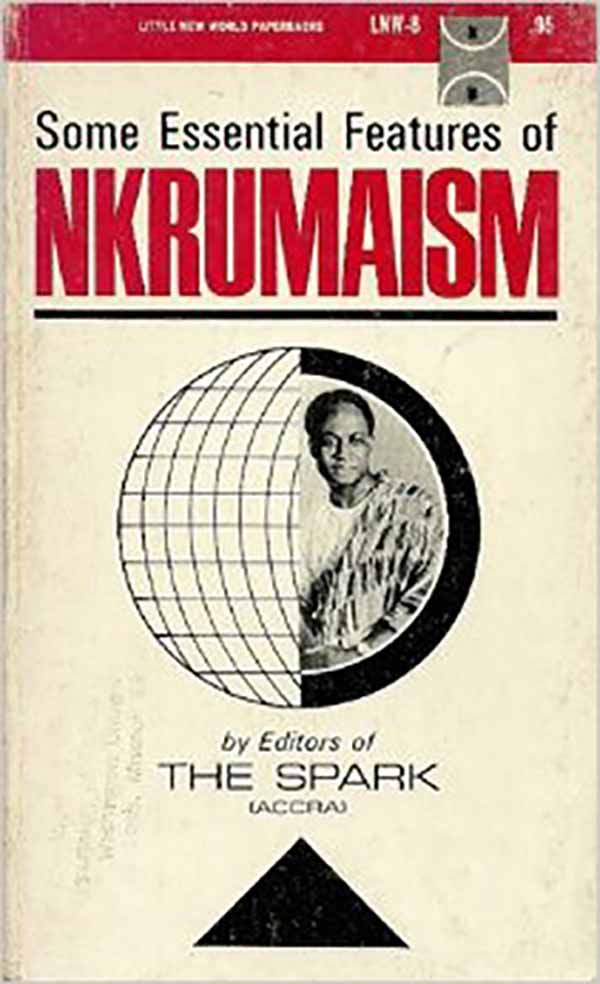
Below left is the cover for the first of a series of books LNW would produce by and/or about Kwame Nkrumah. It is cast in the same mold as the initial Pomeroy cover—reddish-magenta and black and the main colors, the type is bold and tall, and the graphic elements are largely subdued. Here the targets are replaced with a globe, Nkrumah taking up half of it. I like the black triangle at the bottom, which functions both as an arrow pointing towards the cover’s content, and a base for the sphere, converting into a spinning, desk-top globe.
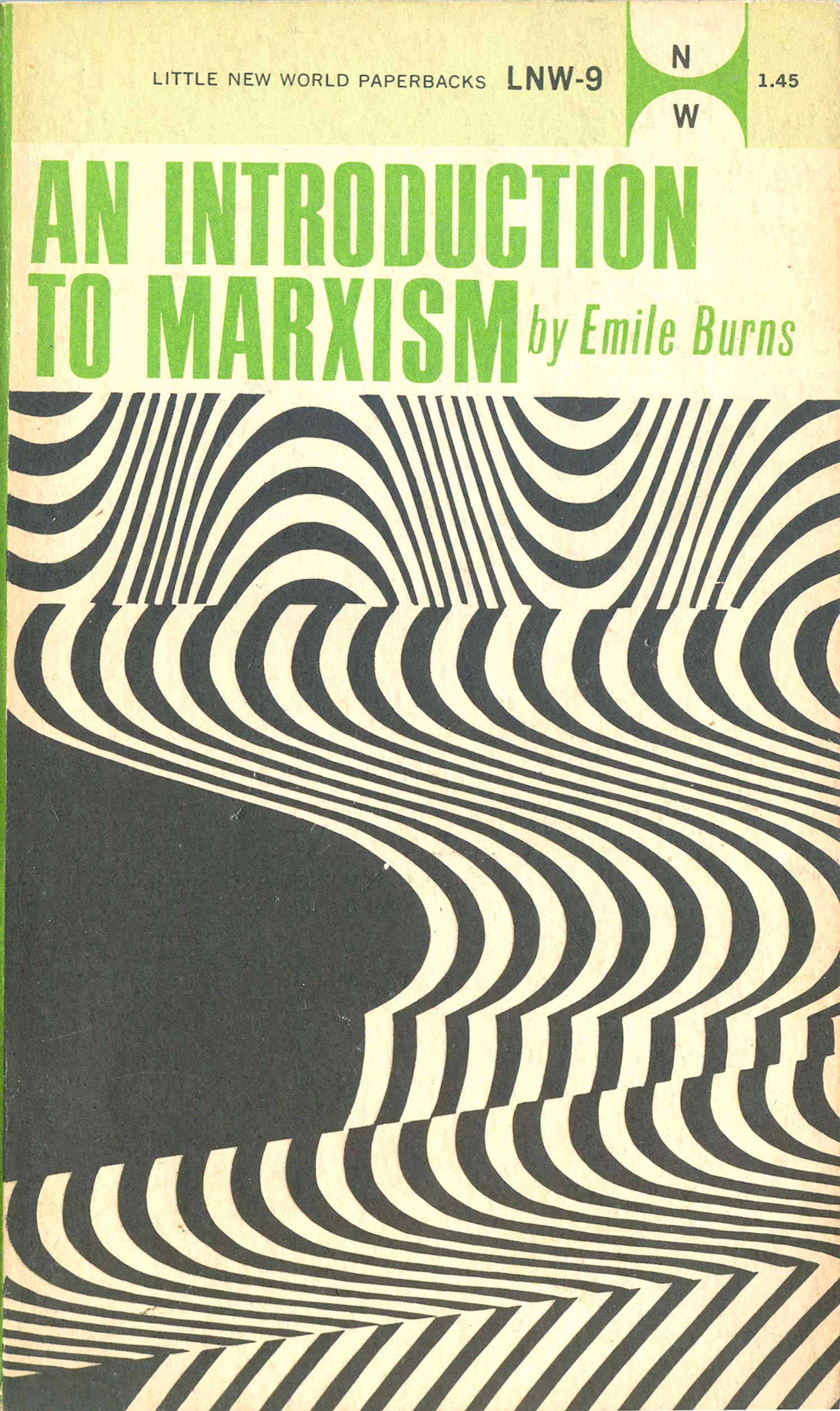
Burns’ Introduction to Marxism (LNW-9) is the first cover to start to break out of a real 1950s mold. The op-art cover borders on psychedelic, but doubles as a nice abstraction, and way to avoid having to put old grandpa Marx on the cover, which would certainly be a turn off to a general audience. This is also the first time I’ve seen a change in color printing on different printings: the green copy on the right is from 1972, the blue on the left from 1975. This cover also shares a lot with the covers of the more philosophical list on parent publisher New World Paperbacks/International Publishers (see posts 12, 13, and 53, or my article on the history of New World Paperbacks published in Counter-Signals #1). Those covers were designed by Jules Halfant, so I suspect so was this one, and possibly many of the other earlier titles.
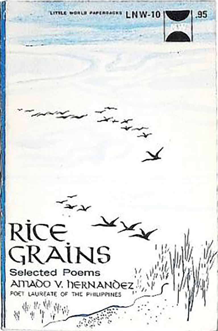
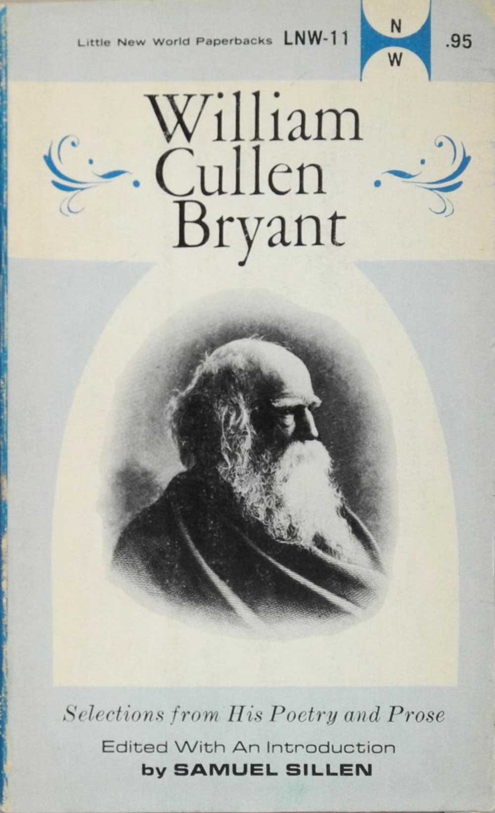
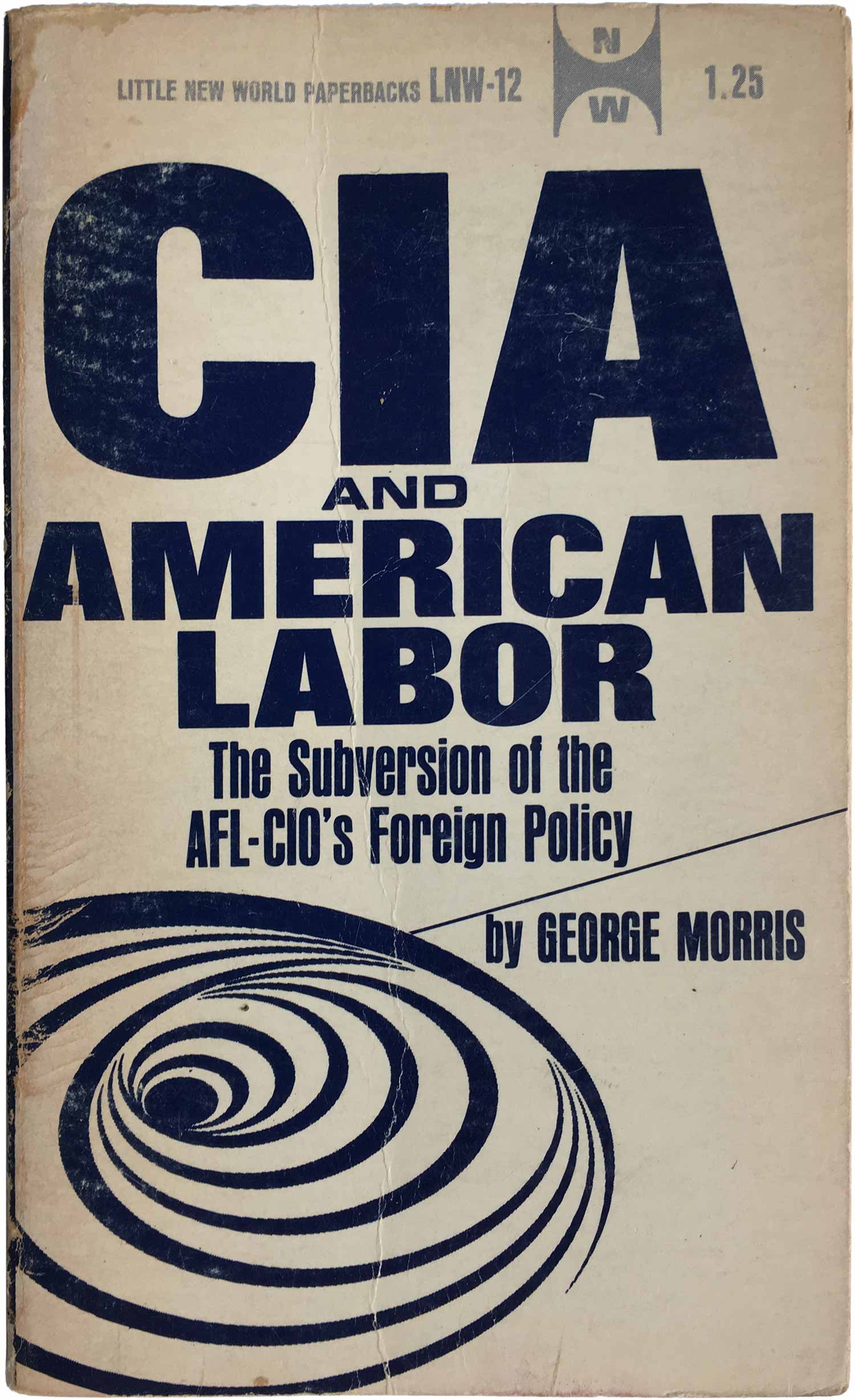
Filipino Communist Amado Hernandez’s collection of poetry, Rice Grains and an edited collection of writings by William Cullen Bryant are the only two volumes in the series that aren’t non-fiction (although a couple of the books below that purport to be reportage or legitimate information are largely fictitious—see Half a Century of Socialism and Handbook for Revolutionary Warfare below, I mean come on, Nkrumah was an impressive statesman and central to African liberation thought, but he didn’t pick up a gun to free Ghana, and although he helped fund African liberation struggles, he was hardly running around in the woods with a rifle). The cover pushes the boundaries of the series design, with an calligraphic font, and a painterly illustration that fills the entire cover. Next to it is the Bryant collection, effectively staid and safe as a representation of the 19th century Romantic. The design for CIA and American Labor smartly returns to the op-art swirls of the Selsam and Burns covers. It actually charts a path between those two cover designs, allowing the object to live free outside of a box, but to not completely dominate the cover like it does on the Burns’ book. I like these swirling stripe shapes, and really wished the had been used on more covers, and bushed to more interesting places.

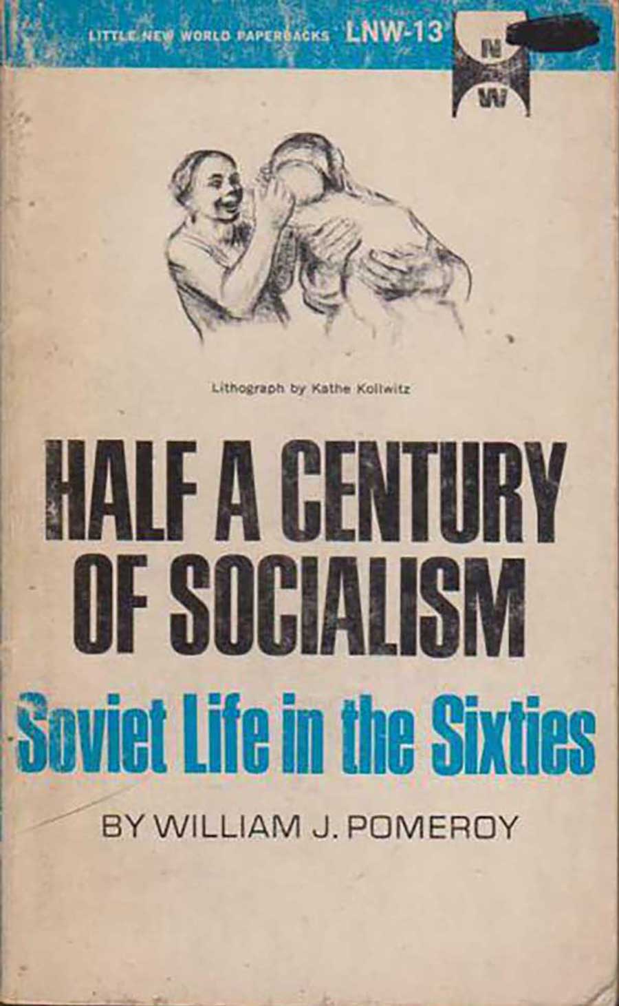
Half a Century of Socialism (mis)uses a Käthe Kollwitz print of mother and child to illustrate how wonderful life is in the Soviet Union. While I’m sure 1969 was seeing some improvements from the Stalinist period, this book is clearly a piece of hack Comintern propaganda. But no worries, the design is so lifeless, and the Kollwitz illustration so small and unappealing that I doubt this was a best-seller. Aptheker’s “The Nature of Democracy, Freedom, and Revolution” does a little better, largely because their is no awkward illustration floating above the title. Far more than the cover, any discussion about freedom from Aptheker needs to be read in light of the revelation that he abused his daughter (Bettina Aptheker—fellow Marxist and close friend of Angela Davis) for a decade. Old books often have closets—its an important question whether we should open them, and how far.
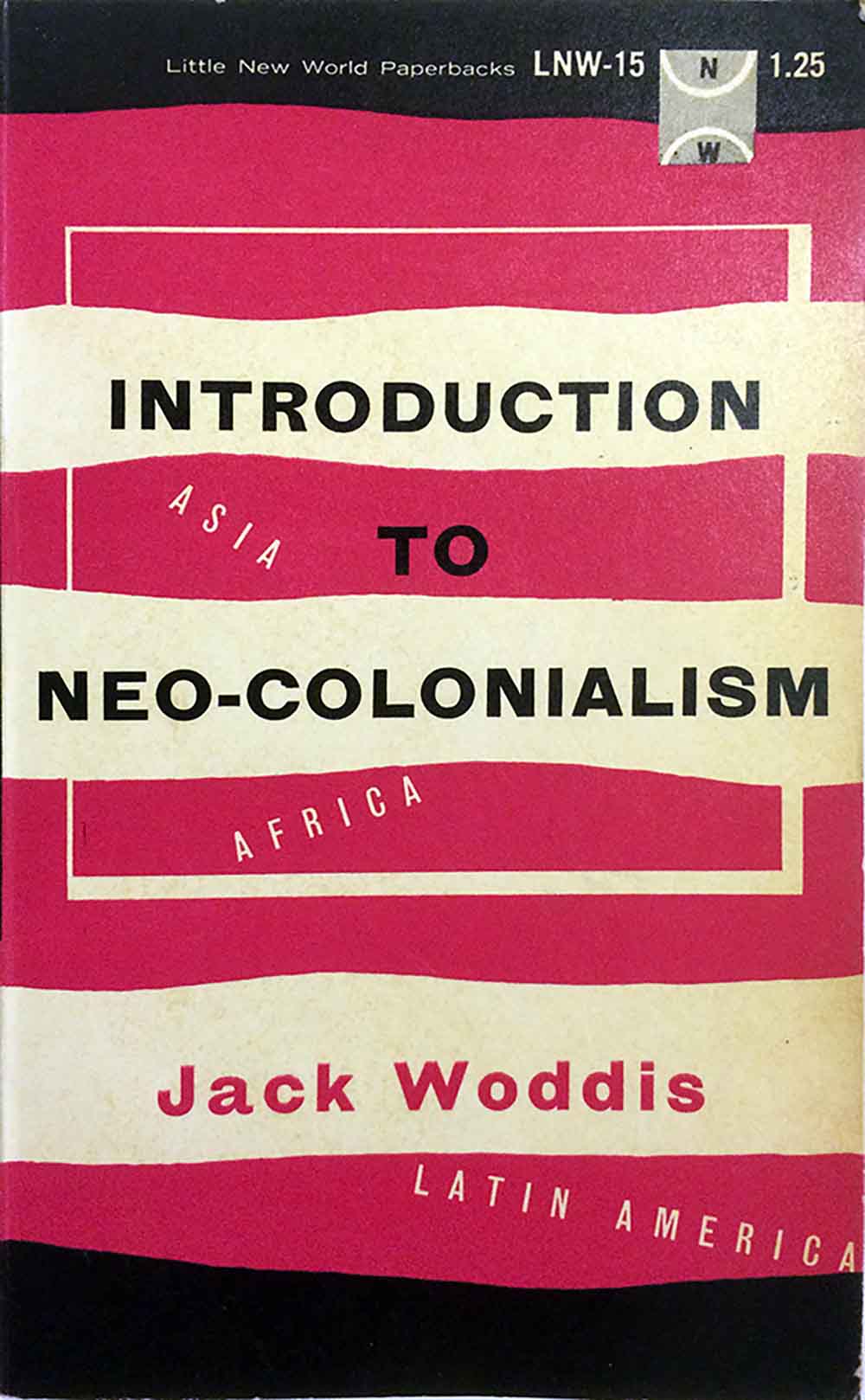
Introduction to Neo-Colonialism (1967) has a cover with a dated-feeling design, but I find it really compelling. The black at the top and bottom compresses and contains the content, keeping your eye moving back and forth across the horizontal lines, with the continent names acting as little bridges that bring your eye from one line to another.

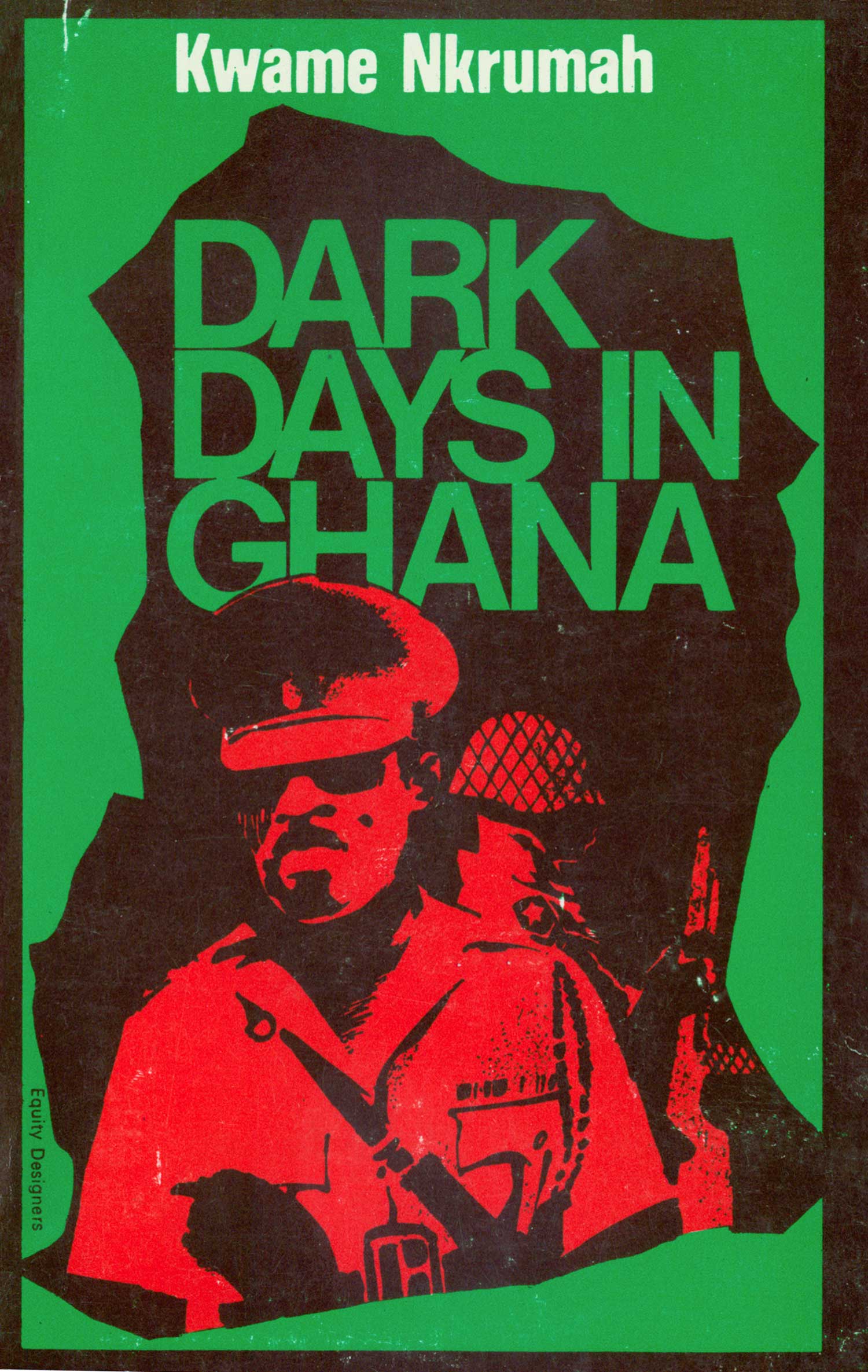
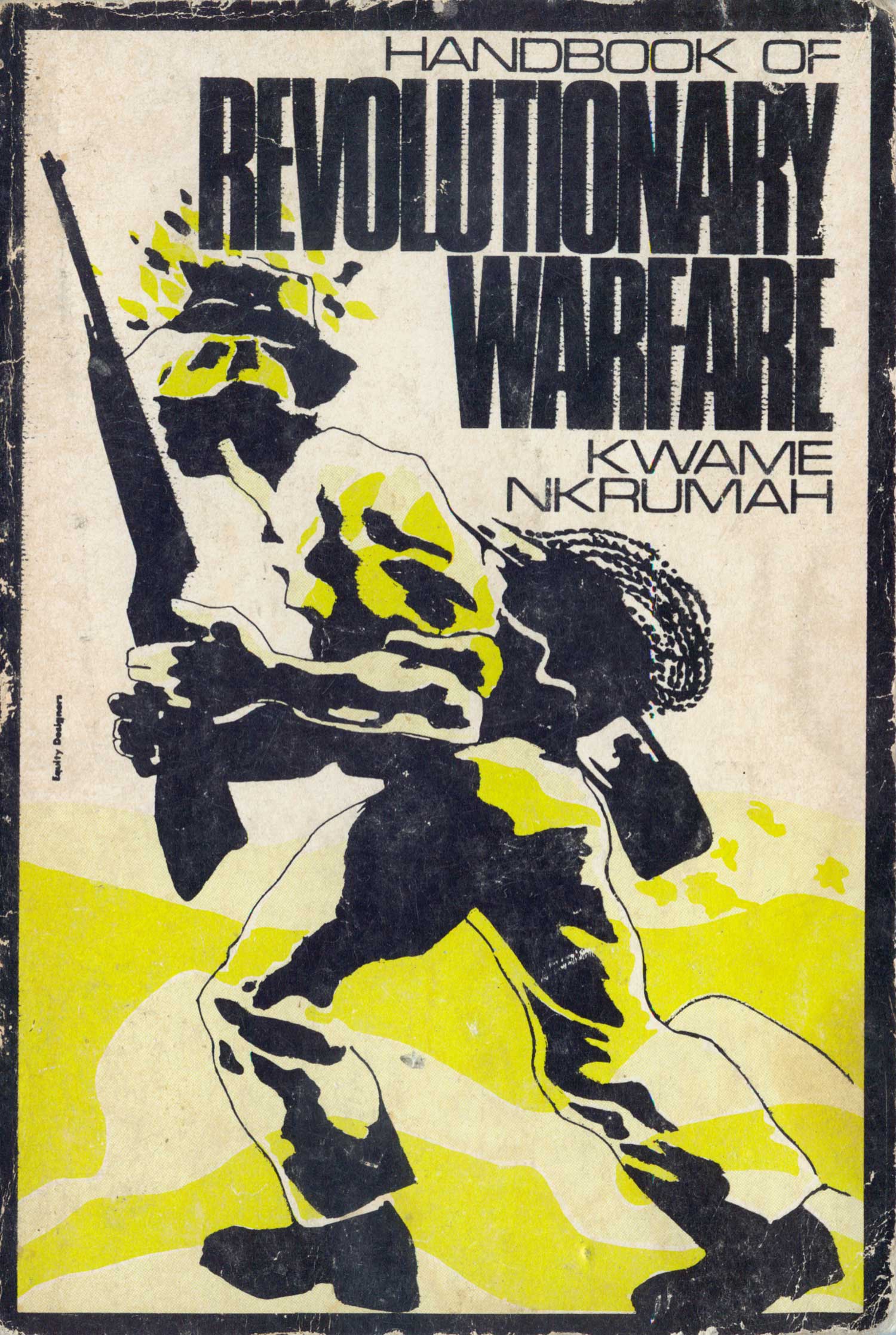
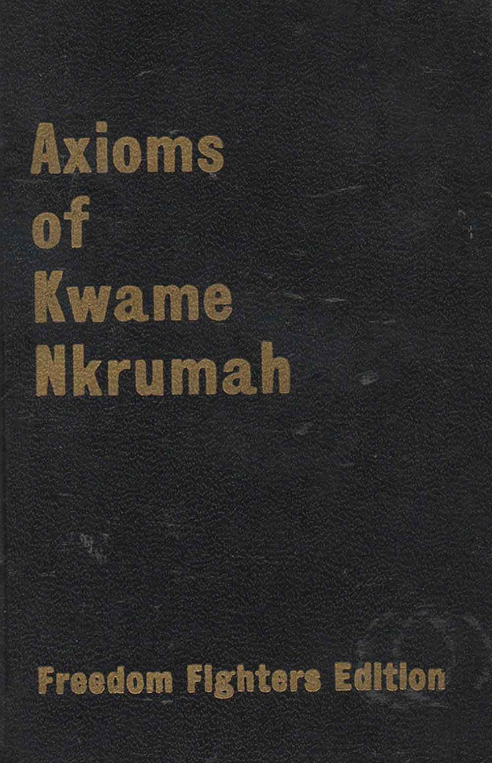
Now on to the rest of the Nkrumah covers. I love Dark Days in Ghana, for all of my usual reasons. The illustration with evidence of the human-hand, the red and green duotone, with the overprint making the rich brown that frames the title and central illustration, the general’s cap poking into the word Ghana—it all reads as powerful, creepy, and compelling, like any book about a coup should. The Handbook of Revolutionary Warfare was designed by the same group, Equity Designers. Not surprisingly, there is nothing about them online, and I’ve never seen the name on any other books. This cover doesn’t work quite as well as Dark Days, but is still very strong. The soldier as guerrilla is captured in motion, and although detail is scarce, the overall picture is clear: a strong and motivated African, armed and moving forward. The image is reminiscent of the illustrations of Emery Douglas, but appears to predate them. The Handbook is Nkrumah’s answer to Che Guevara’s Guerrilla Warfare, and Axioms is his Little Red Book. Shown below is the “Freedom Fighters Edition,” which is the only one I can find. The cover is simple, gold embossed onto a textured black cover. This book is listed as being published in the Little New World series but I have yet to be able track down a unique LNW edition (this image is one I tracked down online, and since I’ve yet to find this book in a store, and is never available online for less than $50—a little steep for my thin wallet—I’ll have to wait to get confirmation).
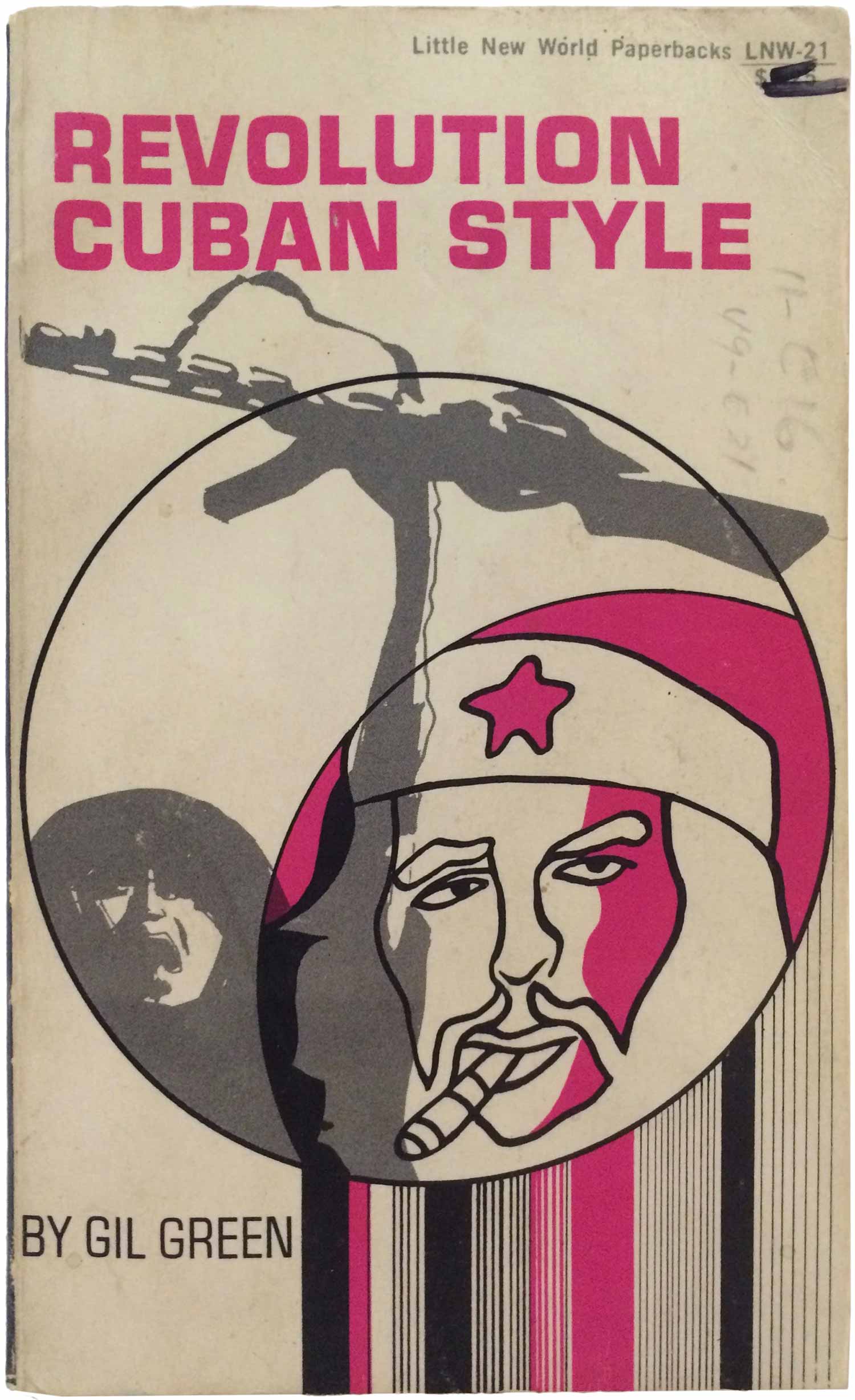
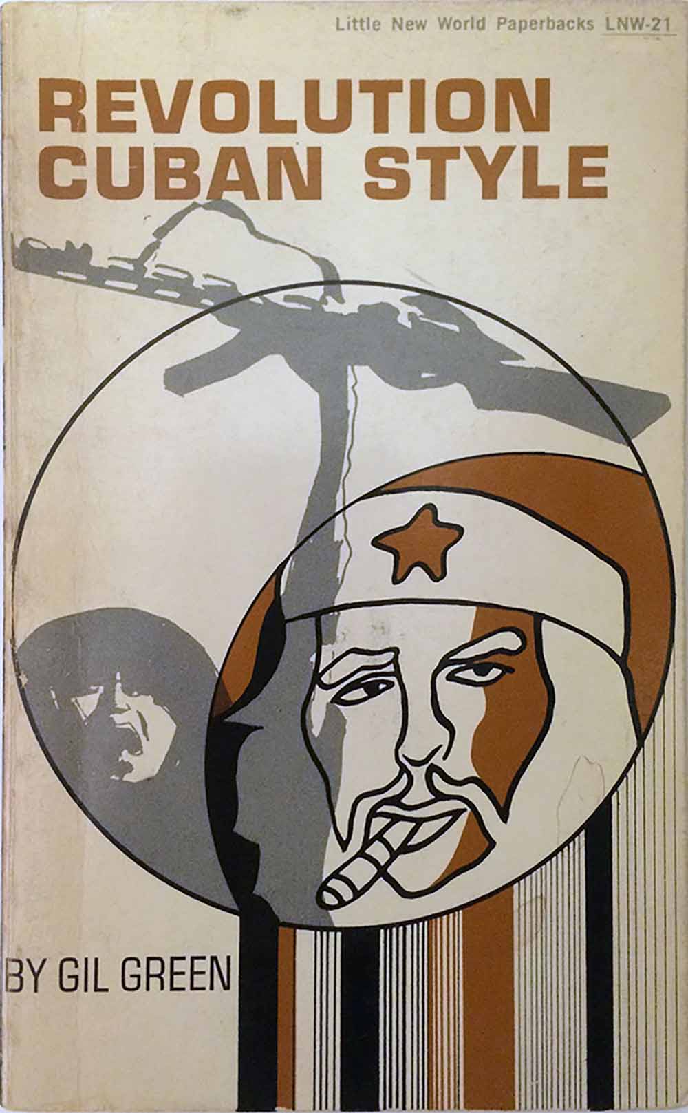
Below is the cover for Gil Green’s Revolution Cuban Style. It’s one of the nicer covers, drawing graphic elements from multiple political posters of the time (this was released in 1970). The image of a Viet Cong in the background is a well known photograph, and likely drawn here from an anti-Viet Nam war poster (and used in many other contexts as well, including on the cover of the Chilean group Quilapayún’s album Por Viet-Nam) and the image of Ché in the front is a variation on a image by one of Cuba’s well-known poster artists, Raul Martínez. The use of the poster images is interesting, because it suggests a play on the word “style” in the title, although I doubt that was intentional. The first edition has a really nice pink for the duotone color, but typical of the Communist Party USA, they botched the attempt to be culturally relevant with the reprints, using muddy browns and greys, instead of the more appropriate and exciting bright pinks and oranges.
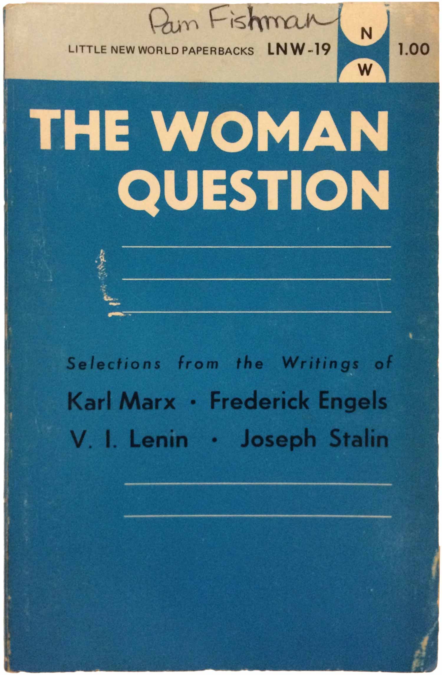
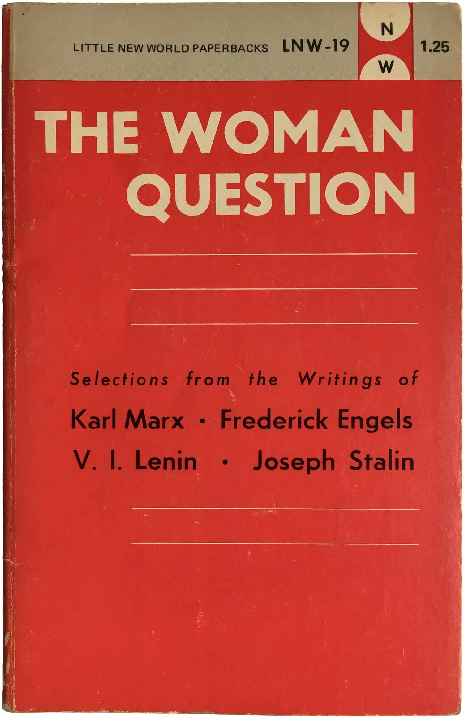
Next is an edited collection with the ever-exciting title, The Woman Question. Not surprisingly, the experts on this question are four men. Like the Green book, the first edition was released in one color scheme, with further editions in alternate colors. I’m not sure the motivation to do this, especially in a situation like this one, where I can’t imagine a new color convinced anyone to buy a second copy of this book. The design here is super simple, but kind of nice, with the title aligned right, and the thin white lines running only the width of the word “Question.
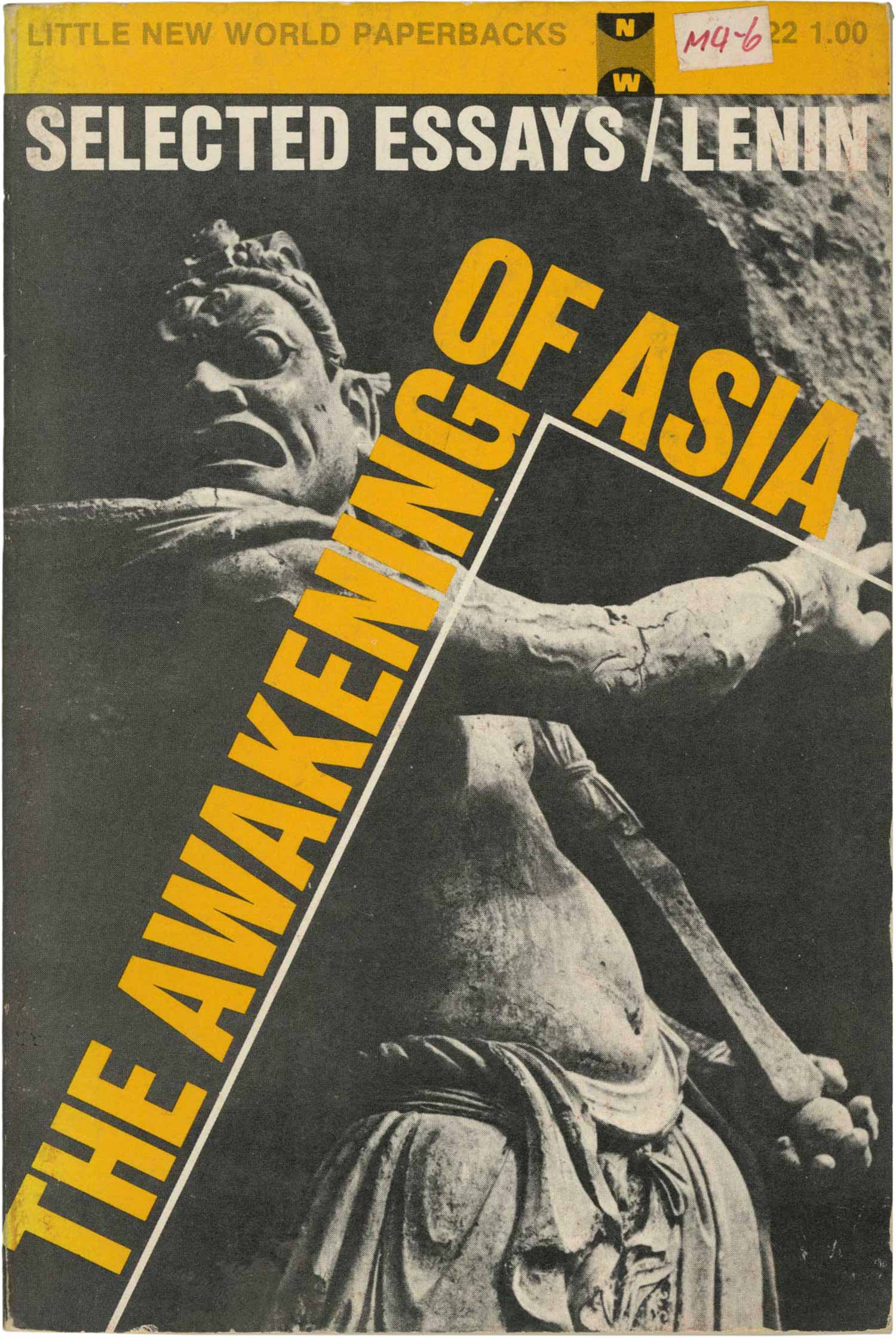
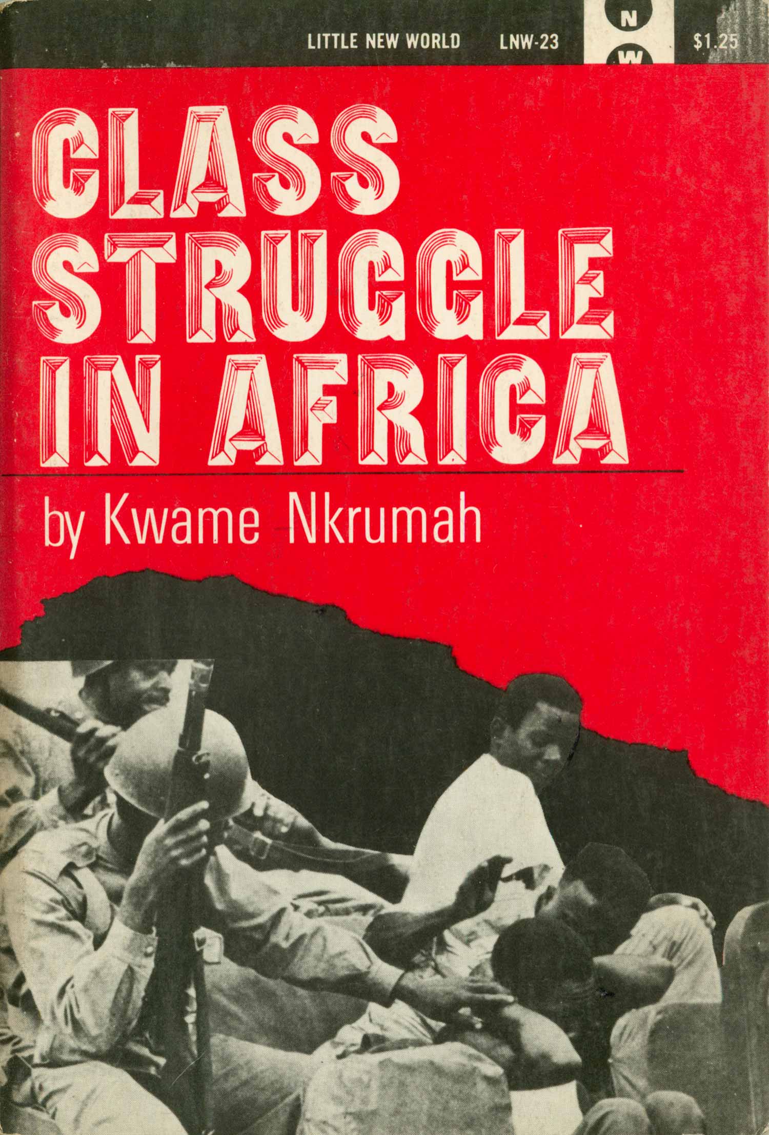
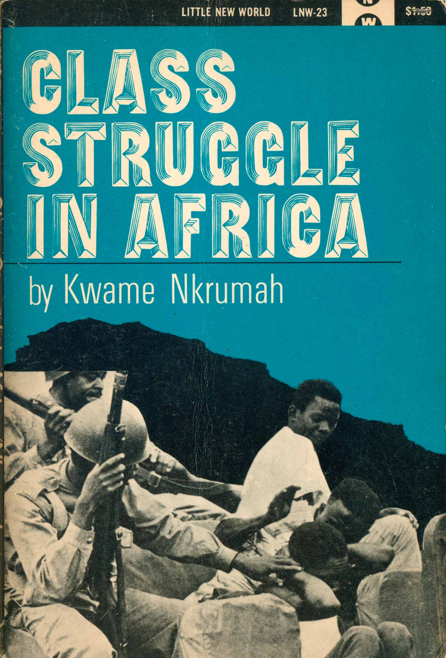
The cover of the Lenin book below is really strong, with the feel of a Cuban OSPAAAL political poster: precolonial art overlaid with powerful, almost Futurist, type and sharp lines. It’s compelling and forward thinking. And next to Lenin is another example of covers changing colors over time, with the original Class Struggle in Africa in red, then a later printing in blue. The design works in both color schemes, and I’ve even seen others out in the world, like one with a green background.
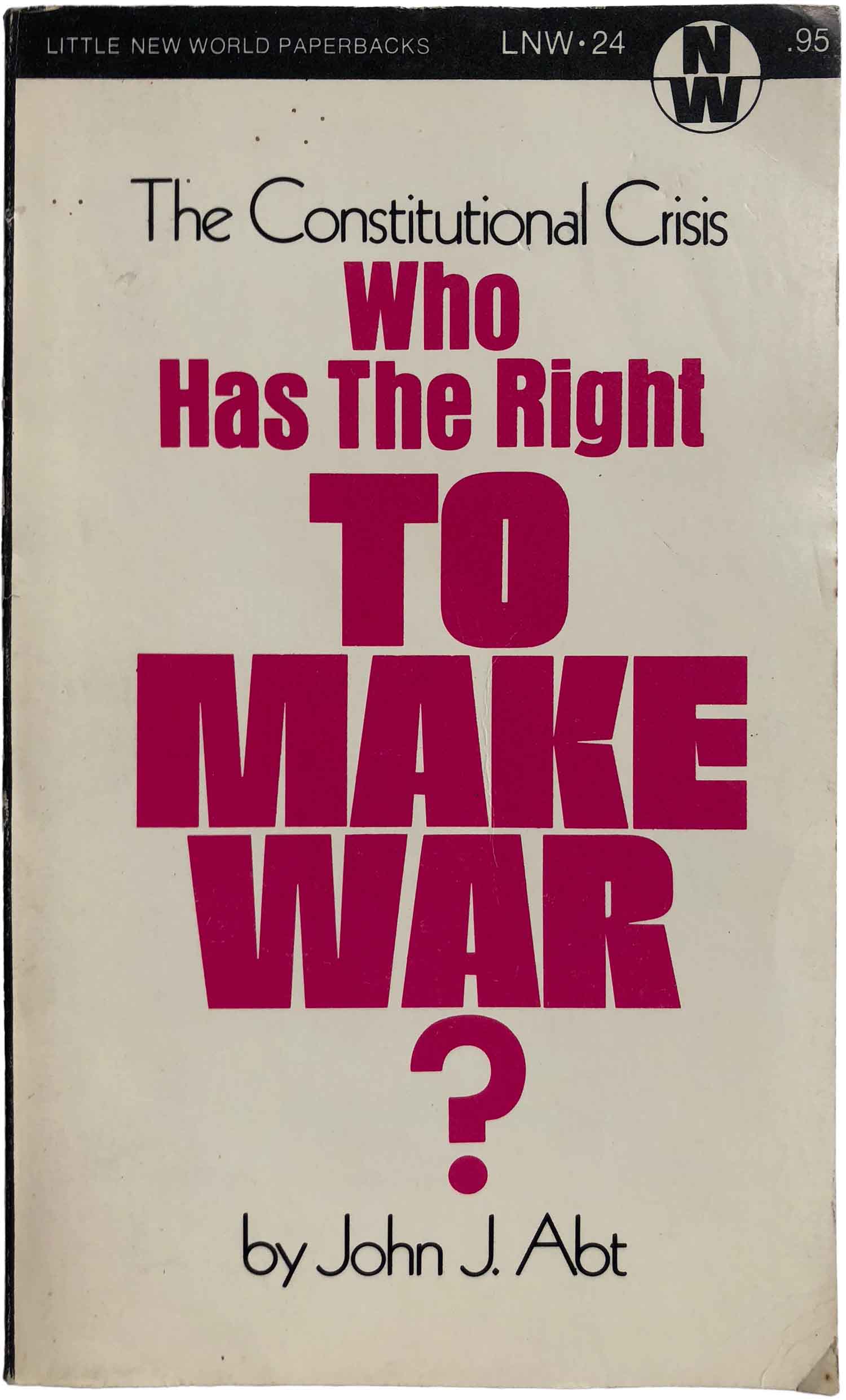
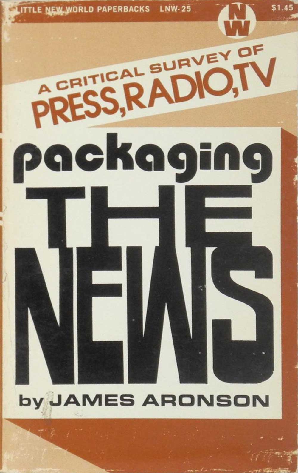
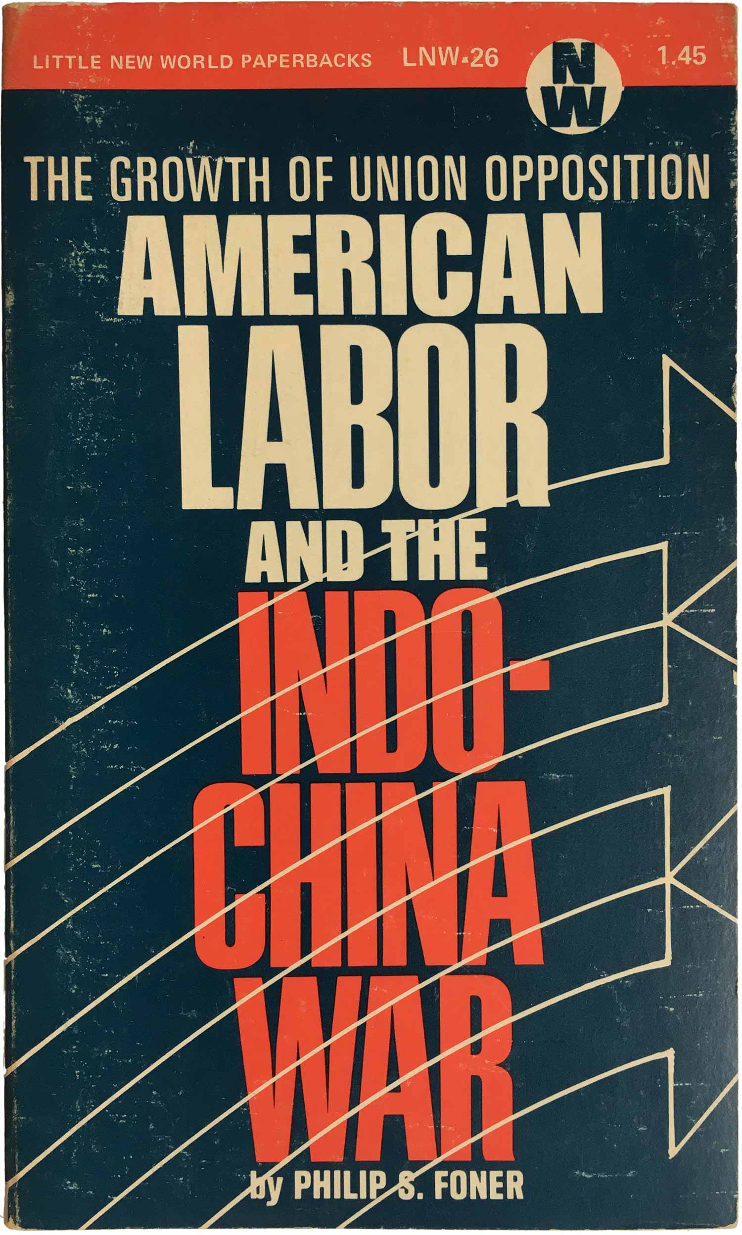
The next three in the series take a sharp minimalist turn. The Abt cover features only type, Aronson’s has very minimal graphic elements framing the text, and Fonor’s adds a graphic overprint to a largely type-based cover. The first two both feature three or four separate type-faces, but not for any clear or articulate reason. The font-styles don’t direct the eye from one to the next, and don’t inhabit any particular ideas or book content themselves, which ruins the minimalism, giving the viewer a bunch of unnecessary visual information to attempt to decode. That said, the font used for “The News” on Aronson’s cover is so nice and weird, I’m not sure I care that doesn’t seem to relate to what it is saying at all. While still mostly typographic, the Fonor cover is superior here. It sticks to different weights of the same font, tightly stacking the words in a compelling, top-heavy tower (with “Union Opposition” running the widest). The outlines of arrows run through the title to the right, throwing the composition enough out of balance to bring it alive without being too distracting.
The cover to William Pomeroy’s 3rd book in the series, Apartheid Axis (1971, LNW-28) is a melange of styles. For color we’ve got the old New World fallback of black and brown, for fonts a strange mix of bold Helvetica and an Art Deco-type, which looks both ornate and almost too emotional, literally in the shadow of the bolder Helvetica. The splitting of APART away from Apartheid feels a little too obvious, and awkward since there is no other wordplay present. But the most interesting thing about the cover is the shadow under Axis, which at first glance seems like a simple, if deep, drop shadow. But it’s not, the black below the X and S are off, not exactly conforming to the rules set by the other letters. I’m not sure if it is purposeful, but it sets the whole cover a little on edge.

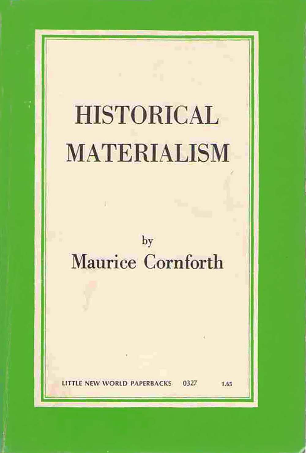
In 1971, LNW produced a set of Maurice Cornforth’s trilogy on materialism. I have only seen the covers on later reprints, so I’m not sure if the originals carried designs more in character with the overall series, but the ones below have a much more continental and classical feel. The covers are suited for the staid content, the light colored frames reading like a very early Penguin Classic. Outside of the basic frame ad decision to use a serifed font, there is almost no “design” here, very unique for LNW. Even The Woman Question above maintains the LNW logo in the top right and has the series of horizontal lines giving a sense of some (unknown and uncredited) designer’s hand.


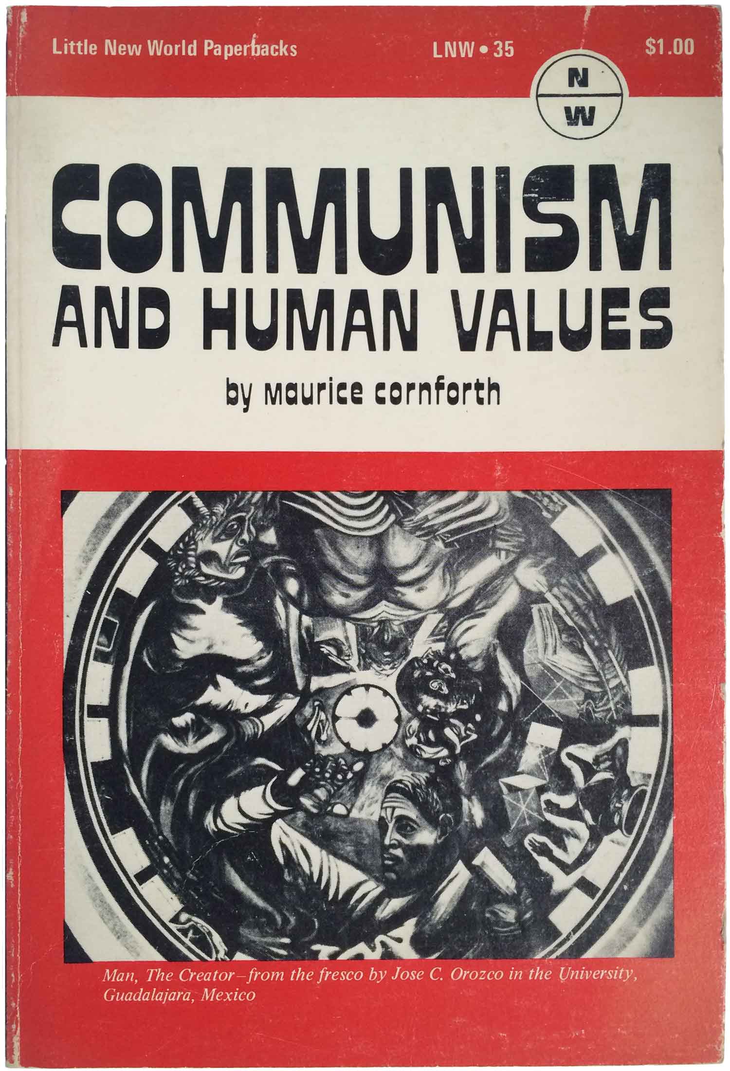
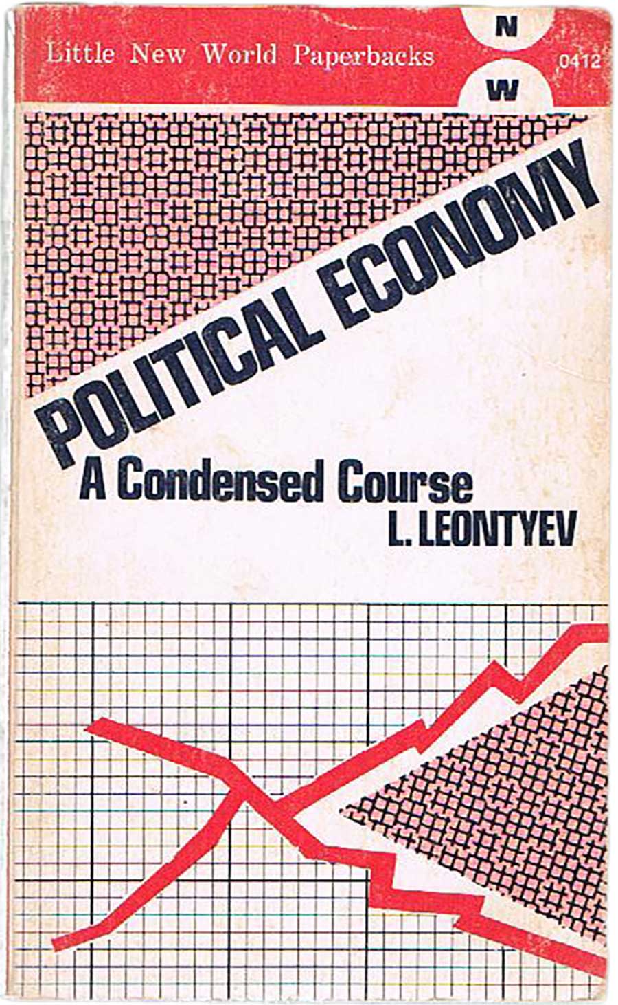
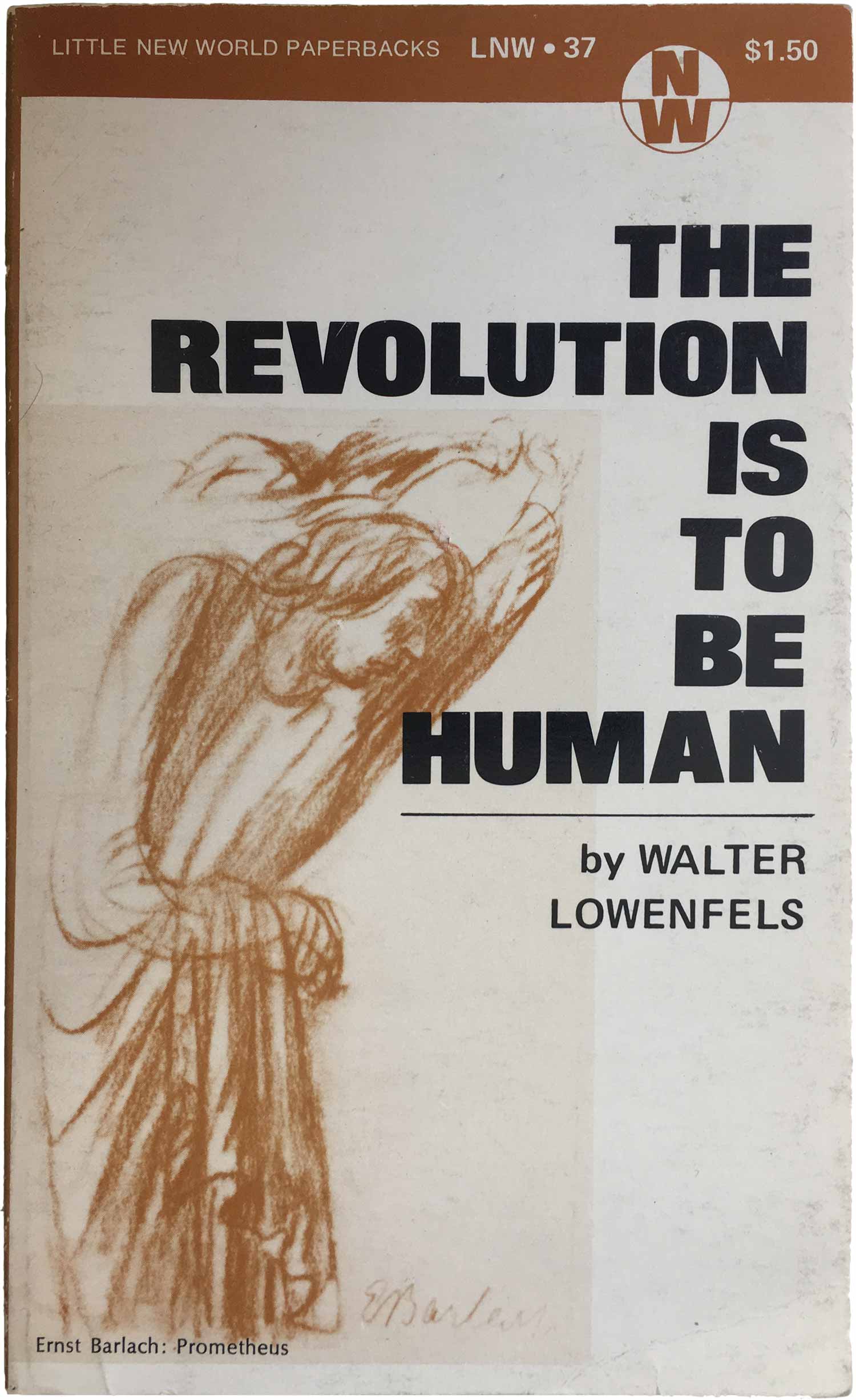
The Hall, Cornforth, and Lowenfels books below jump back to the very first titles designwise, featuring very simple type and then a single illustration, just dumped on the cover. Each of the illustrations is credited as they would be inside, but on the front cover—an odd aesthetic decision I’ve rarely seen anywhere else. The type on the Cornforth title is a little more active, with the heavy, heavy horizontal axis. You don’t see fonts like this much in the Anglo-world, maybe they are too overcoded as “psychedelic,” but they’re super popular in Lusophone design for some reason. Overall the idea of using more “fine art” to illustrate the ideas in the book is an interesting, if very classical and conservative, idea. The trouble is that the execution is so generally so poor, with the images cut, trimmed, and shoved to the side by the titles. The Leontyev cover is the outlier here, it’s pretty scrappy for an LNW design, with the patterns and graph lines clearly cut out and pasted together. This actually gives the whole design a little more life than some of the other ones here.
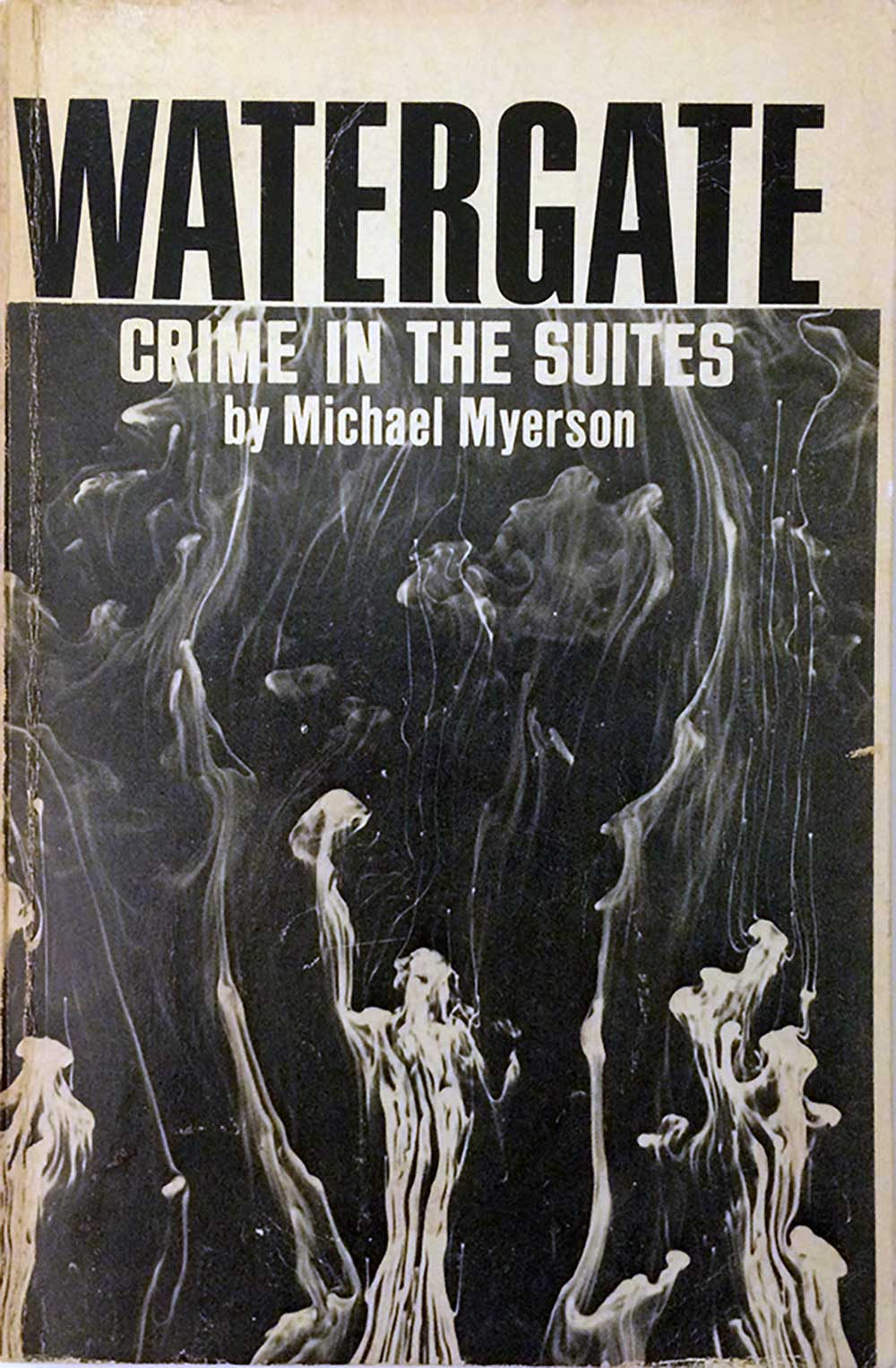
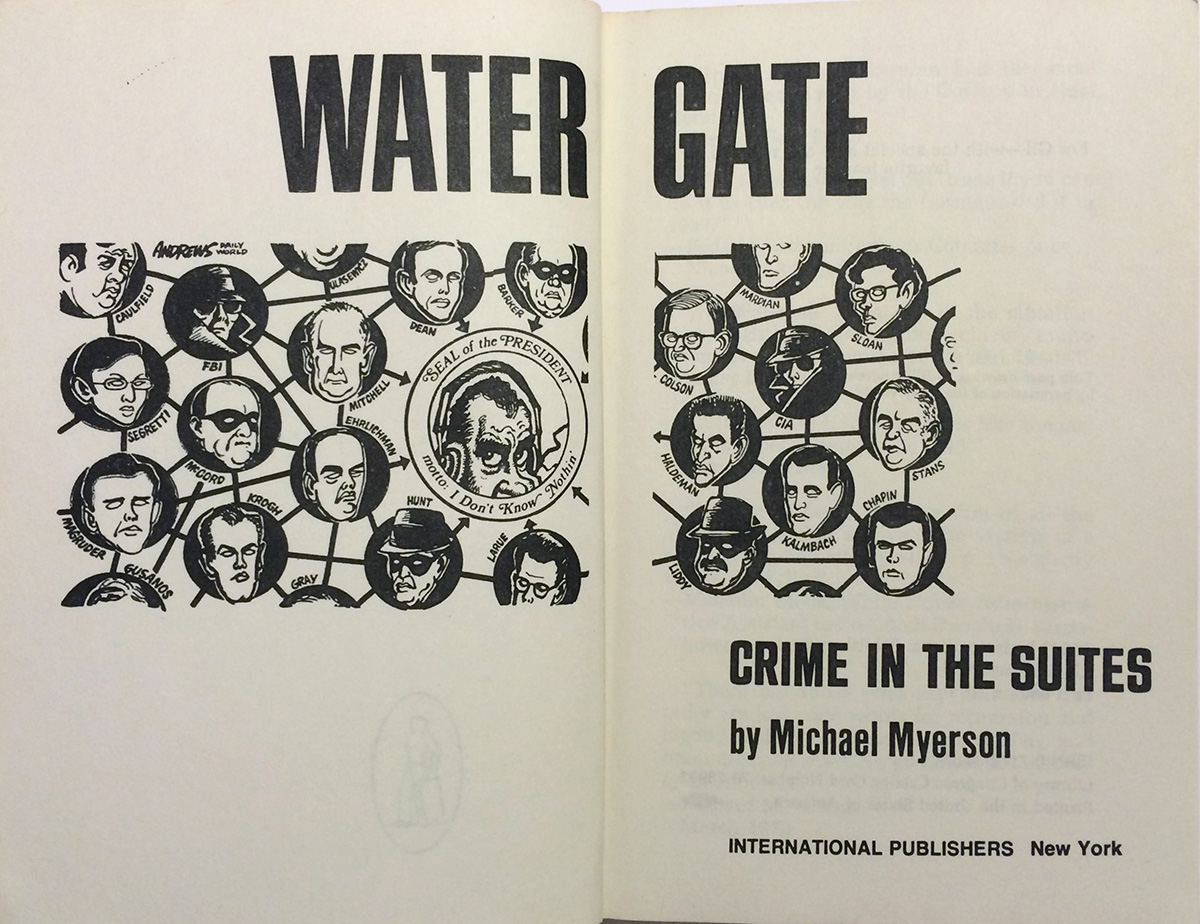
With Watergate we’ve hit a new design format all together. The title is still bold and straightforward, but the image, for the first time, is really abstract, a bold decision for American Communists! I think it’s a series of smoke puffs, as if just below the picture’s frame there were a dozen cigarettes, just burning away. There might be some direct reference to Watergate which is lost to me, or it could just be an attempt to call into being the idea of a closed boardroom of cigar smoking bureaucrats. The illustration on the frontispiece is really great, an editorial cartoon of the interconnected web of Watergate corruption. Looks like it’s by someone named “Andrews” who did cartoons for the Daily World, the CP USA newspaper.
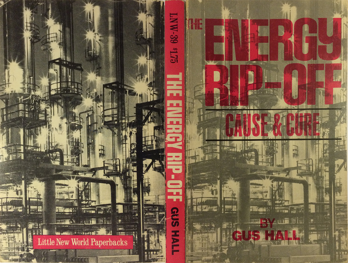
And the final book in the series, as far as my research has found, is Gus Hall’s The Energy Rip-Off (1974, LNW-39). This is the first book that actually looks “Communist,” at least in a Soviet way. The industrial photo on the cover, and how it wraps around the back, are reminiscent of Russian industrial design magazines and other photo-montage-based publication covers from the 1920s and 30s. The titling finally has a little flair as well—set in a big pink block, the “THE” set off to the top left, the Y in Energy so playful, and far from a standard sans serif. This cover is definitely moving in a strong and new direction, it’s too bad this is the last one in the set.
I’ve compiled this bibliography of Little New World paperbacks, it’s incomplete, but as far as I can get with available information. If any readers out there can add any info, in particular about the three books I’m completely missing, or any I am missing photos of, please leave a comment!:
LNW-1: William J. Pomeroy, Guerilla and Counter-Guerilla Warfare (New York: International Publishers, 1965). Cover design unattributed.
LNW-2: Hyman Lumer, Poverty: Its Roots and Its Future (New York: International Publishers, 1965). Cover design unattributed, illustration by Kathë Kollwitz.
LNW-3: Jacob M. Budish, Is Communism the Next Stage?: A Reply to Kremlinologists (New York: International Publishers, 1965). Cover design unattributed.
LNW-4: John and Margrit Pittman, Peaceful Coexistence: Its Theory and Practice in the Soviet Union (New York: International Publishers, 1965).
LNW-5: Howard Selsam, Ethics and Progress: New Values in a Revolutionary World (New York: International Publishers, 1965).
LNW-6: Stanley Ryerson, The Open Society: Paradox and Challenge (New York: International Publishers, 1965).
LNW-7: Josh Dunson, Freedom In the Air: Song Movements of the 60’s (New York: International Publishers, 1965). Cover design unattributed.
LNW-8: The Spark, eds, Some Essential Features of Nkrumaism (New York: International Publishers, 1965).
LNW-9: Emile Burns, An Introduction to Marxism (New York: International Publishers, 1972 [4th printing]). Cover design unattributed.
*LNW-9: Emile Burns, An Introduction to Marxism/5th printing (New York: International Publishers, 1975). Cover design unattributed.
LNW-10: Amado V. Hernandez, Rice Grains: Selected Poems (New York: International Publishers, 1967).
LNW-11: Samuel Sillen, ed., William Cullen Bryant: Selections from His Poetry and Prose (New York: International Publishers, 1968).
LNW-12: George Morris, CIA and American Labor: The Subversion of the AFL-CIO’s Foreign Policy (New York: International Publishers, 1969).
LNW-13: William J. Pomeroy, Half a Century of Socialism (New York: International Publishers, 1969).
LNW-14: Herbert Aptheker, The Nature of Democracy, Freedom and Revolution (New York: International Publishers, 1969).
LNW-15: Jack Woddis, Introduction to Neo-Colonialism (New York: International Publishers, 1967). Cover design unattributed.
LNW-16: Kwame Nkrumah, Dark Days in Ghana (New York: International Publishers, 1970).
LNW-17: Kwame Nkrumah, Handbook of Revolutionary Warfare (New York: International Publishers, 1970). Cover design by Equality Designers.
LNW-18: Kwame Nkrumah, Axioms (New York: International Publishers, 1970).
LNW-19: Marx, Engels, Lenin, and Stalin, The Woman Question (New York: International Publishers, 1970). [blue cover] Cover design unattributed.
*LNW-19: Marx, Engels, Lenin, and Stalin, The Woman Question (New York: International Publishers, 1973 [3rd printing]). [red cover] Cover design unattributed.
LNW-20: Ho Chi Minh (Jack Woddis, ed.), Selected Articles and Speeches 1920–1967 (New York: International Publishers, 1970). Cover design unattributed.
LNW-21: Gil Green, Revolution Cuban Style (New York: International Publishers, 1970). Cover design unattributed.
*LNW-21: Gil Green, Revolution Cuban Style (New York: International Publishers, 1972). [brown cover] Cover design unattributed.
LNW-22: V.I. Lenin, The Awakening of Asia (New York: International Publishers, 1970). Cover design unattributed.
LNW-23: Kwame Nkrumah, Class Struggle in Africa (New York: International Publishers, 1970). Cover design unattributed.
*LNW-23: Kwame Nkrumah, Class Struggle in Africa (New York: International Publishers, 1975 [4th Printing]). Cover design unattributed.
LNW-24: John J. Abt, Who Has the Right to Make War?: The Constitutional Crisis (New York: International Publishers, 1970). Cover design unattributed.
LNW-25: James Aronson, Packaging the News: A Critical Survey of Press, Radio, and TV (New York: International Publishers, 1971). Cover design unattributed.
LNW-26: Philip S. Foner, American Labor and the Indochina War: The Growth of Union Opposition (New York: International Publishers, 1971). Cover design unattributed.
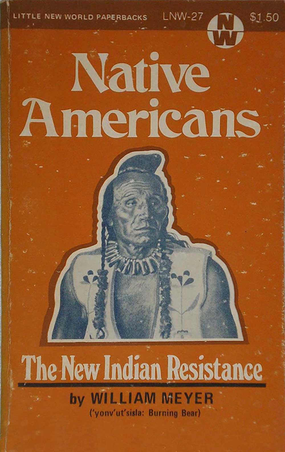
LNW-27: William Meyer, Native Americans: The New Indian Resistance (New York: International Publishers, 1971). Cover design unattributed.
LNW-28: William H. Pomeroy, Apartheid Axis: The United States and South Africa (New York: International Publishers, 1971). Cover design unattributed.
LNW-29: Maurice Cornforth, Materialism and the Dialectical Method (New York: International Publishers, 1971).
LNW-30: Maurice Cornforth, Historical Materialism (New York: International Publishers, 1971). Cover design unattributed.
LNW-31: Maurice Cornforth, The Theory of Knowledge (New York: International Publishers, 1971). Cover design unattributed.
*LNW-31: Maurice Cornforth, The Theory of Knowledge (New York: International Publishers, 1977 [5th Printing]). Cover design unattributed.
LNW-32: [unknown]
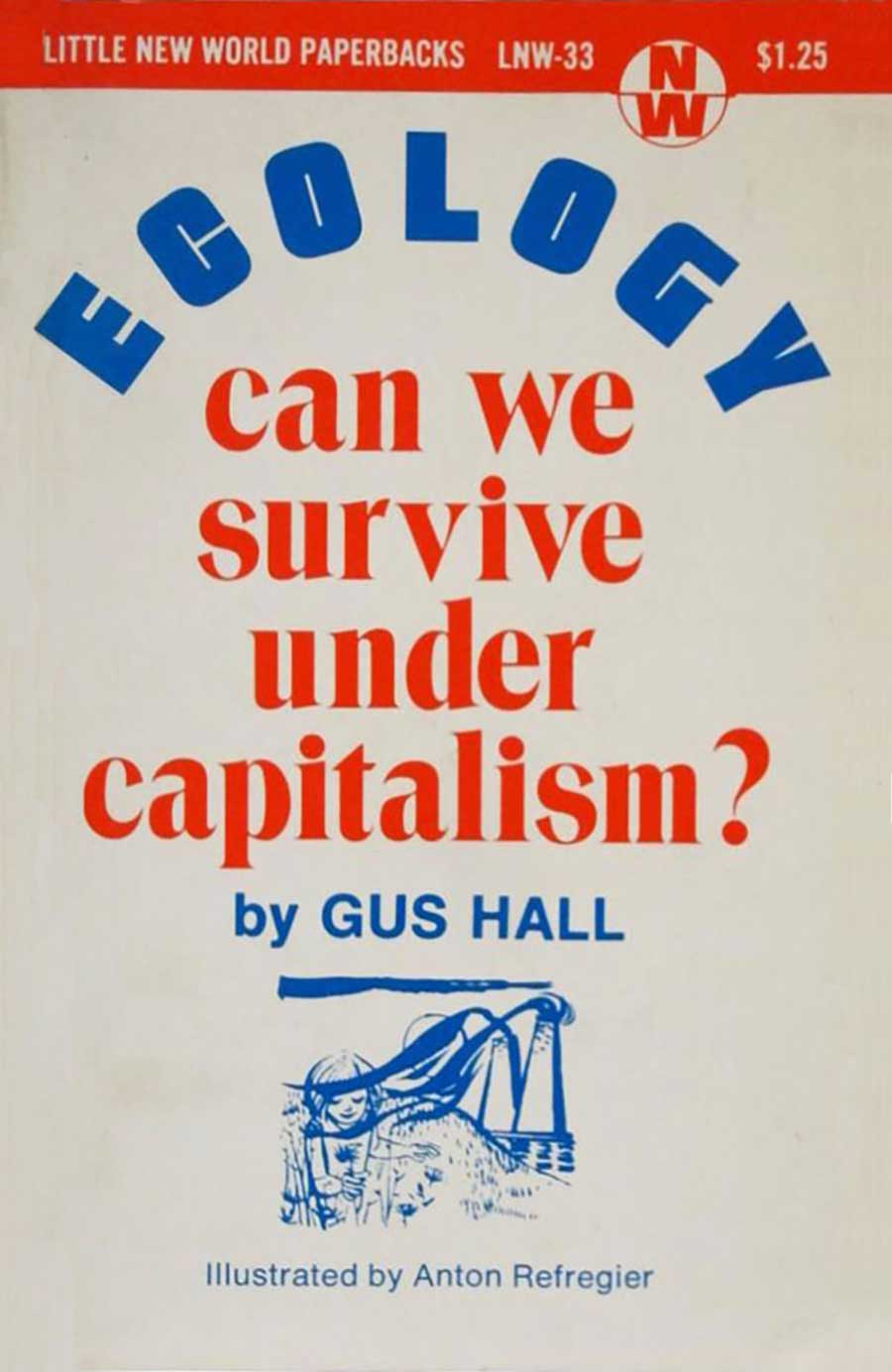
LNW-33: Gus Hall, Ecology: Can We Survive Under Capitalism? (New York: International Publishers, 1972). Cover illustration by Anton Refregier.
LNW-34: [unknown]
LNW-35: Maurice Cornforth, Communism and Human Values (New York: International Publishers, 1972). Cover illustration by Jose Orozco.
LNW-36: L. Leontyev, Political Economy: A Condensed Course (New York: International Publishers, 1972). Cover design unattributed.
LNW-37: Walter Lowenfels, The Revolution is to Be Human (New York: International Publishers, 1973). Cover illustration by Ernest Barlach.
LNW-38: Michael Myerson, Watergate: Crime in the Suites (New York: International Publishers, 1973). Cover design unattributed.
LNW-39: Gus Hall, The Energy Rip-Off (New York: International Publishers, 1974). Cover design unattributed.