I’ve been on hiatus from this book blog for about six months, but I’m going to try to start posting new entries again, although time will likely only allow one a month. It would be nice to go back to weekly, but sadly I just can’t keep up the pace on an unpaid project. Last March I posted an epic post about crime novels published by Penguin Books (257), especially the series of “green” covers printed in the 1960s. Today I want to look at another period in Penguin’s stories history, this time at science fiction novels published in the late 1960s into the 70s. These are sometimes referred to as “purples” because of the purple background used on Penguin logo on sci-fi covers roughly between 1967–77. I’ll give a little background, then get into the specifics.
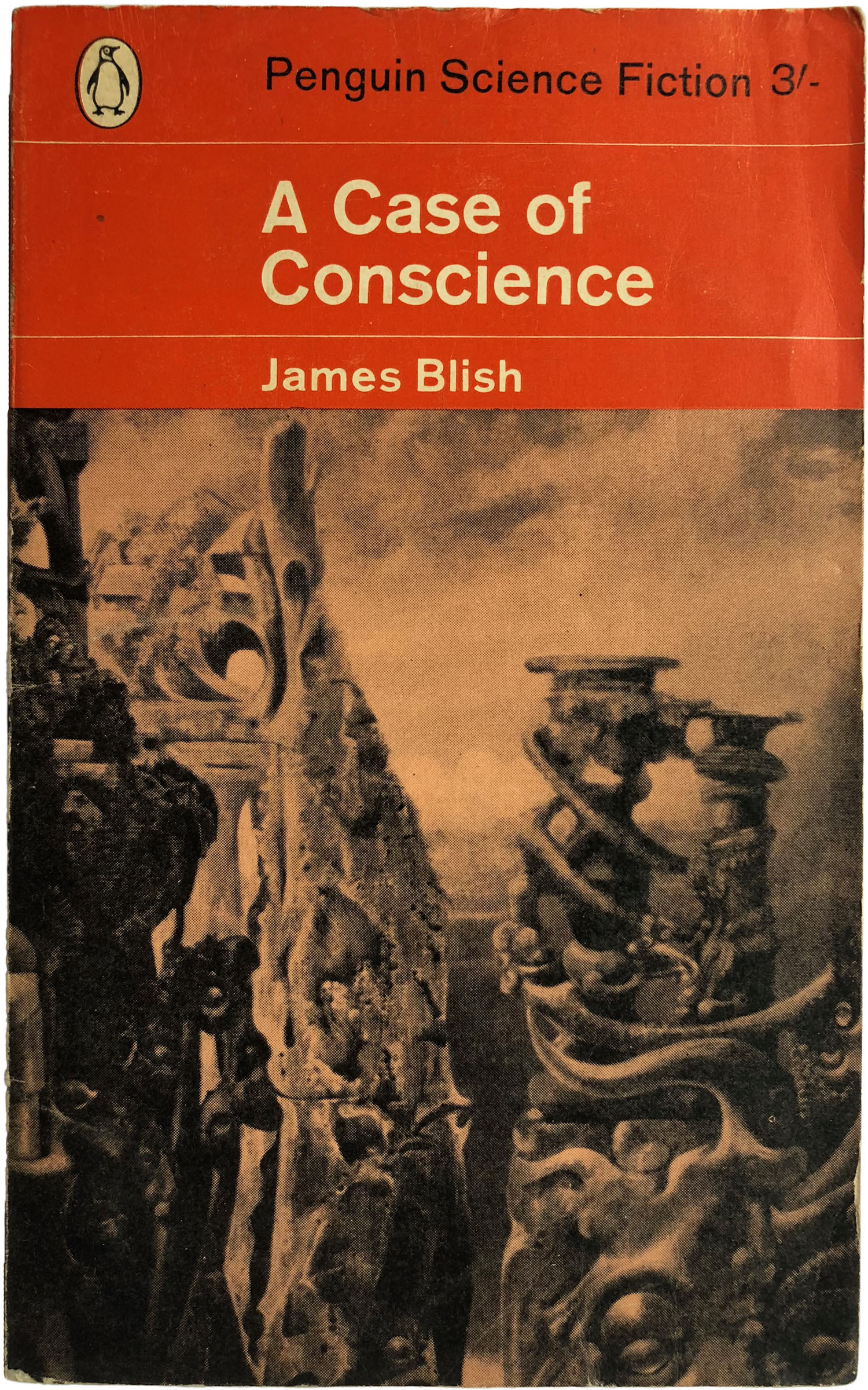
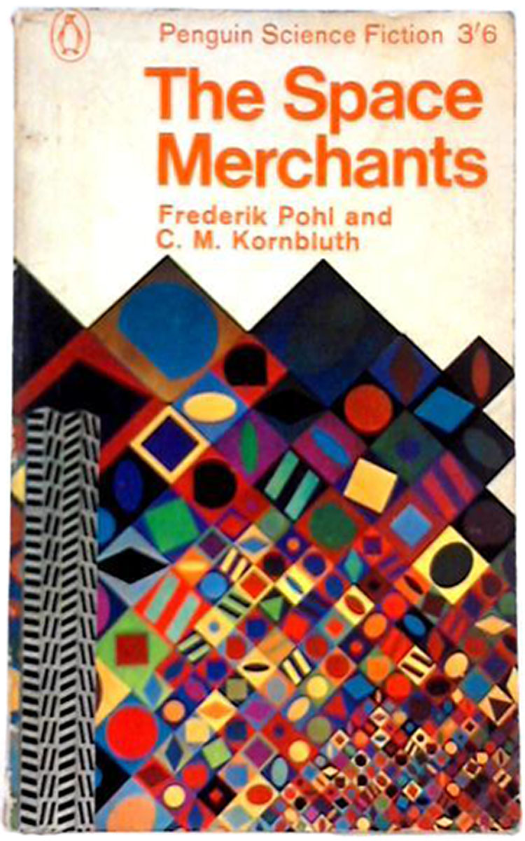
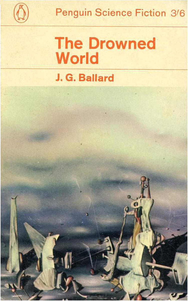
Like crime novels, science fiction books have never been a truly distinct series within the Penguin universe, and arguably even less so. In the early days sci-fi novels were published in orange wraps just like regular fiction, and even after Penguin started creating unique series design for sci-fi it wasn’t totally uncommon for some titles to end up published with standard orange fiction covers. After a couple H.G. Wells titles in the 1940s, one of the first sci-fi novels Penguin published—and likely the first with a cover illustration—was John Wyndham’s The Day of the Triffids in 1954, below right. To the left and of that are a Blish and a Harrison from 1963 and then things start to get more creative, with The Space Merchants from 1965. Below those two early Ballards from 1965, all in orange.


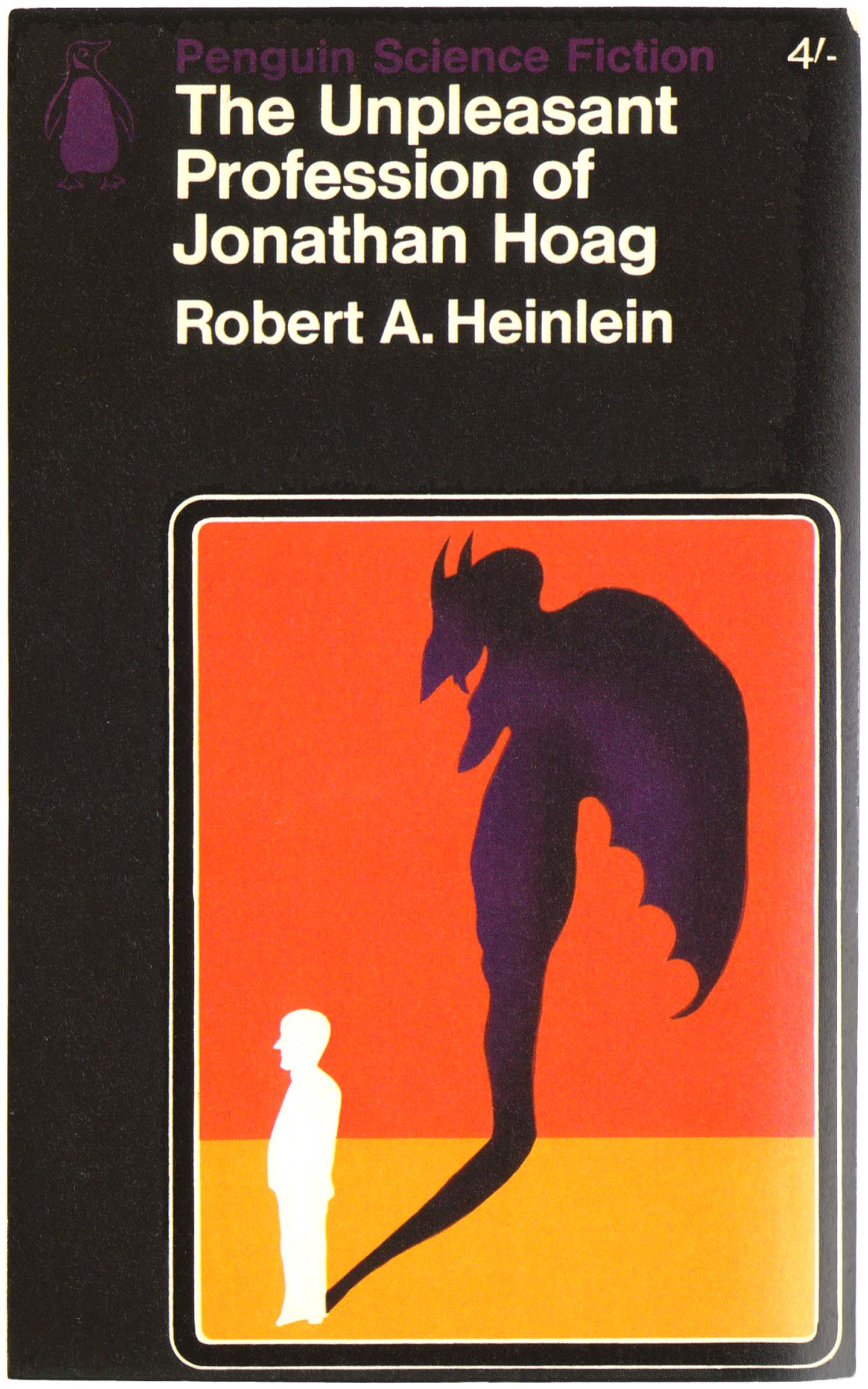
In 1965, Alan Aldridge was hired as Penguin’s art director. He set up the first formal science fiction style in 1966, choosing black as the dominant color and creating a “Penguin Science Fiction” masthead at the top, in purple. This echoed the “Penguin Crime” masthead that had previewed a couple years earlier. But unlike the crime series, Aldridge initially kept the penguin orange (although it turned purple during this phase). These initial covers are awkward, and clearly mark the beginning of something but are not quite there yet. Although some of the illustrations are nice, the rounded box within the frame of the cover feels unwieldy, minimizing the impact of the images. The list of novels itself was still young, mostly populated by authors who already were science fiction heavyweights and old standbys, such as Robert Heinlein and Frederik Pohl. Most of these authors had separate U.S. paperback contracts, so very, very few of these were ever available for sale in the U.S., so it’s quite rare to stumble upon them in bookshops here.
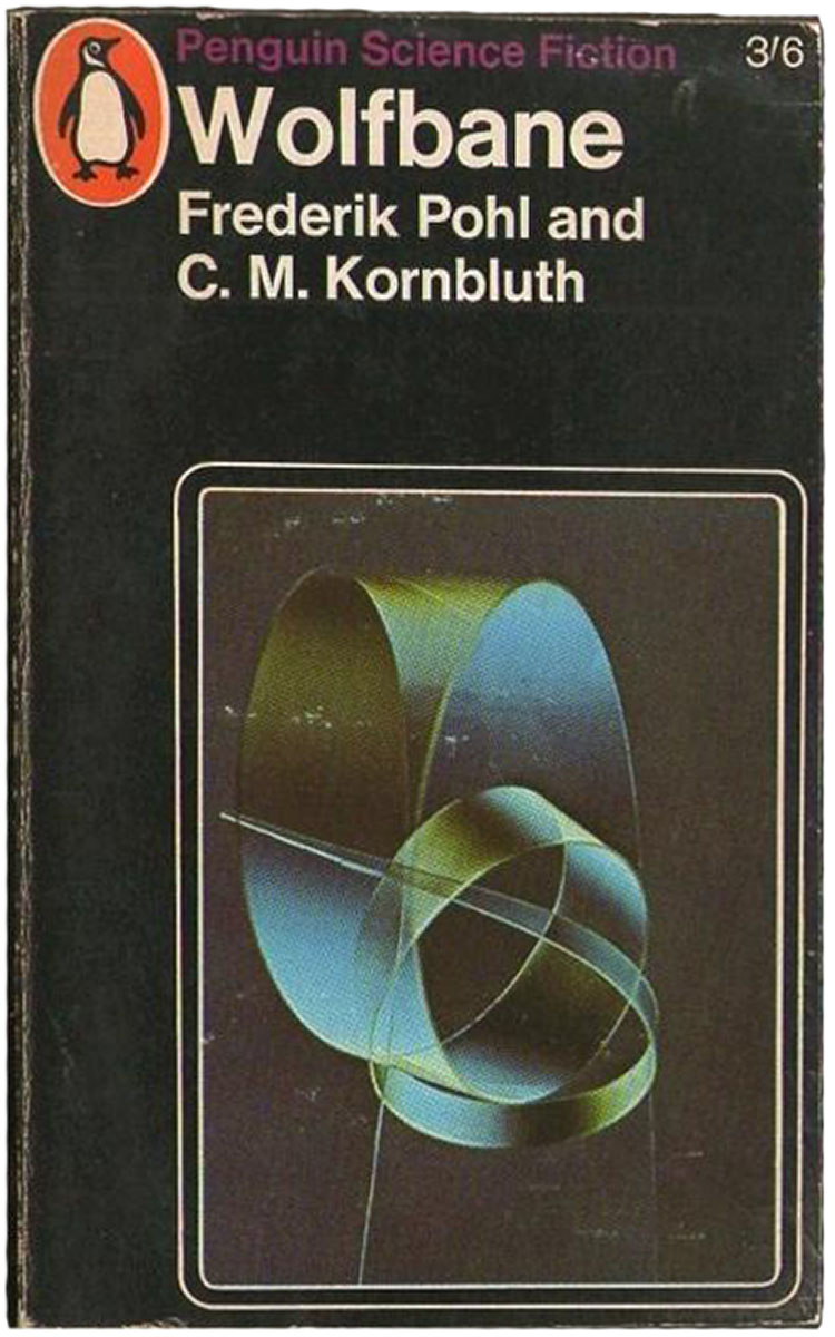
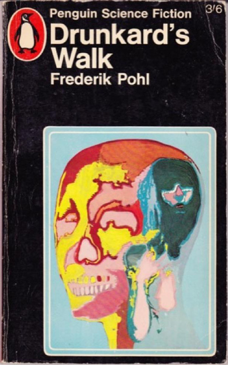
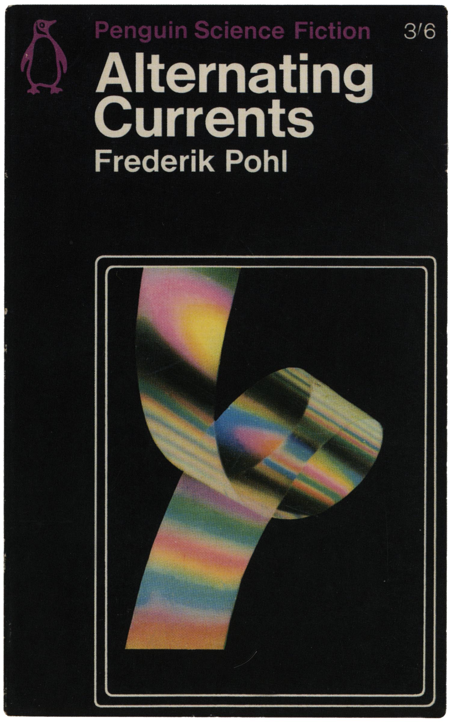
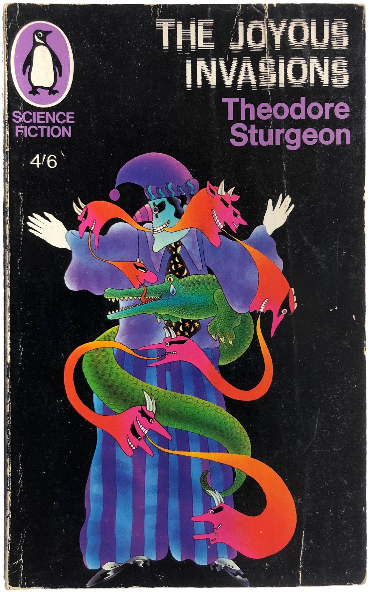
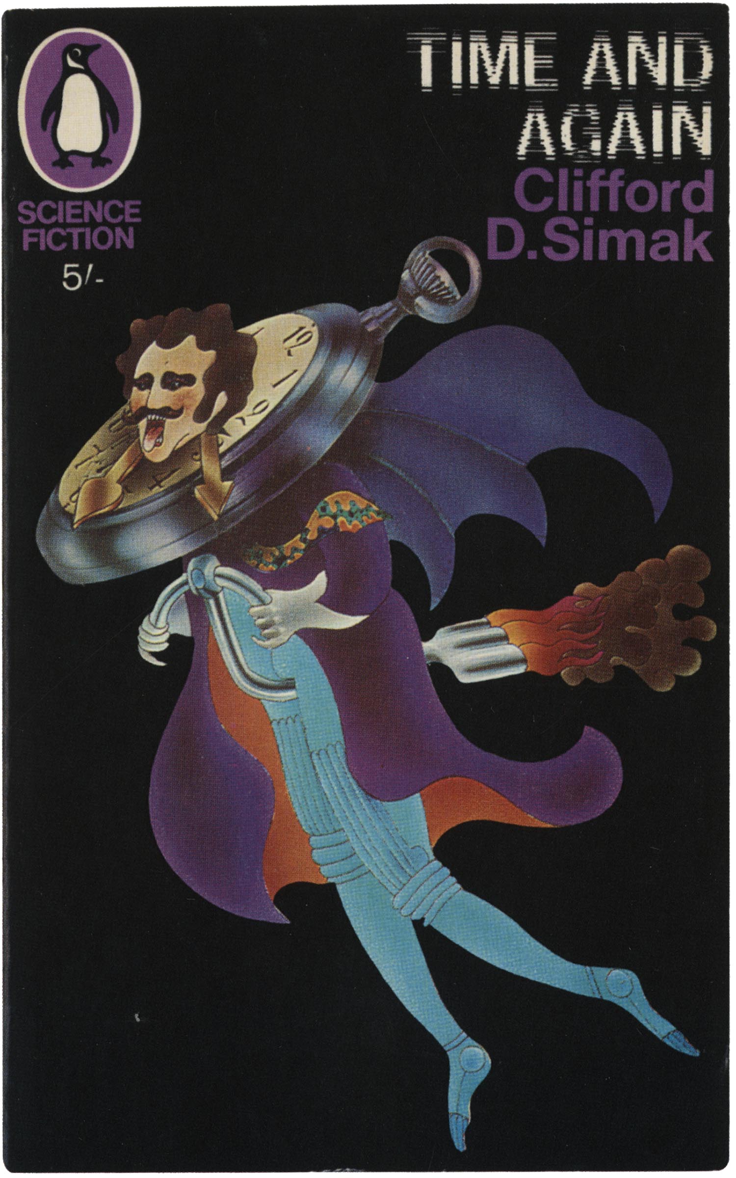
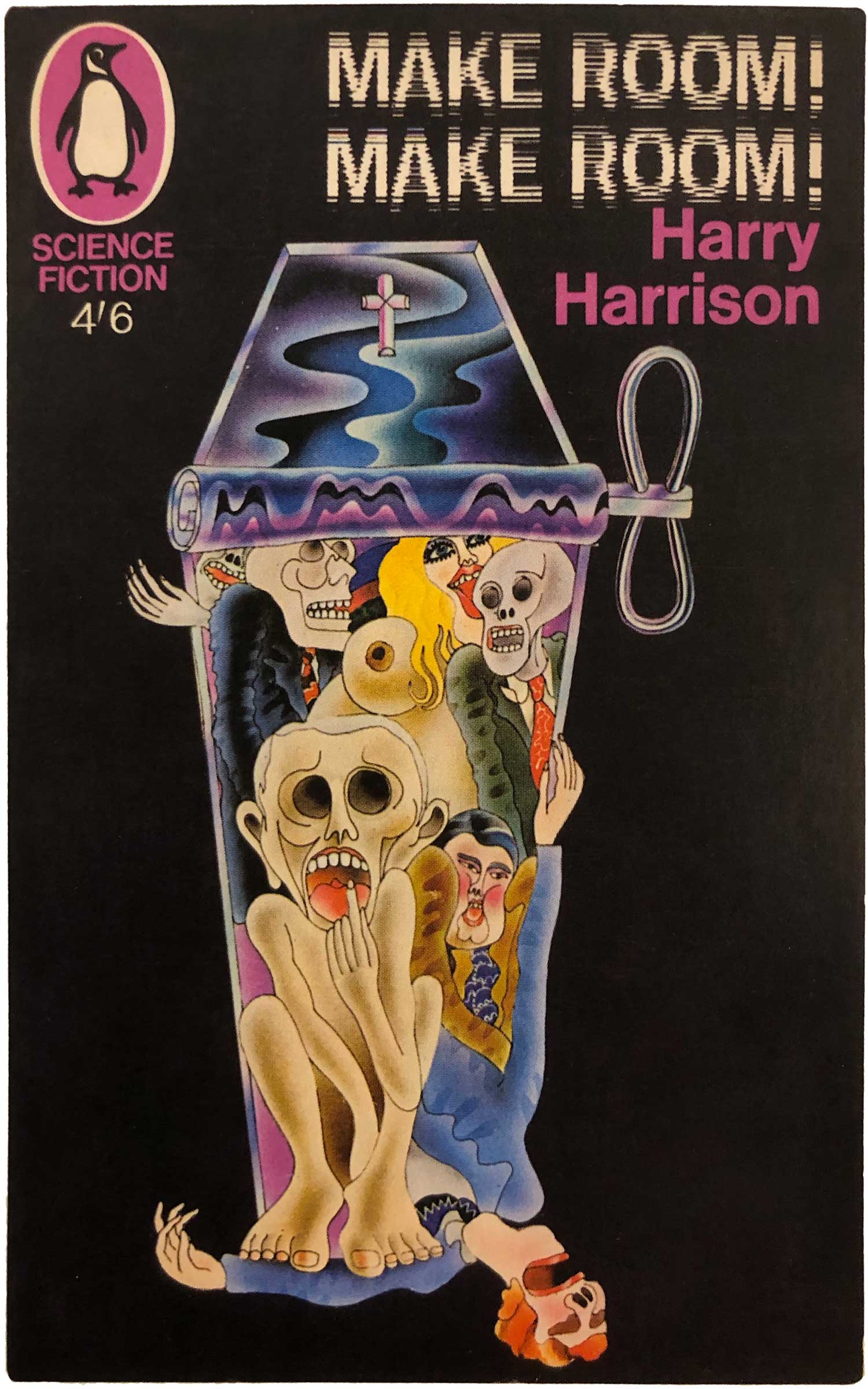
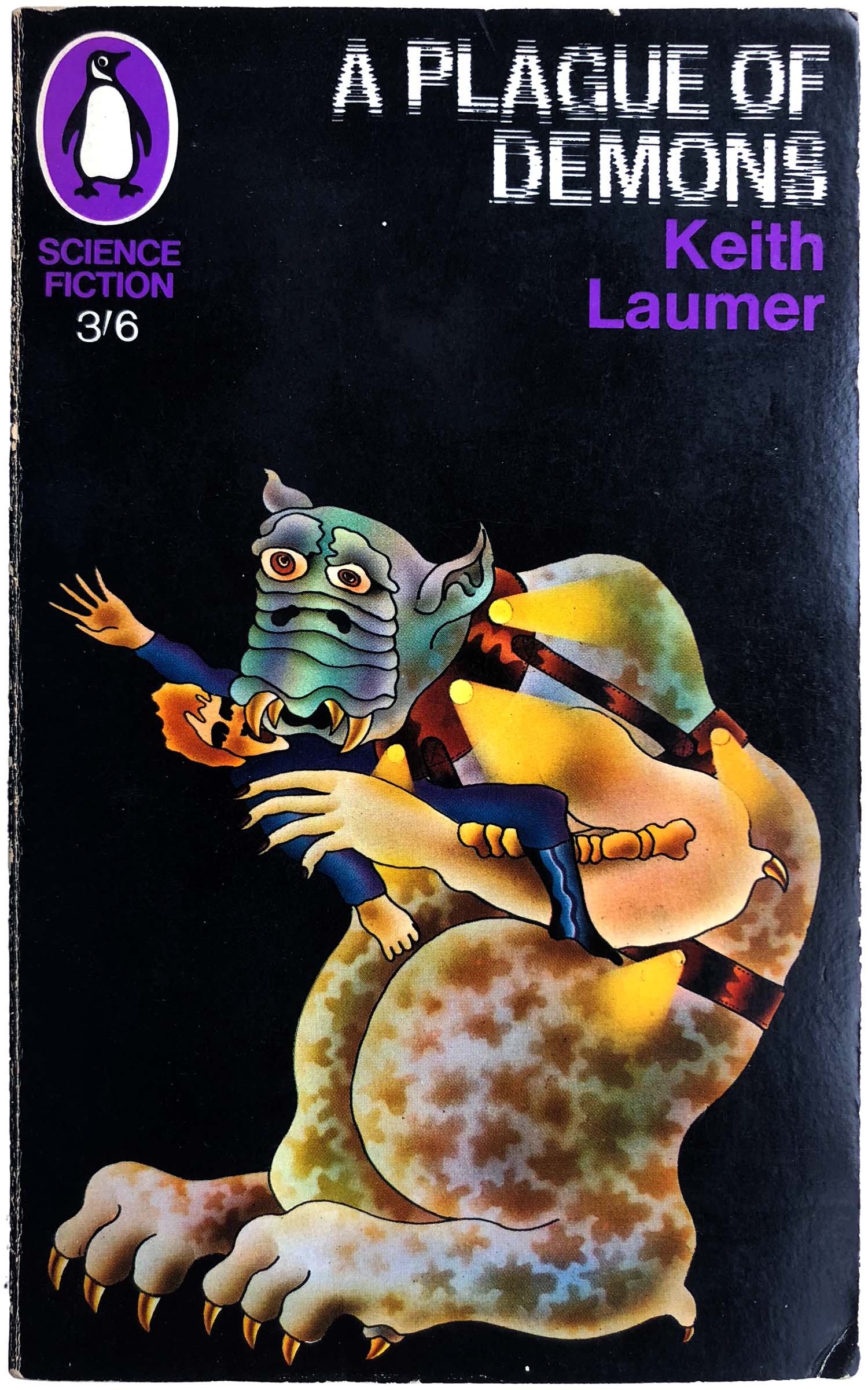
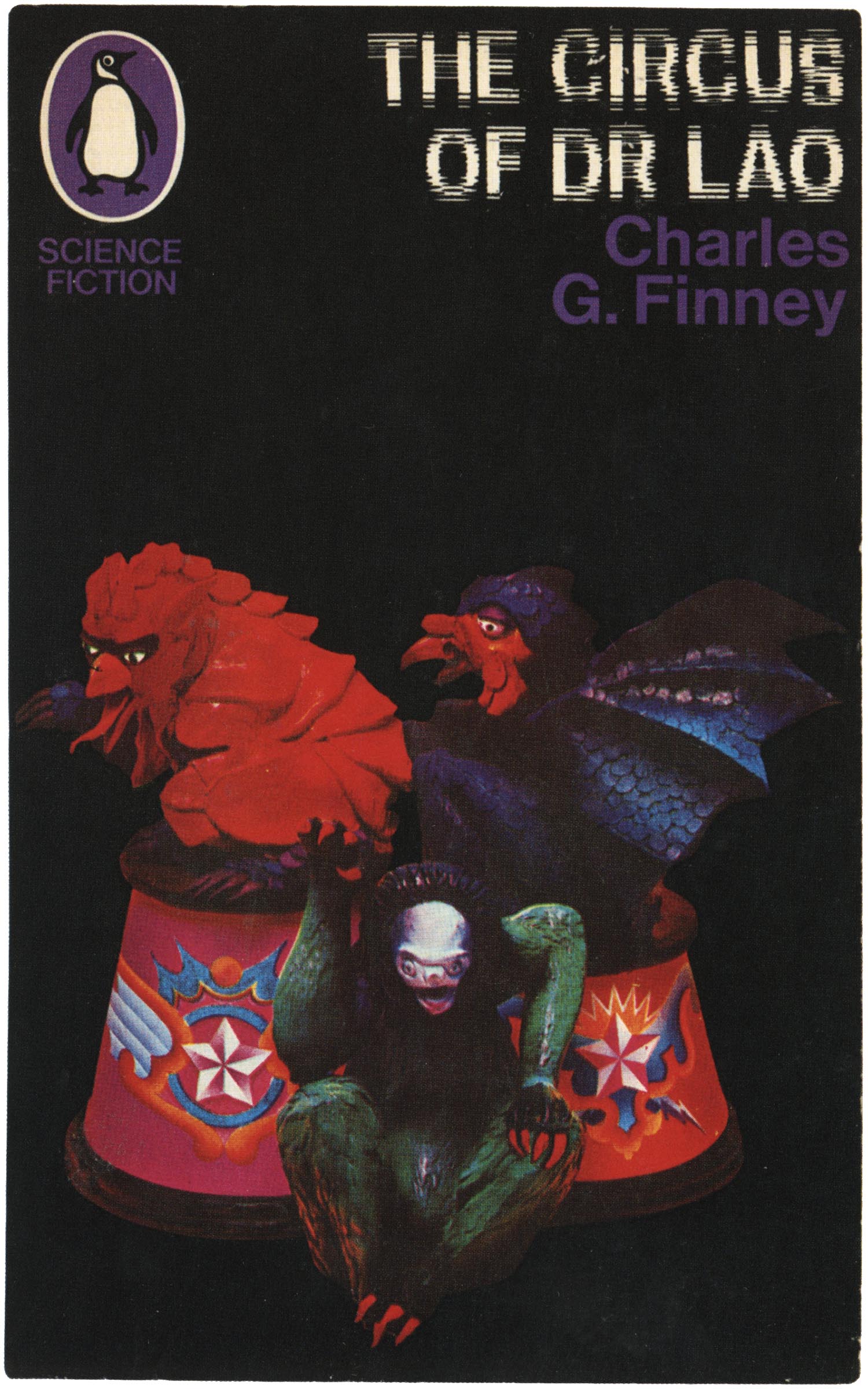
An illustrator by training, Aldridge was tuned in to the burgeoning counter-culture, and channeled that into giving Penguin a much hipper look. He took on the science fiction list in 1967, stripping Penguin’s Marber grid down to the bare basics. He placed an enlarged purple penguin in the top left, then the titles in a unique out-of-phase typeface, the author names in purple below that, and colorful, trippy, pop-art illustrations on a field of black. These covers really pushed the boundaries of Penguin design at the time, squarely yanking the aesthetic out of the 1950s and into the “future.” This is really the onset of the peak creative “purple” period, and some really sharp covers came out of this phase.
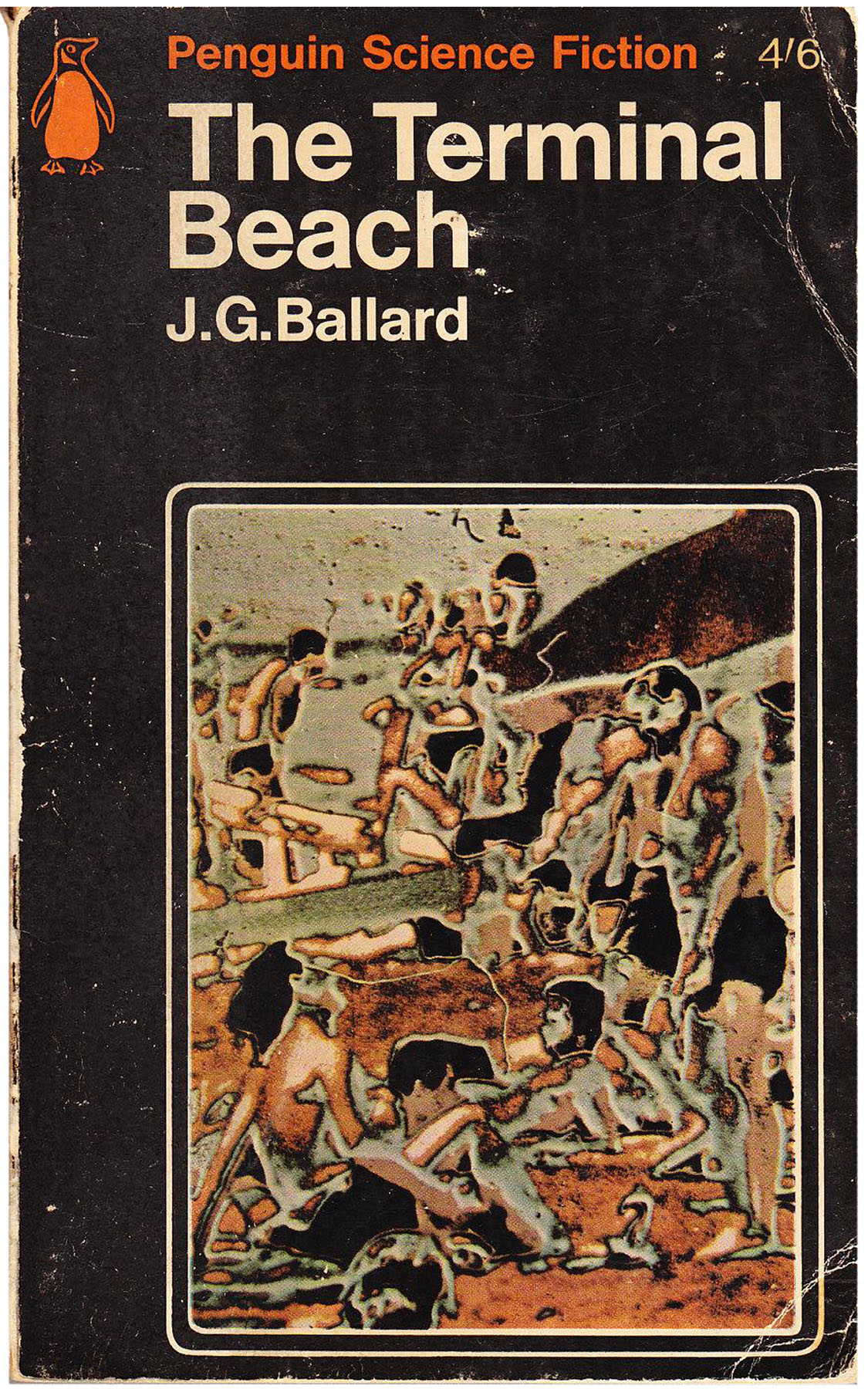
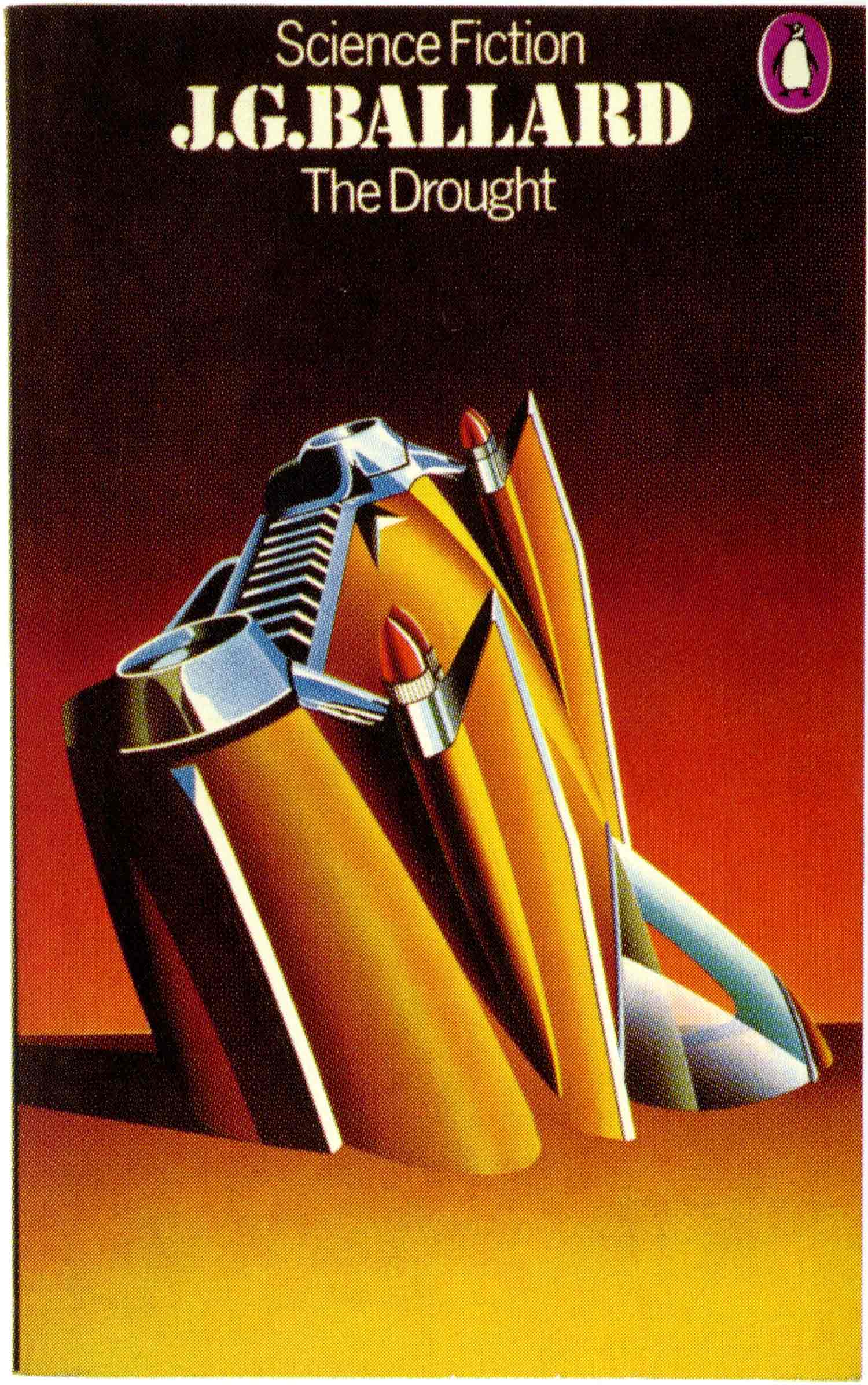
Aldridge, who had been controversial at Penguin—in part because of how far he stretched the previously staid design—left in 1967. For the second half of 67 and into 68, Penguin was without an art director, and cover design ended up being somewhat adrift. Whoever stepped in was forced to add the then standard, and way too large, “A PENGUIN BOOK” at the top of each cover, and set the titles in a new “space-age” font that feels far more backward looking than Aldridge’s choices. The illustrations are all photo-based, and read as close-ups of lunar surfaces and petri dishes. Although some of the covers maintain the black and purple feel, there is a lot of slippage, with dominant reds and yellows on some of the covers, undermining the overall style. Some are even designed by real giants (The Last Refuge was done by Richard Hollis!), but overall they just seems a little too distant and disengaged. The only one of this series that really feels like it really comes together is Ballard’s The Drought, largely because the cover is not a straight photo, but a montage of photo elements. That said, it works in its own right, decidedly not as part of the over-arching Penguin sci-fi series aesthetic.

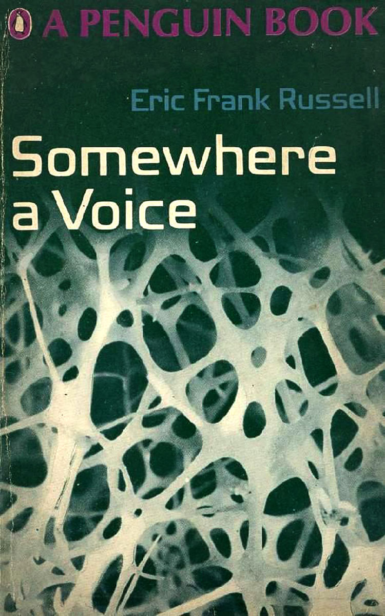


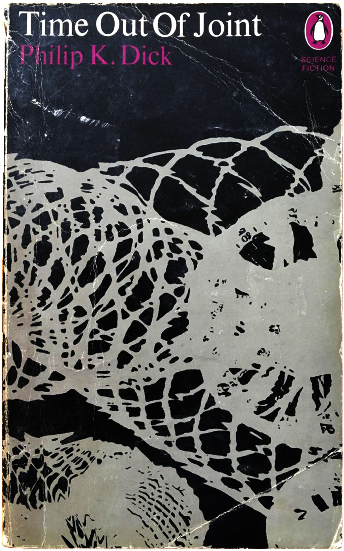
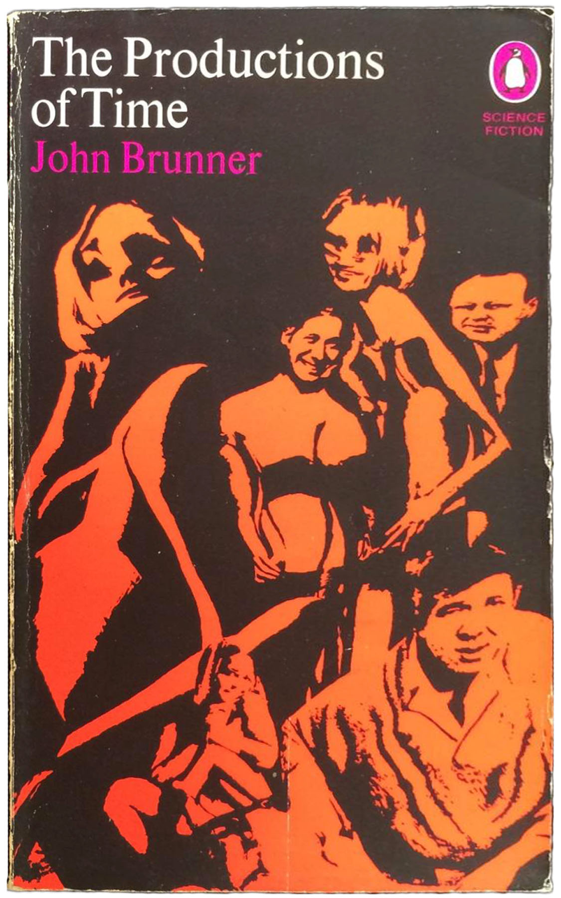
In late 1968 Aldridge was finally replaced by David Pelham. Pelham, who was also an illustrator, maintained the purple penguin icon and overall black cover designs, but passed the illustration work to Franco Grignani, who in 1969 and 70 significantly evolved Aldridge’s template by replacing the colorful and playful illustrations with heavily manipulated monotone photographs. In many ways these covers are more reminiscent of the 1960s Science Fiction Book Club designs (see post 176), with near abstraction recalling a series of outer space and proto-digital themes. To my eyes the more abstract of these the stronger, with the cover’s for Dick’s Penultimate Truth and Brunner’s Production of Time failing because the illustrations too recognizable as groups of people. Leiber’s Conjure Wife is more successful, the visible face melding into exploding flower shapes is weird enough to carry the cover. I’ve collected a dozen of these covers, but it is likely that their are more.
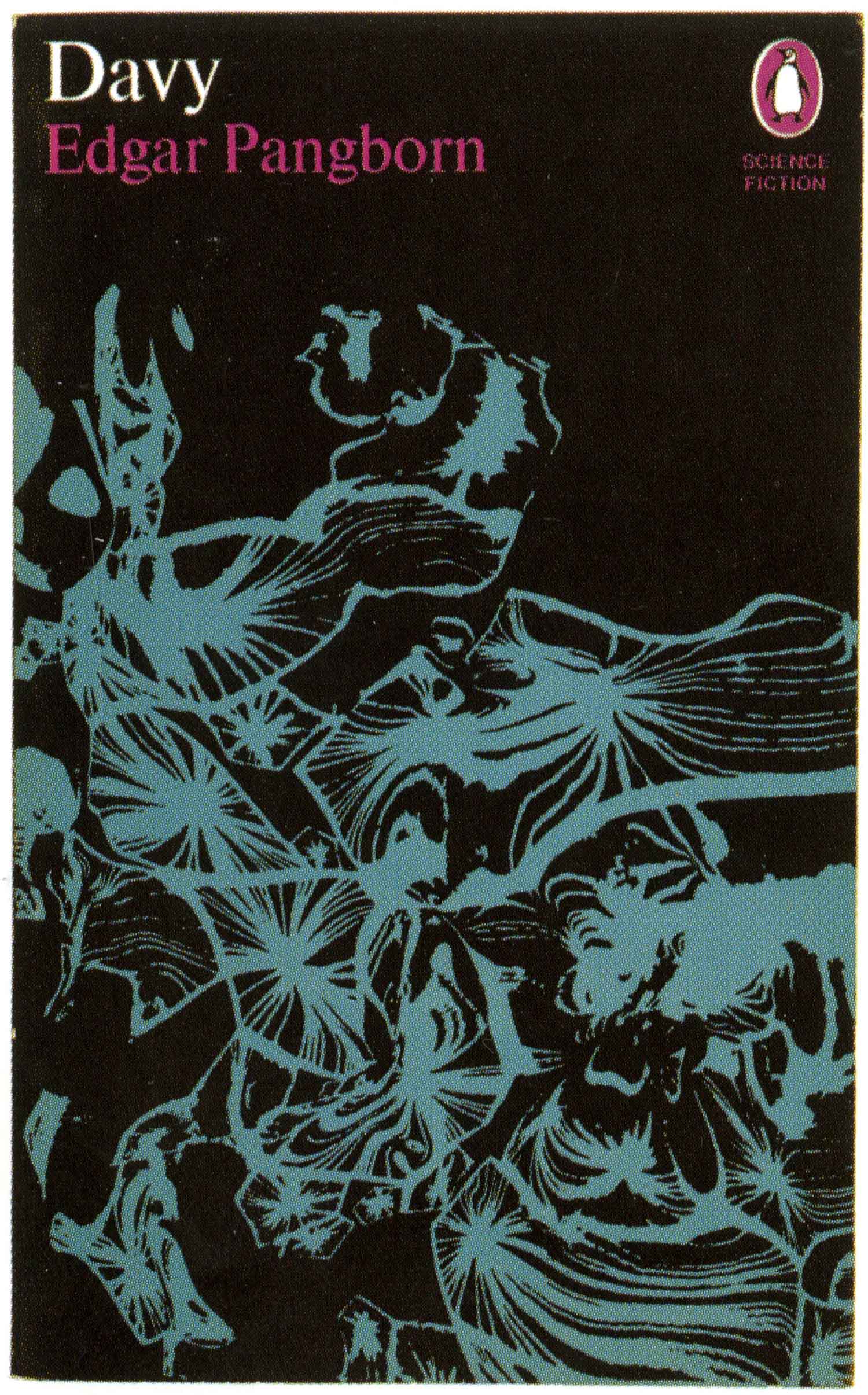
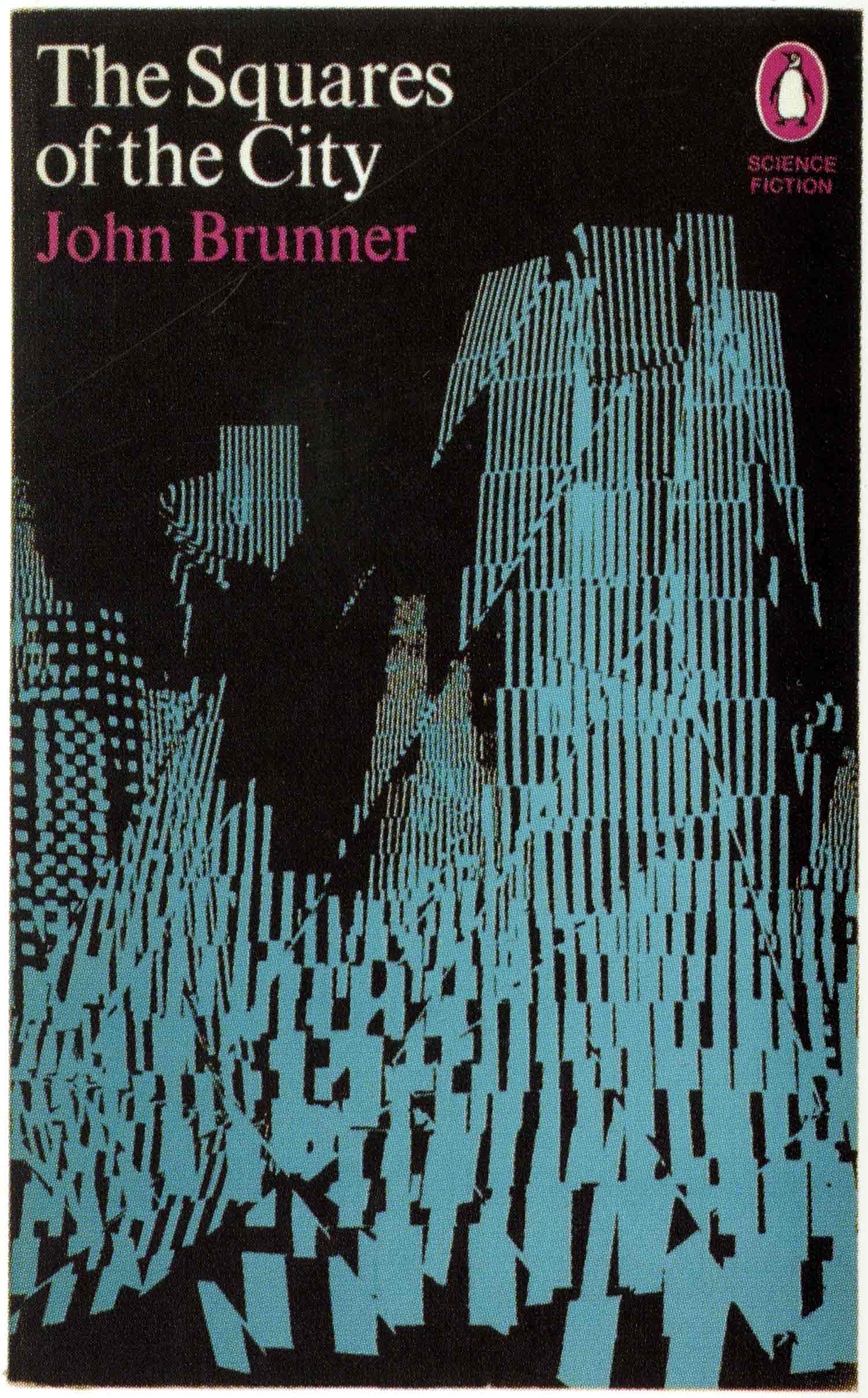
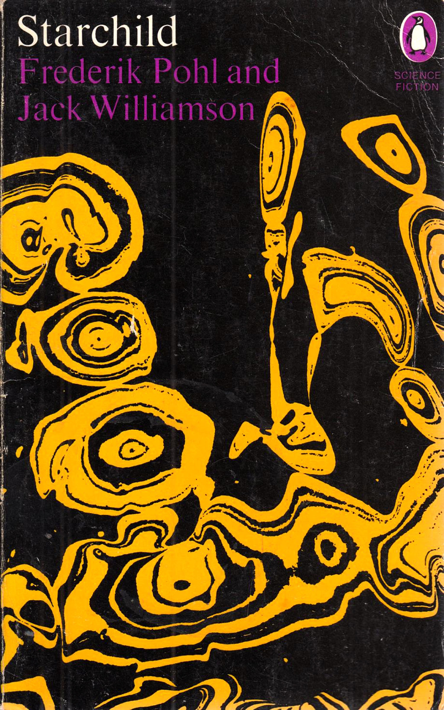
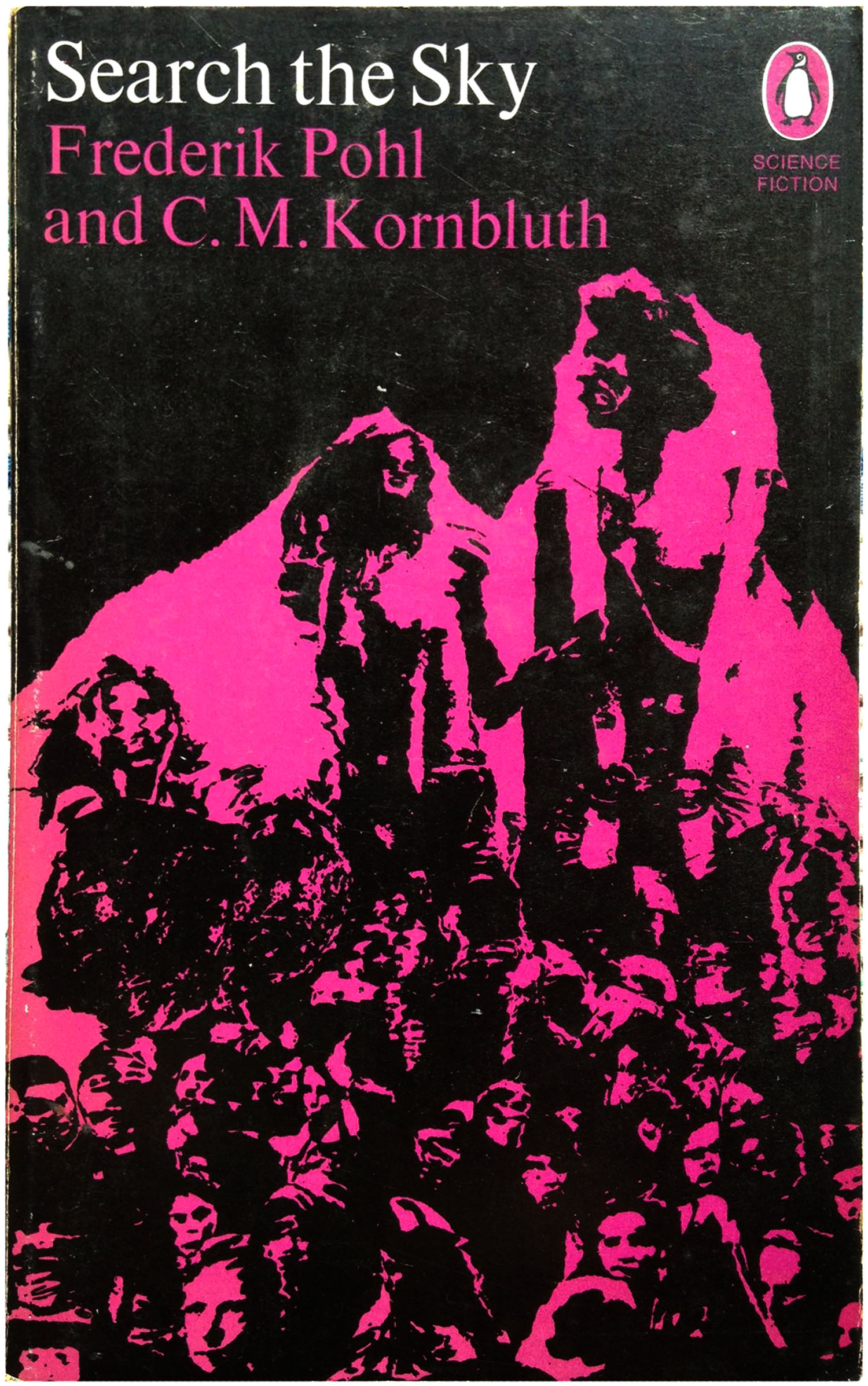
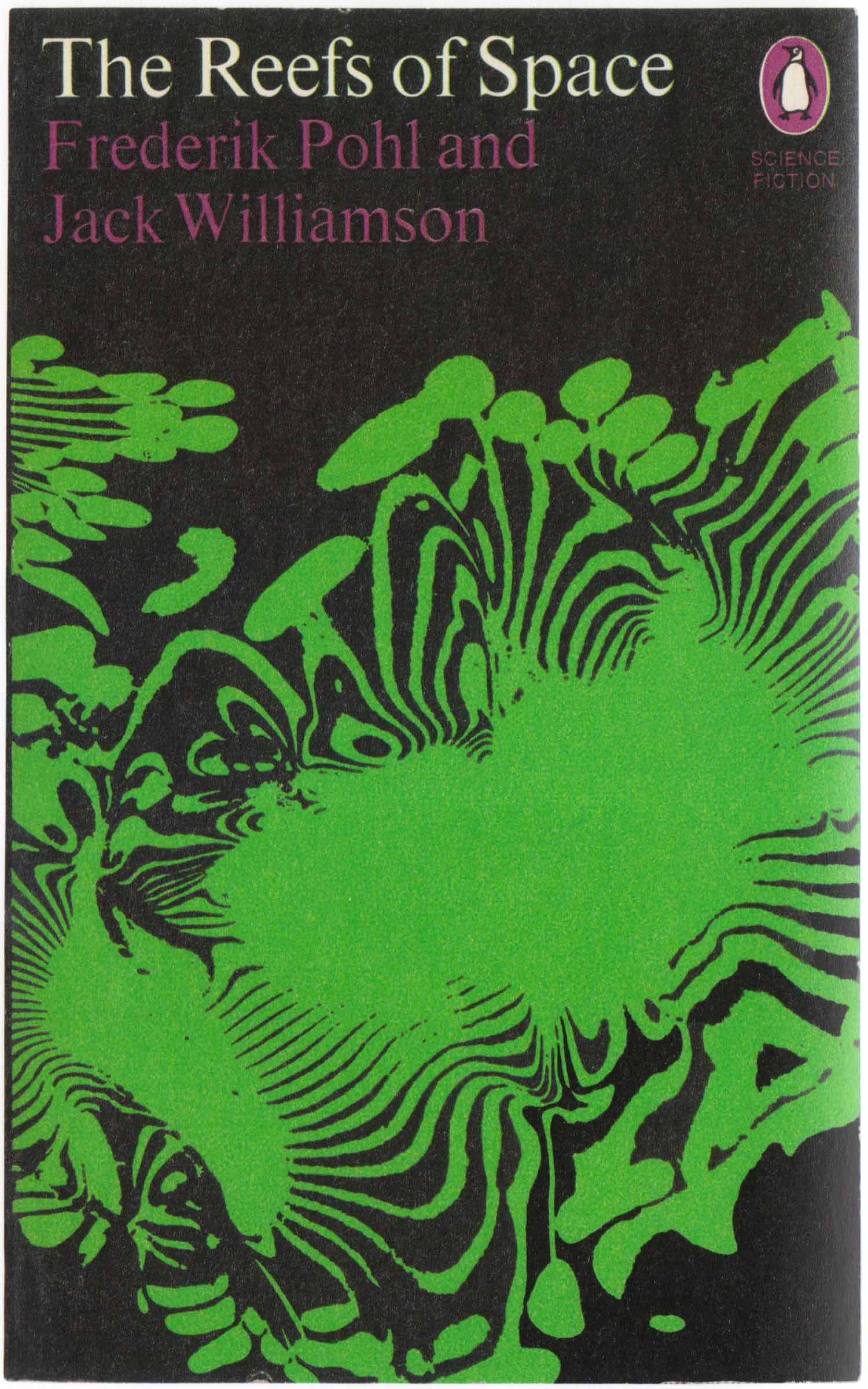
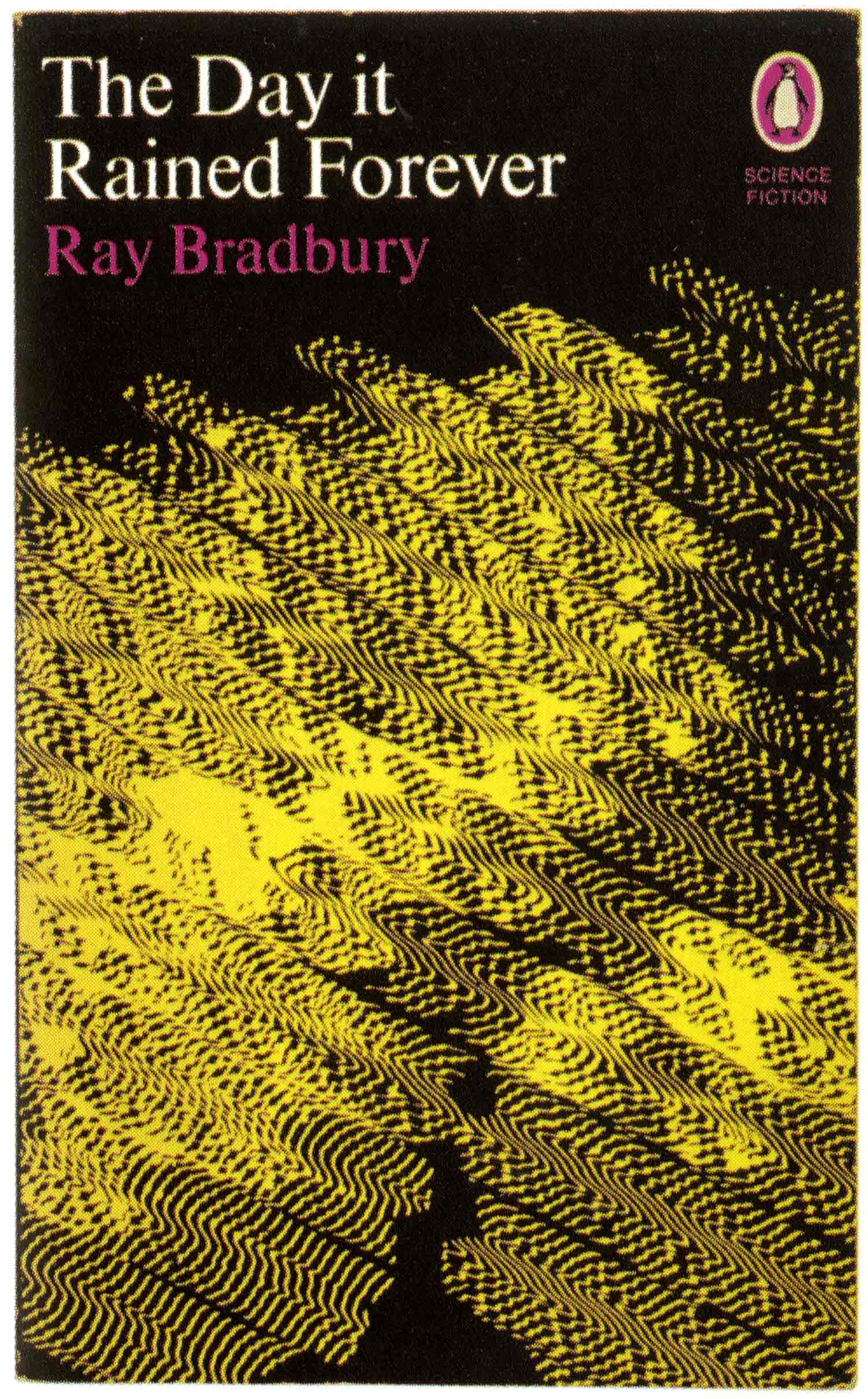


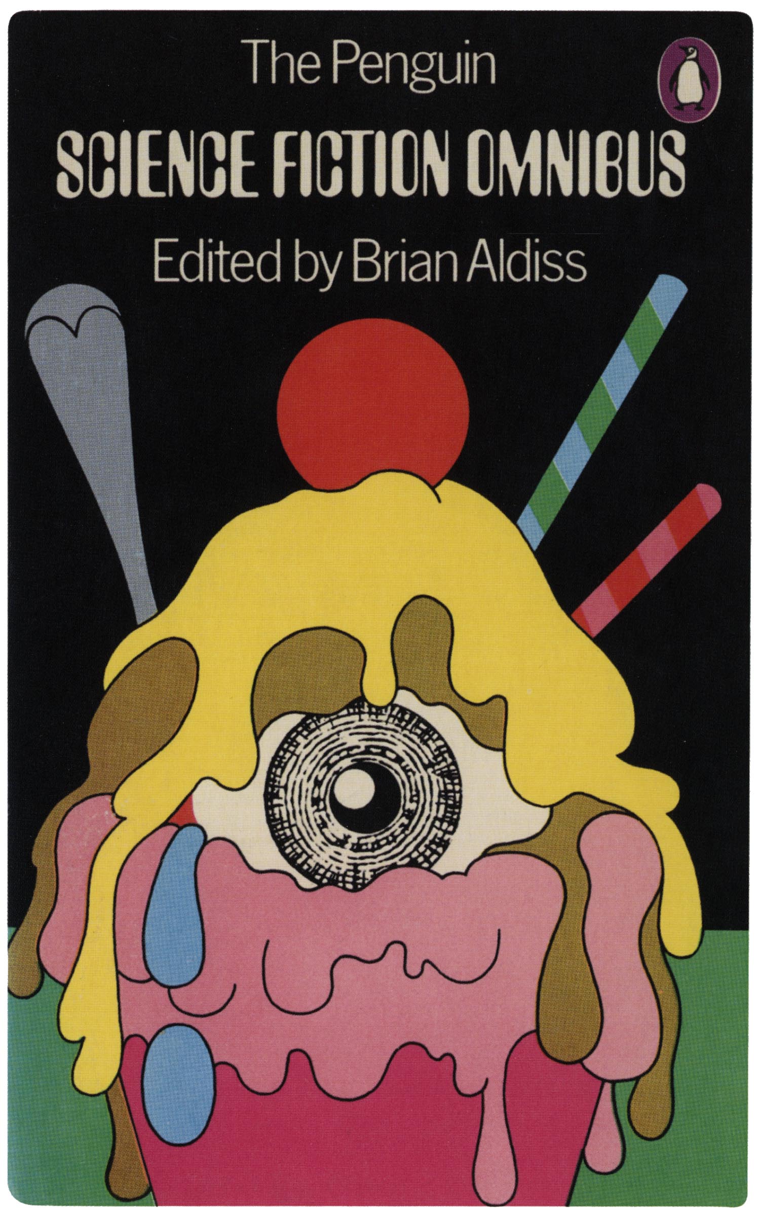
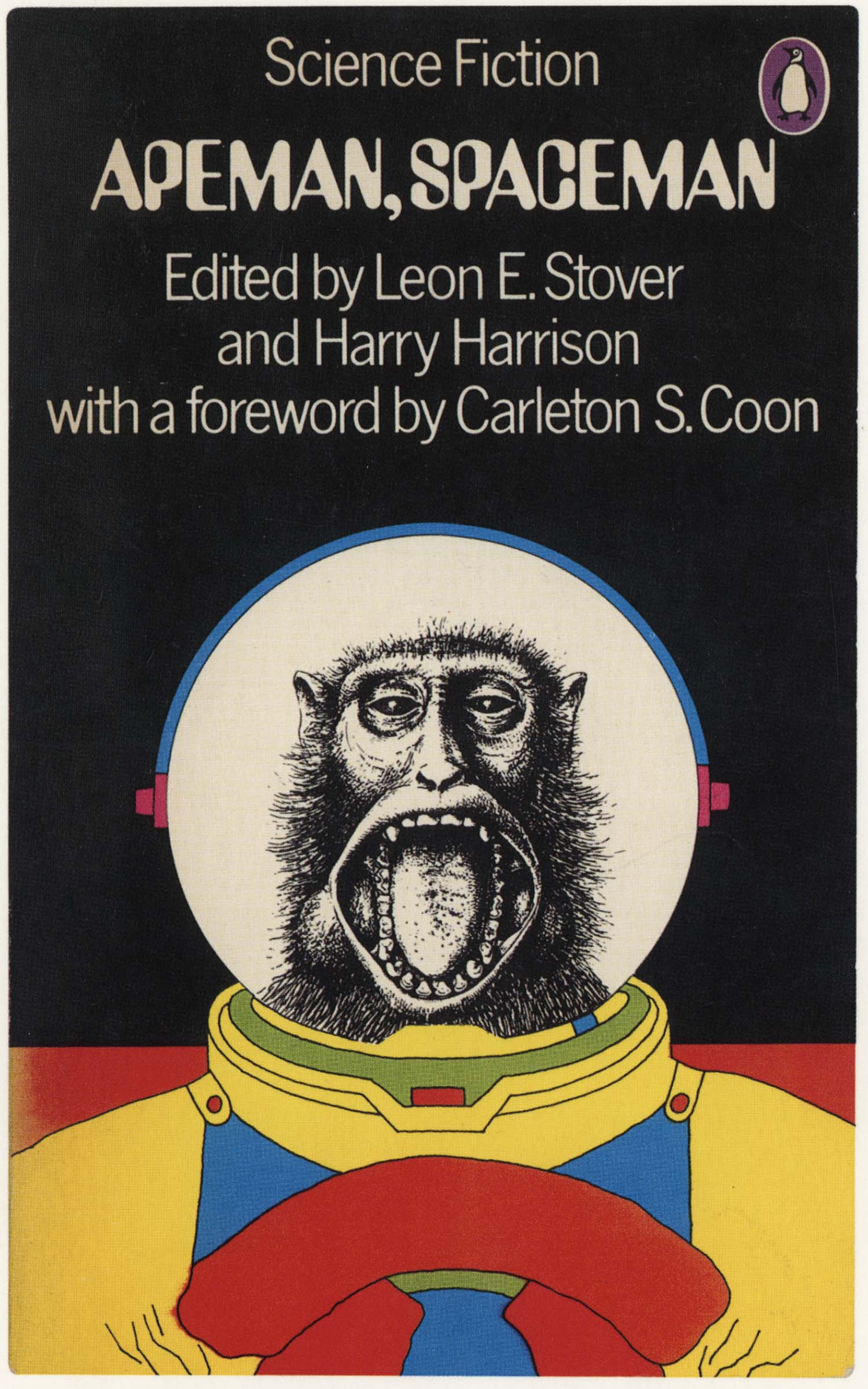
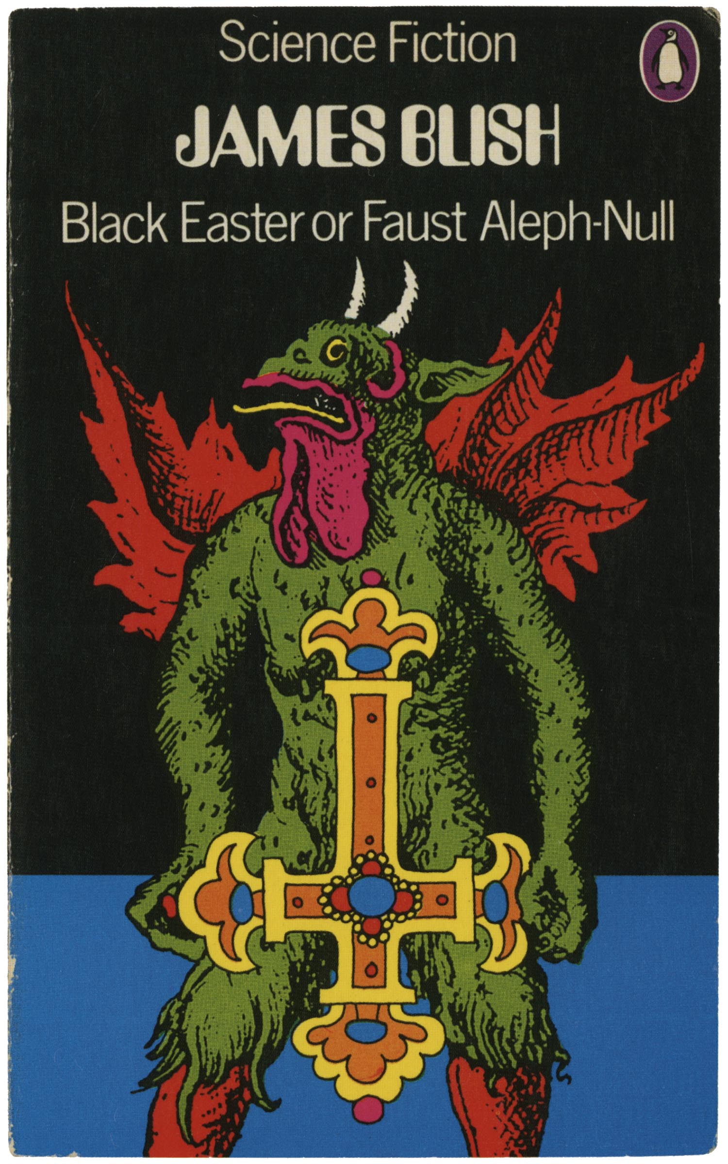
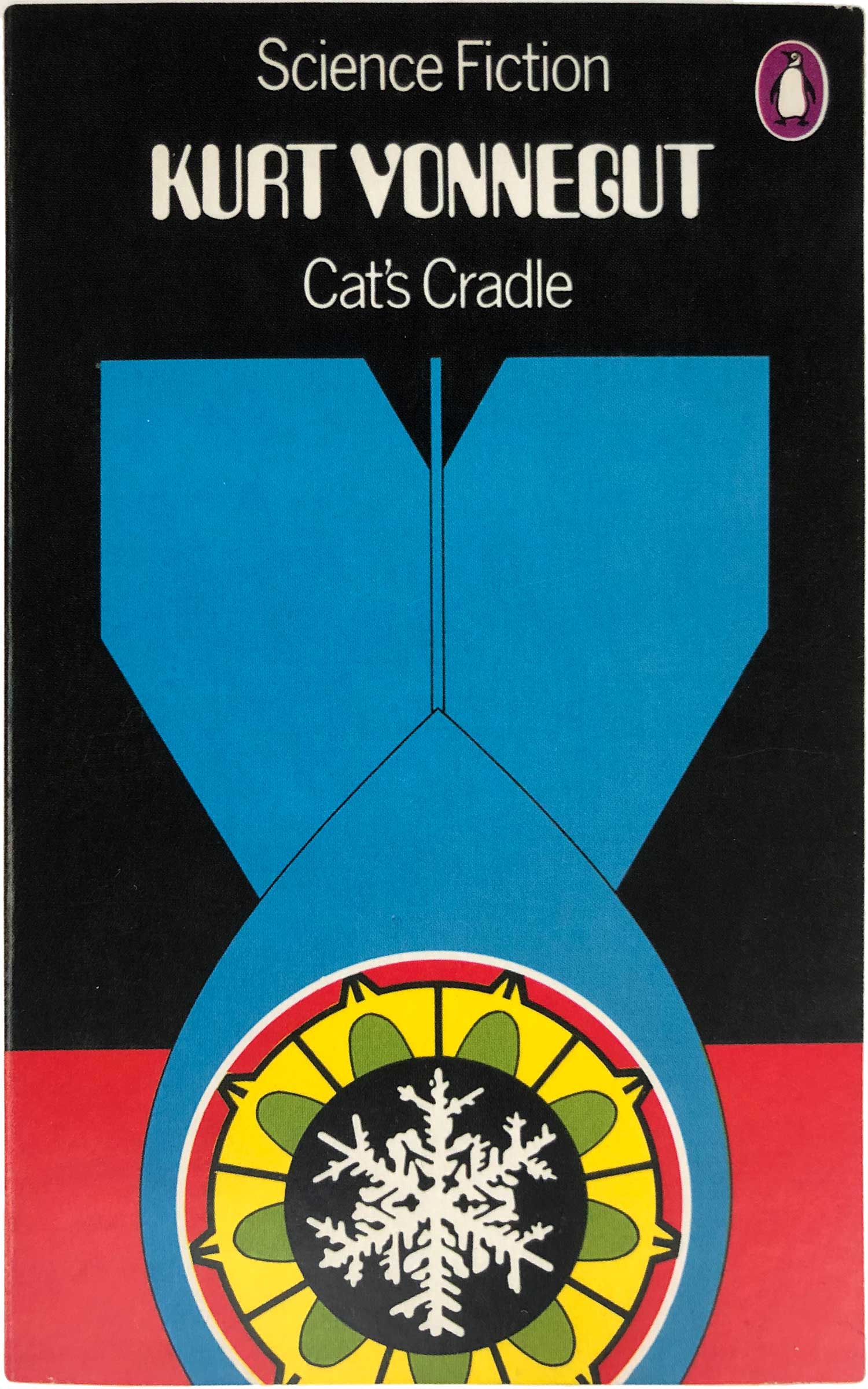
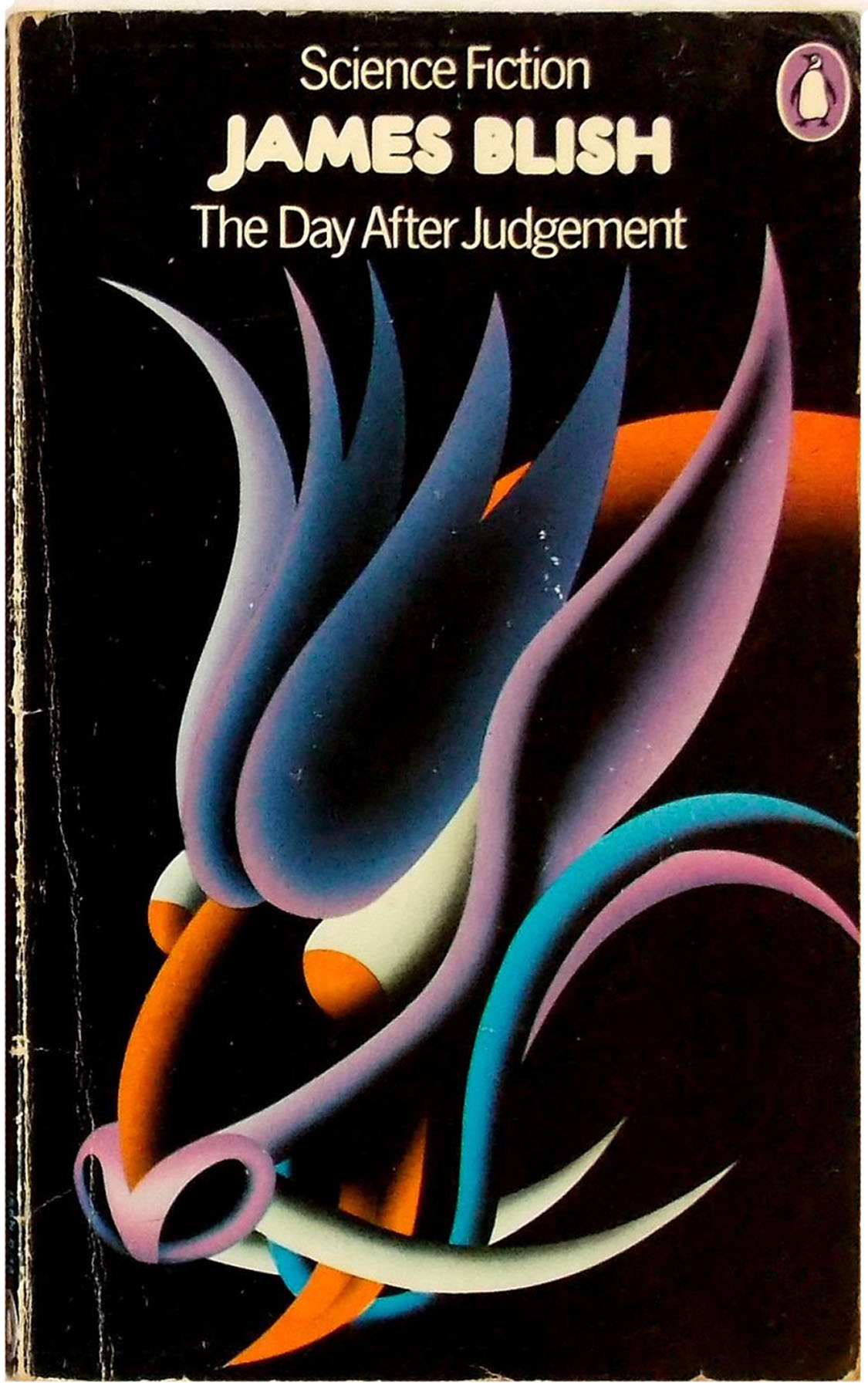
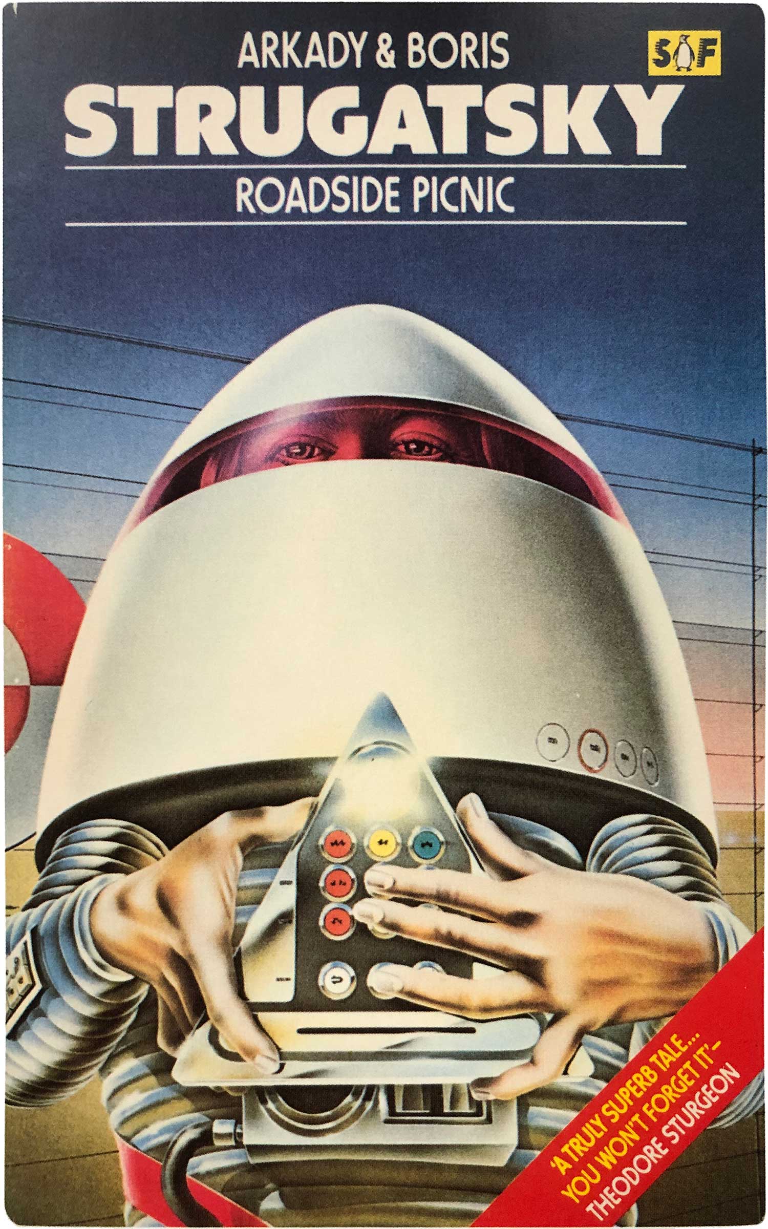
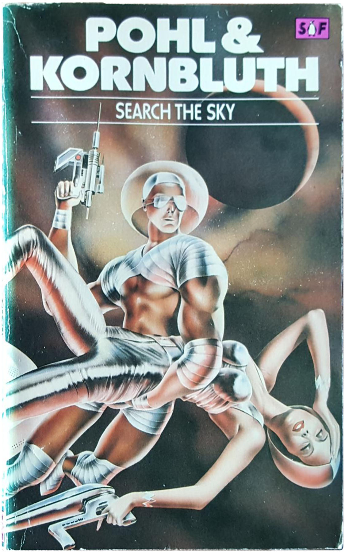
Starting in the early 1970s, Pelham returned to more illustrative covers, toggling between two related but distinct styles. The one that I really enjoy is a series of covers using flat, brightly colored pop-art elements collaged with black and white pieces that look like they were clipped from 18th century etchings. A couple of the strongest examples of this are 1973’s The Space Merchants by Frederik Pohl and C.M. Kornbluth and Brian Aldiss’ 1973 edition of the Penguin Science Fiction Omnibus. Below those I’ve included a bunch of other covers in this series.
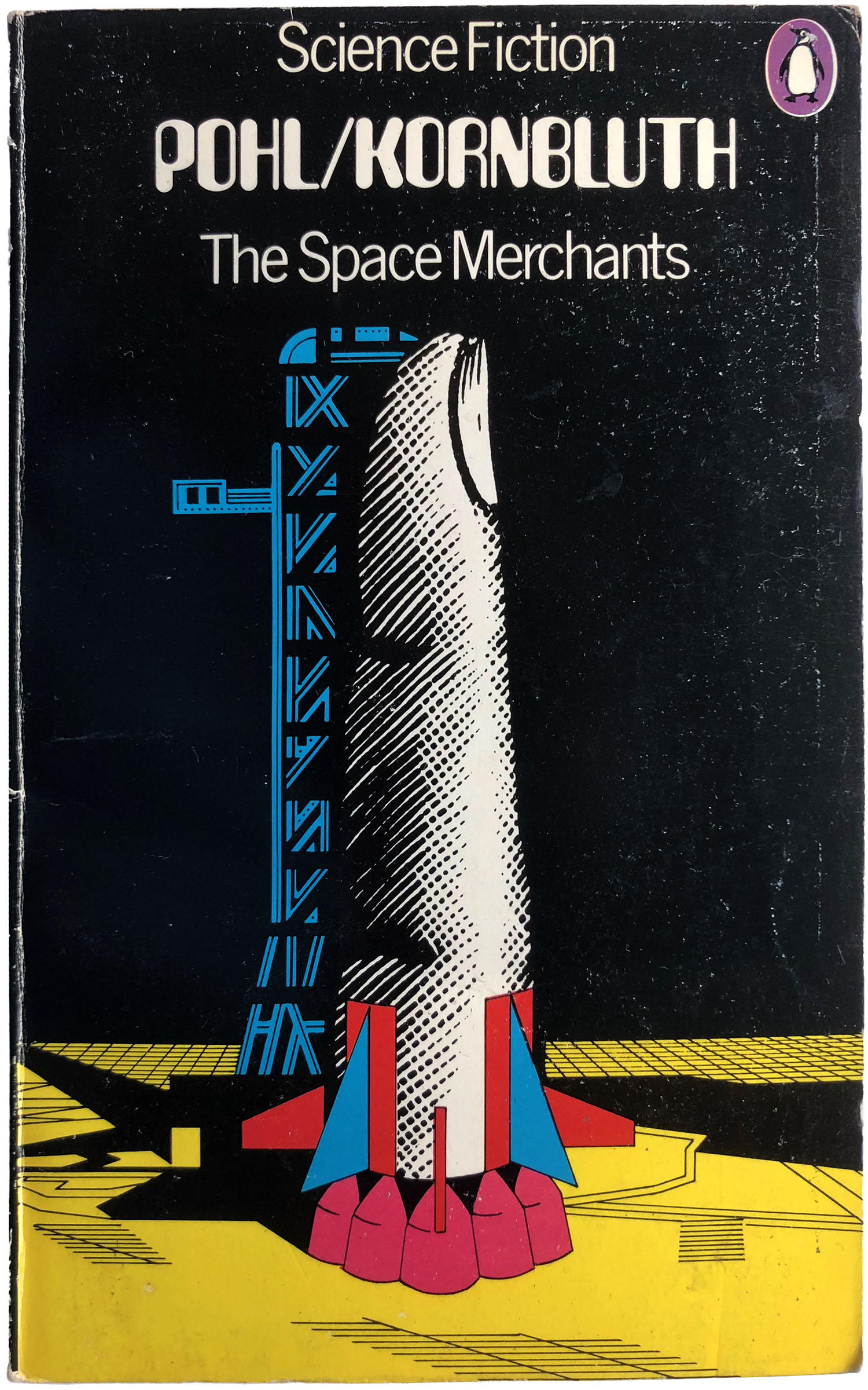
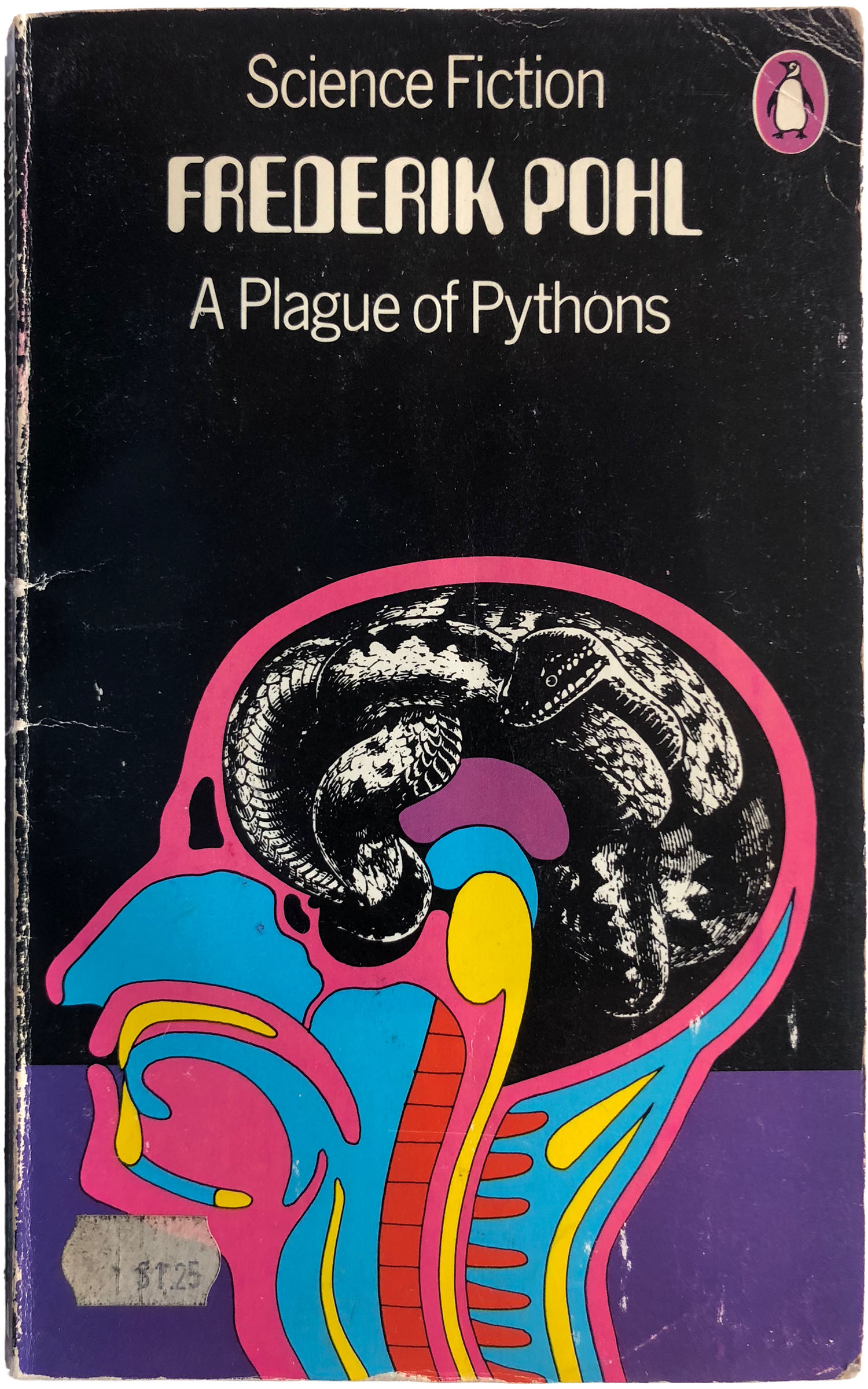
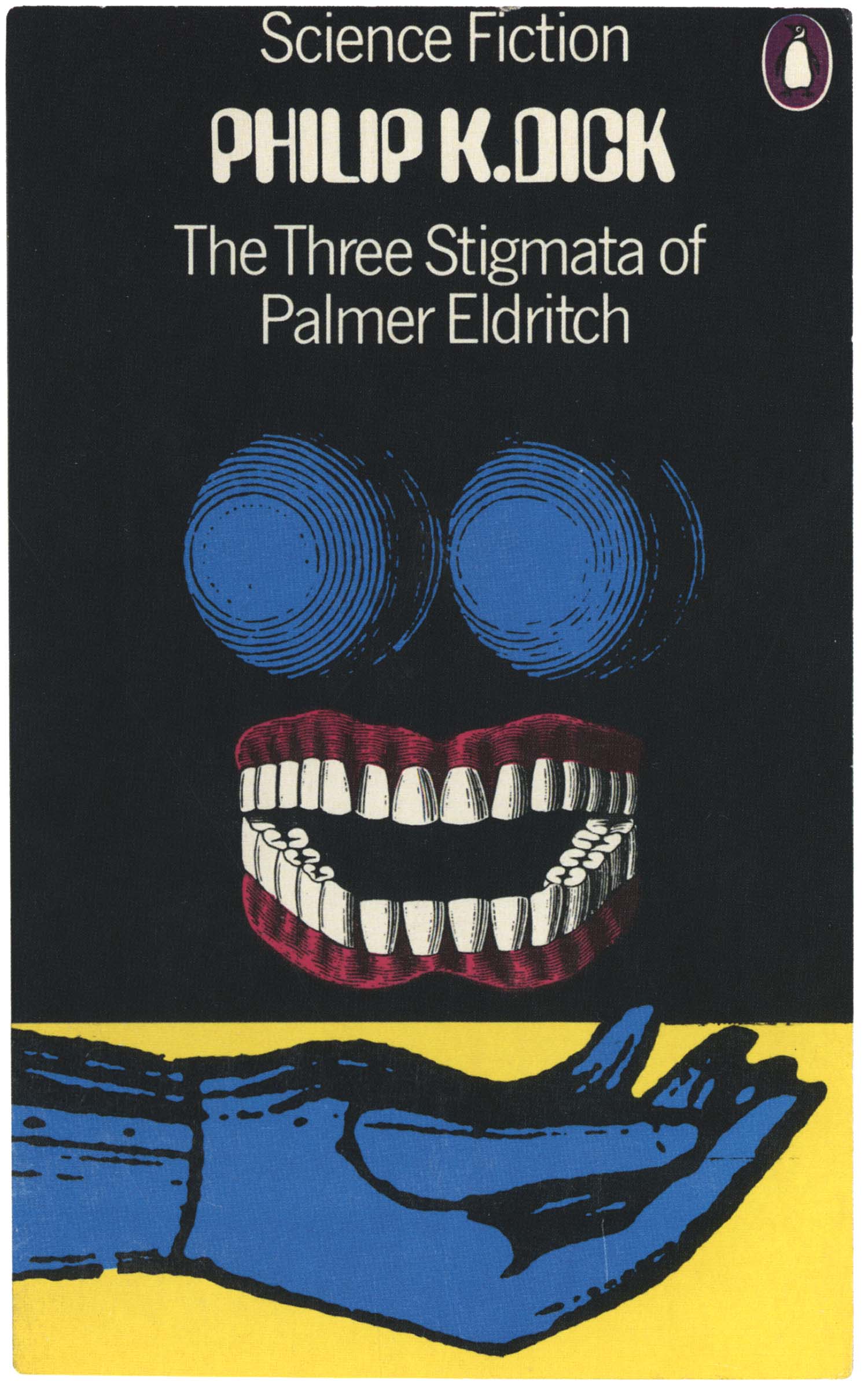
Notice that not only is black the dominant color, but that each cover has a different color field that fills bottom quarter of the design. In some, like The Space Merchants above, the illustration engages with the field, in other, like Apeman, Spaceman below, the illustration almost completely covers the field, and then in some it is a dominant visual element, like the cover for Zenna Henderson’s The People.


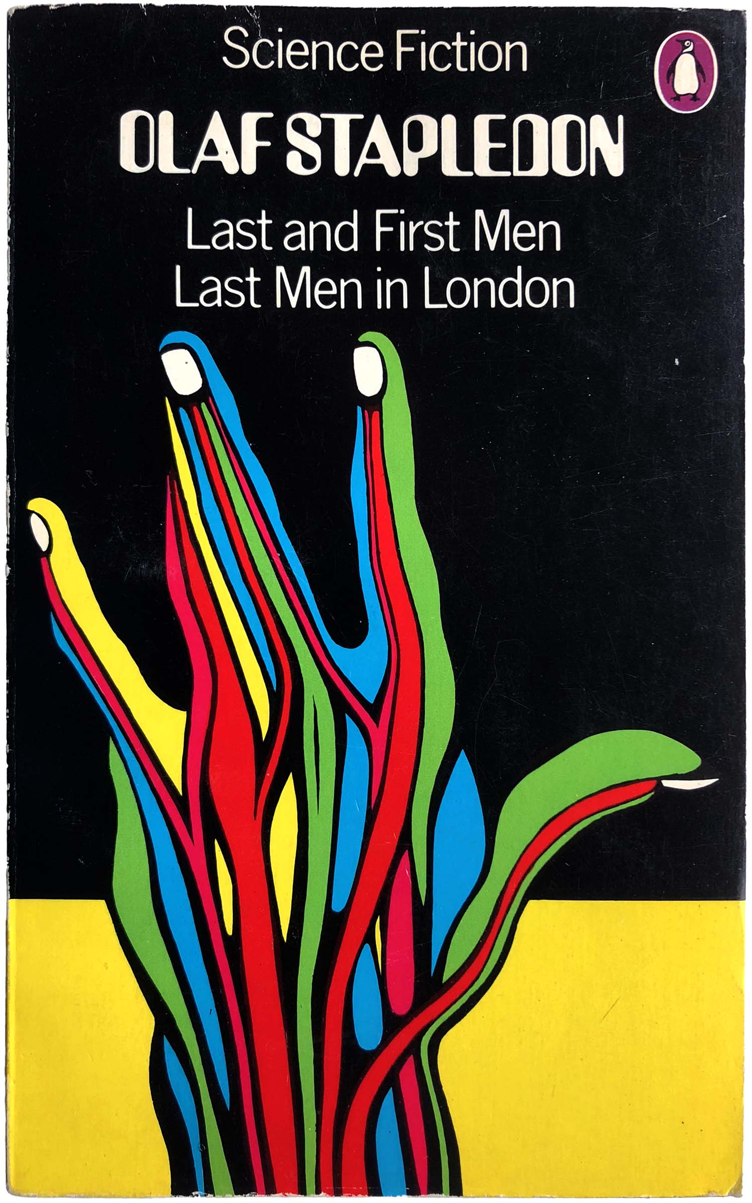
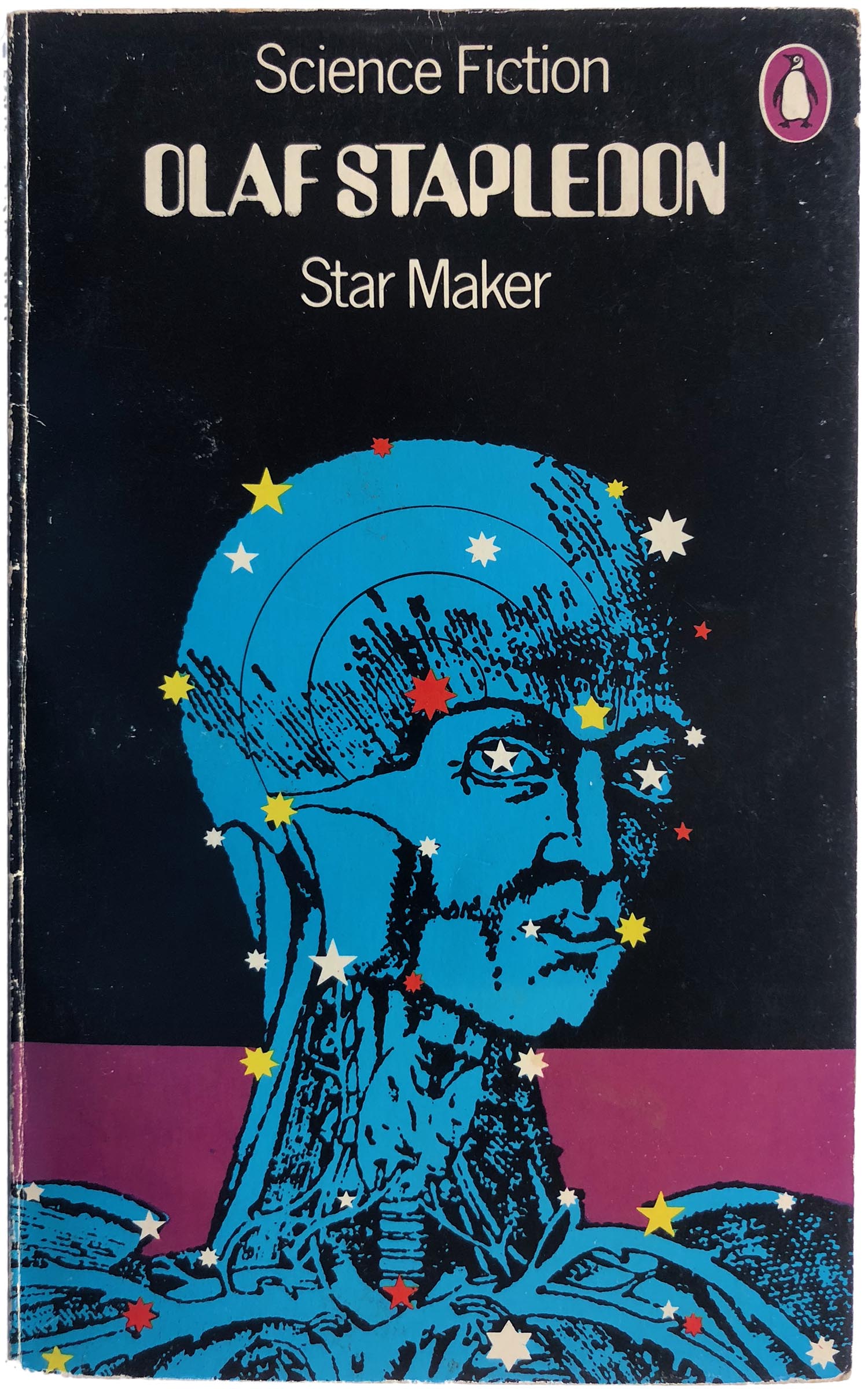
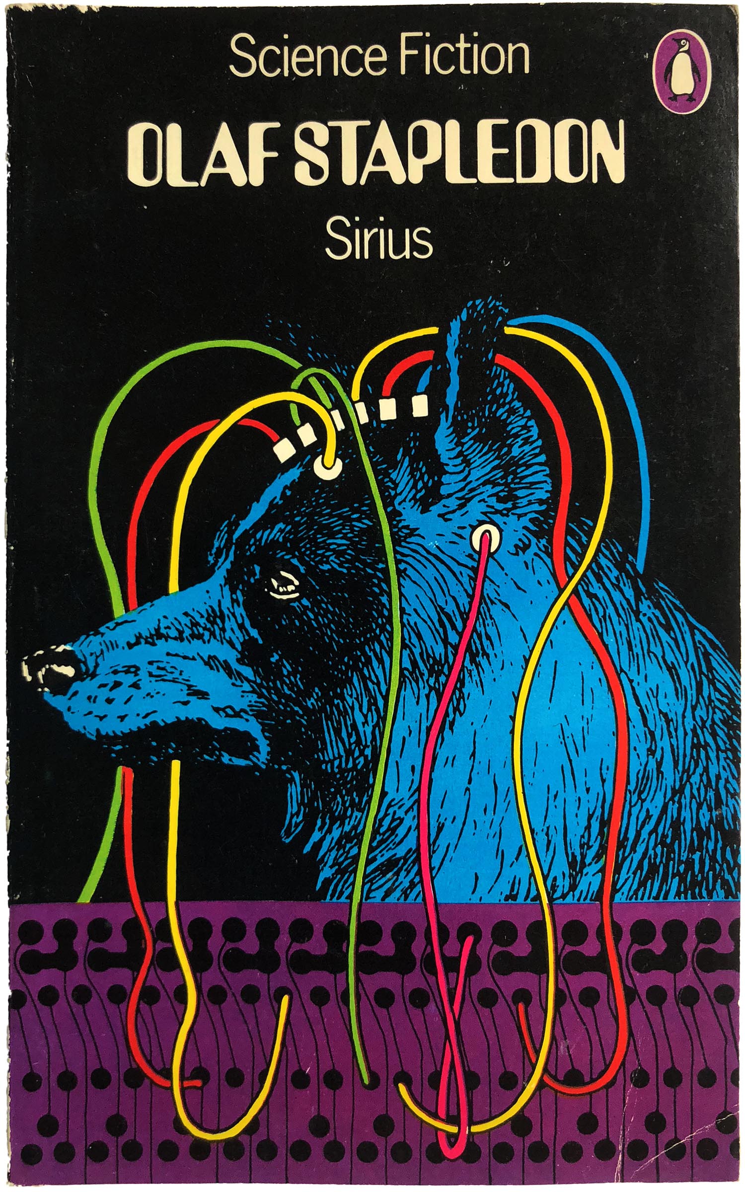
In this period we also start to see sub-series created for specific authors. The coolest example is for Olaf Stapledon’s early 20th century stories and novels. A trailblazer within the genre, his covers are often boring and staid, but they get the royal treatment here, with a set of gorgeous inter-related illustrations by Pelham.
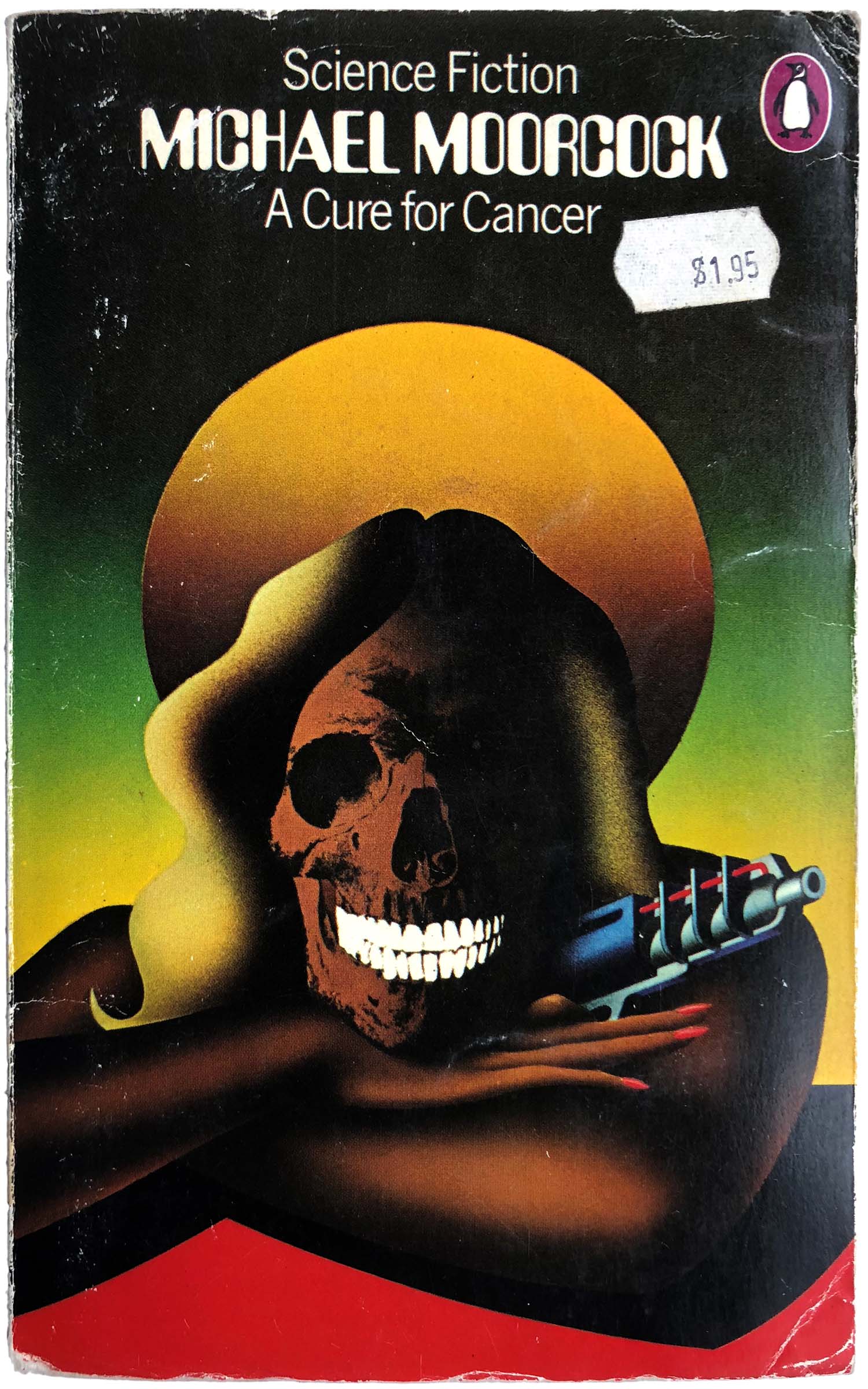
The other style Pelham used was less graphic and more in the stable of classic airbrushed sci-fi and fantasy illustrations. Some of them have an almost spraypaint graffiti feel, on the one hand more realistic than the graphic designs above, but on the other completely fantastical and fake looking. I can see the appeal, although I’m not a huge fan. I think the cover for Moorcock’s A Cure for Cancer is one of the best here, largely because the soft airbrush feel is contrasted with the sharp lines of the skull.
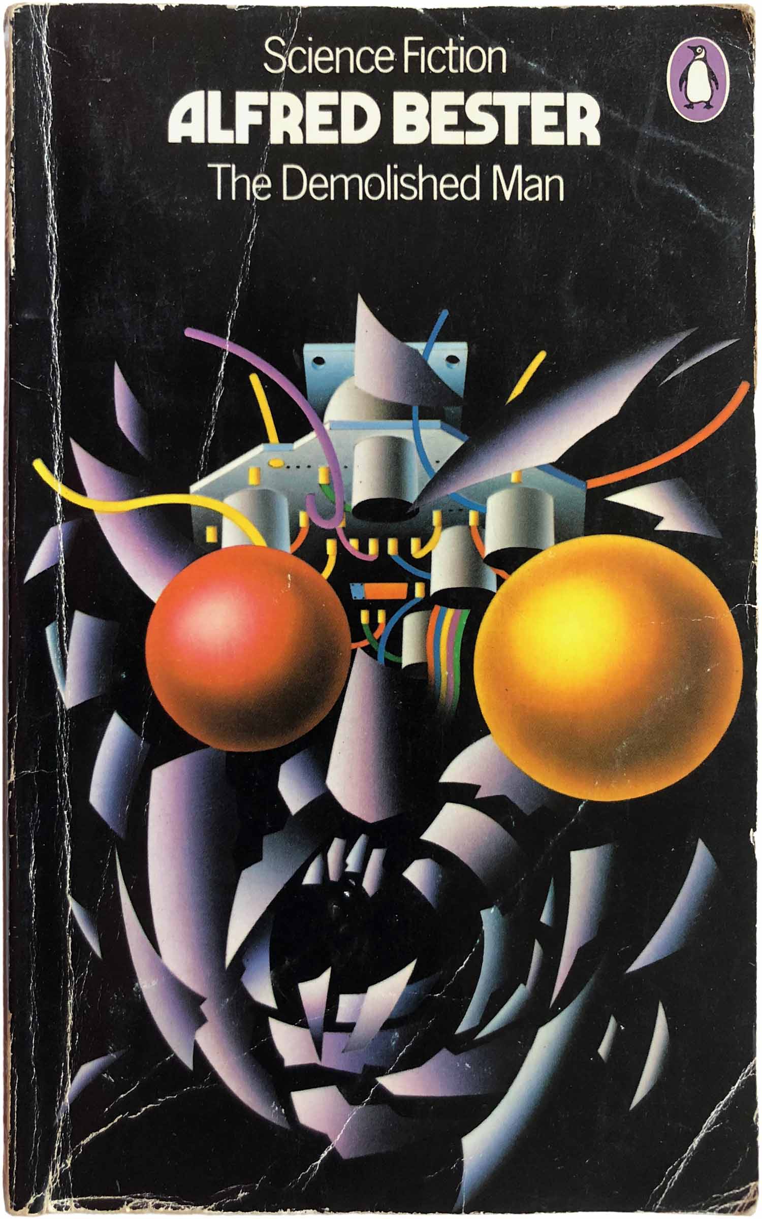
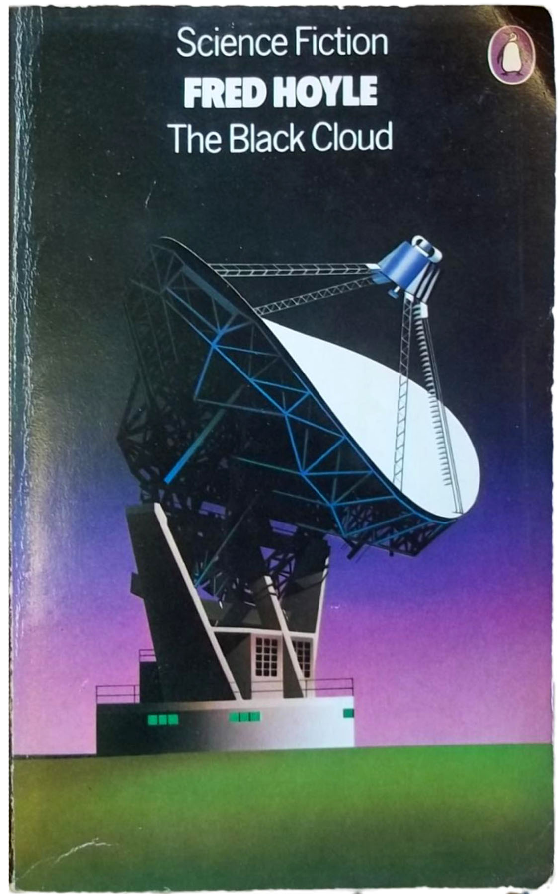
You’ll notice above with the more flat graphic covers (mostly produced in 1973) that the author titles are all in the same old-school “computer” looking font. That started to break up with the airbrushed designs, and starting in the mid-1970s, Pelham began using different author titling fonts for different authors. As you can see below, J.G. Ballard, Alfred Bester, the Hoyle brothers, and others all received unique fonts for their names.

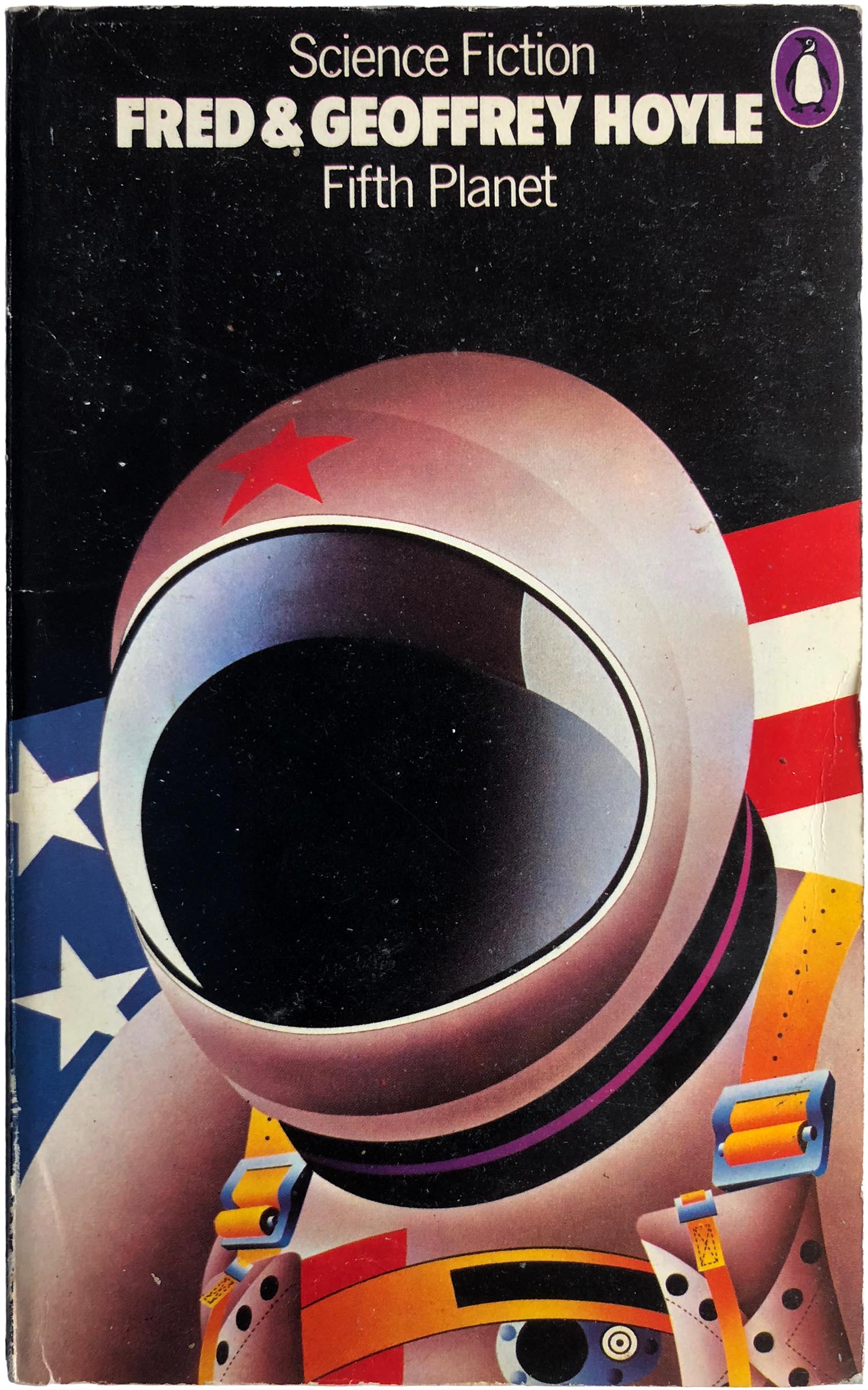
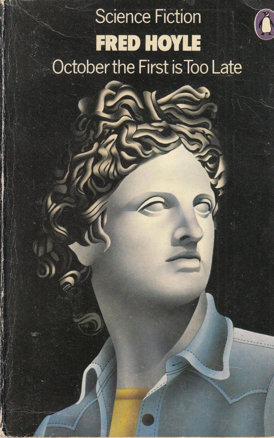
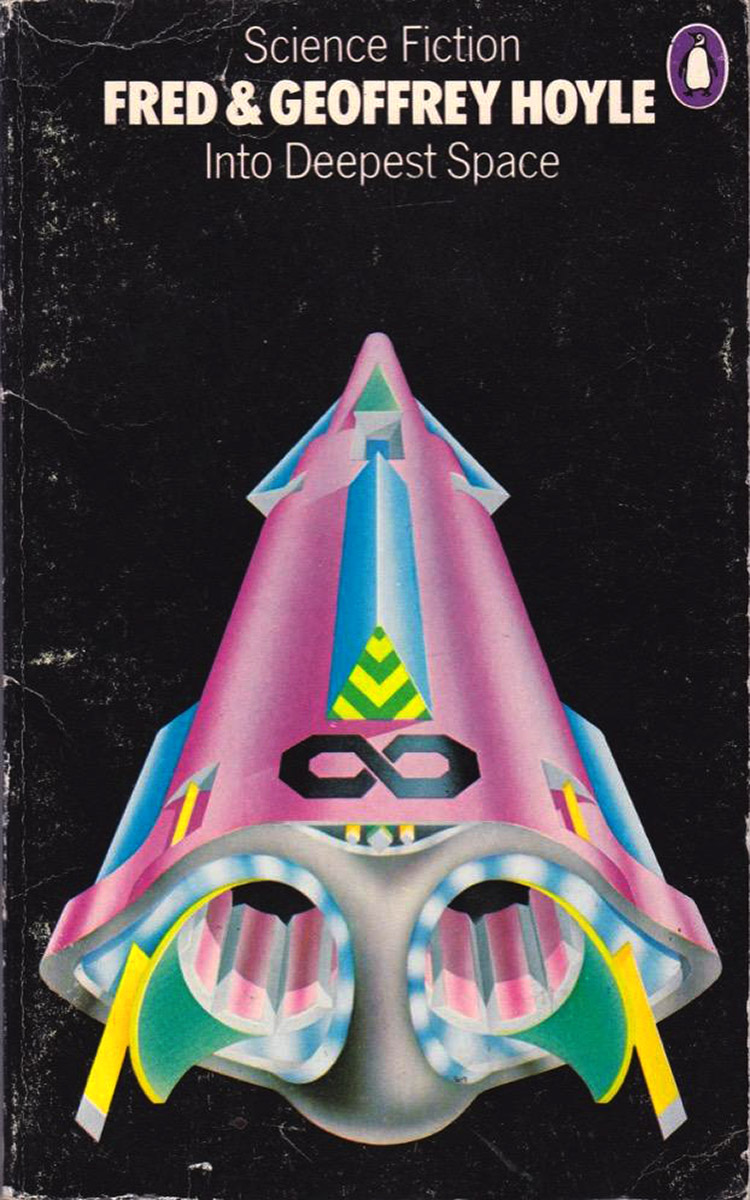
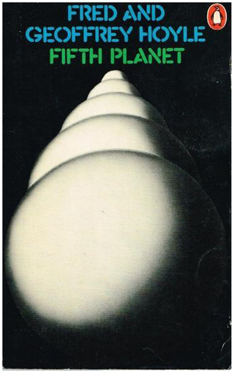
Someone at Penguin must have thought the Hoyle brothers had some real breakout potential, because in 1972, right as Pelham was crafting the new sci-fi series aesthetic, he was also commissioned to create this series of more abstract covers, all featuring variations on these white globes, and sporting orange penguins, not purple.
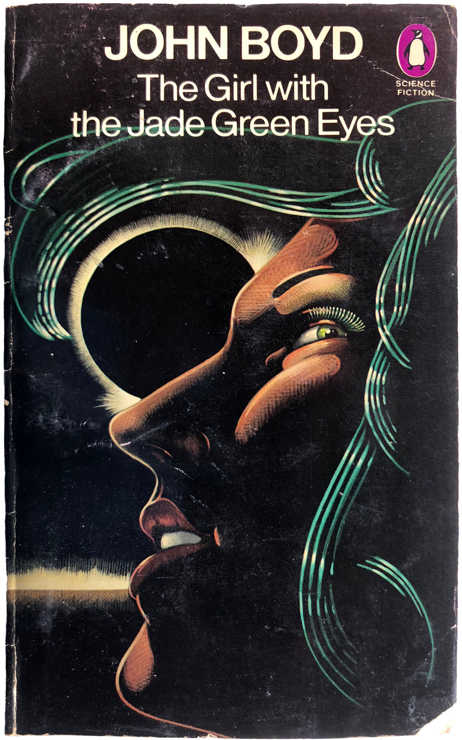
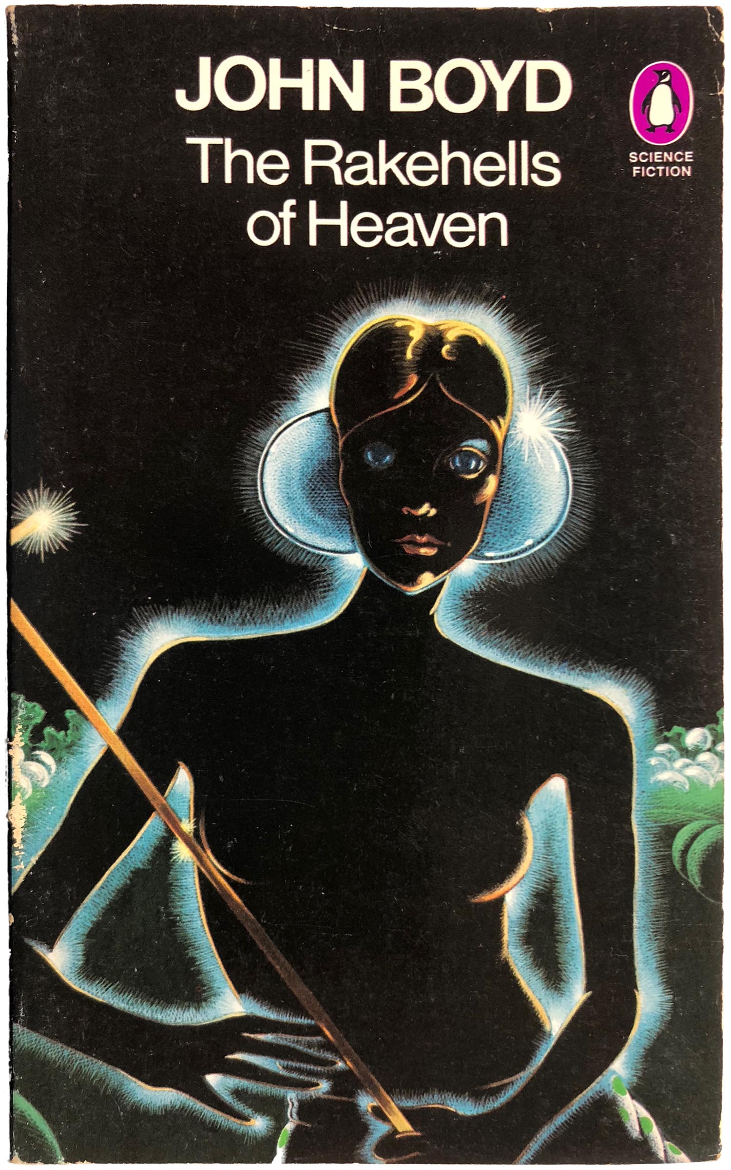
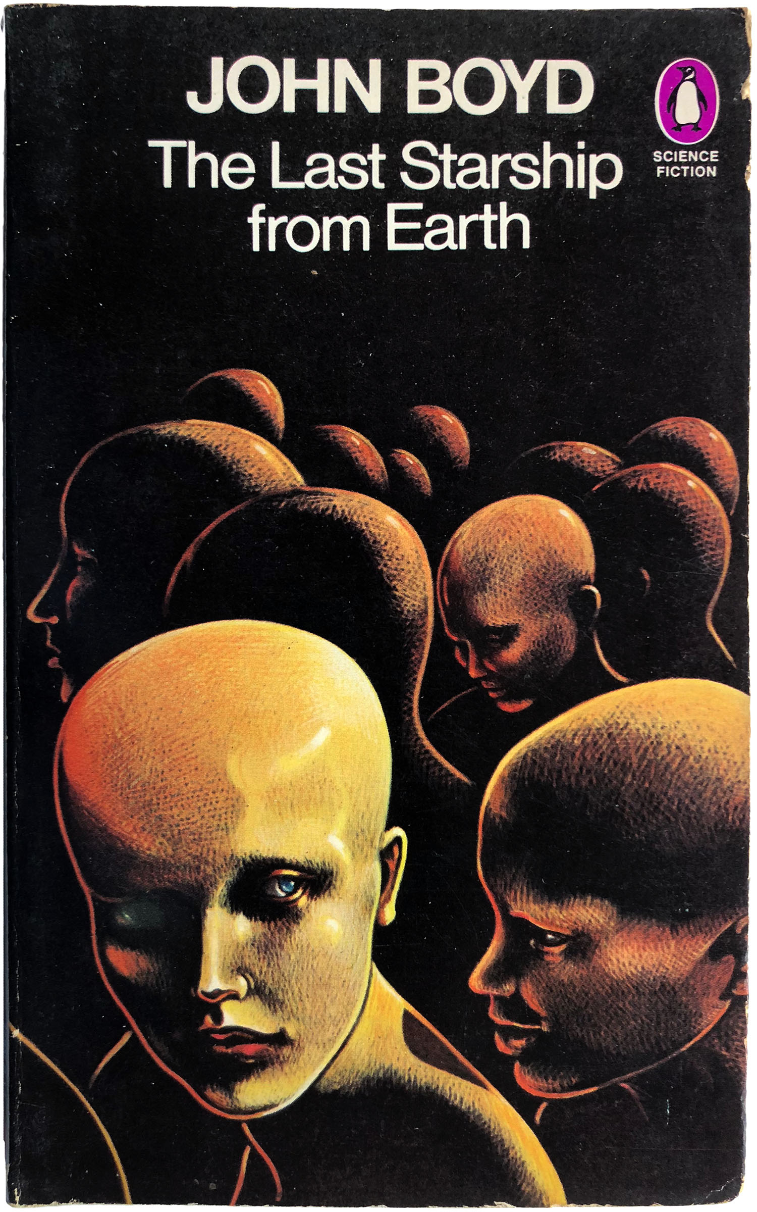
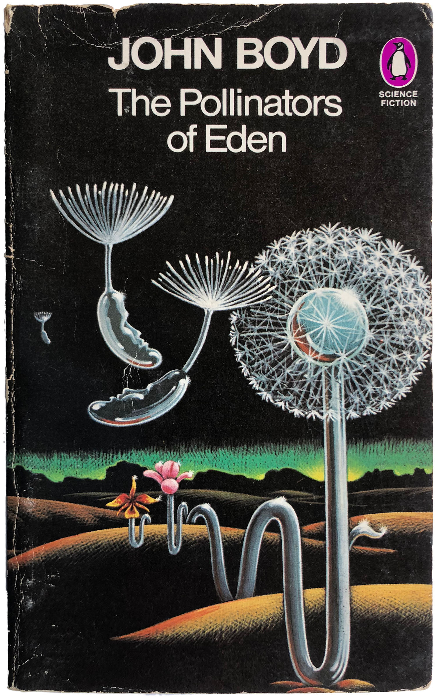
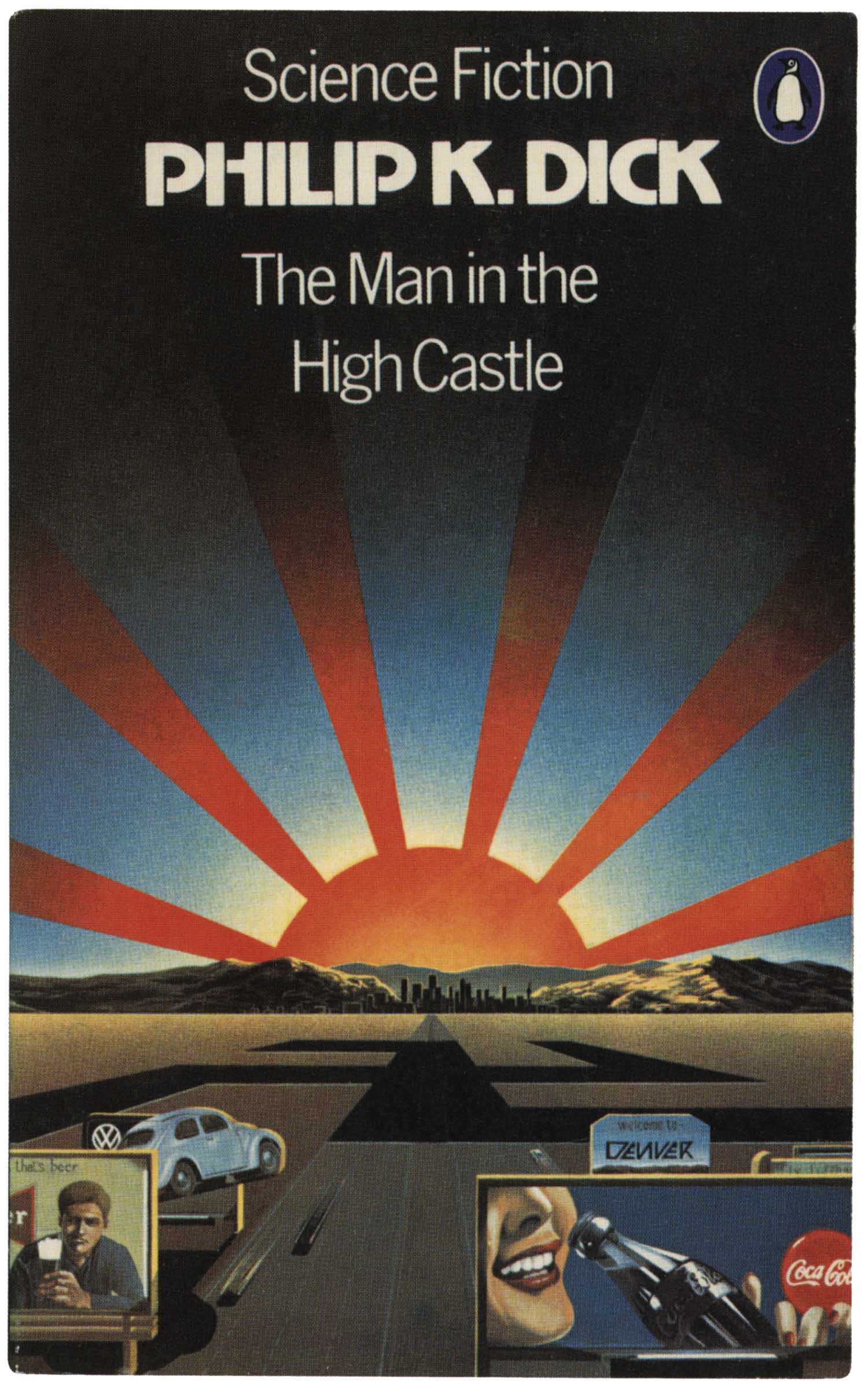
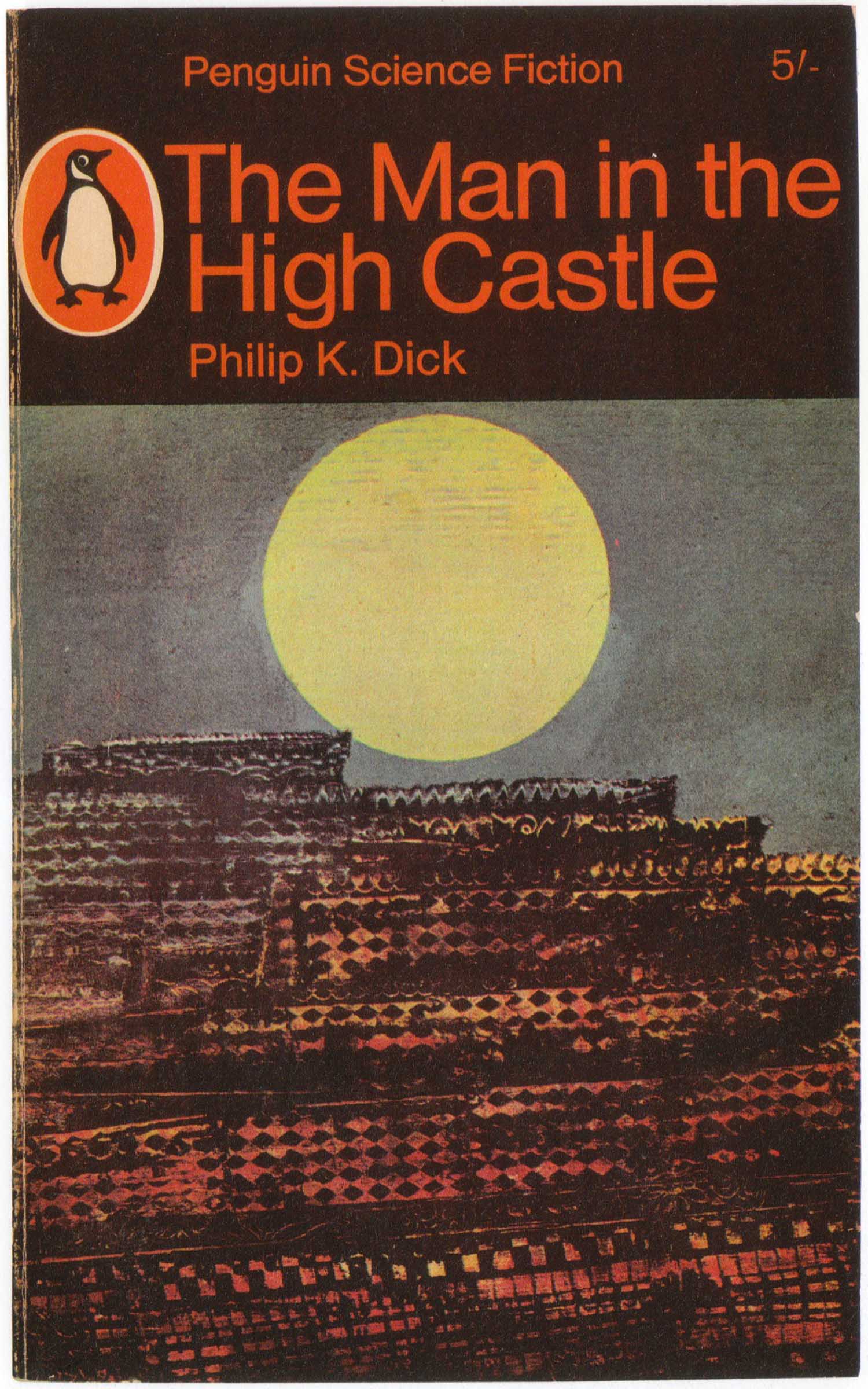
By 1977-78, Pelham had mostly handed the reins to other illustrators. For some projects, this worked well, such as the set of four John Boyd covers wonderfully—and very intensely—illustrated by Peter Cross. Peter Goodfellow’s cover for The Man in the High Castle is also quite nice, as is the 1965 edition I’ve placed next to it for comparison.
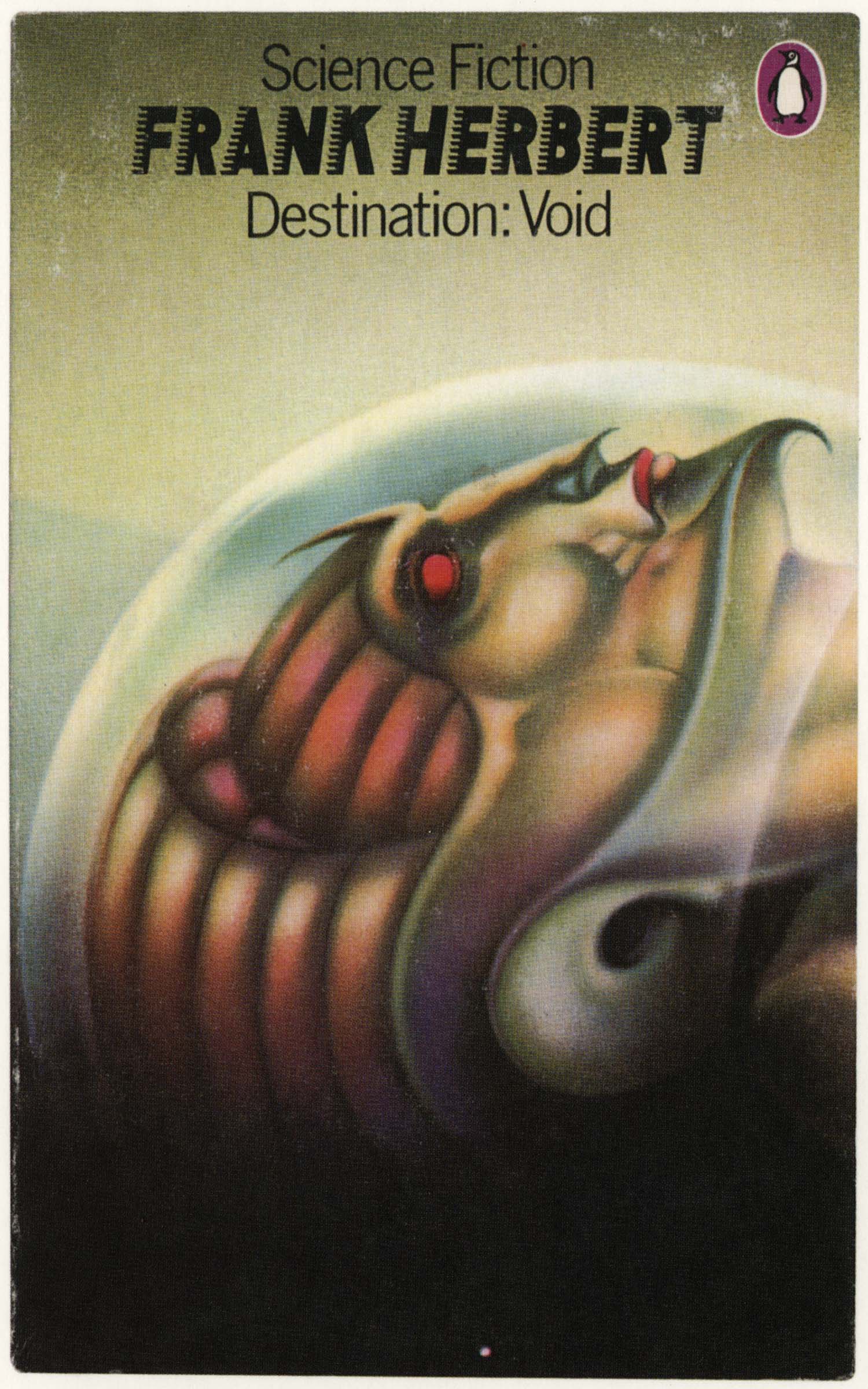
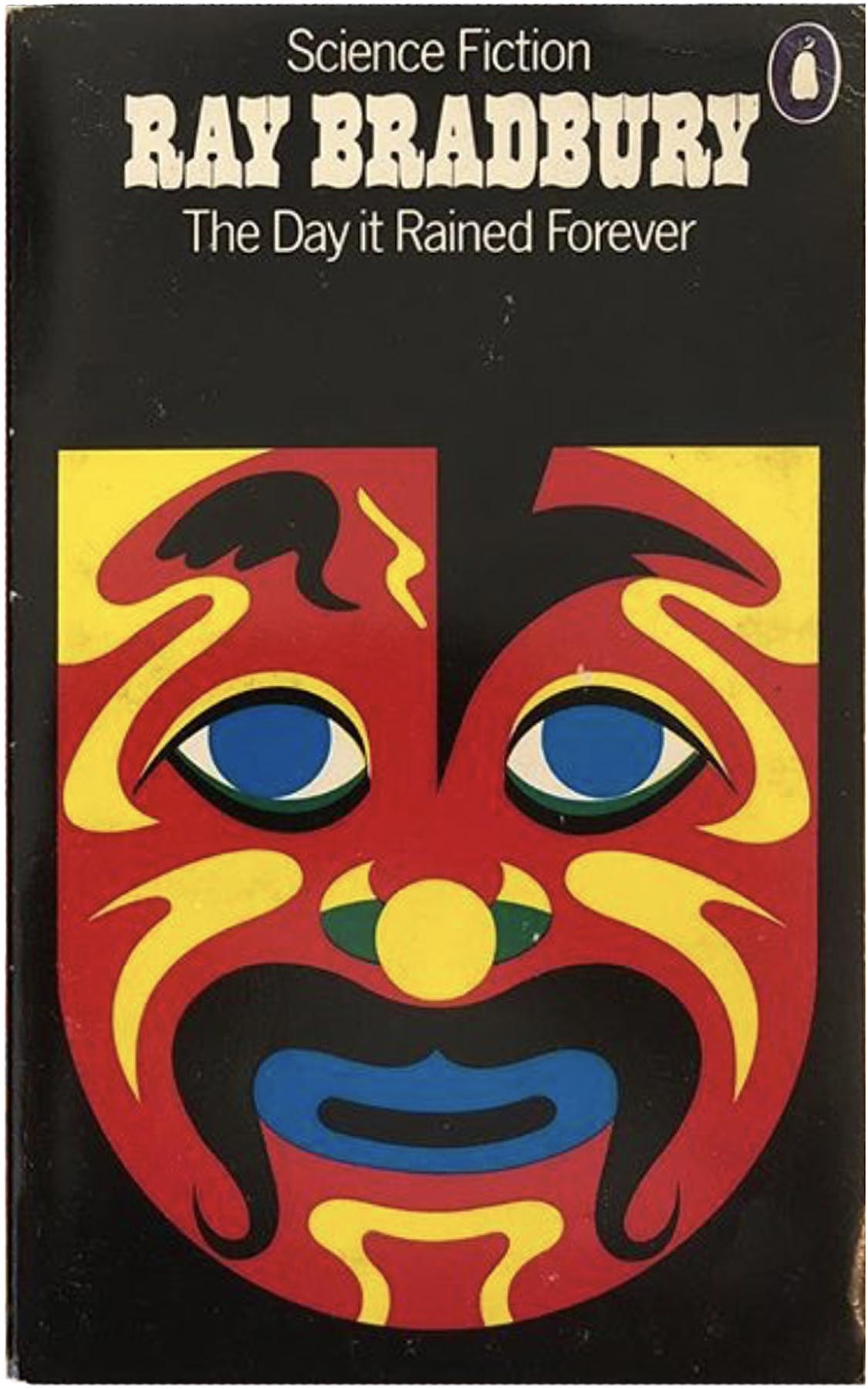
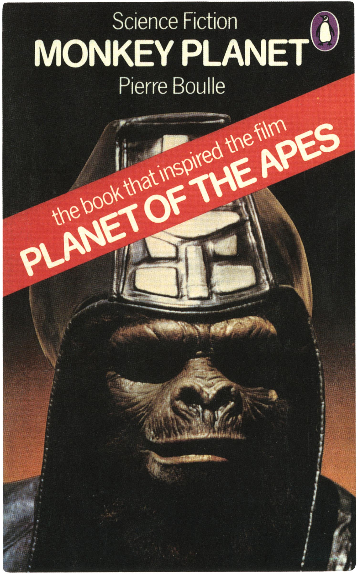
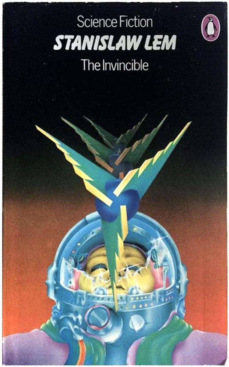
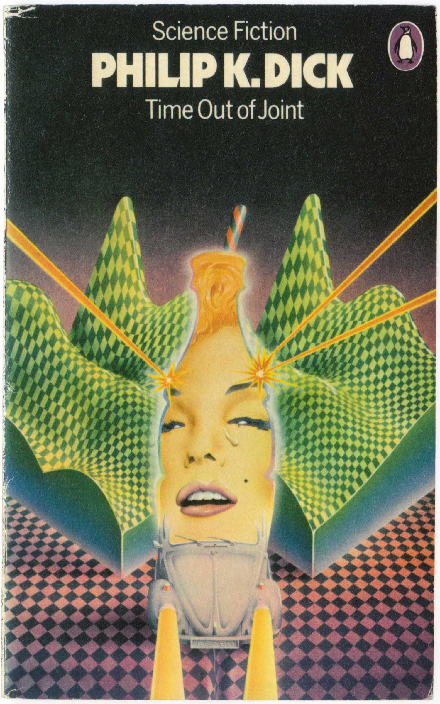
In other cases, it led to subpar work. The 1976 cover for Fritz Leiber’s The Wanderer is amazingly creepy, but not so much in a good way. The Bradbury cover is also really strange, it owes more to the early Pelham flat and graphic style, but it’s not done well at all. The PKD and Lem covers from the late 70s don’t really do much for me either. The cover of Monkey Planet is an almost total throw-away, the photo from the film isn’t bad, but the red banner cutting across the cover kills any possible positive impression.

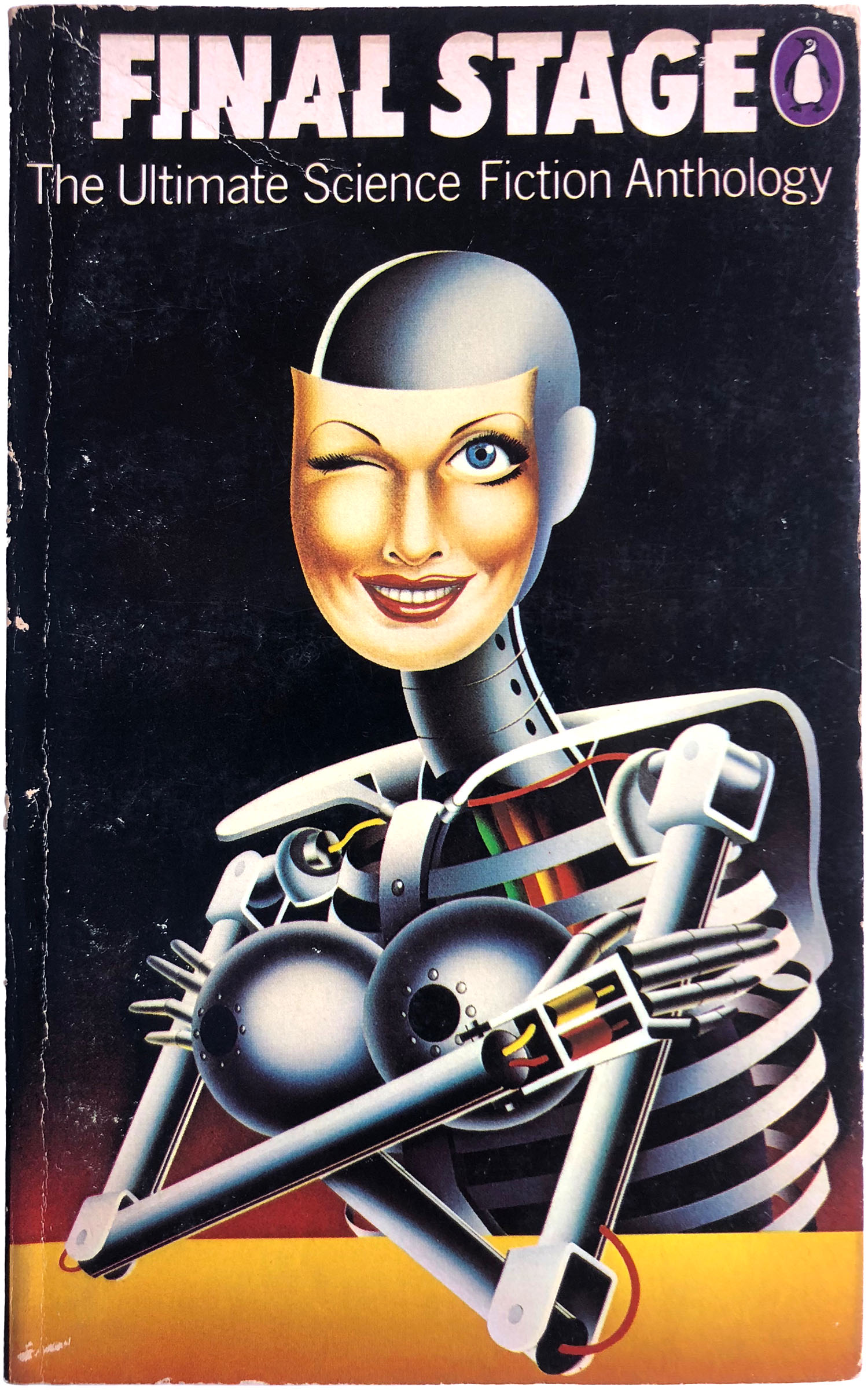
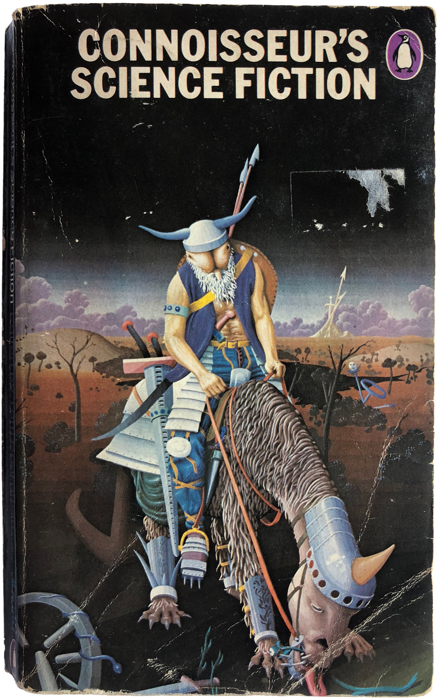
A number of sci-fi collections came out in the late 70s with extremely weird covers. While the Pelham cover for Final Stage is certainly strange, it’s also interesting and graphically compelling. But the cover for Connoisseur’s Science Fiction is just inscrutably terrible! I mean, what the hell is going on here? It basically looks like a space viking come samurai with a butt for a head is wandering through the apocalypse on a furry beast with an extremely long tongue.
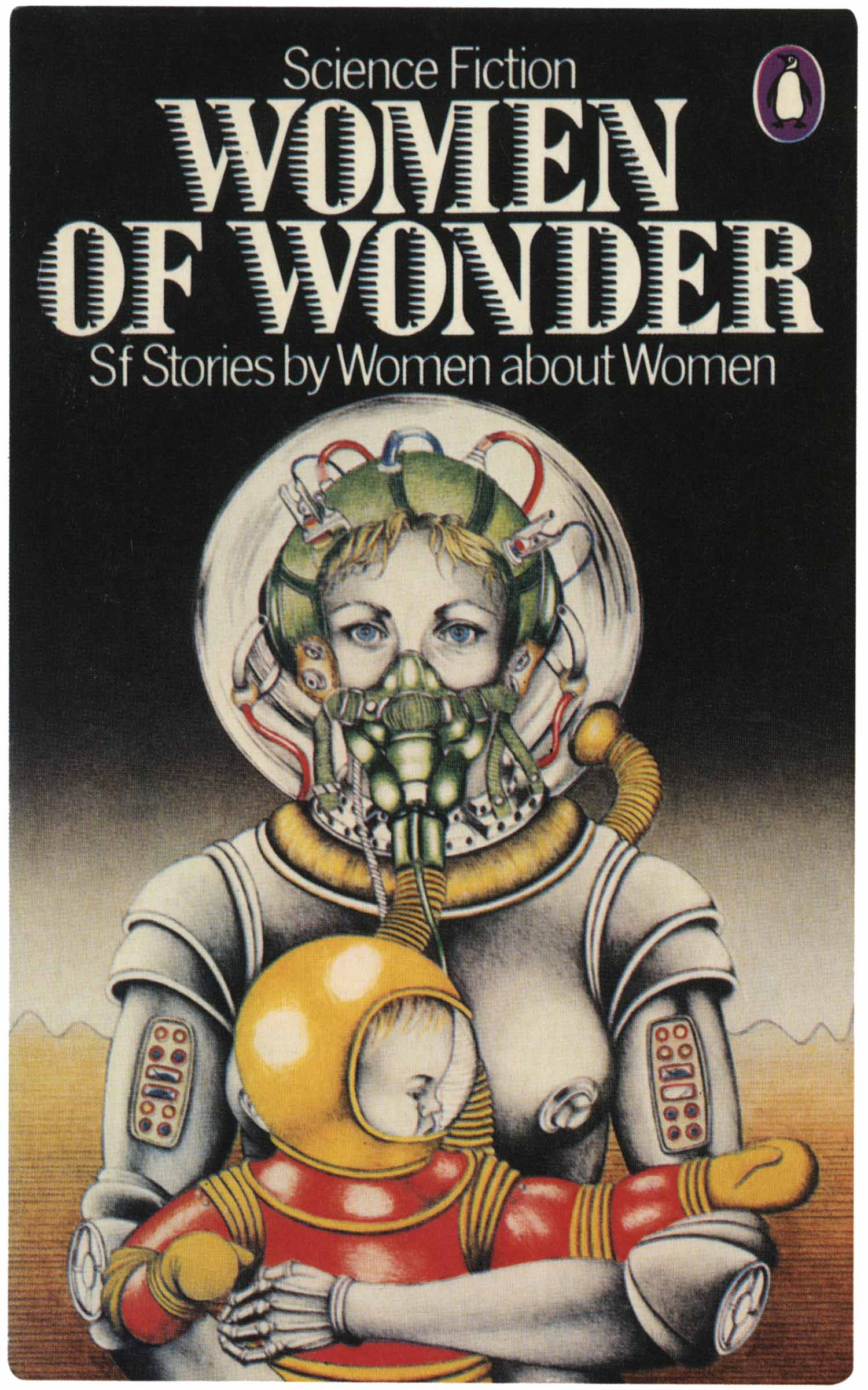
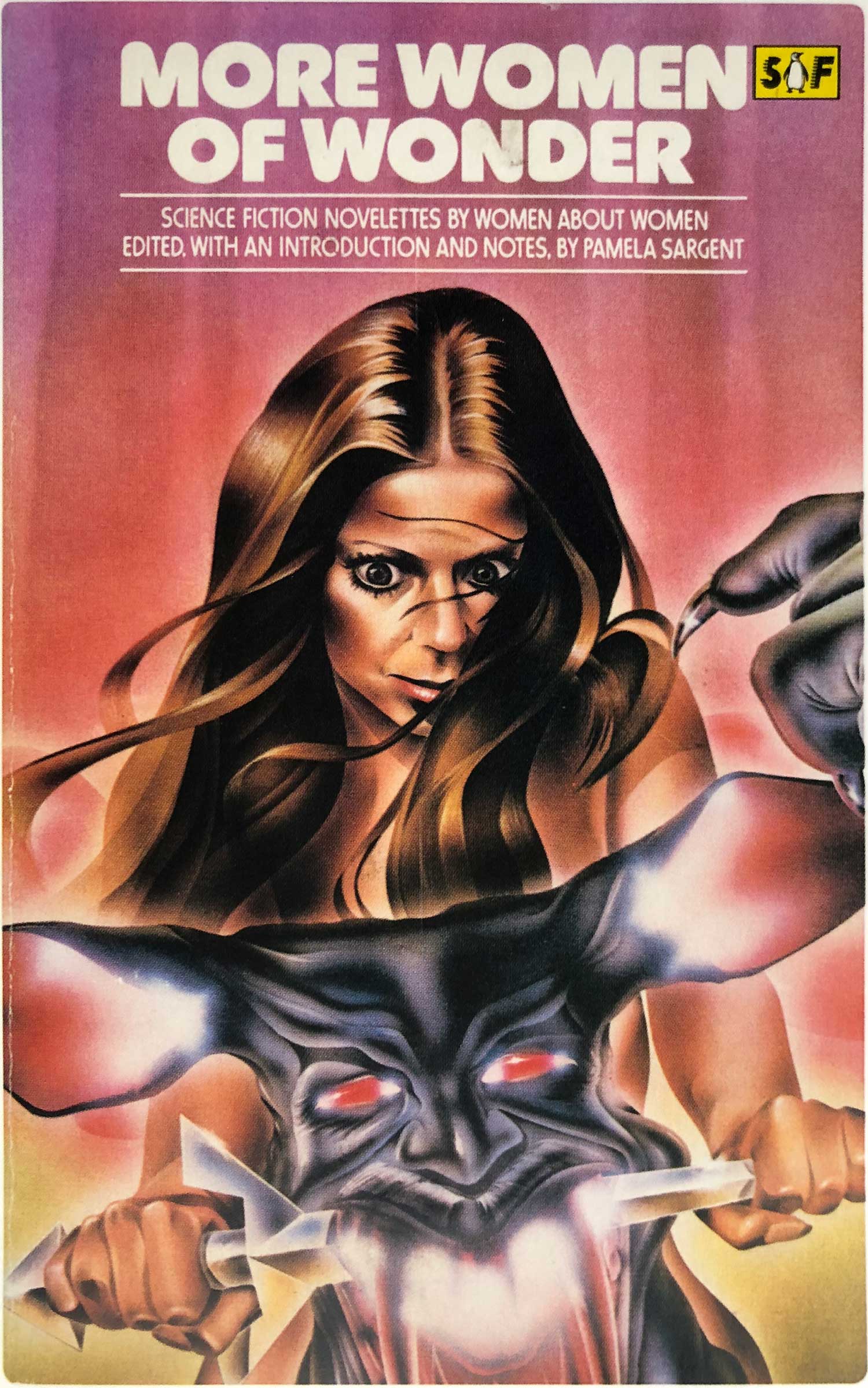
Pamela Sargent’s two edited volume’s of Women of Wonder are a perfect case study to see the near collapse of Penguin’s Sci-fi series design. On the left is the initial volume from 1978, with a cover by Candy Amsden. Although the illustration is a far out of the wheelhouse of either Aldridge or Pelham, it’s strong on its own, and still fits within the larger series aesthetic, with its black top three quarters, and color at the bottom. Next to it is the second volume, released only a year later, in 1980. Here the series design is collapsed to a new rectangular “SF” penguin which fits awkwardly between the title and the edge of the cover, and a new, tubular font. The illustration is completely strange and hard to make sense of, as well as being just ugly.
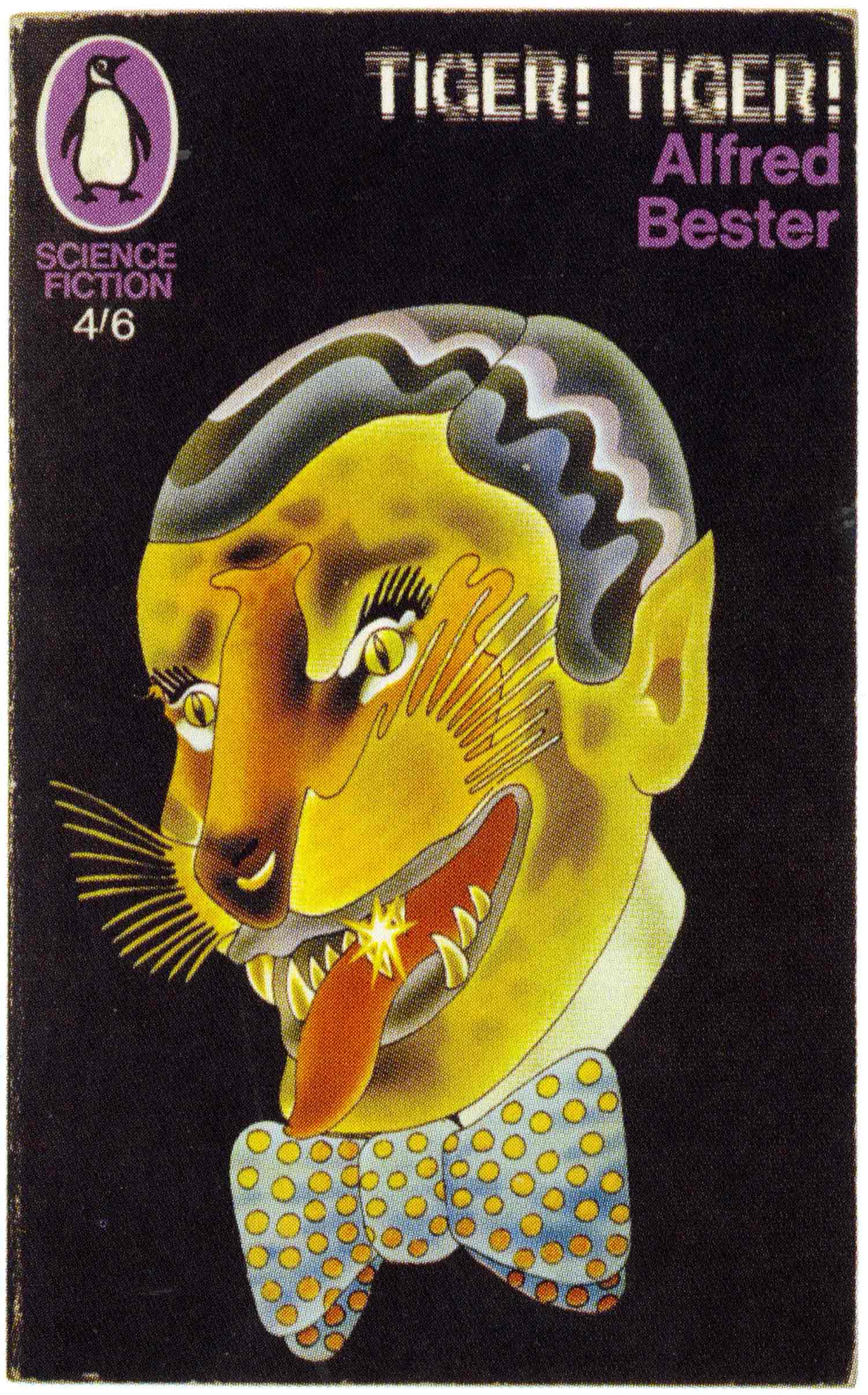
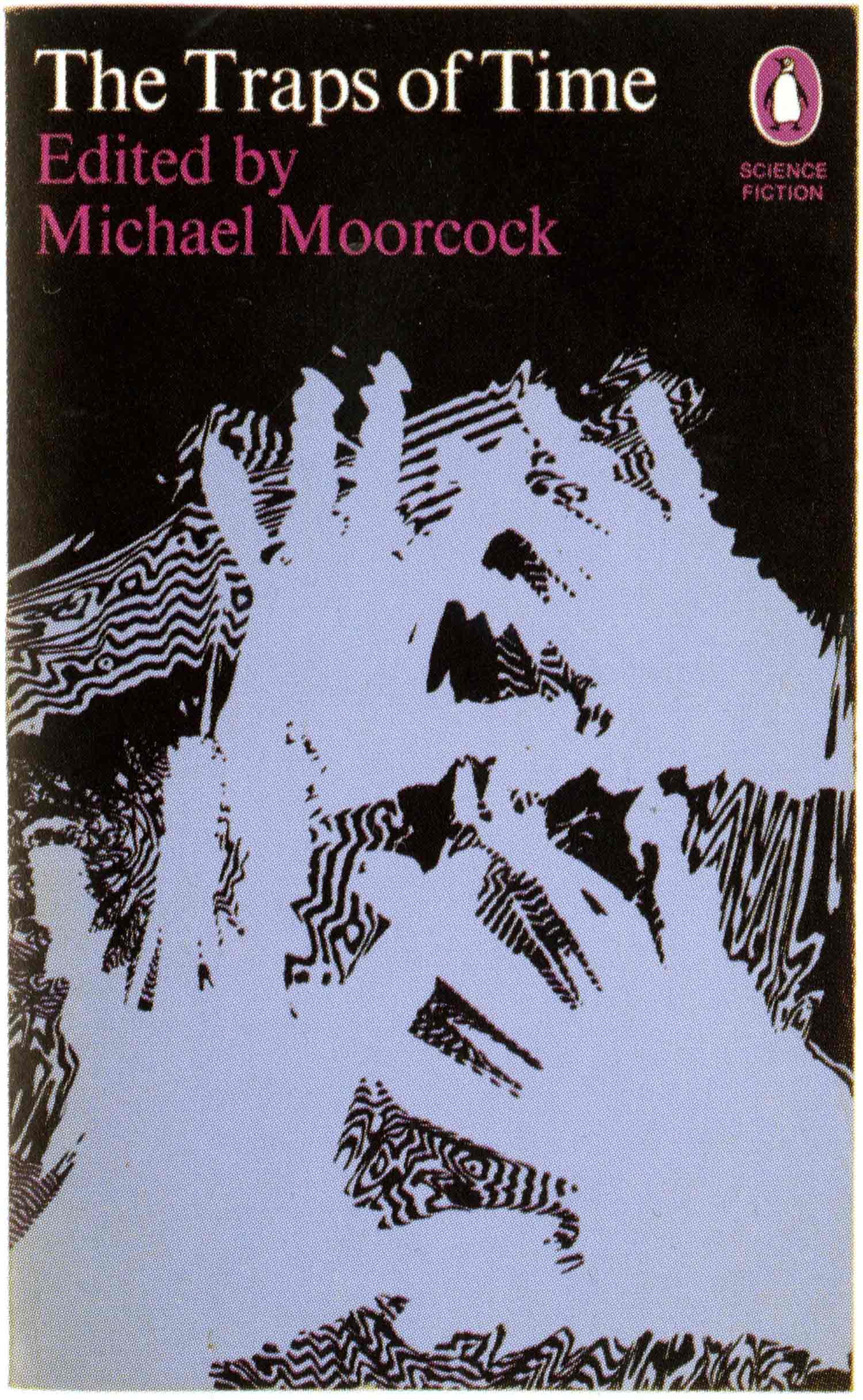
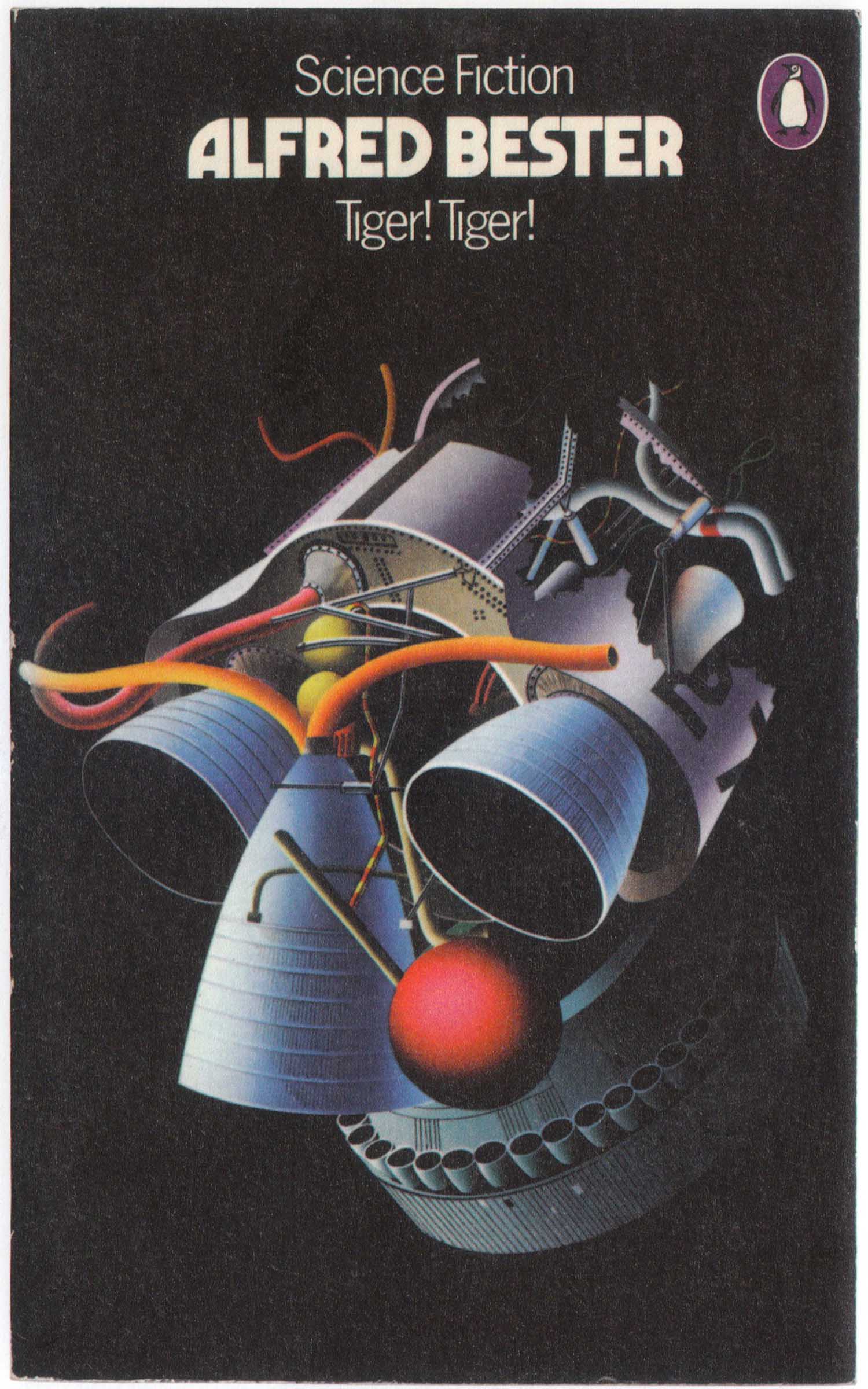
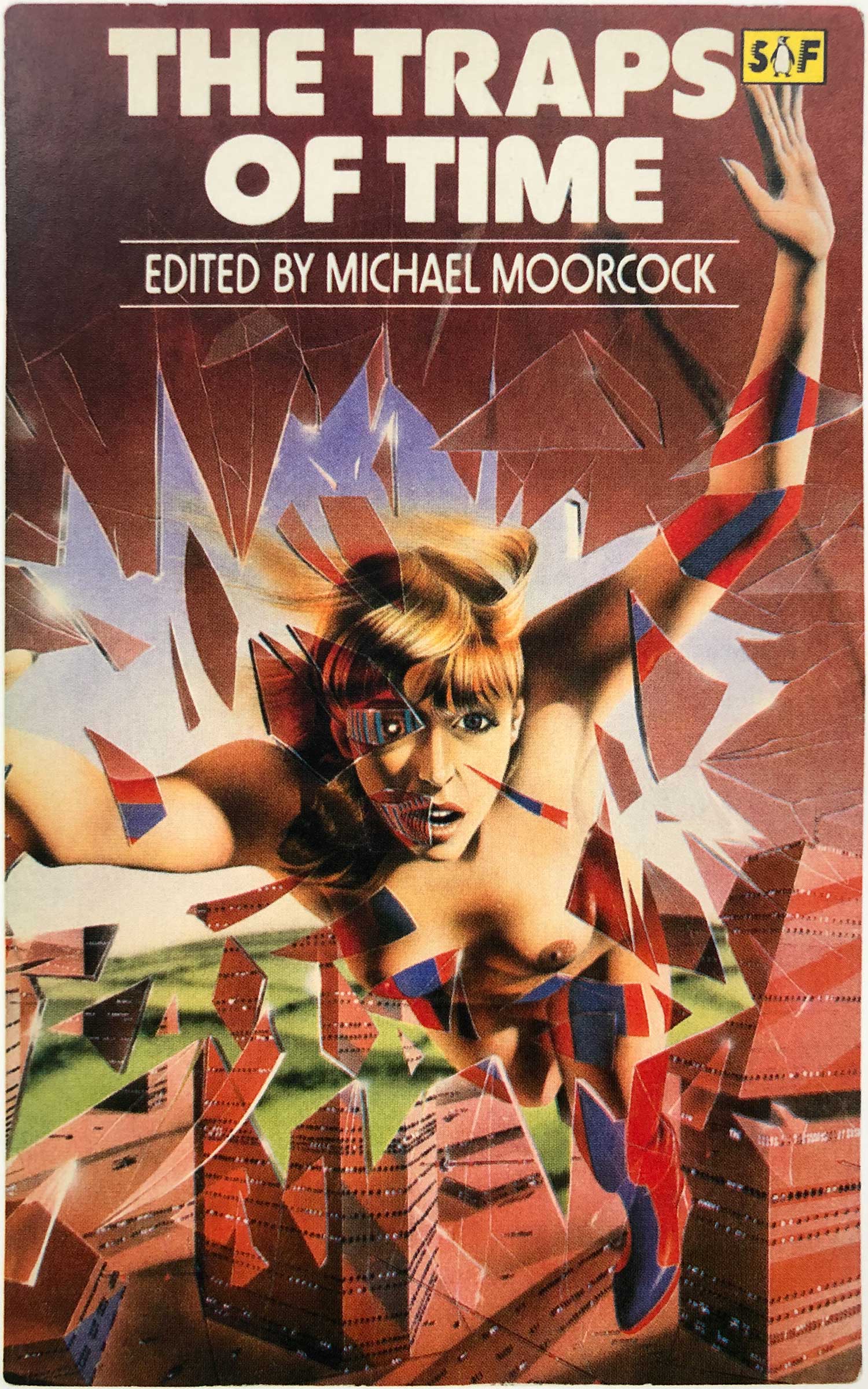
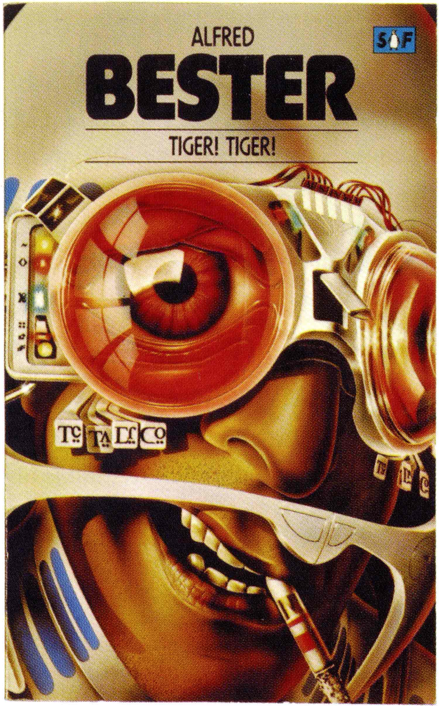
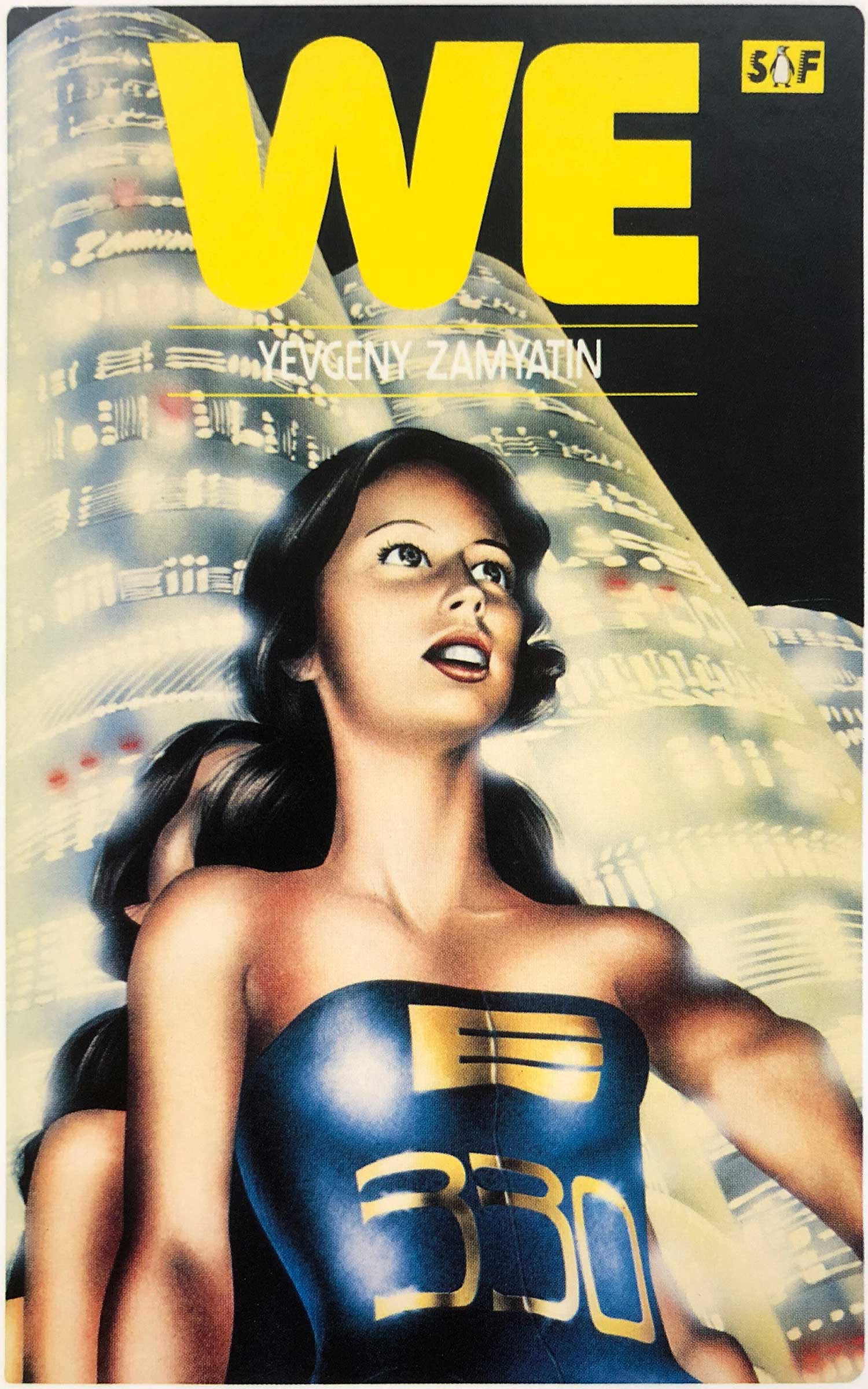
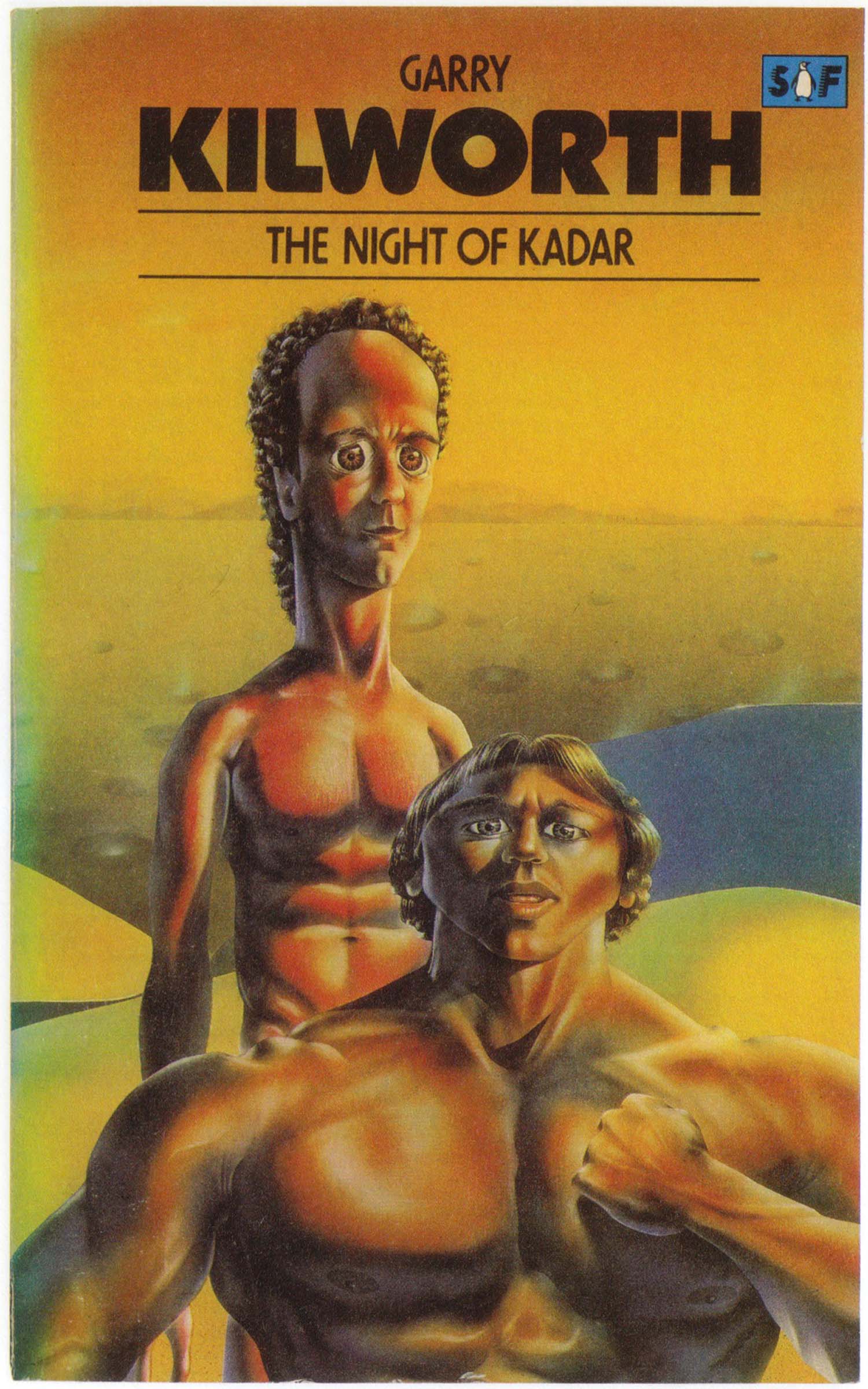
Things mostly go downhill from here. From 1979 through the mid-80s, this new, far less coherent airbrush style is dominant. There are dozens and dozens of these, and most of them do not hold up over time. I’ve included a small number of them here, some of the best (Tiger! Tiger! and We) and some of the worst (Traps of Time—ugh! another abhorrent collection cover—and Night of Kadar). After this period all pretense of a separate sci-fi series is dropped, and science fiction is just absorbed into the larger grab bag of design chaos all the big publishers become by the 1990s.
Looking back at the covers in this post, I’m starting to wonder if I just fetishized them because they were so hard to find. But I actually think there is some real magic here, especially in the early 1970s David Pelham covers. They feel great to hold, and the flat, bright colors are so different than almost all other sci-fi design. This is a real legacy that would be fun to pick up and try again. The relatively recent series of Cuban sci-fi novels published by Restless Books have nice, flat, graphic covers that I really like, but they don’t quite have the punch of these. And the painful reality is that most of the genre is now wrapped with an amalgam of stock space and spaceship photos and poor, rudimentary design. Here’s to hoping for a return of stunning sci-fi series design!
Wow, I’m really out of practice. I hope you enjoy this post, and the almost 90 covers included. We just updated the back end of our site, so I apologize for any glitches, I’m still trying to work out the kinks of the new system for building these image heavy posts.
Below is a bibliography for the this period of Penguin Sci-Fi. Most of the books above are included, although a couple have slipped through the cracks:


Love how in the first women of wonder the baby is like how the fuck am I going to eat
I’m sure there is a tube for that!
The Alan Aldridge era was the pinnacle in Penguin Sci-Fi cover art! But, I must admit that Chris Foss was just as powerful over at Corgi.