There are a couple really sweet spots (for me) where book cover design starts to feel sublime, and one of these is the “Green Period” of the Penguin crime series in the mid-1960s. Crime has never truly been a separate series for Penguin, but part of their general fiction output. Two of the first ten Penguin books published (a novel each by Agatha Christie and Dorothy Sayers) were crime, and it has always been a genre central to the Penguin list. Initially crime fiction was distinguished design-wise by being covered in a dark green color, but otherwise looking like any other Penguin. Various design experiments in the 1940s and 50s led to brief experiments in other designs, but this was the solid, basic design until 1962. Below you can see the core design (far left—1953 example, far right, 1961 example), as well as an American variation from 1945 (center left) and an Eric Stanley Gardner cover from the brief Abram Games cover design experiment from 1957 (center right).
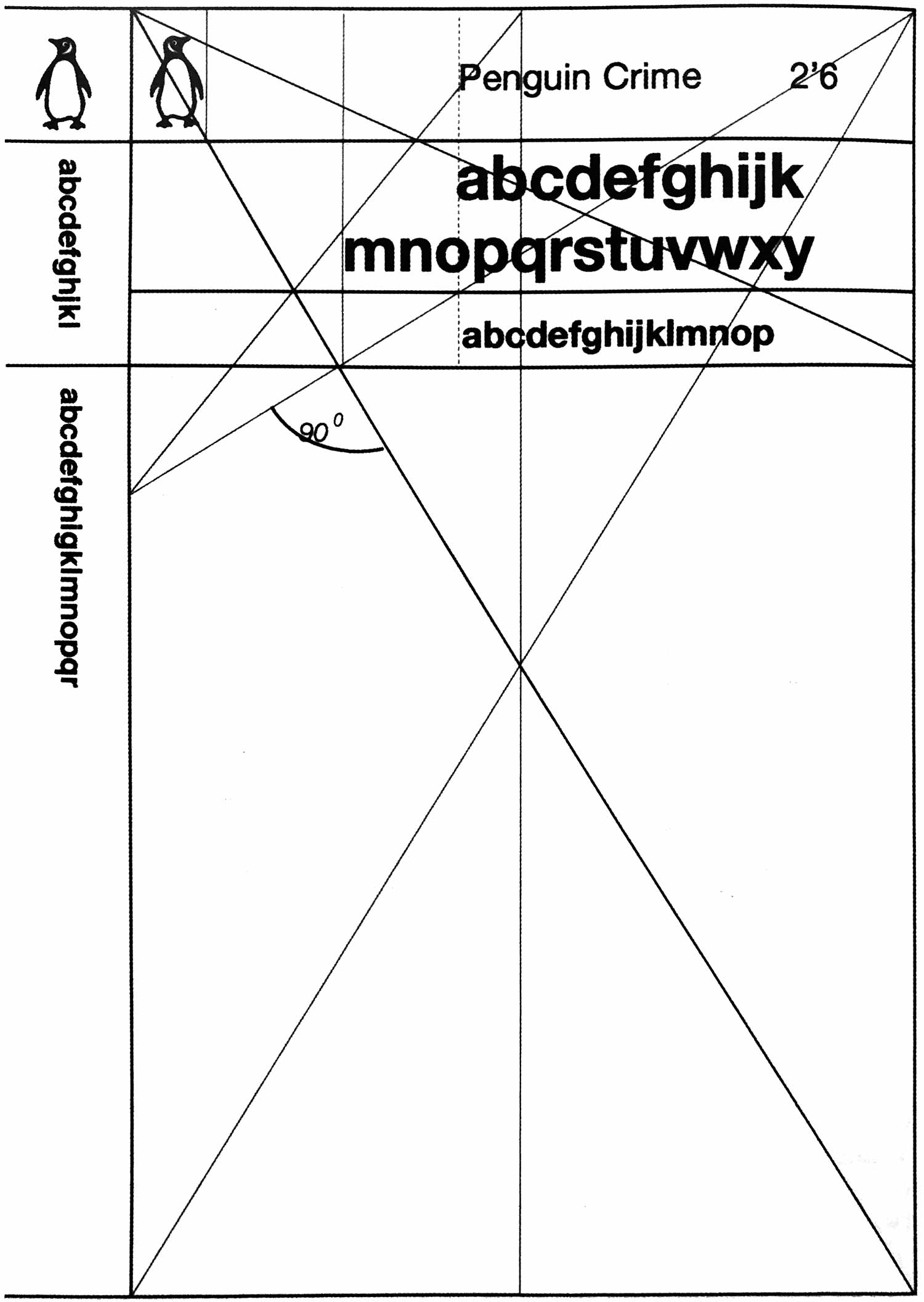
In 1961, Penguin designer Romek Marber designed a new grid for the crime series, moving away from the three equal horizontal bars and creating a new system where the titling info all fit in a series of thin horizontal boxes. The design eloquently created dedicated space for the Penguin colophon, series name, price, title, and author, while leaving significant real estate for an illustration. In addition, the dark green color of the series was lightened, and early designs were limited to green and black printing on white stock. In the long run we’ll also see that all of these elements of structure ultimately gave designers a lot of boundaries to push against and transcend. Below is the original template for the design and an early example of the grid in action.
This is one in a series of posts ongoing posts exploring the book cover design of Penguin, one of the longest running and most creative paperback presses in the Anglo world:
252: Penguin Specials
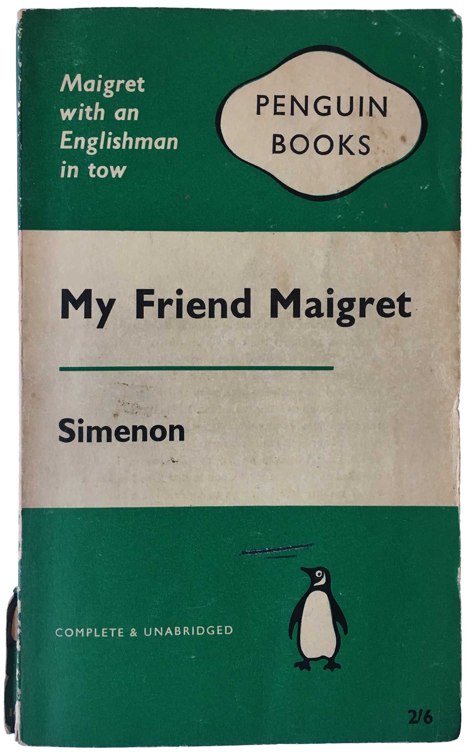
246: Penguin Simenon
233: Penguin with Ben Shahn covers
148: Penguin early African fiction
111–120: Penguin African Library
94: Penguin Political Leaders
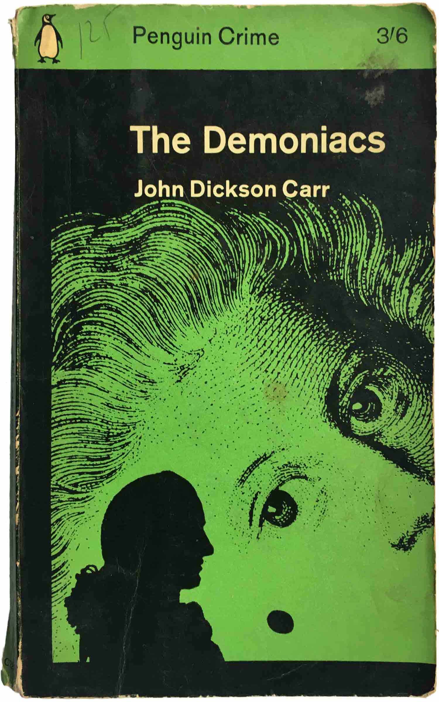
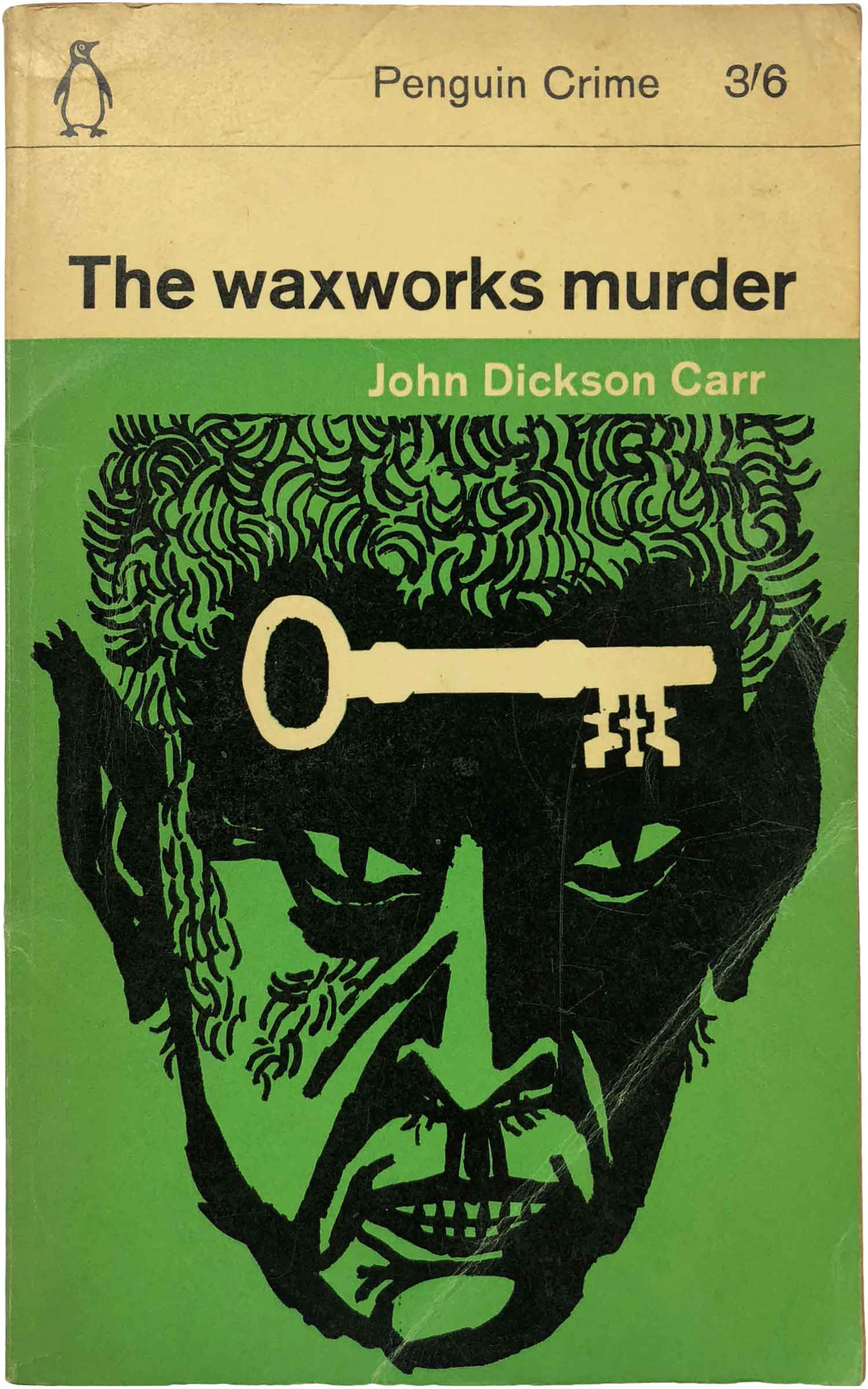
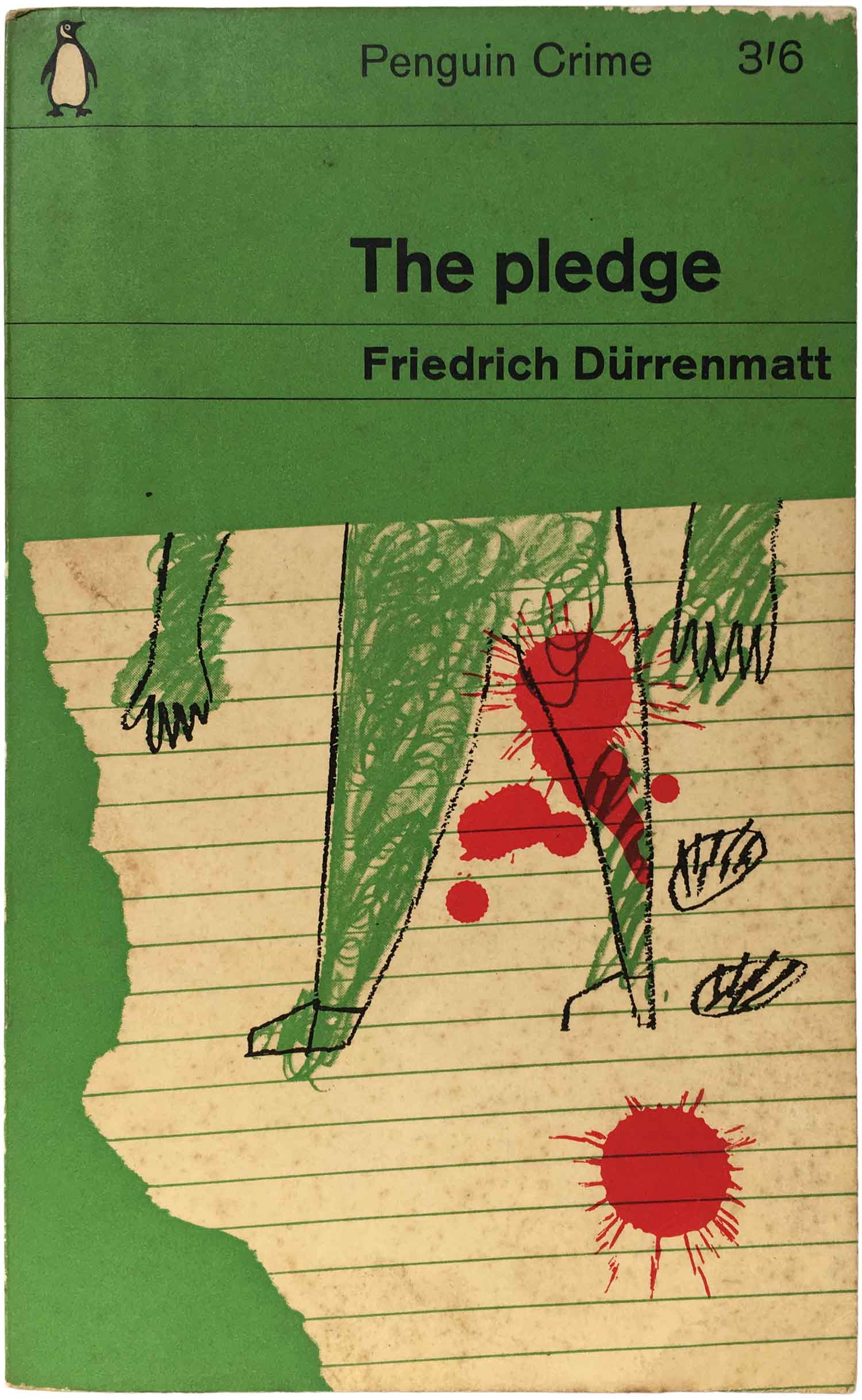
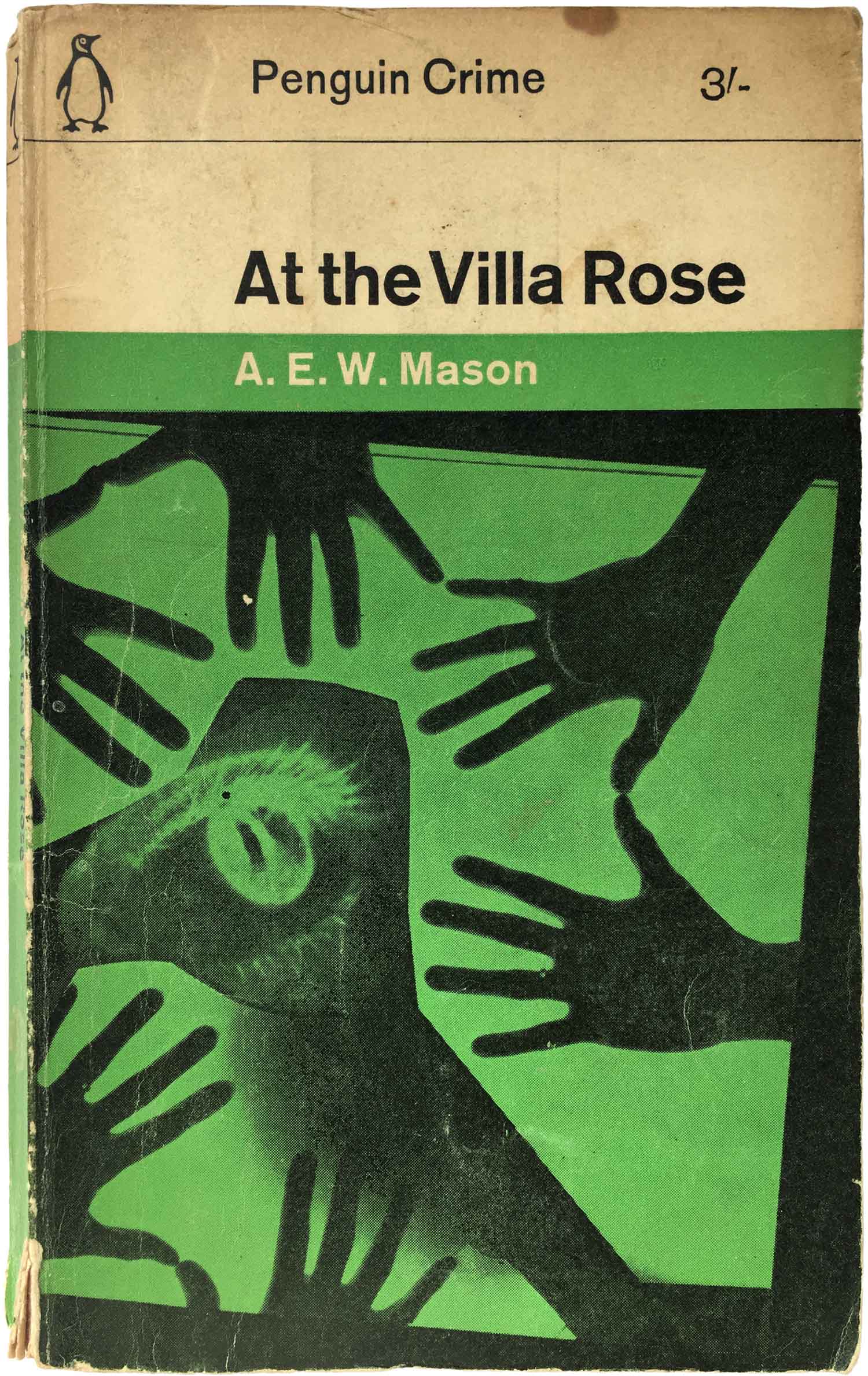
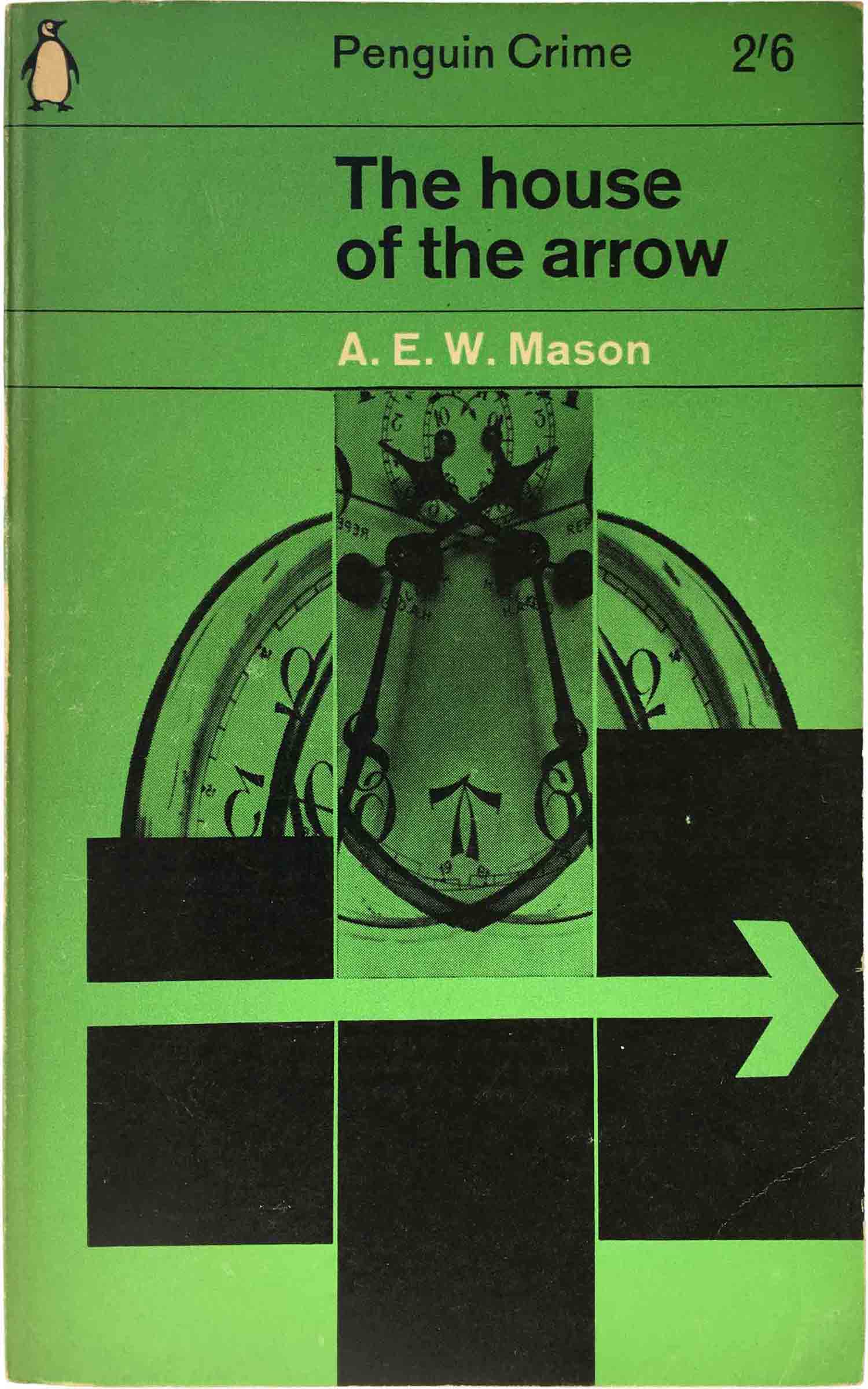
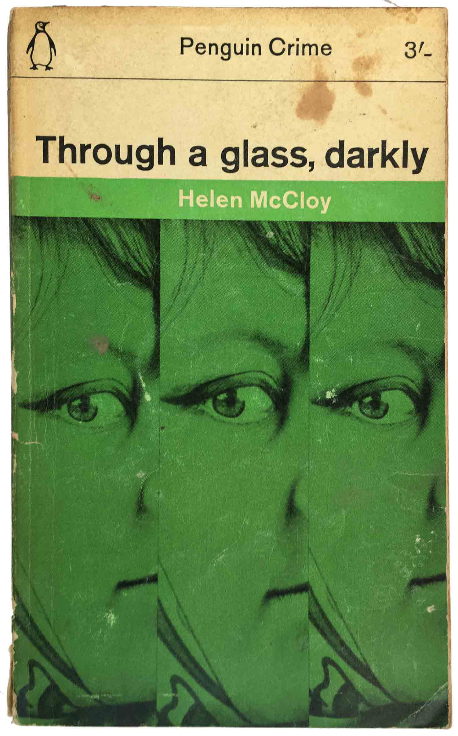
Unlike these other series, crime novels were never separated out at Penguin, so although they were distinguished by their series design, they carried the same overall list numbers as other fiction books (excepting that some would have the letter C appended to their list number). So it is a little hard to tell exactly how many crime novels Penguin released because they aren’t distinctly listed, and it is even harder to figure out exactly how many different covers were published using the Marber grid. According to The Penguin Companion, 170 crime titles were in print in 1962, right as the new grid was being rolled out (over 1961–62, both designs were used, likely as some books were already in the pipeline when Marber’s grid became the new standard). But some of the earlier titles were never released in Marber grid editions, while others had multiple different covers printed while the grid was in effect. I suspect around 300 different designs were released, and there’s a little over 100 in this post. I’m also including a number of post-Marber designs, both because they are interesting in looking at how designers pushed the grid to the point of eventually abandoning it, and also because many are striking in their own right.
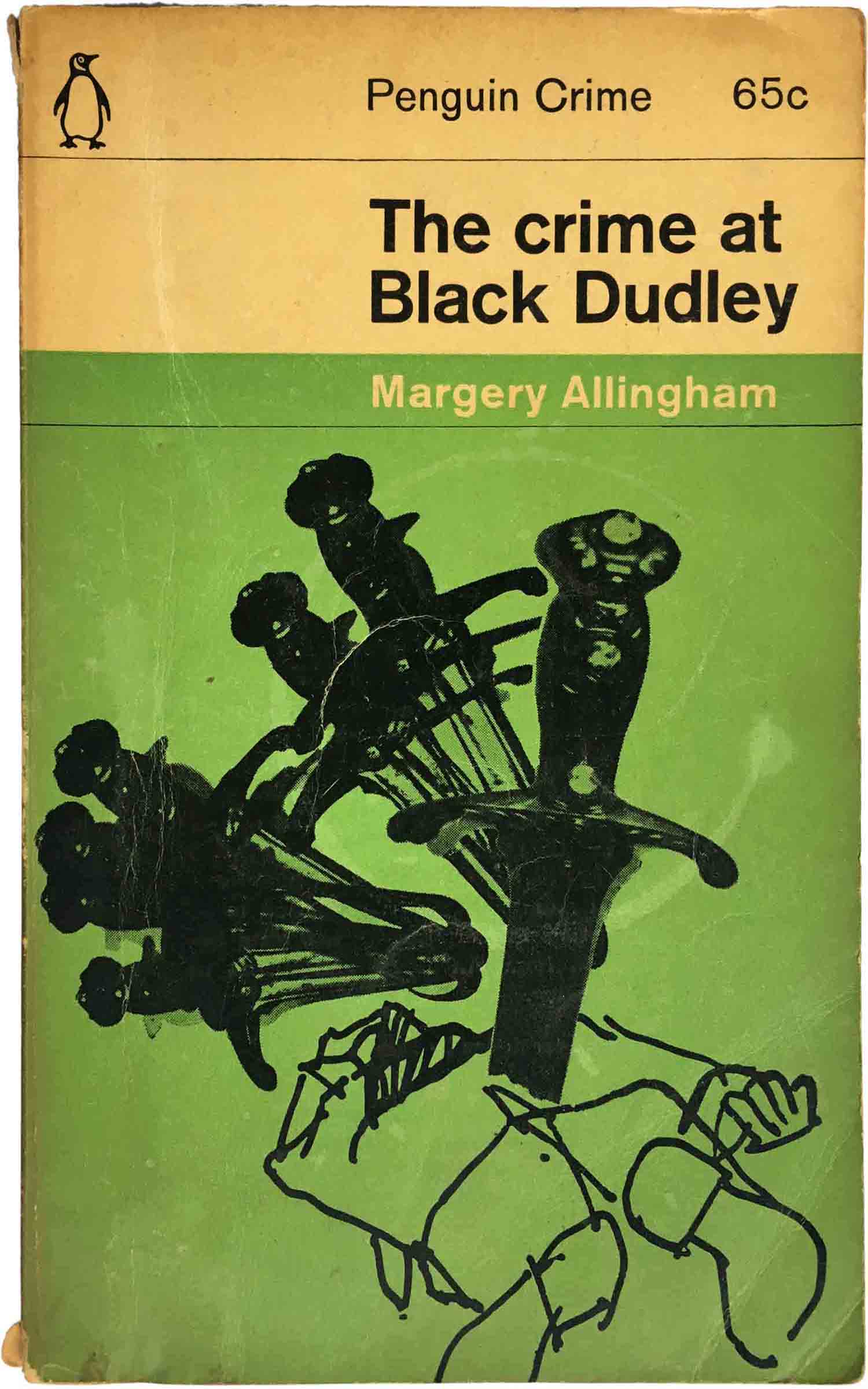
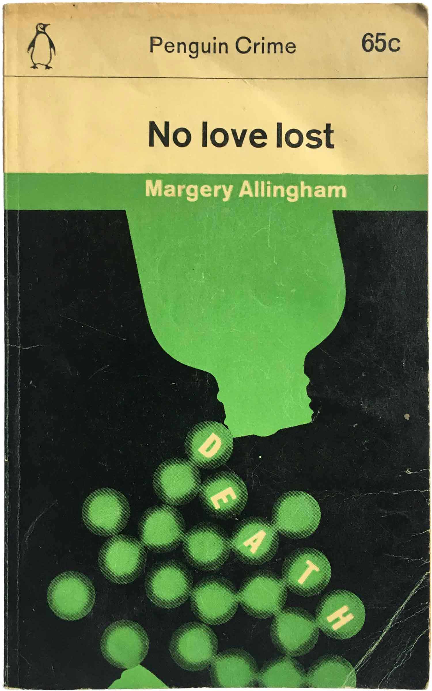
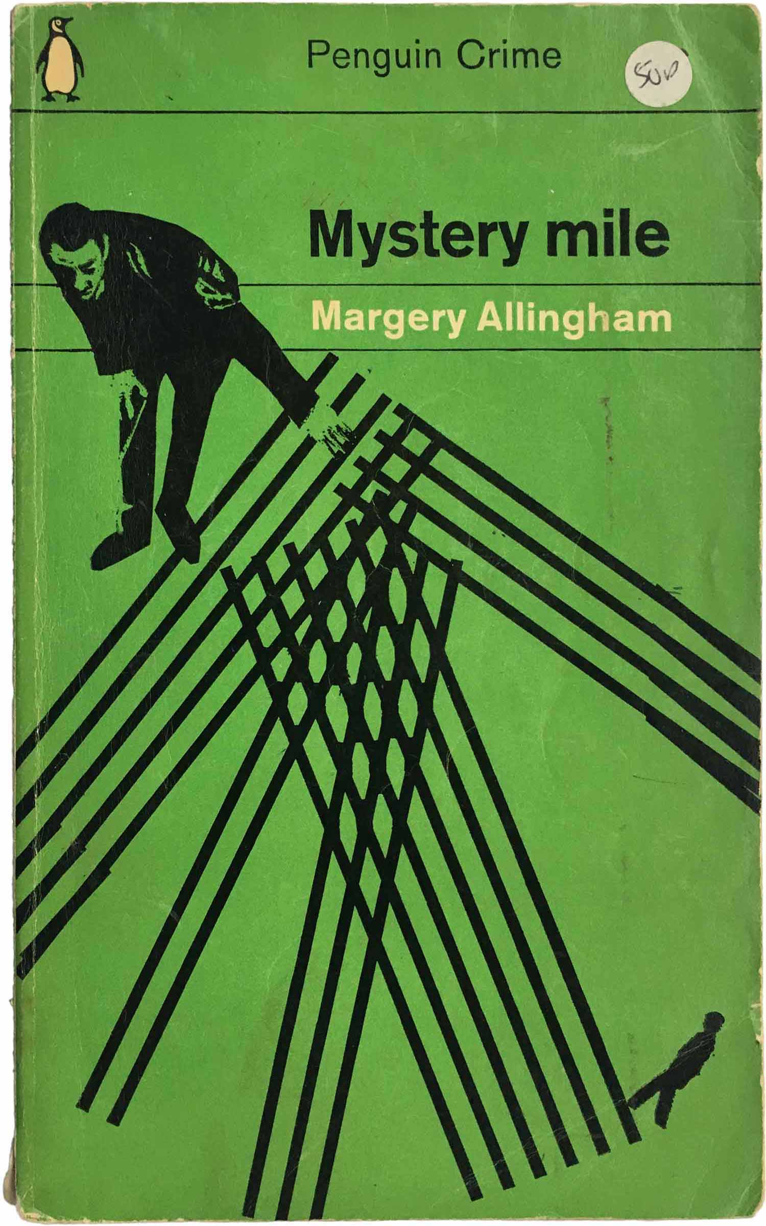
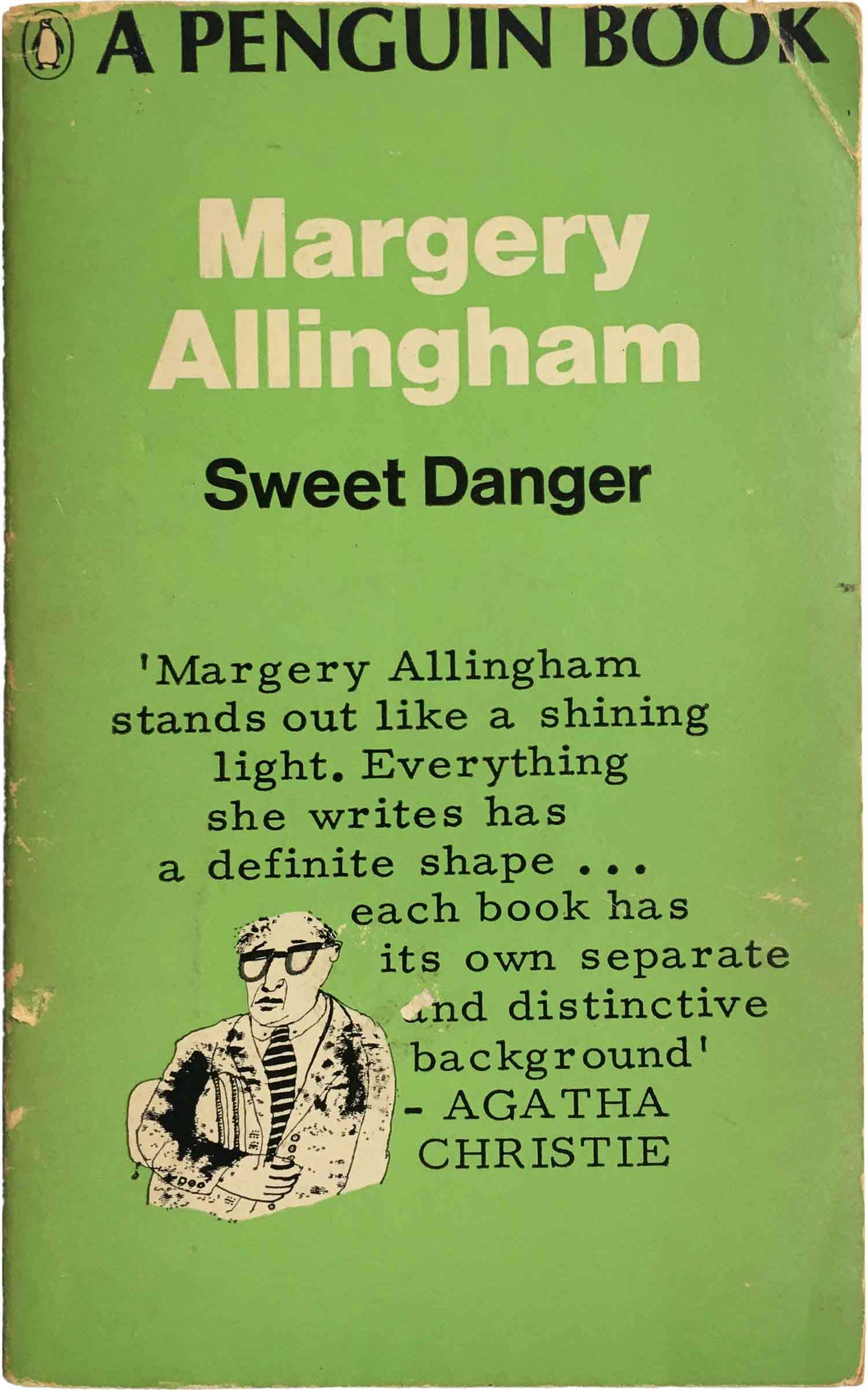
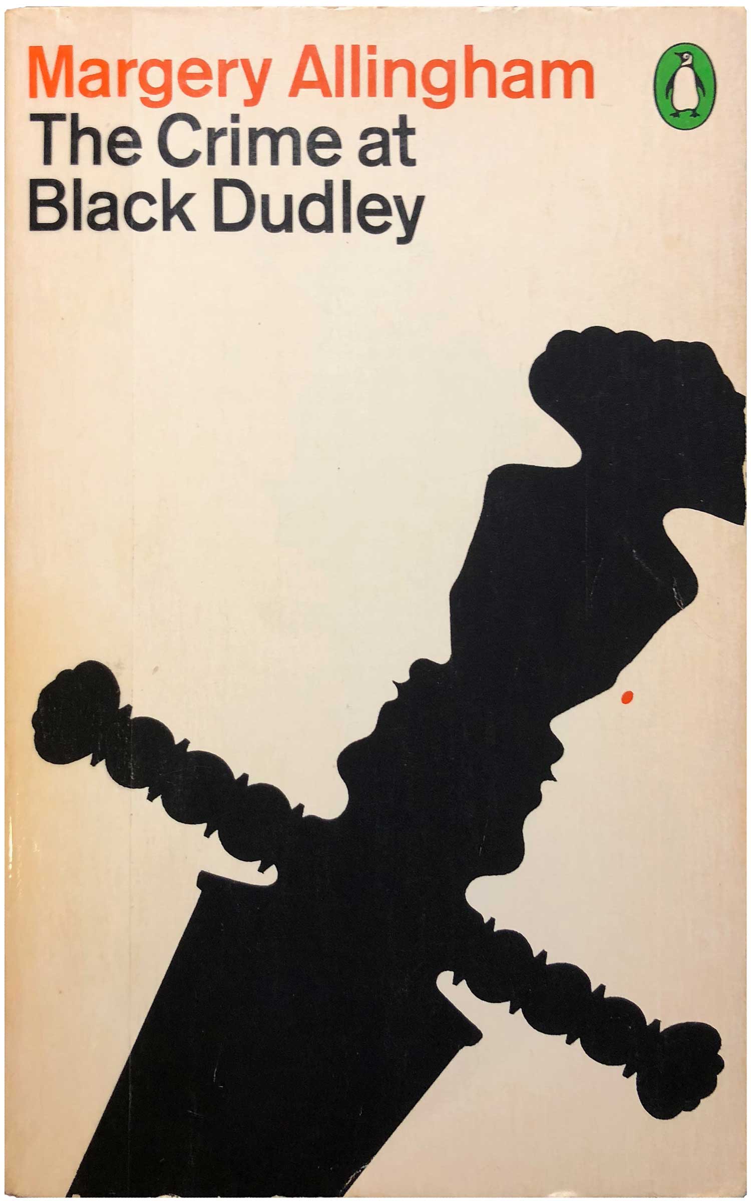
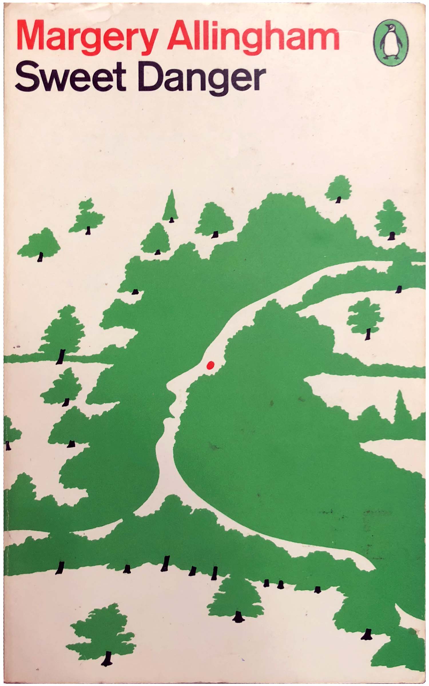
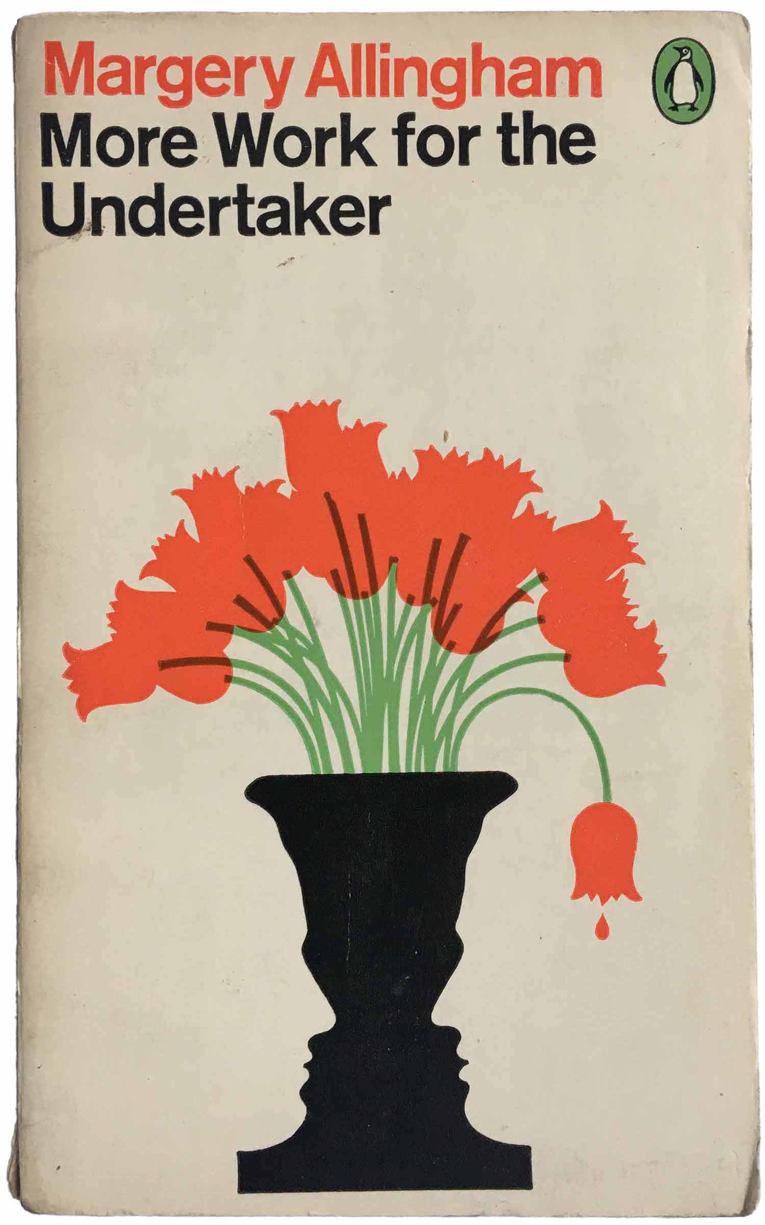
Because of the sheer volume of covers I’m sharing in this post, it’s hard to find a perfect way of organizing them. While chronological makes some sense, it is also really nice to see how a single author’s work is represented over time, so I’ve done a variation of the two—organizing alphabetical by author, but putting covers in chronological order internally to the author. I also can’t comment on all of them (nor would anyone want me to), so I’ll reserve commentary for places where I have something interesting to add. Starting from the top we have Margery Allingham, a British author of the golden age of detective fiction. She’s a good place to start because Penguin published a wide array of her books, and I’ve collected seven different editions over the years. The first four are from peak grid-era (1963), and you can see in the last one, Mystery Mile, that the designer John Sewell has already started breaking out of the strict grid, setting the main figure so that he pushes through the lines marking the areas for title and author. This is also a great example of what makes so many of these covers so strong, the important information is easy to find, but the illustration is powerfully compelling and is allowed to be the center of attention. We can also already see in these four examples how it was left to the design on how to incorporate the green, which some filling the entire cover, others using it to contrast with white in the various elements of the grid.
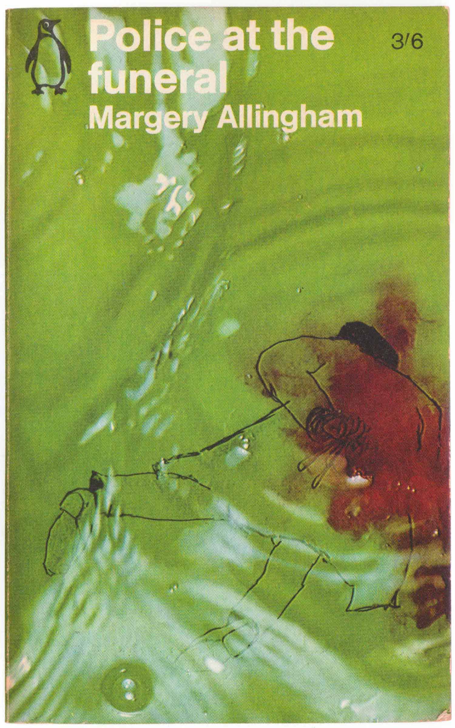
Unlike many American publishing counterparts at this time, where the idea of a strong crime book cover was a lurid painting of a damsel in distress that vaguely illustrated the story, Penguin’s brief to their designers was to create graphic imagery that captured the feel of the book, not to attempt to illustrate the story. This leads to amazing burst of creativity, with dozens of covers that puzzle, terrify, confuse, and otherwise capture the emotional resonance of the books. You can see that by 1966 Penguin was likely feeling some pressure to compete with American full-color covers, so we get a strange compromise, as illustrated by the cover of Police at the funeral. We’ve got the color photo, but also the illustrative style laid of the prone figure scribbled on top, and a general lean towards abstraction. It completely falls on its face (pun intended?), at least in this iteration.
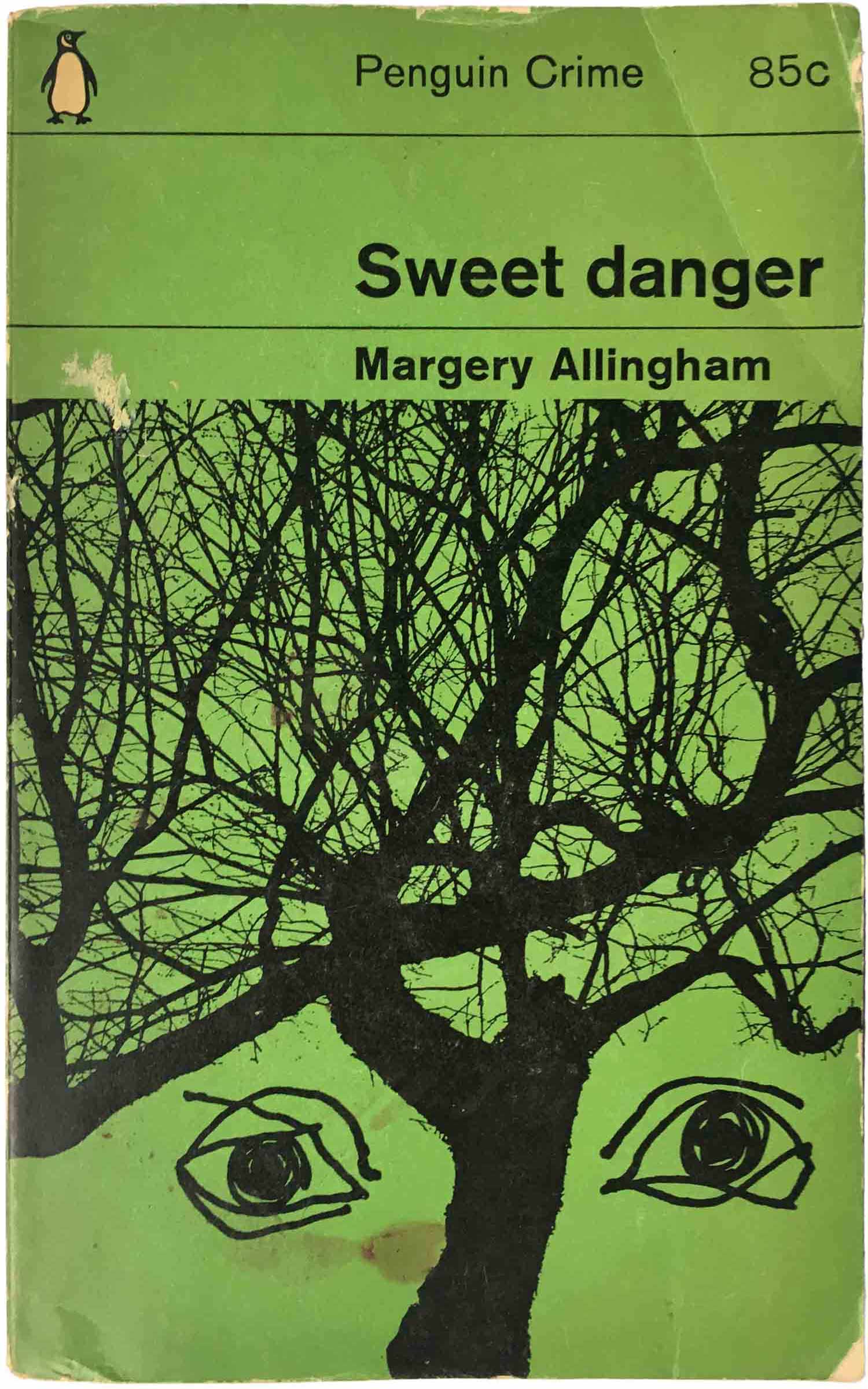
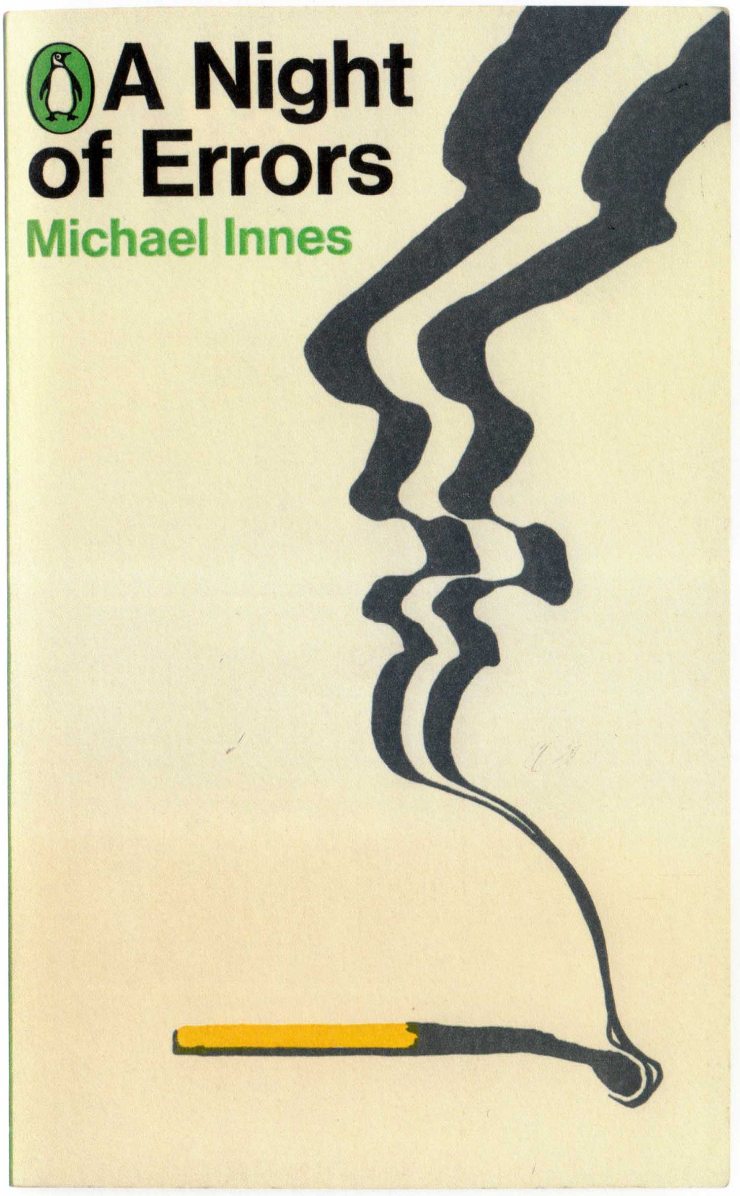
A couple years later (1968) we get the cover of Sweet Danger below. It appears as if Penguin wanted to reign in the chaos of the earlier couple years with a new, looser, series style—which ran across a number of author’s covers (see examples on Freeling and Innes books below). The font choice was open, but all the covers feature more or less centered text, the addition of a paragraph pulled from the text blown up writ-large, and a smaller spot illustration towards the bottom of the page. Following that we have 1973’s More Work for the Undertaker. Here there is a return to the graphically efficient mid-60s, but a much looser grid and style. This cover feels like a true evolution from the earlier grid covers, as opposed to thrashing around of the previous two.
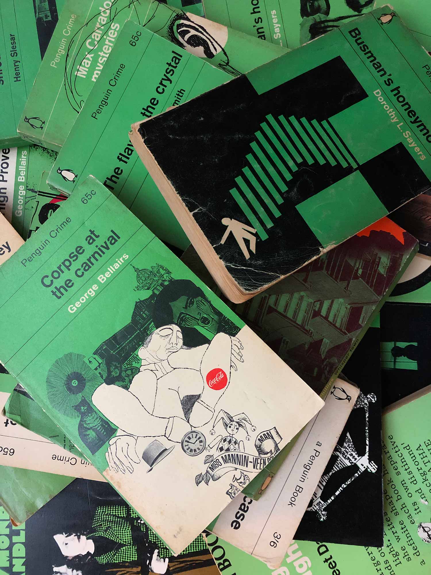
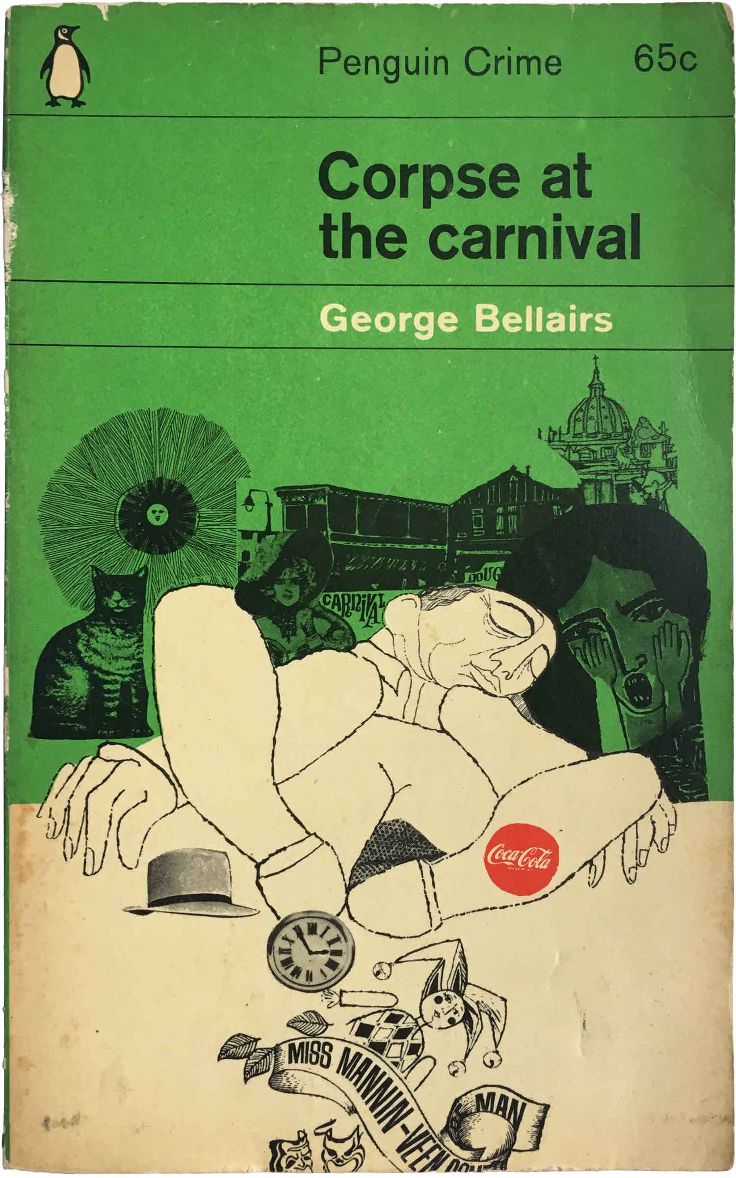
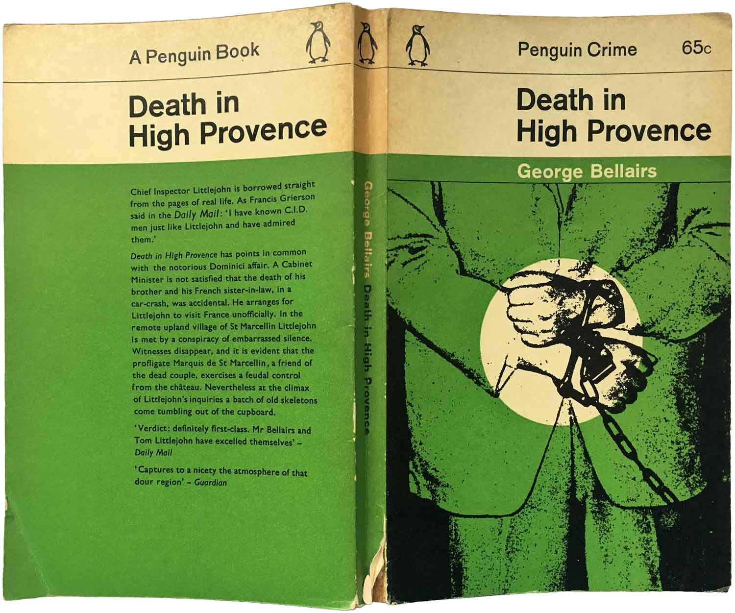
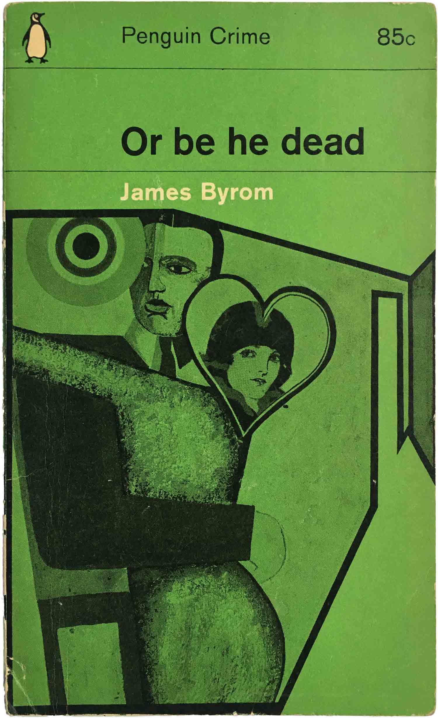
Next we’ve got the B’s: Bellairs, Bingham, Bramah, and Byrom. The cover of Corpse at the carnival shows the introduction of a third spot color to strong effect, with the Coke stamp on the shoe of the corpse. And the image of Death in High Provence is an example of how the grid wrapped around the spine and onto the back cover. John Sewell’s cover of Max Carrados mysteries is another great example of the illustration breaking the boundaries of the grid (and a nice re-use of the horizontal lines he used on the Allingham cover above).


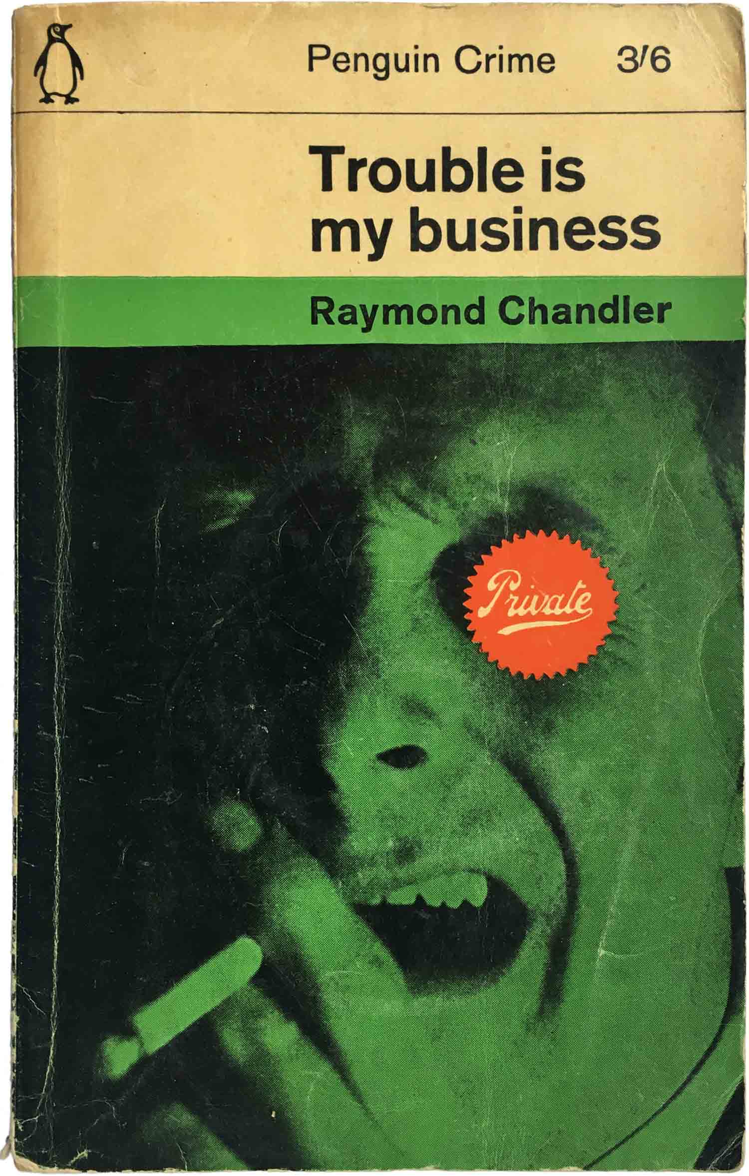
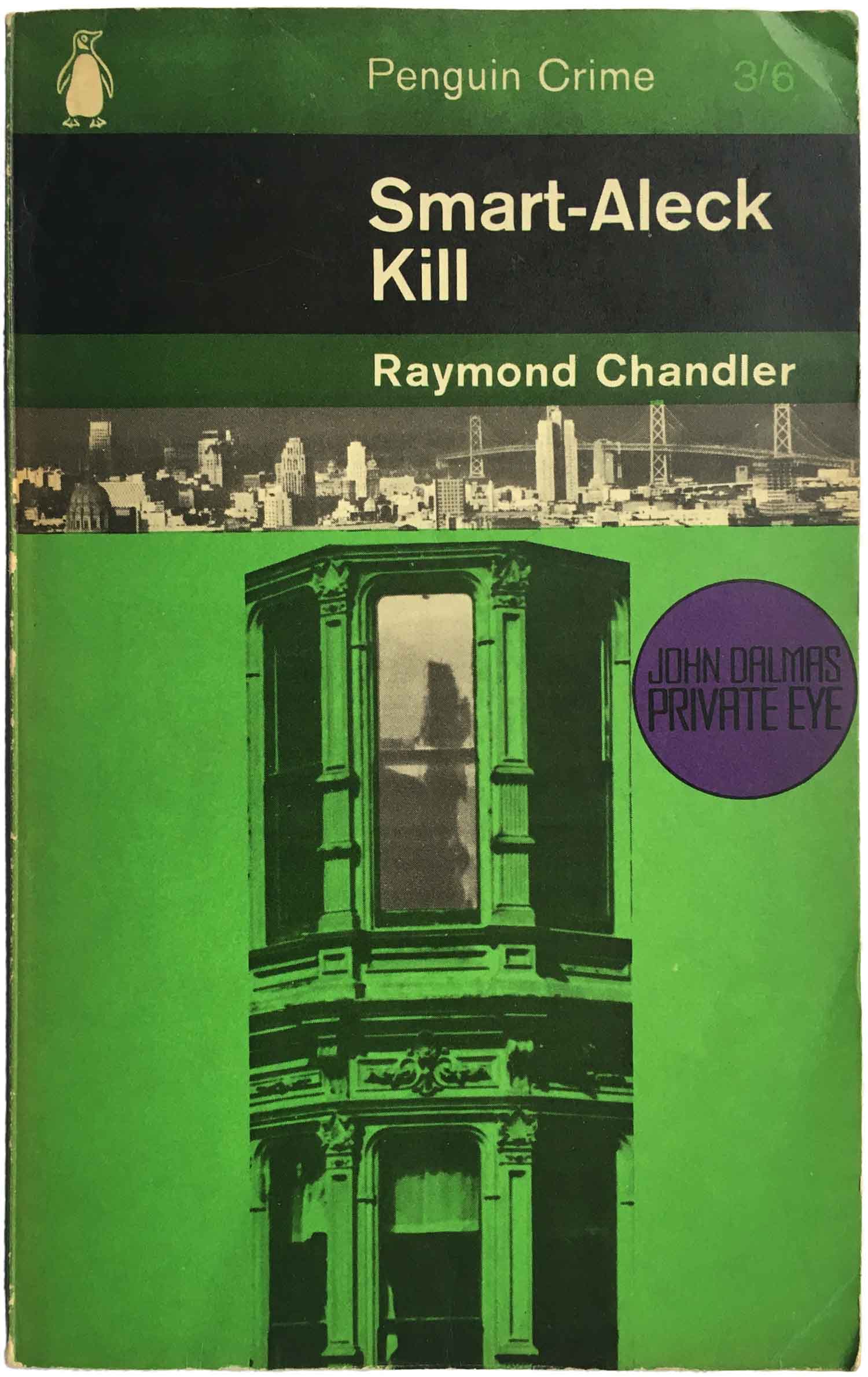
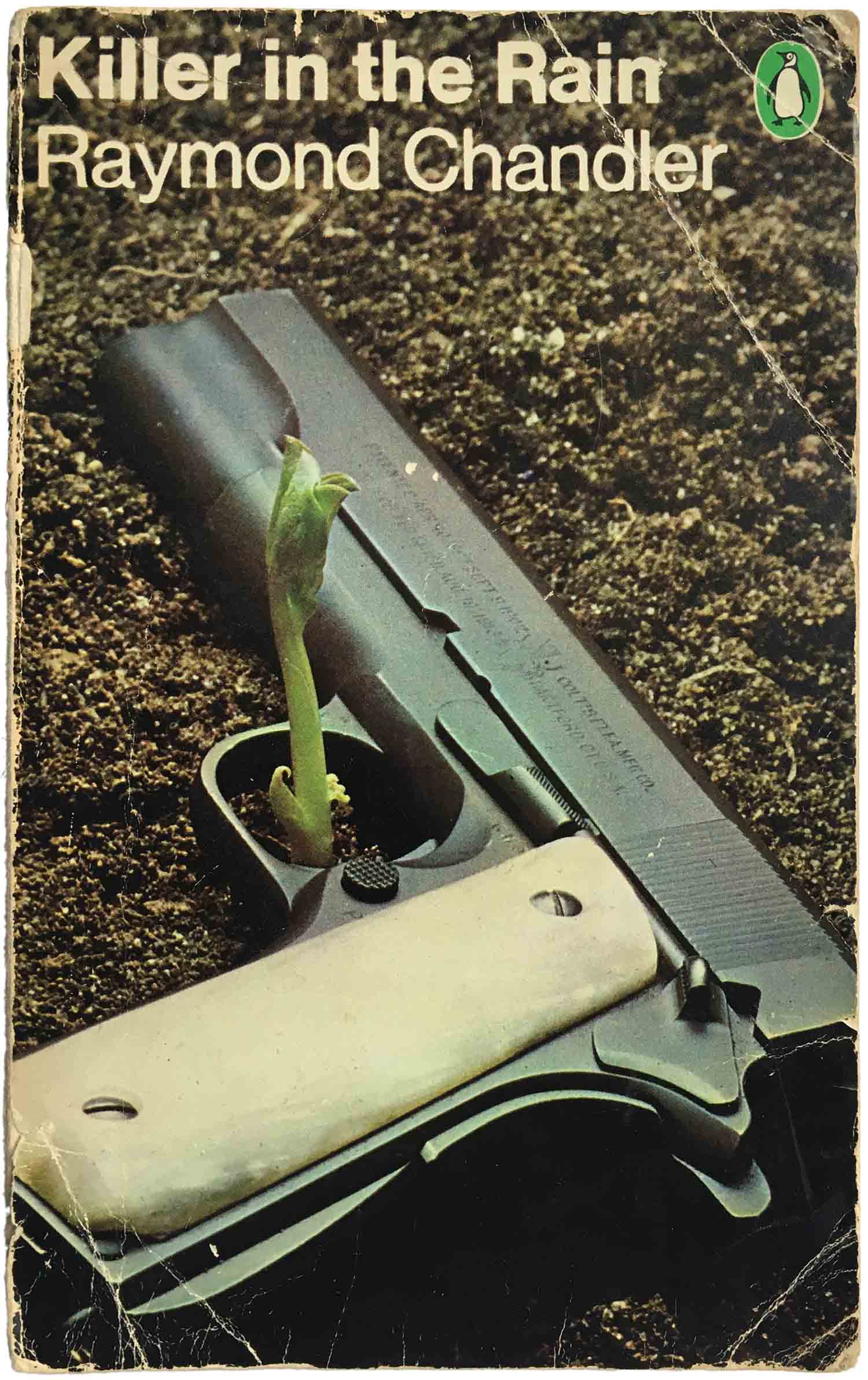
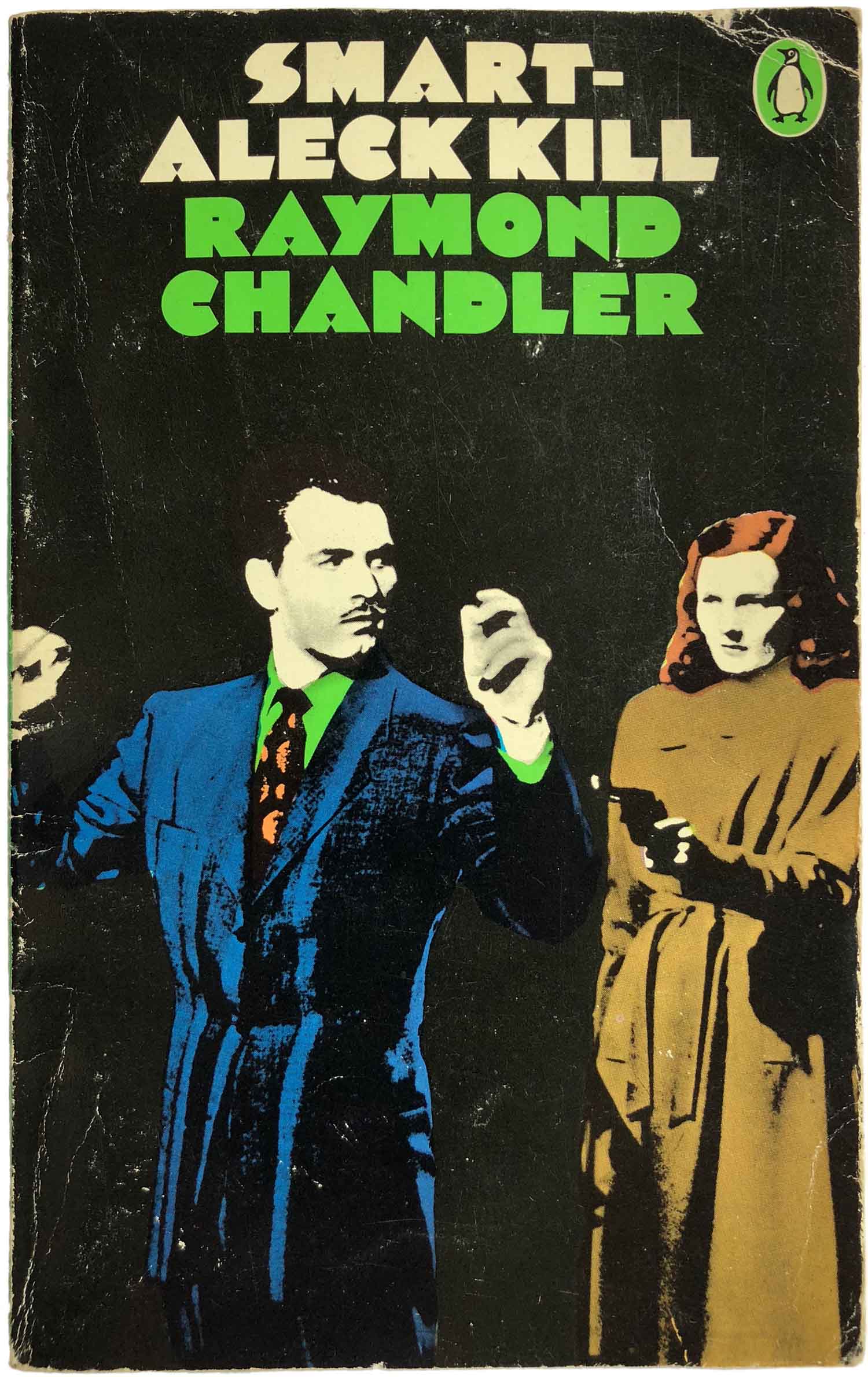
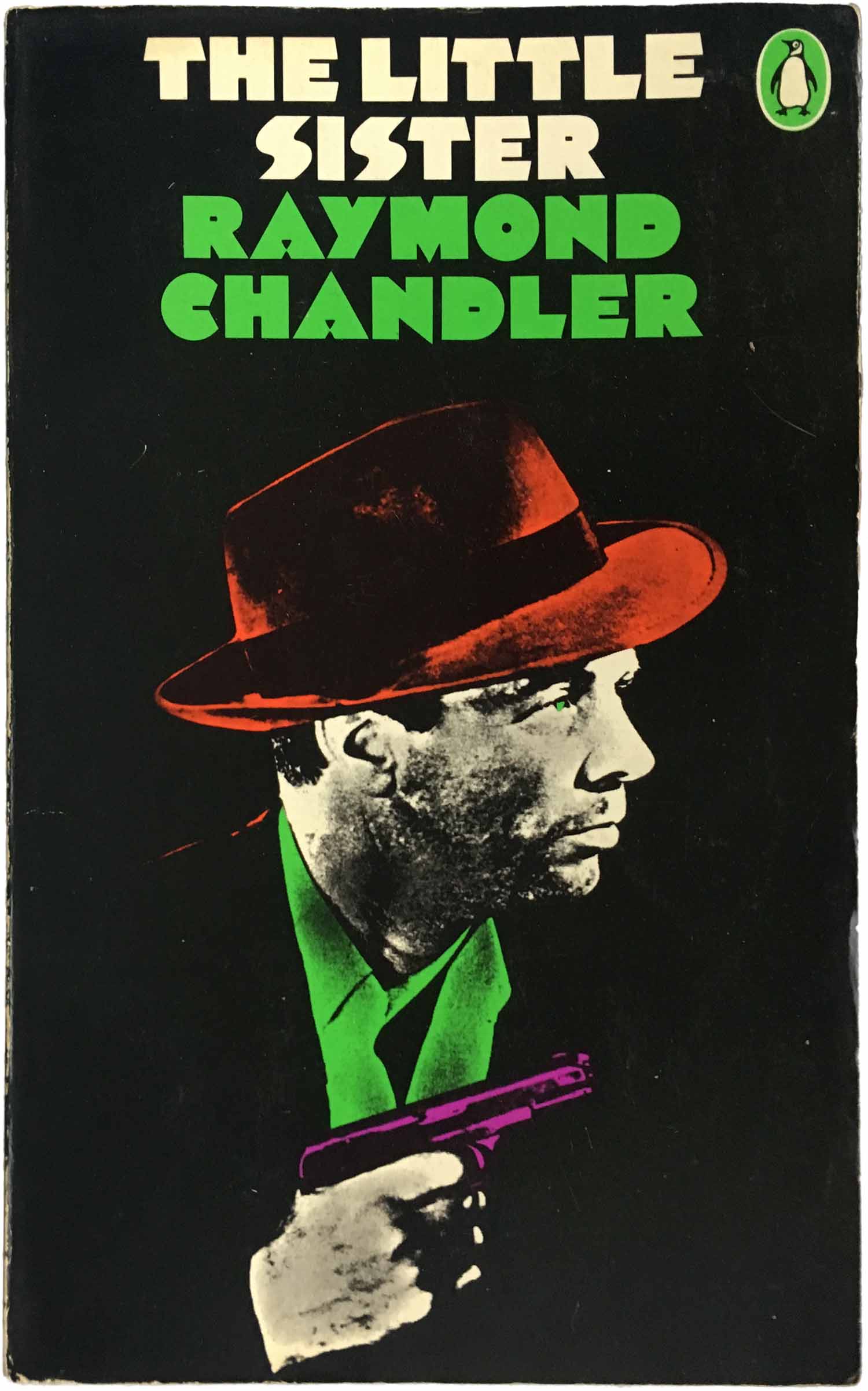
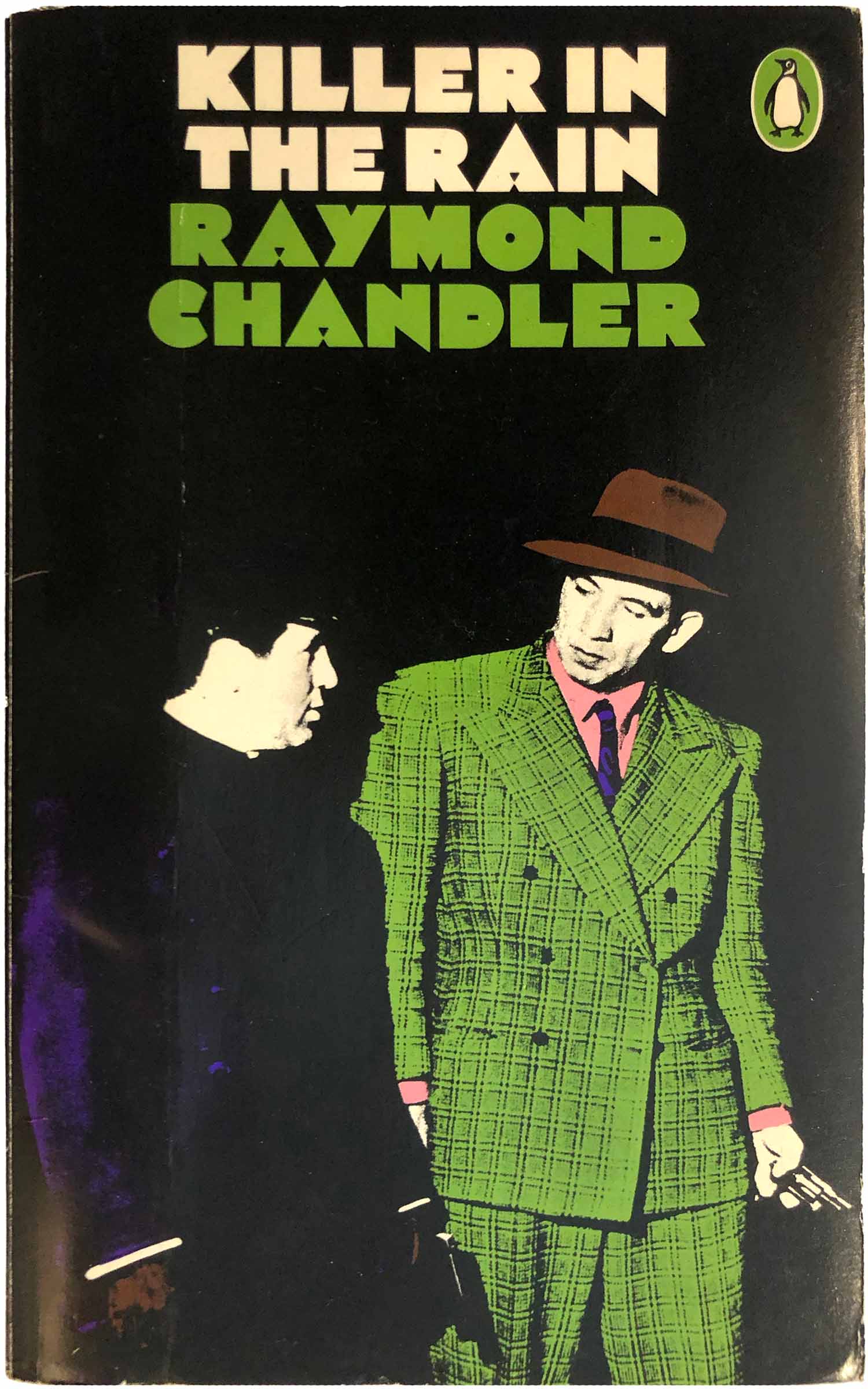
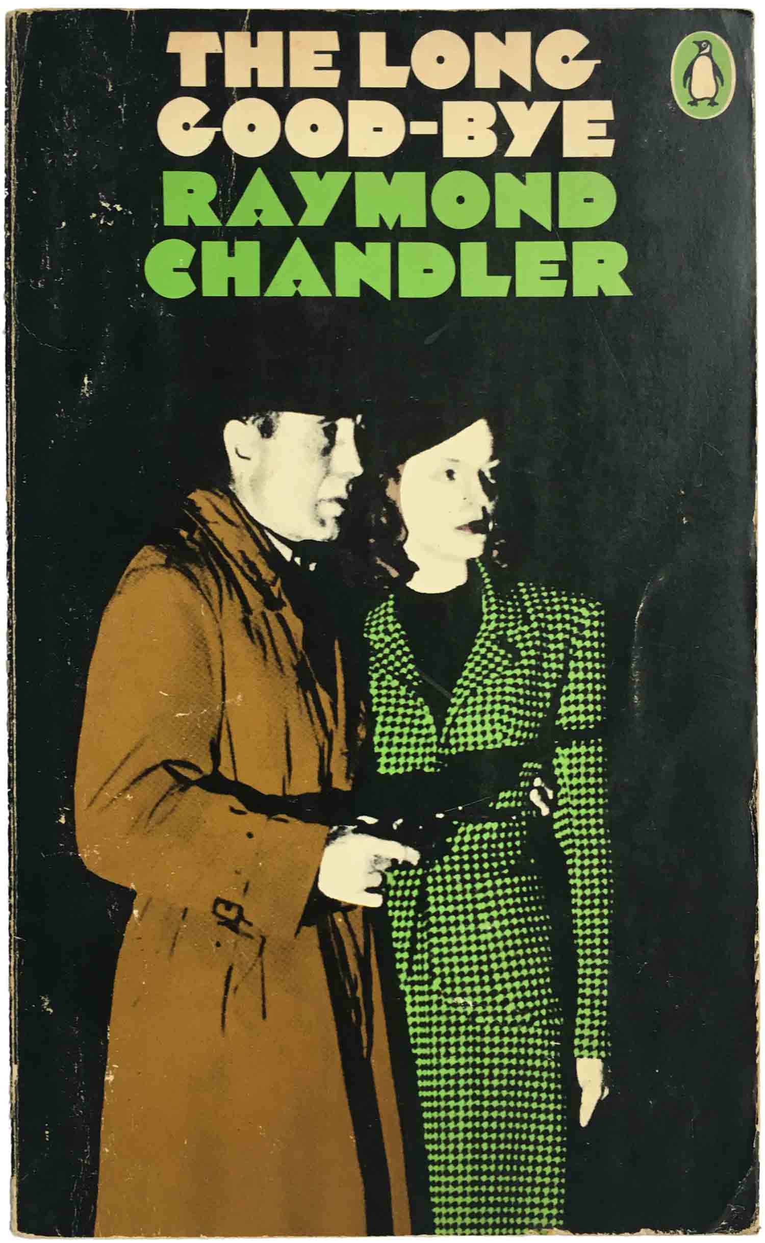
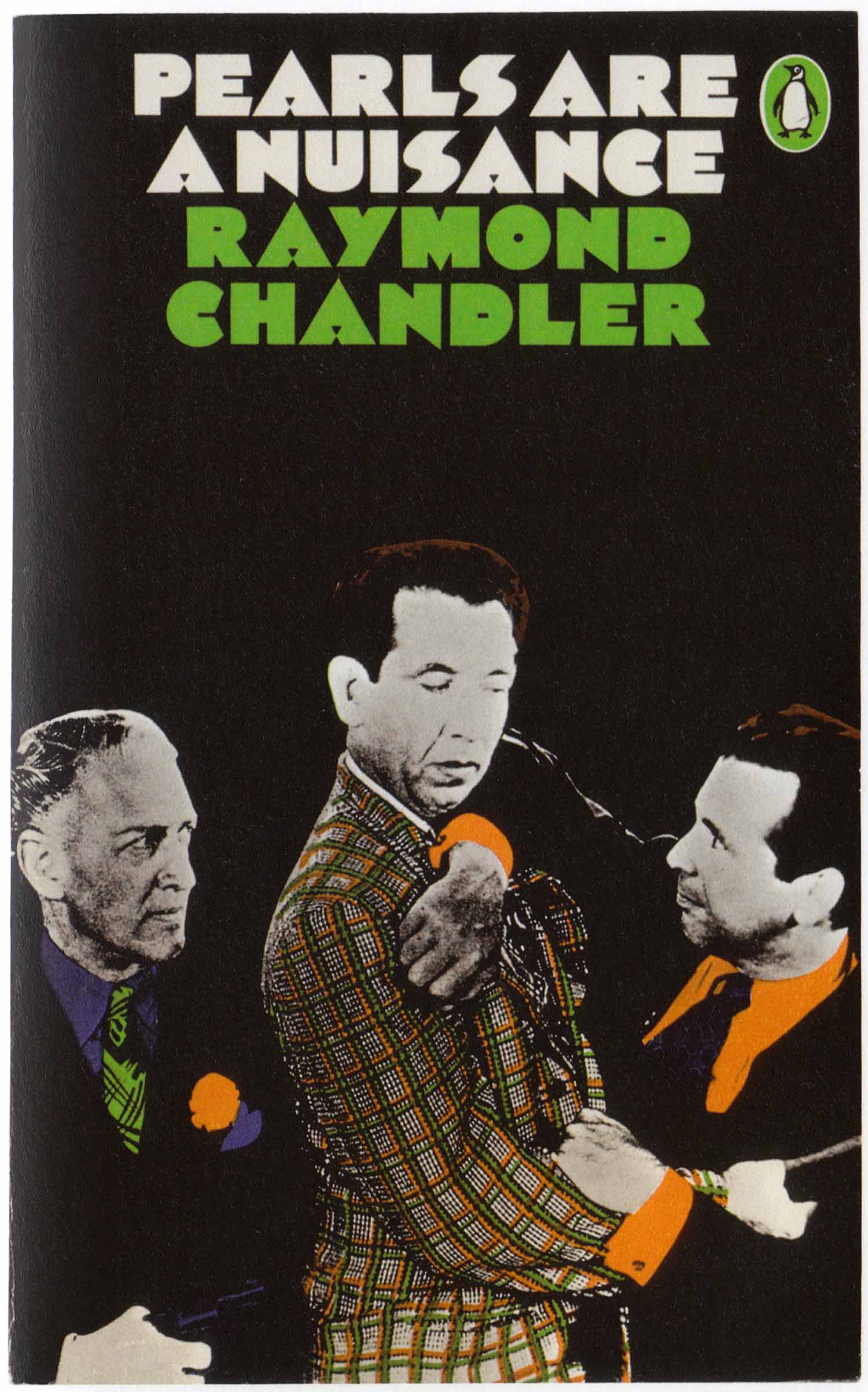
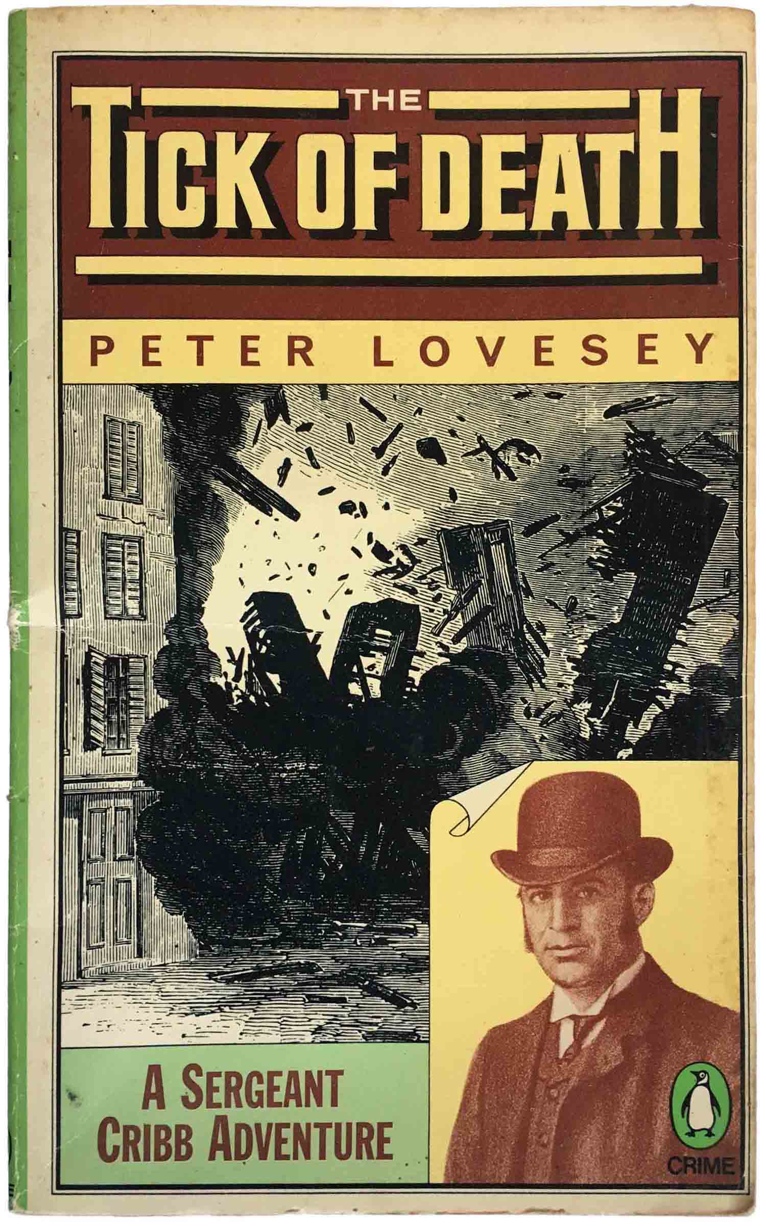
Raymond Chandler is a giant of the crime genre, and his books were massively popular in Penguin editions. You can see in the bibliography below that some of these covers are for the 7th, 8th, or 9th printings, and each printing was a likely a minimum of 20,000 copies! International rights issues meant that none of the Marber grid period editions were ever available for sale in the US—this is true of what appears to be true for about 70% of the Penguin crime list at the time because rights had been sold to different American publishers. Because of this, very few of the Chandler books (and many others) are quite hard to find in the States, and I had to pick up a lot of mine on trips to London or other parts of the British Commonwealth. My favorite is for Trouble is My Business, once again designed by John Sewell. For some reason the Chandler covers you do see kicking around used bookstores here are the later covers by James Tormey and based on films of the books. They’re alright, but I much prefer the earlier ones.
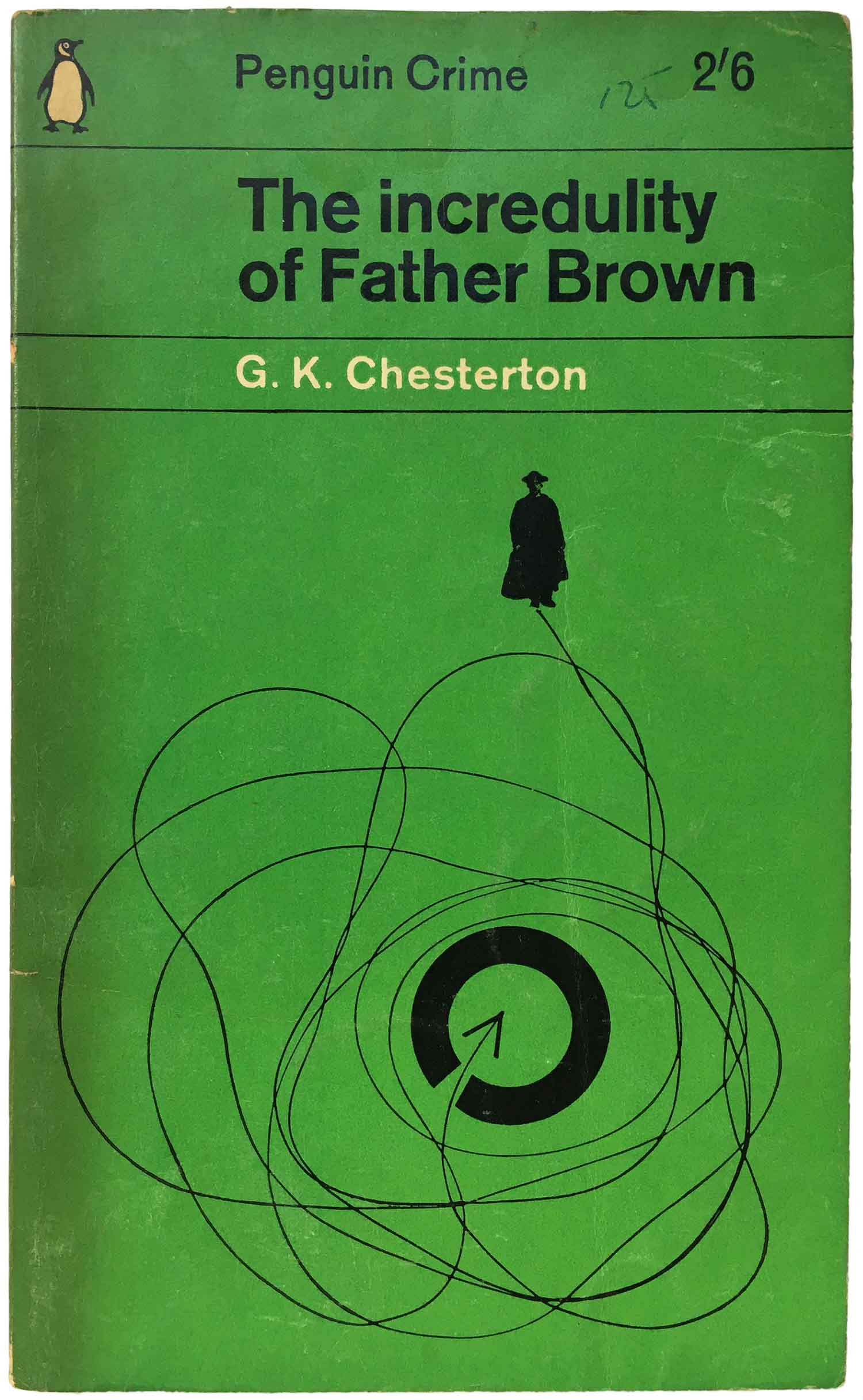
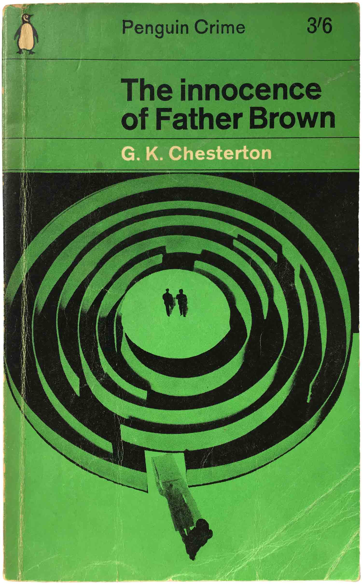
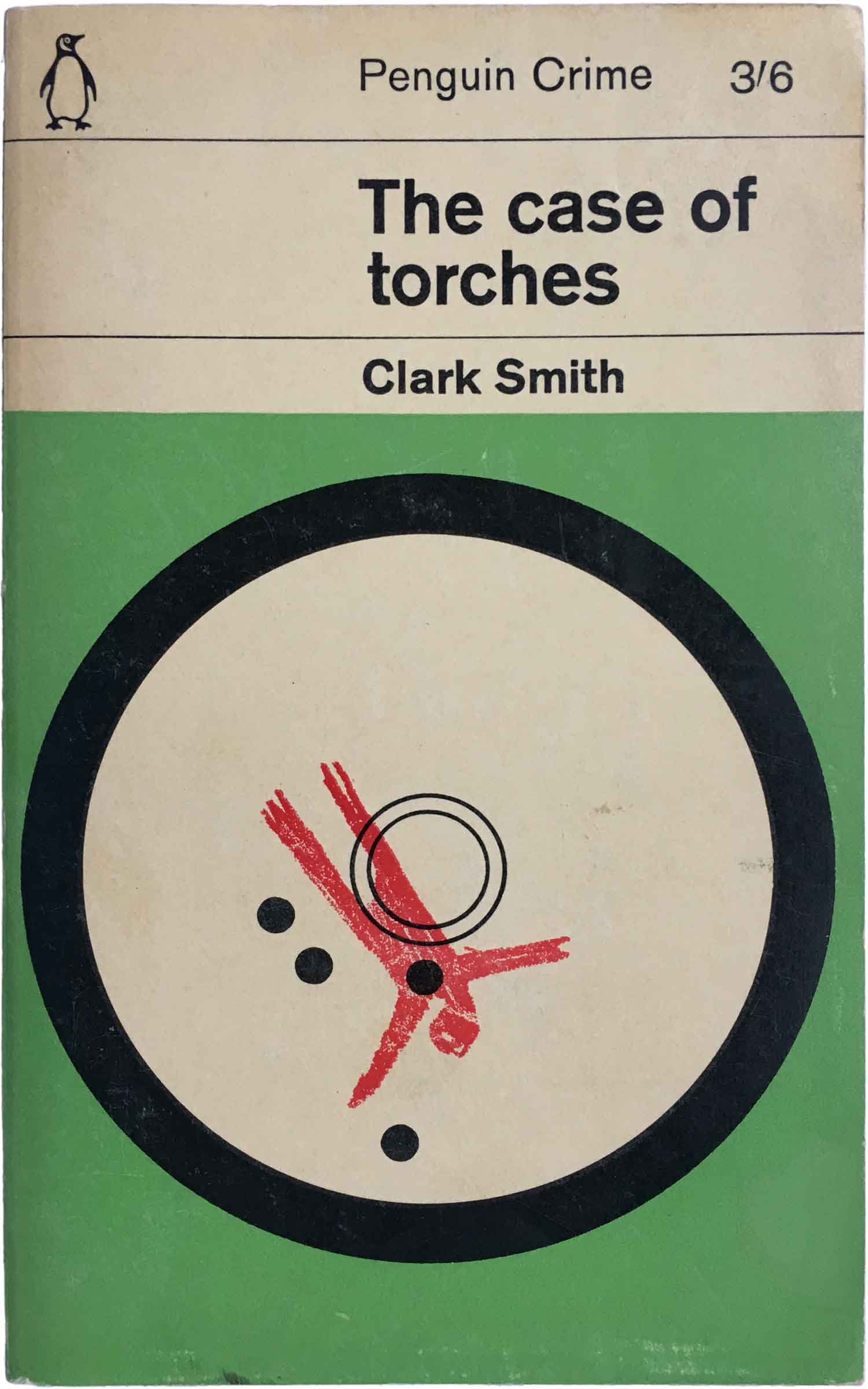
Although I’m not a big fan of G.K. Chesterton (outside of the really enjoyable proto-psychedelic, anarchist-fear-mongering The Man Who Was Thursday), the covers that Romek Marber designed for this period are fabulous! I’ve only tracked down a couple, but there are more out there. They always involve some sort of maze, a nice marker of the sub-series.
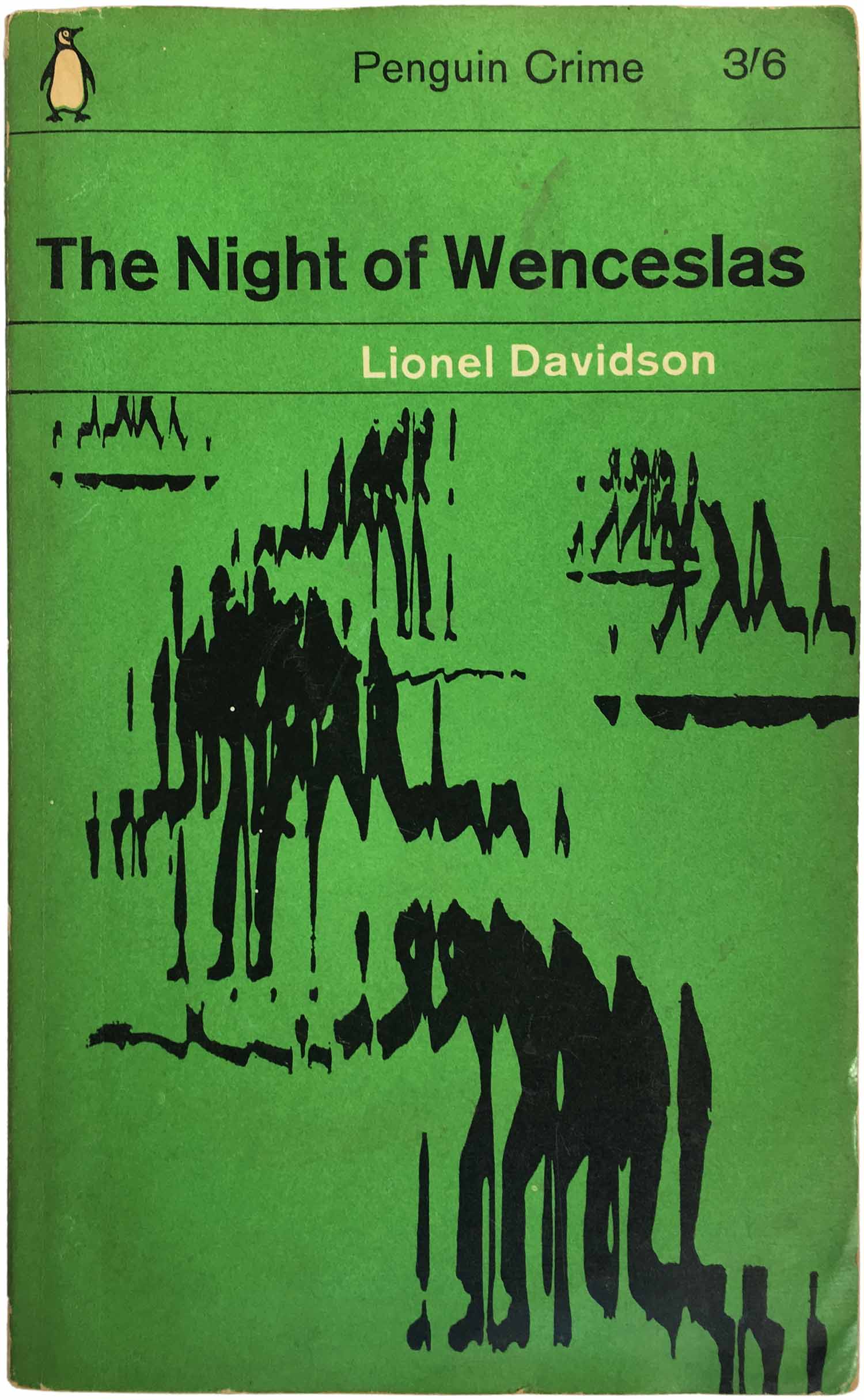
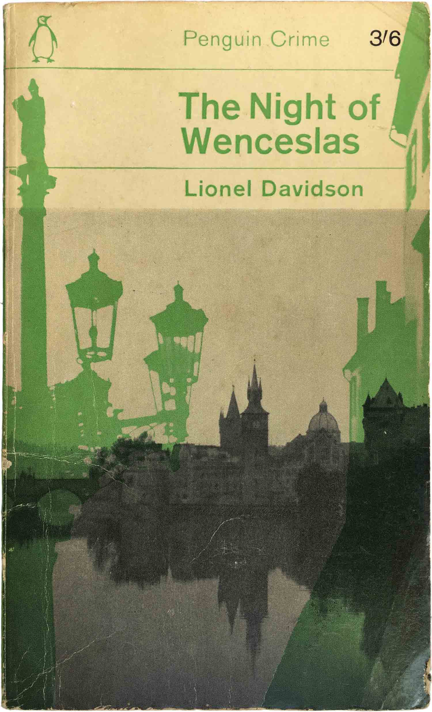
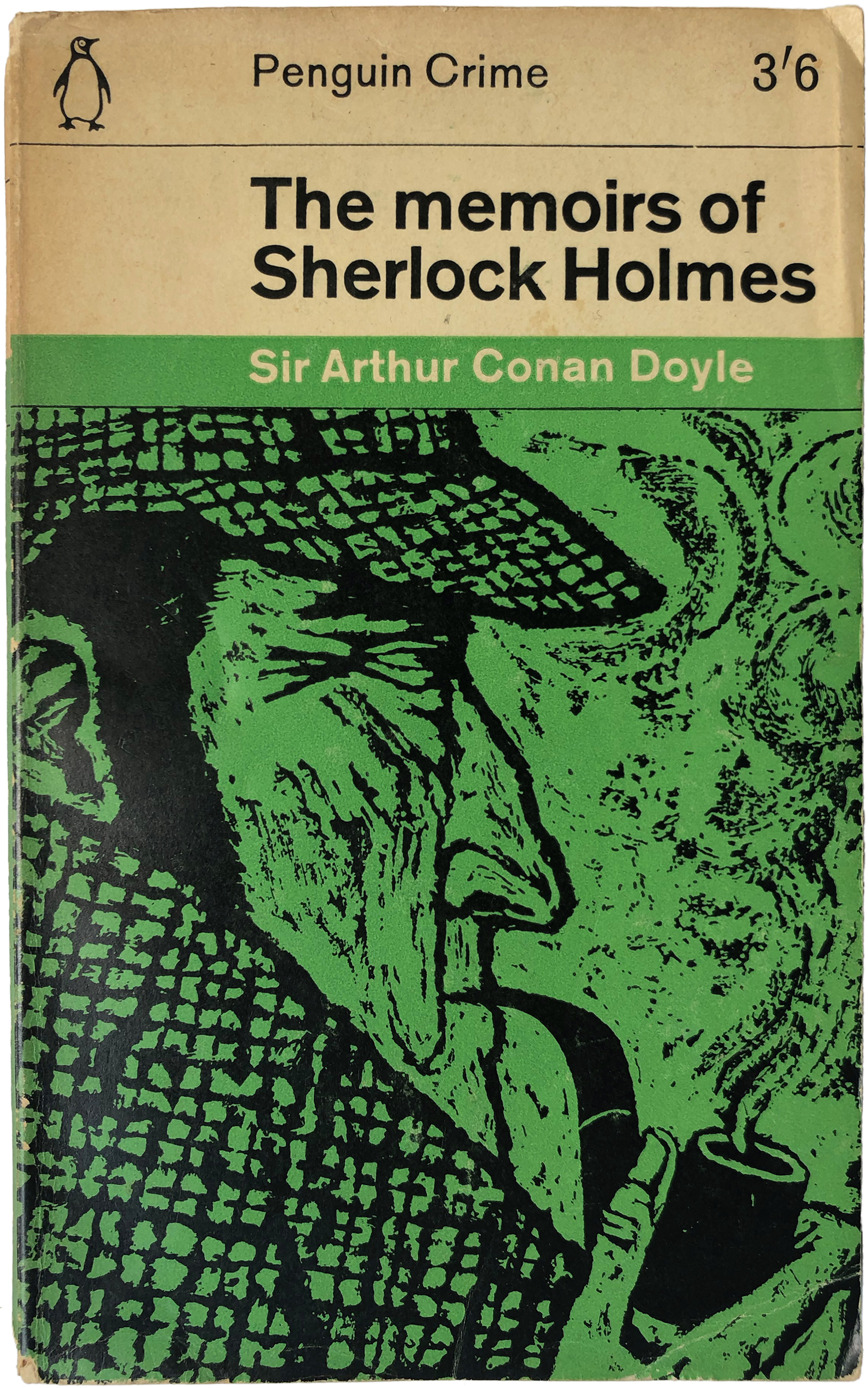
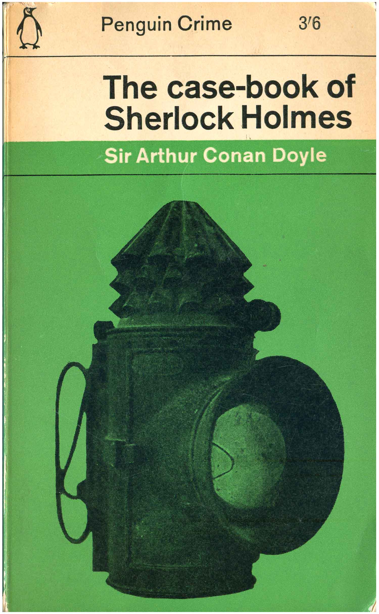
The two different printings of Night of the Wenceslas below—designed two years apart—are a nice illustration of the adaptability of the grid. The first (to the left) is a more “classic” green Penguin, with its dominant coloring and contained illustration. The second (on the right) really plays with the series conventions, using green as a spot color rather than the controlling one, and giving a real sense of depth absent from a lot of the earlier covers. It’s also nice to see a book covered with such different designs, both attractive and strong in their own right. And below that are three more great covers, and a nice spread to show the diversity designers played with within the logic of the overall structure. The first is a play with foreground and back, the second uses a powerful and rough illustration to capitivate the viewer, and last is one of my favs of the series, the deceptively simple cover of The case-book of Sherlock Holmes .
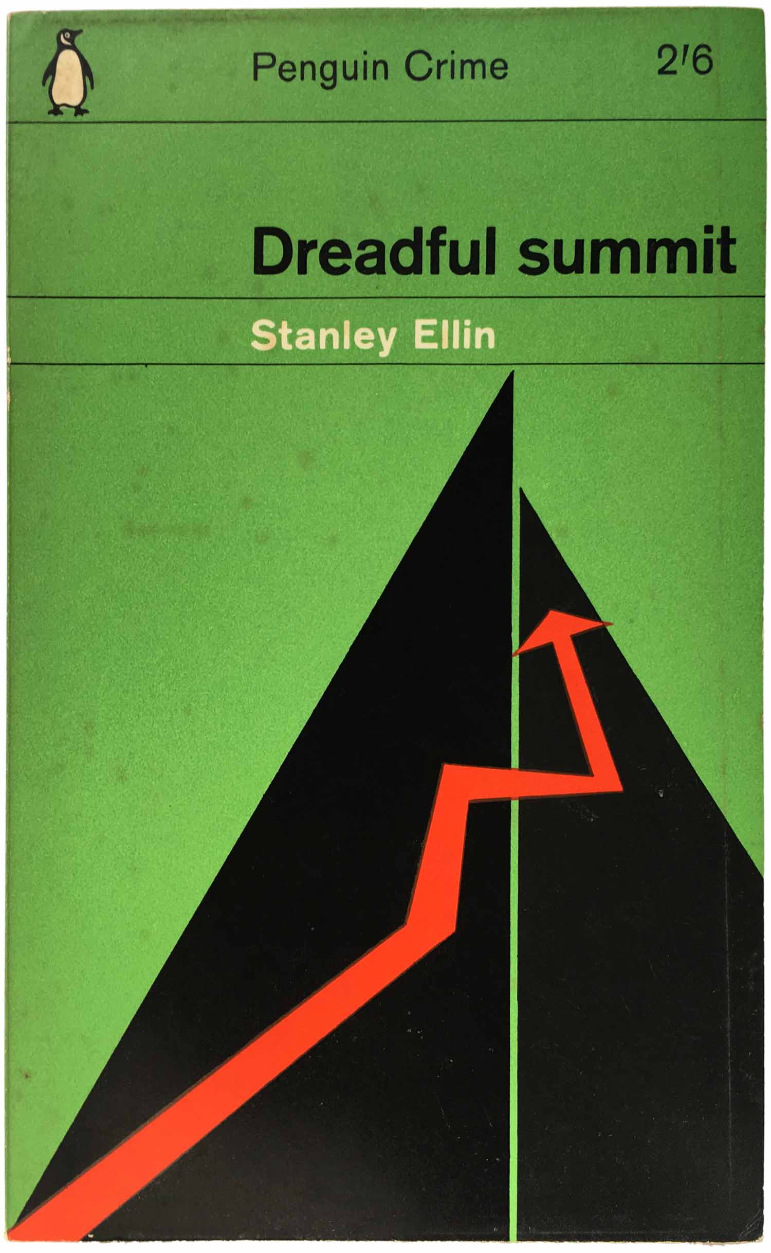
The cover below left is one of the classics of this series, Germano Facetti’s Dreadful Summit design, an exercise in Modernist design perfection. Three shapes, the intervention of red on the black and green field—Facetti shows that that is really all you need to make a profoundly powerful cover.
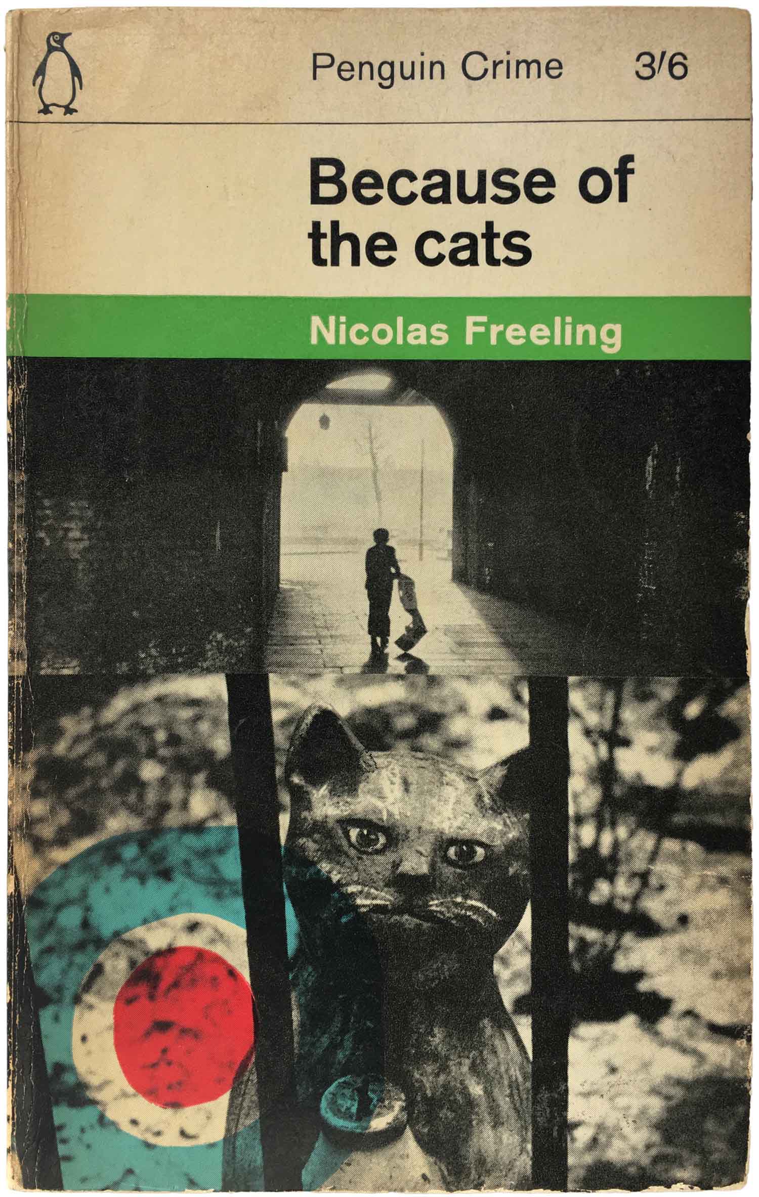
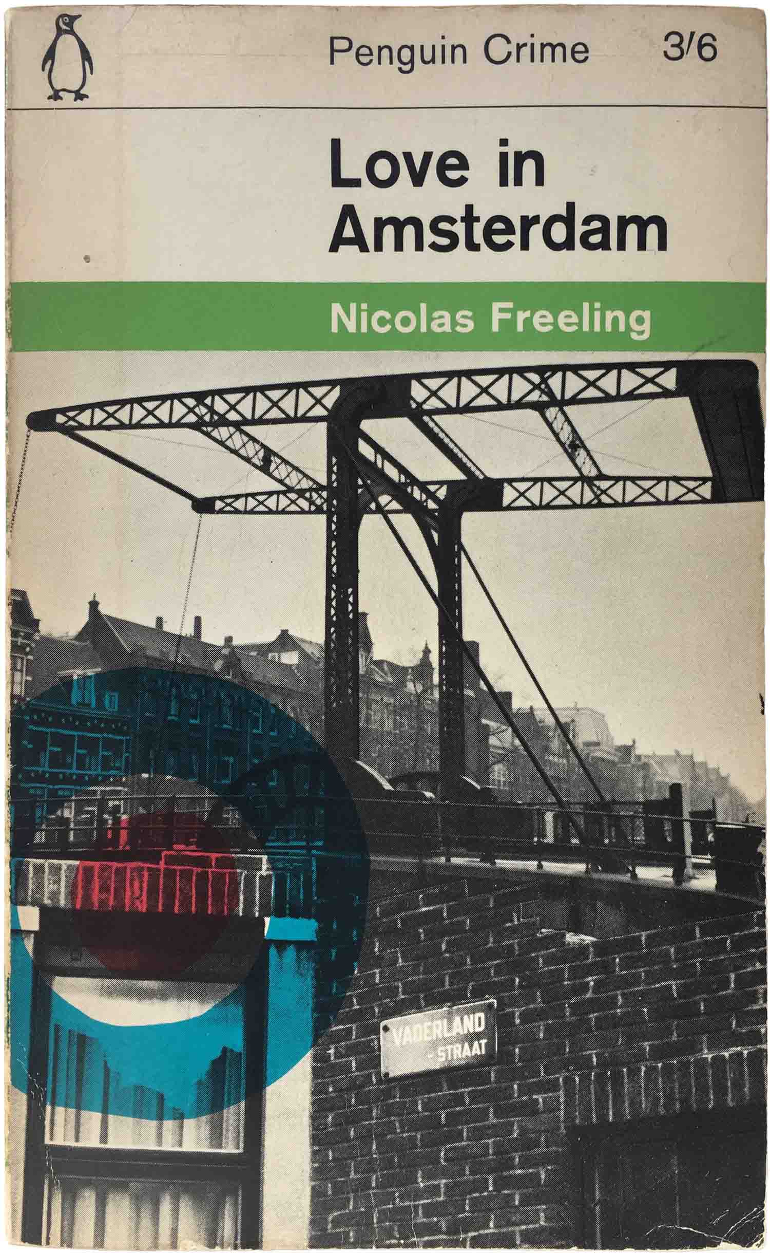
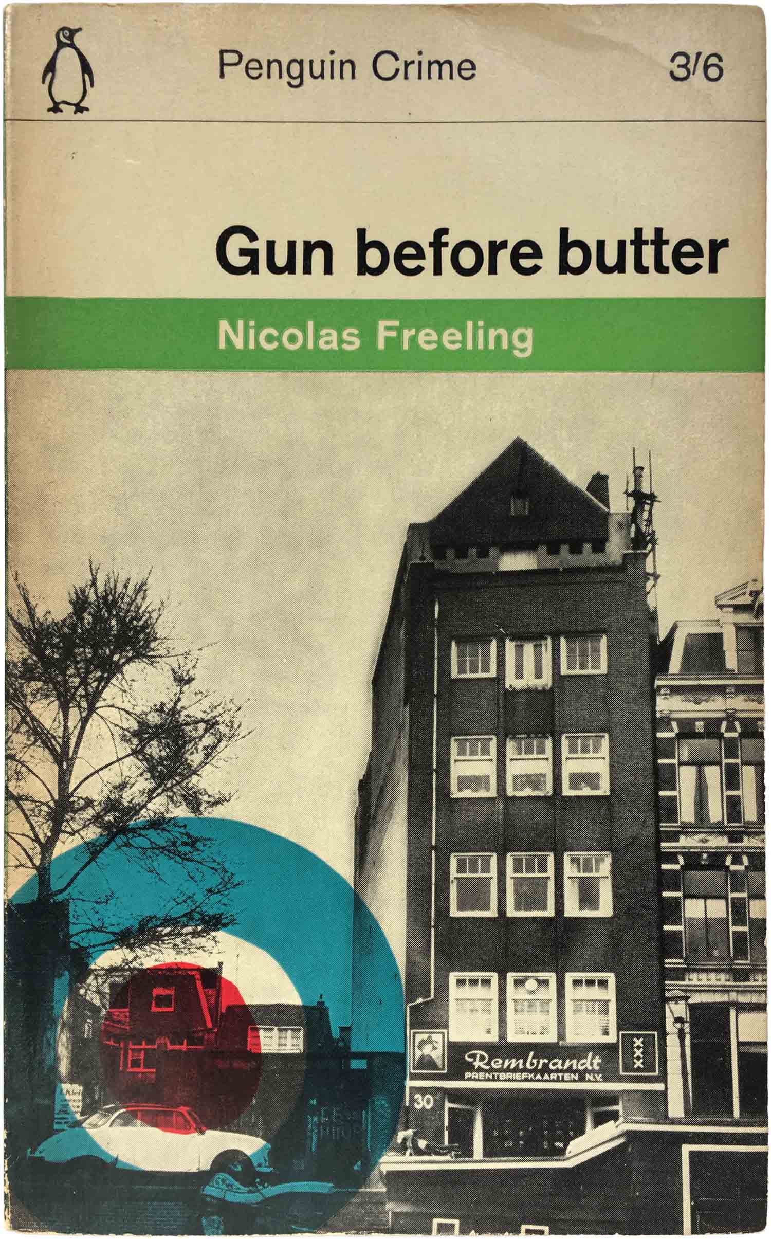
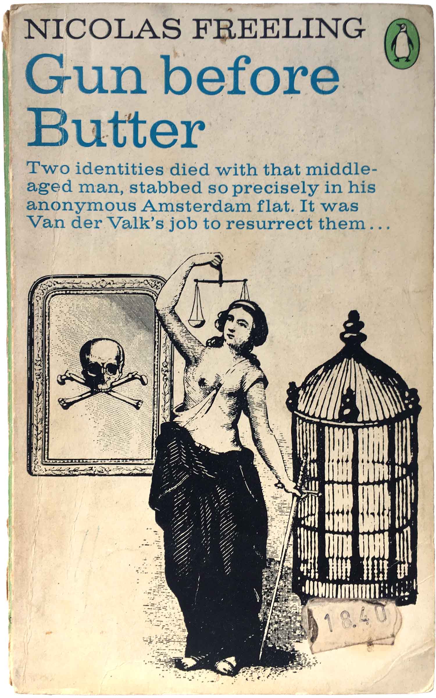
Below that are a handful of Nicolas Freeling novels, the initial three a nice set which utilizes the introduction of a forth spot color to make the red and blue bullseye on each cover. Overall the photos themselves seem unlikely to hold someones attention, so the added graphic element is a necessary and effective addition. The last cover (and second of Guns Before Butter) is from the late 60s design evolution discussed with the Allingham titles. Although it’s fine, to my eye its far inferior to the other three design (all by Denise York).
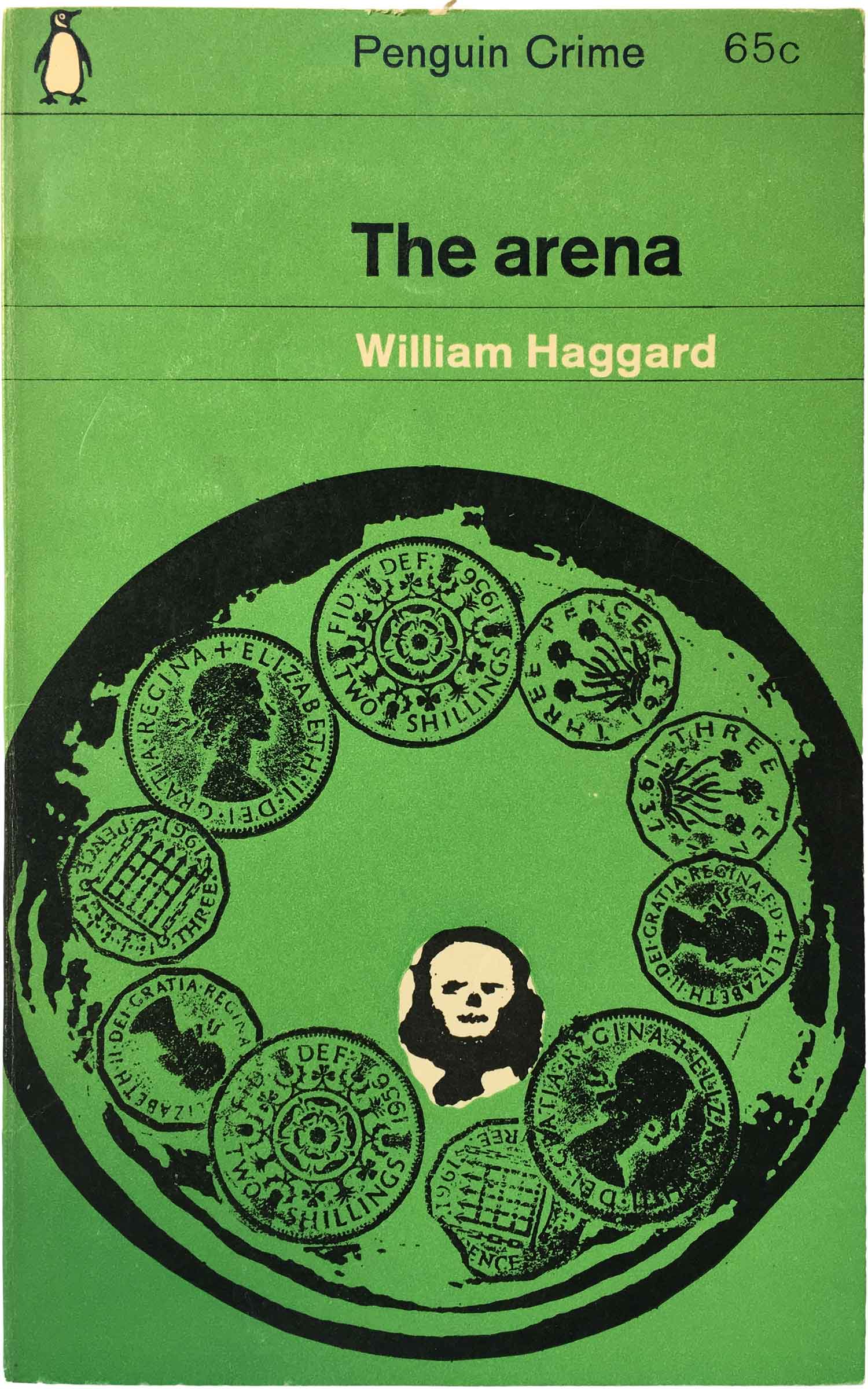
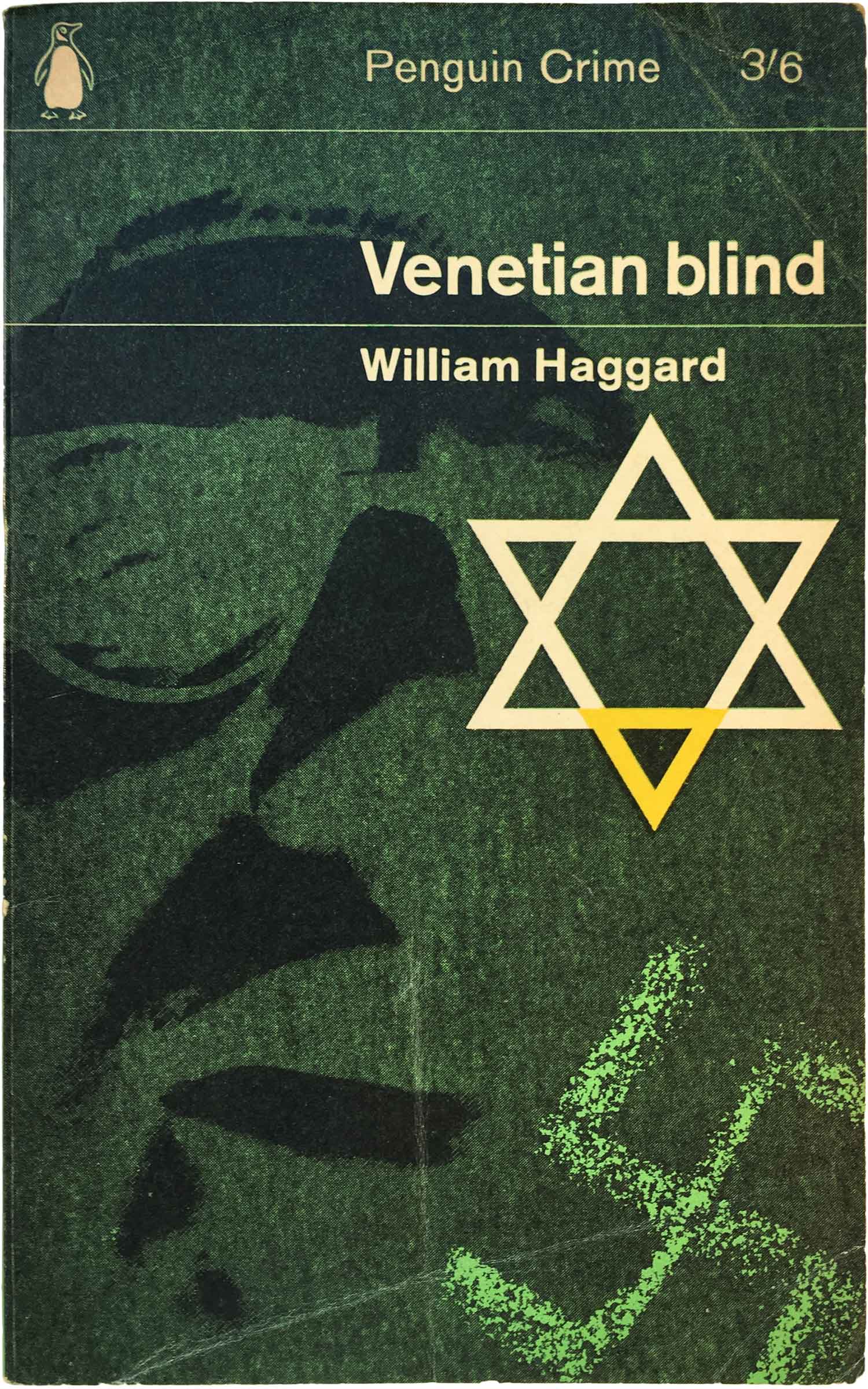
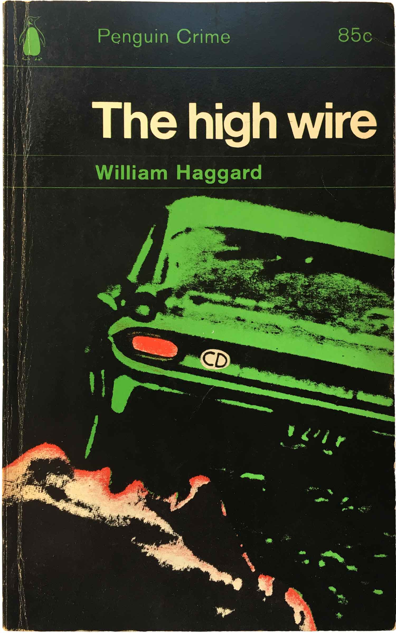
These four William Haggard novels show another nice range of different variations on the series design. Unlike some authors, there isn’t much that tie these together, instead they are interesting because of their diversity. They use three different spot colors, and while the first two are relatively staid, the 2nd couple really push the grid, with overwhelmingly dark colors that spill well beyond the defined illustration area at the bottom of the covers.

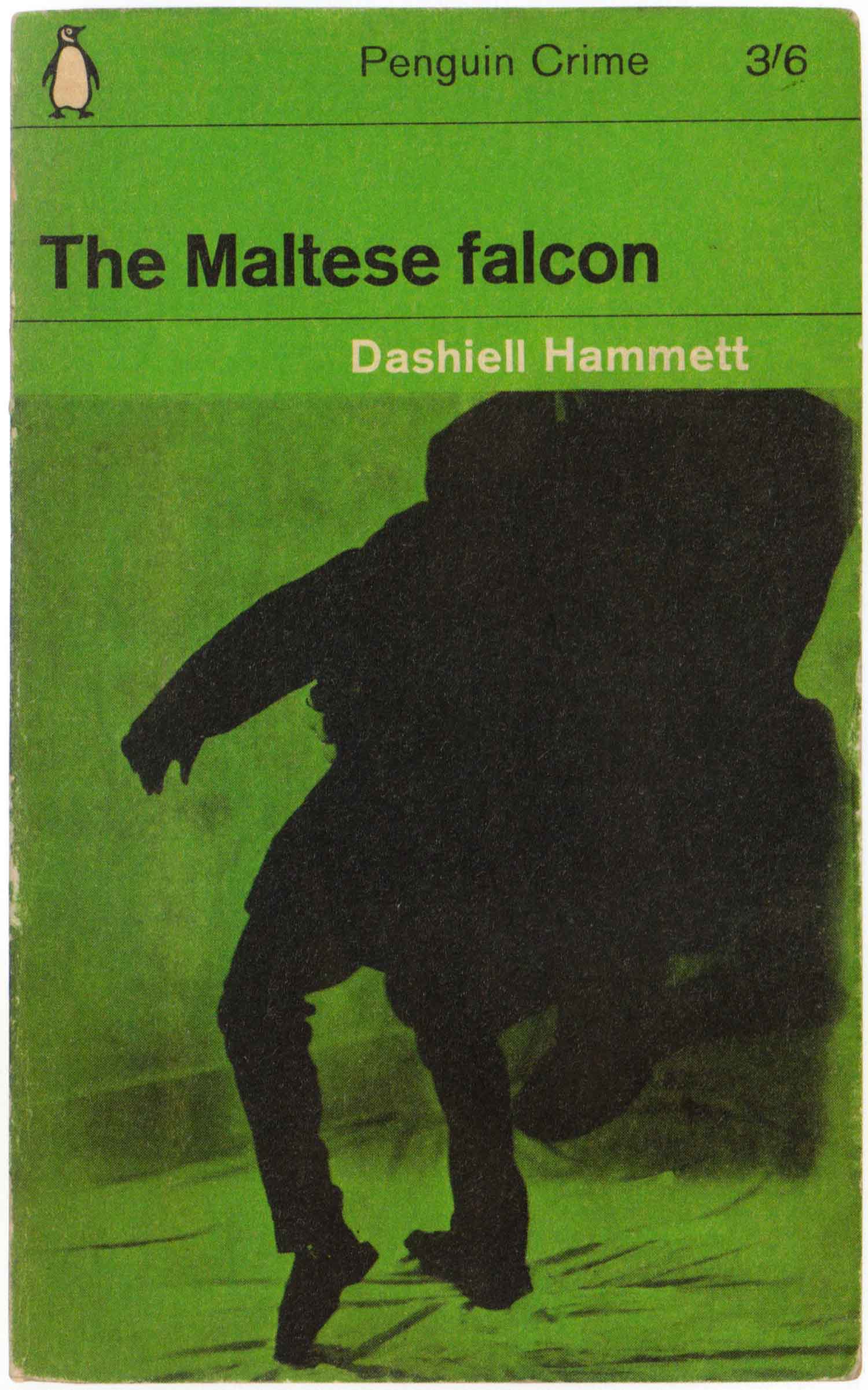
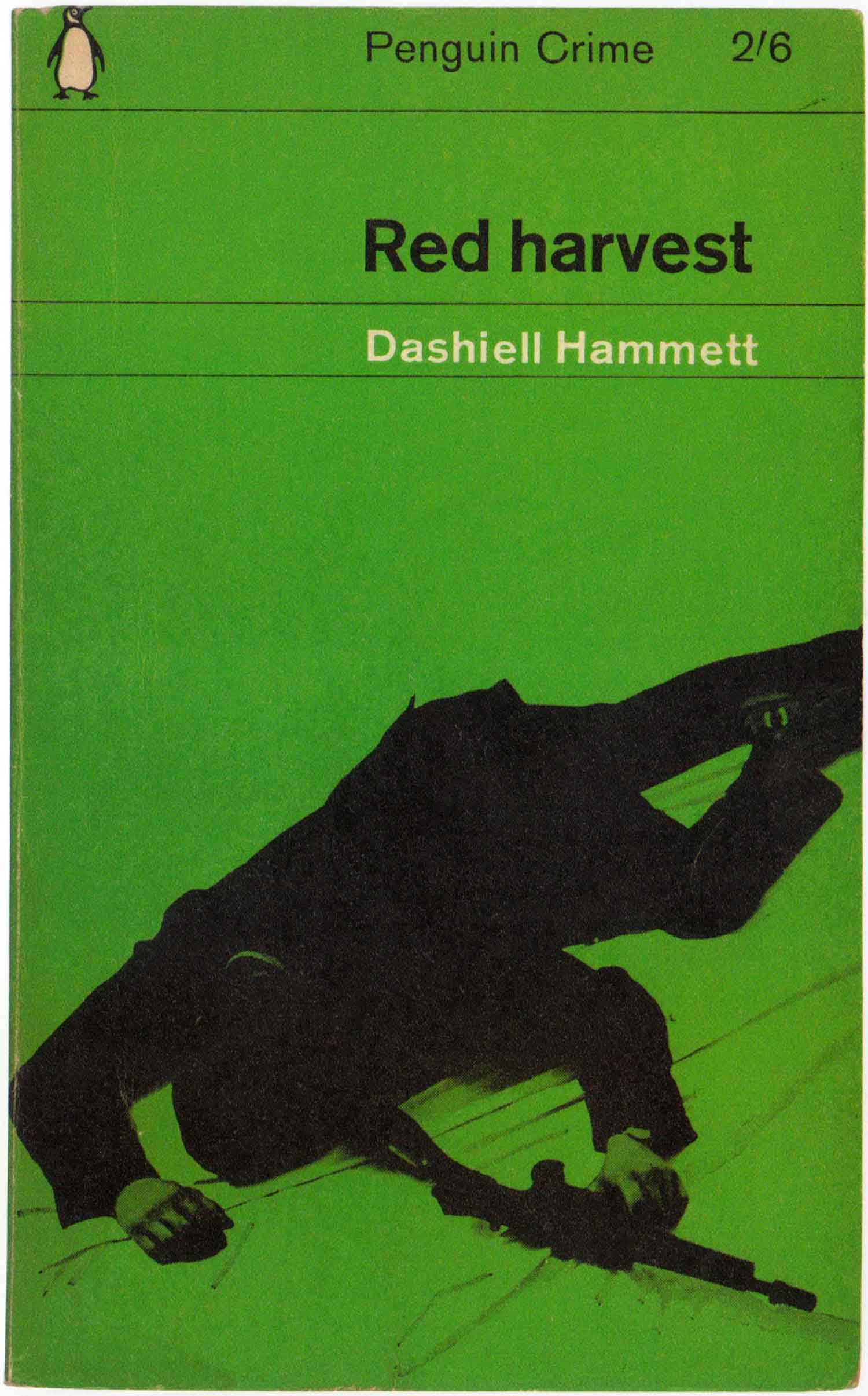
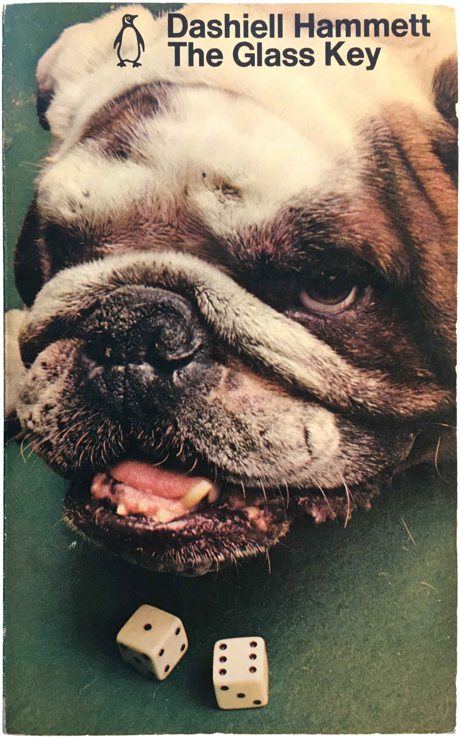
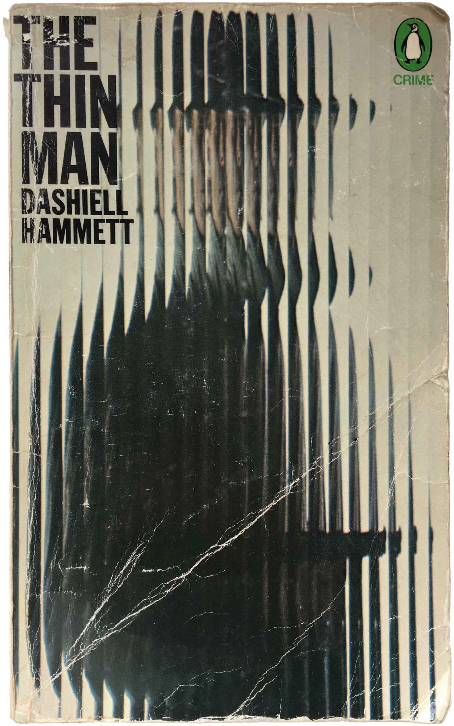
Like Chandler, Dashiell Hammett is one of the greats of American crime (and the true grandfather of the politicized or “social” crime novel, in particular). Penguin didn’t have the US rights to his books in the 60s and 70s, so very few of these circulate over here. The earlier designs (by Romek Marber) are really cool, and they all share some sort of attack or transgression on a shadowed figure. The later ones are far more scattershot, the bisected glass of the Thin Man is a nice touch, but the bulldog on The Glass Key is too much, far more camp than noir.
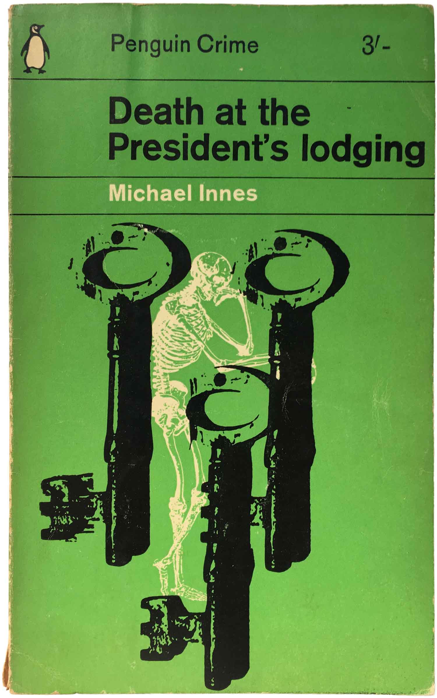
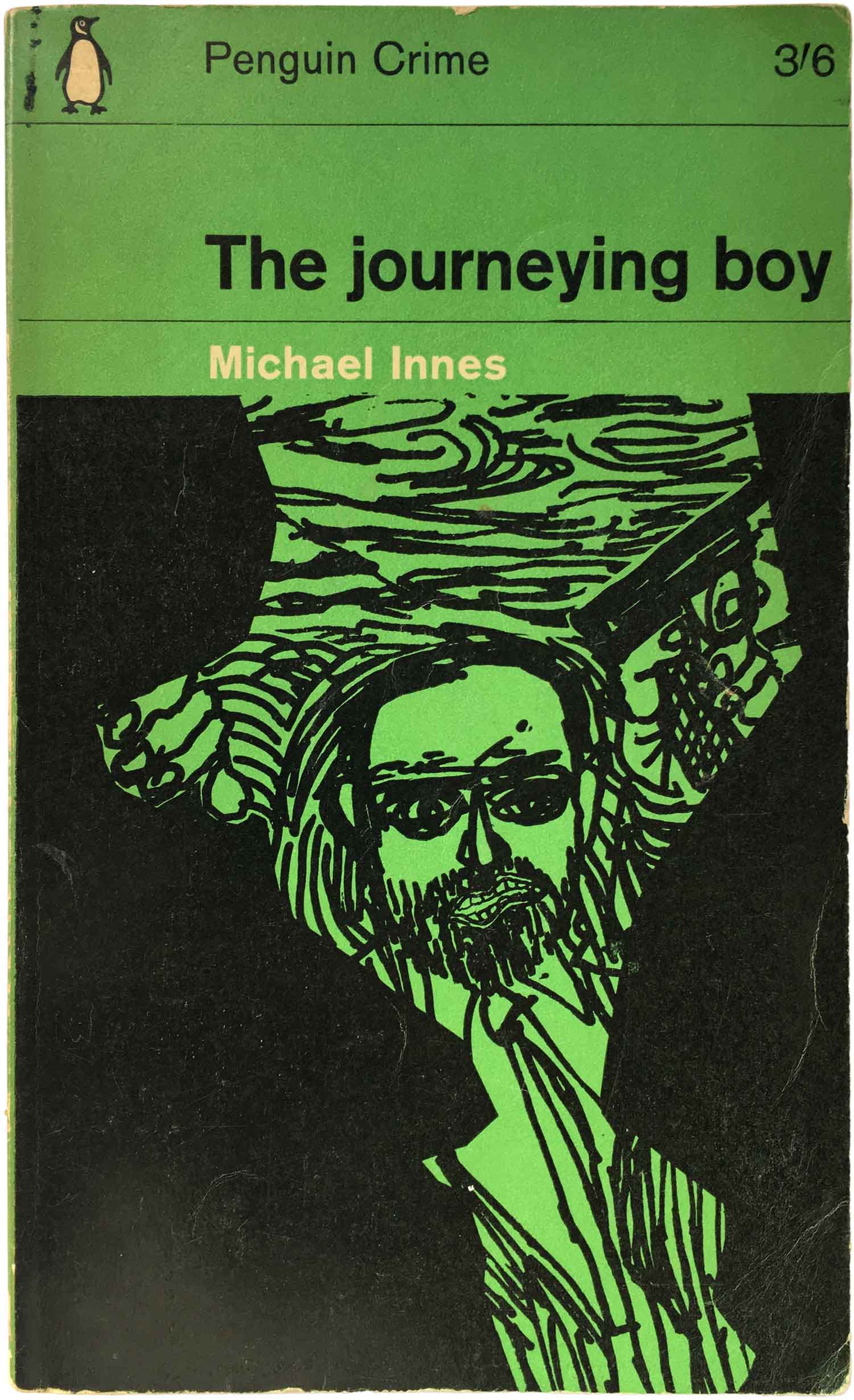
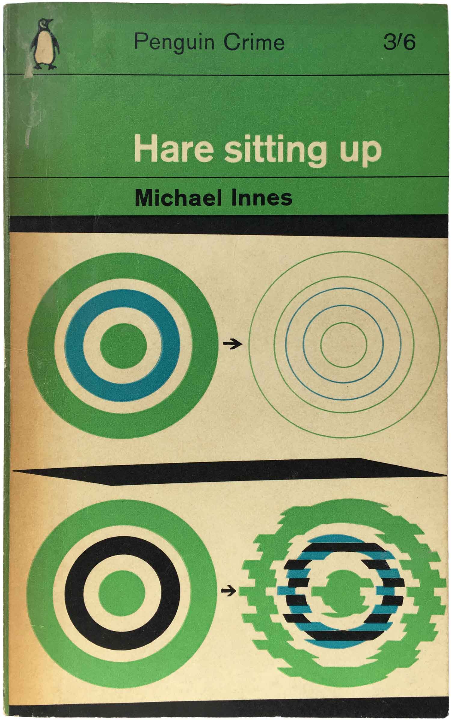
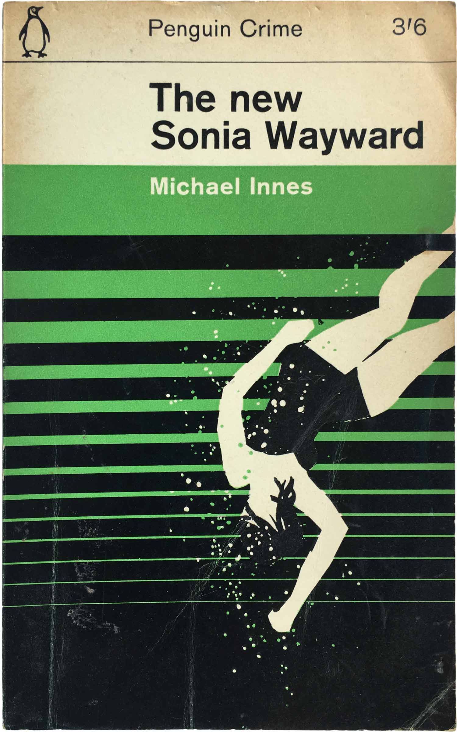
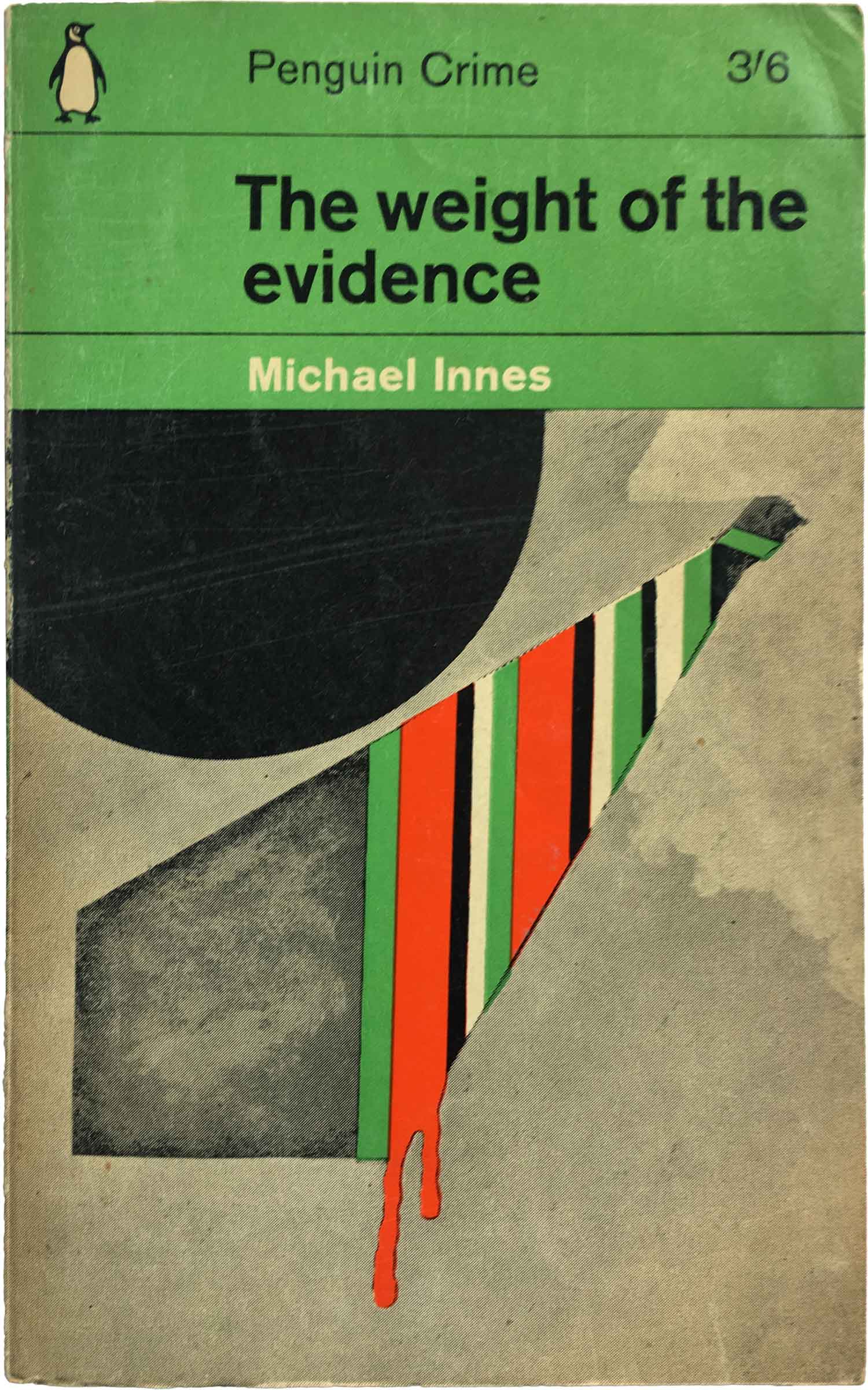
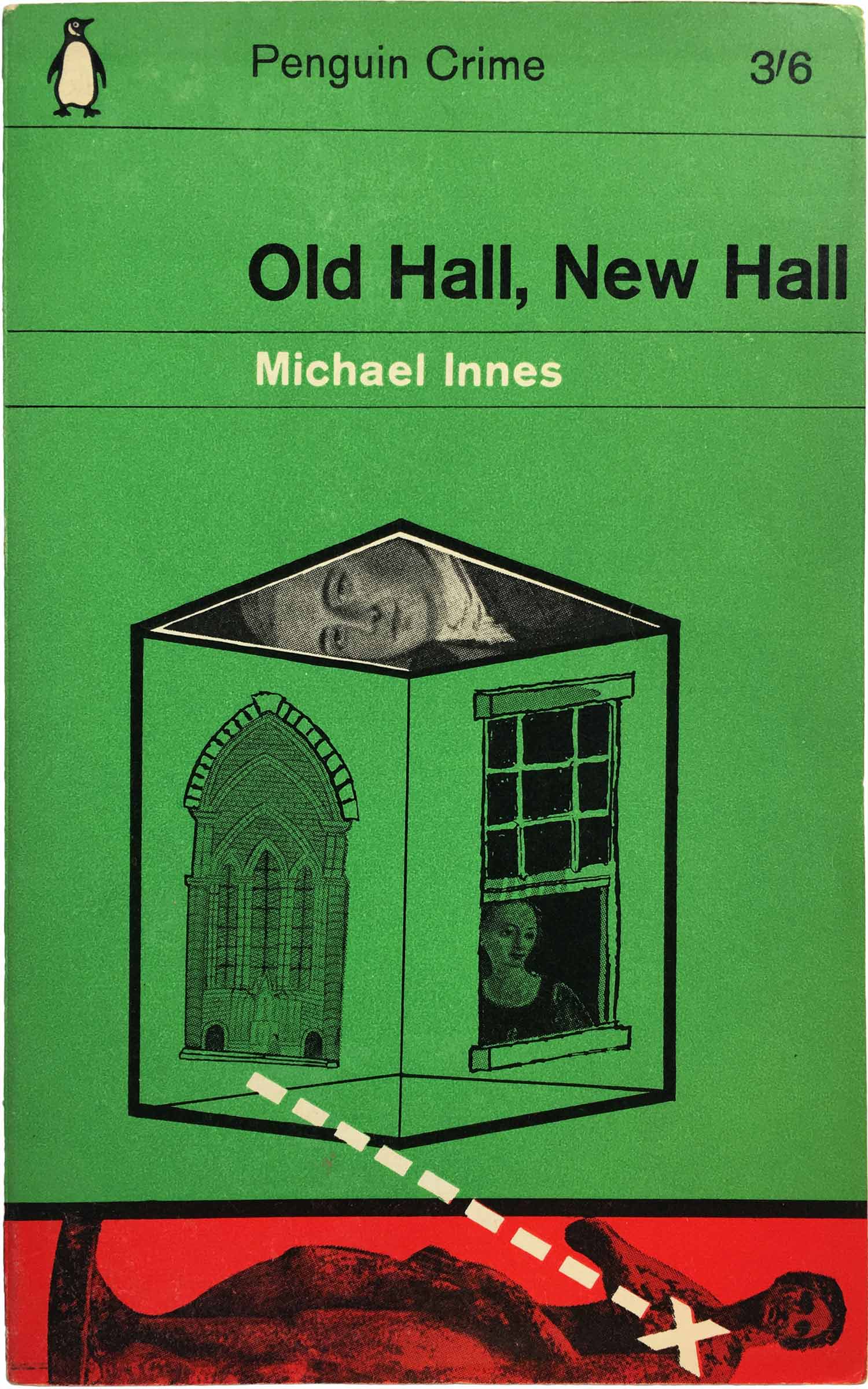
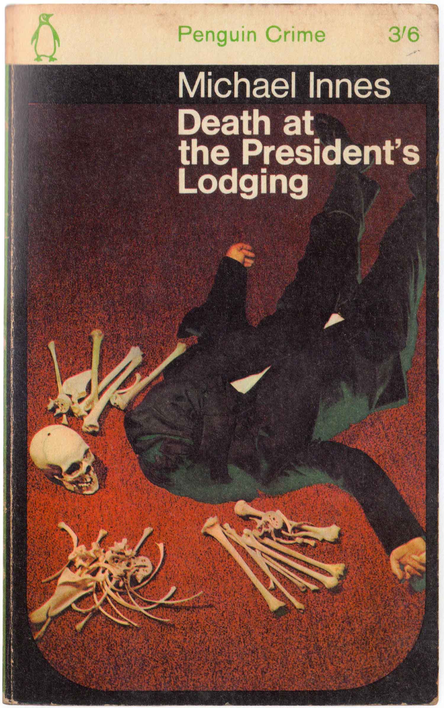
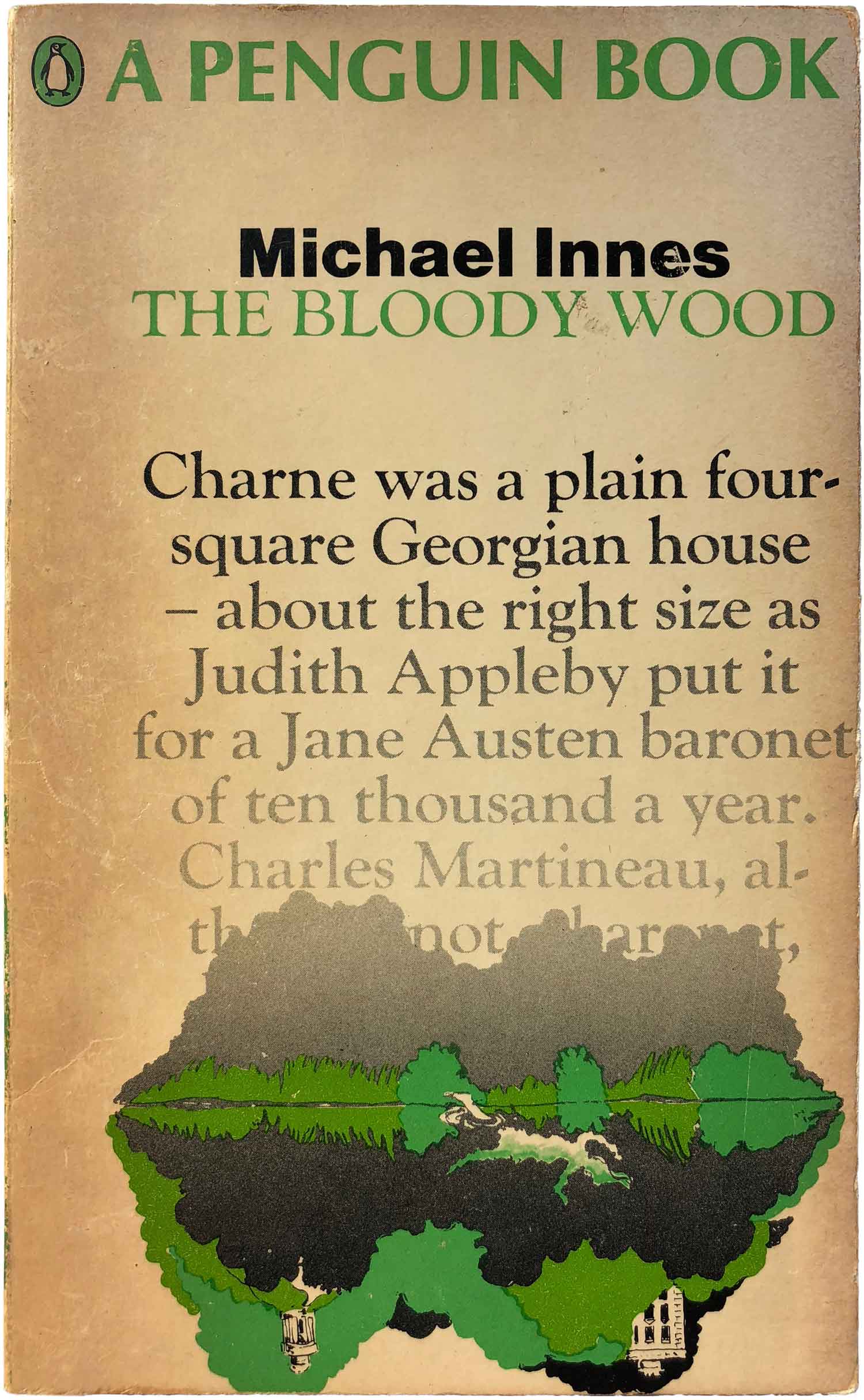
Michael Innes is one of Penguin’s premier crime writers. Scottish, he wrote over fifty novels, but I’ve never actually read one. But because he was so prolific, he’s a great case study in cover design. The eleven covers below are a really nice set, with some amazing standouts. I love the covers for Death at the President’s lodging, Hare sitting up, and The new Sonia Wayward. And the forth row shows how the grid loosening and eventual abandonment worked (A Night of Errors) for didn’t work (Silence Observed) for Innes.
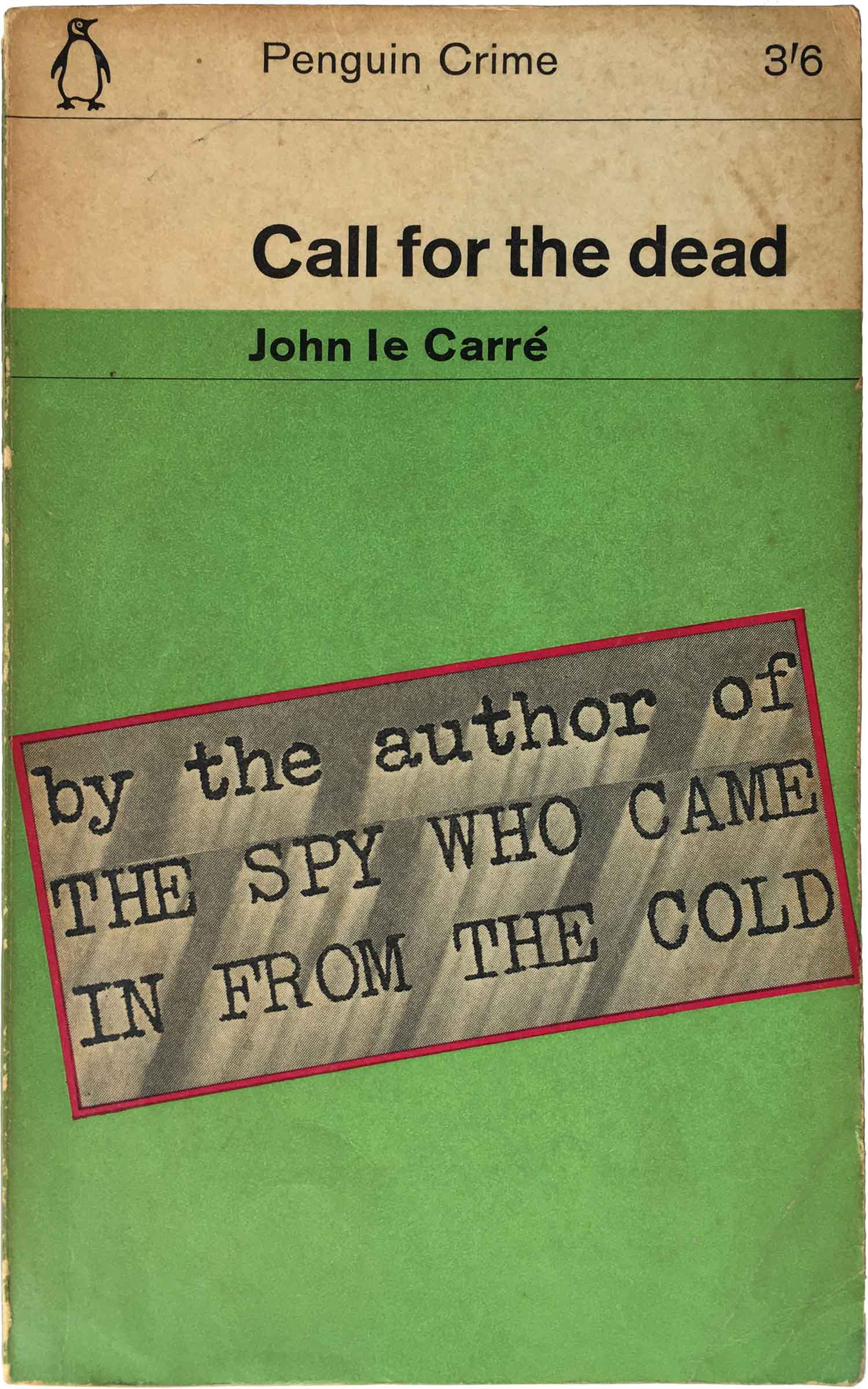
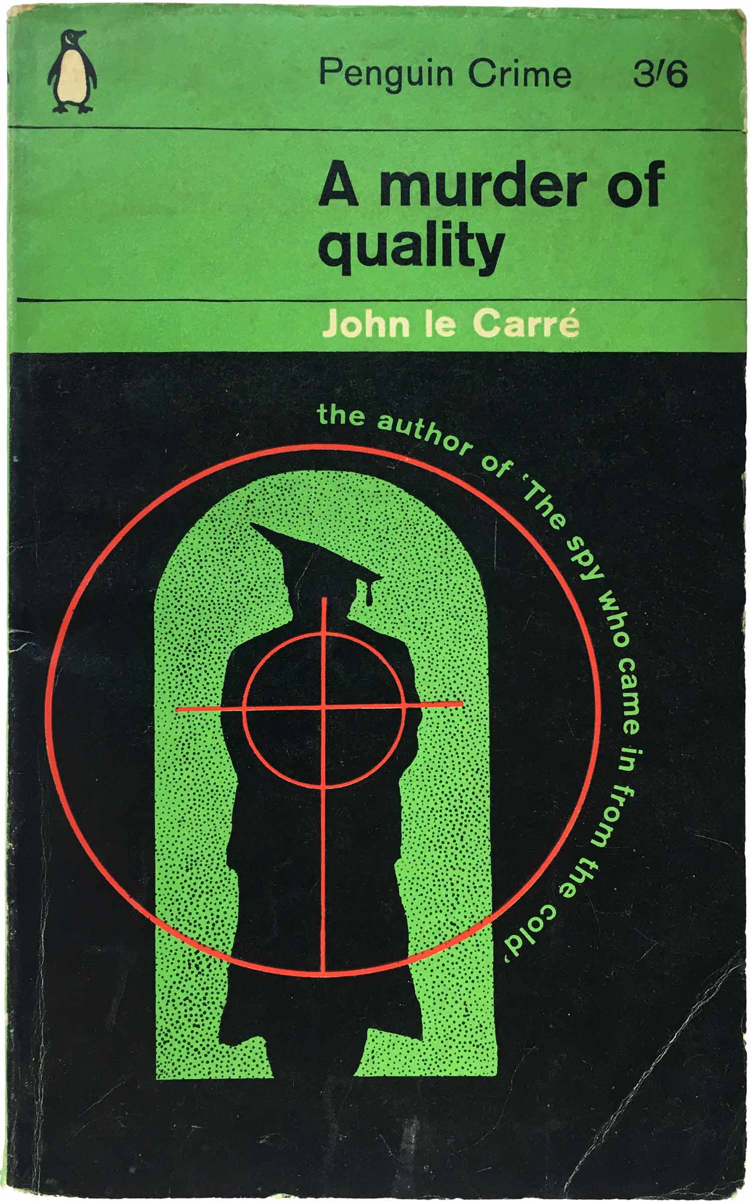
John le Carre really got the shaft when it came to Penguin covers during this period. Both of the ones I have are crap, and traffic on his name and previous titles rather than constructing anything compelling for the book in hand. I mean, geez, Call for the Dead features a “by the author of” statement that is bigger than the title for this book!
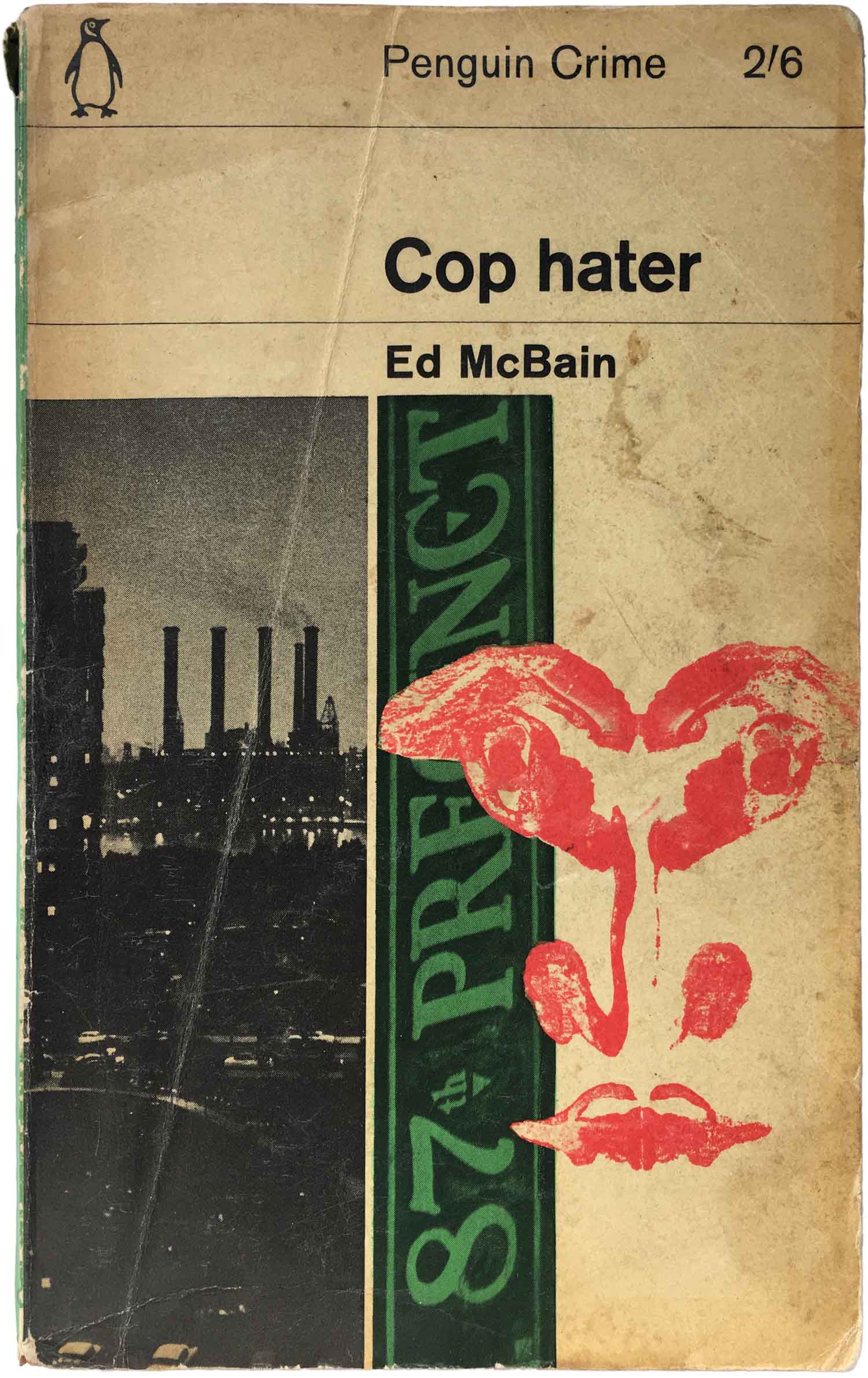
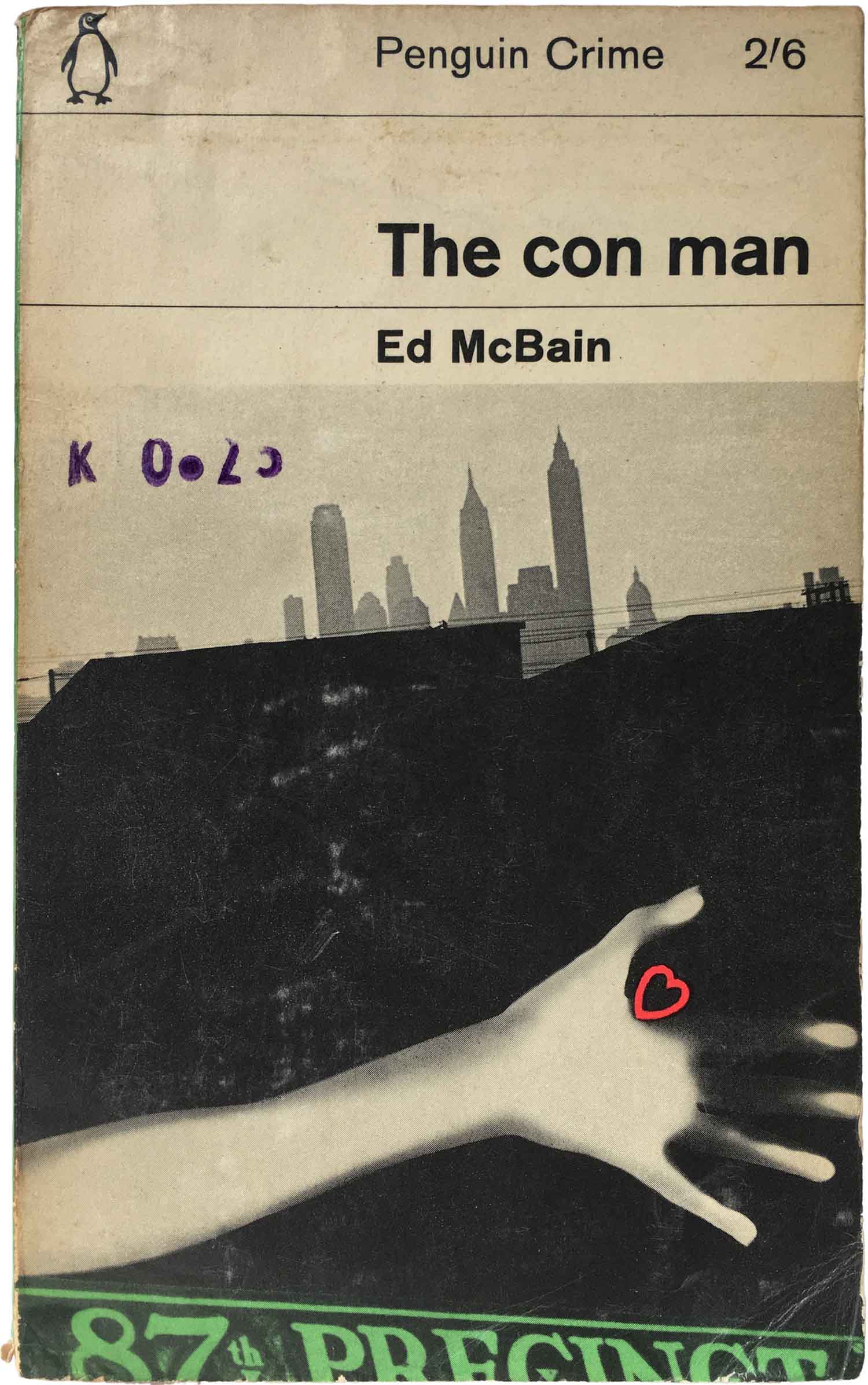
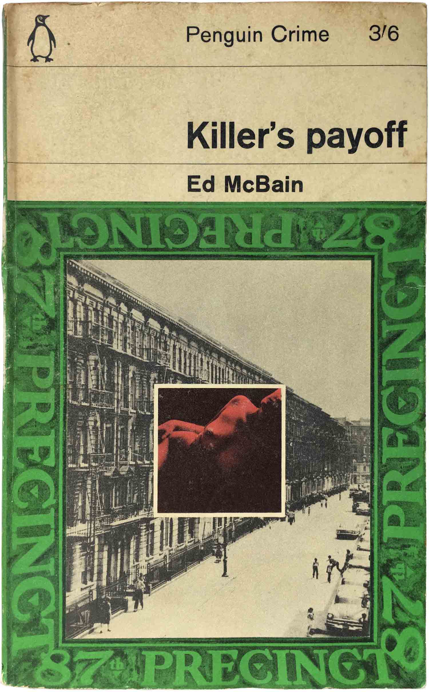
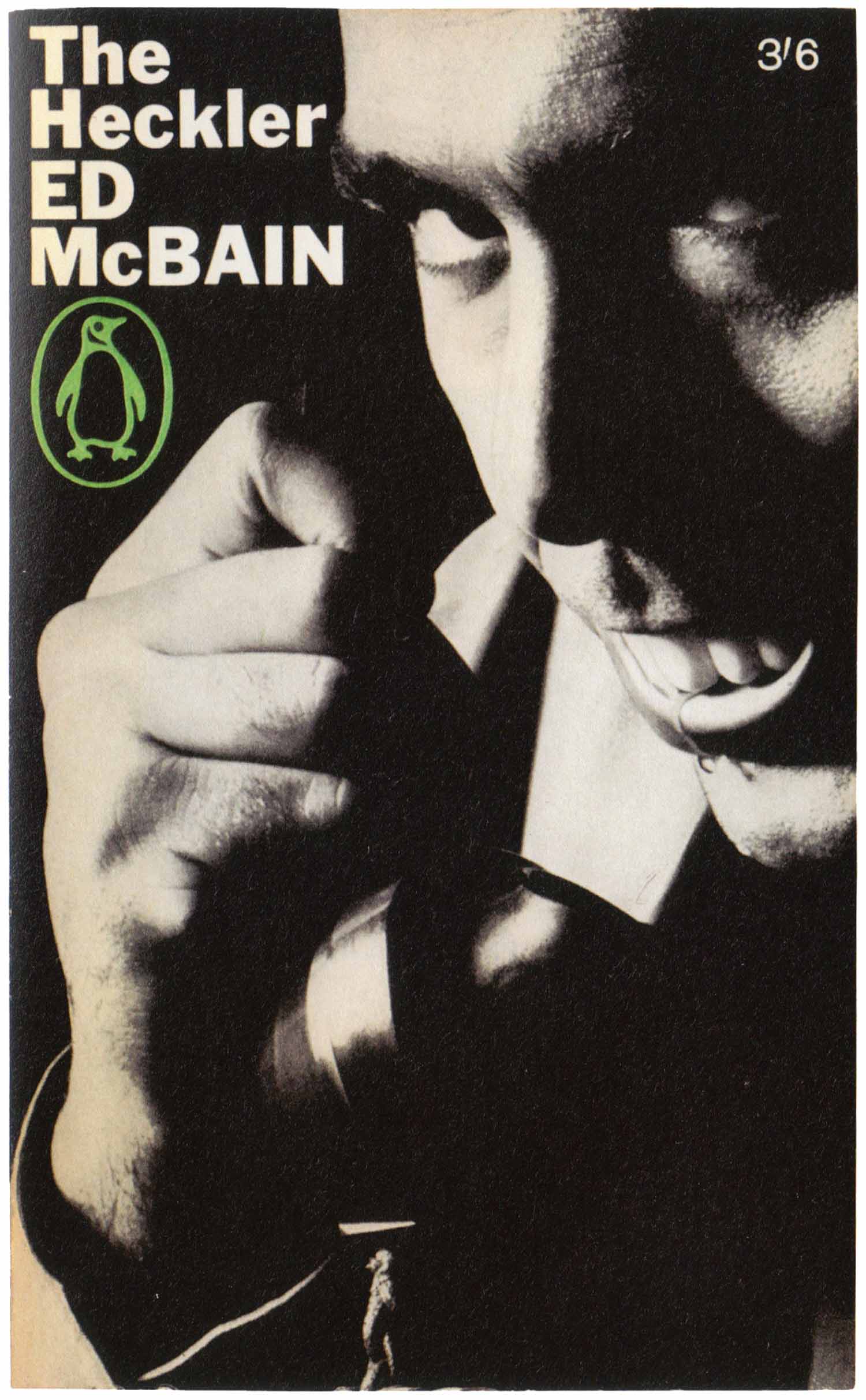
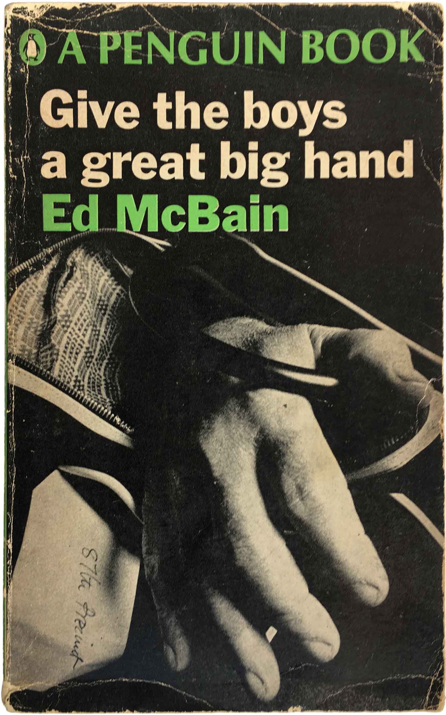
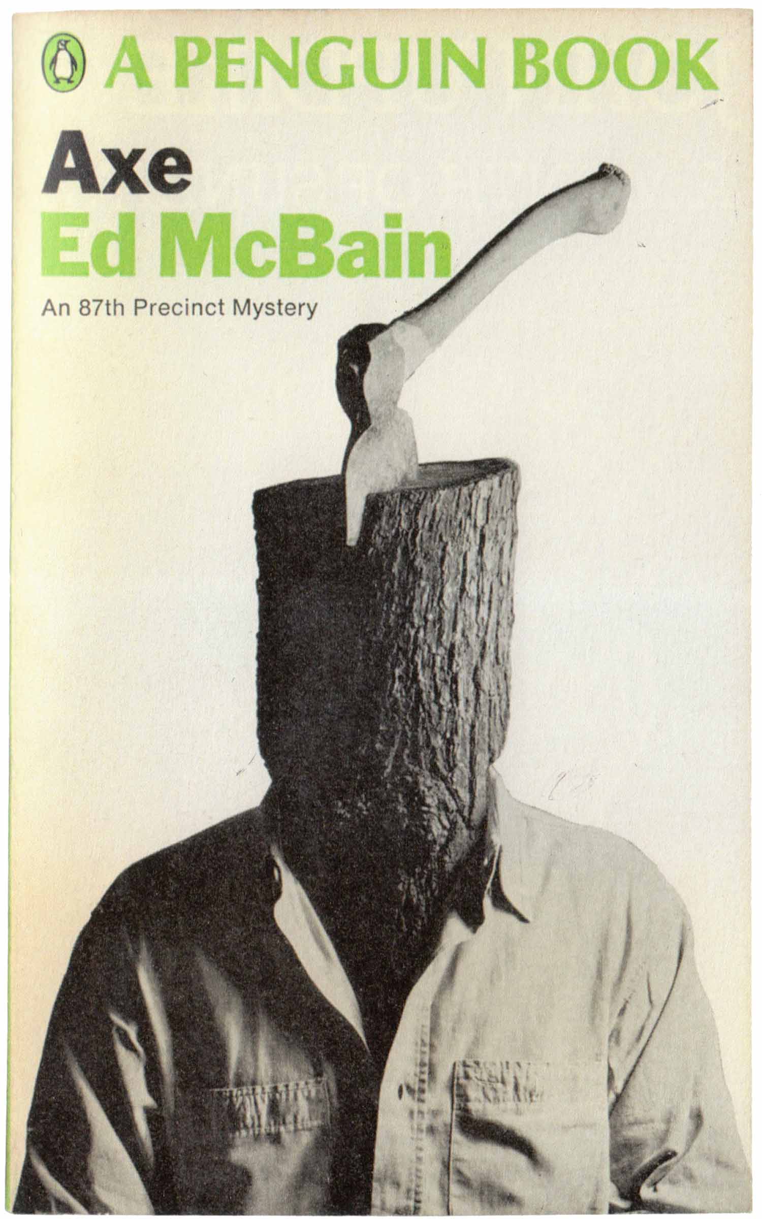
I think Ed McBain is one of the few authors who gained more by the post green experimental period than by the Marber grid itself. While his novels printed in the early 60s all have this sort of pastiche of urban photography, a drawing of the 87th Precinct sign (the crew all his novels are based around), and some sort of red element, they don’t really come together individually or as a whole. But as you can see the late 60s covers below them are much, much stronger, with their full bleed photography and hyper realism. All three here are super accomplished, and the only thing that detracts from the far two is the terrible “Penguin” header across the top. All of them are funny, but The Heckler is also downright creepy, Give the boys a great big hand is so direct as to be a little shocking, and on the Ax designer /photographer Tony Palladino is channeling the greats of photomontage—John Heartfield and Klaus Staeck. Any one of these three covers would make for a great film poster.
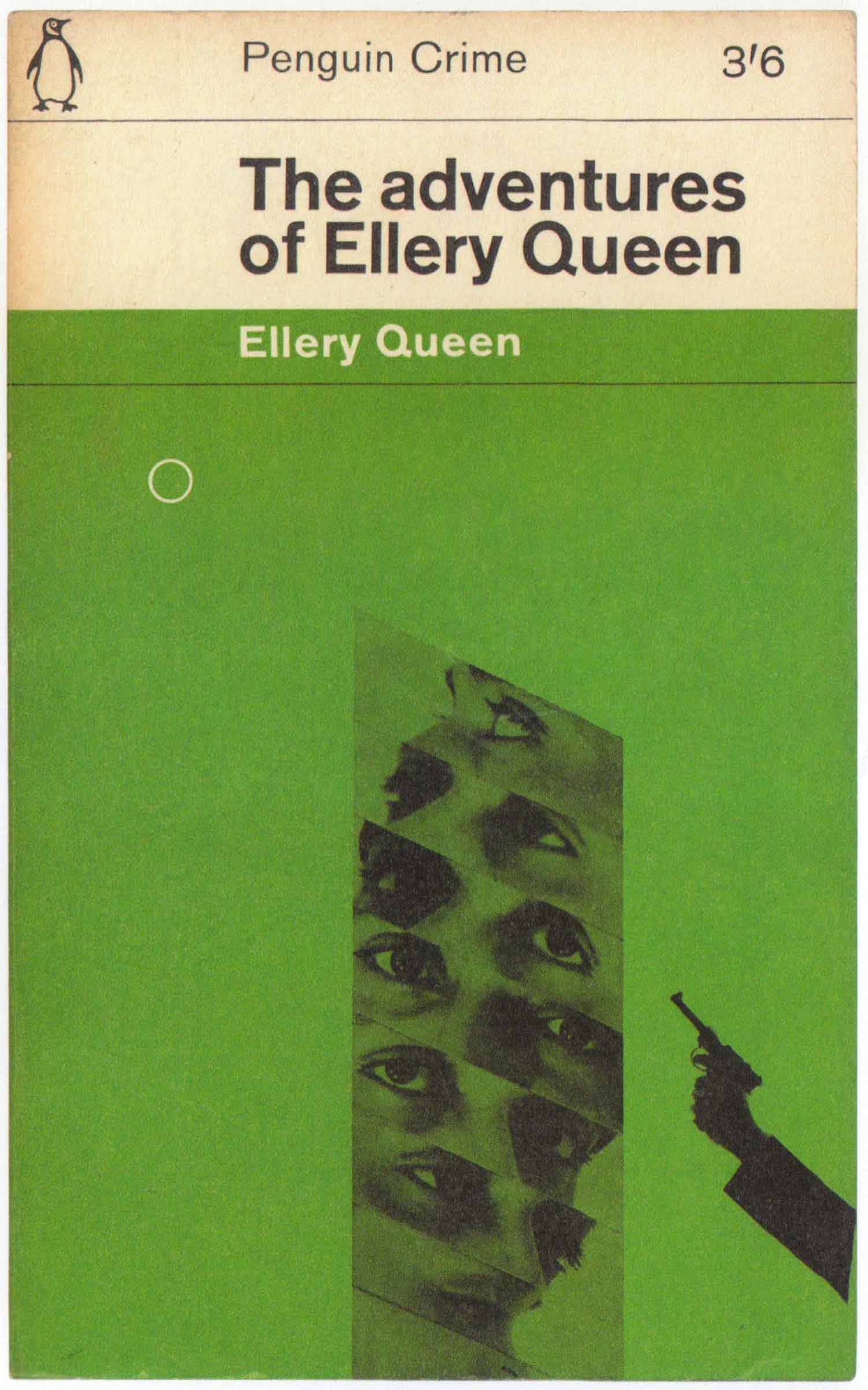
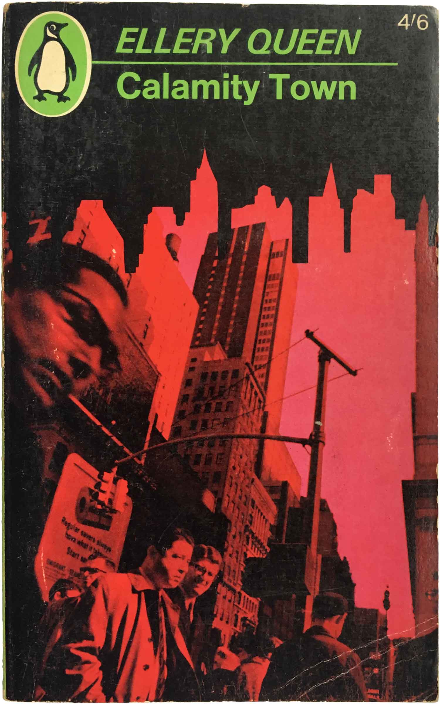
Ellery Queen is a another crime classic, the brain child of Brooklyn cousins Emanuel Benjamin Lepofsky and Daniel Nathan. Not only did they take up the psyudonym Ellery Queen for themselves, but they also used the name for their primary detective. Their stories from the 30s and 40s are given new life here with covers by Romek Marber. For Queen he uses a black figure in movement as the common thread, but strays even farther away from a common visual palette than elsewhere, with each cover in the top three below standing out in their own way. The white circle in the design on the left is an interesting addition, the center design really stands strong and bold, and the cover on the right is really nice because the small figure gives such an overwhelming presence to the building, which would otherwise be afloat in the sea of green.
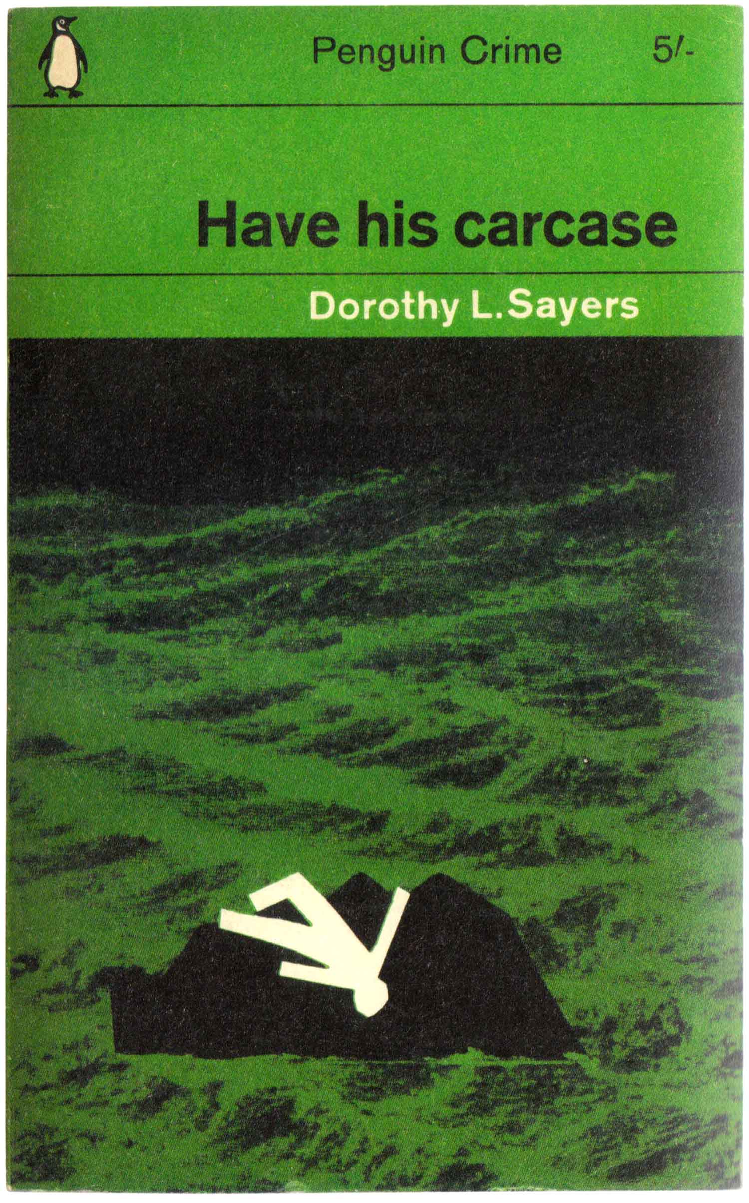
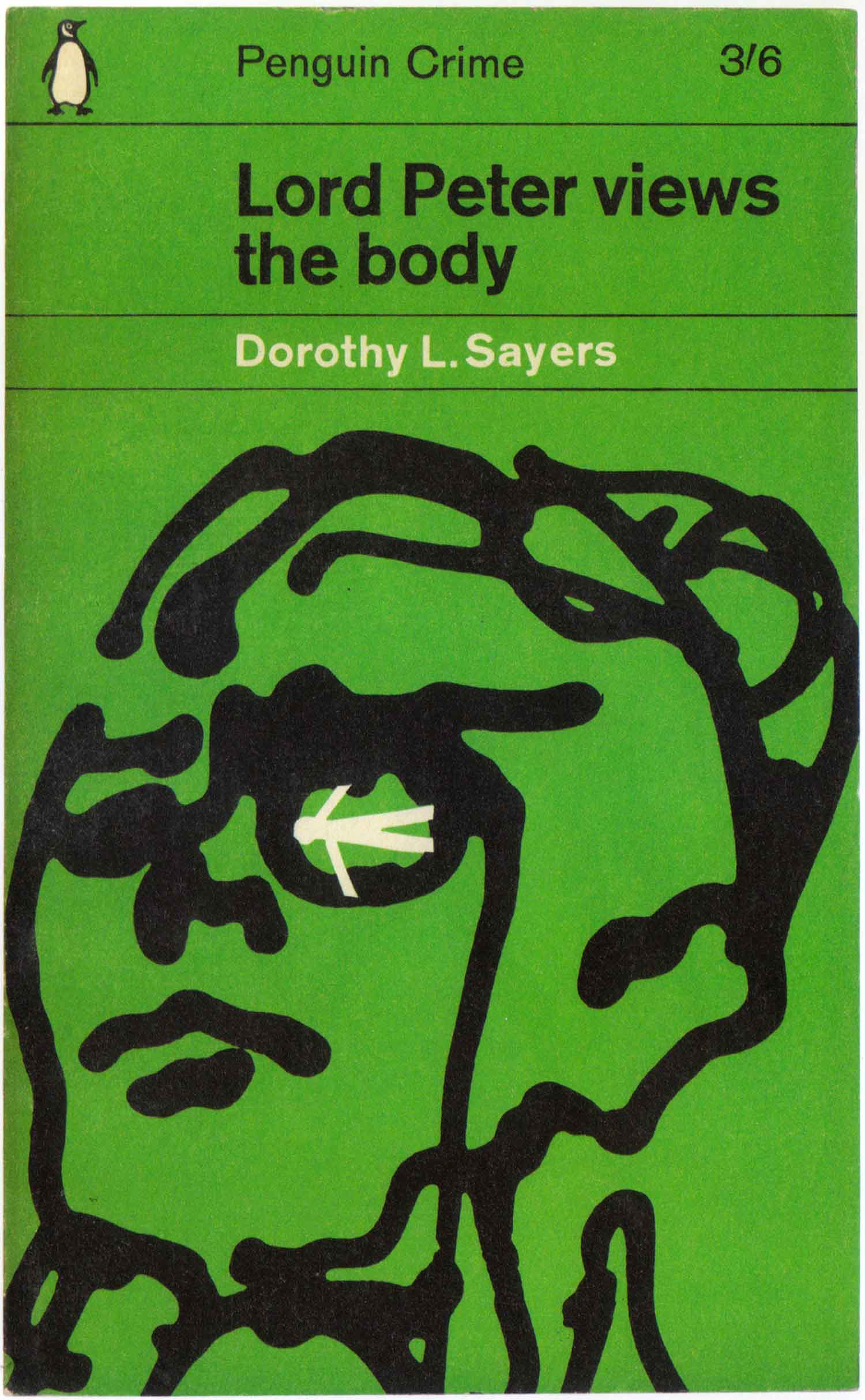
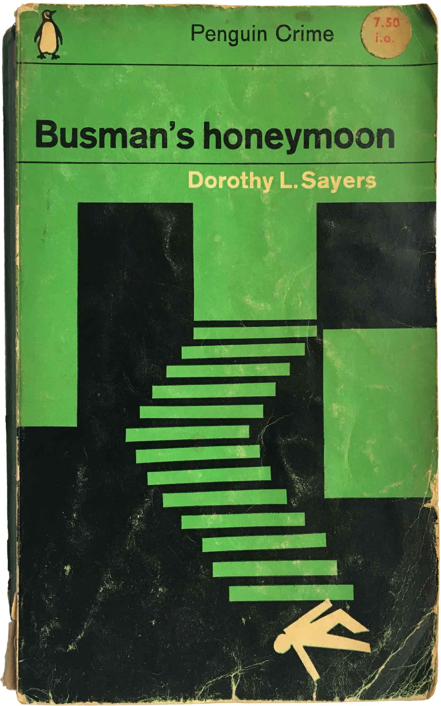
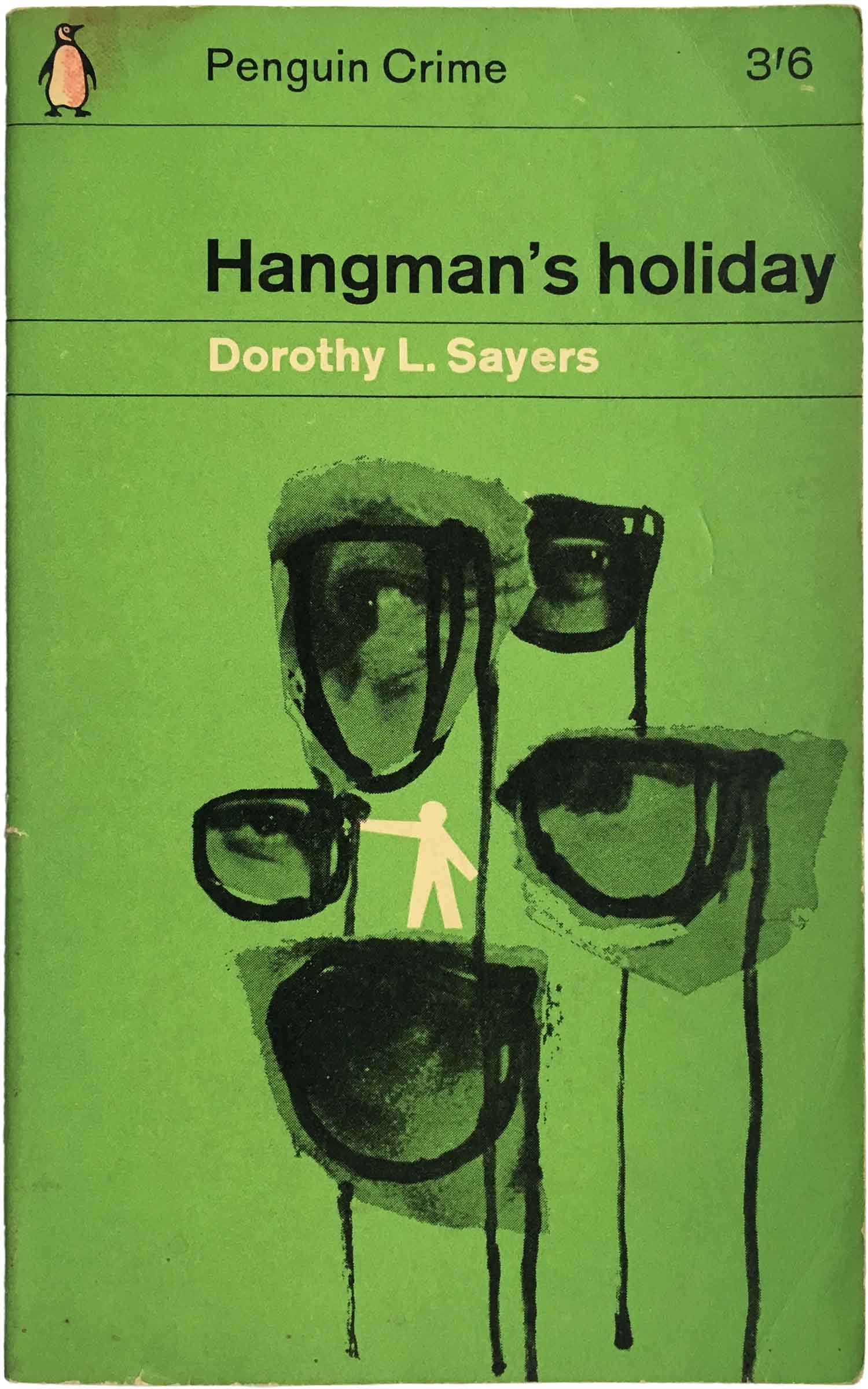
Dorothy Sayers was a popular English crime writer, and all of her covers seem to have been assigned to Romek Marber. He’s done a really nice job balancing continuity (with the white stick figure) and diversity (with photos, rough drawing, and geometric shapes). His cover for Busman’s honeymoon is one of the best Penguin covers of the whole period.
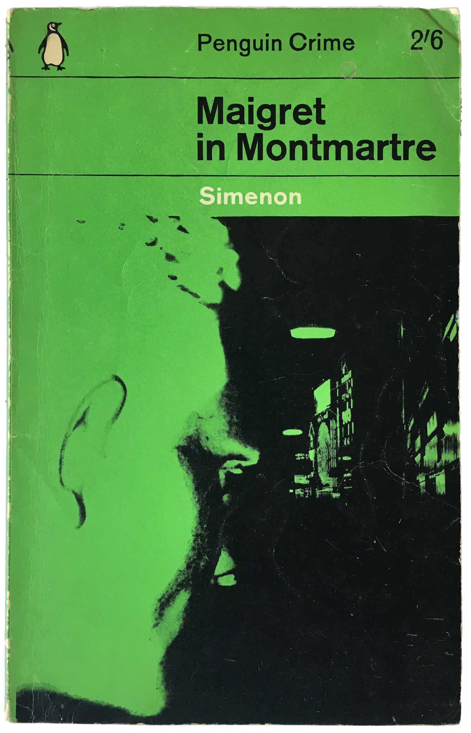
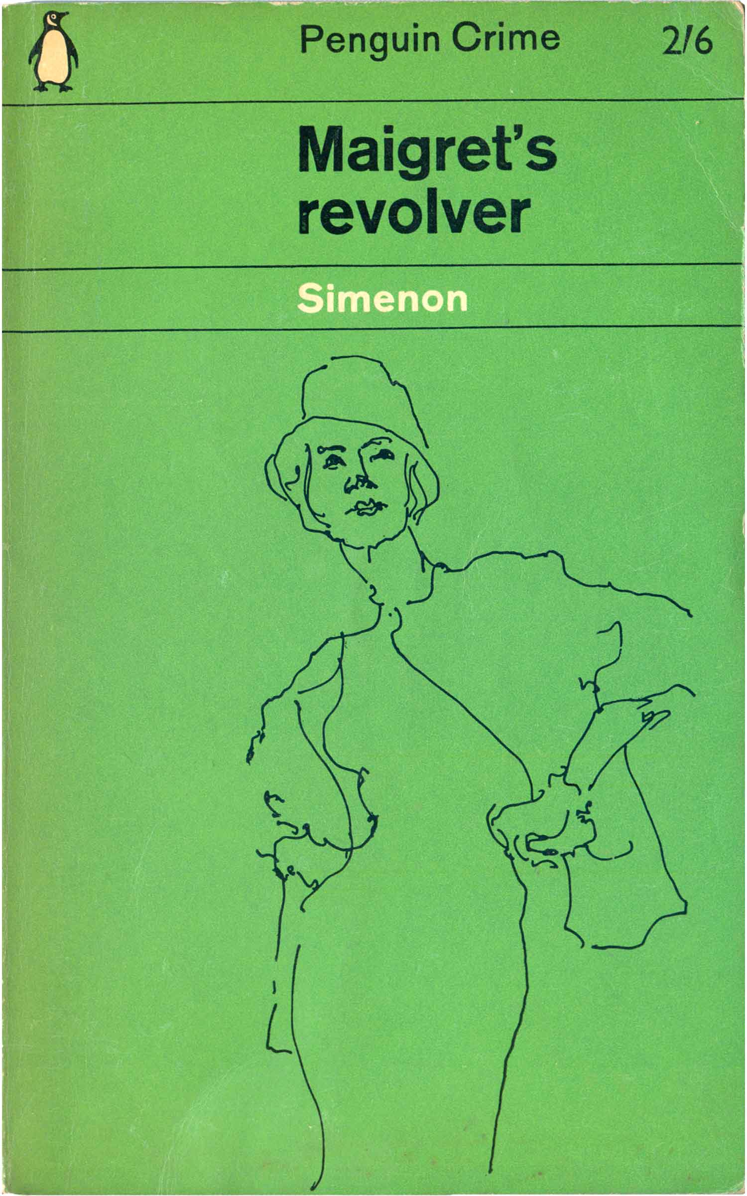
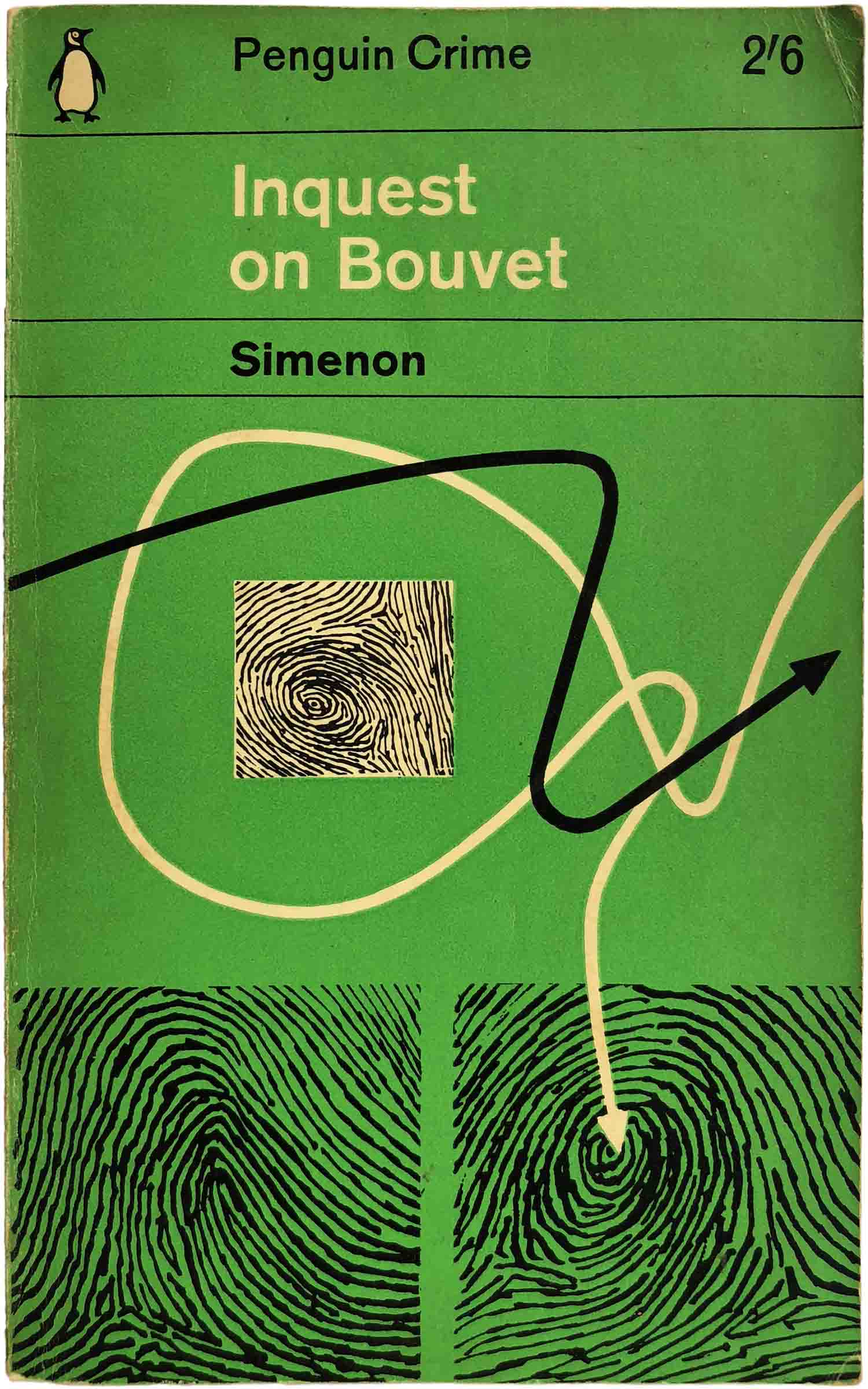
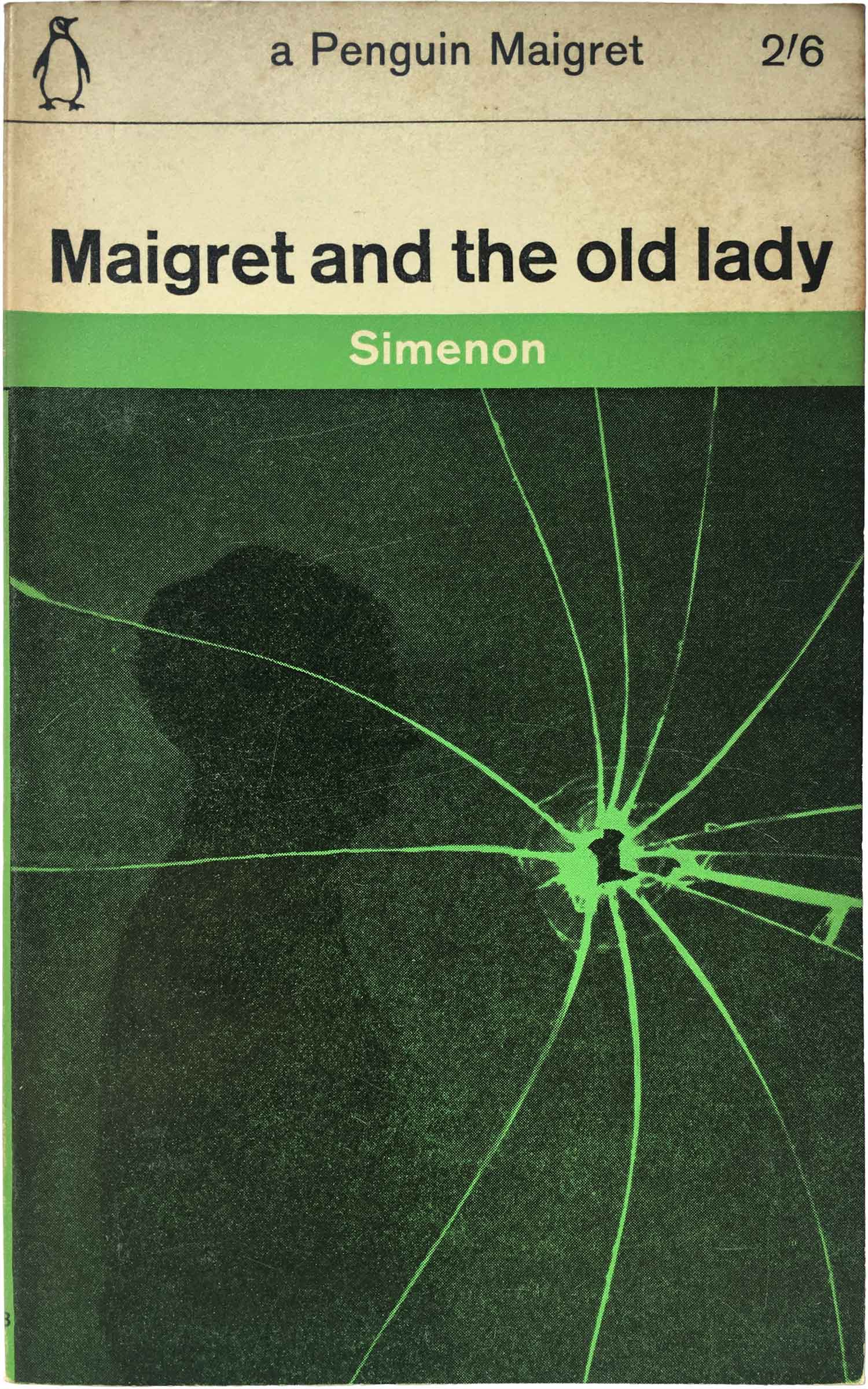
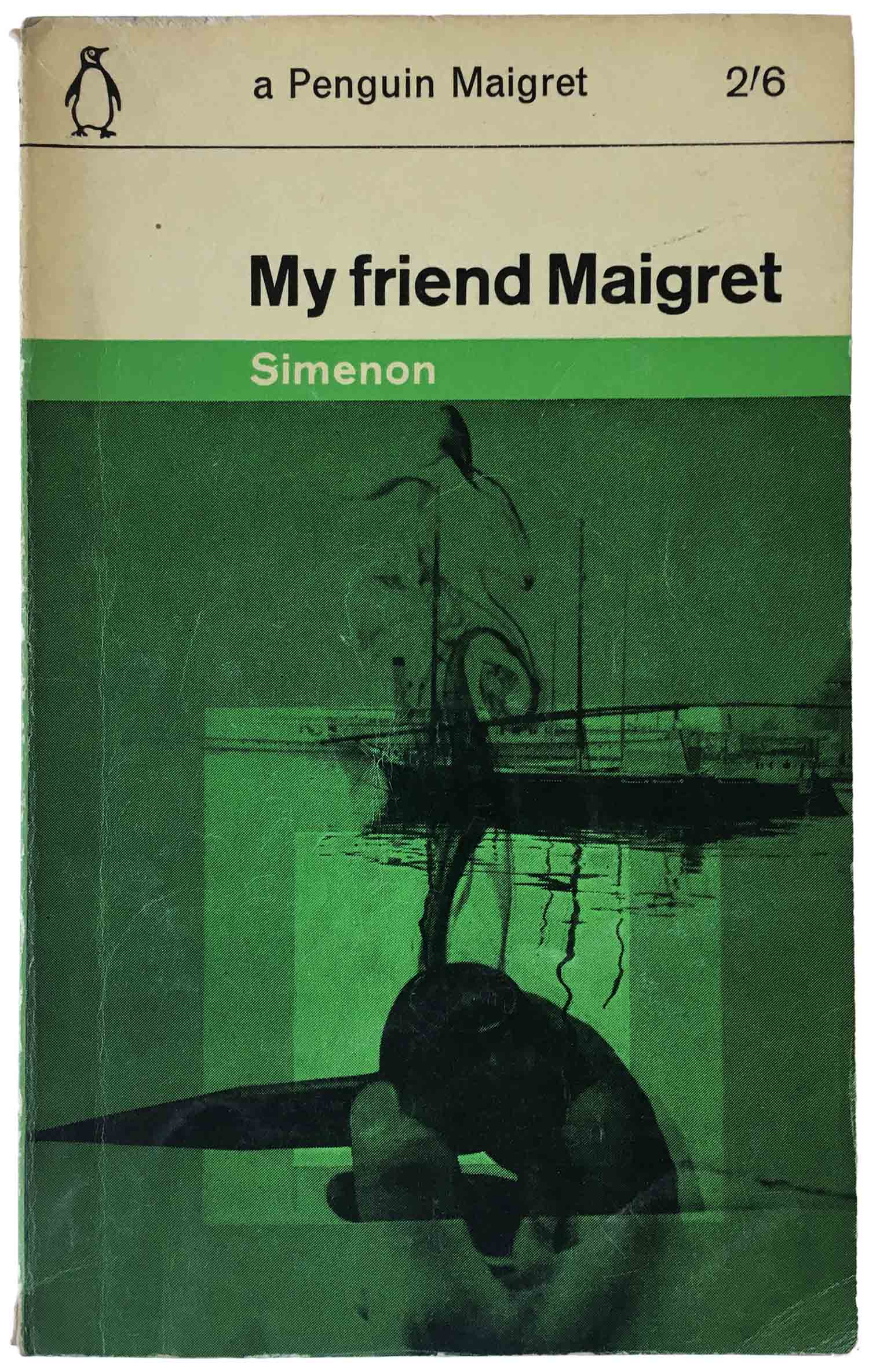
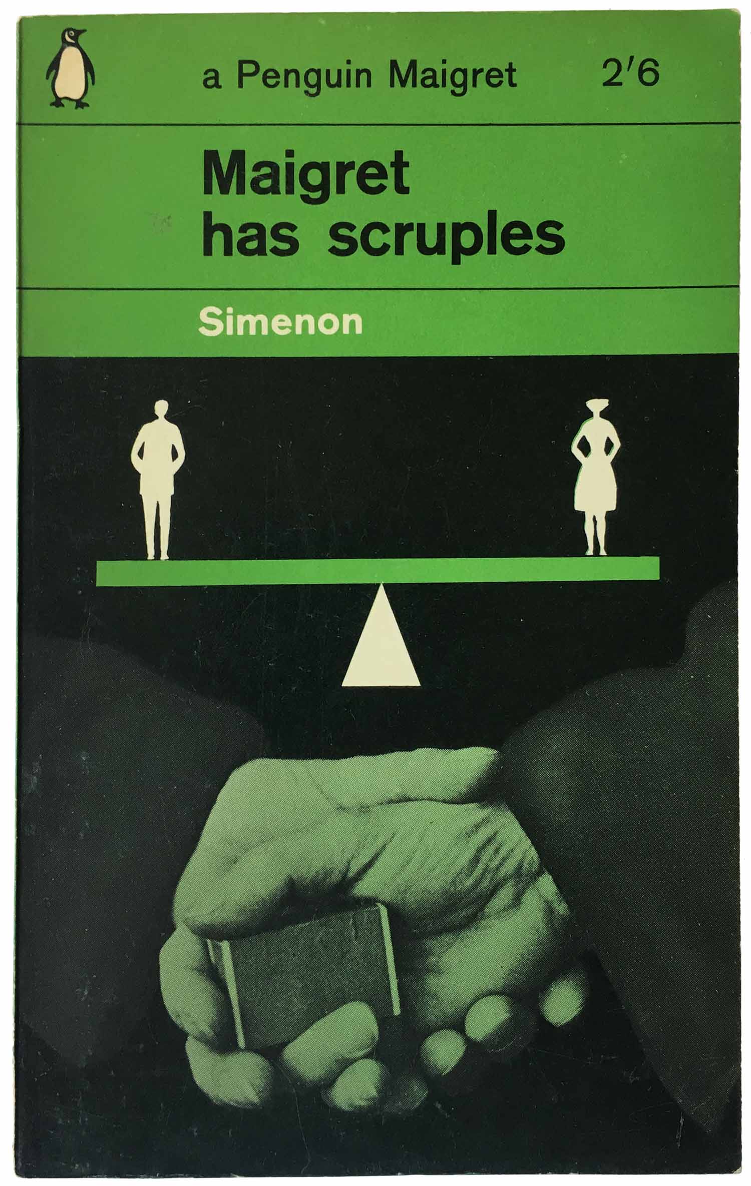
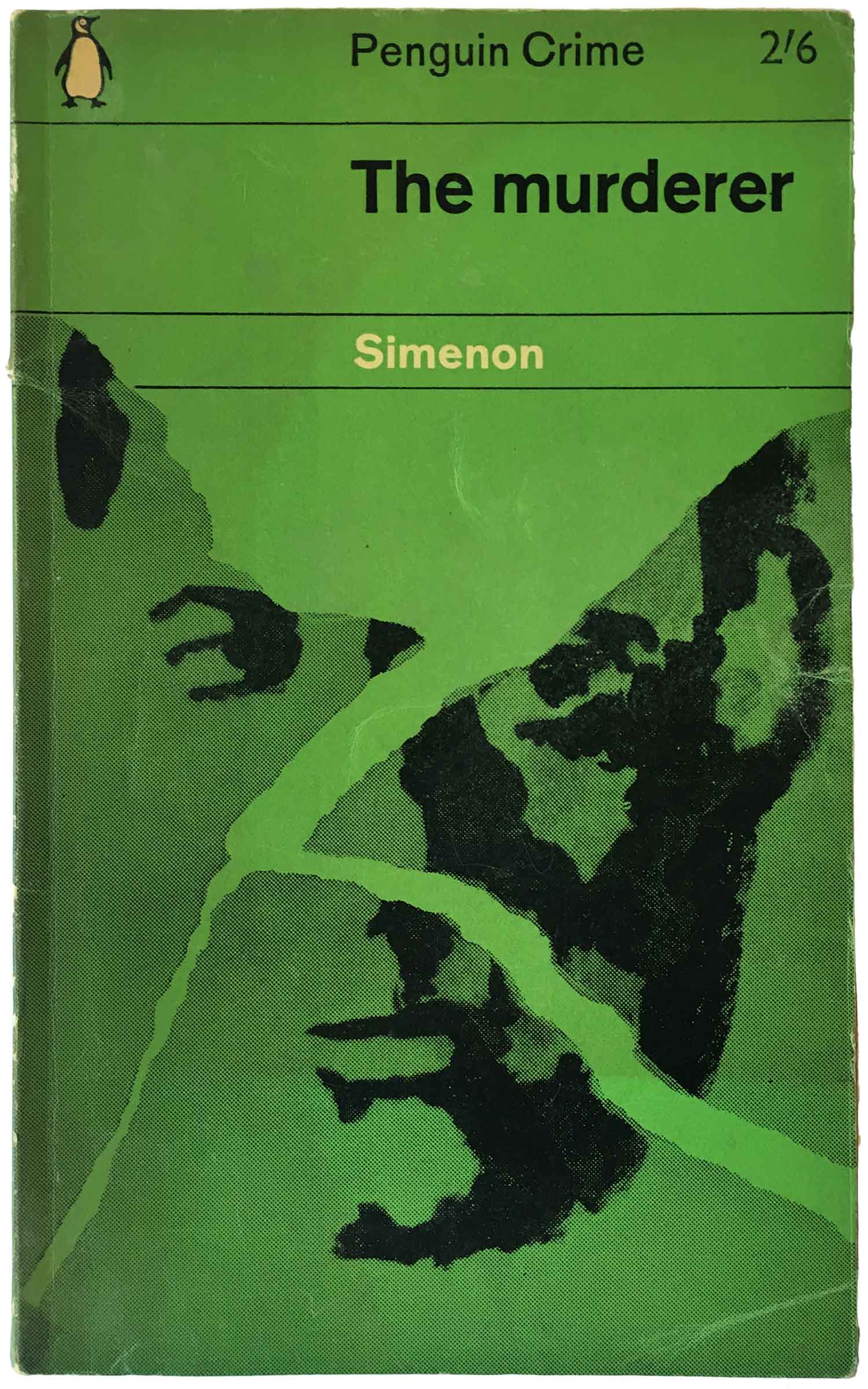
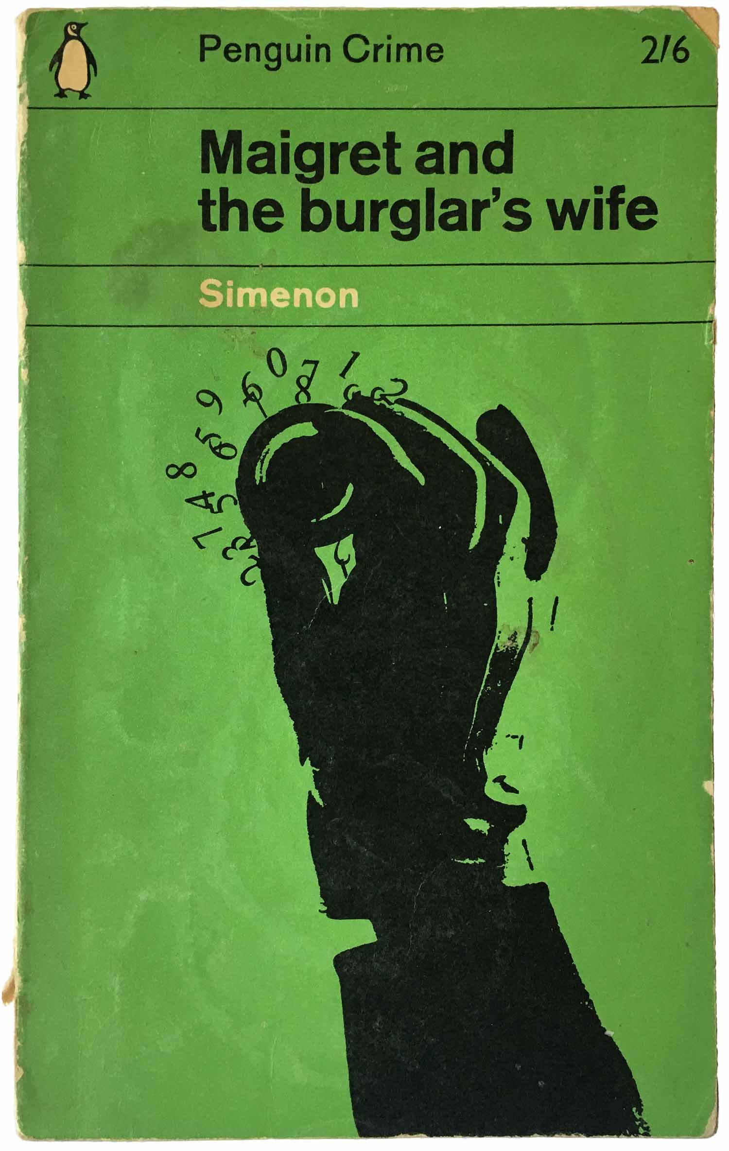
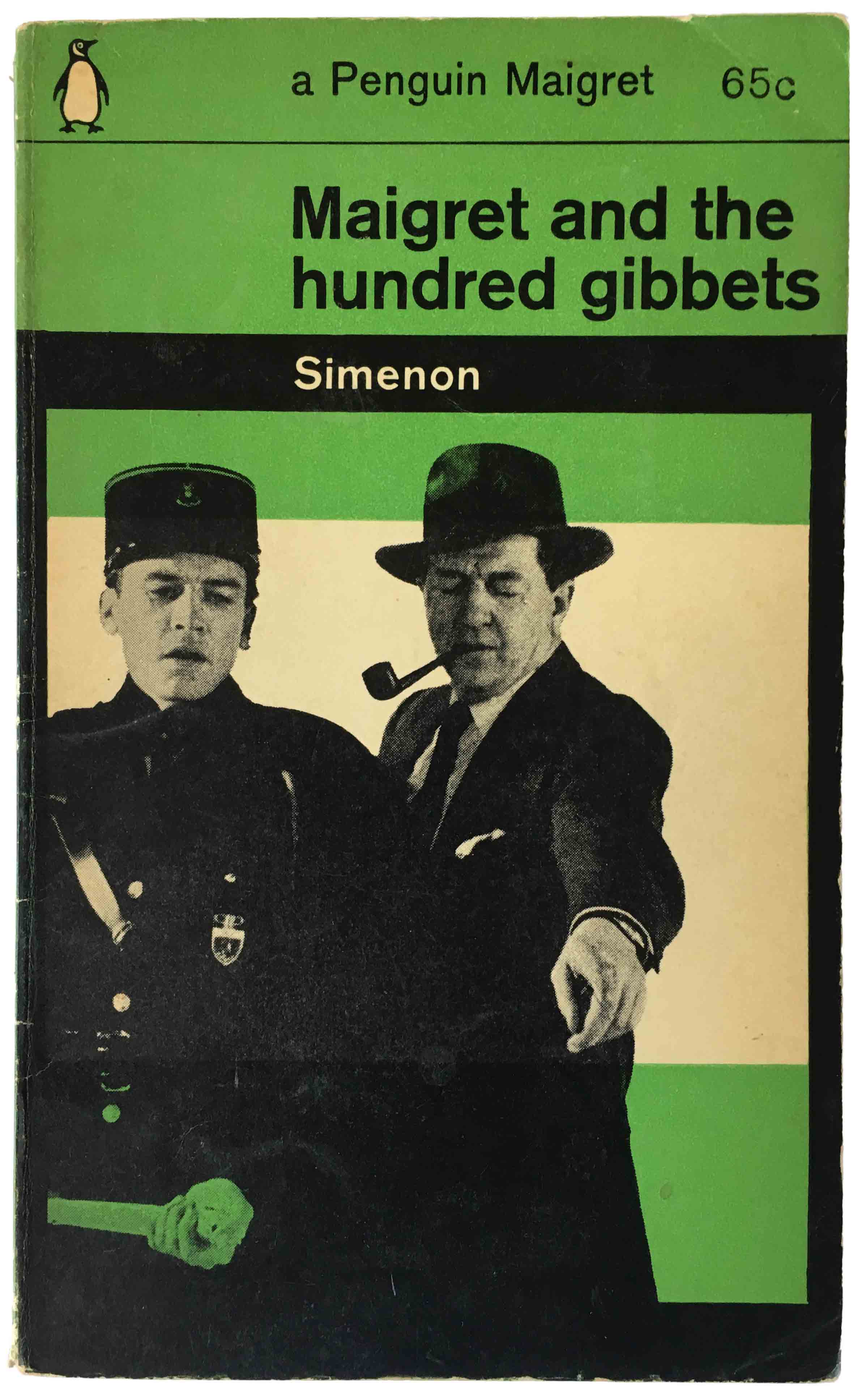
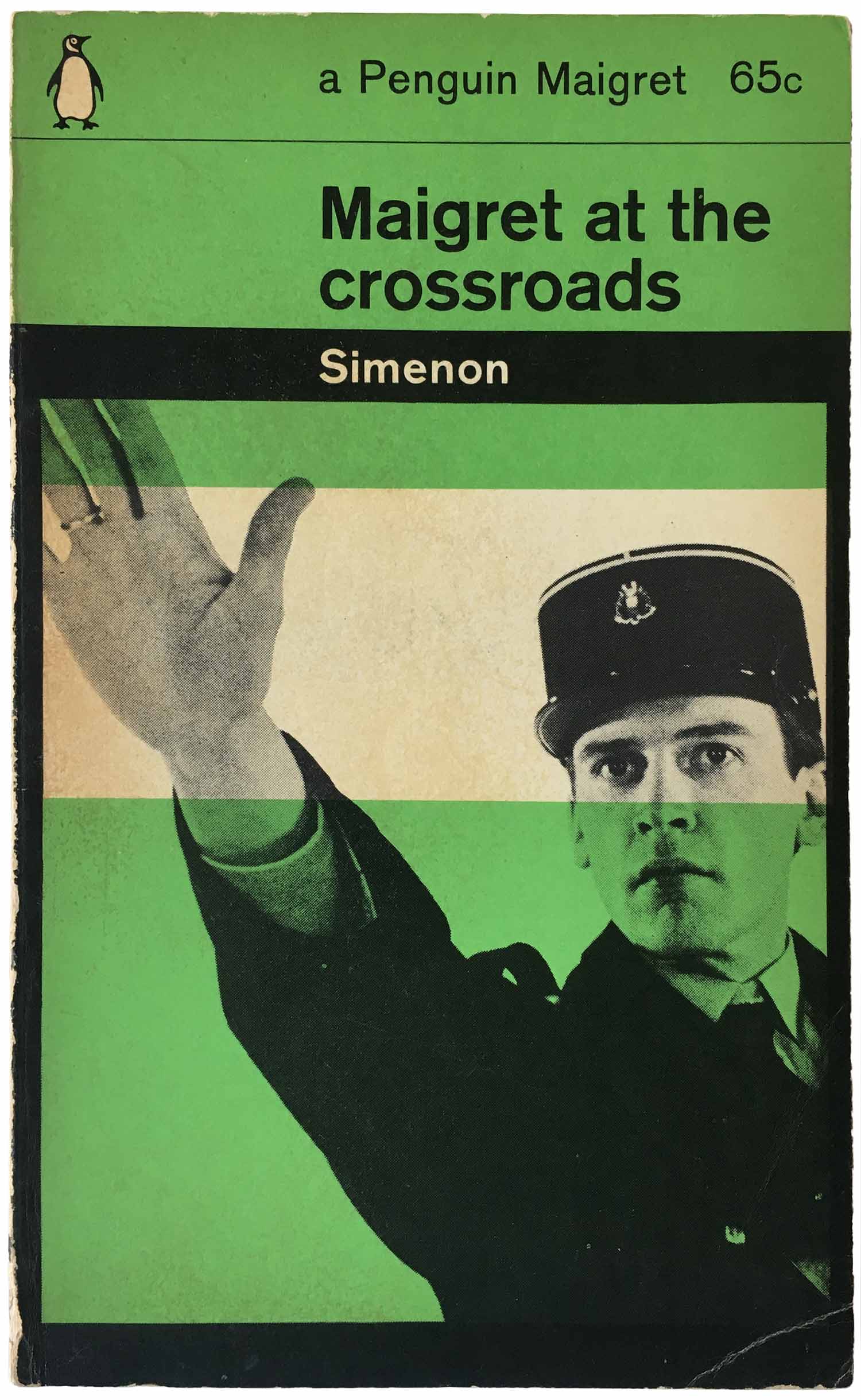
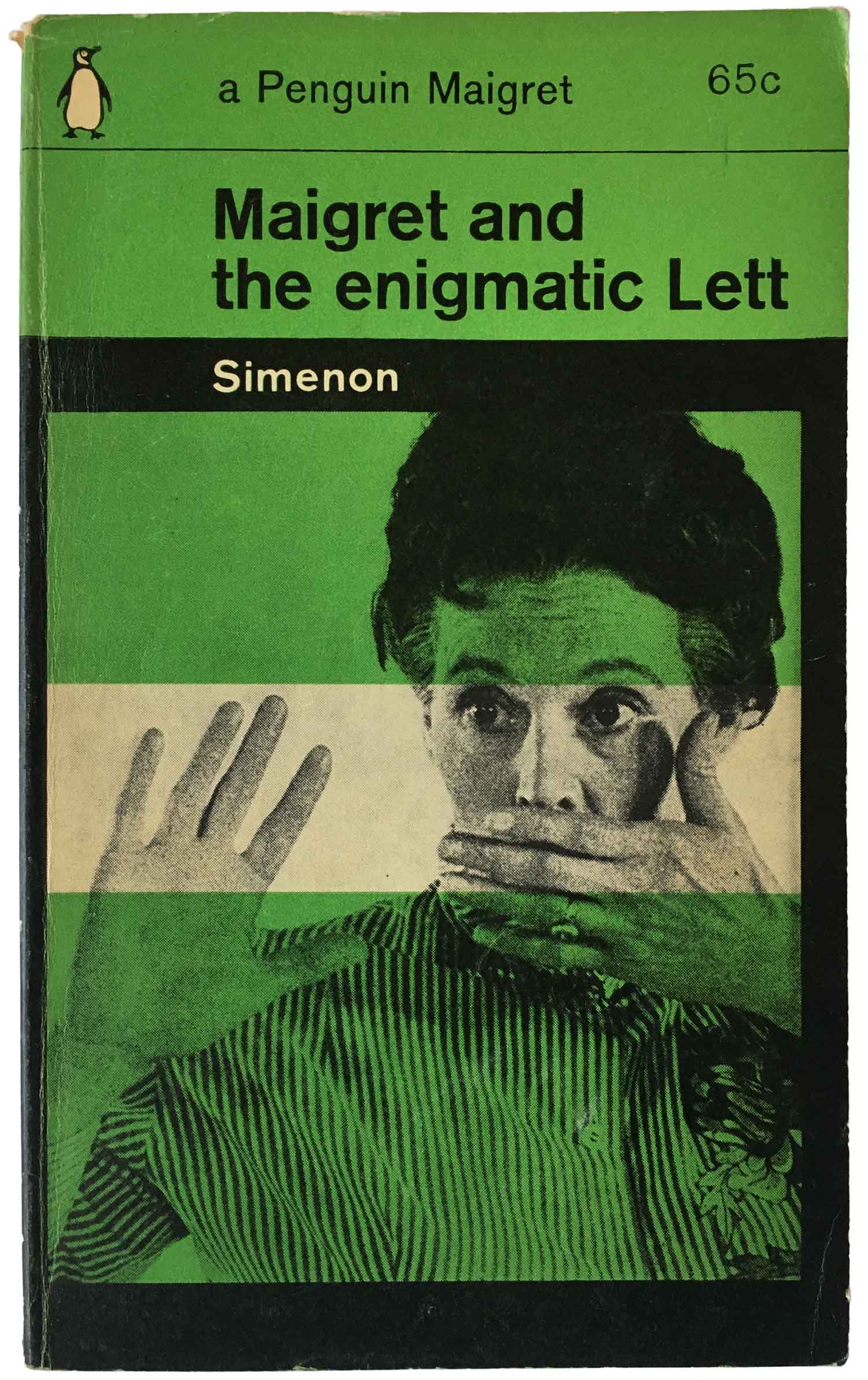
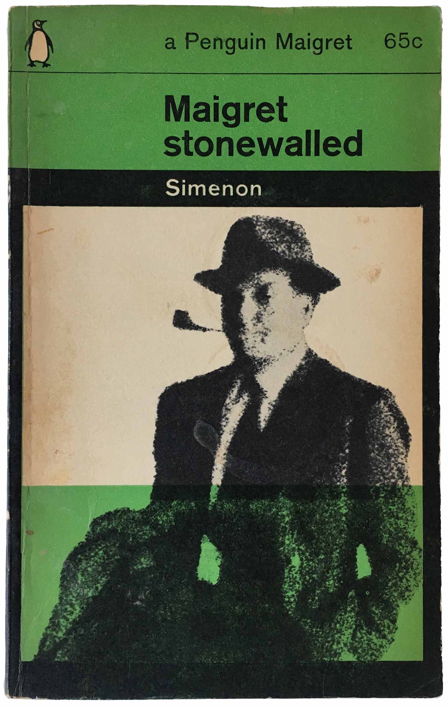
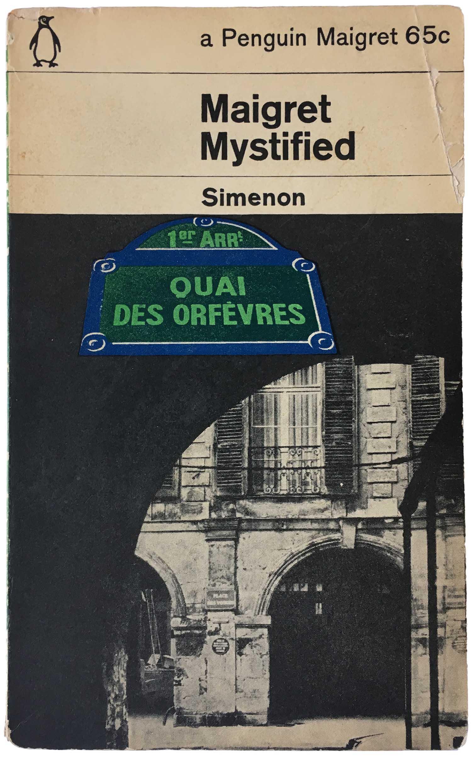
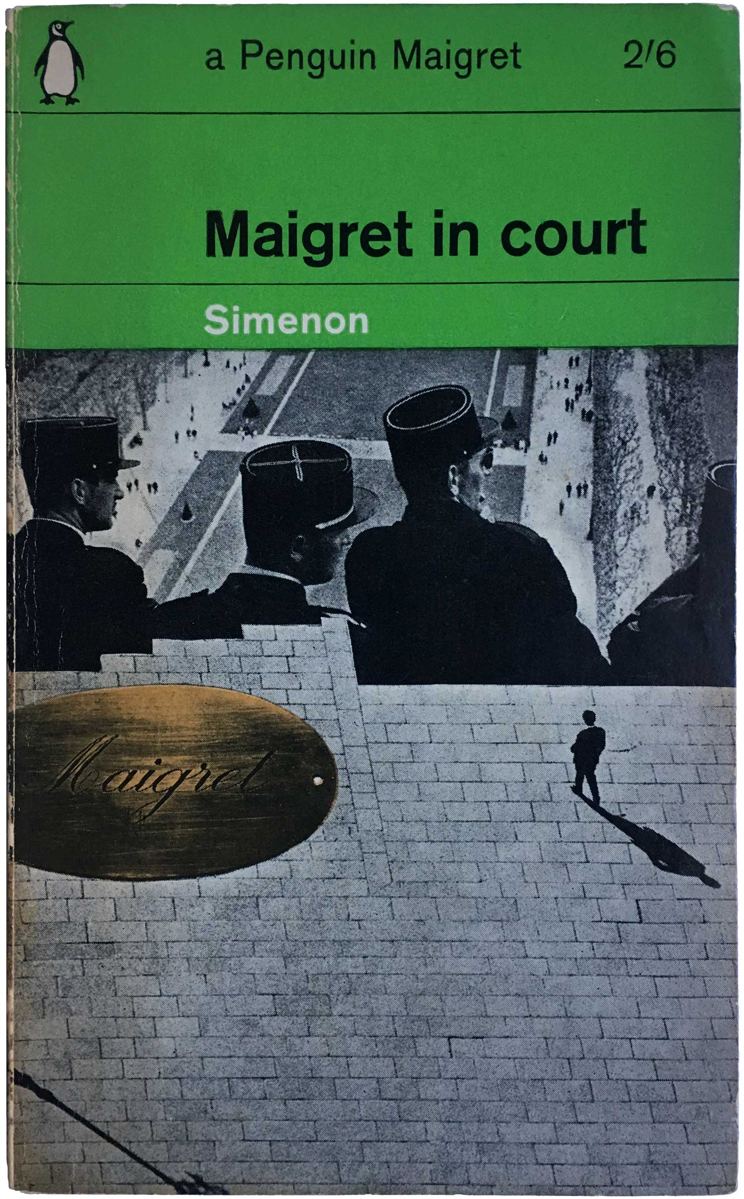
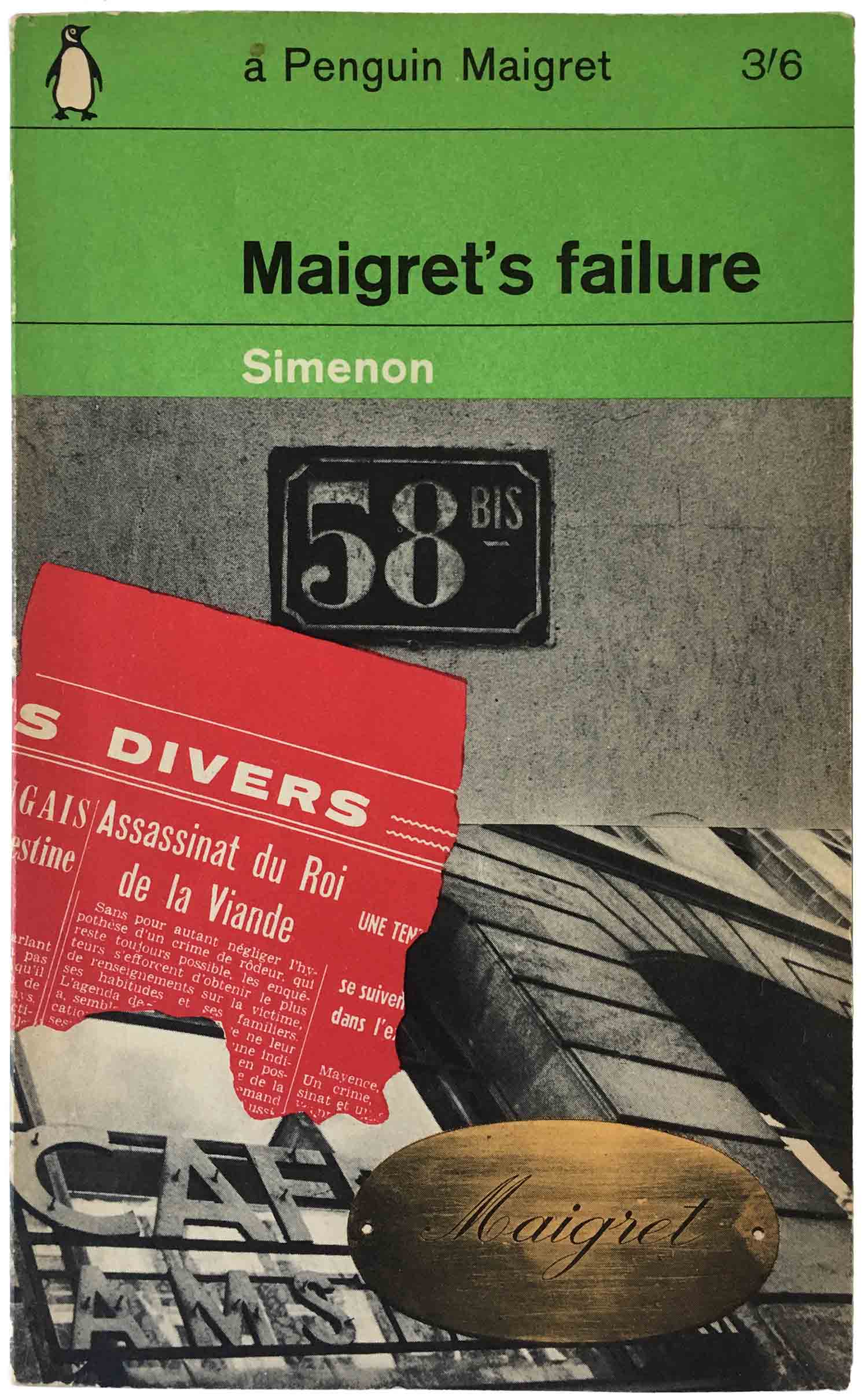
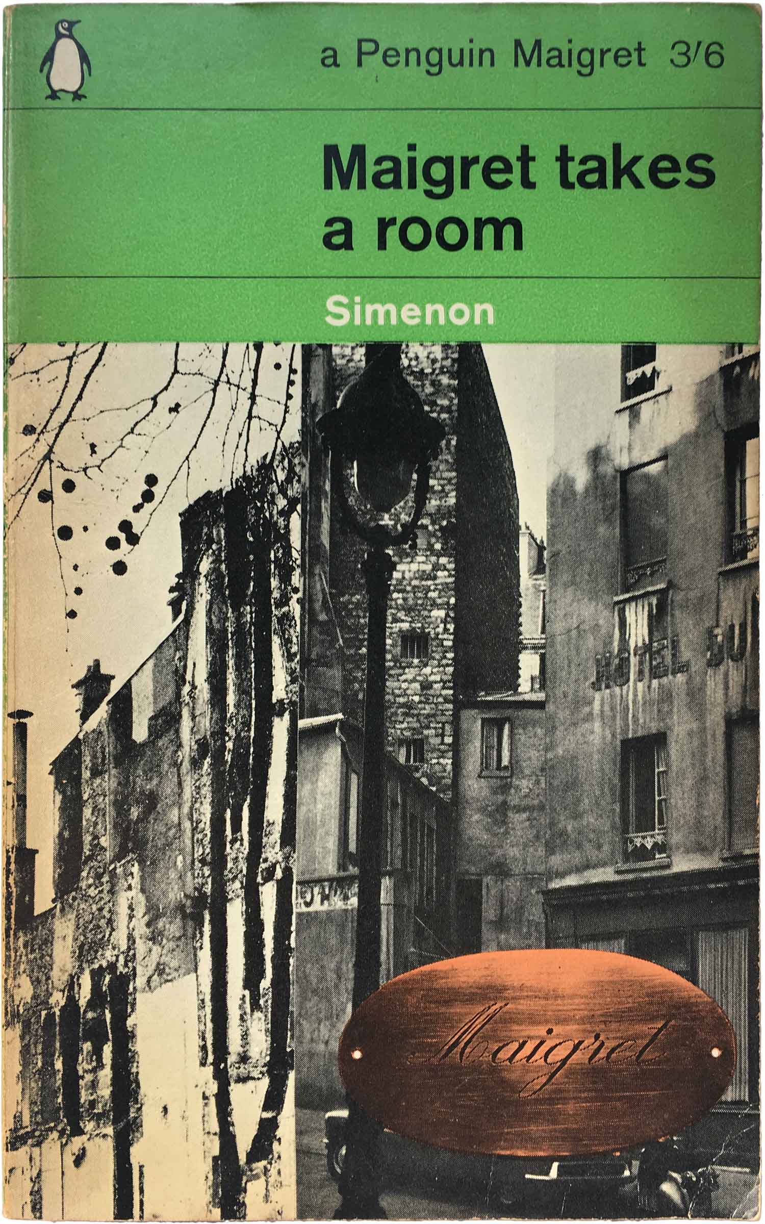
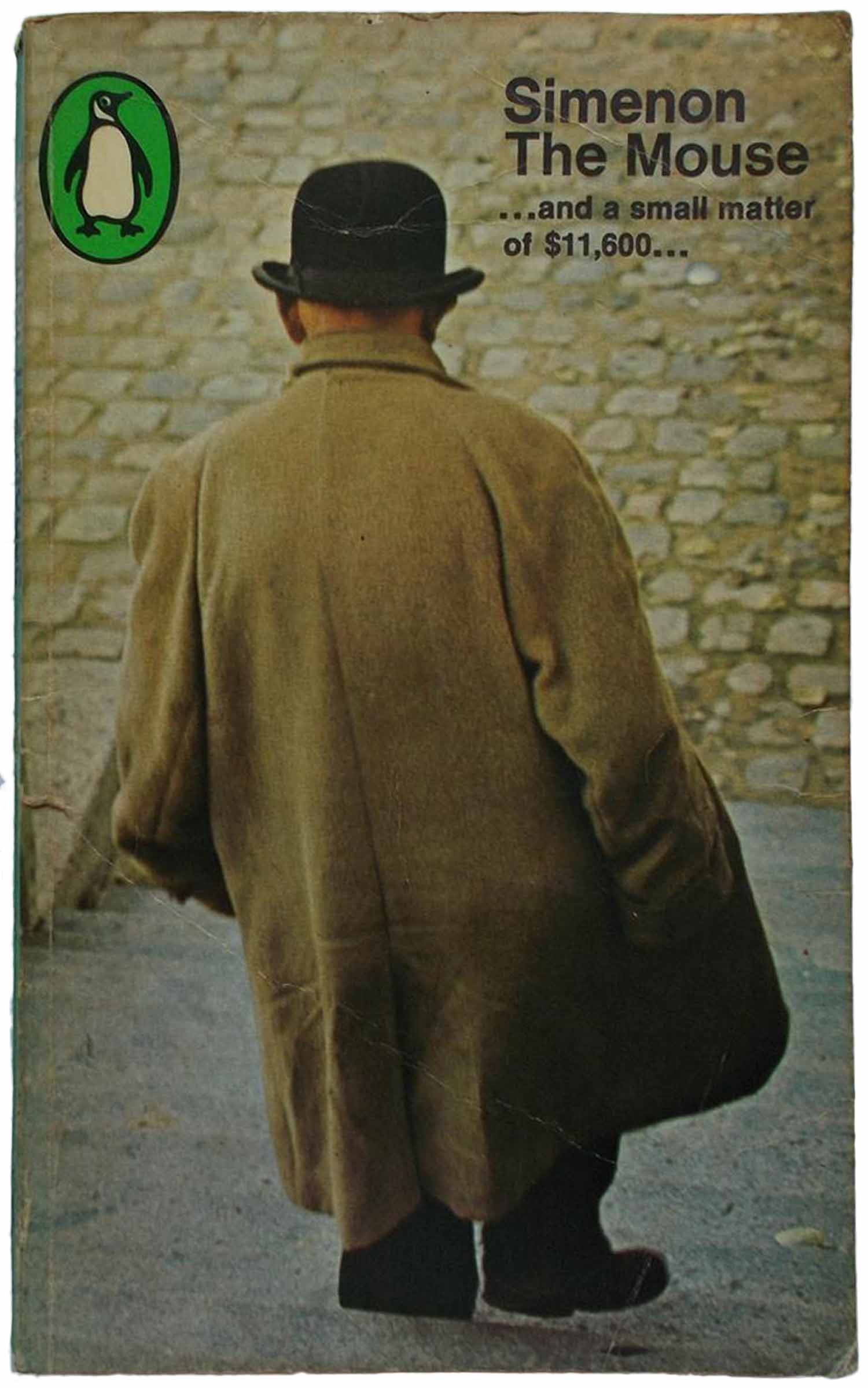
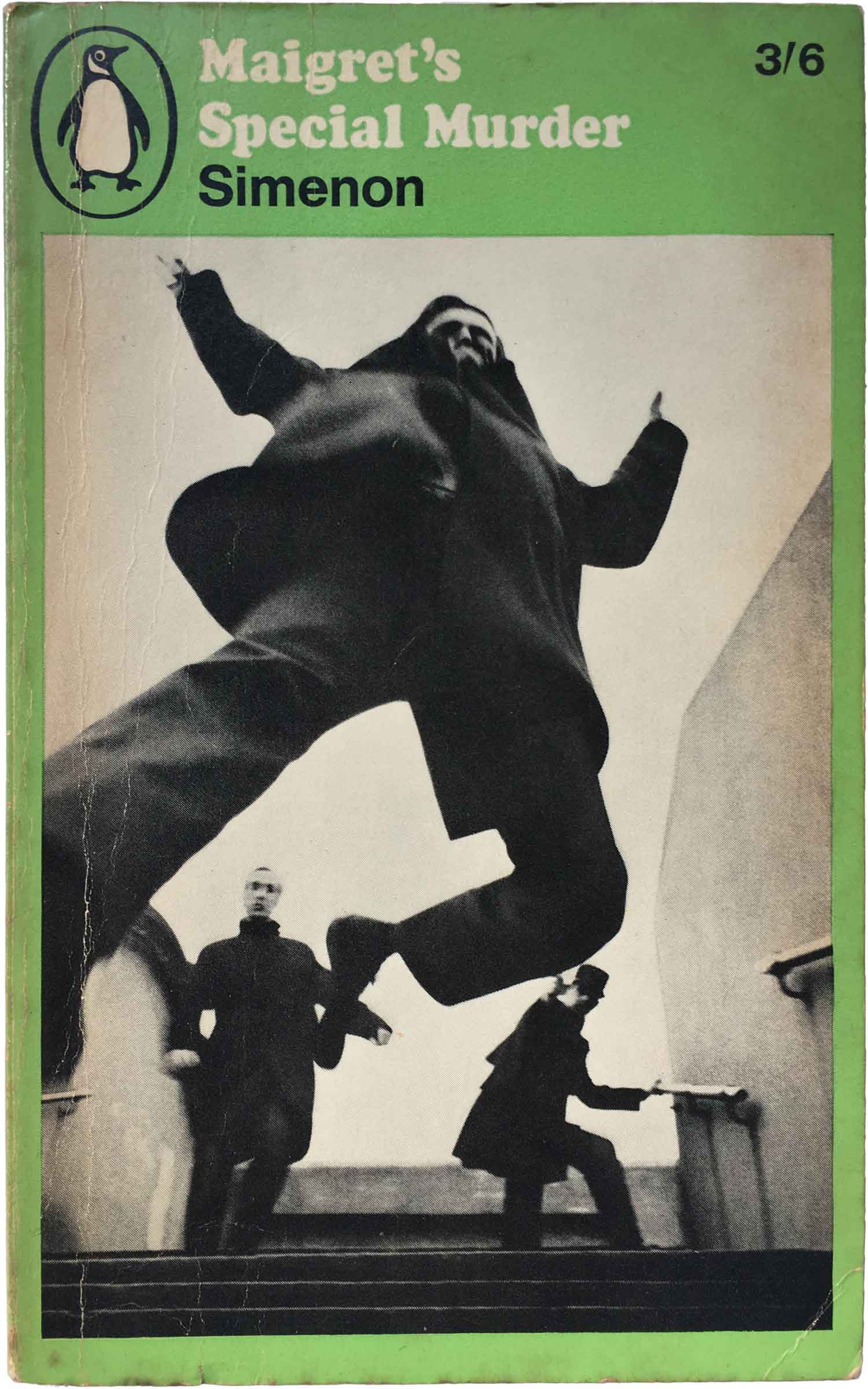
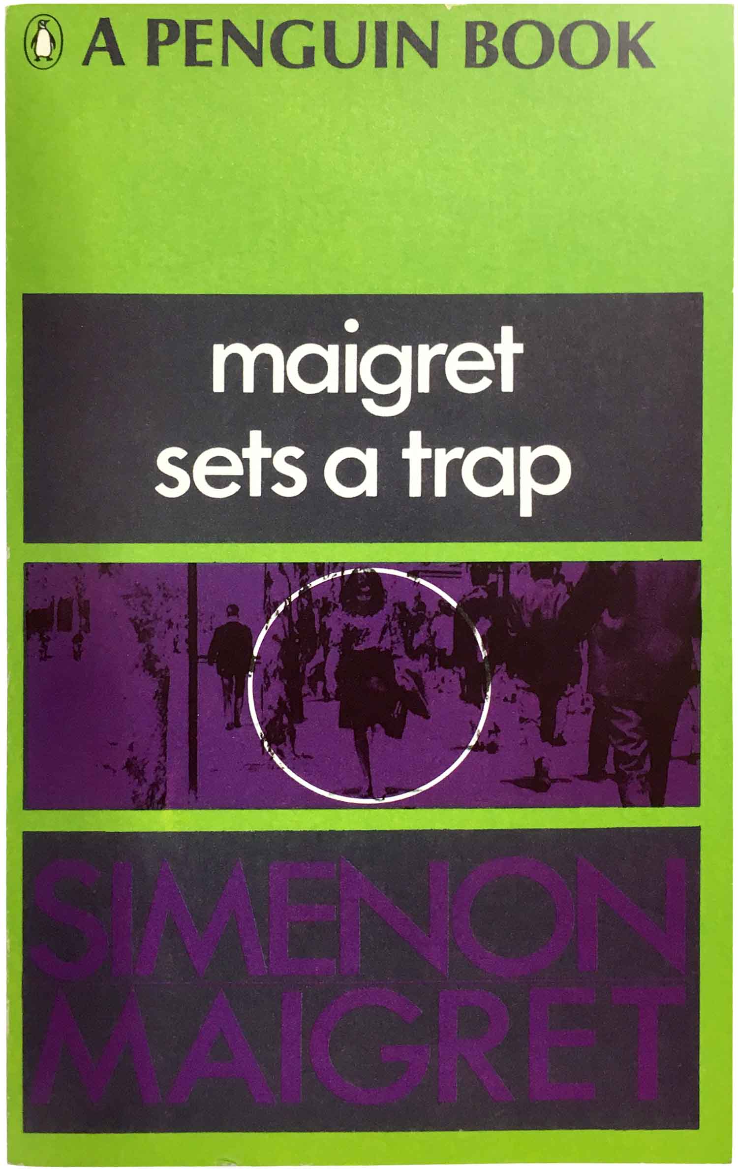
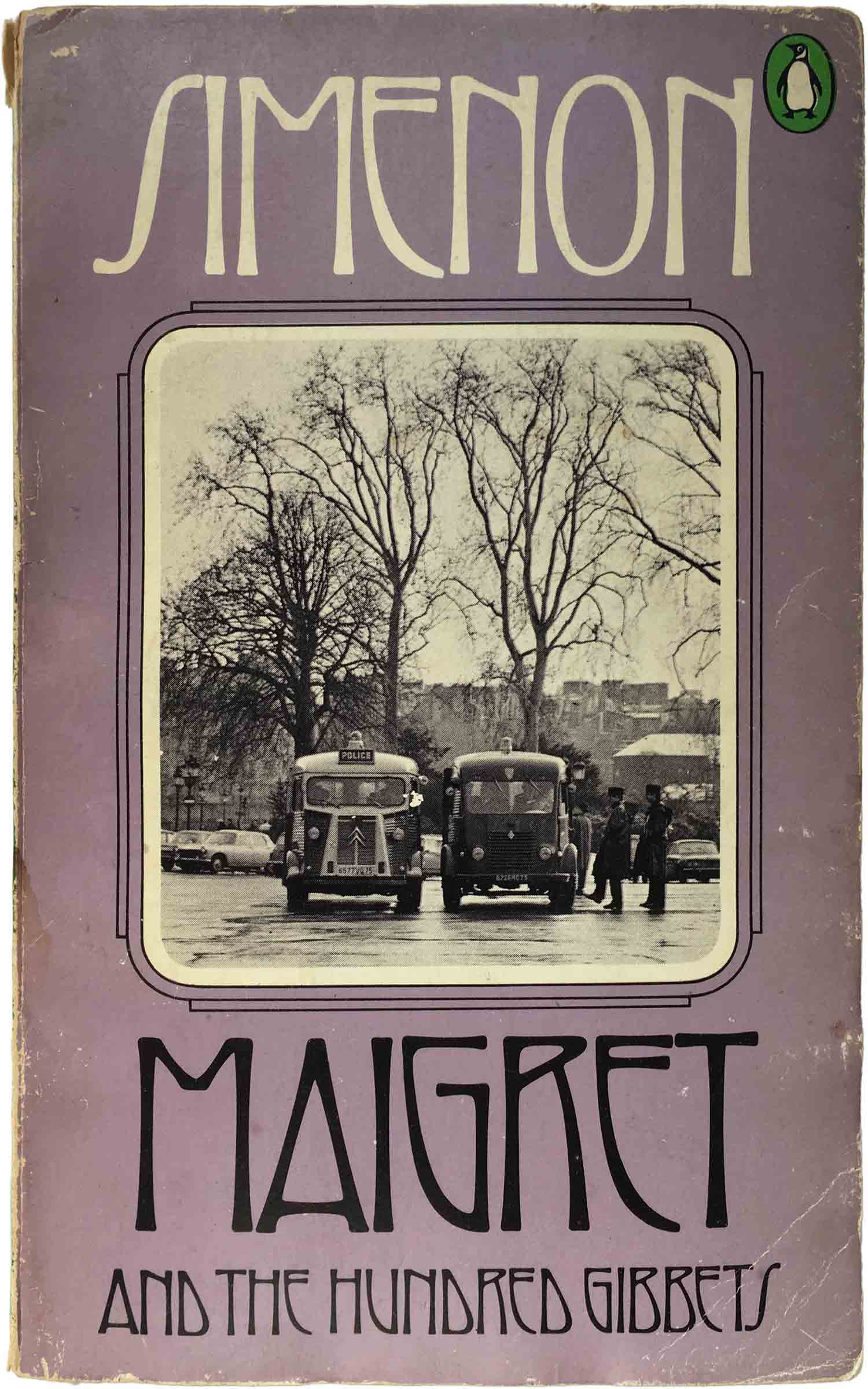
I already devoted an entire post to Simenon’s Penguin covers (week 246) so I’ll skip the commentary here. The only thing worth mentioning is the addition of the great cover to Inquest on Bouvet (designed by Edwin Taylor), with its abstraction of fingerprints and arrows making for a simultaneously high modern and completely paranoid cover.
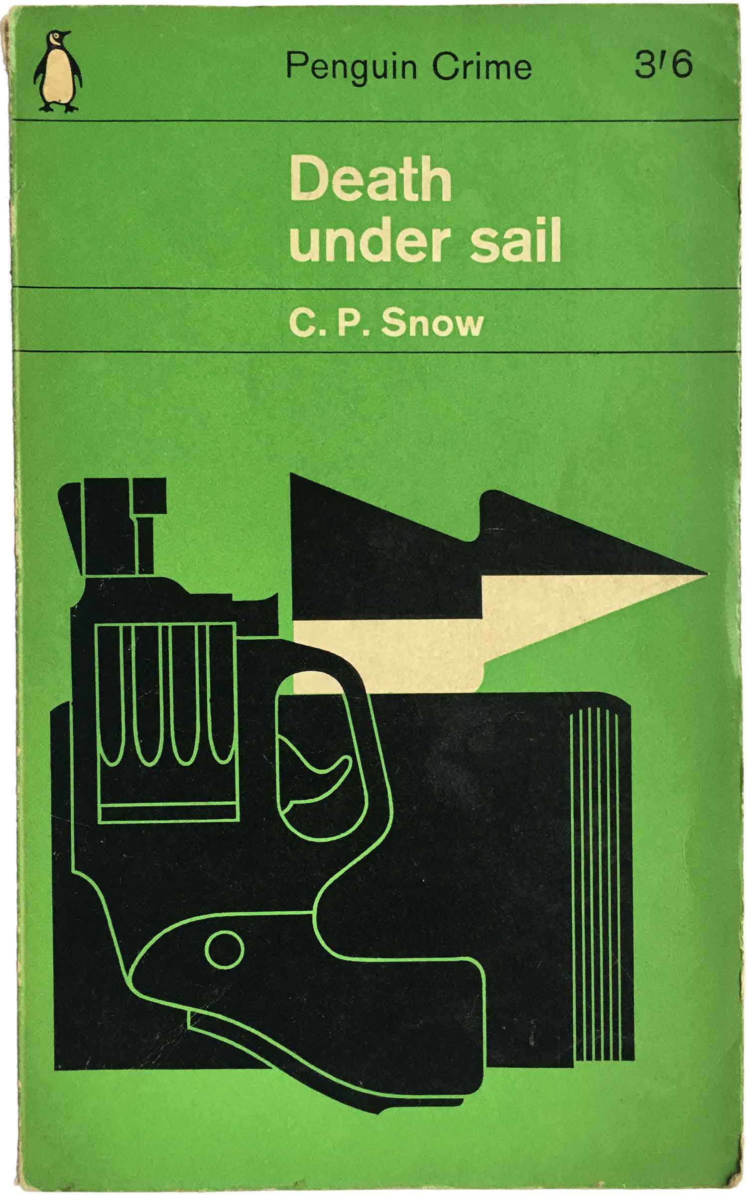
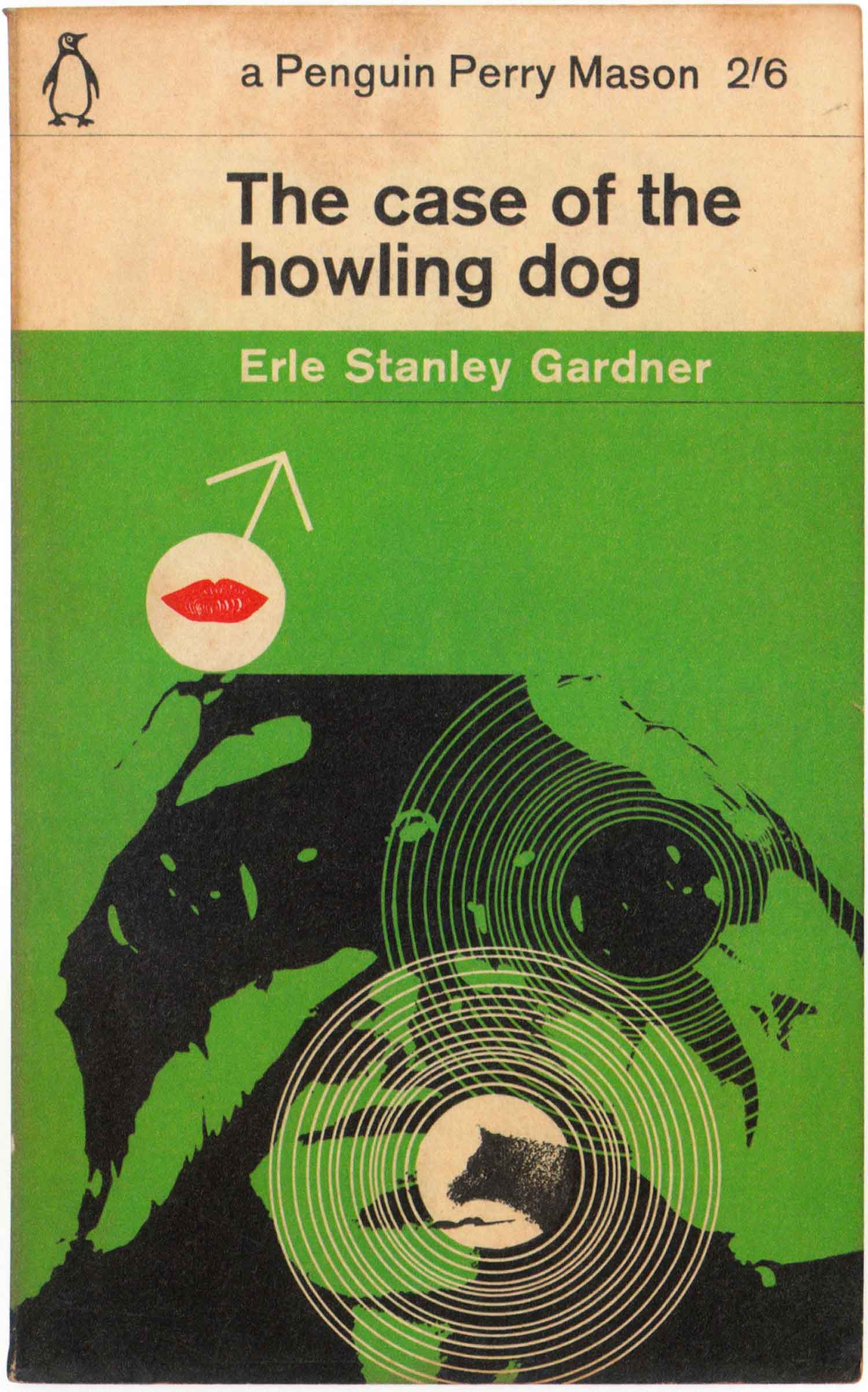
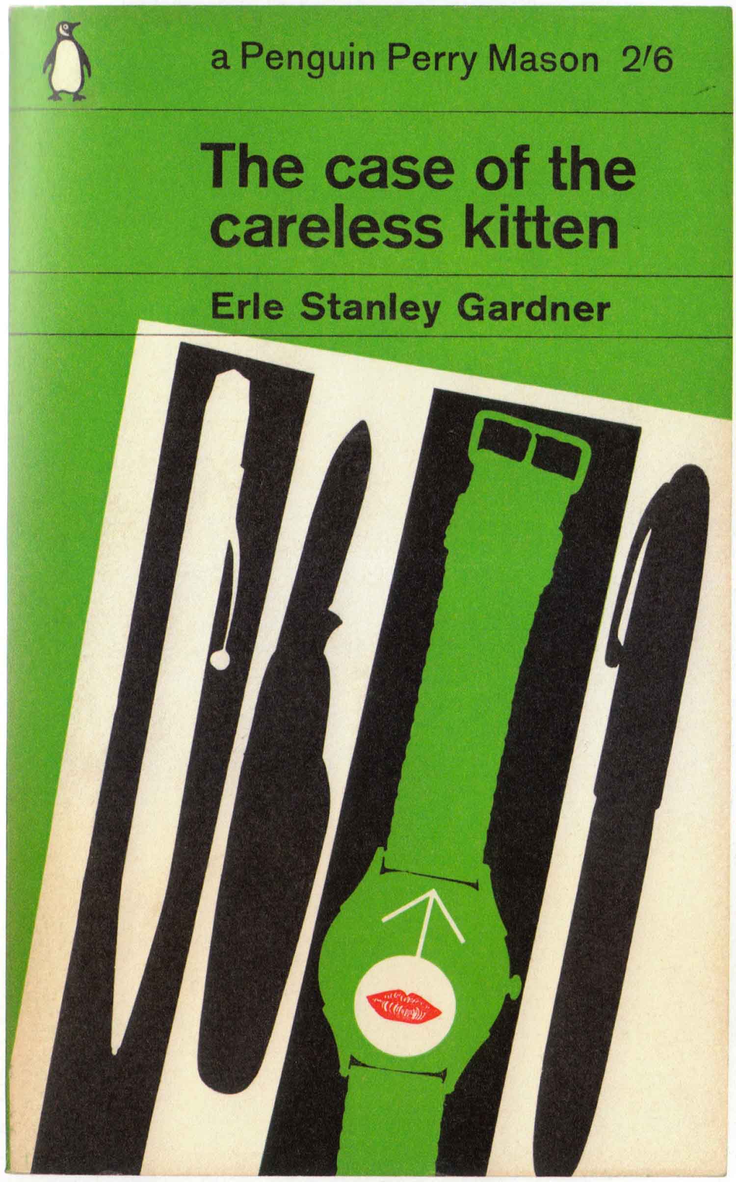
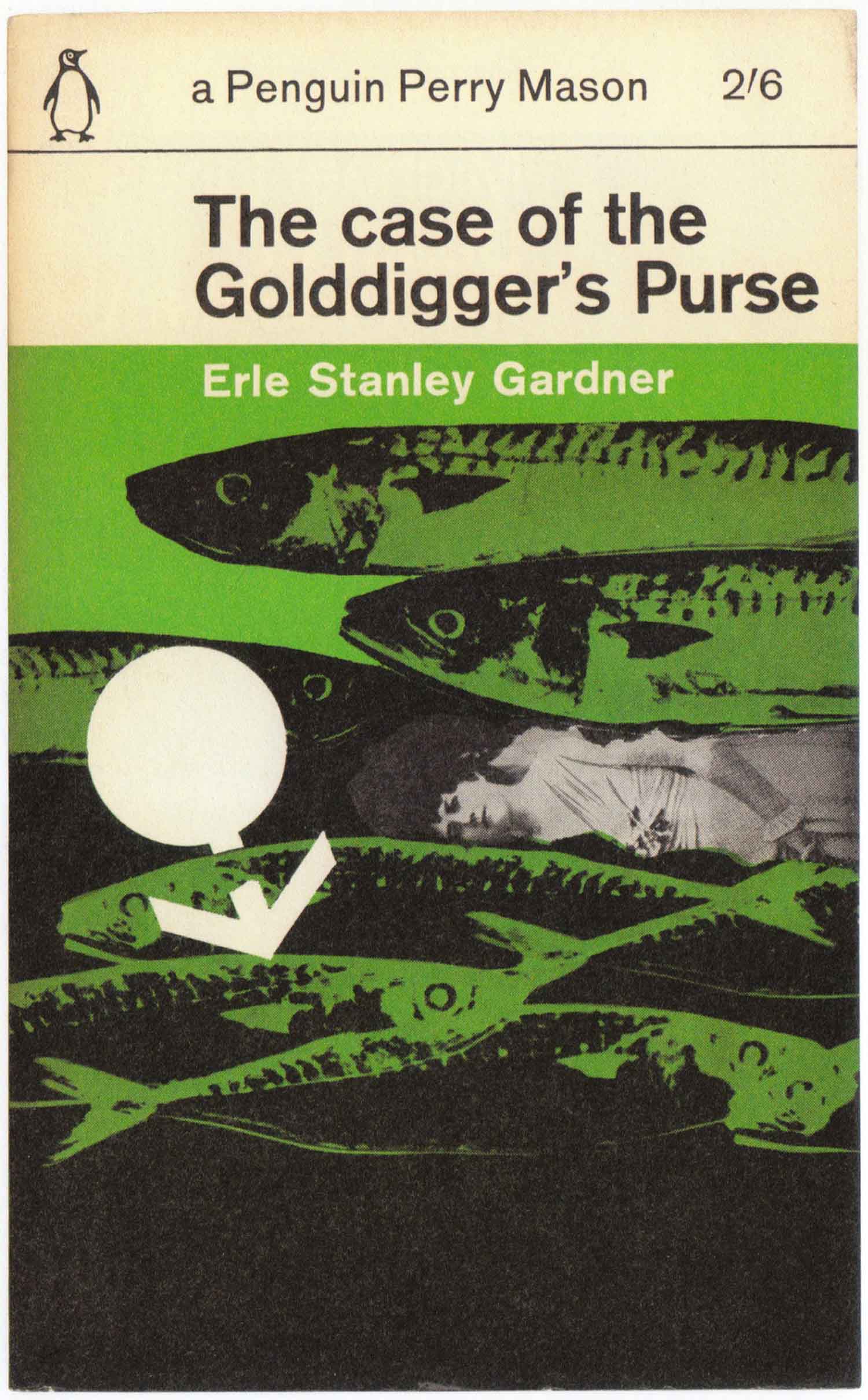
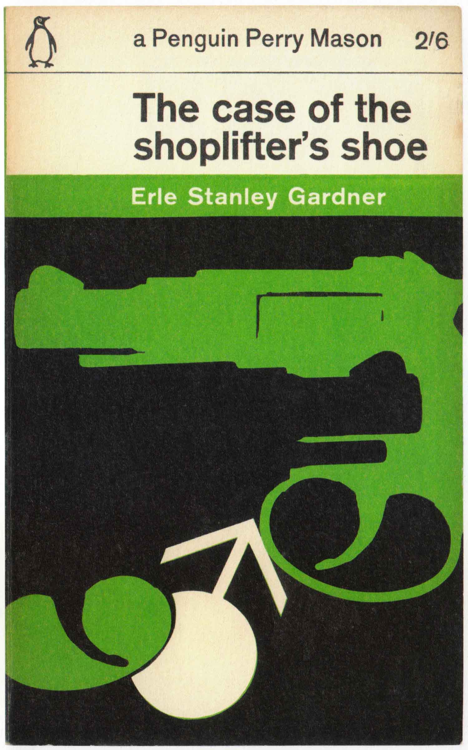
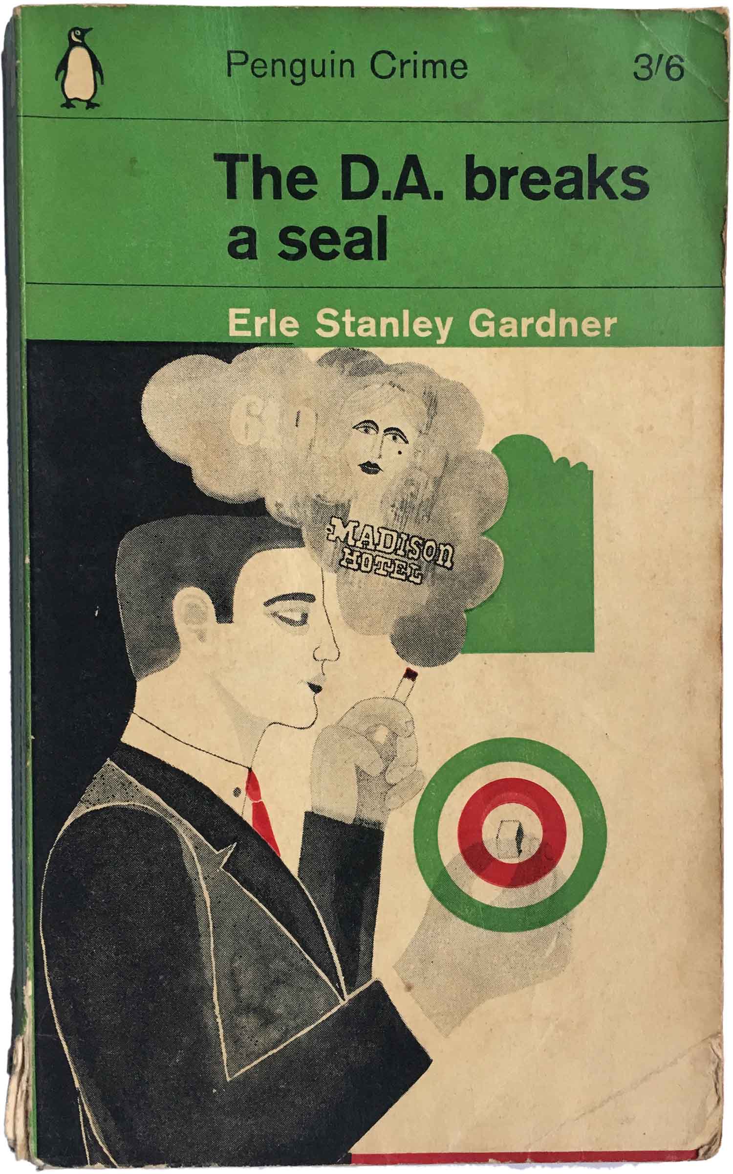
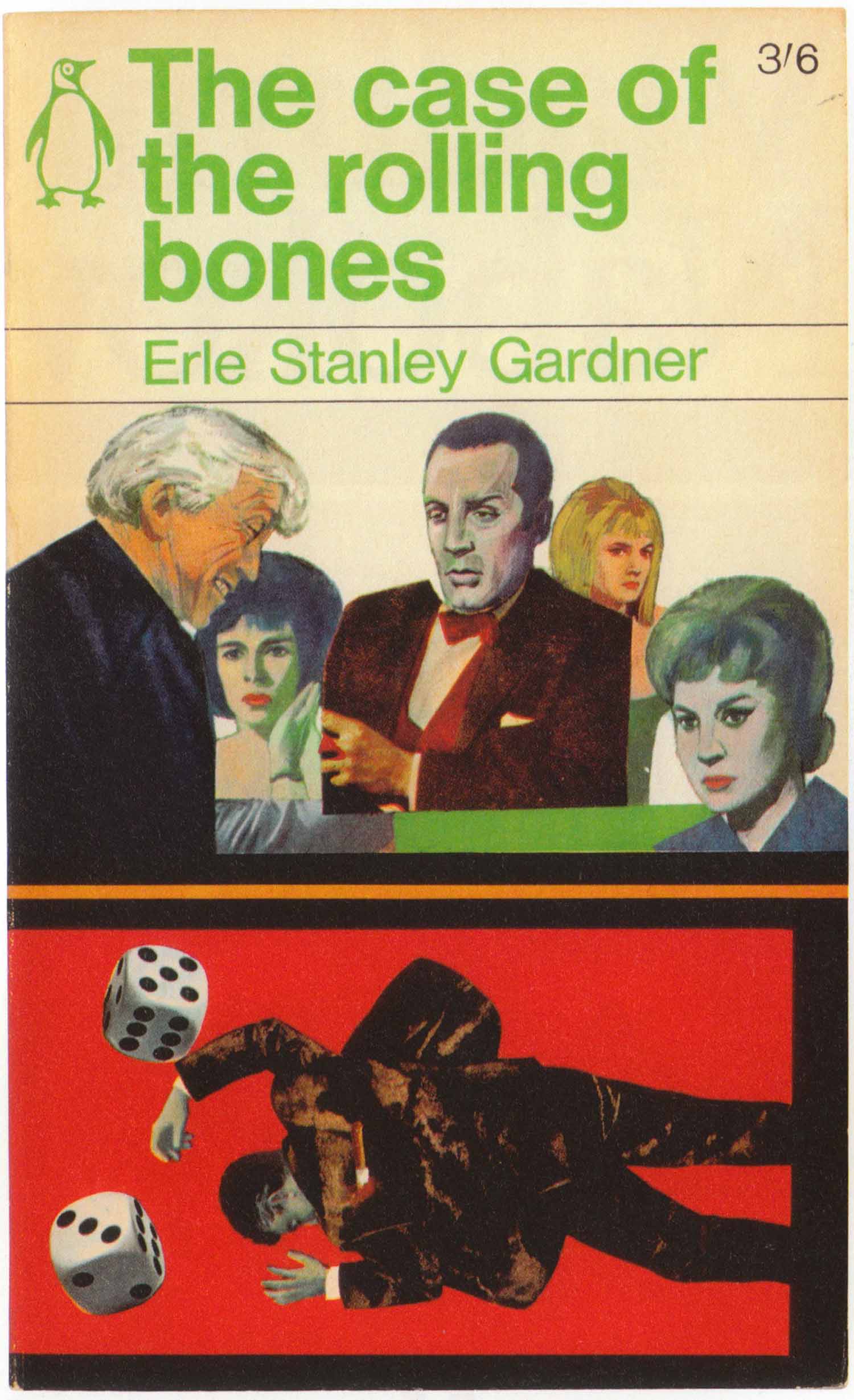
Ursula Noerbel’s cover for C.P. Snow is worth pointing out. I must admit I do love flags, but the conversion of the handgun and the book into icons is also perfectly done here. Below that we have a bunch of Erle Stanley Gardner books (Perry Mason), the bulk of them from 1963, and all done by Romek Marber. His use of a singular graphic element, in this case the circle with the arrow, is once again what holds all the covers together. The later covers are increasingly garish (and done by others), but I have to admit to liking them. The colorized collage of figures on The case of the rolling bones is fabulously trashy.
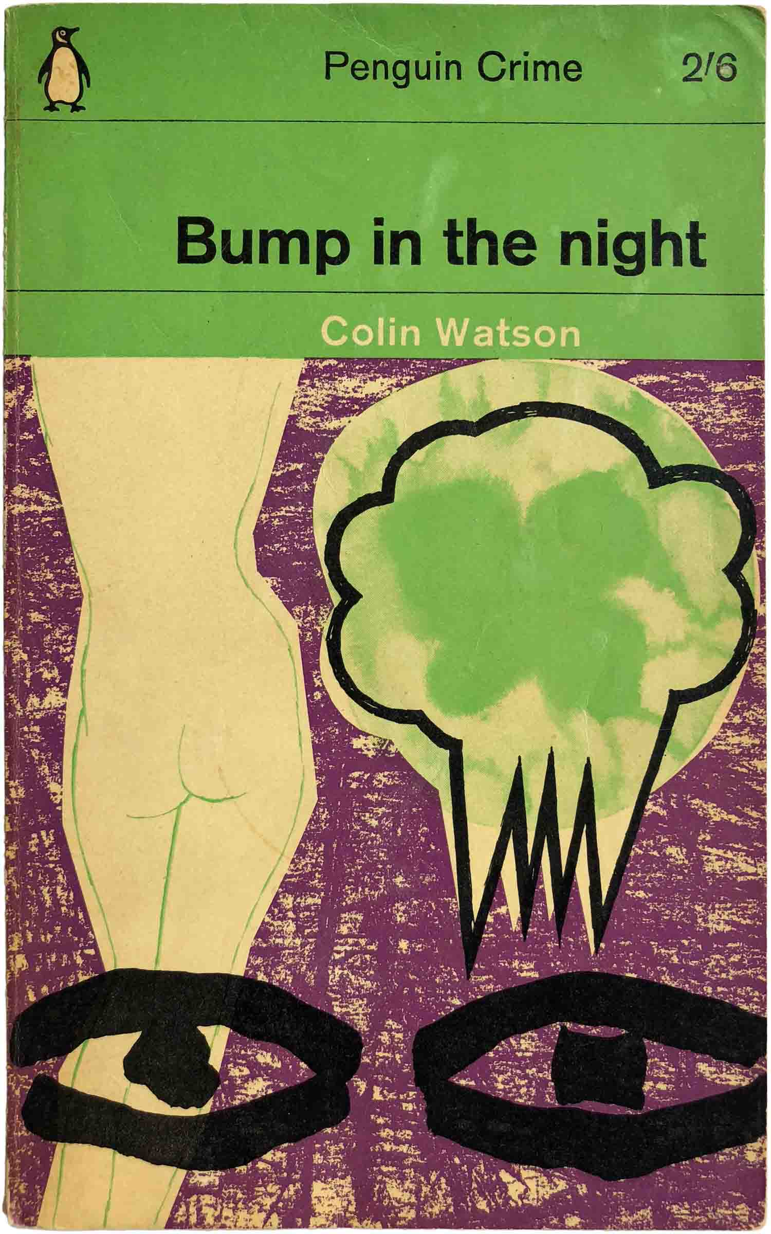
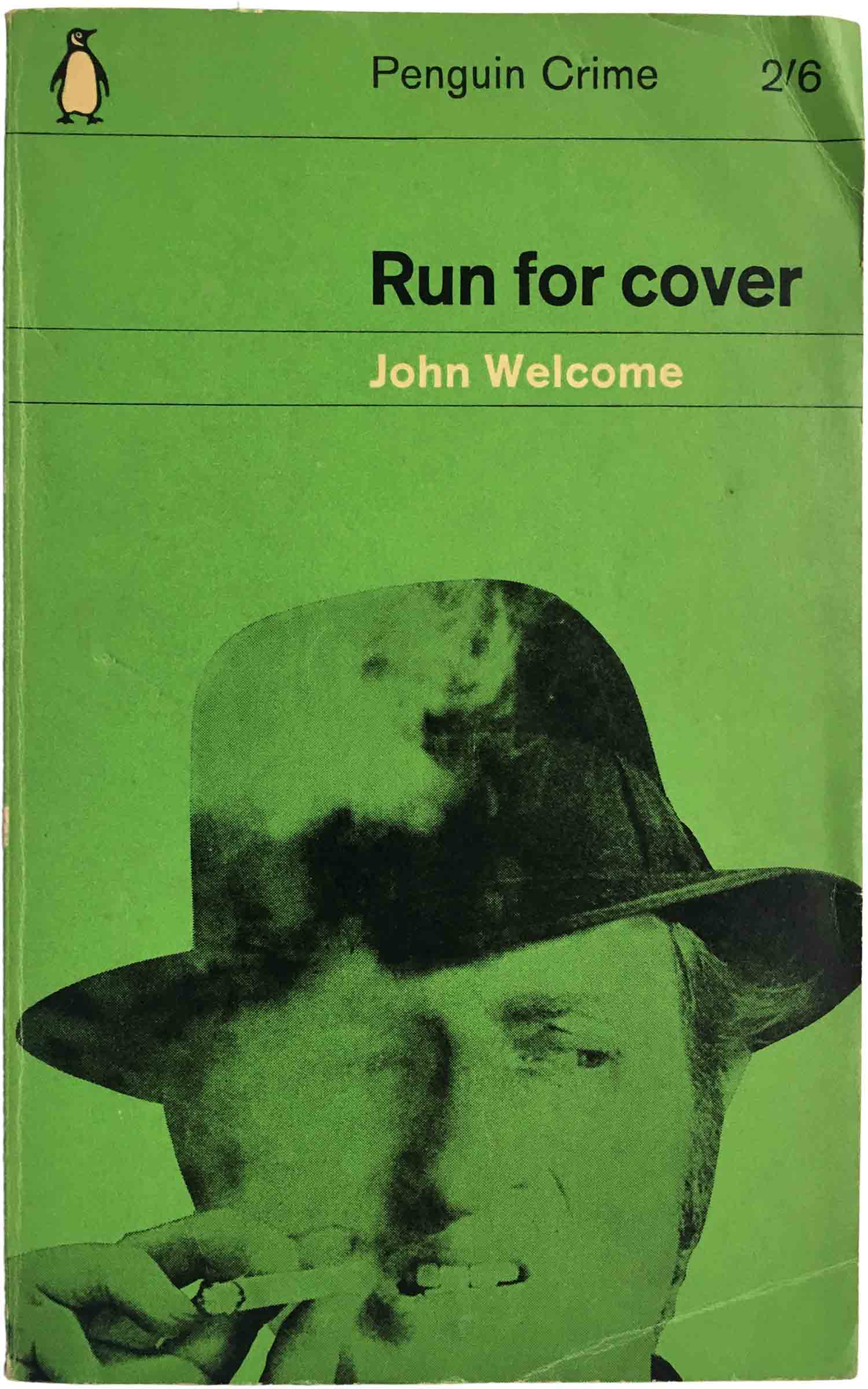
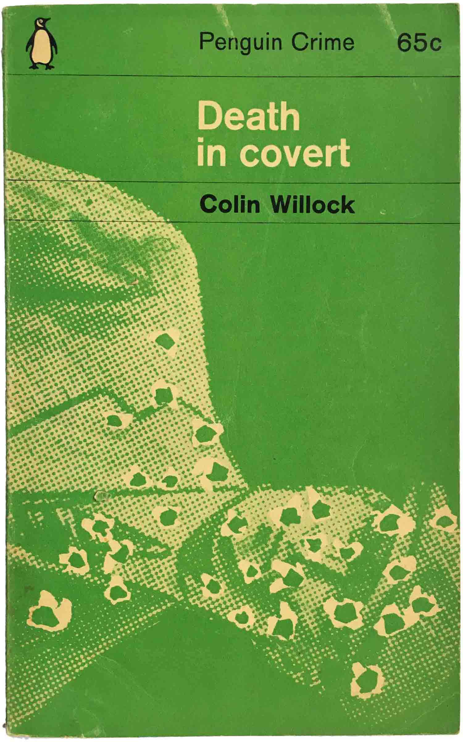
The below three covers make a nice accidental set, all featuring a single figure with a focus on the face, all with different treatments but still strong. The Willock book on the far right must be one of the ones printed in the largest quantity in the US because I’ve found it to be the most common to find in book stores here. Which isn’t a bad thing, as it’s knocked over cop riddled with bullet holes makes for a powerful cover that is always a treat to stumble upon. The restraint in rendering the figure without black really sets it off.

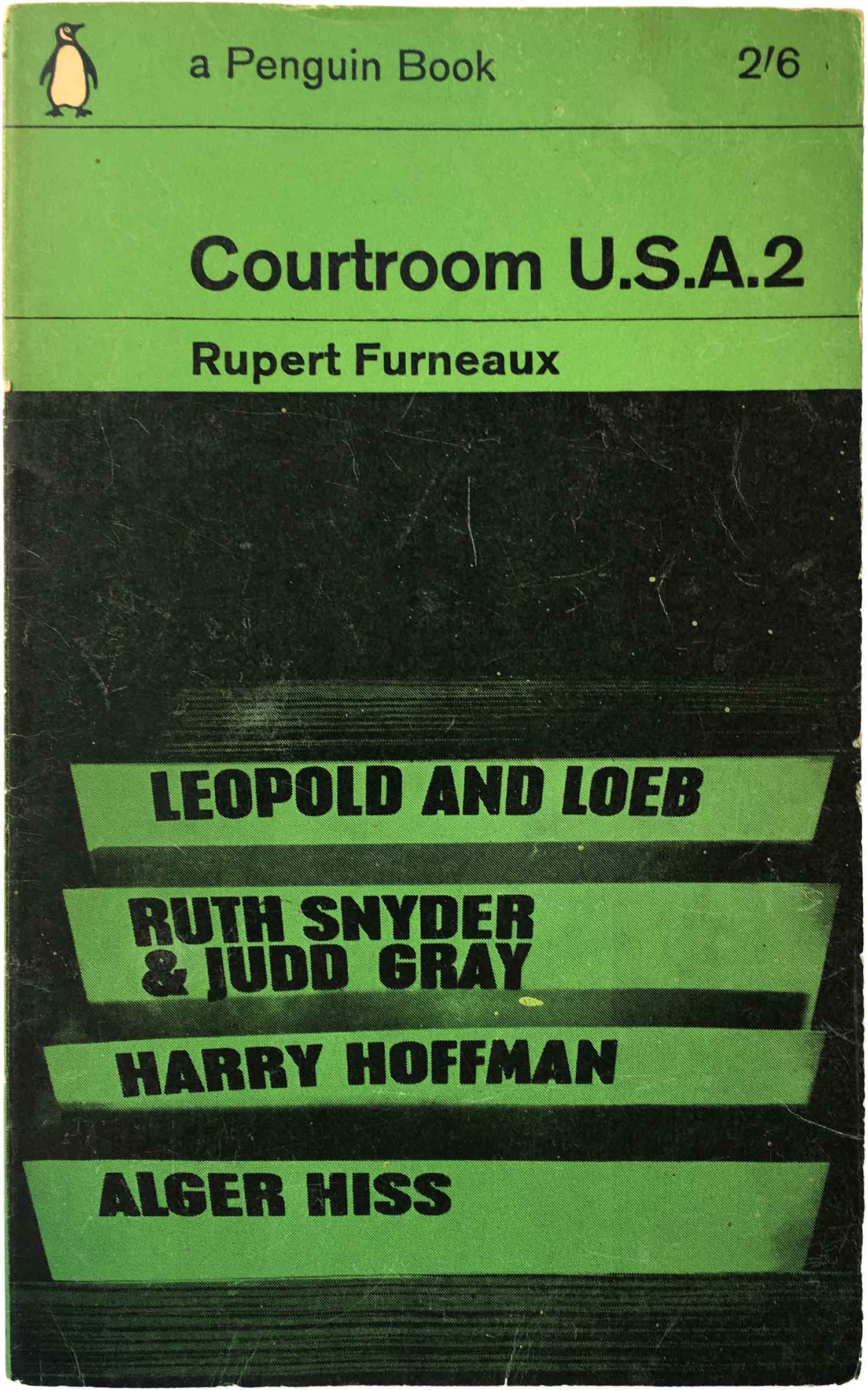
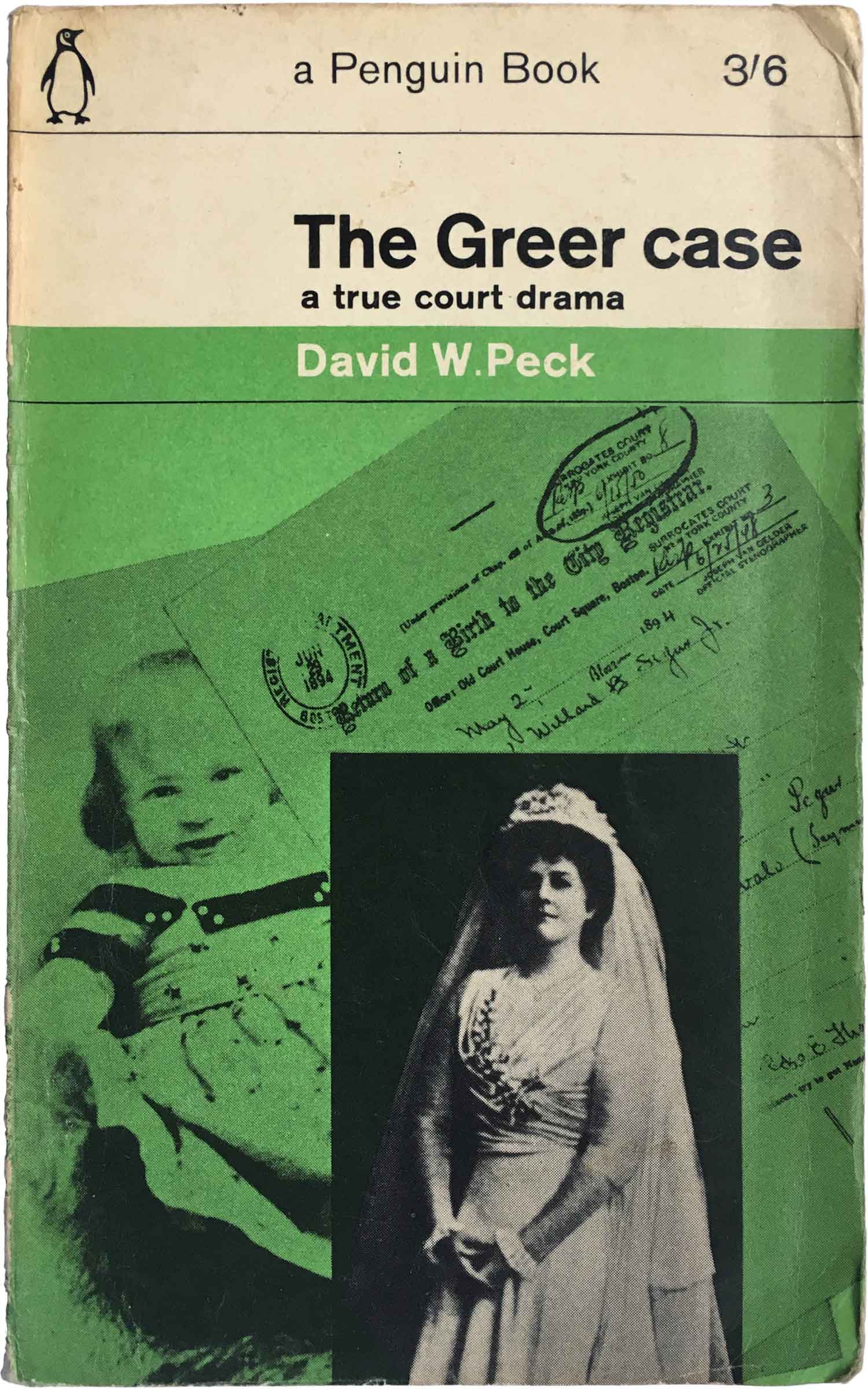
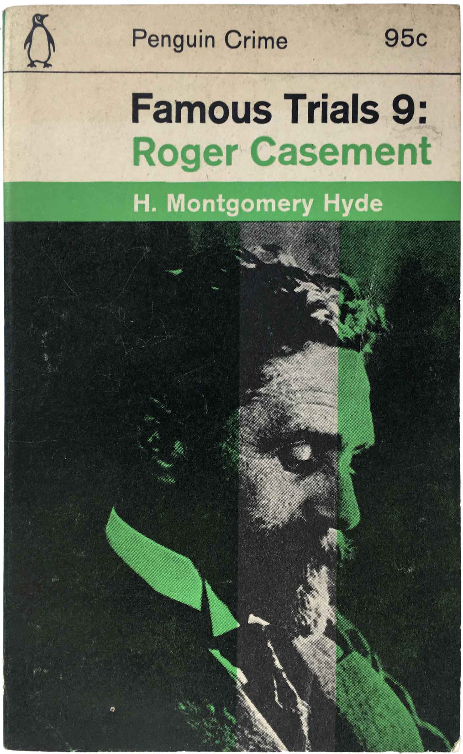
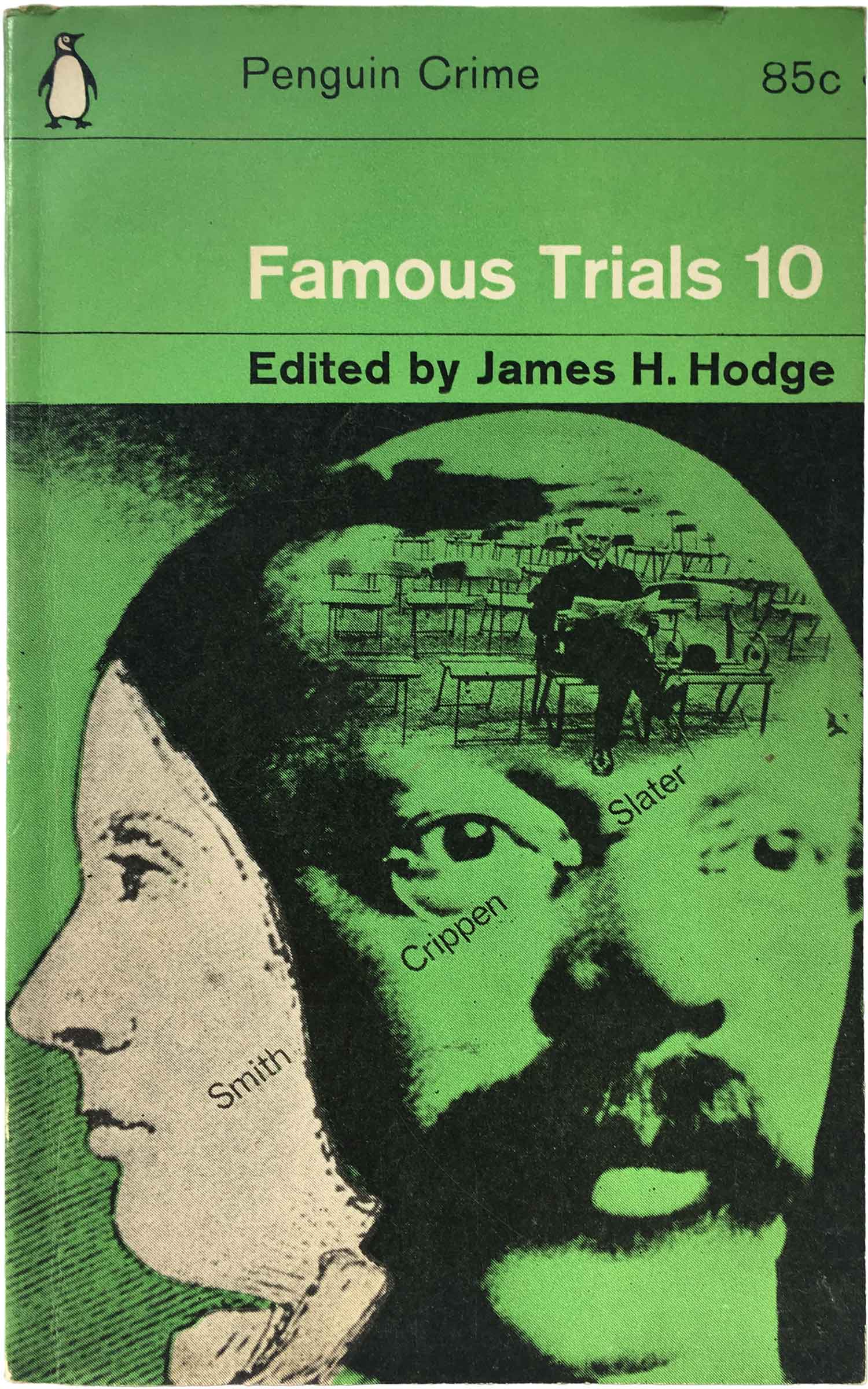
Even though Penguin had separate and unique series for non-fiction, not the least of all Pelicans and Specials, a handful of true crime books were wrapped with the green Marber grid and presented in the same way as all the crime novels. In general the covers of these seem like the were afterthoughts. Maybe because there wasn’t the same level of author investment, or they didn’t expect them to sell, but they overall feel uninspired and phoned in.
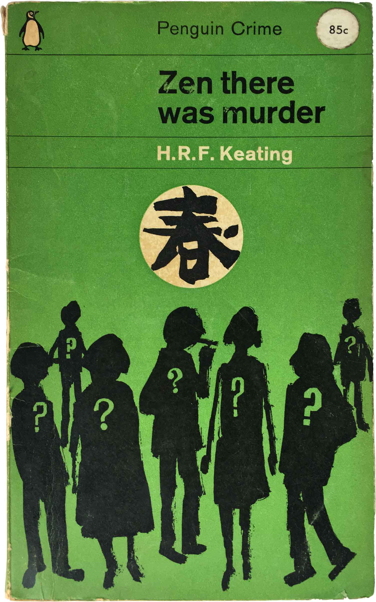
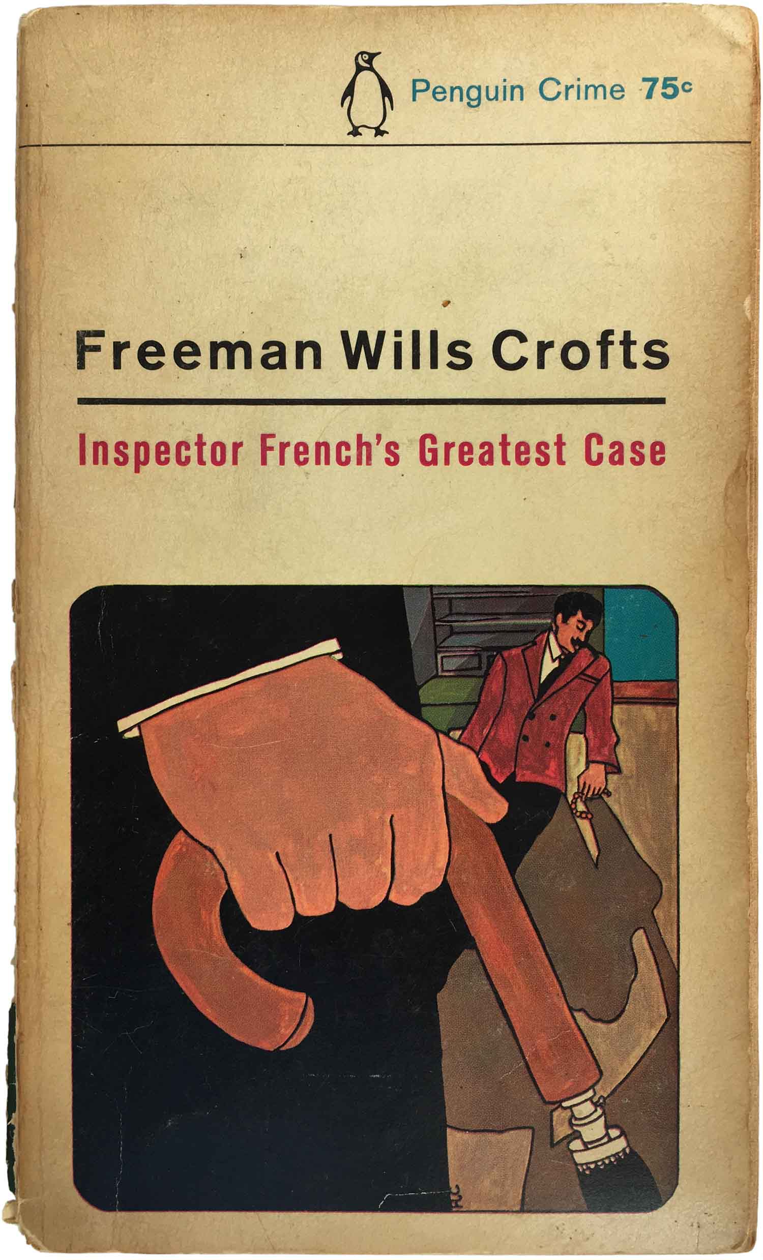
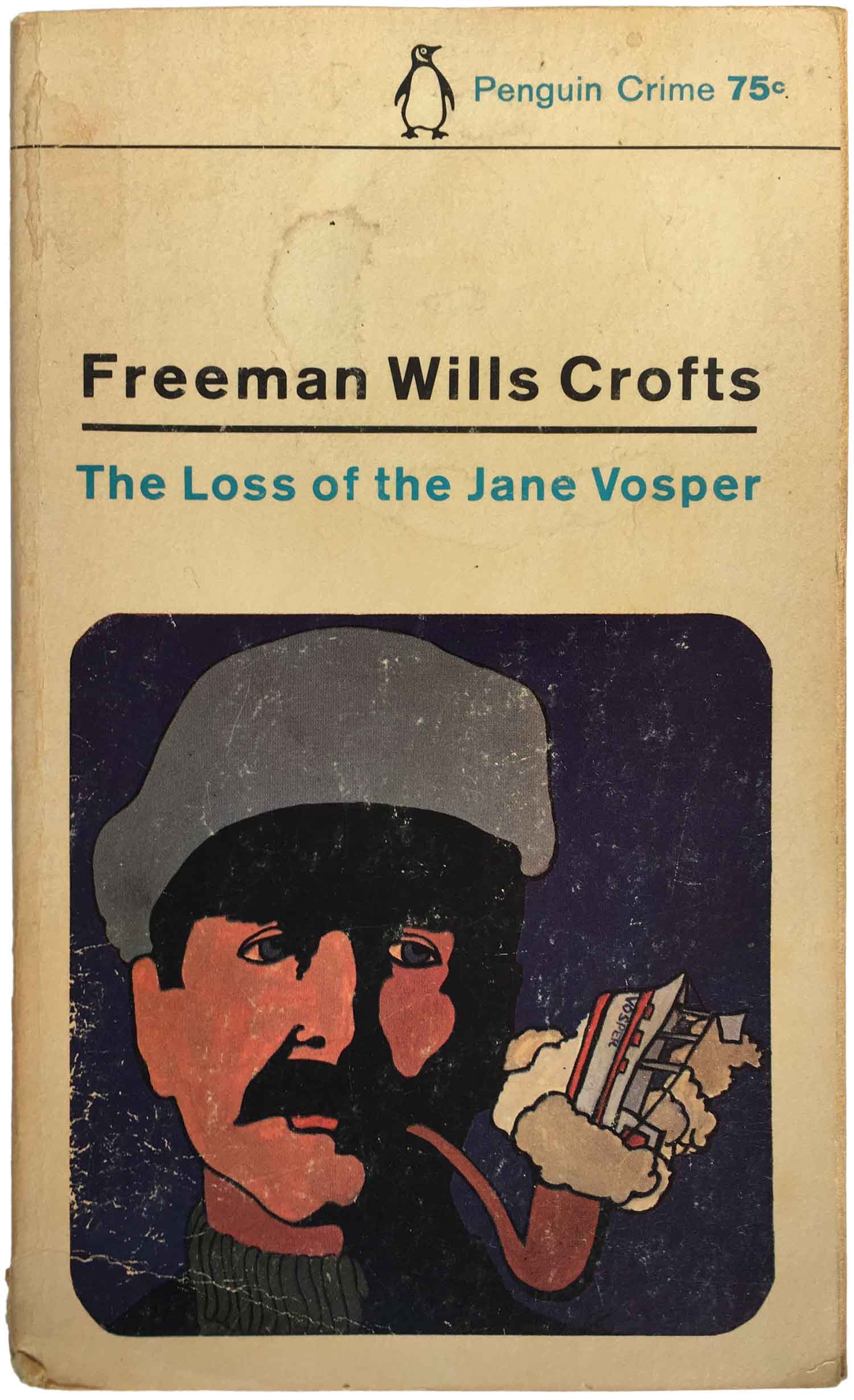
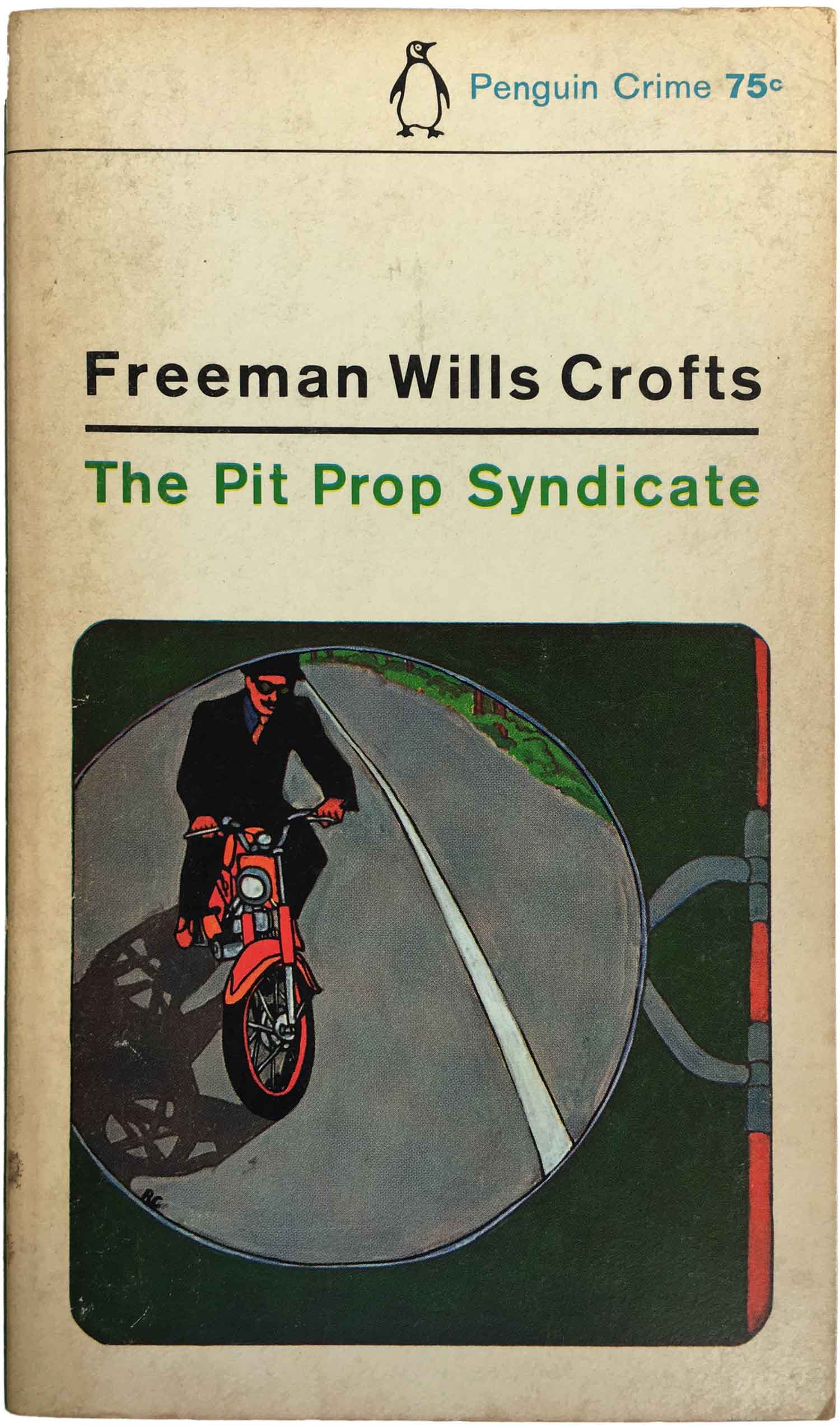
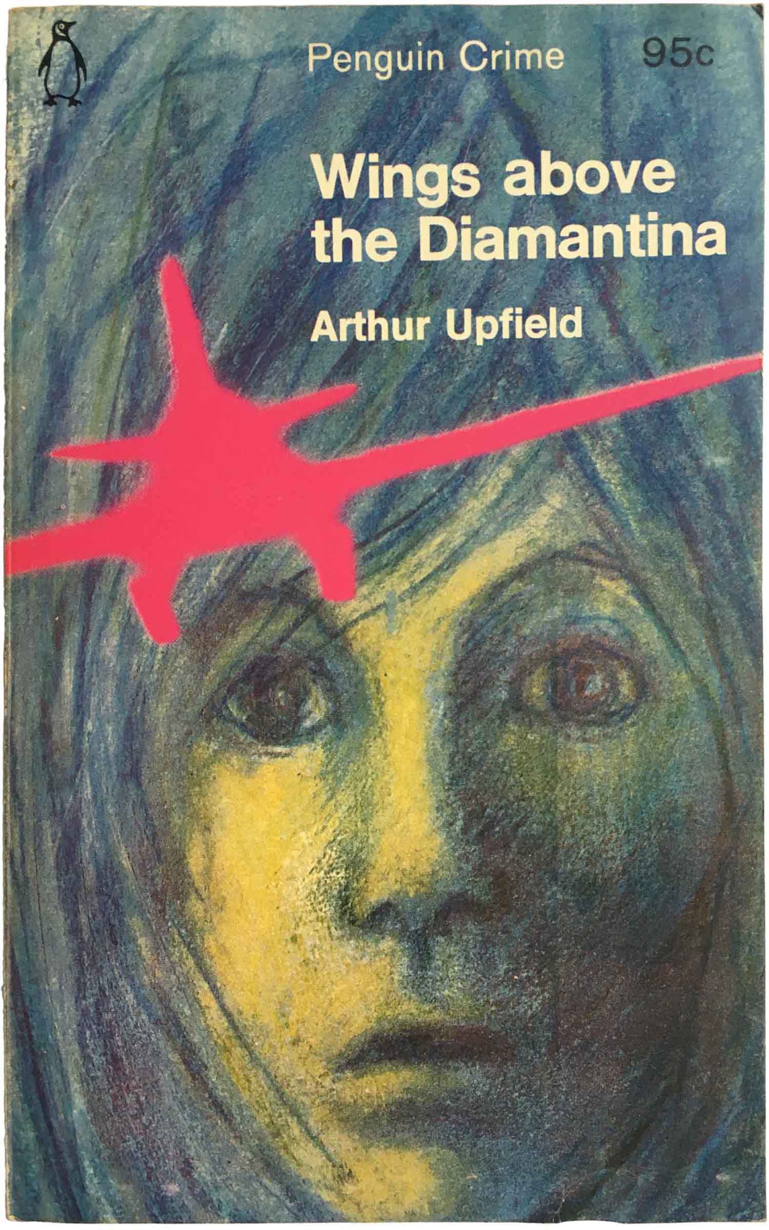
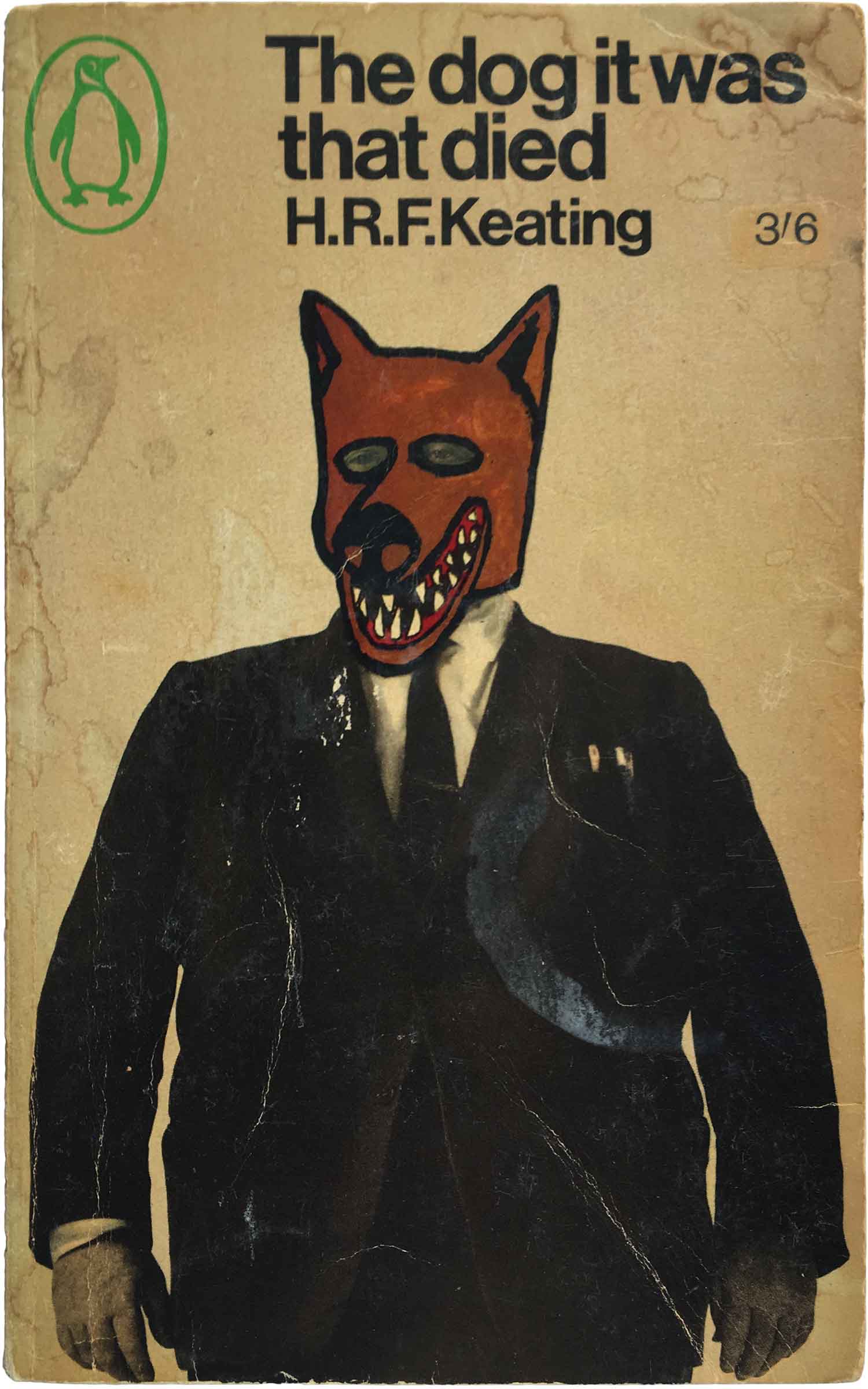
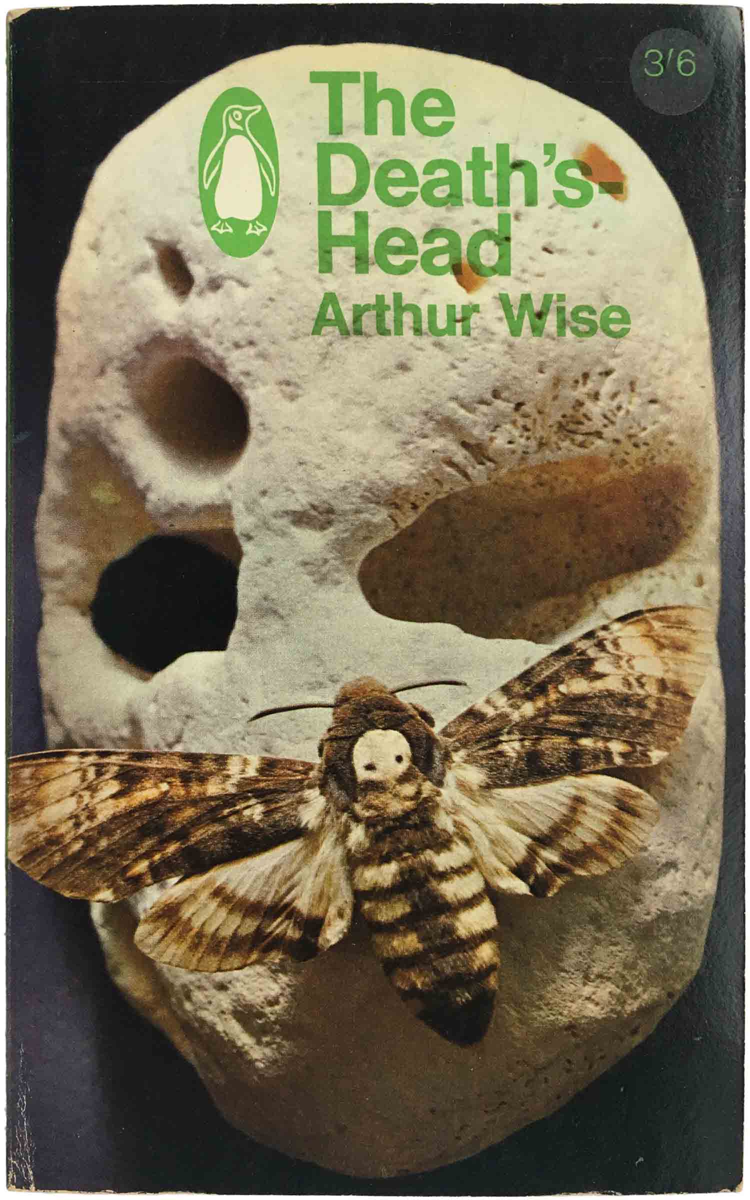
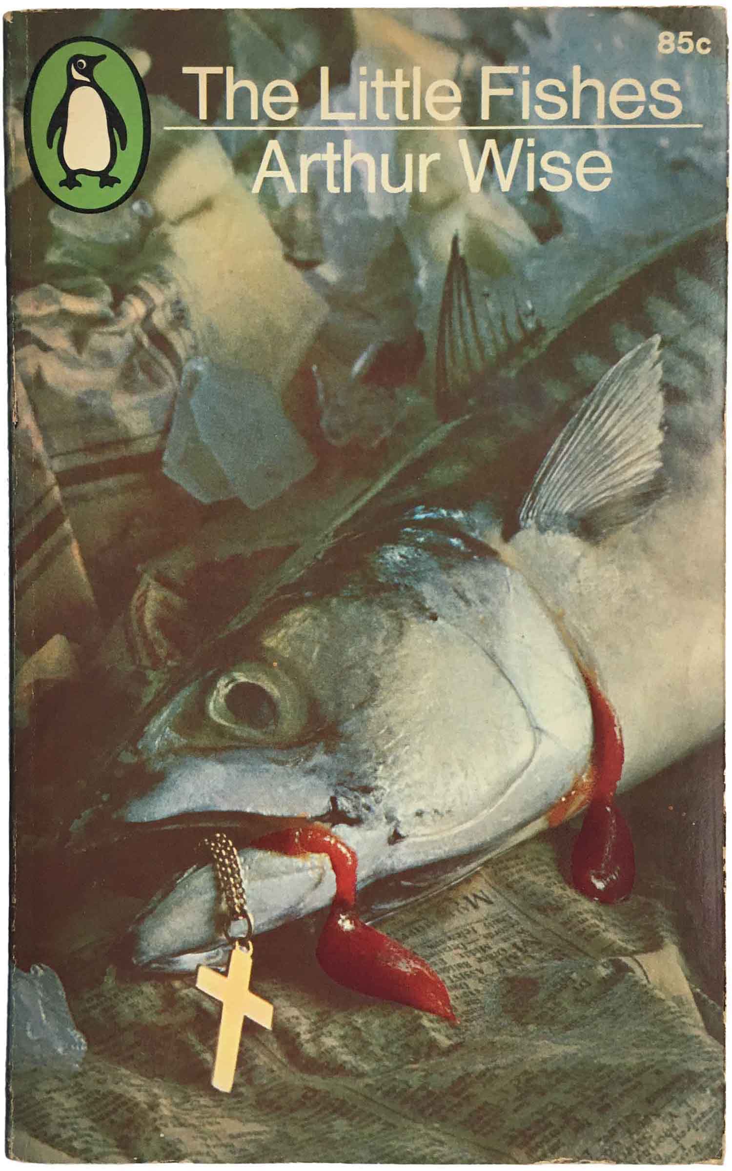
That’s it for the peak 1961–65 period covers, but below are a smattering of later covers, showing the evolution and de-evolution of the grid. The Crofts books below make a nice set, and don’t even seem to really reference the green period even though they are all from 1965, when the grid was largely still in effect. The Upfield book below them feels like a lesson in how not to use an illustration, while the Keating design on the right side is the opposite, the dog/man is striking on first glance, and then super creepy once you see the human eyes. The Arthur Wise covers both have photos used to good effect (although the ketchup/blood on the right is a little over the top), and are good example of evolving from the basic grid without totally abandoning it. And finally there are just a couple examples of much later covers, from the late 1970s, to show how quickly the design collapsed into everything goes, with the green Penguin icon being the only thing that held the disparate titles together.
So, hopefully some of you have stuck with me over the course of this epic post of 150 covers, and maybe some of you are convinced on how awesome many of these are! I have always been impressed with Penguin’s willingness and desire to re-cover each title as it is reprinted, it has made for a great range of covers for some of the more popular authors that had already gone into nine or ten printings by the end of the 1960s. They also gave a lot of artists and designers work, and gave us book hounds the joy of tracking down all these variations. Stay tuned over the next couple months for some posts consolidating and adding to older collections (Dover Books, Leonard Baskin, and more), as well as hopefully a couple brand new posts (been working on one about the covers of printmaker Antonio Frasconi for years now, maybe I’ll finally get it done!). And as always please comment on these posts. It really helps us here at Justseeds know that people are actually reading, and is a great encouragement to put the time and energy in to keep posting. Sometimes it feels like all this labor falls into a black hole, and it’s really rewarding when we get notice that people care and are paying attention.
Anyone out there that either has additional information about this period of Penguin crime cover design, or additional titles, please, please get in touch! I’d love to add any more info and images into this post in the future.
Bibliography of this week’s covers:


I want a wall dedicated just to Penguin’s green crime era now.
My absolute favorites are the ones that adhere to the grid as strictly as possible, as well as to the 2-color printing scheme, while relying on illustrations that sort of… do the dance between illustrative line-art and graphic solutions (And maybe a bit of photographic collage).
Highlights:
– Death in High Providence
– Max Carrados Mysteries
– The Incredulity of Father Brown
– The New Sonya Wayward
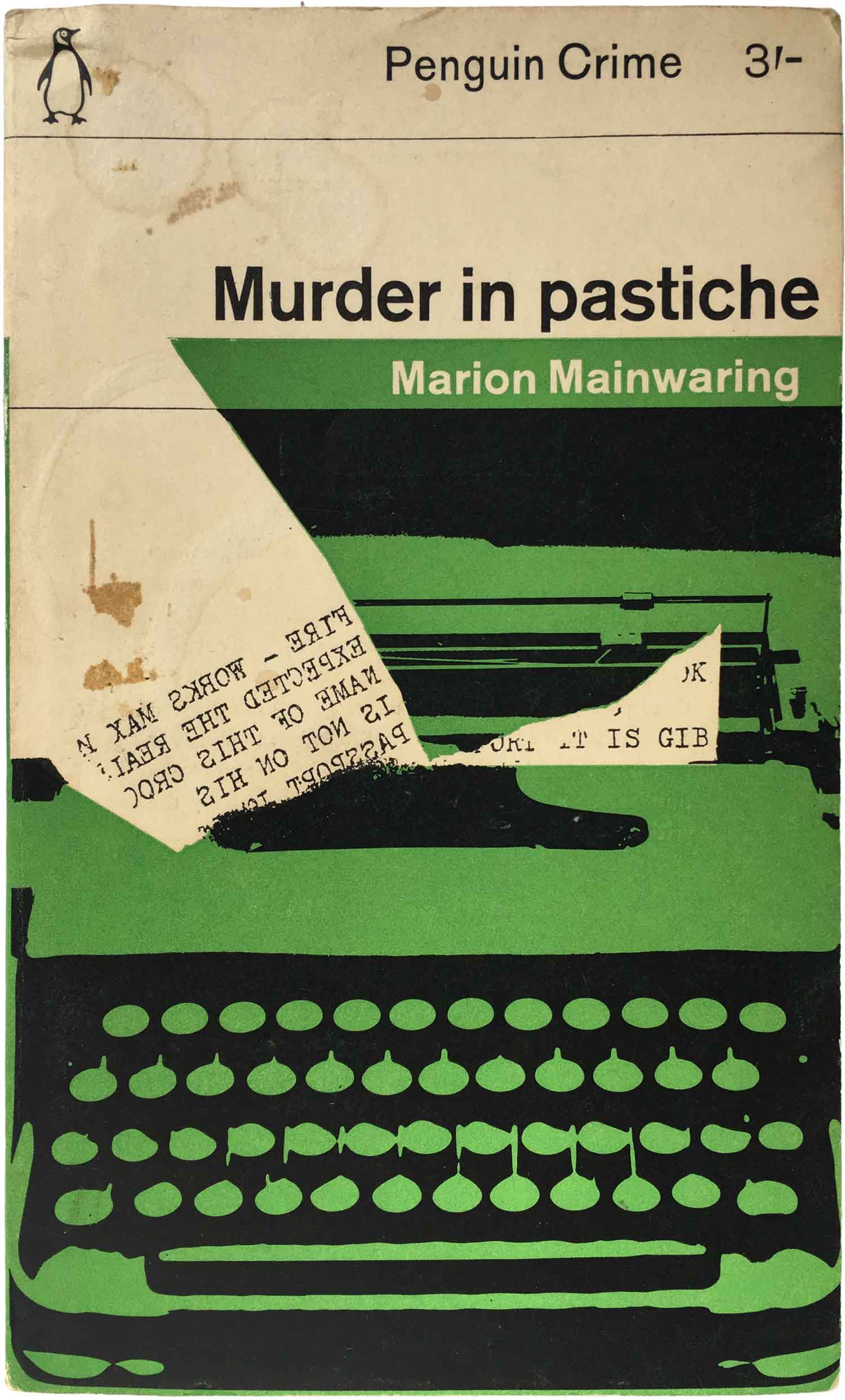
– Murder in Pastiche
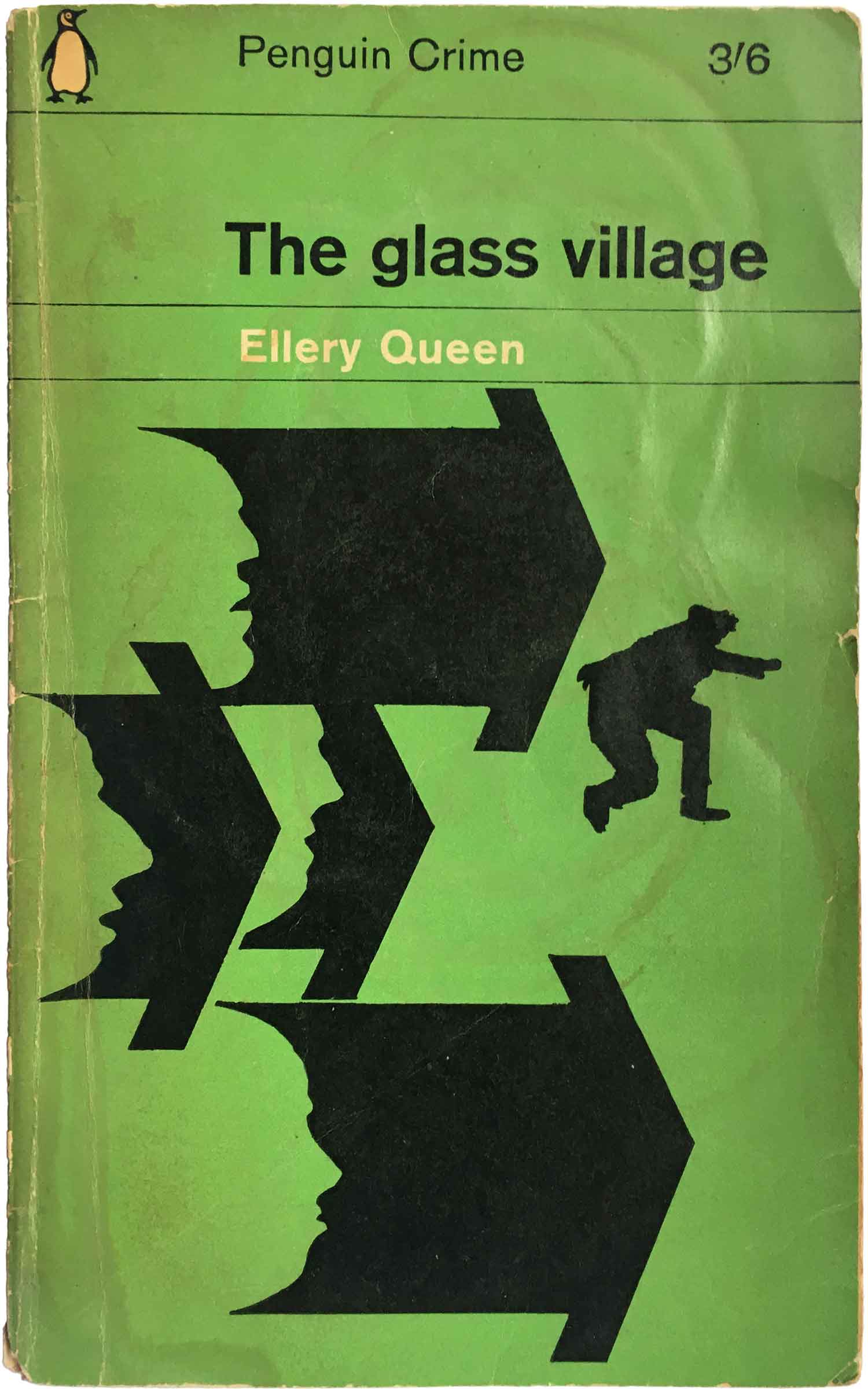
– The Glass Village
– Death Under Sail
What I don’t entirely get is their rules on capitalization. Sometimes you get something like “The case of the howling dog” with only the T in “The” capitalized, but then you also get “The case of the Golddigger’s Purse”
It may seem like an odd nitpick, but it’s really throwing me off!
Yup, I love the straight green/black on white, esp. the ones like New Sonya Wayward where the negative space really is activated! As for the spelling, I think it’s old British spelling rules, so only first letter and proper names are capitalized. But this changes by the late 60s to standardize with U.S. capitalization of titles…
There is a different, but similar drift in the location of the left justification, on early titles it’s always a little to the left of center, but it sprawls out and further left as time goes on.
Thanks for the read Josh, it’s a good one!